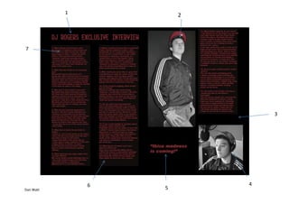
The document describes the process and design decisions made for a magazine double page spread. Key points:
1) The masthead uses the same red font as the cover for consistency. It was easy to insert and scale.
2) The main photo of Jack Rogers was edited in black and white, but his red hat was left in color for visual interest.
3) The background was kept black for easy readability of text, though a more interesting design could be used given more time.
4) A second photo of Jack was cropped and centered, feeling it better captured a serious photo shoot vibe.
5) A large quote was included to fill space and hopefully intrigue readers to the

