
Recommended
Recommended
More Related Content
What's hot
What's hot (18)
Similar to Newspaper Advert Poster Analysis
Similar to Newspaper Advert Poster Analysis (20)
Recently uploaded
Recently uploaded (20)
Newspaper Advert Poster Analysis
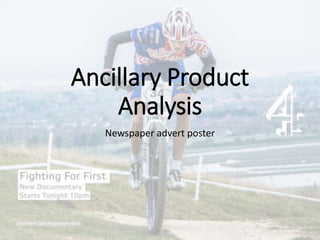
- 2. Image I have used an image of my main actor in a race. The image was taken at the top of a hill. Both of these factors have meant that the image shows him clearly trying hard and represents the racing perfectly. His facial expressions show the pain he is in, telling us that he is really trying. This links to the name of my documentary as he is quite clearly actually Fighting for First. In the image the actor is using the same bike and cycling kit as featured in the documentary. This helps make the image straight away linked to my main piece as not only is it the same person but also using the same props. I took the image using my DSLR and then edited it in Adobe Lightroom. This allowed me to produce a high quality striking professional quality image which is completely in focus and has all the colours corrected, of a high resolution and lots of contrast and overall a good look to it. The background of the image is out of focus due to using a low aperture and it being far away. This means that the part of the image that I want to be seen, the bike and rider is in focus and quite clearly the main aspect to the image. The image is very striking. You cant see all of the subjects face so there is no direct mode of address to attract the audience, however I like this as it makes him look more mean and adds to the “fighting” to win and not just racing. Once again linking to my main product and brand identity. The mis en scene in the image such as the race board on the bike and the course markings in the background help to make the scenario easily identifiable as a race and not just someone riding a bike.
- 3. Text The text used is short and to the point. It simply states the name of the documentary, the fact that it is a new addition and confirms that it is a documentary not a series or reality TV etc. And finally the start time and the date that it starts. This is then followed by a web address for the website for the program. The text relates to the image as it says fighting and due to the body language and the nature of the environment the image is taken in it is clear that the actor is fighting to win this race. The font used for the text is Elteka Pro. This is a font that I have found to be as close as possible to the official channel 4 font. This make the poster look like a real channel 4 production. It is in size 27pt for the top line and 18pt for the following two. This allows for the title to be easily read from far away and then the additional information read easily when the attention of the audience has already been caught by the title and the striking main image. The text is backed onto a white rectangle for each line of text. This is in order to allow it to be easily read as the background colours of the image could blend into the black text and make it hard to decipher. Using one box per line rather than 1 big rectangle gives a cleaner look by covering less of the image than one big box on the page. The text is positioned to the bottom left hand side of the image to ensure that it doesn't’t cover any important aspect of the image. In addition to this having it on the left hand side makes it easier to read as we read from left to right. Finally it has been put there to make the poster even as the C4 logo is positioned on the middle right.