Download as PDF, PPTX


![Heatmaps: in-page analysis in GA
• [JONI SHOWS]
53](https://image.slidesharecdn.com/digitalanalyticslecture5-150818190335-lva1-app6892/85/Digital-analytics-Visualization-Lecture-5-54-320.jpg)
![Visualization options in Google Analytics
• [JONI SHOWS]
• pie chart, bar, pivot, motion graph
• ”plot rows” option
61](https://image.slidesharecdn.com/digitalanalyticslecture5-150818190335-lva1-app6892/85/Digital-analytics-Visualization-Lecture-5-62-320.jpg)

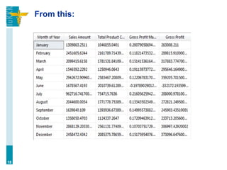
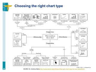
The document outlines the structure and content of a digital analytics program at Aalto University, focusing on data visualization, analytics problems, optimization, and building analytics teams. It emphasizes the importance of choosing appropriate chart types for data representation and discusses various visualization tools such as Tableau and Google Analytics. The workshop includes exercises on using Tableau to create impactful visualizations and highlights the principles and psychology behind effective data presentation.