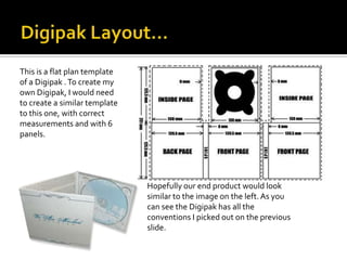
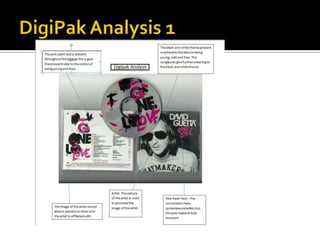
   What is a Digipak?
 It is a type of CD packaging made of card stock or heavy paper/cardboard
    material. Digipaks usually flip open like a book, or it has three parts, so
    that one portion of the packaging opens to the right and one to the left
    with the CD in the centre portion.
In order for us to make create our digipak we have to take a lot of things
into consideration:
 Logo
 Font Styles
 Layout
 Images to be used.
 It reflects the image of the artist
When analyzing Digipaks, I noticed some conventions of the product,
   that could be useful information when creating your own.
Here are the conventions I noticed..
 It had either 4 or 6 panels
 A main image was placed on the front either being a logo, symbol,
   image to represent the artist or band.
 A song list was at the back to show what songs were on the CD.
 The logo of the production company.
 Barcode of the product.
 Name of the album and artist in the form of text or pictures.
 Same theme running throughout.

Before creating my own, I decided to analyse and research into other
   Digipaks.
Pros                                     Cons
 Digipaks can be at times great           The cardboard packaging is less
  visual products for the artist/bands      resistant to abrasion than jewel
  i.e. providing fans with exclusive
  footage and live tour footage.            cases, it tends to show signs of
 The trays in Digipaks often break         wear relatively quickly
  much more often than in jewel            The digipak sleeves with 3 sleeves
  cases because the paper doesn't           for more design options, however
  provide as much protection for the        these are more expensive than
  disc.                                     traditional jewel cases – so if bands
 Which means when the trays do             are just starting out, looking for
  break in digipaks, the disc falls out     ways to cut manufacturing costs is
  of the bottom, because unlike jewel
  cases, there is nothing to hold it in     important
 Digipaks can be more                     Although digipaks can be
  environmentally friendly than the         environmentally friendly, they aren’t
  jewel plastic cases because they          always made from recycled
  can be made from recycled material        materials
This is a flat plan template
of a Digipak . To create my
own Digipak, I would need
to create a similar template
to this one, with correct
measurements and with 6
panels.


                               Hopefully our end product would look
                               similar to the image on the left. As you
                               can see the Digipak has all the
                               conventions I picked out on the previous
                               slide.
This particular Digipak
     focuses on one theme
     pattern with the bury
     lights.
Simple layout which is                    The use of a simple prop
effective as it’s not over                of the rose interlinks with
crowed for the audience                   the main front image of
to understand.                            the tree.


       This Digipak focuses very        The prop of the mask
       much on one person               portrays the character to
       which I'm guessing is the        be mysterious . It could
       artist.                          mean that he’s trying to
                                        hide his identity.


          The text style used gives a
          sense of a rock theme to
          the album.
This Digipak is based on
an abstract look which I
really took a liking to.
It works really well in
creating a different look
compared to the other         The simplicity of the
Digipaks.                     colours works well with
                              the title of the album. As
                              the blue links in with the
The title is set in bold to   water and the red with the
set attention towards it      danger aspect of it.
which is effective. The
star adds to the abstract
look that there going for.

Presentation2

  • 2.
    What is a Digipak?  It is a type of CD packaging made of card stock or heavy paper/cardboard material. Digipaks usually flip open like a book, or it has three parts, so that one portion of the packaging opens to the right and one to the left with the CD in the centre portion. In order for us to make create our digipak we have to take a lot of things into consideration:  Logo  Font Styles  Layout  Images to be used.  It reflects the image of the artist
  • 3.
    When analyzing Digipaks,I noticed some conventions of the product, that could be useful information when creating your own. Here are the conventions I noticed..  It had either 4 or 6 panels  A main image was placed on the front either being a logo, symbol, image to represent the artist or band.  A song list was at the back to show what songs were on the CD.  The logo of the production company.  Barcode of the product.  Name of the album and artist in the form of text or pictures.  Same theme running throughout. Before creating my own, I decided to analyse and research into other Digipaks.
  • 4.
    Pros Cons  Digipaks can be at times great  The cardboard packaging is less visual products for the artist/bands resistant to abrasion than jewel i.e. providing fans with exclusive footage and live tour footage. cases, it tends to show signs of  The trays in Digipaks often break wear relatively quickly much more often than in jewel  The digipak sleeves with 3 sleeves cases because the paper doesn't for more design options, however provide as much protection for the these are more expensive than disc. traditional jewel cases – so if bands  Which means when the trays do are just starting out, looking for break in digipaks, the disc falls out ways to cut manufacturing costs is of the bottom, because unlike jewel cases, there is nothing to hold it in important  Digipaks can be more  Although digipaks can be environmentally friendly than the environmentally friendly, they aren’t jewel plastic cases because they always made from recycled can be made from recycled material materials
  • 5.
    This is aflat plan template of a Digipak . To create my own Digipak, I would need to create a similar template to this one, with correct measurements and with 6 panels. Hopefully our end product would look similar to the image on the left. As you can see the Digipak has all the conventions I picked out on the previous slide.
  • 7.
    This particular Digipak focuses on one theme pattern with the bury lights. Simple layout which is The use of a simple prop effective as it’s not over of the rose interlinks with crowed for the audience the main front image of to understand. the tree. This Digipak focuses very The prop of the mask much on one person portrays the character to which I'm guessing is the be mysterious . It could artist. mean that he’s trying to hide his identity. The text style used gives a sense of a rock theme to the album.
  • 8.
    This Digipak isbased on an abstract look which I really took a liking to. It works really well in creating a different look compared to the other The simplicity of the Digipaks. colours works well with the title of the album. As the blue links in with the The title is set in bold to water and the red with the set attention towards it danger aspect of it. which is effective. The star adds to the abstract look that there going for.