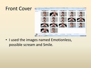
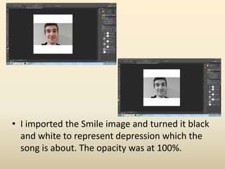
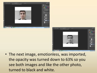
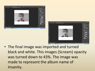
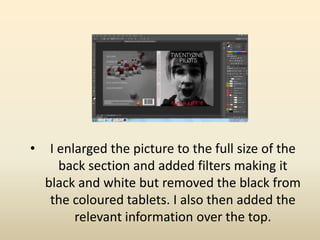
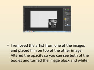
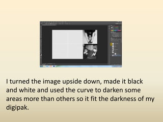
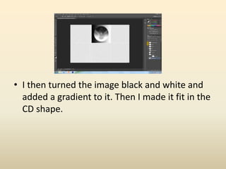
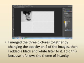
Digipak Development
Front Cover
• I used the images named Emotionless,
possible scream and Smile.
• I imported the Smile image and turned it black
and white to represent depression which the
song is about. The opacity was at 100%.
• The next image, emotionless, was imported,
the opacity was turned down to 63% so you
see both images and like the other photo,
turned to black and white.
• The final image was imported and turned
black and white. This images (Scream) opacity
was turned down to 43%. The image was
made to represent the album name of
Insanity.
• I enlarged the picture to the full size of the
front section. Then I added the artist and
album name.
Back Cover
• I used the image called maybe
• I enlarged the picture to the full size of the
back section and added filters making it
black and white but removed the black from
the coloured tablets. I also then added the
relevant information over the top.
Bottom right
• I used the images called 20170405_152556
and 20170405_152755
• I removed the artist from one of the images
and placed him on top of the other image.
Altered the opacity so you can see both of the
bodies and turned the image black and white.
Top Right
• I used the image called 20170405_154214
I turned the image upside down, made it black
and white and used the curve to darken some
areas more than others so it fit the darkness of my
digipak.
CD
• For this image I used a screenshot from my
music video
• I then turned the image black and white and
added a gradient to it. Then I made it fit in the
CD shape.
• I used the images called 20170405_154214 ,
20170405_154313 , 20170405_154539
• I merged the three pictures together by
changing the opacity on 2 of the images, then
I added a black and white filter to it. I did this
because it follows the theme of insanity.

Digipak Development

  • 1.
  • 2.
    Front Cover • Iused the images named Emotionless, possible scream and Smile.
  • 3.
    • I importedthe Smile image and turned it black and white to represent depression which the song is about. The opacity was at 100%.
  • 4.
    • The nextimage, emotionless, was imported, the opacity was turned down to 63% so you see both images and like the other photo, turned to black and white.
  • 5.
    • The finalimage was imported and turned black and white. This images (Scream) opacity was turned down to 43%. The image was made to represent the album name of Insanity.
  • 6.
    • I enlargedthe picture to the full size of the front section. Then I added the artist and album name.
  • 7.
    Back Cover • Iused the image called maybe
  • 8.
    • I enlargedthe picture to the full size of the back section and added filters making it black and white but removed the black from the coloured tablets. I also then added the relevant information over the top.
  • 9.
    Bottom right • Iused the images called 20170405_152556 and 20170405_152755
  • 10.
    • I removedthe artist from one of the images and placed him on top of the other image. Altered the opacity so you can see both of the bodies and turned the image black and white.
  • 11.
    Top Right • Iused the image called 20170405_154214
  • 12.
    I turned theimage upside down, made it black and white and used the curve to darken some areas more than others so it fit the darkness of my digipak.
  • 13.
    CD • For thisimage I used a screenshot from my music video
  • 14.
    • I thenturned the image black and white and added a gradient to it. Then I made it fit in the CD shape.
  • 15.
    • I usedthe images called 20170405_154214 , 20170405_154313 , 20170405_154539
  • 16.
    • I mergedthe three pictures together by changing the opacity on 2 of the images, then I added a black and white filter to it. I did this because it follows the theme of insanity.