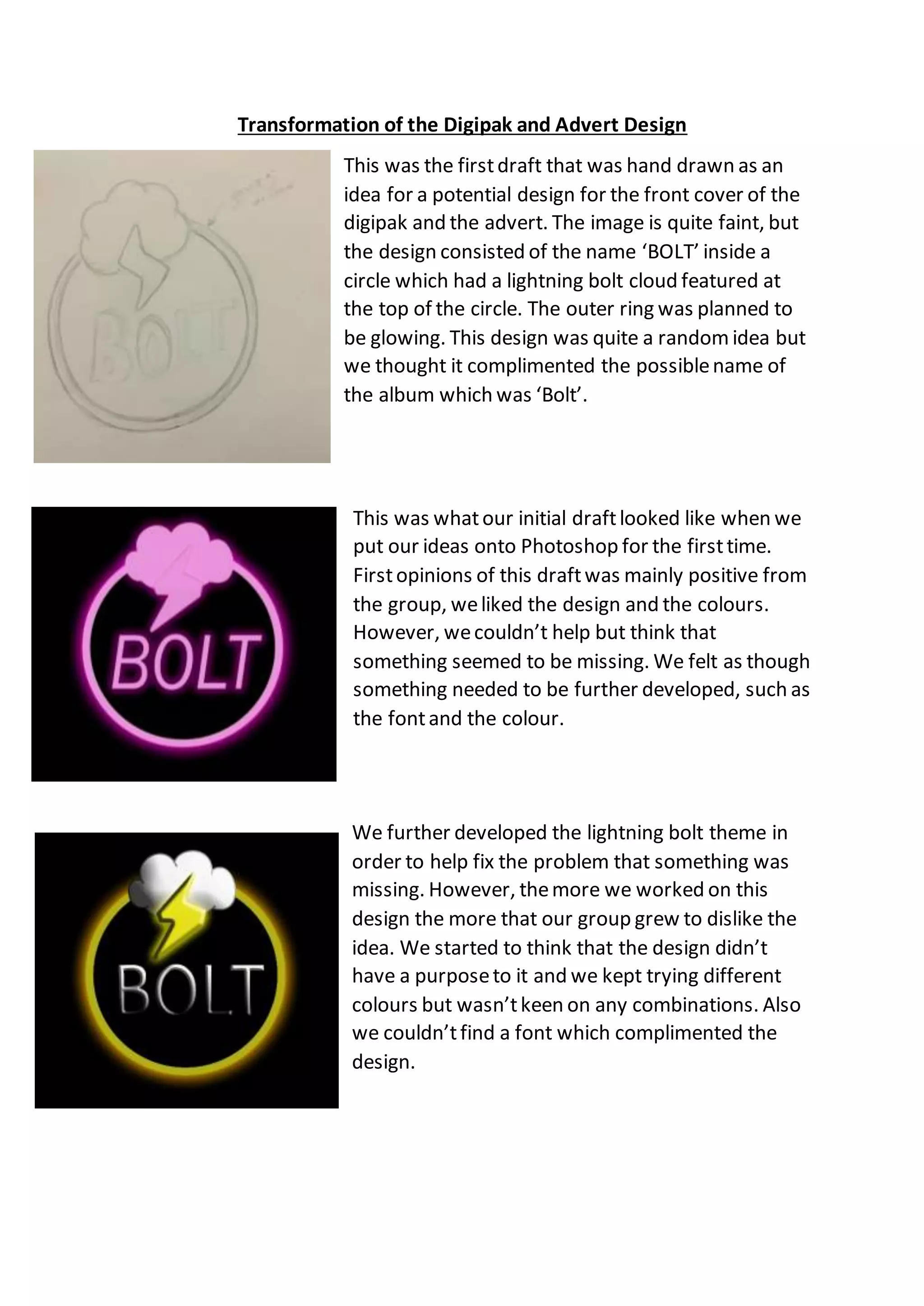
Transformation of the Digipak and Advert Design
This was the firstdraft that was hand drawn as an
idea for a potential design for the front cover of the
digipak and the advert. The image is quite faint, but
the design consisted of the name ‘BOLT’ inside a
circle which had a lightning bolt cloud featured at
the top of the circle. The outer ring was planned to
be glowing. This design was quite a random idea but
we thought it complimented the possiblename of
the album which was ‘Bolt’.
This was whatour initial draftlooked like when we
put our ideas onto Photoshop for the firsttime.
Firstopinions of this draftwas mainly positive from
the group, weliked the design and the colours.
However, wecouldn’t help but think that
something seemed to be missing. We felt as though
something needed to be further developed, such as
the fontand the colour.
We further developed the lightning bolt theme in
order to help fix the problem that something was
missing. However, themore we worked on this
design the more that our group grew to dislike the
idea. We started to think that the design didn’t
have a purposeto it and we kept trying different
colours but wasn’tkeen on any combinations. Also
we couldn’tfind a font which complimented the
design.

Digipak and Advert Drafts

  • 1.
    Transformation of theDigipak and Advert Design This was the firstdraft that was hand drawn as an idea for a potential design for the front cover of the digipak and the advert. The image is quite faint, but the design consisted of the name ‘BOLT’ inside a circle which had a lightning bolt cloud featured at the top of the circle. The outer ring was planned to be glowing. This design was quite a random idea but we thought it complimented the possiblename of the album which was ‘Bolt’. This was whatour initial draftlooked like when we put our ideas onto Photoshop for the firsttime. Firstopinions of this draftwas mainly positive from the group, weliked the design and the colours. However, wecouldn’t help but think that something seemed to be missing. We felt as though something needed to be further developed, such as the fontand the colour. We further developed the lightning bolt theme in order to help fix the problem that something was missing. However, themore we worked on this design the more that our group grew to dislike the idea. We started to think that the design didn’t have a purposeto it and we kept trying different colours but wasn’tkeen on any combinations. Also we couldn’tfind a font which complimented the design.