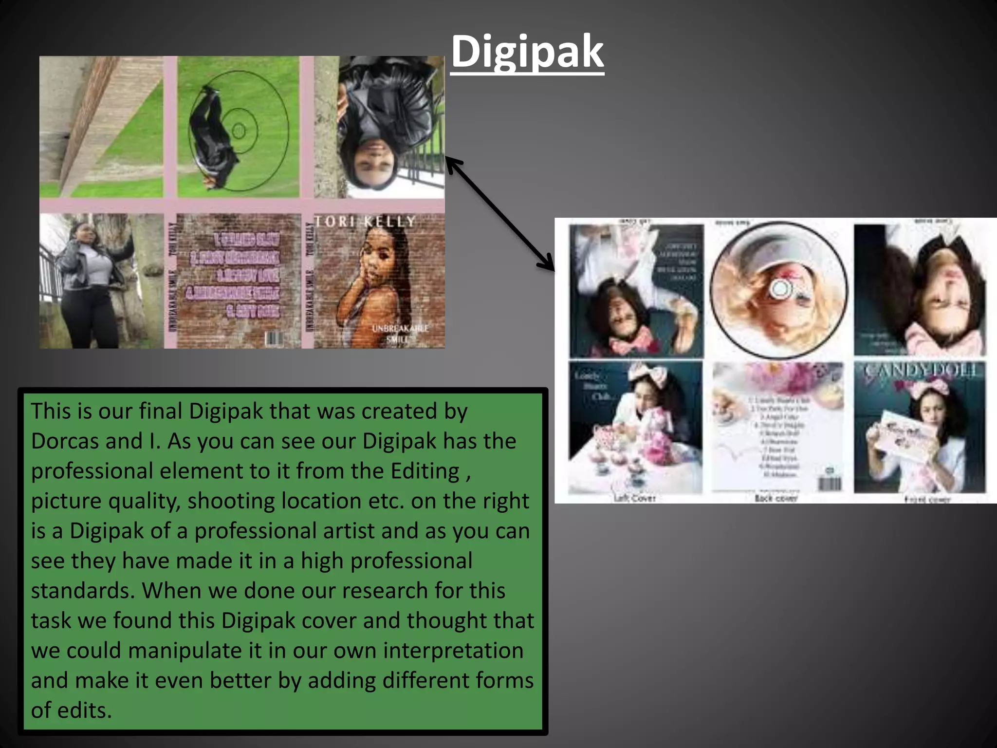
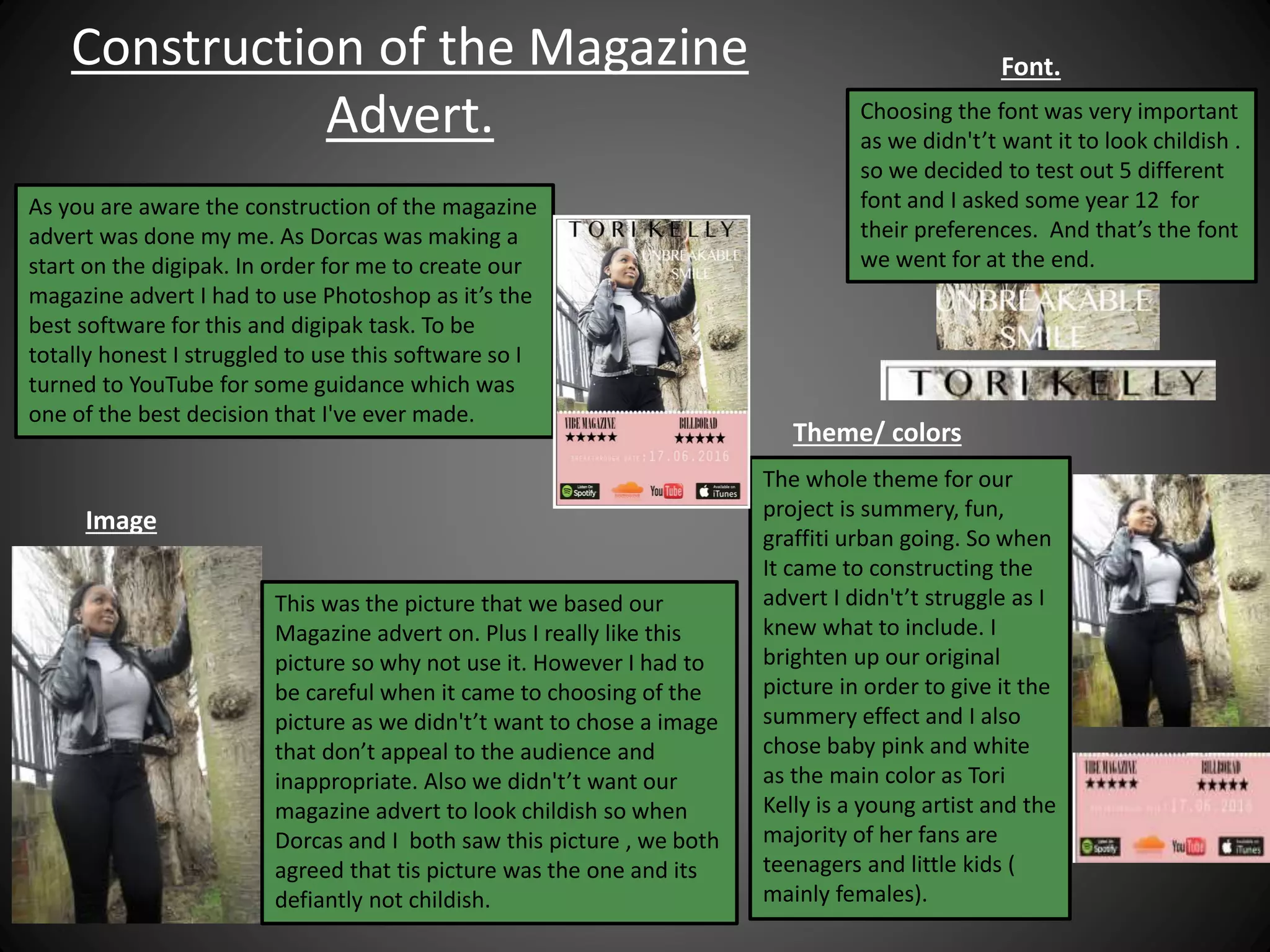
Q2. How effective is the
combination of your main product
and ancillary texts?
Kemique Scantlebury
Digipak
This is our final Digipak that was created by
Dorcas and I. As you can see our Digipak has the
professional element to it from the Editing ,
picture quality, shooting location etc. on the right
is a Digipak of a professional artist and as you can
see they have made it in a high professional
standards. When we done our research for this
task we found this Digipak cover and thought that
we could manipulate it in our own interpretation
and make it even better by adding different forms
of edits.
Construction of Digipak.
To begin with we started of with a
normal picture of Nadine standing on
front of a brick wall. We then used
Photoshop in order to edit the image
and to added effects. The process took
long as Dorcas was not sure of how to
use Photoshop and she struggled to
follow the YouTube tutorial. So instead I
had to write down the steps for her in
order to complete this task. As you can
see there was allot of editing done and I
believe that she did a very good job.
Construction of digipak ( Font/ colors)
To complete this task this is where I had to
watch lots of YouTube tutorials to help me
use Photoshop. I did this so that I could go
above and beyond for the preparation of our
Digipak. I tried to make the theme graffiti
because I was stuck on this due to a lot of the
footage for our music video being graffiti
walls. This task was quite difficult due to the
fact that I was a novice to Photoshop but I
exceeded my expectations and enjoyed
completing it. In addition me and Dorcas
decided on a font and font size for the front
cover of our Digipak as shown in the picture
below. We chose white because it stands out
from the background image.
Comparison of our Digipak
We compared our Digipak
front cover with this front
cover because it has been
very well edited and the
formation of the face is
much like ours. Although,
the this cover has a theme
of three colours whereas
ours does not.
Magazine Advert
This is our magazine advert
made by me.
When it came to creating our
magazine advert their were some
factors we had to consider and they
are.
* The overall theme
* Which color works best for our
target audience
*The colors if they are aesthetic
pleasing.
* Whether if it meets the professional
standers like other well know artist.
Construction of the Magazine
Advert.
As you are aware the construction of the magazine
advert was done my me. As Dorcas was making a
start on the digipak. In order for me to create our
magazine advert I had to use Photoshop as it’s the
best software for this and digipak task. To be
totally honest I struggled to use this software so I
turned to YouTube for some guidance which was
one of the best decision that I've ever made.
This was the picture that we based our
Magazine advert on. Plus I really like this
picture so why not use it. However I had to
be careful when it came to choosing of the
picture as we didn't’t want to chose a image
that don’t appeal to the audience and
inappropriate. Also we didn't’t want our
magazine advert to look childish so when
Dorcas and I both saw this picture , we both
agreed that tis picture was the one and its
defiantly not childish.
Image
The whole theme for our
project is summery, fun,
graffiti urban going. So when
It came to constructing the
advert I didn't’t struggle as I
knew what to include. I
brighten up our original
picture in order to give it the
summery effect and I also
chose baby pink and white
as the main color as Tori
Kelly is a young artist and the
majority of her fans are
teenagers and little kids (
mainly females).
Theme/ colors
Choosing the font was very important
as we didn't’t want it to look childish .
so we decided to test out 5 different
font and I asked some year 12 for
their preferences. And that’s the font
we went for at the end.
Font.

Q2 kemique evaluation

  • 1.
    Q2. How effectiveis the combination of your main product and ancillary texts? Kemique Scantlebury
  • 2.
    Digipak This is ourfinal Digipak that was created by Dorcas and I. As you can see our Digipak has the professional element to it from the Editing , picture quality, shooting location etc. on the right is a Digipak of a professional artist and as you can see they have made it in a high professional standards. When we done our research for this task we found this Digipak cover and thought that we could manipulate it in our own interpretation and make it even better by adding different forms of edits.
  • 3.
    Construction of Digipak. Tobegin with we started of with a normal picture of Nadine standing on front of a brick wall. We then used Photoshop in order to edit the image and to added effects. The process took long as Dorcas was not sure of how to use Photoshop and she struggled to follow the YouTube tutorial. So instead I had to write down the steps for her in order to complete this task. As you can see there was allot of editing done and I believe that she did a very good job.
  • 4.
    Construction of digipak( Font/ colors) To complete this task this is where I had to watch lots of YouTube tutorials to help me use Photoshop. I did this so that I could go above and beyond for the preparation of our Digipak. I tried to make the theme graffiti because I was stuck on this due to a lot of the footage for our music video being graffiti walls. This task was quite difficult due to the fact that I was a novice to Photoshop but I exceeded my expectations and enjoyed completing it. In addition me and Dorcas decided on a font and font size for the front cover of our Digipak as shown in the picture below. We chose white because it stands out from the background image.
  • 5.
    Comparison of ourDigipak We compared our Digipak front cover with this front cover because it has been very well edited and the formation of the face is much like ours. Although, the this cover has a theme of three colours whereas ours does not.
  • 6.
    Magazine Advert This isour magazine advert made by me. When it came to creating our magazine advert their were some factors we had to consider and they are. * The overall theme * Which color works best for our target audience *The colors if they are aesthetic pleasing. * Whether if it meets the professional standers like other well know artist.
  • 7.
    Construction of theMagazine Advert. As you are aware the construction of the magazine advert was done my me. As Dorcas was making a start on the digipak. In order for me to create our magazine advert I had to use Photoshop as it’s the best software for this and digipak task. To be totally honest I struggled to use this software so I turned to YouTube for some guidance which was one of the best decision that I've ever made. This was the picture that we based our Magazine advert on. Plus I really like this picture so why not use it. However I had to be careful when it came to choosing of the picture as we didn't’t want to chose a image that don’t appeal to the audience and inappropriate. Also we didn't’t want our magazine advert to look childish so when Dorcas and I both saw this picture , we both agreed that tis picture was the one and its defiantly not childish. Image The whole theme for our project is summery, fun, graffiti urban going. So when It came to constructing the advert I didn't’t struggle as I knew what to include. I brighten up our original picture in order to give it the summery effect and I also chose baby pink and white as the main color as Tori Kelly is a young artist and the majority of her fans are teenagers and little kids ( mainly females). Theme/ colors Choosing the font was very important as we didn't’t want it to look childish . so we decided to test out 5 different font and I asked some year 12 for their preferences. And that’s the font we went for at the end. Font.