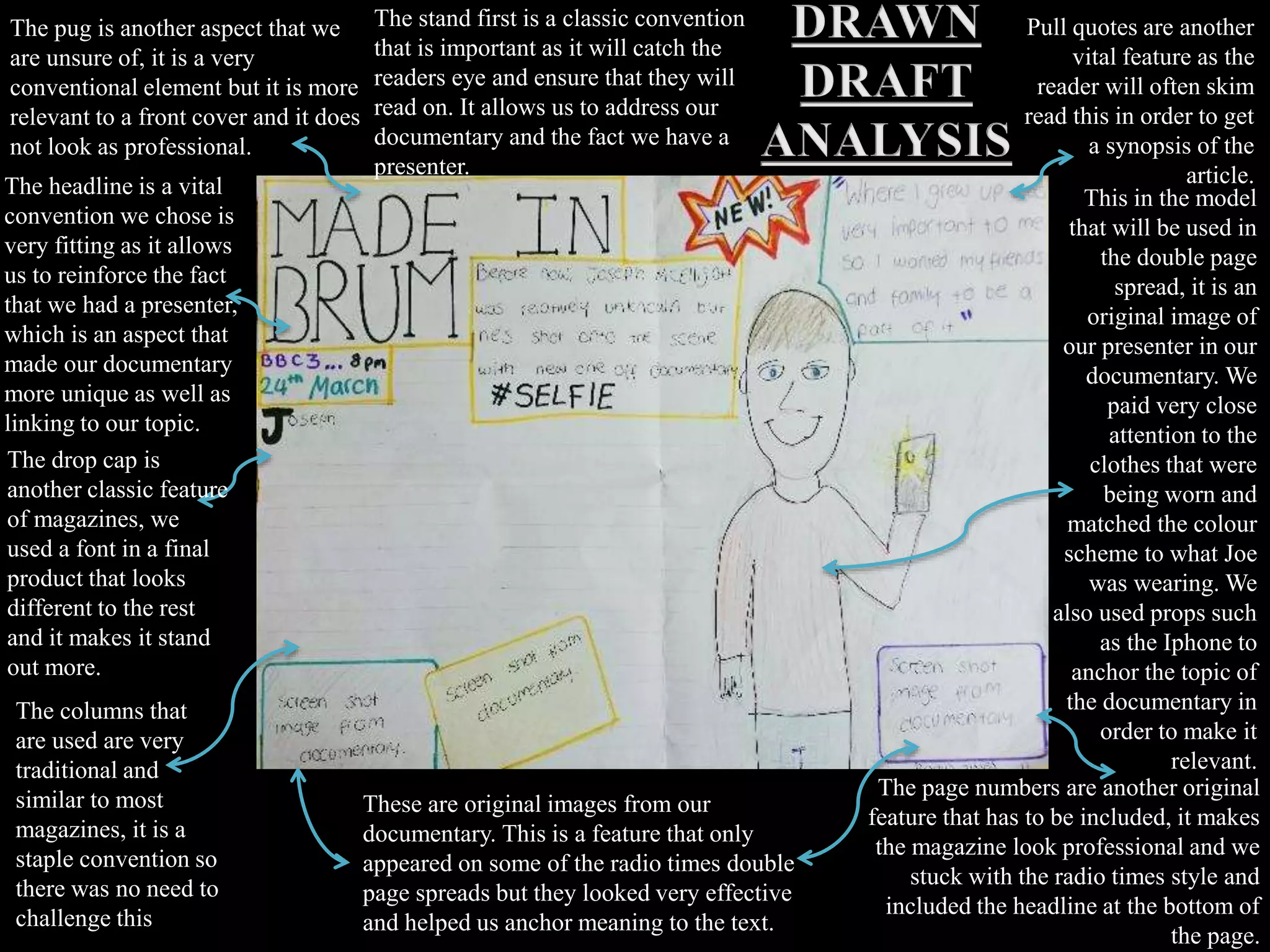
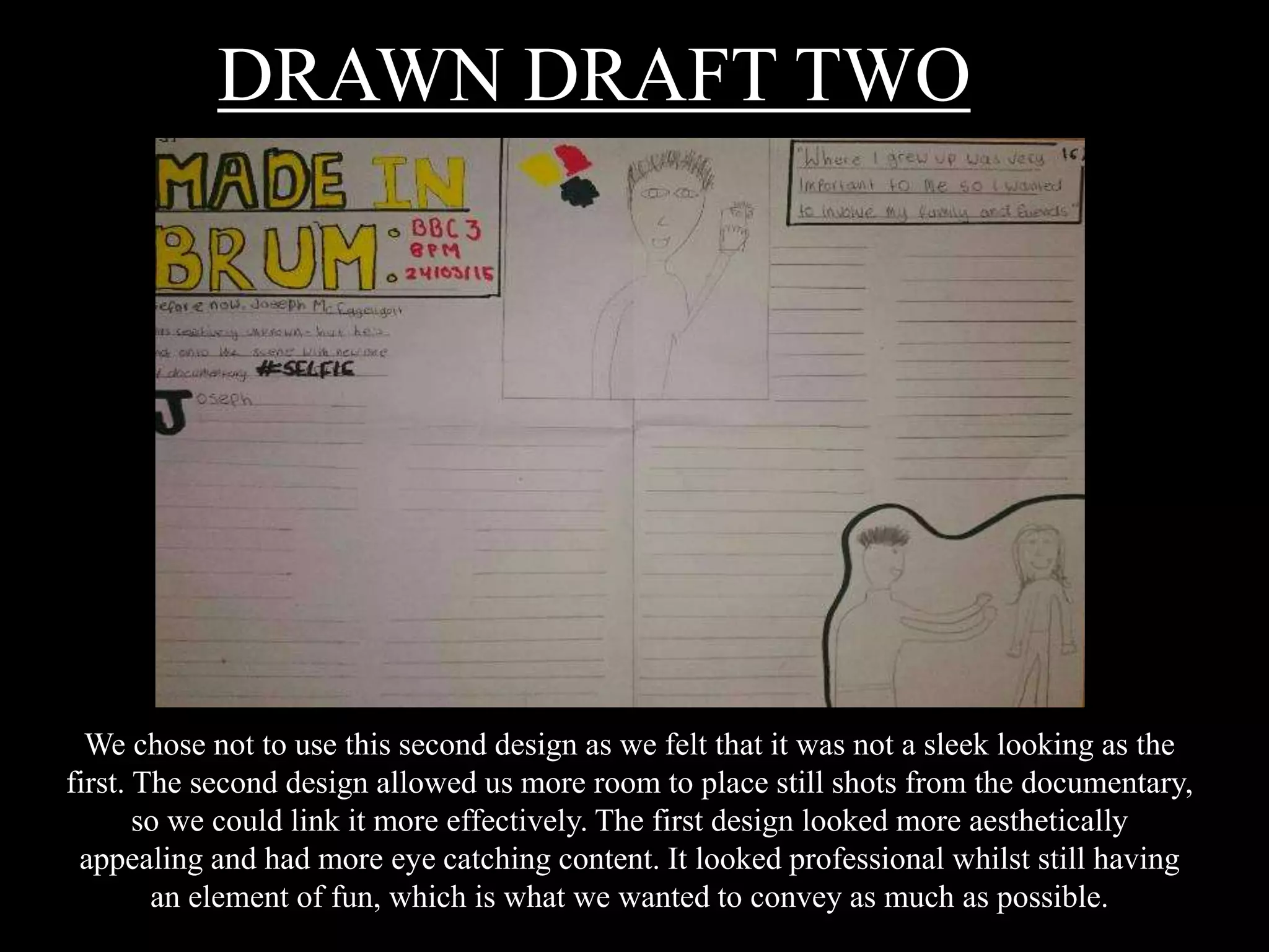
The document discusses two drawn draft designs for a double-page magazine spread about a documentary. The first design is chosen over the second as it looks more professionally sleek and eye-catching while still conveying fun. Consistent branding and references to "#SELFIE" help associate the article with the documentary. Color schemes and photos aim to represent youth in an intelligent light countering negative stereotypes about "selfies". The design aims to engage the target audience while fitting in the traditional magazine.


![Photos for our_contents_page[1]](https://cdn.slidesharecdn.com/ss_thumbnails/photosforourcontentspage1-110111142543-phpapp01-thumbnail.jpg?width=640&height=640&fit=bounds)


![Reading Techniques [Autosaved].pptxReading Techniques [Autosaved].pptx](https://cdn.slidesharecdn.com/ss_thumbnails/readingtechniquesautosaved-251211193055-b8821f9d-thumbnail.jpg?width=640&height=640&fit=bounds)


