
Recommended
More Related Content
What's hot
What's hot (20)
Similar to Mallory Knox Asymmetry Digipak Design Analysis
Similar to Mallory Knox Asymmetry Digipak Design Analysis (20)
More from alyblue98
More from alyblue98 (20)
Recently uploaded
Recently uploaded (20)
Mallory Knox Asymmetry Digipak Design Analysis
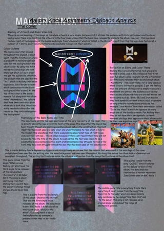
- 1. Mallory Knox Asymmetry Digipack Analysis The cover Colour Scheme The main colours that is used throughout this digipak is black apart from the front cover where a gradient fill texture has been used for the background of the album cover. By using this fill it makes the bands logo and text stand out which is key in order the get the audience’s attention. The colours that are used for the “MK”, which is Mallory Knox’s new logo uses a lot of bright colours which contrasts with the black background that is used. At the top of the cover is the band’s name in full along with the album name “Asymmetry”, the colours that have been used are a plain white and a dark blue, these are easily readable colours for the reader as they contrasts against the background Reflection on Genre and Cover Theme Mallory Knox are an alternative rock group who formed in 2010, and in 2013 released their first ever full album called “Signals”. On the 27 October 2014 the band released their second debut album “Asymmetry”. The cover theme for is very basis as there is not a lot that is going on, I get the feeling that the artwork of the cover is simply to create a statement and attract the audience as it is only their second album and they are not well known yet. With bands such as “Blink- 182 and Iron Maiden they have symbolic artwork which could, or appears on very artwork that the band produces. For example “Iron Maiden” have their own mascot called “Eddie the Head” in which he appears on every single one of the bands artwork. For Mallory Knox they do not have their own symbolic artwork, however this logo that appears on their album could be their new signature logo. Meaning of Artwork and Music Video link There is no real meaning of the image as the whole artwork is very simple, but even still it strikes the audience with its bright colours and textured background. There is no link from the artwork to the four music videos that the band have released to promote the album, however , this logo does feature right at the beginning of the bands lead single from “Asymmetry” which is “Ghost in the Mirror”. Apart from this the logo does feature of a number of T-shirts, scarfs and hats that can be available to buy from their website. Positioning of the Band Name and Title The band name an title has been positioned at the very top centre of the cover, this is directly above the logo which fills most of the page, this shows that the layout has been thought though and planning could have been before the construction. The font itself that has been used is a very clear and understandable to read which is key to the reader, this also shows that there was planning about what type of font to use and even the font size . This is simply because if they can’t read it then they will not be able to read the title of the album. As well as this the text also needs to be a substantial size as someone with a sight problem someone may struggle to read a tiny font, they may even struggle to read the size that has been used on this album cover. This is inside Mallory Knox’s Asymmetry digipack and straight away we can see that the colours that were used in the main logo of the cover analysis have been used for the writing, also the same background has been used throughout. By doing this makes the album look professional and consistent throughout. The writing that features inside the album are all quotes from the songs that features on the album itself: This quote comes from the single “When are we Waking Up” which was the third single to be released of the bands album “Asymmetry” in October 2014. The song is about continuing from that stating that you still have the power to change things and you should never lose hope This is a quote from the lead single of the album “Ghost on the Mirror”. This was the first single to be released of the album. The song made in onto BBC Radio 1 A list as well as their next single “Shout at the Moon”. The song itself is about feeling haunted by someone's presence when they're not really there. This quotes comes from the song “QOD II” which features on the deluxe version of the album, this song was also featured as a hottest record on Zane Lowes show on BBC Radio 1 The middle quote “She’s everything I hate She’s everything I Love” comes from the song “She Took Him to the Lake” which is a seven minute song combined by two songs “She Took Him” and “To the Lake”. This song is not released as an original single and is about the range of emotions in general.
- 2. This is the back of album, which shows the audience the track listings of the song which feature. As this is the deluxe edition it comes with a DVD of the recording process of the album. The story is told through each band member Mikey Chapman (Vocals), Sam Douglas (Bass), Joe Savins (Lead Guitar) James Gillert (Rhythm Guitar) and Dave Rawling (Drums).The colour scheme has been kept the same throughout and the writing that has been used matches the font that was used previously on the cover page. This makes it easy to read for the audience, but as well it maintains the consistent look throughout which makes this album look professional. As well as other features are included on this page such as the record label as it would be important to know who the band is signed with. Secondly another feature that is displayed on the back is the gatekeeping age. The reason why the record label has done this is to make sure that parents know who buy the album that it is suitable for 15’s and overs. Members of the Band Mikey Chapman (Vocals) Sam Douglas (Bass) James Gillert (Rhythm Guitar) Joe Savins (Lead Guitar) Dave Rawling (Drums)