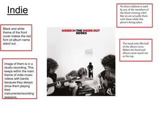
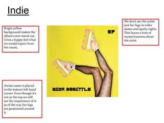
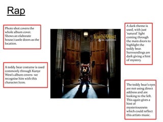
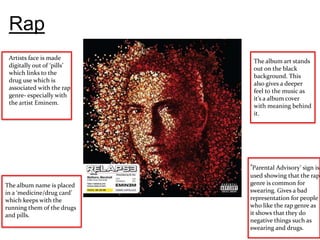
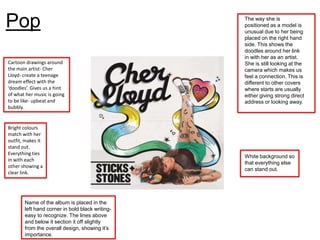
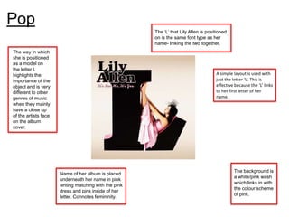
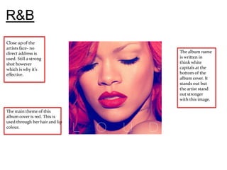
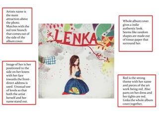
No direct address is used

  Indie                  by any of the members of
                         the band creating a feel
                         like we are actually there
                         with them while this
                         photo’s being taken.

Black and white
theme of the front
cover makes the red
font cd album name
stand out.                 The band only fills half
                           of the album cover.
                           Makes the band and
                           album name stand out
                           at the top.

Image of them is in a
studio recording. This
keeps within the main
theme of indie music
videos with bands
because they always
show them playing
their
instruments/recording
sessions.
Indie
                           We don’t see the artist-
                           just her legs in roller
Bright yellow              skates and spotty tights.
background makes the       This leaves a hint of
album cover stand out.     mysteriousness about
Gives a happy feel what    the artist.
we would expect from
her music.


Artists name is placed
in the bottom left hand
corner. Even though it’s
not at the top we still
see the importance of it
as of the way her legs
are positioned around
it.
Rap
                               A dark theme is
Photo shot covers the          used, with just
whole album cover.             ‘natural’ light
Shows an elaborate             coming through
house/castle doors as the      the main doors to
location.                      highlight the
                               teddy bear.
                               Surroundings are
                               dark giving a hint
                               of mystery.

A teddy bear costume is used
commonly through Kanye
West’s album covers- we
recognise him with this
character/icon.
                               The teddy bear’s eyes
                               are not using direct
                               address and are
                               looking to the left.
                               This again gives a
                               hint of
                               mysteriousness
                               which could reflect
                               this artists music.
Rap
 Artists face is made
                             The album art stands
 digitally out of ‘pills’
                             out on the black
 which links to the
                             background. This
 drug use which is
                             also gives a deeper
 associated with the rap
                             feel to the music as
 genre- especially with
                             it’s a album cover
 the artist Eminem.
                             with meaning behind
                             it.


                            ‘Parental Advisory’ sign is
                            used showing that the rap
The album name is placed    genre is common for
in a ‘medicine/drug card’   swearing. Gives a bad
which keeps with the        representation for people
running them of the drugs   who like the rap genre as
and pills.                  it shows that they do
                            negative things such as
                            swearing and drugs.
Pop                                              The way she is
                                                 positioned as a model is
                                                 unusual due to her being
                                                 placed on the right hand
                                                 side. This shows the
                                                 doodles around her link
                                                 in with her as an artist.
Cartoon drawings around                          She is still looking at the
the main artist- Cher                            camera which makes us
Lloyd- create a teenage                          feel a connection. This is
dream effect with the                            different to other covers
‘doodles’. Gives us a hint                       where starts are usually
of what her music is going                       either giving strong direct
to be like- upbeat and                           address or looking away.
bubbly.


Bright colours
match with her
outfit, makes it
stand out.
Everything ties
                                                 White background so
in with each
                                                 that everything else
other showing a
                                                 can stand out.
clear link.


       Name of the album is placed in the
       left hand corner in bold black writing-
       easy to recognize. The lines above
       and below it section it off slightly
       from the overall design, showing it’s
       importance.
Pop
                                                       The ‘L’ that Lily Allen is positioned
                                                       on is the same font type as her
                                                       name- linking the two together.
The way in which
she is positioned
as a model on
the letter L
highlights the                                                                        A simple layout is used with
importance of the                                                                     just the letter ‘L’. This is
object and is very                                                                    effective because the ‘L’ links
different to other                                                                    to her first letter of her
genres of music                                                                       name.
when they mainly
have a close up
of the artists face
on the album
cover.


                                                                                               The background is
                      Name of her album is placed
                                                                                               a white/pink wash
                      underneath her name in pink
                                                                                               which links in with
                      writing matching with the pink
                                                                                               the colour scheme
                      dress and pink inside of her
                                                                                               of pink.
                      letter. Connotes femininity.
R&B
Close up of the
artists face- no
direct address is               The album name
used. Still a strong            is written in
shot however                    think white
which is why it’s               capitals at the
effective.                      bottom of the
                                album cover. It
                                stands out but
                                the artist stand
                                out stronger
                                with this image.

The main theme of this
album cover is red. This is
used through her hair and lip
colour.
R&B
No direct address
is used. The artist
is focused on the          The artists name
side, showing us           ‘Jason Derulo’ is at
his jaw line               the top looking
(maybe best                simple in lower
features are being         capitals. Stands
enhanced).                 out in white font
                           and moulds with
                           the overall colour
                           scheme of a
                           blue/white wash.


Has a blue/white tint to
the album cover giving
connotations that the
music this man makes is
relaxing and soulful.
Artists name is
the main
attraction above
                      Whole album cover
the photo.
                      gives a indie
Matches with the
                      authentic look.
red tree branch
                      Seems like random
that comes out of
                      shapes are made out
the side of the
                      of tissue paper that
album cover.
                      surround her.


Image of her is her
positioned to the
side on her knees
with her face
towards the front-    Red is the strong
direct address is     theme with her name
used. Unusual use     and pieces of the art
of levels so that     work being red. Also
both the artist       parts on her dress and
herself and her       her tights are red.
name stand out.       Links the whole album
                      cover together.

Album cover powerpoint

  • 1.
    No direct addressis used Indie by any of the members of the band creating a feel like we are actually there with them while this photo’s being taken. Black and white theme of the front cover makes the red font cd album name stand out. The band only fills half of the album cover. Makes the band and album name stand out at the top. Image of them is in a studio recording. This keeps within the main theme of indie music videos with bands because they always show them playing their instruments/recording sessions.
  • 2.
    Indie We don’t see the artist- just her legs in roller Bright yellow skates and spotty tights. background makes the This leaves a hint of album cover stand out. mysteriousness about Gives a happy feel what the artist. we would expect from her music. Artists name is placed in the bottom left hand corner. Even though it’s not at the top we still see the importance of it as of the way her legs are positioned around it.
  • 3.
    Rap A dark theme is Photo shot covers the used, with just whole album cover. ‘natural’ light Shows an elaborate coming through house/castle doors as the the main doors to location. highlight the teddy bear. Surroundings are dark giving a hint of mystery. A teddy bear costume is used commonly through Kanye West’s album covers- we recognise him with this character/icon. The teddy bear’s eyes are not using direct address and are looking to the left. This again gives a hint of mysteriousness which could reflect this artists music.
  • 4.
    Rap Artists faceis made The album art stands digitally out of ‘pills’ out on the black which links to the background. This drug use which is also gives a deeper associated with the rap feel to the music as genre- especially with it’s a album cover the artist Eminem. with meaning behind it. ‘Parental Advisory’ sign is used showing that the rap The album name is placed genre is common for in a ‘medicine/drug card’ swearing. Gives a bad which keeps with the representation for people running them of the drugs who like the rap genre as and pills. it shows that they do negative things such as swearing and drugs.
  • 5.
    Pop The way she is positioned as a model is unusual due to her being placed on the right hand side. This shows the doodles around her link in with her as an artist. Cartoon drawings around She is still looking at the the main artist- Cher camera which makes us Lloyd- create a teenage feel a connection. This is dream effect with the different to other covers ‘doodles’. Gives us a hint where starts are usually of what her music is going either giving strong direct to be like- upbeat and address or looking away. bubbly. Bright colours match with her outfit, makes it stand out. Everything ties White background so in with each that everything else other showing a can stand out. clear link. Name of the album is placed in the left hand corner in bold black writing- easy to recognize. The lines above and below it section it off slightly from the overall design, showing it’s importance.
  • 6.
    Pop The ‘L’ that Lily Allen is positioned on is the same font type as her name- linking the two together. The way in which she is positioned as a model on the letter L highlights the A simple layout is used with importance of the just the letter ‘L’. This is object and is very effective because the ‘L’ links different to other to her first letter of her genres of music name. when they mainly have a close up of the artists face on the album cover. The background is Name of her album is placed a white/pink wash underneath her name in pink which links in with writing matching with the pink the colour scheme dress and pink inside of her of pink. letter. Connotes femininity.
  • 7.
    R&B Close up ofthe artists face- no direct address is The album name used. Still a strong is written in shot however think white which is why it’s capitals at the effective. bottom of the album cover. It stands out but the artist stand out stronger with this image. The main theme of this album cover is red. This is used through her hair and lip colour.
  • 8.
    R&B No direct address isused. The artist is focused on the The artists name side, showing us ‘Jason Derulo’ is at his jaw line the top looking (maybe best simple in lower features are being capitals. Stands enhanced). out in white font and moulds with the overall colour scheme of a blue/white wash. Has a blue/white tint to the album cover giving connotations that the music this man makes is relaxing and soulful.
  • 9.
    Artists name is themain attraction above Whole album cover the photo. gives a indie Matches with the authentic look. red tree branch Seems like random that comes out of shapes are made out the side of the of tissue paper that album cover. surround her. Image of her is her positioned to the side on her knees with her face towards the front- Red is the strong direct address is theme with her name used. Unusual use and pieces of the art of levels so that work being red. Also both the artist parts on her dress and herself and her her tights are red. name stand out. Links the whole album cover together.