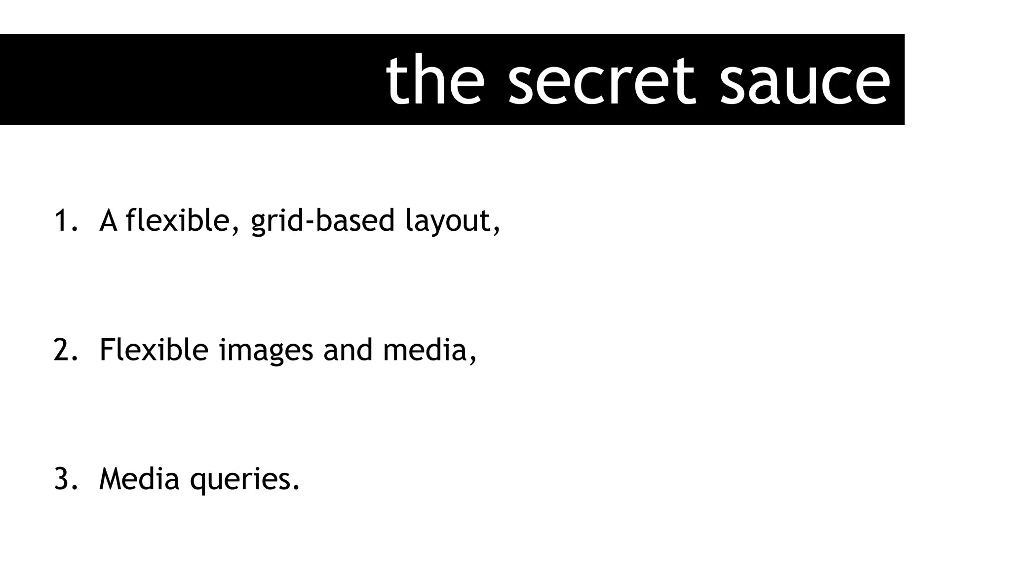
1) The document discusses responsive web design, which involves making websites flexible and adaptable to different devices through flexible grids, images, and media queries.
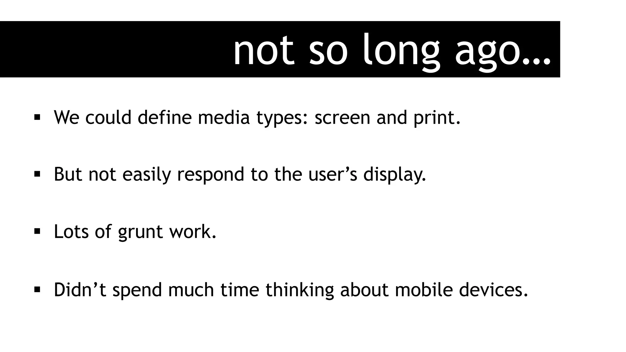
2) Key aspects of responsive design include thinking of user needs rather than our own, adapting to various device capabilities, and future-proofing sites.
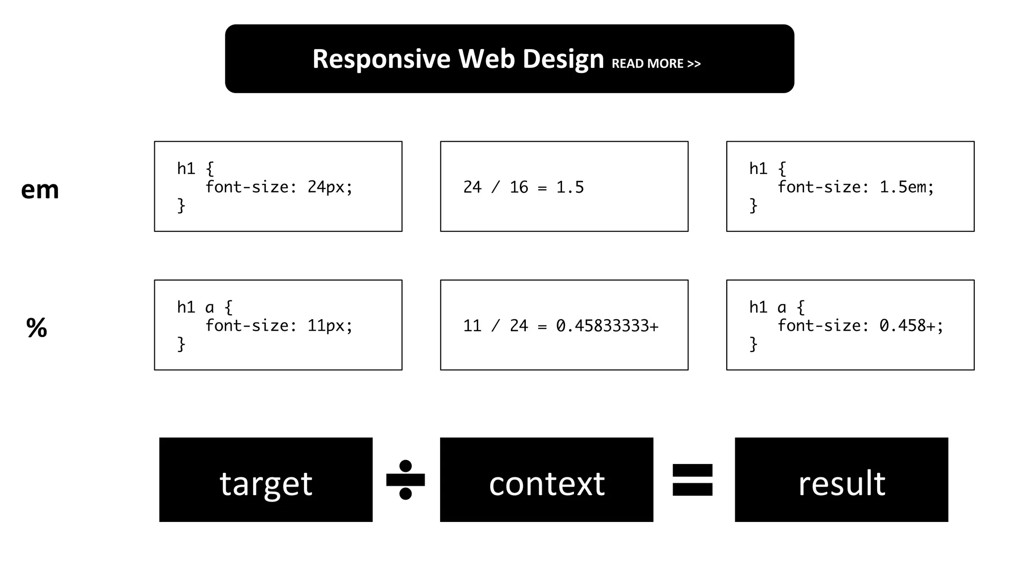
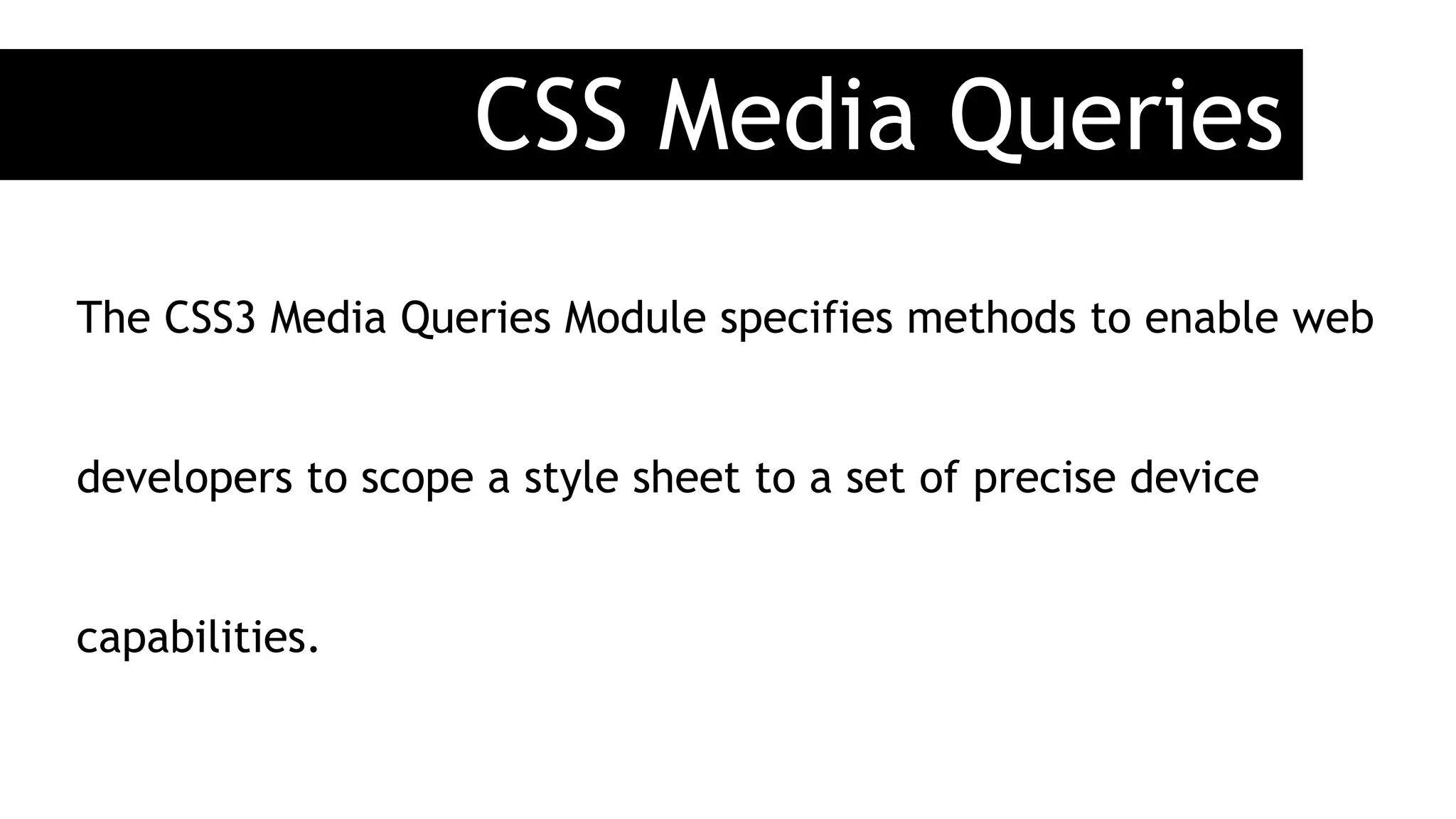
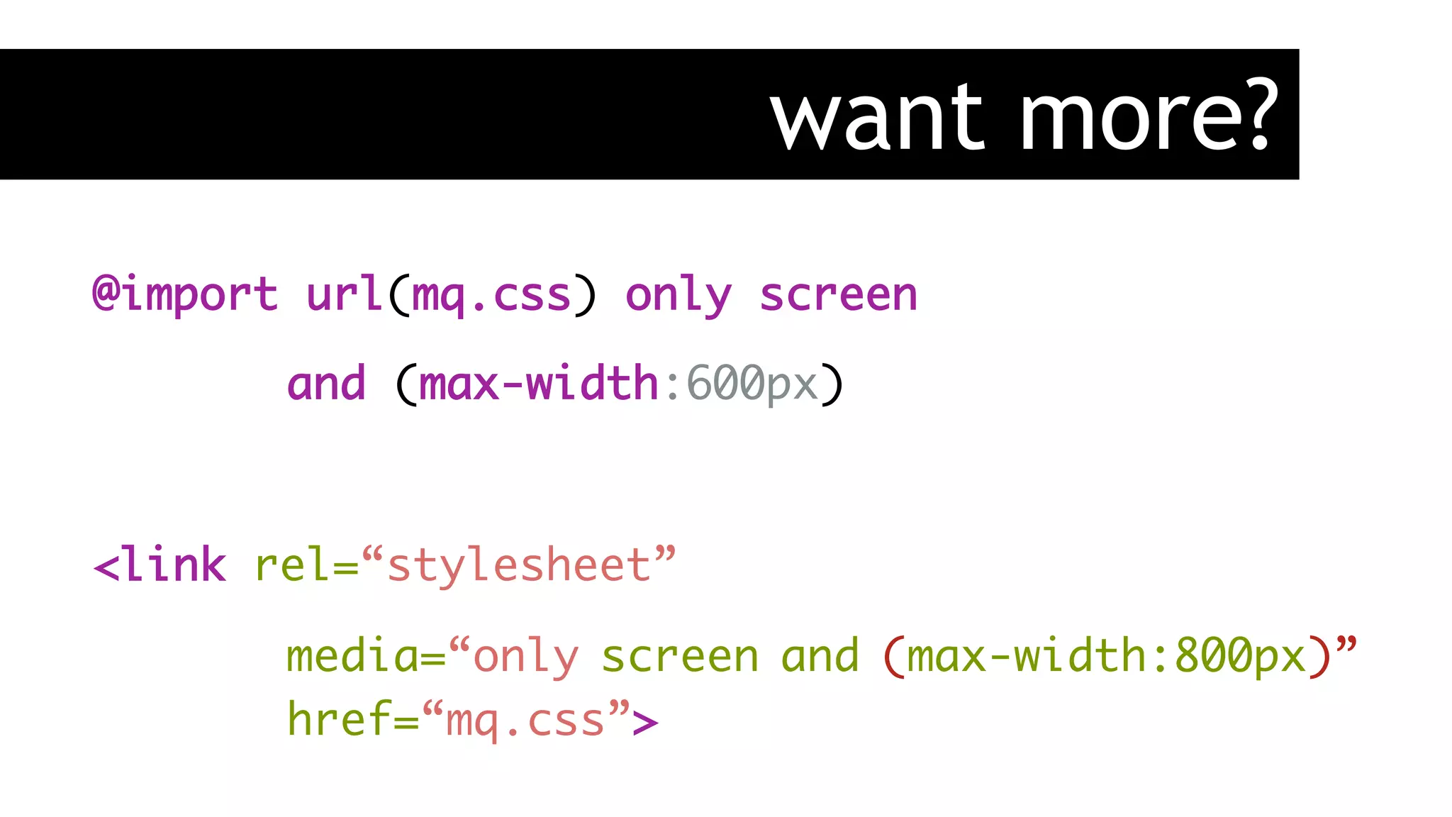
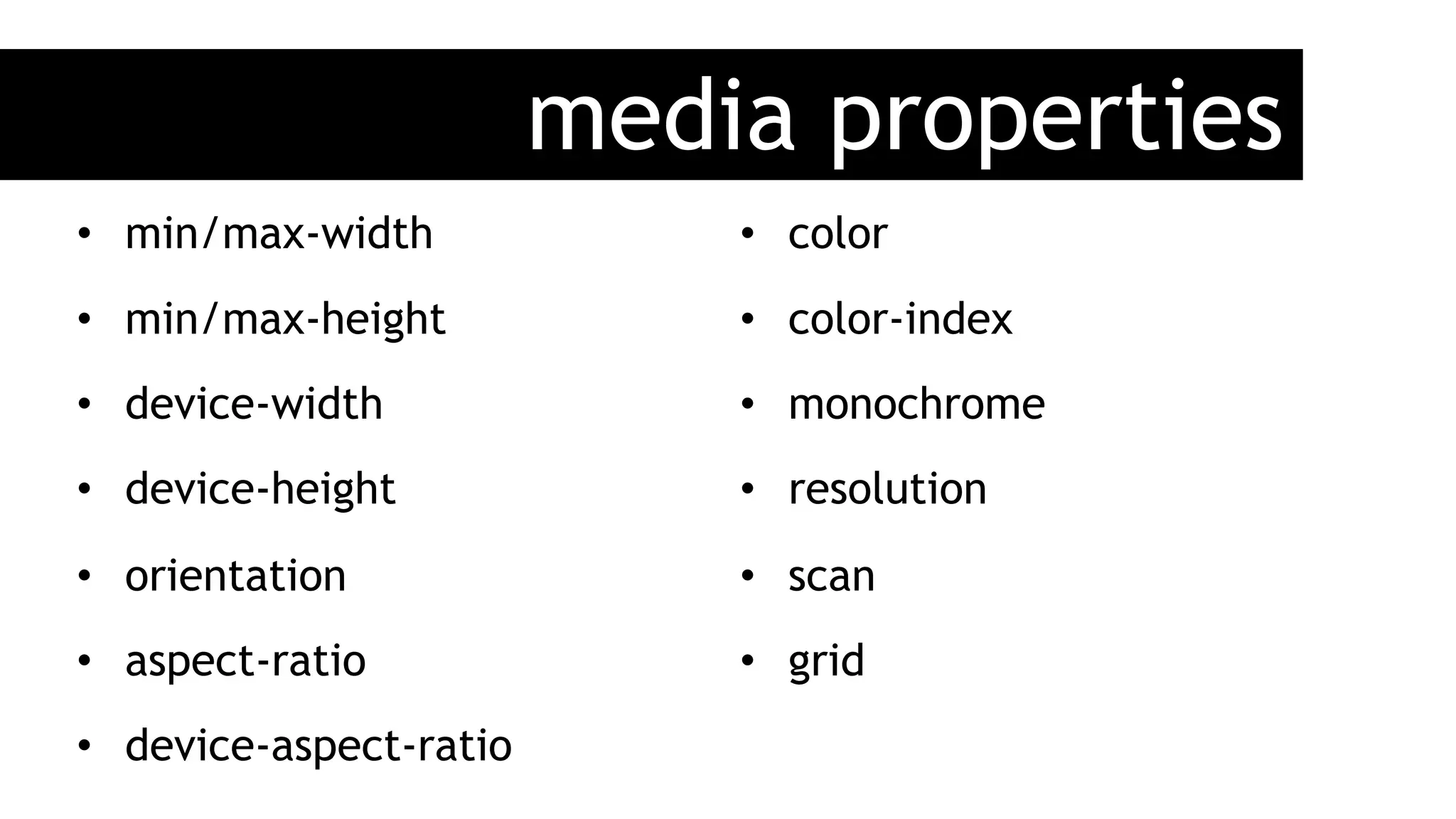
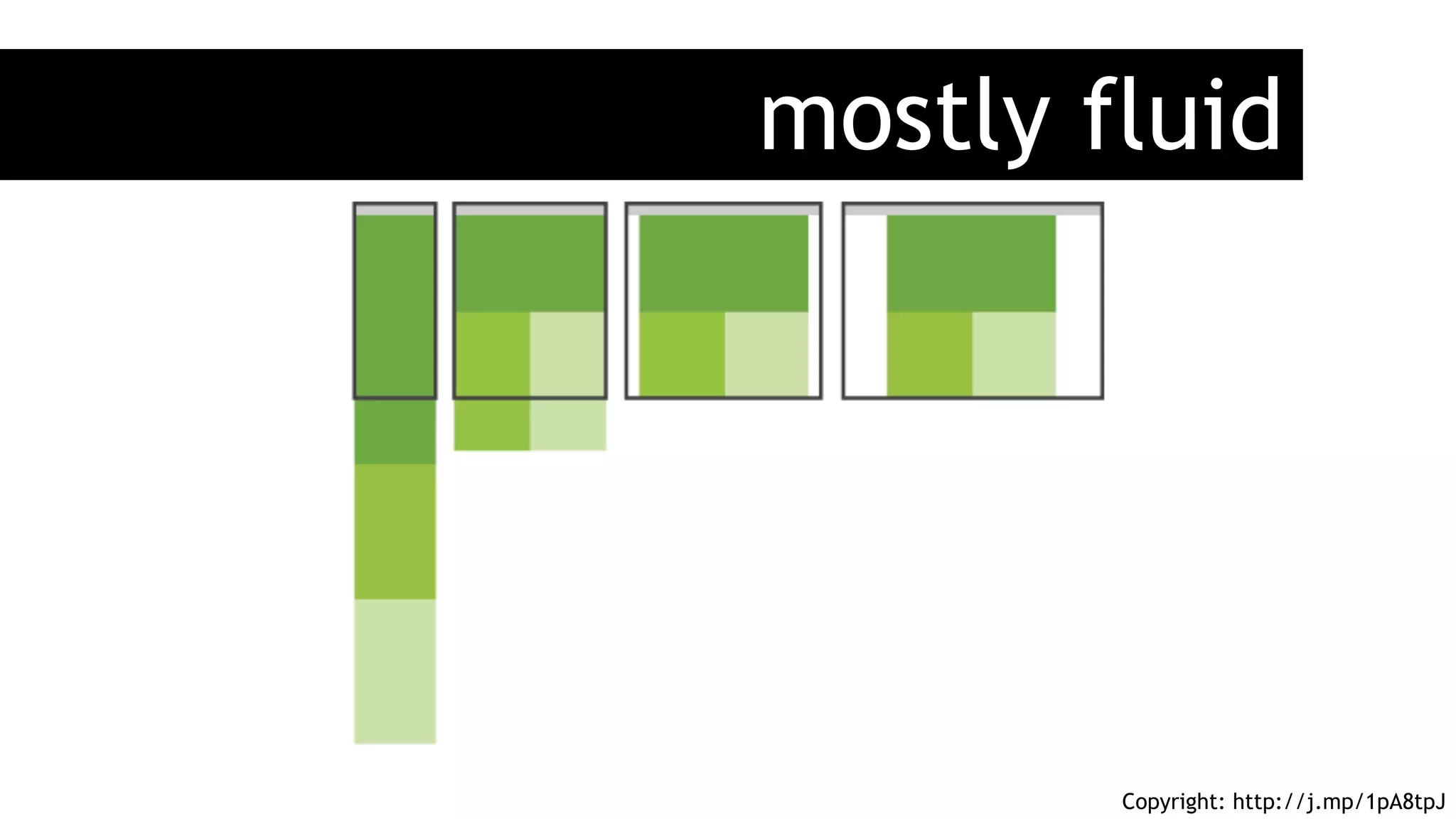
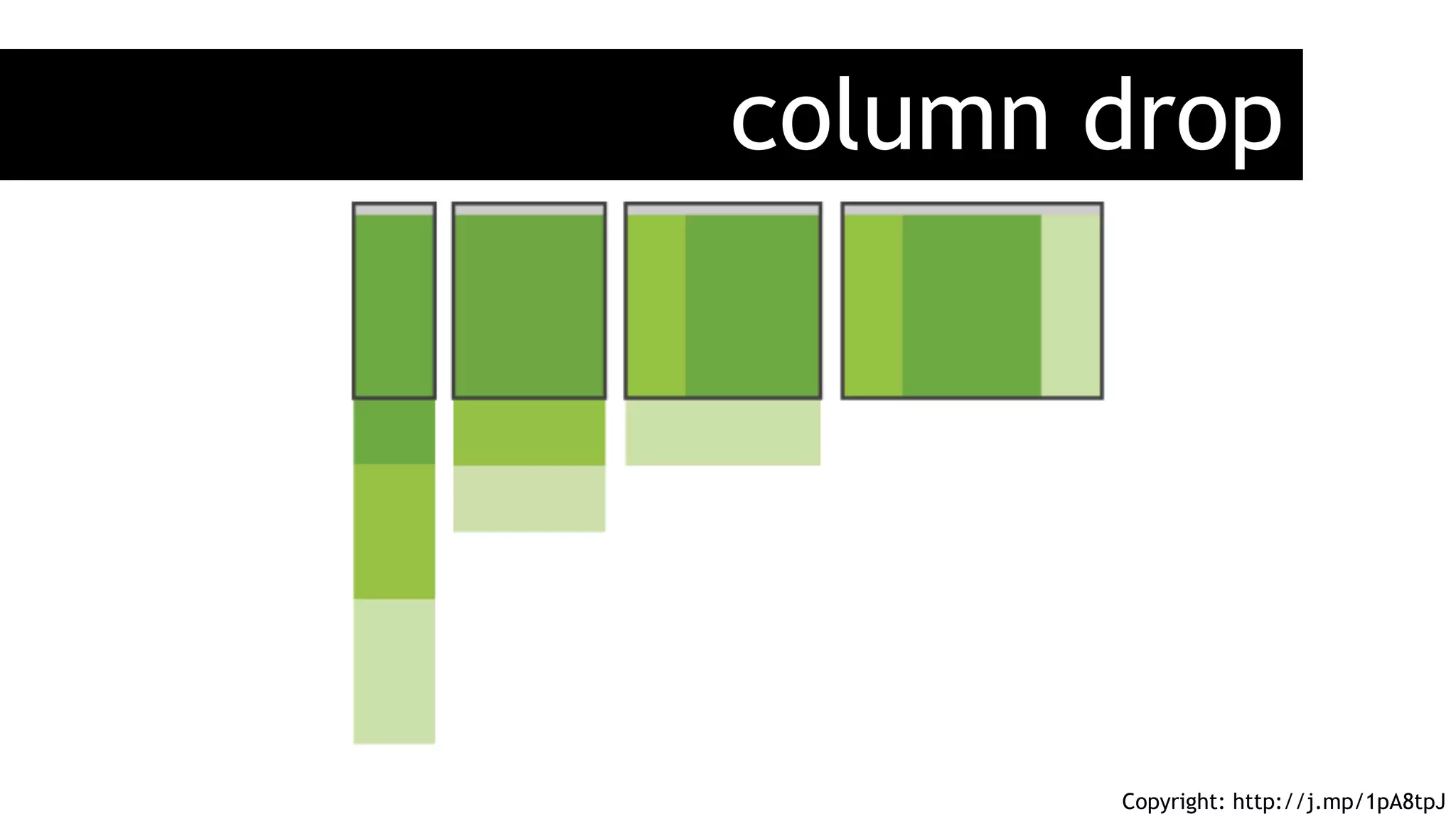
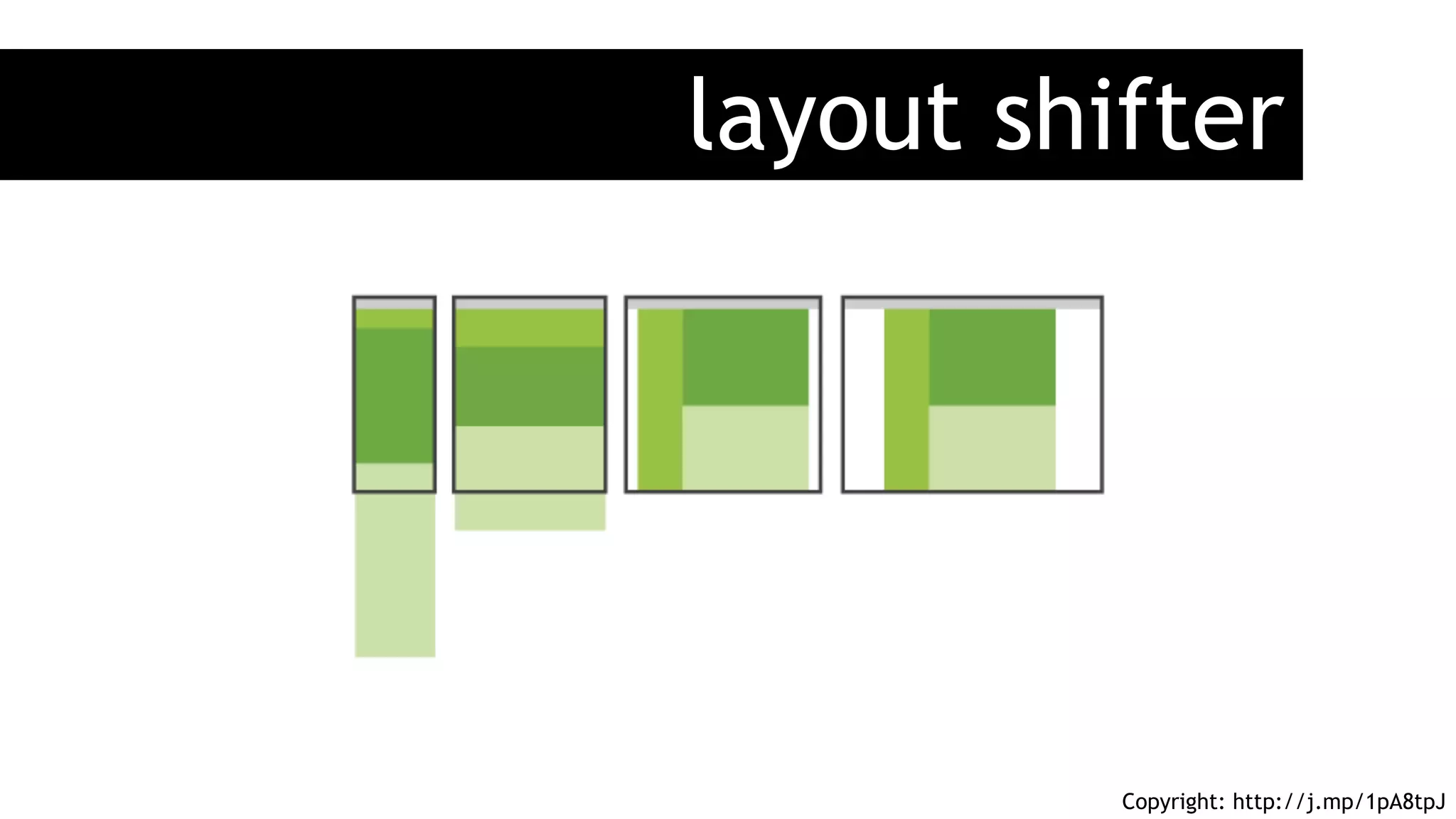
3) Media queries allow scoping styles to specific device capabilities like width, height, and orientation. Common patterns like fluid, column drop, and layout shifter are described.


![[BROCHURE] Italy Tour Project | @SlideON](https://cdn.slidesharecdn.com/ss_thumbnails/brochure8-251215152319-2805af68-thumbnail.jpg?width=640&height=640&fit=bounds)


