Download to read offline


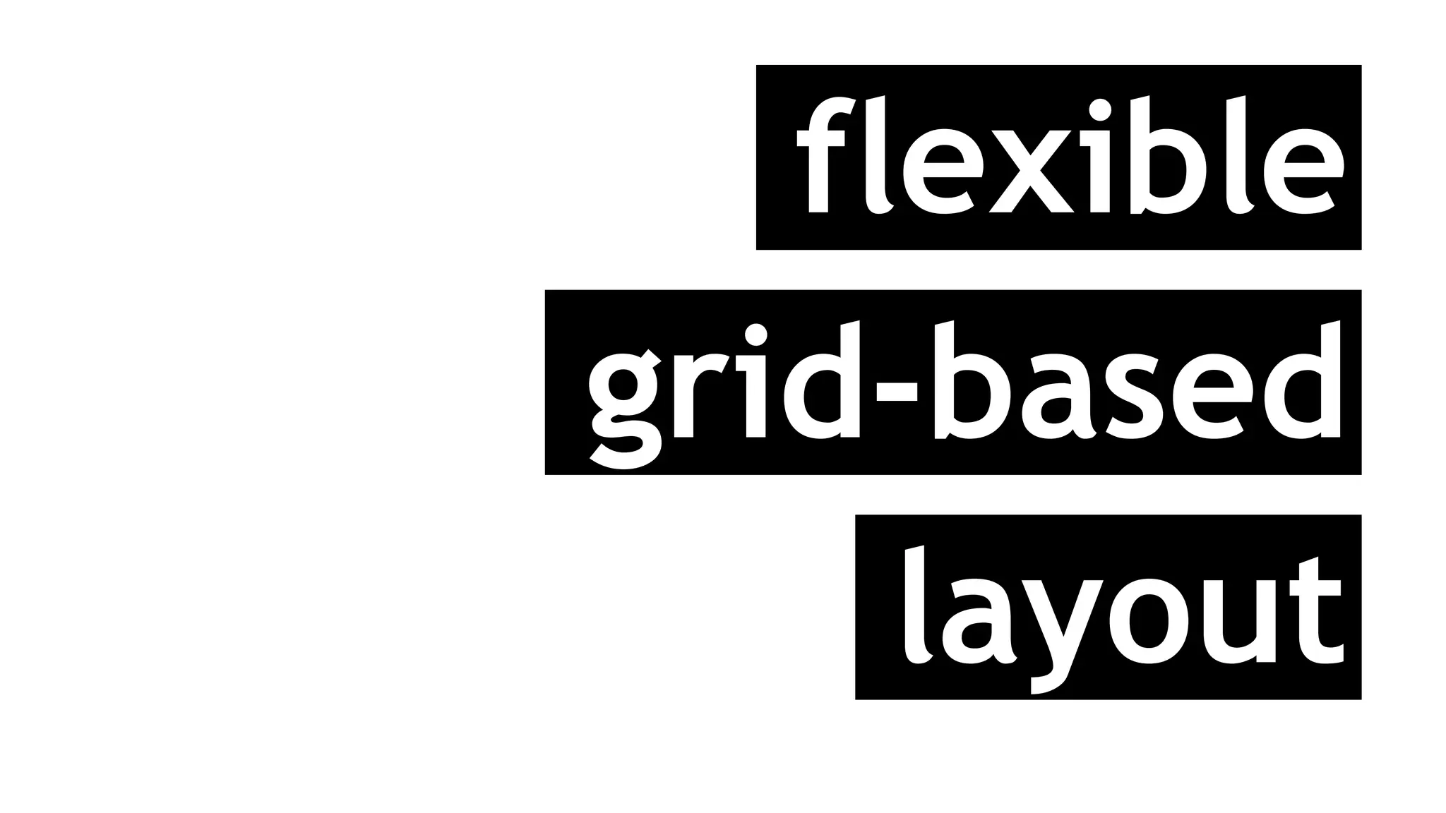


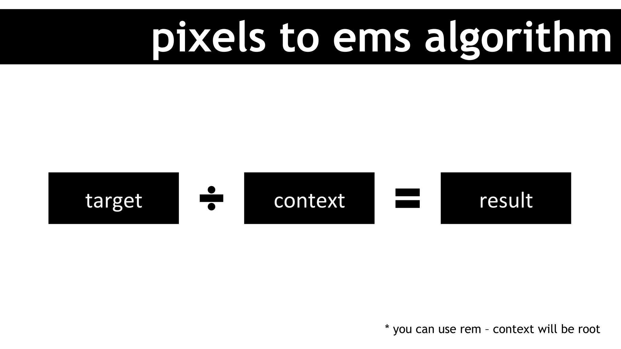

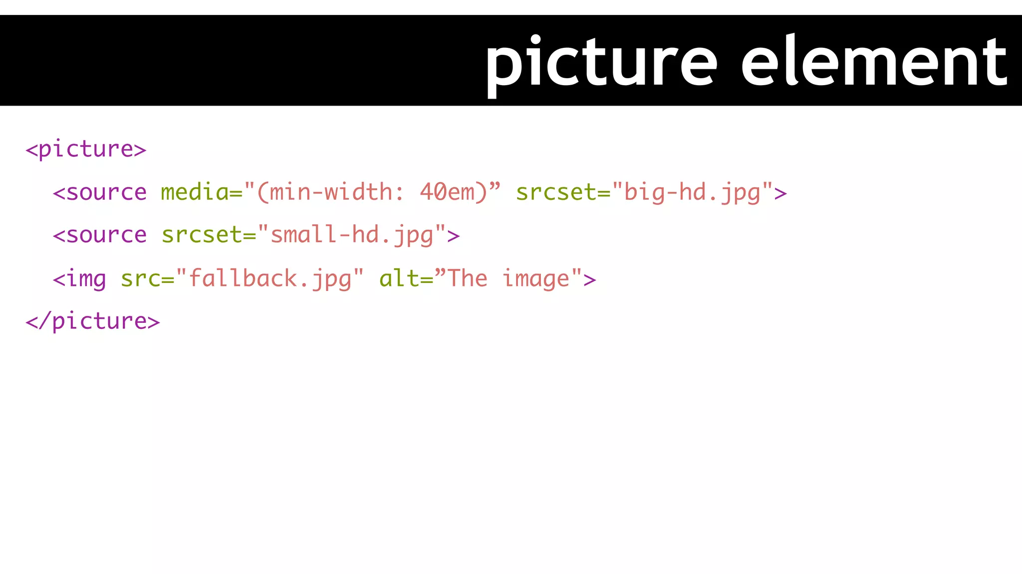
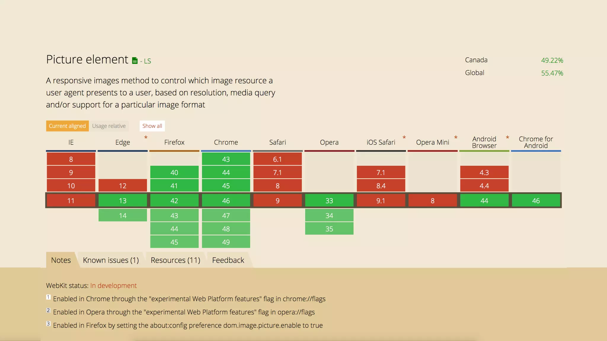
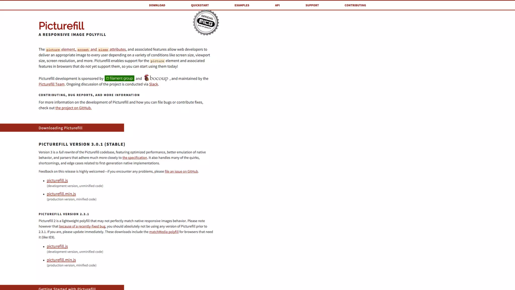

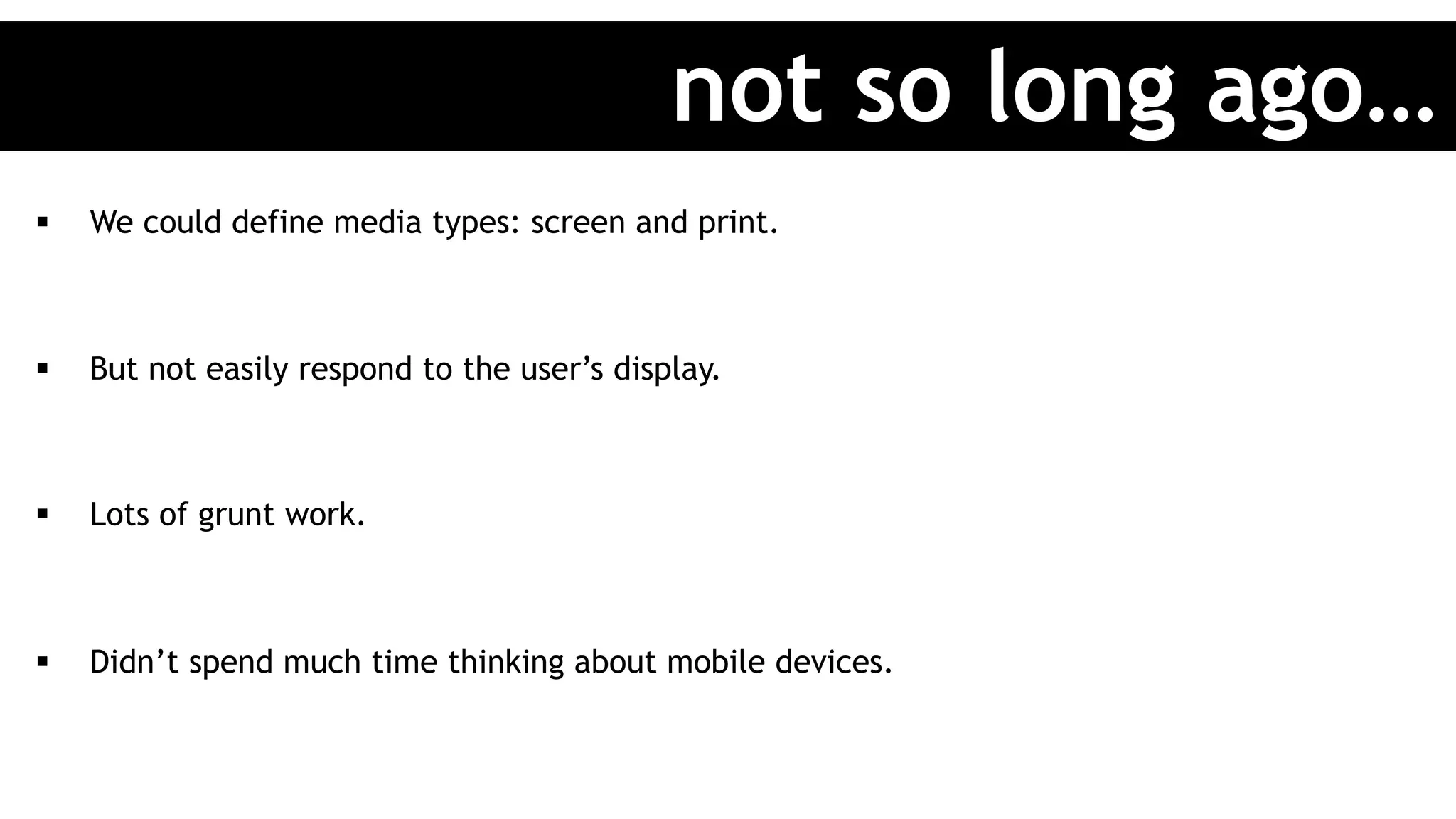
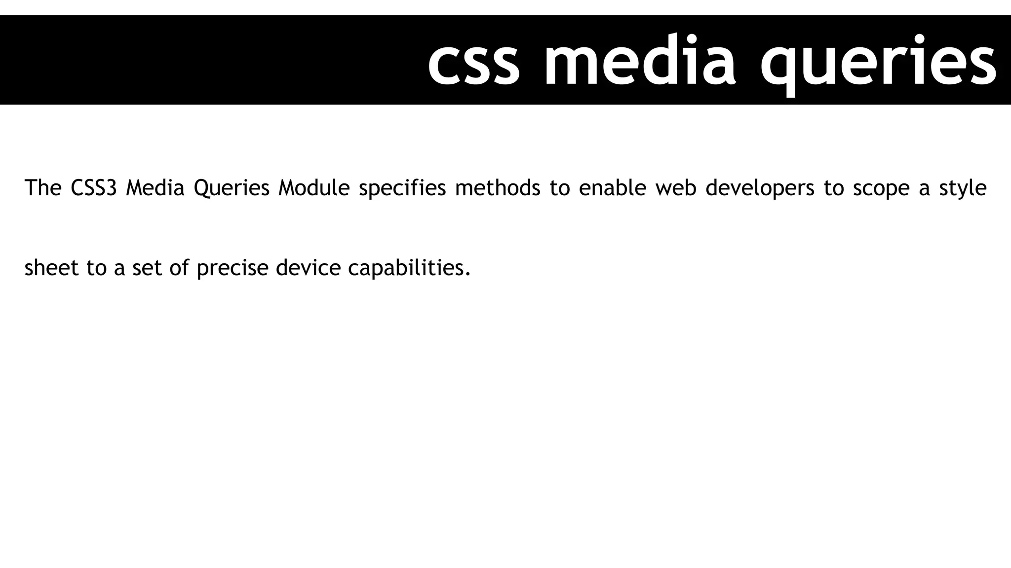
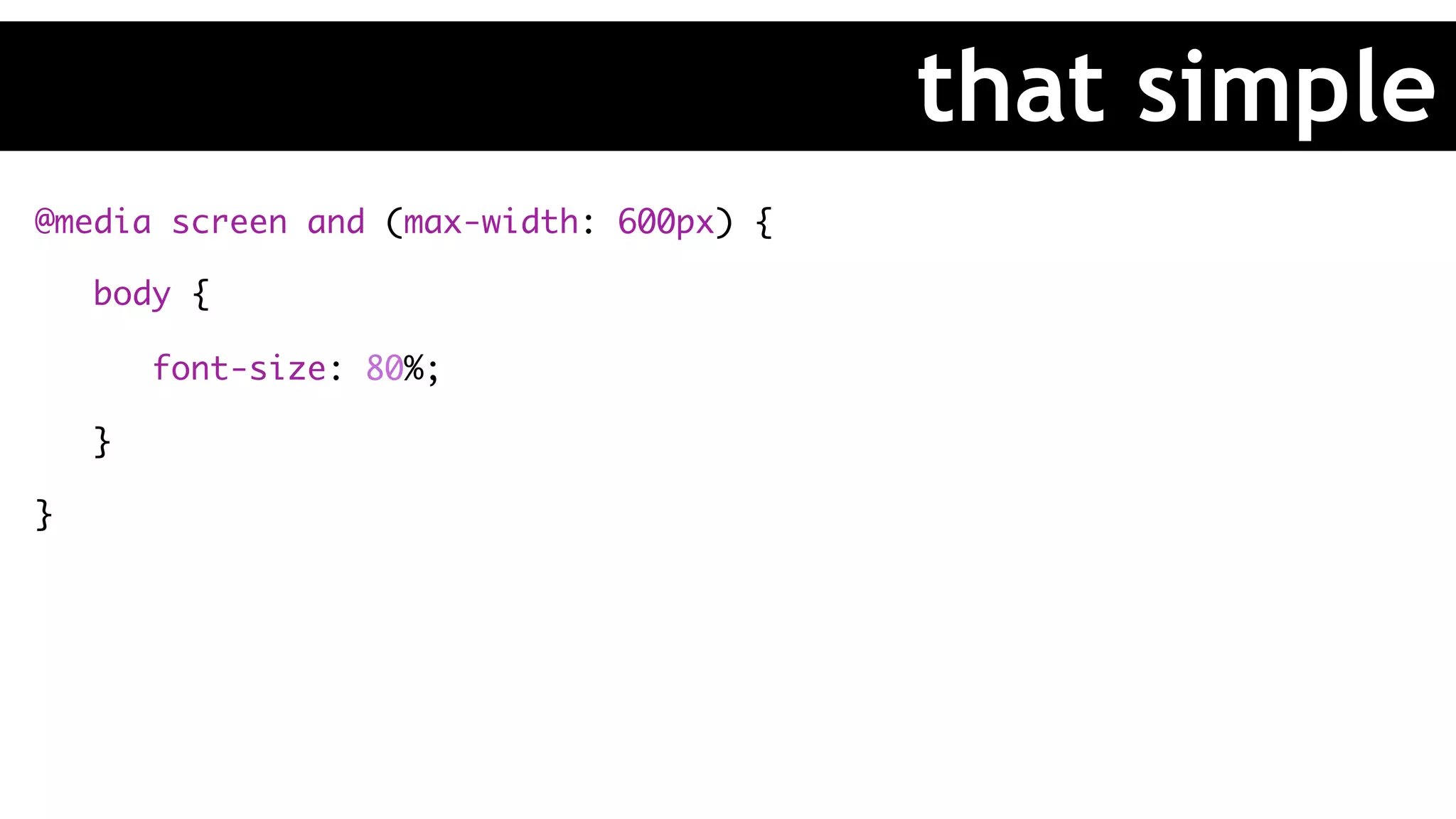
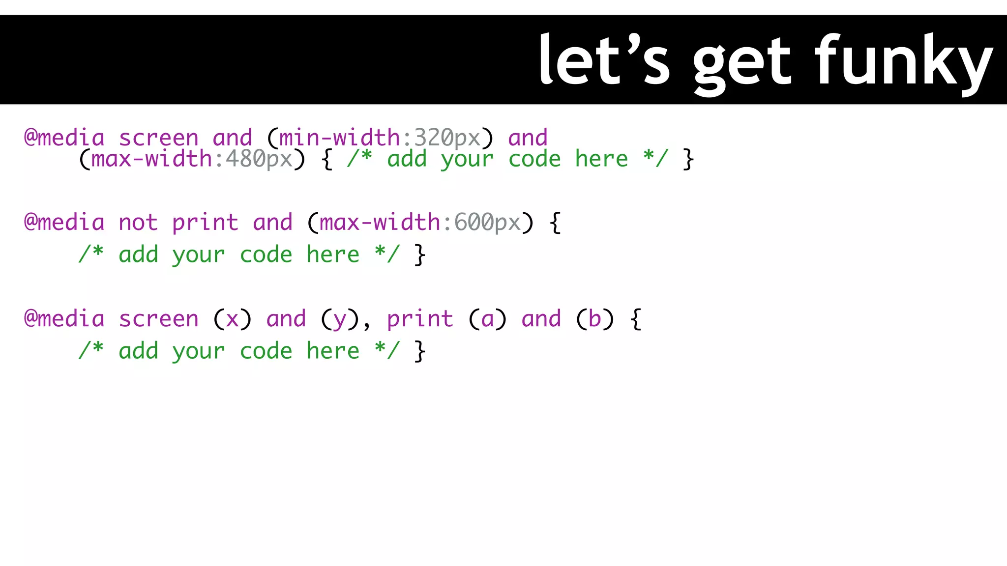
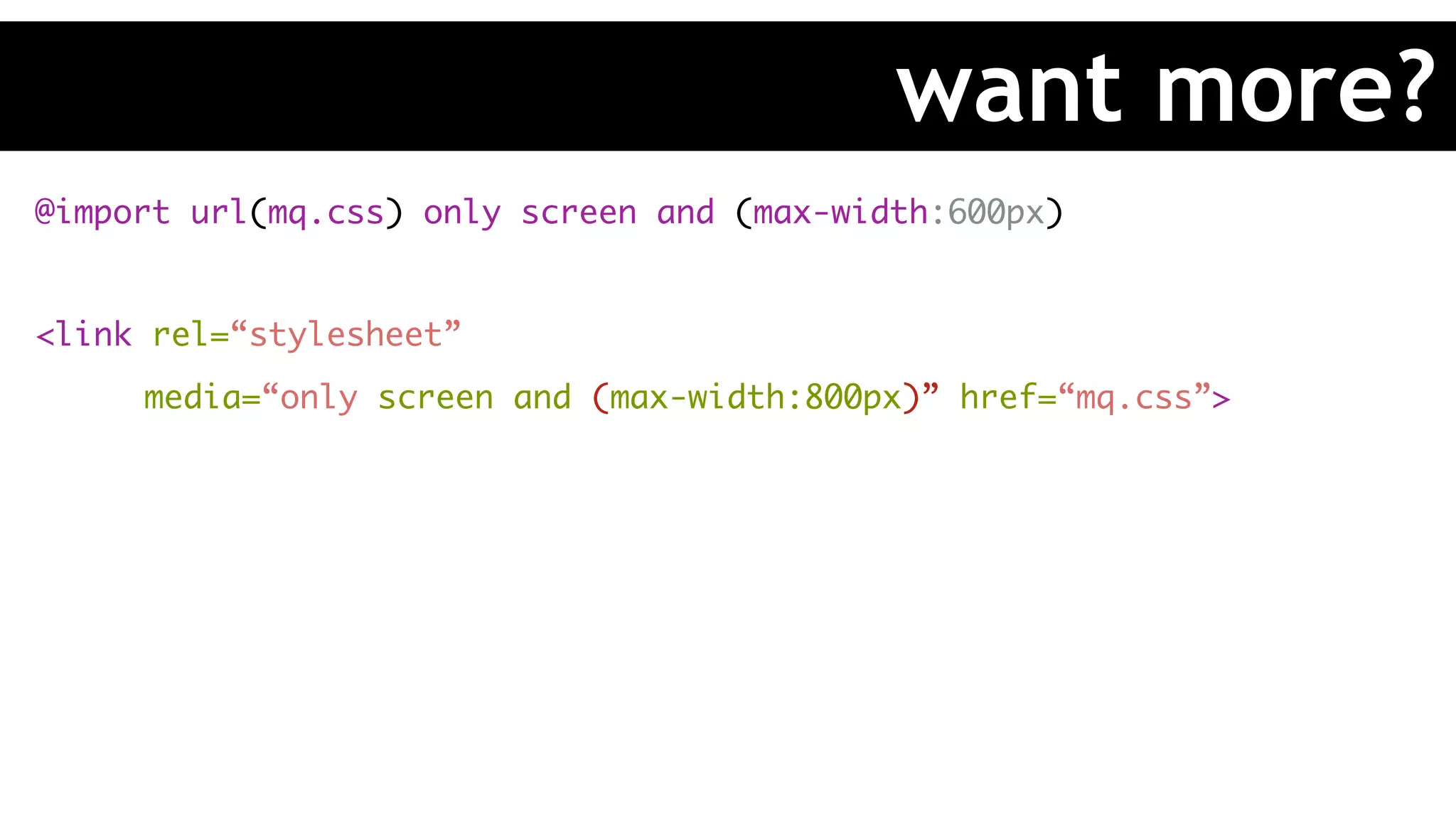
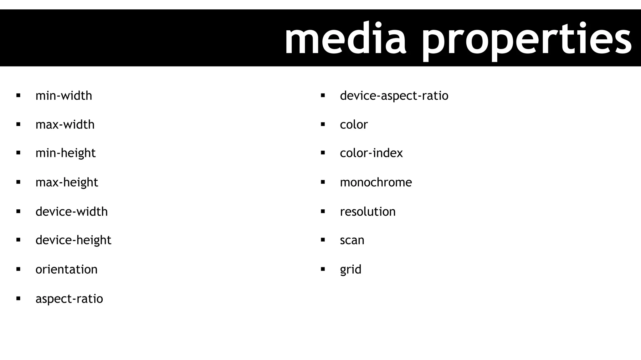

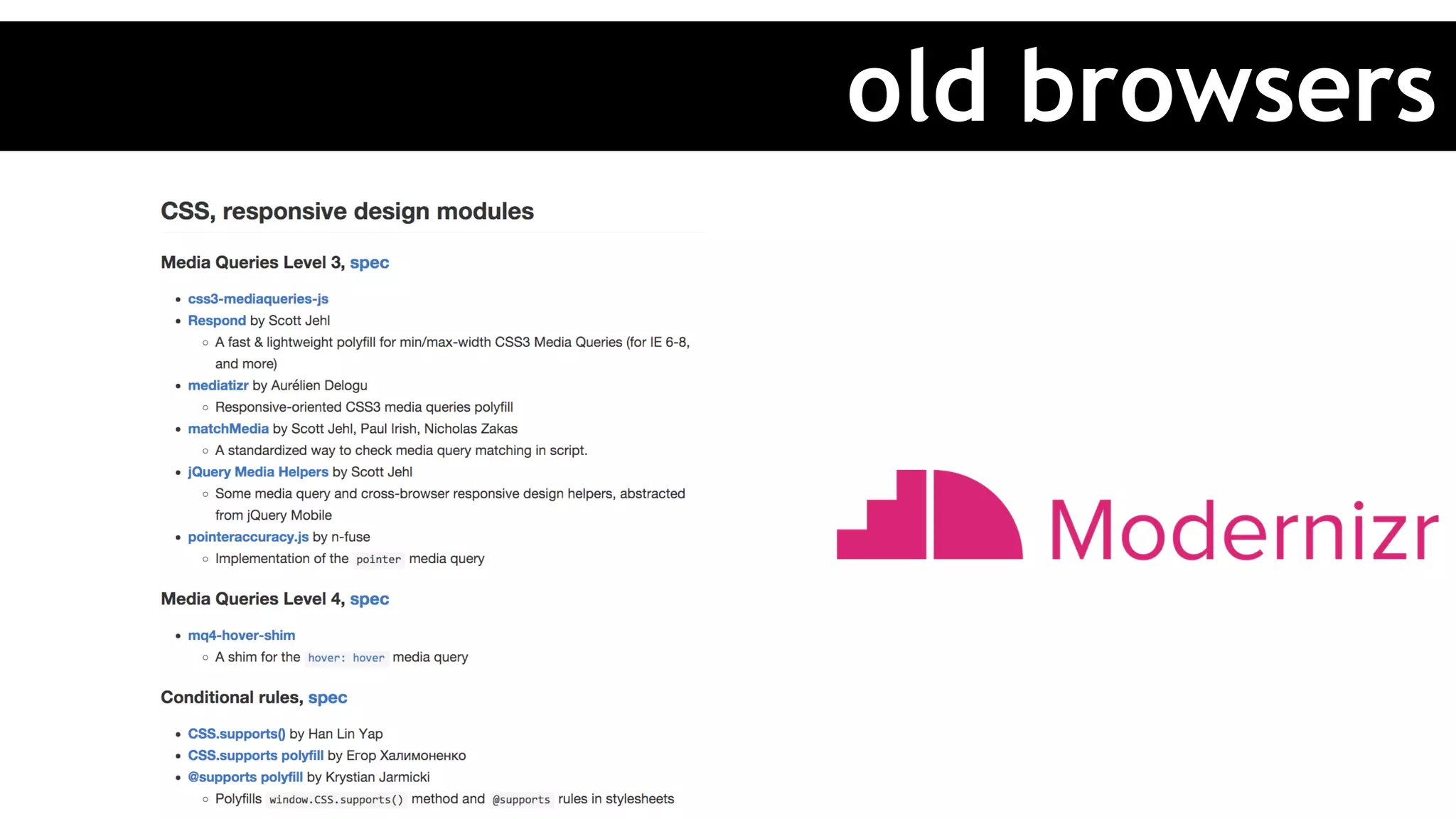

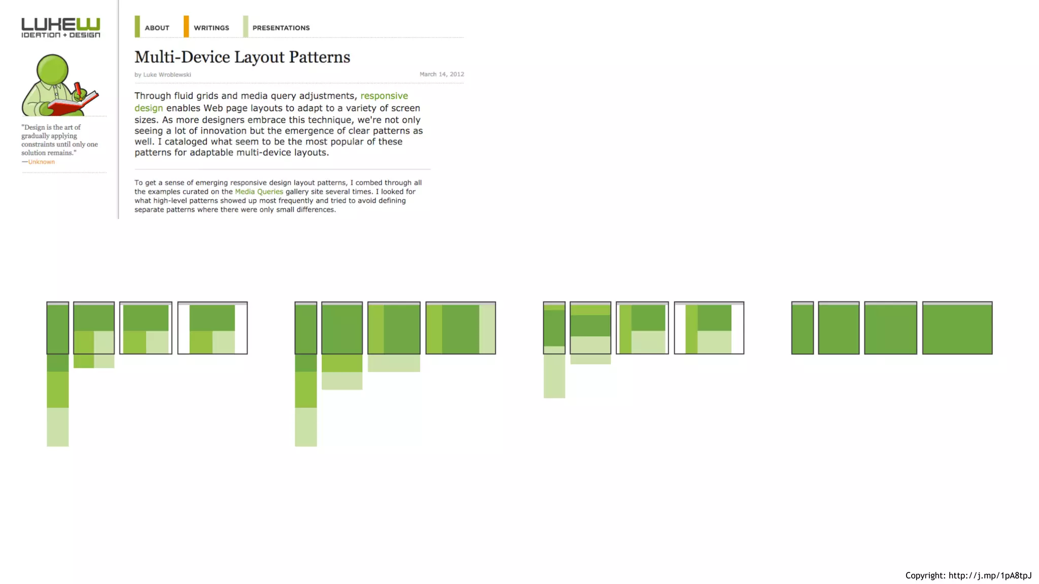
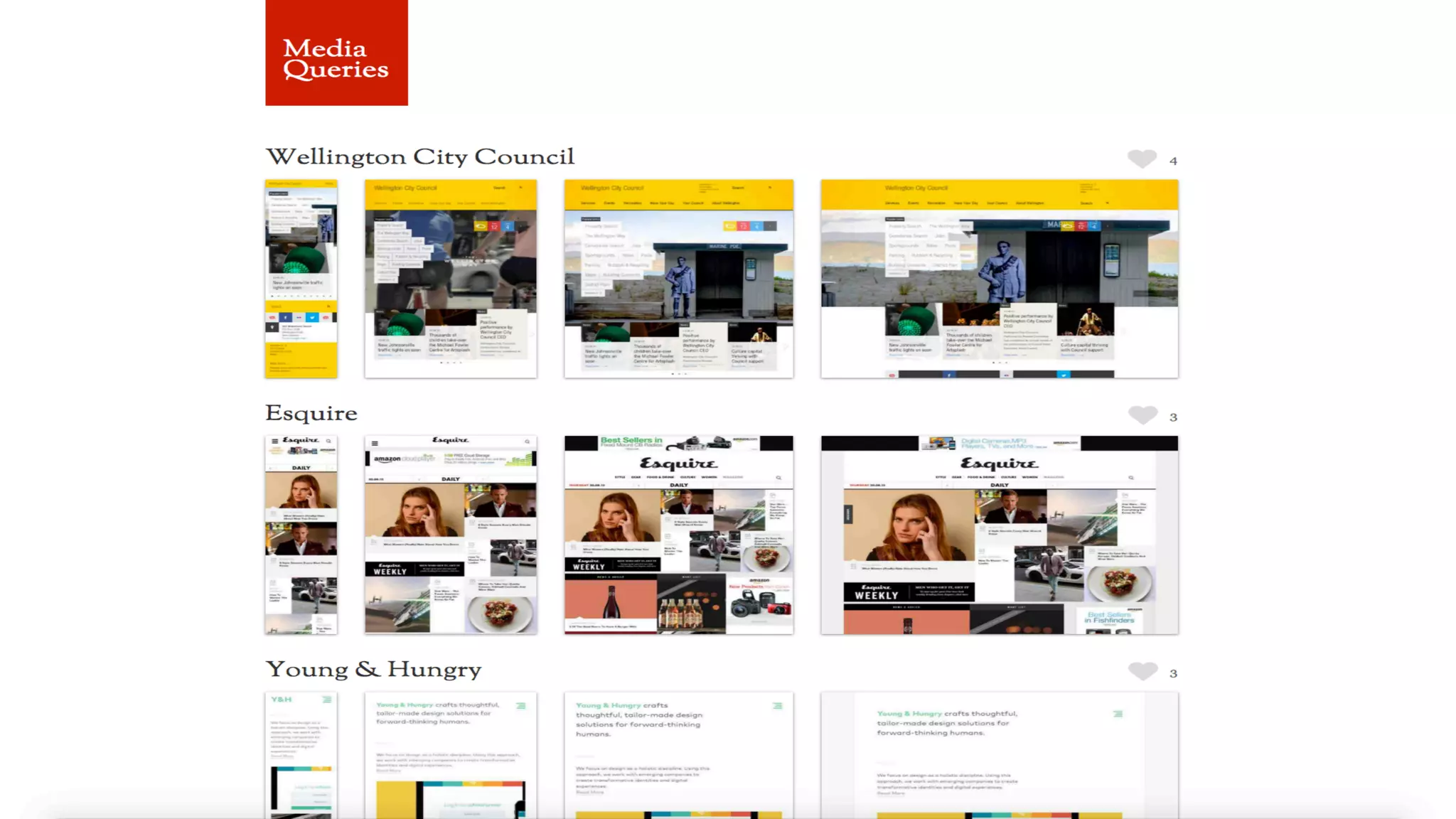


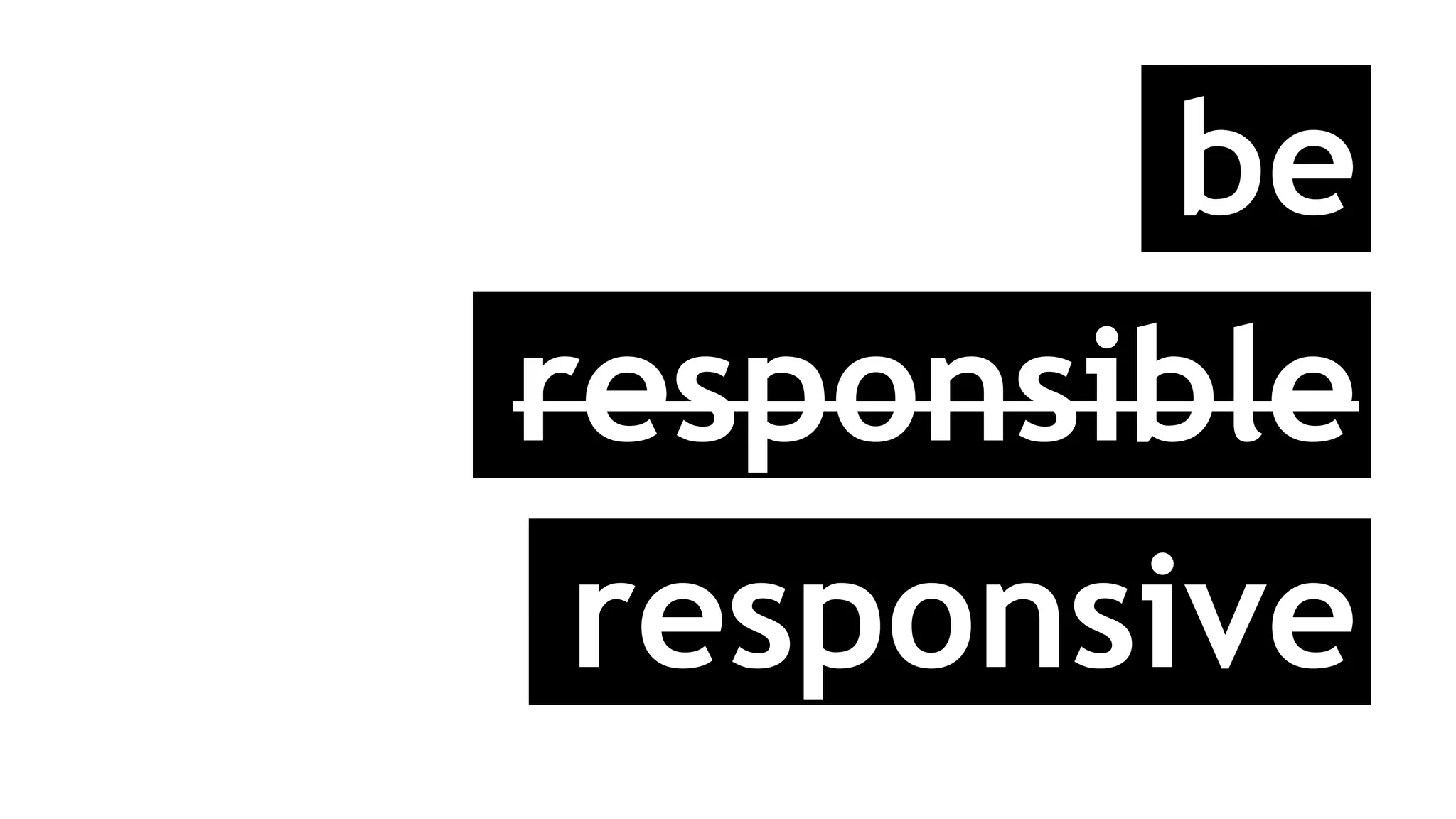


The document discusses responsive web design, emphasizing the importance of adapting to user needs and various device capabilities through techniques like flexible grid layouts, responsive images, and media queries. It highlights the shift from fixed-width layouts to more flexible designs that enhance user experience across multiple platforms. Additionally, it poses questions about the approach to responsive design, including mobile-first strategies and the necessity of visual comps for different devices.


![Vibe Coding vs. Spec-Driven Development [Free Meetup]](https://cdn.slidesharecdn.com/ss_thumbnails/vibecodingvsspecdrivendevelopment-251209105622-43f455e7-thumbnail.jpg?width=640&height=640&fit=bounds)


