Download as PDF, PPTX


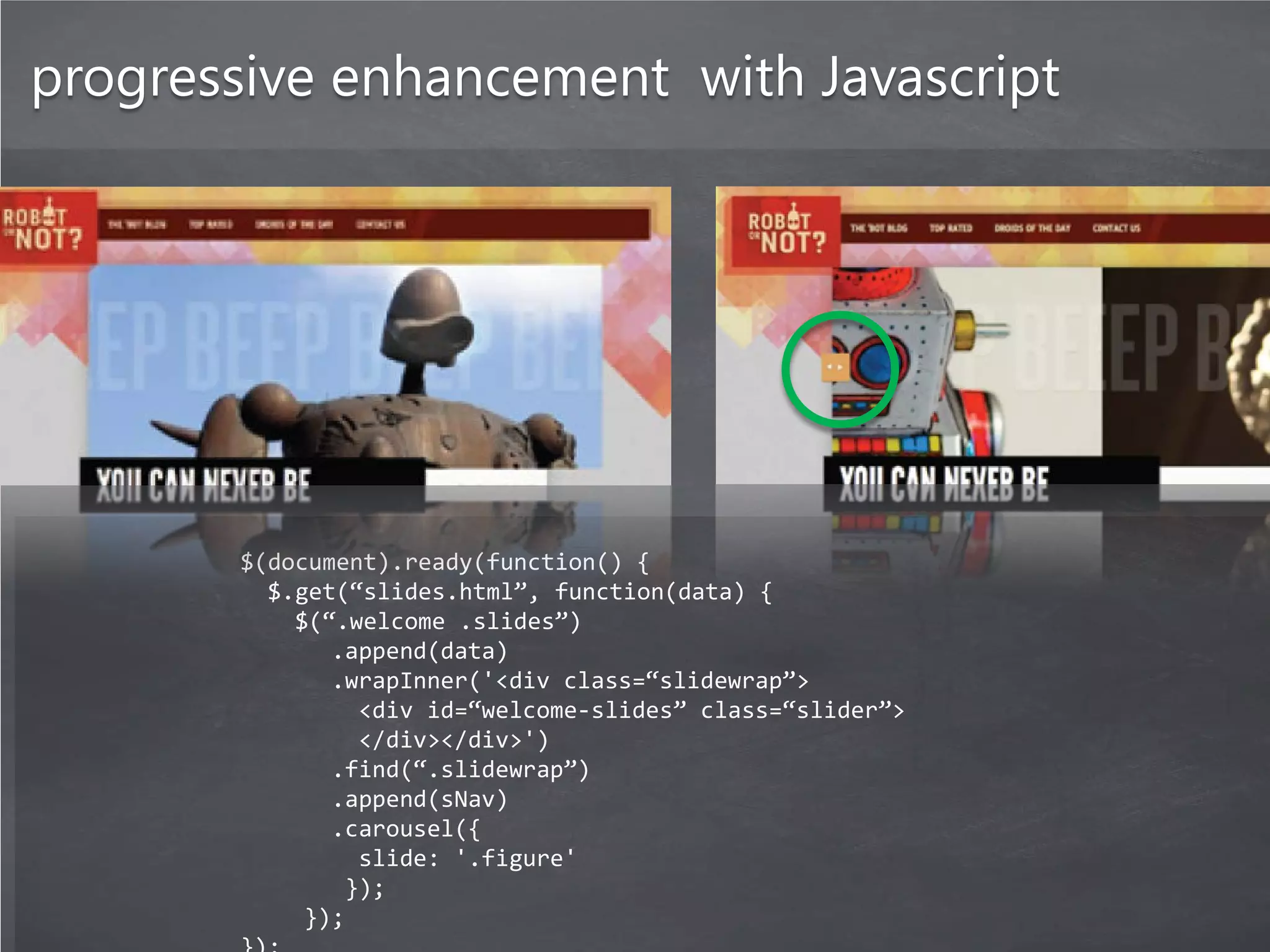
![progressive enhancement with Javascript
Modernizr is
a small JavaScript library
that detects the availability of
native implementations for
next-generation web
technologies.
Modernizr.load([
{
test : Modernizr.websockets && window.JSON,
nope : 'functional-polyfills.js‘,
both : [ 'app.js', 'extra.js' ],
complete : function () {
myApp.init();
}
}
]);](https://image.slidesharecdn.com/devon-2011-f-1-responsive-web-design-120821082011-phpapp01/75/Devon-2011-f-1-28-2048.jpg)
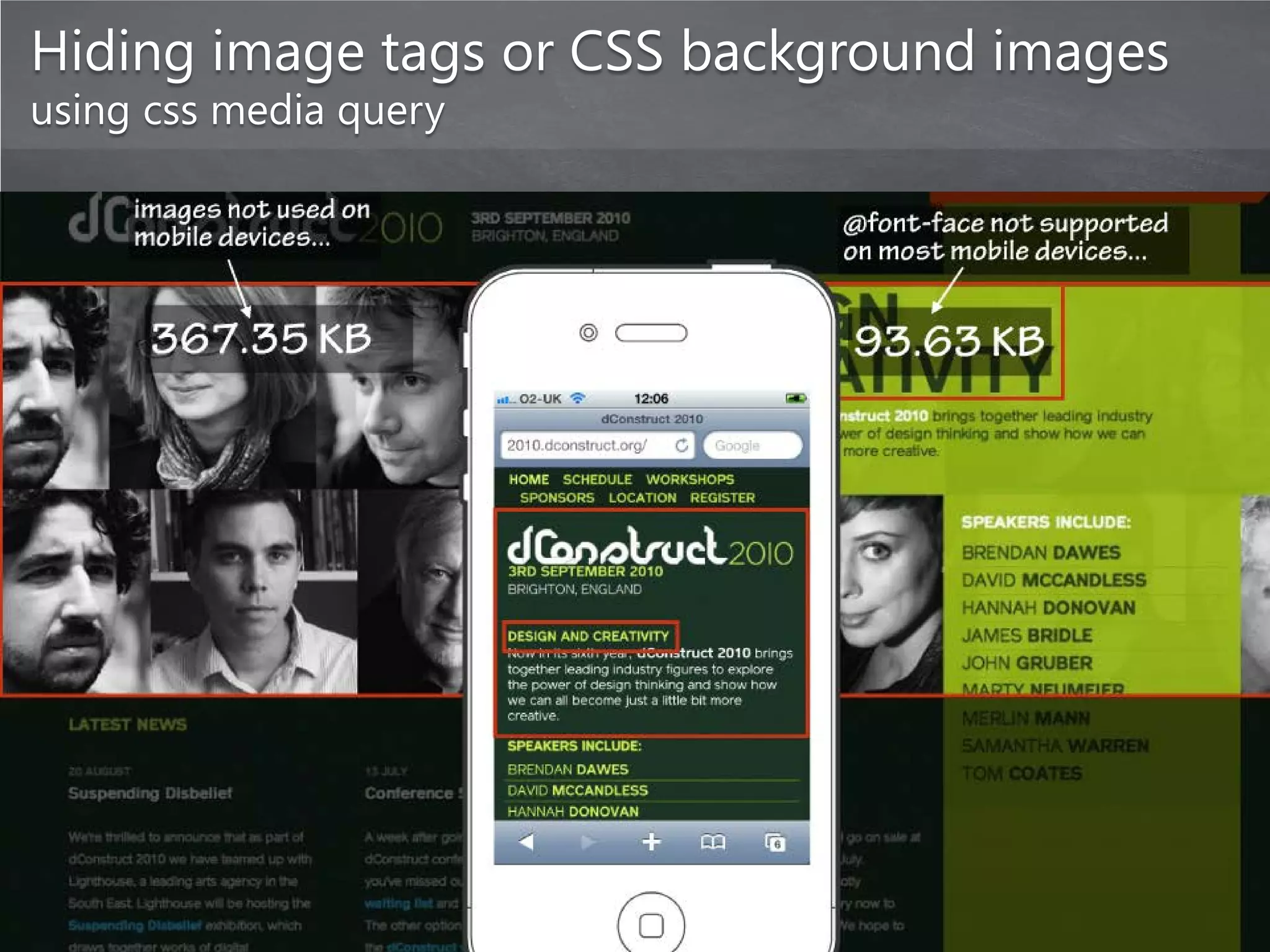

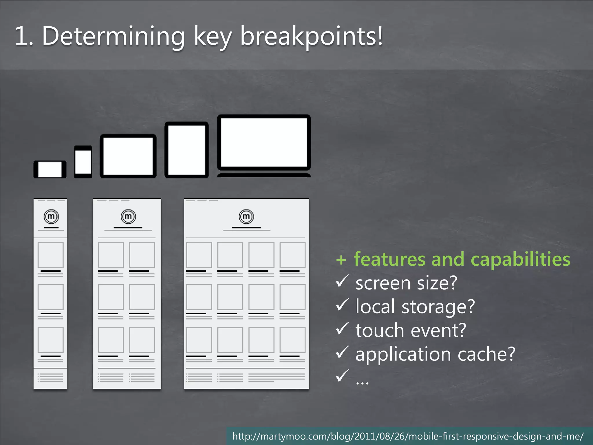
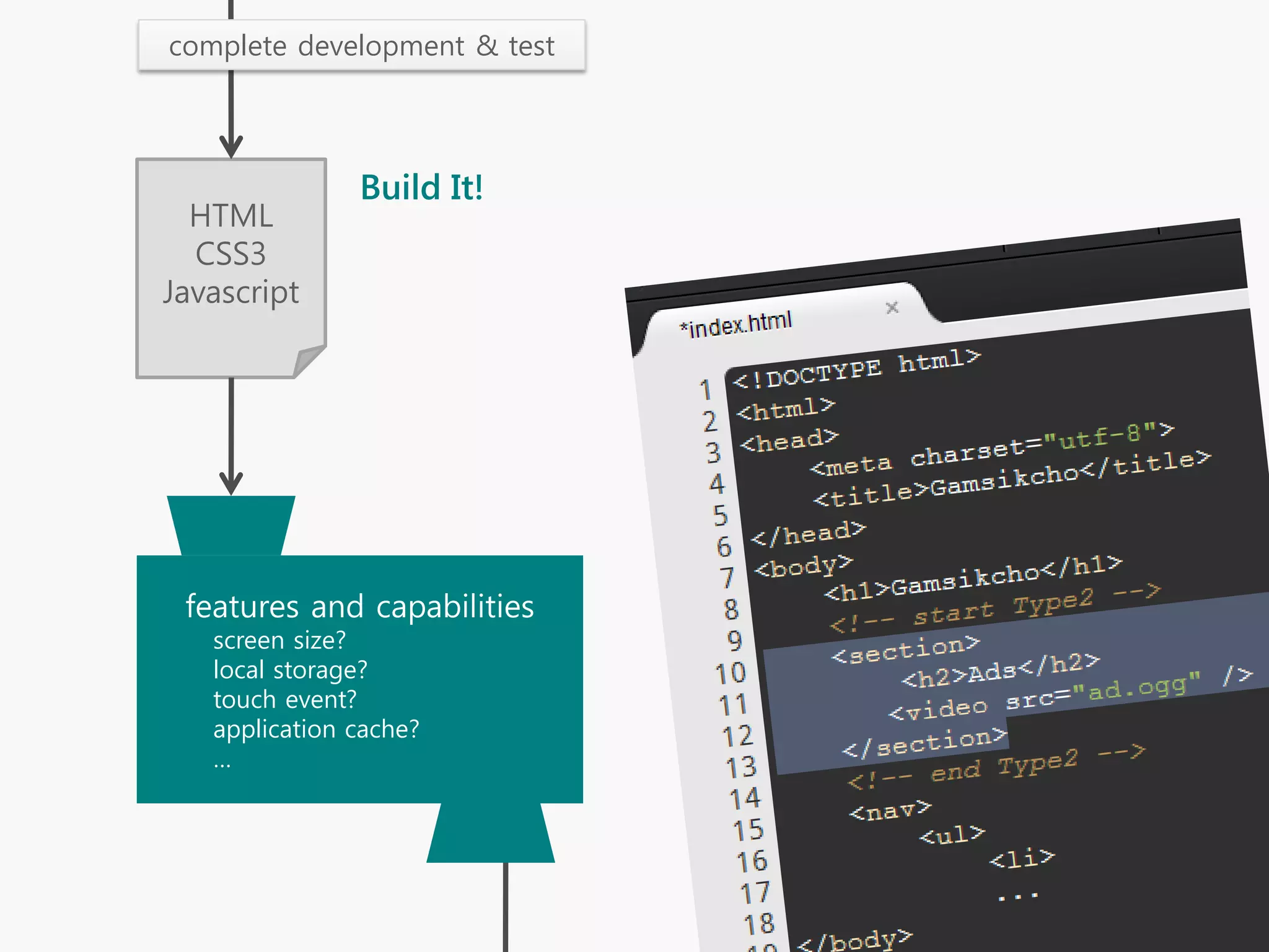
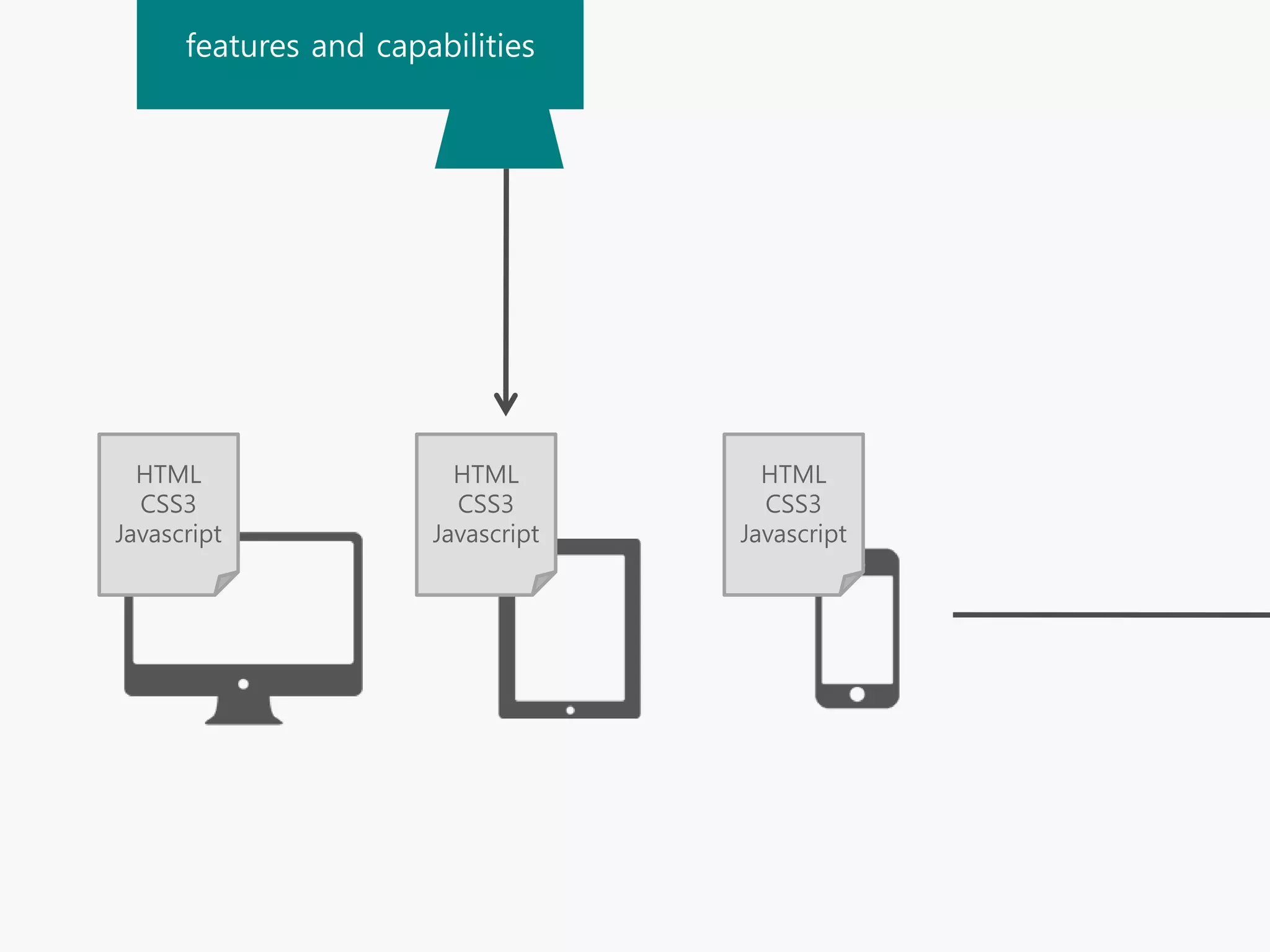
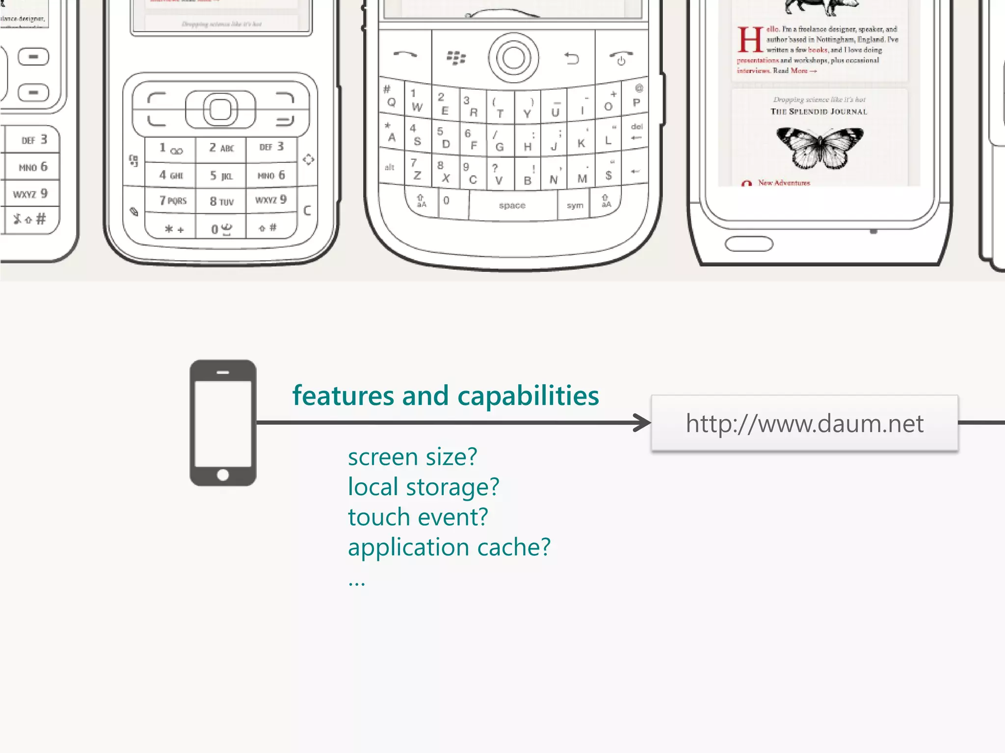
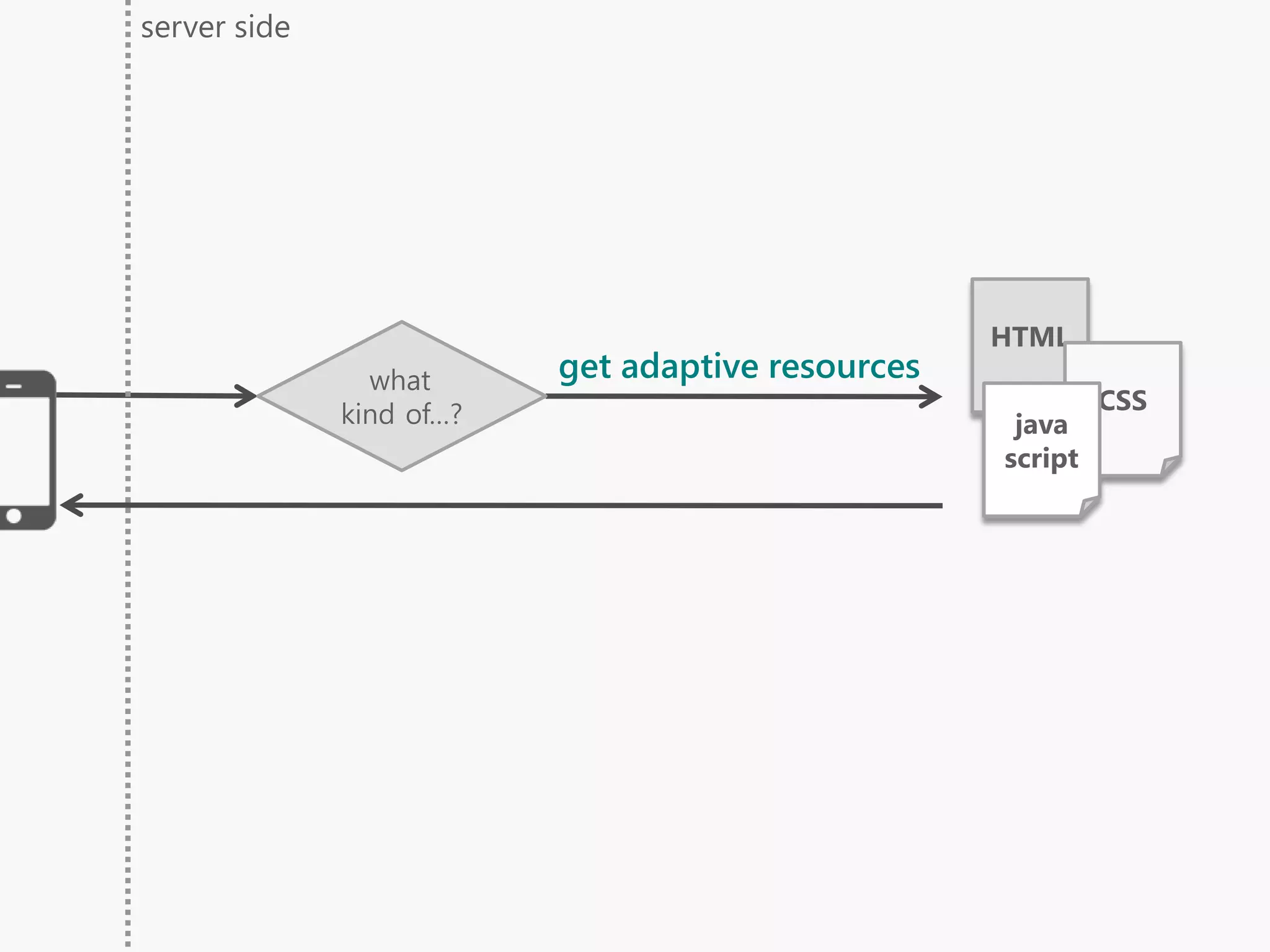


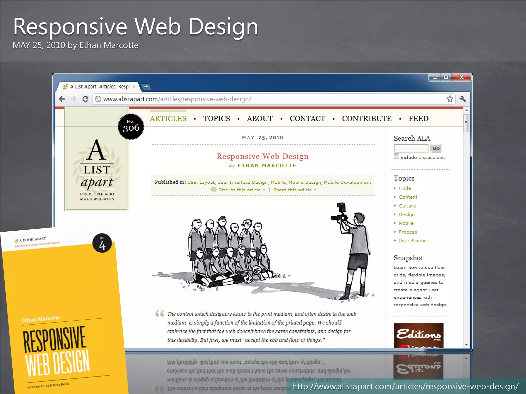
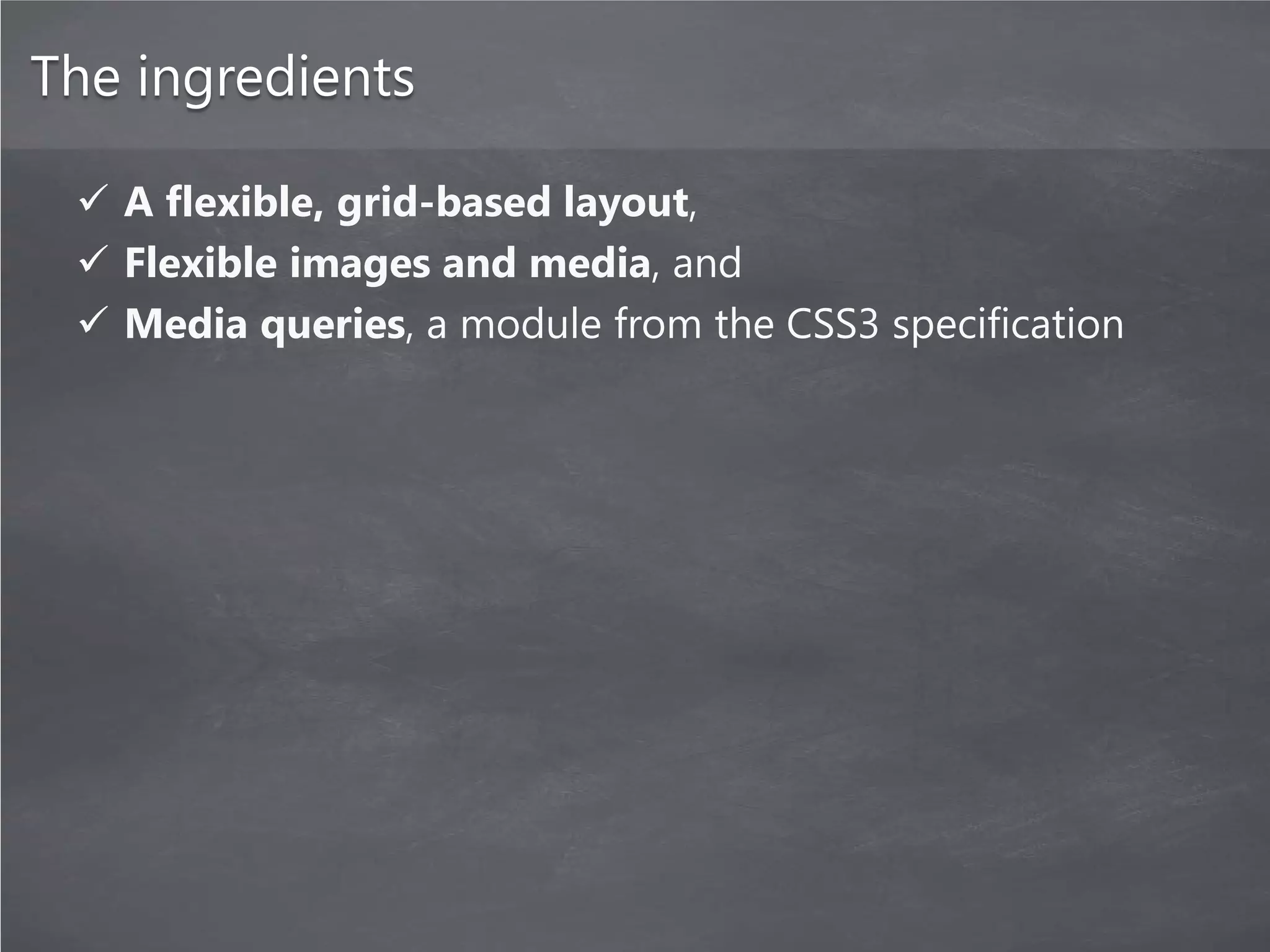
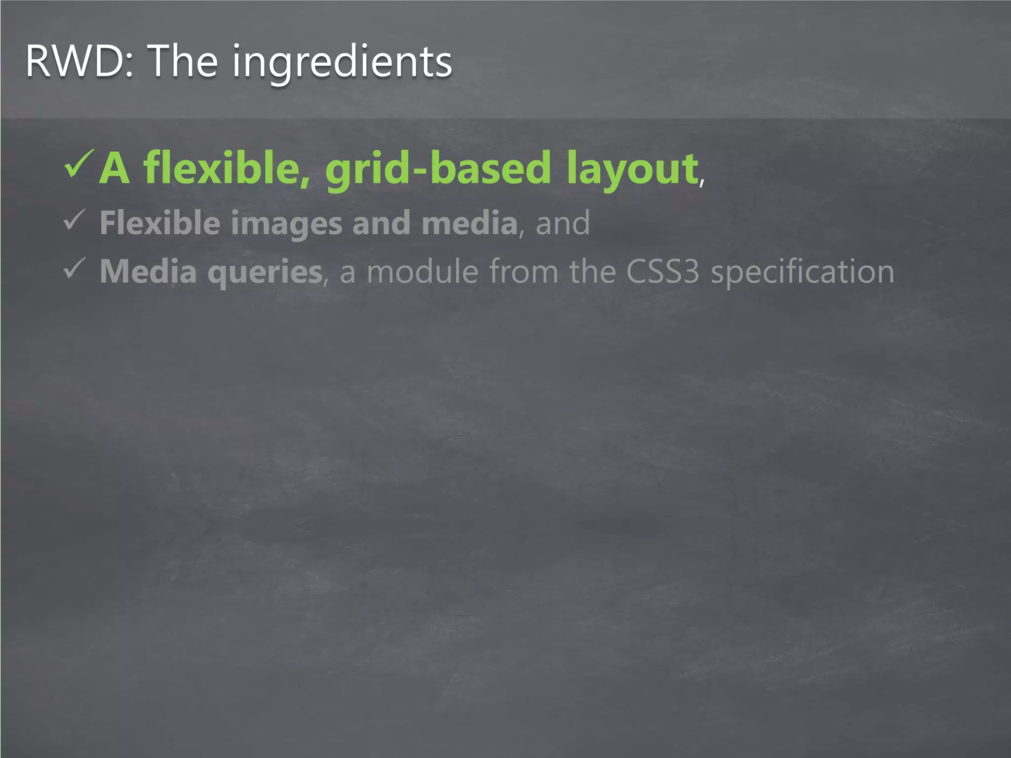
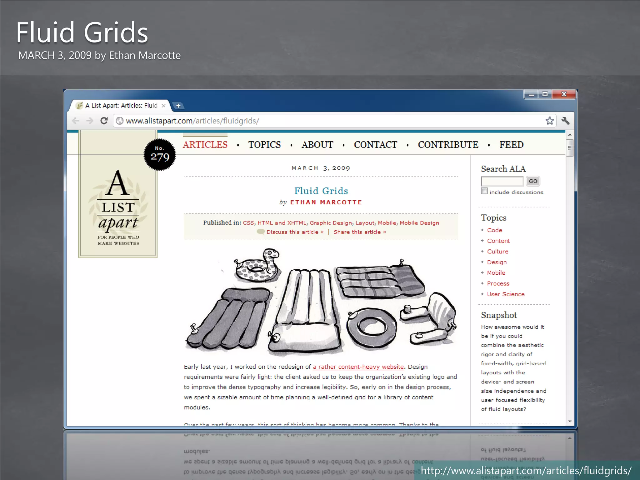
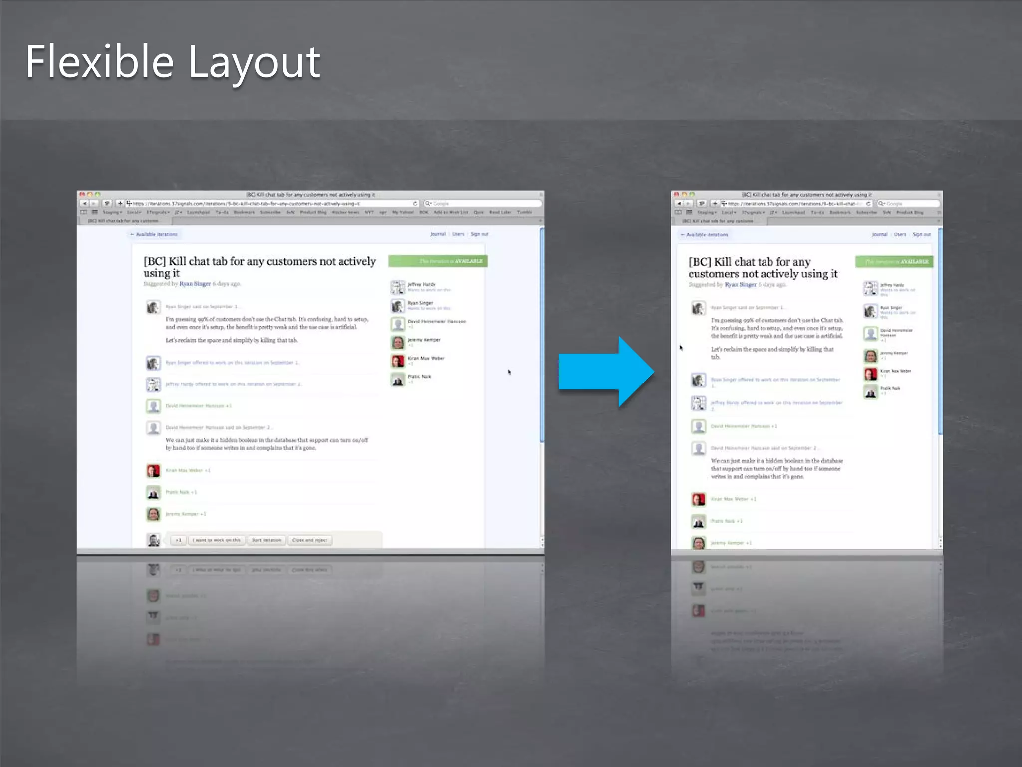
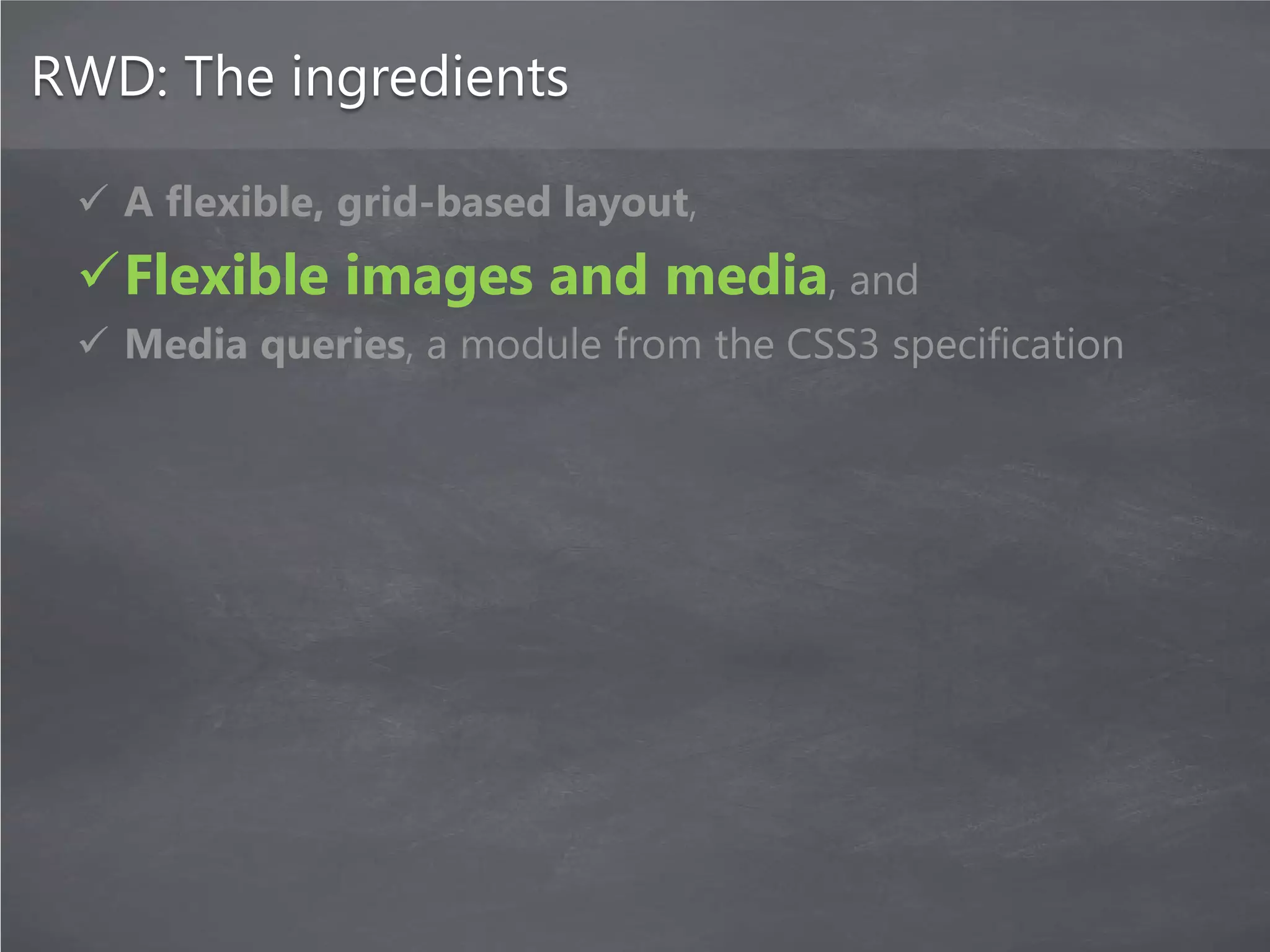
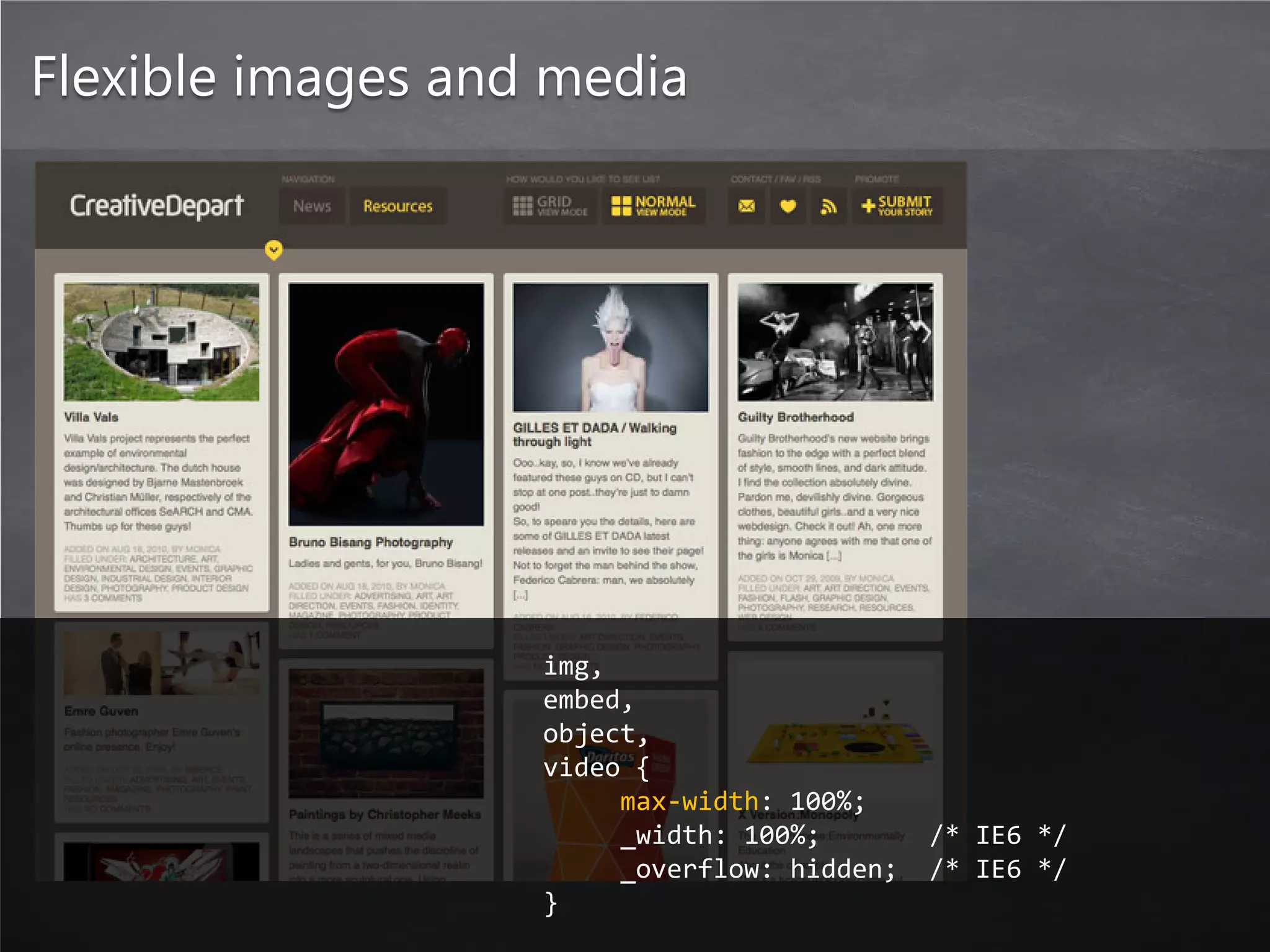
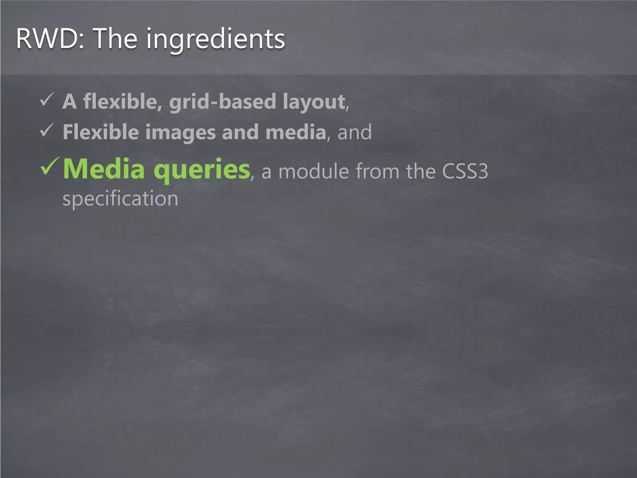
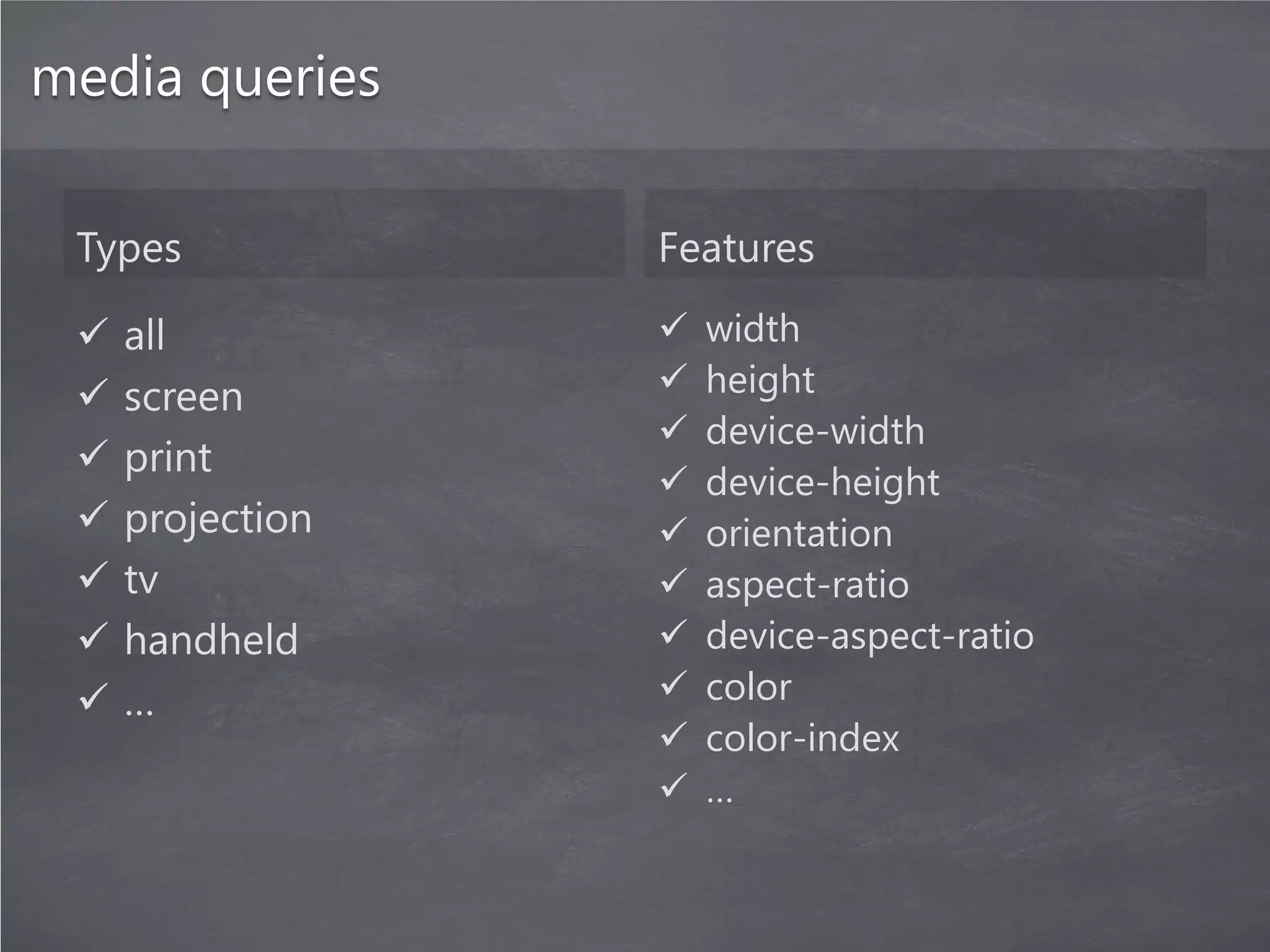
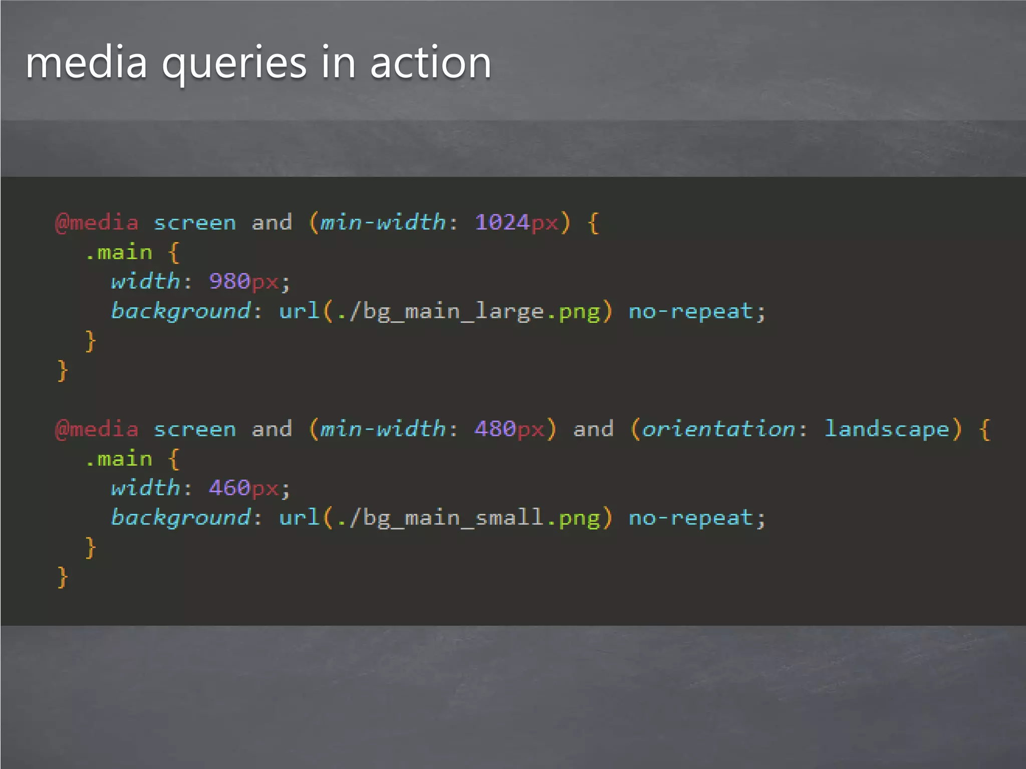
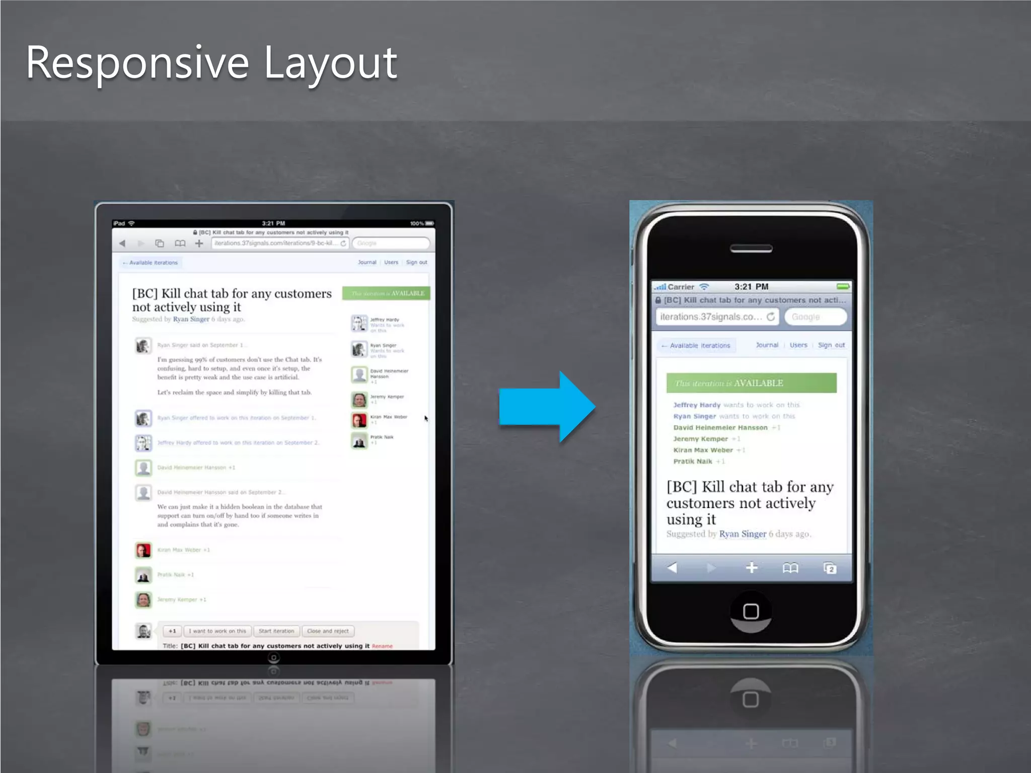
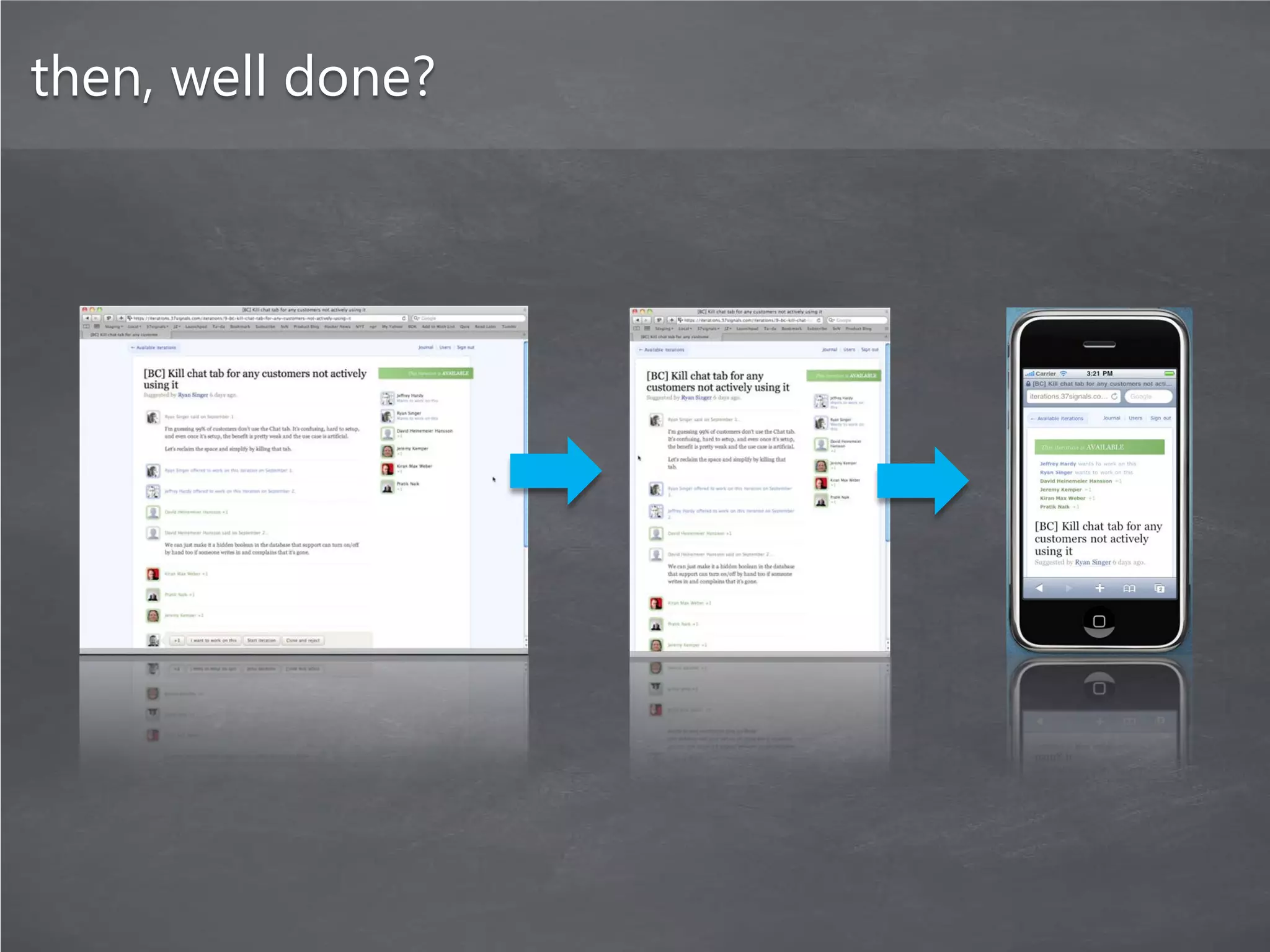
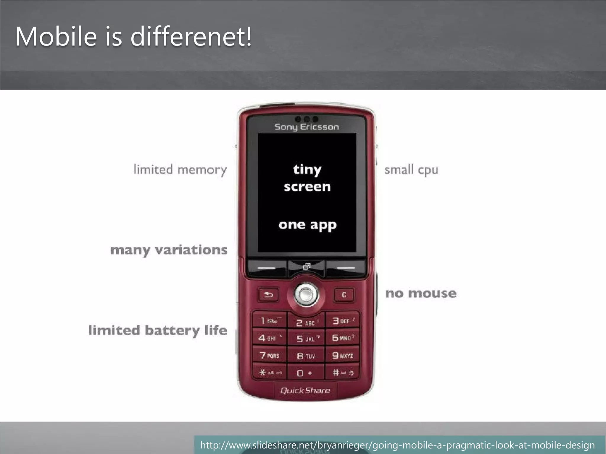
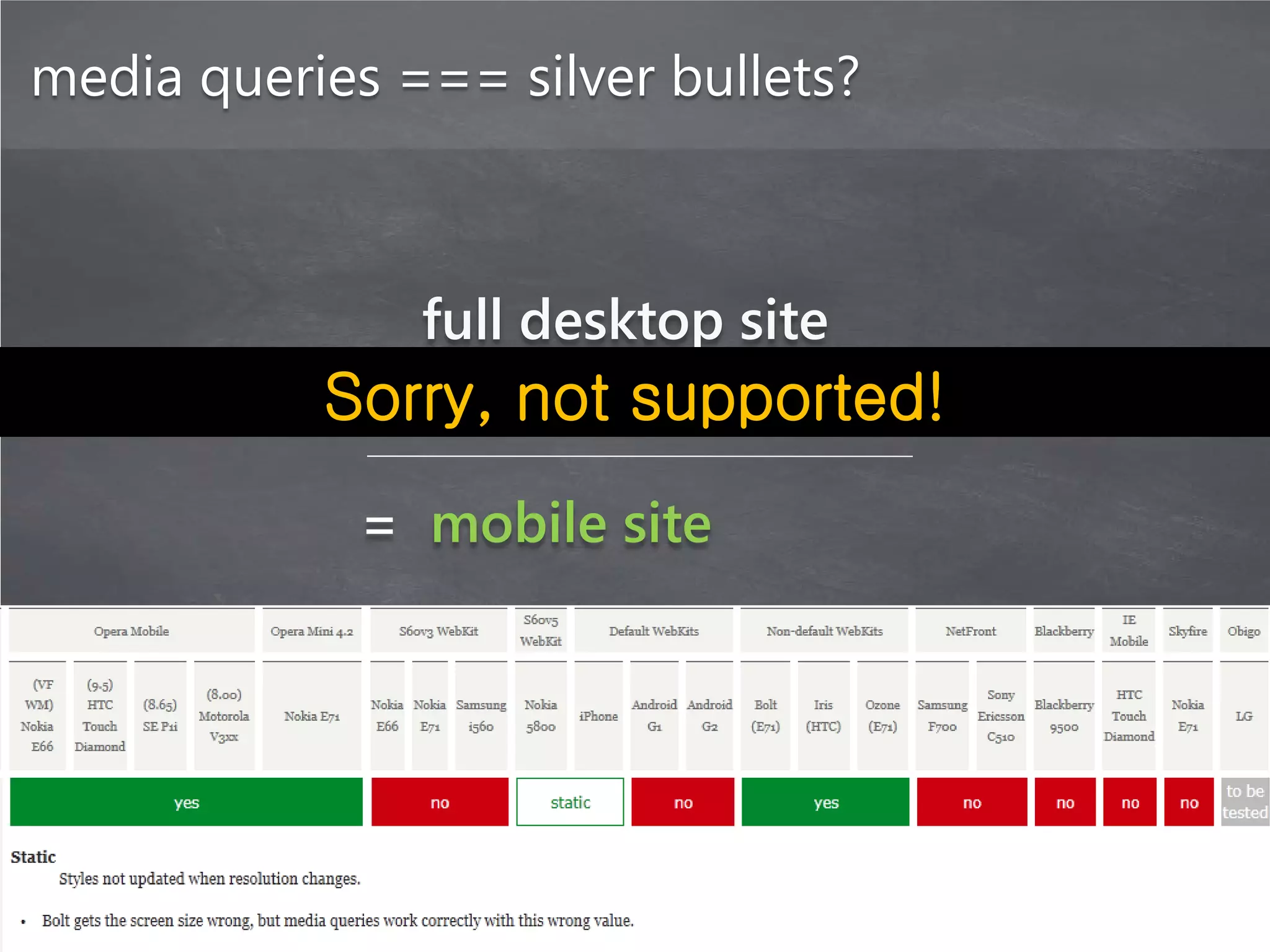
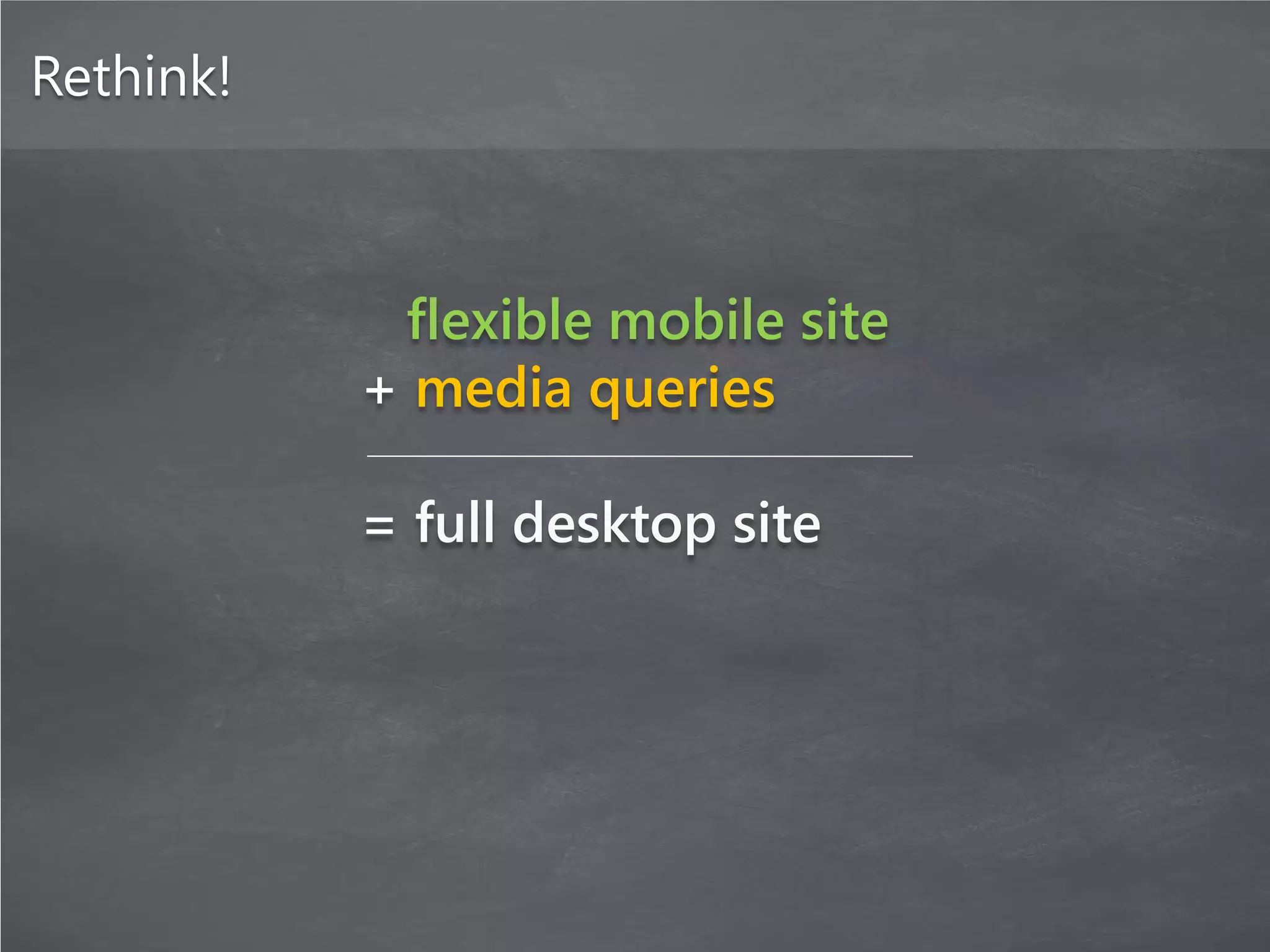
The document discusses responsive web design, which involves creating websites that automatically adapt their layout to different screen sizes and devices using flexible grids, flexible images and media, and media queries. The key ingredients of responsive web design are a flexible grid-based layout, flexible images and media that resize appropriately, and media queries which allow the application of CSS styles based on characteristics of the device. Responsive design aims to provide an optimized viewing and interaction experience across a wide range of devices without the need for separate mobile sites.
![[SF HTML5] Responsive Cross-Device Development with Web Standards (2013)](https://cdn.slidesharecdn.com/ss_thumbnails/rwd-web-standards-sfhtml5-170412200009-thumbnail.jpg?width=640&height=640&fit=bounds)


![[제5회] 9x년생 개발자 모임](https://cdn.slidesharecdn.com/ss_thumbnails/59x-160925063037-thumbnail.jpg?width=640&height=640&fit=bounds)


![Daum devday 13 [bap]](https://cdn.slidesharecdn.com/ss_thumbnails/daumdevday13-bap-130225010411-phpapp02-thumbnail.jpg?width=640&height=640&fit=bounds)


![Vibe Coding vs. Spec-Driven Development [Free Meetup]](https://cdn.slidesharecdn.com/ss_thumbnails/vibecodingvsspecdrivendevelopment-251209105622-43f455e7-thumbnail.jpg?width=640&height=640&fit=bounds)


