
More Related Content
What's hot
What's hot (20)
Viewers also liked
Viewers also liked (18)
Similar to Detailed analysis 1
Similar to Detailed analysis 1 (20)
More from DavidKelly_
Detailed analysis 1
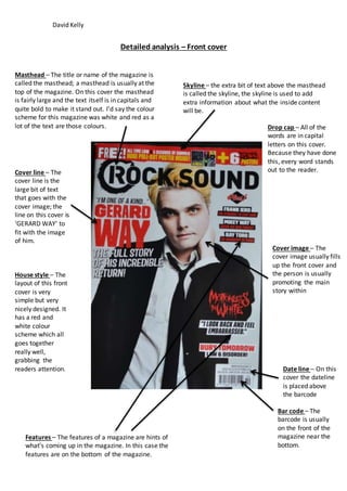
- 1. David Kelly Detailed analysis – Front cover Masthead – The title or name of the magazine is called the masthead; a masthead is usually at the top of the magazine. On this cover the masthead is fairly large and the text itself is in capitals and quite bold to make it stand out. I’d say the colour scheme for this magazine was white and red as a lot of the text are those colours. Skyline – the extra bit of text above the masthead is called the skyline, the skyline is used to add extra information about what the inside content will be. Cover image – The cover image usually fills up the front cover and the person is usually promoting the main story within Date line – On this cover the dateline is placed above the barcode Bar code – The barcode is usually on the front of the magazine near the bottom. Cover line – The cover line is the large bit of text that goes with the cover image; the line on this cover is ‘GERARD WAY’ to fit with the image of him. Features – The features of a magazine are hints of what’s coming up in the magazine. In this case the features are on the bottom of the magazine. Drop cap – All of the words are in capital letters on this cover. Because they have done this, every word stands out to the reader. House style – The layout of this front cover is very simple but very nicely designed. It has a red and white colour scheme which all goes together really well, grabbing the readers attention.
- 2. David Kelly Detailed analysis - Contents Contents – This shows the general contents of the magazine letting the reader know what articles are features. Images – There are few images. They are mainly medium shots and group shots. The images are previews based on articles within the magazine. House style – these contents have a red and white colour scheme which goes with the front cover. Subtitles/sections – The stories have been split up into different sections so the page is more organized. The reader can go straight to the article they’re interested in. Title – the title suggests that this is the contents page; it’s large and bold so the reader should see it almost instantly.
- 3. David Kelly Detailed analysis – Double page spread House style – The main colours used in this double page spread are the same as the front cover, it’s mainly red and white. Compared to other double page spreads, this one does not contain much writing. Main image – The image takes up most of the page and is spread across both pages. Quote – The page has a lot of quotes on it but one stands out in bold capitals, this is the main quote and grabs the reader’s attention. Layout – A very simple layout is used which follows a colour scheme that is visually appealing to the reader and it is very easy to read and follow the text. The right page is mainly covered in the image and album art in the top right corner. Whereas the left page mainly consists of quotes by the people and something about them.