
More Related Content
What's hot
What's hot (18)
Viewers also liked
Viewers also liked (20)
Similar to Design annotations
Similar to Design annotations (20)
Recently uploaded
Recently uploaded (20)
Design annotations
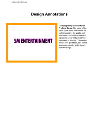
- 1. Methembe Darikwa Design Annotations The typography is called Myriad Pro Bold Conde. The colour of the font is black with a pink outline; the outline is used by the stroke tool. I used these colours because Black represents power and pink carries connations of feminity. This design doesn’t look good because it carries an ameature quality and it doesn’t look likle a logo.
- 2. Methembe Darikwa The font I used was called Bolts SF. I chose this font because the competitors seem to go for bold fonts. For this design I thought I can still keep colours used before because they looked pleasing to the eyes. I mainly used the outerglow for the pink so it’s arround the edges using te special effects section. However I would not use this logo as Idon’t think it’s attractiv instead it would need more layersof work. # I used this font because I liked the fact that thighlighted the out/line The name of the font is called Alphabet soup. I wrote it in capitail letters because it is a common covention in across all logo designs. I used the stroke tool to colour the innner lines of the counter to give the logo character. The colours I chose are purple and pink because they carry feminimity and their the most comme colours that appear on women’s product. I also used the inner glow and outer glow to make the colour more vibrant because tthis will interpollate the auidence.
- 3. Methembe Darikwa With this design I wanted to incoroprate shapes into the logo because I wanted to standout. So I used the elipsis tool instead of the shape tool because I felt that I can have more control over the shapes size. I liked the purple colour and I decided to incorperate in this design. The purple would complement the orange, yellow and light blue very well. I made the shape orange with yellow uding the inner shadow tool. I made the SM in light blue because I wanted it to stand out infront of all the colours. The size of that font is 72 and I used italics to give it personailty. The rest of the typography is purple and the size of 32. In conclusion I think this logo is good but in the morden day standards of logo it would be seen as nostaligia relic from the early 2000s.
- 4. Methembe Darikwa The size of this logo is 72 because this size is suitable to bee seen at a far distance. The colours I have chosen is yellow and pink because these colours connatate happiness and femininty respectivly. These colours are also bright, that way they can interpolate the target auidence. The name of the font is called Ballonsit SF. I picked this because I liked the tails of each character as they are smooth and short. The arm on the T is smooth and cartoony. The tools I used where inner glow and outer glow because they would make the colours more vibrant and bright this will interpollate the auidence.However I feel like this would look great as shirt design however I think this doesn’t look great as logo because it isn’t memeorable.
- 5. Methembe Darikwa Annie BTN is the name of the font I chose because I liked the tail of the characters because they resemble handwriting which is close to my signature idea. The colours I used was orange, pink and black. Black represents power, orange carries connatations of warmth and pink connates warmth I chose these colours because they complement each other well and they standout vert well. I used the stroke tool so the letters are more defined and easy to read. I used the outer glow tool to add character to the font. Using that tool I made the outside of the letters orange it allso made the countor of the letters orange as well. I made filled the inside with the colour pink as it is the brightest colour of them all. In conclucstion the font is inappropriate for
- 6. Methembe Darikwa the company because it carries connations of childhood and it will be approriate to be seen on a television. Other issues that may occur when using this as a logo is that it will distort what the company industry is. I decided to take a minimalist approach by just having the font ans the colour. Name of the font is called Cinema Gothic BTN Outline. I think this font is just bad because it needs working on the kerning as I beleve the letters are too close the cross bar on the E is a little too low and it could be raised.
- 7. Methembe Darikwa ConcursoModerne BTN was the font I chose for this design.I typed the letters in small caps because I loved the ball terminal on the letter are and the terminals on the other letters. I made the sm in pink because it’s a record label that targets the female auidence and pink carries connations of feminity. The red represents passionan blue carries connations of masculinity.
- 8. Methembe Darikwa The font of this logo is called double bubbleshodow I chose this because I found it easy to read. The colout i picked is yellow, pink and black. I chose these colours as they will complement each other very well. I used the stroke tool from the fx kit to make the letters more defined. I used the stroke tool again but from the inside instead of the outside to give the font a 3D look. However despite it being pleasing to the eye and eye catchy it doesn’t look like a record label.Instead it looks like a logo for a chocolate brand. This design can be improved by adding a graphic like a vinly record or a microphone. The surbs and the terminals have a smooth design which interpollate the auidence.
- 9. Methembe Darikwa I picked this dont because I liked how creative it is. They made the contour in the shape of a heart; giving it the connatations of ferminisim.This is seen with the tittle is even in the shape of heart. I wanted to use black because it connatates power. However this wont be suitable as it will be likely linked to a female clothing brand thats aimed for children.
- 10. Methembe Darikwa To draw the graphic I used the pen tool and traced it over a statue which is found in Seoul. I thought this would make an intresting logo as it is a popular figure in the city, i decided to have it in a silouhte because it would take awhilew to draw the details using the pen tool . The font I used is called deluruim. It carried connations of class. However the statue in silouhte can be confusing to the auidence as they wouldnt know what it is.However I would keep the font because it looks good.
- 11. Methembe Darikwa I kept the font from the prevouse design because of the connations it carried. I made it the colour purple because it carried connatatons of royalty. Instead of a statue; this tmie I decided to trace around the Seoul Skyline using the pen tool. After that I left clickked on the drawing and clicked on fill stroke to make the lines thicker. I chose this because they’re huge and very popular among tourists and citizens. This could be a potential logo design.
- 12. Methembe Darikwa With this design i made a soundwave using the pen tool and I duplicated the line using the duplicate layer. Then I used the wind tool from the stylize bar to make lines come out the straight line creating an audio wave. Then I used gussain blur so typography can standout. Then I added the typography using the font Awesome South Korea. I chose this font because it resembles hangul which is the langauge in that country. I used the colour light blue, dark blue and pink because they both represent masculinbty and feminimism. I used the graident tool to make the transtision smooth. This design is one of the best i have come up with so far, it does give a japanese pop asthetic due to the bright colours. This would be a good design for a logo and it is a good design.
- 13. Methembe Darikwa Since SM stands for Star Muesum I thought I could incorprate a galaxy insteads of an actual star because I felt that it could be chessy and not professional and it would look great. I picked the colours red, yellow and orange because there unisex colours and they’re conatate warmth and they are bright colours. I used the ellispes tool to make the circle because the tool provides a lot of control and i could add graident easily. Then i made the same circle by duplicating it. Rasterrized the image and used the twirl tool to create the galaxy tool.
- 14. Methembe Darikwa This is the website of the company. I liked the orginals layout but i didn’t like the colours and some elements the elemements. I changed the font to match the logo. I used one of the potential logo and placed them at the bottom corner. Bottom right corner i added the legal copyright date. I kept the galleryy slide.
- 15. Methembe Darikwa