Download as PDF, PPTX


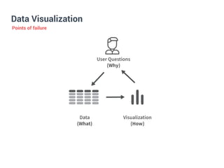


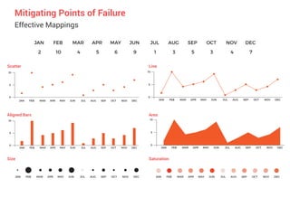


The document discusses effective data visualization and communication. It notes that a visualization is only powerful if used properly by mapping data to visual elements in an optimal way. It can fail if the questions cannot be answered by the data, or if the mapping is suboptimal. Other points of failure include not being able to extract the key points or answer user questions. The document provides tips for mitigating these failures, such as effective mapping, arrangement of elements, use of data-ink ratio, enabling comparison through juxtaposing or partitioning data, and effective communication through annotations, storytelling and interactive content.