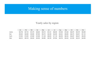
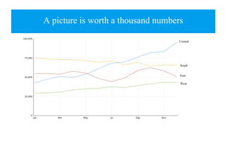
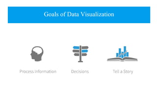
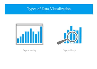
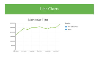
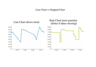
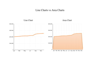
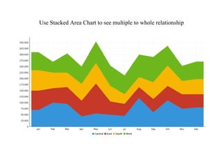
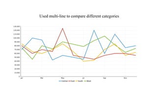
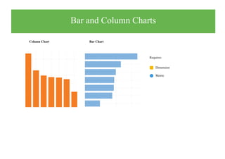
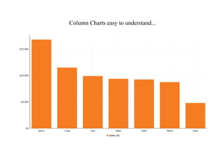
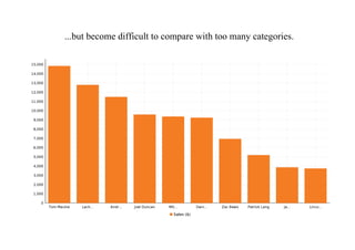
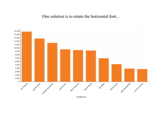
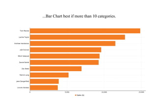
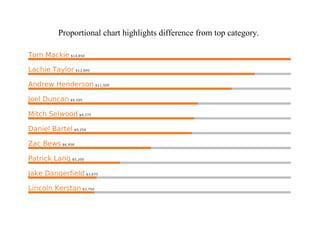
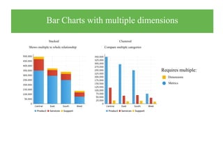
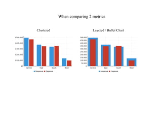
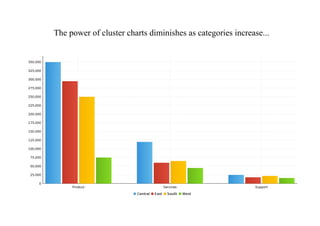
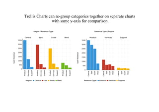
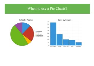
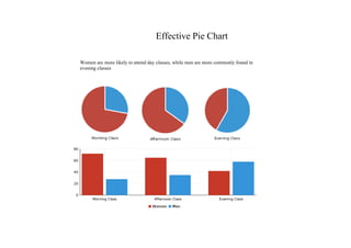
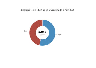
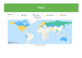
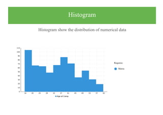
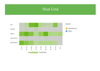
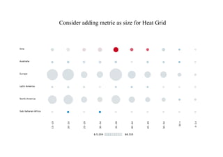
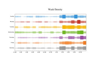
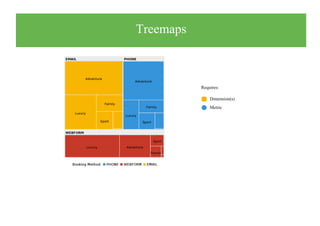
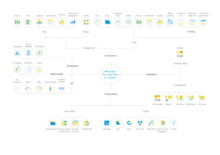
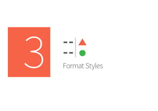
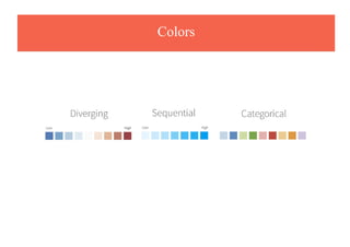
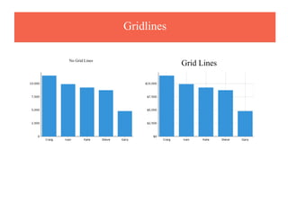
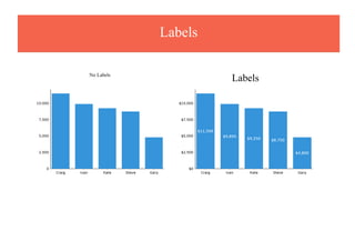
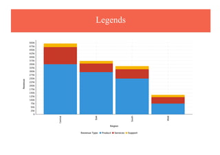
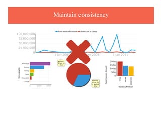
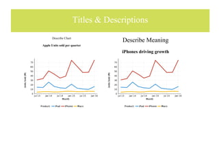
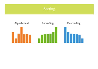
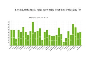
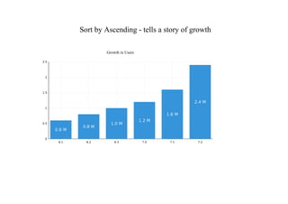
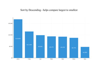
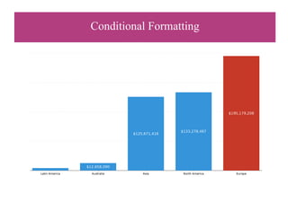
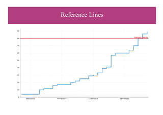
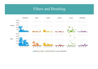
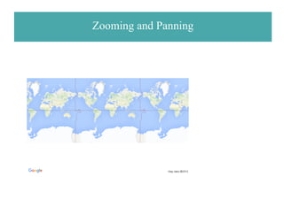
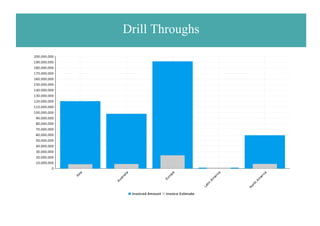
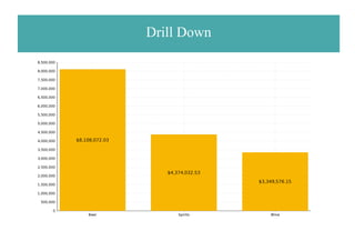
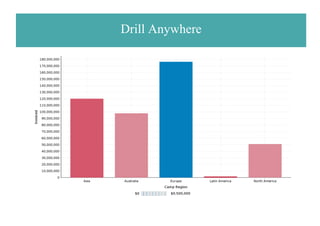
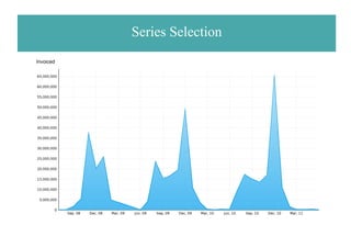
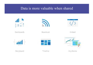
Data Vis
Today's agenda
Data is exploding
The Human Brain
Making sense of numbers
Sum Sales Month
Region Jan Feb Mar Apr May Jun Jul Aug Sep Oct Nov Dec
Central $42,759 $47,743 $51,075 $49,825 $54,010 $61,321 $68,250 $70,038 $76,328 $82,075 $83,475 $95,385
East $55,000 $54,850 $53,995 $57,850 $55,372 $48,328 $44,385 $49,342 $58,950 $62,375 $58,251 $51,100
South $75,500 $73,650 $72,980 $72,999 $71,438 $69,500 $71,150 $66,359 $69,352 $64,287 $66,247 $65,295
West $29,272 $29,735 $30,500 $33,520 $34,980 $35,795 $37,594 $36,759 $39,243 $41,500 $43,513 $42,955
Yearly sales by region
A picture is worth a thousand numbers
Central
South
East
West
Goals of Data Visualization
Types of Data Visualization
Best Practice Data Visiualization
Encode meaning in your charts
Key Concepts
Revealing patterns
Choose the right chart type
Big Number Charts
Big Number answer questions about a single metric
Views this month
Requires: Metric

Add Big Numbers to Charts
Yearly Sales
Infographics
Tweet History Last 90 Days
Line Charts
Metric over Time
Date or Date/Time
Metric


Requires:
Line Chart vs Stepped Chart
Line Chart shows trend
Step Chart more granular
(better if dates missing)
Line Charts vs Area Charts
Line Chart Area Chart
Use Stacked Area Chart to see multiple to whole relationship
Used multi-line to compare different categories
Bar and Column Charts
Column Chart Bar Chart

 Metric
Dimension
Requires:
Column Charts easy to understand...
...but become difficult to compare with too many categories.
One solution is to rotate the horizontal font...
...Bar Chart best if more than 10 categories.
Proportional chart highlights difference from top category.
Bar Charts with multiple dimensions


Stacked
Shows multiple to whole relationship
Clustered
Compare multiple categories
Requires multiple:
Dimensions
Metrics
When comparing 2 metrics
Layered / Bullet ChartClustered
The power of cluster charts diminishes as categories increase...
Trellis Charts can re-group categories together on separate charts
with same y-axis for comparison.
When to use a Pie Charts?
Effective Pie Chart
Women are more likely to attend day classes, while men are more commonly found in
evening classes
Consider Ring Chart as an alternative to a Pie Chart
Attendees
Maps
Requires:
Metric GeoPack or GISPolygon or GISPoint 
Country, State,
Postcode, Zip

GIS Map / Thematic
Bubble Maps
Heat Map
Histogram
Histogram show the distribution of numerical data

Requires:
Metric
Box and Whisker
Requires:
Dimension
Metric


Scatter Plots
Positive Correlation Negative Correlation No Correlation
Requires: 2 Metrics
Consider using Trend Lines
Add a metric as size and make Bubble Charts
Heat Grid
Requires:
Dimension (2)
Metric


Consider adding metric as size for Heat Grid
Week Density
Treemaps
Requires:
Dimension(s)
Metric

Meters
Requires:
Metric
with conditional formatting

Special Purpose
Requires:
Dimension
Metric


Funnel
Categories by Stage
Radar - multivariate data with categories along 3+ axis
Proportional Infographic
Ranch Dressing Ingrediants
Requires:
Metric
Dimension

Comparative Infographics add context and emotion
Metric
Gross Domestic Product (Billions)
Required:
Dimension

Raster Map Infographic
3D is not best practice
Now in 3-D !!!!!!!!!!!

Style with Formatting
Colors
Gridlines
Grid LinesNo Grid Lines
Labels
LabelsNo Labels
Legends
Maintain consistency

Add Clarity
Titles & Descriptions
Describe Chart
Apple Units sold per quarter
Describe Meaning
iPhones driving growth
Sorting
Alphabetical Ascending Descending
Sorting Alphabetical helps people find what they are looking for
NBA regular season wins 2015-16
Sort by Ascending - tells a story of growth
Growth in Users
Sort by Descending - helps compare largest to smallest
Highlight what's important
Conditional Formatting
Reference Lines
Annotations
Highlight Trends
Project Forecasts
Make it interactive
Time Sliders and Unit Selection
Filters and Brushing
Zooming and Panning
Drill Throughs
Drill Down
Drill Anywhere
Series Selection
Invoiced
Share
Data is more valuable when shared
Demo
Summary
Recommended Reading
YOUTUBE - Yellowfin Best Practices Webinars
Data Visualization Best Practice Webinar presentation slides

Data Visualization Best Practice Webinar presentation slides