Downloaded 144 times


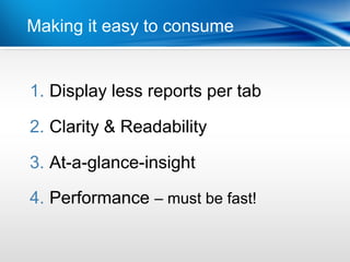


This document discusses best practices for designing dashboards. It outlines 12 best practices: 1) Design dashboards for a specific purpose, 2) Ensure consistent, high-quality data, 3) Make dashboards relevant to intended users, 4) Display important metrics through KPI dashboards, 5) Start with a high-level overview, 6) Make dashboards interactive, 7) Keep dashboards simple, 8) Draw attention to important information using color, 9) Select layouts that assist information flow, 10) Position/size content to reflect relative importance, 11) Prioritize communication over aesthetics, 12) Plan for mobile and device independence.