Download as PDF, PPTX


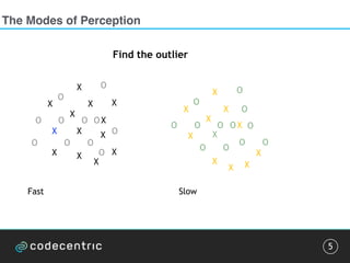
![Pattern detection
10
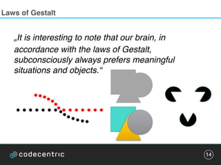
„It is interesting to note that our brain […]
subconsciously always prefers meaningful
situations and objects.“
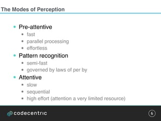
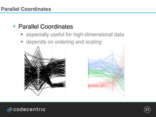
• Emergence
• Reiification
• Multi-stability
• Invariance
Pattern detection can be trained.
Exploit this for frequent visualizations.](https://image.slidesharecdn.com/datavisualizationcodetalks-160930154200/85/Data-Visualization-at-codetalks-2016-10-320.jpg)


The document discusses the complexities and methodologies involved in visualizing high-dimensional data, highlighting the challenges of accurate representation and potential for misinterpretation. Key concepts include various visualization techniques such as pair plots, t-SNE, and principal component analysis, as well as the importance of understanding human perception in data interpretation. The presentation emphasizes that while data visualization is inherently flawed, it can still be incredibly useful when done thoughtfully.


