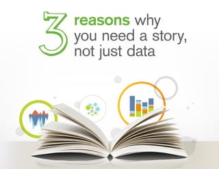
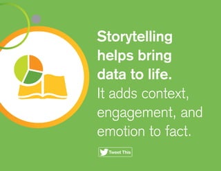
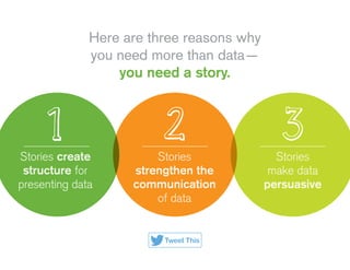
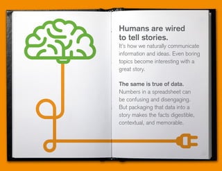
1. Sepa exactamente de donde provienen sus datos.
2. Asegure que todos en la organización comparten los mismos datos, con un acceso fácil y libre de complejidades.
3. Gobernabilidad de la información: mantenga a su equipo capacitado en procesos simples y transparentes.
Data visualizations make huge amounts of data more accessible and understandable. Data visualization, or "data viz," is becoming largely important as the amount of data generated is increasing and big data tools are helping to create meaning behind all of that data.
This SlideShare presentation takes you through more details around data visualization and includes examples of some great data visualization pieces.
Data visualization is a complex set of processes which is like an umbrella that covers both information and scientific visualization simultaneously. We can’t ignore the benefits of data visualization for its accurate quantities, as it is easily comparable. It also lends valuable suggestion pertaining to the usage of its technique and tools. Scientifically its effectiveness lies in our brain's ability to maintain a proper balance between perception and cognition through visualization.
Data visualization trends in Business Intelligence: Allison Sapka at Analytic...Fitzgerald Analytics, Inc.
Allison Sapka's presentation at the Analytics and Data in Financial Services Meetup in Dec 2012. Alison discusses trends in Data Visualization, including why visualization is so powerful when implemented well, and confusing or misleading when done badly
Thinking about how to communicate results from global health and development programs can be a challenge. By looking beyond long form, narrative, text reports, we can make our learning more accessible to wider audiences and promote the use of data for decision making by formatting our results in interesting, inviting ways. This deck includes a ideas, resources, and inspiration for great alternative reporting formats, including videos and SlideDocs.
2015 is knocking on the door and will be an exciting and surprising year for the BI industry. However, not everything will be a surprise for Panorama as we are always on top of the latest trends influencing the Business Intelligence community.
• What will the future hold for the industry?
• What are our BI experts thoughts, predictions and internal assessments on what new directions the Business Intelligence community will see in the coming year?
• Countdown of the most important trends in the industry
The Future of Business Intelligence: Data VisualizationKristen Sosulski
Kristen Sosulski
The future of business intelligence: Data Visualization
How can data visualization be used as a platform to reveal intelligent insights and help business analysts make timely decisions? In this talk, Kristen Sosulski will discuss the opportunities for personalized, location aware, context relevant, and platform independent information visualizations as a toolkit for business analysts.
Understanding your audience and considering them in your design is essential for building great visualizations. This deck will walk you through the critical steps for identifying and understanding your audience, and developing a complex visualization storyboard to share your message.
Data visualization is the presentation of data in a pictorial or graphical format. It enables decision makers to see analytics presented visually, so they can grasp difficult concepts or identify new patterns
Beyond Data Visualization: What's next in communicating with data?Zach Gemignani
We've made great progress in learning how to visualize data, yet a gap still remains between the data experts and the data consumers who might take action on the data. This presentation, shared at the Nashville Analytics Summit, explains how we can bring people into the process of communicating data and guide them to informed actions.
A short workshop from MERL Tech 2016 on how we can think more purposefully about telling stories with our data and designing visualizations to bring those stories to life in global health and development.
Borrowing from the communications and media experts, storyboarding is one of my favorite approaches to work through a data visualization design with a team. First identify your audience & what your data story is, then map it out visually to come to a common understanding of what your team is designing.
Is big data handicapped by "design"? Seven design principles for communicatin...Zach Gemignani
Is big data handicapped by "design"? This presentation shares the seven design principles for effective data communication. Good and bad examples for data visualizations highlight the choices designers make in helping non-analytical audiences understand the meaning in data.
Presented on May 7, 2015 to the TechChange Technology for M&E course. The aim of the presentation was to highlight key considerations in designing visualizations as part of international development programs, and includes both challenges of visualization in development programs and six things to consider when designing visualizations.
A quick reference on designing data visualizations that delight and leverage best practices from the design world to ensure your data is presented in meaningful, usable, fun ways.
White paper : the top 10 trends in business intelligenceJean-Michel Franco
Highlights trends in Business Intelligence. though written in early 2010, it is still accurate. I would add Mobile BI and Collaborative Decision Management as complementary trends.
Launching Data Products for Fun and ProfitZach Gemignani
You've made your big data investments, but where is the ROI. The answer may be in data products -- using your data assets to build customer-facing solutions that differentiate and generate new revenue streams. This presentation explains the opportunity and best practices for designing, building, and launching data products.
Prepared for the Voting Information Technology Summit, Leslie Bradshaw of JESS3 walks through some of the fundamentals of creating compelling and engaging content that is still informative through data visualization.
Presentation was originally delivered in Austin, TX on December 10, 2010.
A powerful data-driven narrative opens up new perspectives and concepts within the minds of those who read it by strategically utilizing narrative, data analysis, data visualization, and storytelling techniques.
Why does telling a story with your data matters Explain the impo.docxfranknwest27899
Why does telling a story with your data matters? Explain the importance of accurate data in today's business environment.
Data Storytelling: What It Is, Why It Matters
Telling a compelling story with your data helps you get your point across effectively. Here are four tips to keep your data from getting lost in translation.
8 Non-Tech Skills IT Pros Need To Succeed
(Click image for larger view and slideshow.)
Organizations can do a lot more with their data if they understand it better than they do. While businesses continue to invest dollars in business intelligence (BI) and analytics tools, they aren't necessarily getting the information they need to improve business decision-making.
Data visualizations
help by transforming complex information into something easier to understand. However, two people can interpret the same data visualization differently. Notably, data visualizations tend to answer "what" questions, but they don't tend to explain the "why," or provide other contextual information. Data storytelling does exactly that.
"Data storytelling weaves data and visualizations into a narrative tailored to a specific audience in order to convey credibility in the analytical approach, confidence in the results, and a compelling set of insights that is actionable to the audience." said Ryan Fuller, general manager at Microsoft and former CEO and cofounder of enterprise analytics company VoloMetrix, in an interview. "The narrative is the key vehicle to convey insights, and the visualizations are important proof points to back up the narrative."
Executives, managers, and employees have always told stories as part of their everyday work experience, but they are increasingly being required to use data to support their points of view, claims, and recommendations. The danger, of course, is data can be tortured into saying almost anything.
"One of the biggest mistakes is trying to fit the data to the story, which often results in a jumbled narrative that doesn't arrive at a compelling conclusion," said Francois Ajenstat, VP of product development at BI and analytics solution provider
Tableau
, in an interview. "Always start with the data, then build your story around it, rather than vice versa."
After speaking with experts in data science and analytics, we've developed the following four tips to help guide your data storytelling.
1. General Storytelling Rules Apply
Effective data storytelling is a lot like storytelling generally. The data story should have a beginning, a middle, and an end. It should also include a thesis (or a hypothesis), supporting facts (data), a logical structure, and a compelling presentation. Yet, all too often, those responsible for analyzing data are unable to present it in a way that's meaningful to the audience.
"A common mistake is spending too much time on the technical aspect or methodology and not providing much creativity in pointing out how the data can help the business," said David Liebskind, VP of anal.
Data analysis has transformed the way organizations and individuals make decisions. As the volume of data continues to grow exponentially, the need for data-driven insights has become increasingly critical. However, raw data, no matter how extensive, can often be overwhelming and challenging to interpret. This is where the concept of data storytelling comes into play. In this comprehensive exploration, we will delve into the essence of data storytelling, its significance in data analysis, the key elements that constitute an effective data story, and practical tips for implementing data storytelling techniques.
Data is a powerful thing. When it's used to tell a compelling story, data becomes unforgettable. Stories bring data to life. And, if you have data to analyze, you have a story to tell, whether it’s diagnosing budget issues or explaining zoning laws.
• Tell meaningful stories that resonate with citizens, journalists, and analysts
• Define the characteristics of a data-driven story
• Create different story types based on different analytical methods
• Make stories personal and emotional for your audience
Analytical Storytelling: From Insight to ActionCognizant
Merging the ancient art of storytelling with digital-era data journalism, analytical storytelling makes data-based insights accessible and thus informs and guides skillful and effective decision-making.
In today's data-driven world, data visualization plays a pivotal role in conveying complex information, making it accessible and understandable to a broad audience. Whether in the context of business, science, journalism, or academia, data visualization is a powerful tool that helps storytellers convey their messages effectively. In this essay, we will explore the role of data visualization in storytelling with data, highlighting its significance, benefits, and best practices.
How to start generating leads with infographicsInfogram
Infographics are a powerful way of communicating information since they combine data and visual images - left brain and right brain - thereby making it easier to digest, remember and share information.
They get shared more frequently on social media than a simple text-only post with the same information.
Creating infographics for your website can get you more traffic.
So how do we go about creating effective infographics that tell our brand story through data visualisation? And how do we promote those infographics to drive real, qualified leads for our sales team?
In this presentation we show you:
- What infographics are and why you should care
- The "dos and dont's" of Infographic creation
- How to optimise your infographic for lead generation
- How to promote your infographic
- Measure and optimise your infographic campaign
- Make your storytelling more effective through infographics
infogr.am
Data Storytelling: The only way to unlock true insight from your dataBright North
Data visualisation is failing. Many businesses are relying on tools like Excel and PowerPoint to deliver an engaging data story without first establishing the plot. Bright North's latest whitepaper explains why Data Storytelling is the only way to unlock true insight from your data and lists five steps you can take to give your data story a happy ending.
Data storytelling connects two worlds, As a result, storytelling is fast becoming the most effective way to reach people. Storytelling is the new way to get consumers and the answers they need about you and your business. It's also becoming a vital element of a strong campaign, and stories are a proven medium for teaching, explaining, and influencing. Data storytelling is a communication technique that uses data as the guiding source. For more just check it out this presentation, and you will get best ideas from it. For more email us on info@nds.group
Here's the recap of my in-class presentation for the 9th session for the (2009) "Future of Advertising" course at the Minneapolis College of Art and Design (MCAD). On March 23 we got granular and talked about Data, but not just on obsessive detail. Instead, we focused on the idea that data can help propel better stories, more effective media and more useful technology. Many thanks to Patty Henderson from Magnet360 for stopping by to share her perspective; and a big thanks to Chris Wexler and Kristen Findley for sharing their links and resources. Please note the Creative Commons license. Thanks.
Do you create data dashboards, but don’t know how best to tell their story? Is there a gap between what you want your users to do with your dashboards and how they currently use them? Does it sometimes feel overwhelming to try to design for multiple audiences at once? In this 90-minute webinar, I shared:
-simple techniques to better understand your data audiences.
-tips on how to embed data storytelling into your dashboards
-ways to frame data to increase user engagement.
-narrative approaches to reach multiple audiences at once
Where Data and Story Meet - Building the Data Storytelling CapabilityRanda McMinn
Data is rapidly transforming the way companies are transacting and engaging with customers. Gone are the days of not having enough data, now we are being inundated with too much data and are struggling to find ways to make sense of it. As a business leader, especially in the roles of data science and marketing, your success is heavily reliant on making sense of data, so it is becoming imperative to build and nurture a great data storytelling capability.
In this piece, we explore the increasing demands in skillsets for the modern data scientist and marketer. Further, we explore the mindset of data scientists and whether or not that mindset differs from a group of analytics professionals who have been identified as great data storytellers. We also reveal different ways to build the data storytelling capability.
Slides Dave Skrobela recently used in his discussion w/ mentees of The Product Mentor.
Synopsis: Storytelling can be a powerful tool for a PM. We’ll take a look at some examples of effective techniques to ensure you’re telling the story you want to tell, whether that is directly in the user experience or supporting the ongoing management of the product.
The Product Mentor is a program designed to pair Product Mentors and Mentees from around the World, across all industries, from start-up to enterprise, guided by the fundamental goals…Better Decisions. Better Products. Better Product People.
Throughout the program, each mentor leads a conversation in an area of their expertise that is live streamed and available to both mentee and the broader product community.
http://TheProductMentor.com
Similar to 3 razones para contar historias... (20)
Data IQ ocupa el puesto 26 en el ranking Mejores Empleadores de AperturaData IQ Argentina
Data IQ se posicionó en el puesto número 26 del ranking de la revista Apertura que llevó a cabo un análisis de las empresas líderes en la gestión de talento y en estrategias anti crisis frente a la pandemia.
Neurona Buenos Aires - Modelos BI en la Tesorería General de la ProvinciaData IQ Argentina
El Sistema Integral de Gestión Financiera de la Provincia de Buenos Aires planteó nuevos desafíos en el análisis de datos, en un escenario dinámico de información en constante movimiento.
Empresas pequeñas y medianas usando ERP, CRM o tableros de control con Herramientas de BI ya no son la excepción. Conocé, entre otros, el caso de Juguetes Dimare junto a Qlik.
With releases five times per year, we know that it can be difficult to stay up to date on what’s new. This document will help you keep up to date and includes.
Toma de decisiones impulsada por datos en radiología: Rochester Regional Heal...Data IQ Argentina
La introducción de Qlik para la toma de decisiones en el Rochester Regional Health Radiology Group, les permitió extraer, organizar y mostrar datos para tratar rápidamente necesidades cambiantes.
CÓMO ADMINISTRAR UNA TELCO MULTINACIONAL USANDO QLIK®: Virgin Mobile en Qonne...Data IQ Argentina
Virgin está llevando el entorno de Qlik al siguiente nivel, adoptando Qlik Sense, reconsiderando sus tableros de Qlik e informes de NPrinting e incorporando toda una gama de nuevos tipos de análisis (RoI en gastos de marketing digital, informes de geo-localización, etc.).
Construyendo confianza y abandonando las zonas de confort en las organizacion...Data IQ Argentina
Cómo hizo Sanofi para crear confianza empresarial y abandonar las zonas de confort. De qué manera generando mayor confianza, a través de Analytics y del entendimiento de los datos del negocio, los vendedores se convirtieron en los mejores analistas de negocios.
La transformación digital impulsada por los datos en la industria de servicio...Data IQ Argentina
Te presentamos un resumen de la sesión que Niall Gallacher, Global Director - Qlik Indsutry Solutions, realizó sobre cómo muchas organizaciones de servicios profesionales de todo el mundo están aprovechando analíticas innovadoras para impulsar el éxito en sus estrategias de transformación digital.
Conocé los casos de éxito de Qonnections 2017: QantasData IQ Argentina
Fundada en 1920, Qantas es la mayor aerolínea nacional e internacional de Australia. Considerada como una de las aerolíneas de larga distancia más importantes del mundo, vuela a 41 destinos y cuenta con varias subsidiarias.
SAP Sapphire 2024 - ASUG301 building better apps with SAP Fiori.pdfPeter Spielvogel
Building better applications for business users with SAP Fiori.
• What is SAP Fiori and why it matters to you
• How a better user experience drives measurable business benefits
• How to get started with SAP Fiori today
• How SAP Fiori elements accelerates application development
• How SAP Build Code includes SAP Fiori tools and other generative artificial intelligence capabilities
• How SAP Fiori paves the way for using AI in SAP apps
Key Trends Shaping the Future of Infrastructure.pdfCheryl Hung
Keynote at DIGIT West Expo, Glasgow on 29 May 2024.
Cheryl Hung, ochery.com
Sr Director, Infrastructure Ecosystem, Arm.
The key trends across hardware, cloud and open-source; exploring how these areas are likely to mature and develop over the short and long-term, and then considering how organisations can position themselves to adapt and thrive.
A tale of scale & speed: How the US Navy is enabling software delivery from l...sonjaschweigert1
Rapid and secure feature delivery is a goal across every application team and every branch of the DoD. The Navy’s DevSecOps platform, Party Barge, has achieved:
- Reduction in onboarding time from 5 weeks to 1 day
- Improved developer experience and productivity through actionable findings and reduction of false positives
- Maintenance of superior security standards and inherent policy enforcement with Authorization to Operate (ATO)
Development teams can ship efficiently and ensure applications are cyber ready for Navy Authorizing Officials (AOs). In this webinar, Sigma Defense and Anchore will give attendees a look behind the scenes and demo secure pipeline automation and security artifacts that speed up application ATO and time to production.
We will cover:
- How to remove silos in DevSecOps
- How to build efficient development pipeline roles and component templates
- How to deliver security artifacts that matter for ATO’s (SBOMs, vulnerability reports, and policy evidence)
- How to streamline operations with automated policy checks on container images
Accelerate your Kubernetes clusters with Varnish CachingThijs Feryn
A presentation about the usage and availability of Varnish on Kubernetes. This talk explores the capabilities of Varnish caching and shows how to use the Varnish Helm chart to deploy it to Kubernetes.
This presentation was delivered at K8SUG Singapore. See https://feryn.eu/presentations/accelerate-your-kubernetes-clusters-with-varnish-caching-k8sug-singapore-28-2024 for more details.
Transcript: Selling digital books in 2024: Insights from industry leaders - T...BookNet Canada
The publishing industry has been selling digital audiobooks and ebooks for over a decade and has found its groove. What’s changed? What has stayed the same? Where do we go from here? Join a group of leading sales peers from across the industry for a conversation about the lessons learned since the popularization of digital books, best practices, digital book supply chain management, and more.
Link to video recording: https://bnctechforum.ca/sessions/selling-digital-books-in-2024-insights-from-industry-leaders/
Presented by BookNet Canada on May 28, 2024, with support from the Department of Canadian Heritage.
Le nuove frontiere dell'AI nell'RPA con UiPath Autopilot™UiPathCommunity
In questo evento online gratuito, organizzato dalla Community Italiana di UiPath, potrai esplorare le nuove funzionalità di Autopilot, il tool che integra l'Intelligenza Artificiale nei processi di sviluppo e utilizzo delle Automazioni.
📕 Vedremo insieme alcuni esempi dell'utilizzo di Autopilot in diversi tool della Suite UiPath:
Autopilot per Studio Web
Autopilot per Studio
Autopilot per Apps
Clipboard AI
GenAI applicata alla Document Understanding
👨🏫👨💻 Speakers:
Stefano Negro, UiPath MVPx3, RPA Tech Lead @ BSP Consultant
Flavio Martinelli, UiPath MVP 2023, Technical Account Manager @UiPath
Andrei Tasca, RPA Solutions Team Lead @NTT Data
Securing your Kubernetes cluster_ a step-by-step guide to success !KatiaHIMEUR1
Today, after several years of existence, an extremely active community and an ultra-dynamic ecosystem, Kubernetes has established itself as the de facto standard in container orchestration. Thanks to a wide range of managed services, it has never been so easy to set up a ready-to-use Kubernetes cluster.
However, this ease of use means that the subject of security in Kubernetes is often left for later, or even neglected. This exposes companies to significant risks.
In this talk, I'll show you step-by-step how to secure your Kubernetes cluster for greater peace of mind and reliability.
Epistemic Interaction - tuning interfaces to provide information for AI supportAlan Dix
Paper presented at SYNERGY workshop at AVI 2024, Genoa, Italy. 3rd June 2024
https://alandix.com/academic/papers/synergy2024-epistemic/
As machine learning integrates deeper into human-computer interactions, the concept of epistemic interaction emerges, aiming to refine these interactions to enhance system adaptability. This approach encourages minor, intentional adjustments in user behaviour to enrich the data available for system learning. This paper introduces epistemic interaction within the context of human-system communication, illustrating how deliberate interaction design can improve system understanding and adaptation. Through concrete examples, we demonstrate the potential of epistemic interaction to significantly advance human-computer interaction by leveraging intuitive human communication strategies to inform system design and functionality, offering a novel pathway for enriching user-system engagements.
State of ICS and IoT Cyber Threat Landscape Report 2024 previewPrayukth K V
The IoT and OT threat landscape report has been prepared by the Threat Research Team at Sectrio using data from Sectrio, cyber threat intelligence farming facilities spread across over 85 cities around the world. In addition, Sectrio also runs AI-based advanced threat and payload engagement facilities that serve as sinks to attract and engage sophisticated threat actors, and newer malware including new variants and latent threats that are at an earlier stage of development.
The latest edition of the OT/ICS and IoT security Threat Landscape Report 2024 also covers:
State of global ICS asset and network exposure
Sectoral targets and attacks as well as the cost of ransom
Global APT activity, AI usage, actor and tactic profiles, and implications
Rise in volumes of AI-powered cyberattacks
Major cyber events in 2024
Malware and malicious payload trends
Cyberattack types and targets
Vulnerability exploit attempts on CVEs
Attacks on counties – USA
Expansion of bot farms – how, where, and why
In-depth analysis of the cyber threat landscape across North America, South America, Europe, APAC, and the Middle East
Why are attacks on smart factories rising?
Cyber risk predictions
Axis of attacks – Europe
Systemic attacks in the Middle East
Download the full report from here:
https://sectrio.com/resources/ot-threat-landscape-reports/sectrio-releases-ot-ics-and-iot-security-threat-landscape-report-2024/
GraphRAG is All You need? LLM & Knowledge GraphGuy Korland
Guy Korland, CEO and Co-founder of FalkorDB, will review two articles on the integration of language models with knowledge graphs.
1. Unifying Large Language Models and Knowledge Graphs: A Roadmap.
https://arxiv.org/abs/2306.08302
2. Microsoft Research's GraphRAG paper and a review paper on various uses of knowledge graphs:
https://www.microsoft.com/en-us/research/blog/graphrag-unlocking-llm-discovery-on-narrative-private-data/
Observability Concepts EVERY Developer Should Know -- DeveloperWeek Europe.pdfPaige Cruz
Monitoring and observability aren’t traditionally found in software curriculums and many of us cobble this knowledge together from whatever vendor or ecosystem we were first introduced to and whatever is a part of your current company’s observability stack.
While the dev and ops silo continues to crumble….many organizations still relegate monitoring & observability as the purview of ops, infra and SRE teams. This is a mistake - achieving a highly observable system requires collaboration up and down the stack.
I, a former op, would like to extend an invitation to all application developers to join the observability party will share these foundational concepts to build on:
2. Data can be
enlightening and powerful.
But the purpose of data is not to simply create charts and graphs.
The purpose of data is to answer questions and spark curiosity.
4. Here are three reasons why
you need more than data—
you need a story.
Stories create
structure for
presenting data
Stories
strengthen the
communication
of data
Stories
make data
persuasive
Tweet This
6. Chip and Dan Heath
authors of “Made to Stick”
Data are just
summaries of
thousands of
stories—tell a few
of those stories to
help make the data
meaningful.
7. Stories have structure
—a beginning, middle,
and end.
This structure lets you organize
data into a meaningful narrative
and create a guided pathway that is
linked to the original data source.
The audience can follow along with
the story, taking in data point by data
point. Because the original data is
right at your fingertips, the discussion
takes place in an environment where
there is trust in the data and results
can easily be reproduced.
Beginning
Middle
End
8. By the end of the
presentation, you
will have guided your
audience to a solution
or decision. They can
see how the pieces
form the greater whole.
9. Compiling internal audit
reports is typically a time-
consuming and complicated
process. Internal auditors
must articulate business risk
in a format that the executive
team can easily understand
and use to make decisions.
Compiling
internal audit
reports
Assembling data into a story
internal auditors to create a
more cohesive presentation.
They can identify
risks and issues,
simplify and add
meaning to facts,
and provide
recommended
solutions.
Assembling
data into a
story enables
VS.
Thisstructure
helpsC-suites
understandcause
andeffect.Theyare
empoweredtomake
better-informed
decisions.
11. Jennifer Aaker
General Atlantic Professor of Marketing,
Stanford Graduate School of Business
Stories are
remembered
up to 22 times
more than
facts alone.
12. Humans are wired
to tell stories.
It’s how we naturally communicate
information and ideas. Even boring
topics become interesting with a
great story.
The same is true of data.
Numbers in a spreadsheet can
be confusing and disengaging.
But packaging that data into a
story makes the facts digestible,
contextual, and memorable.
13. The most engaging
stories are multi-way
conversations.
They give listeners
room to ask
questions, just like
an interactive data
visualization.
14. Journalists have always been
publishing statistics and facts in
their articles. But the rise of data
analytics and data visualization
has caused more reporters to
adapt their traditional narratives
into data stories.
The Guardian pioneered the
concept of “data journalism”
in 2009 when Simon Rogers
created the Guardian Datablog.
Today nearly
every media outlet
reports stories
using infographics,
maps, charts, and
graphs.
The reason is simple.Data visualizationsdrive traffic and
sharing. Data
storytelling has
become a primary
way media serve
readers in the
digital era.
16. Stephen Few
Consultant and educator
on business intelligence
and information design
Numbers have
an important story
to tell. They rely on
you to give them
a clear and
convincing voice.
17. A big part of decision
making is convincing
others to adopt your
point of view.
Sometimes hard numbers are
enough. More often you need
something that connects the
audience to the data on an
emotional plane in order to gain
buy-in.
Stories add this emotion to data.
Storytelling lets you talk about
how the data relates to people
and scenarios. You can inspire
imagination. You can galvanize
supporters for a cause.
18. By moving seamlessly
between presentation
mode and the original
data set, you can answer
questions on the fly to
explain your argument.
This helps you reach
common ground, which
is crucial for persuading
others to support a
decision and drive change.
19. Marketers often face challenges
when gaining internal buy-in
for new campaigns. Securing
budget typically requires
marketers to calculate and
prove the ROI of their plans.
Data plays a natural
role here—and it is
made more powerful
by storytelling.
Marketers increase
their power of
persuasion by
explaining and
proving how
their ideas will
help internal
stakeholders
achieve their
goals.
Marketers can
describe how the
data relates to
the needs of the
business and
internal team
members.
Marketers
can convince
stakeholders
because they are
establishing context
for the data and
providing evidence
of the potential
results.
20. Data storytelling is changing
the face of data visualization.
The audience gets more than numbers.
They get wisdom, guidance, and empowerment.
Tweet This
21. Check out
these videos to
learn more about
data storytelling
in Qlik®
Sense
Qlik Sense
Desktop – Data
storytelling
How to work
with data
storytelling