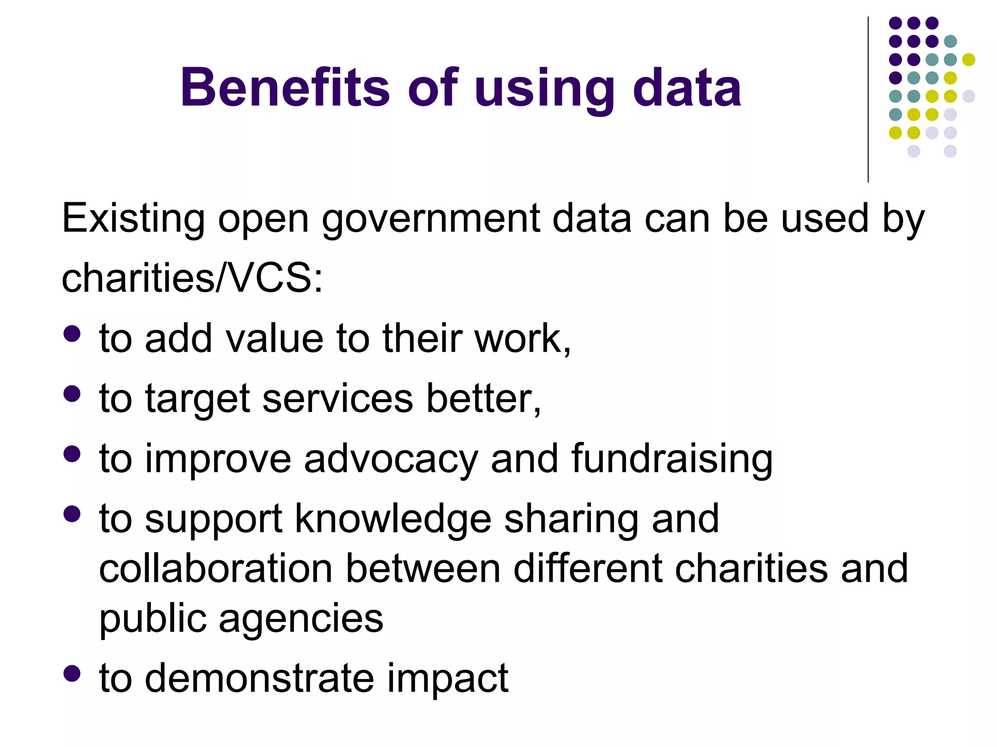
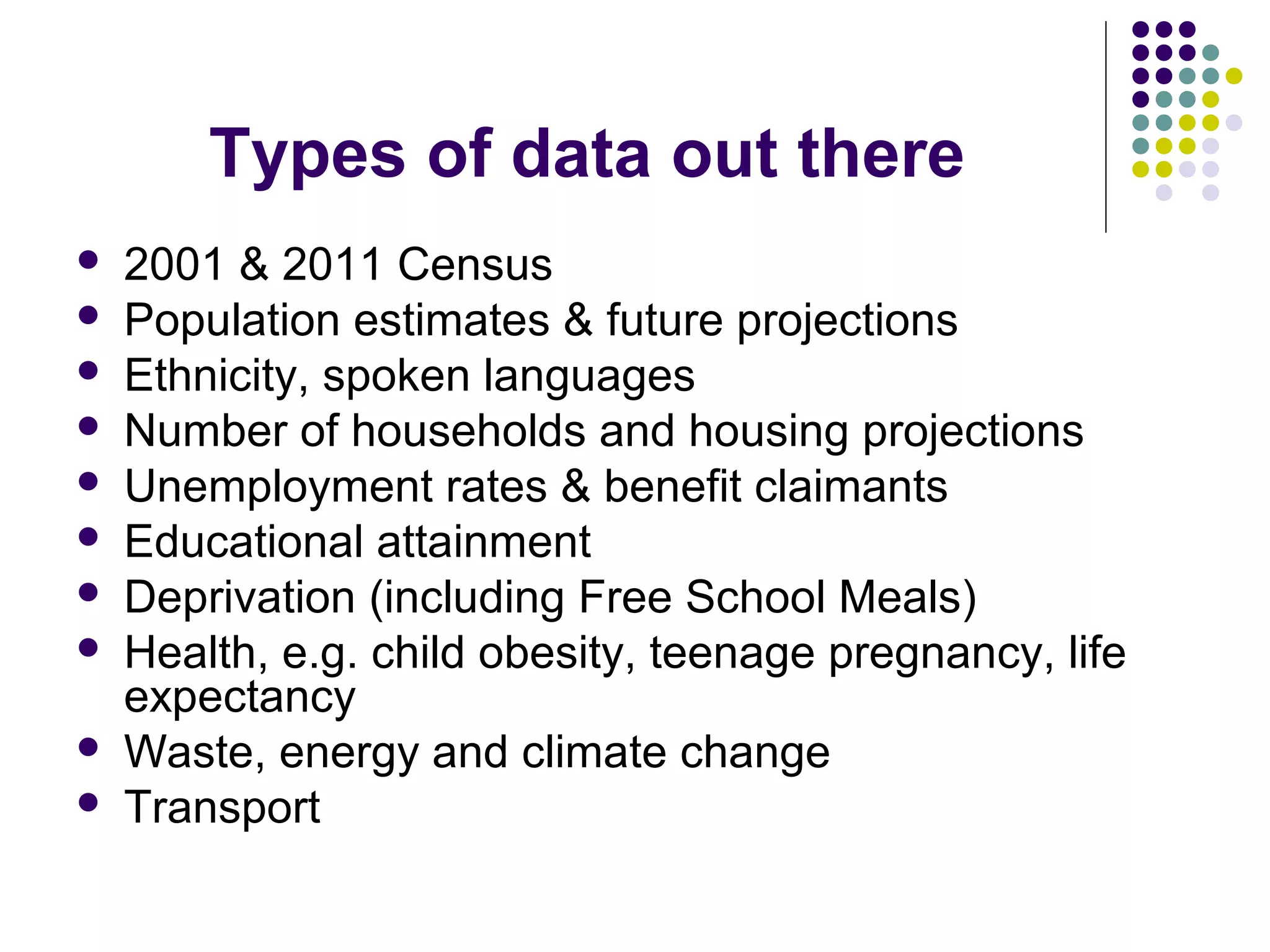
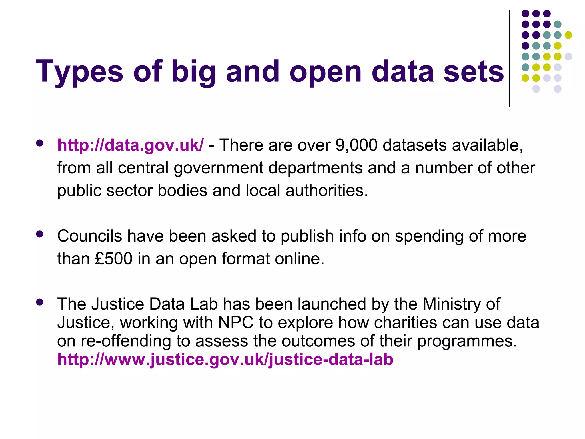
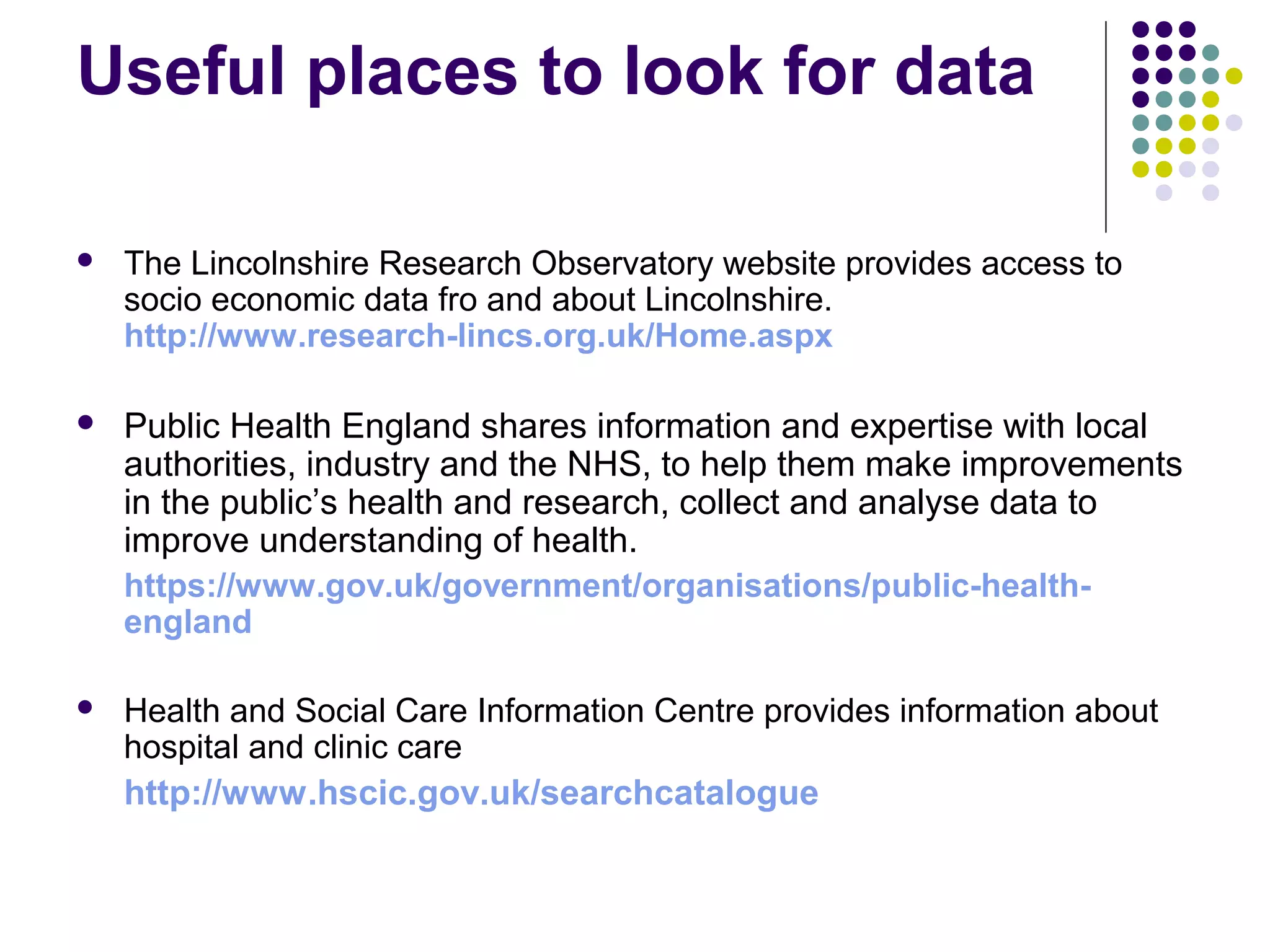
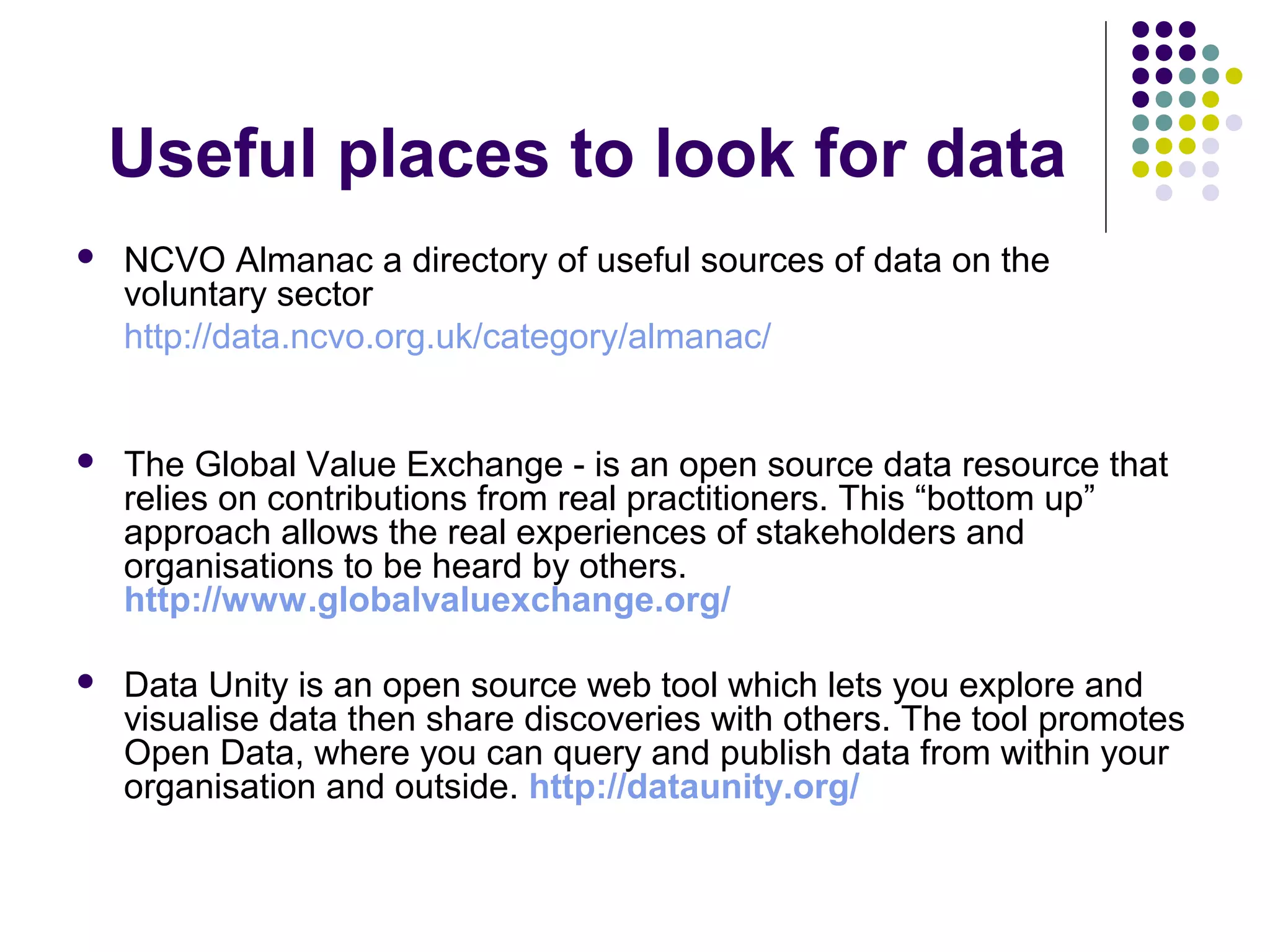
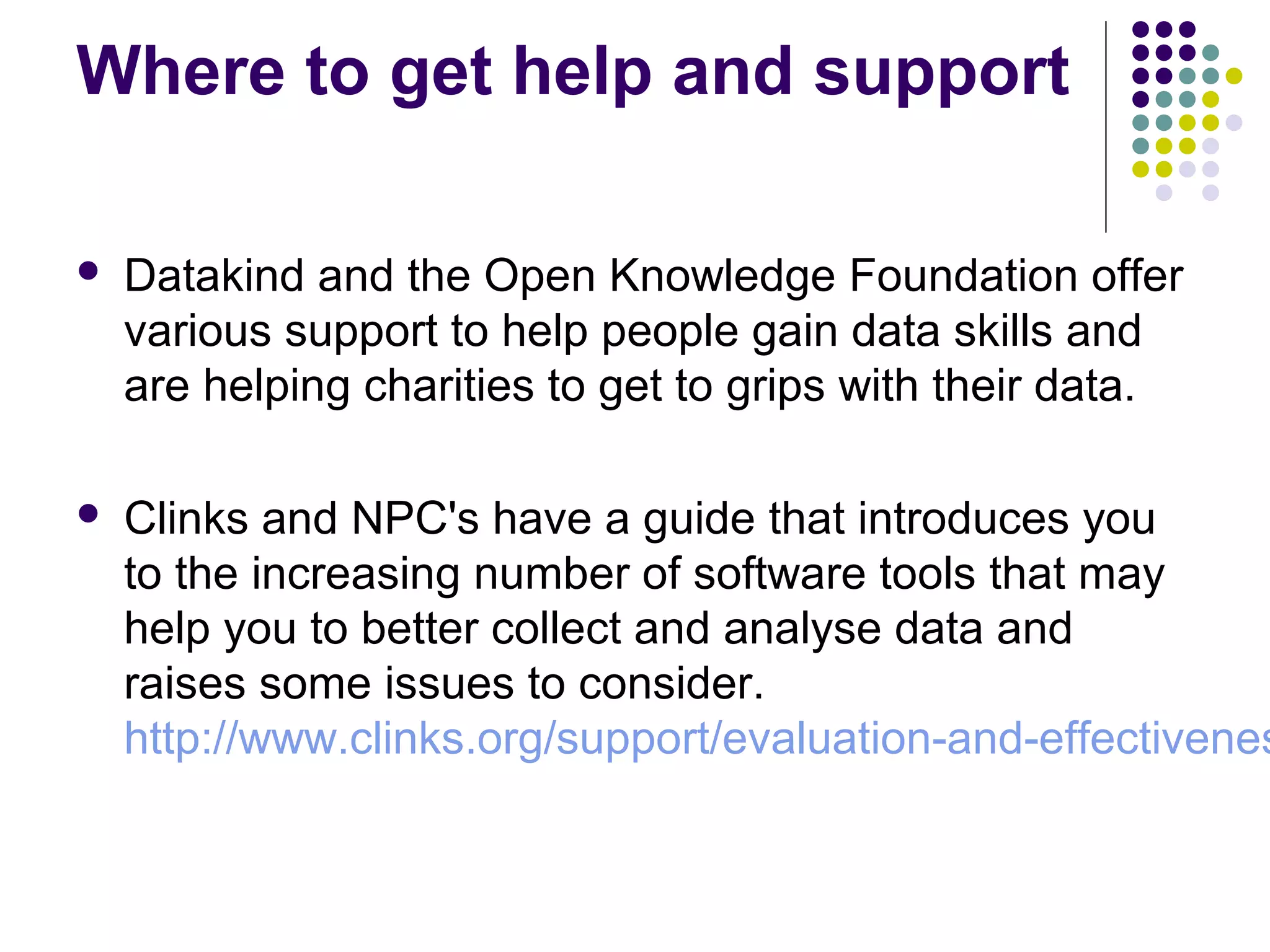
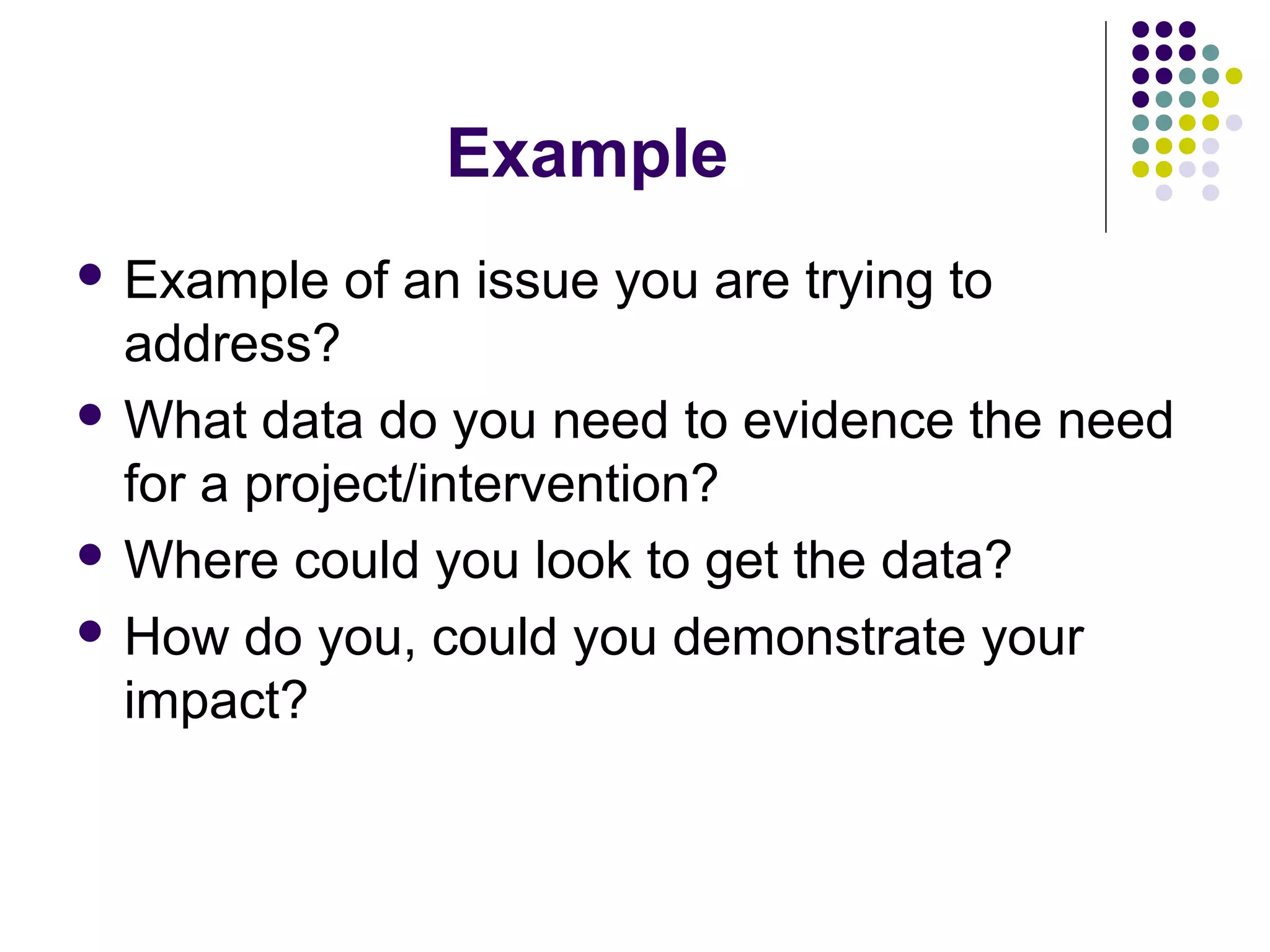
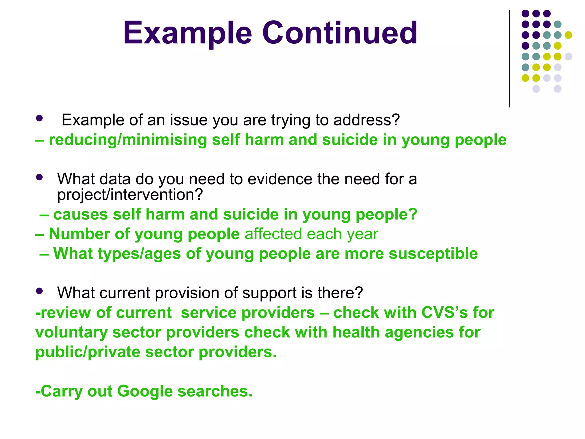
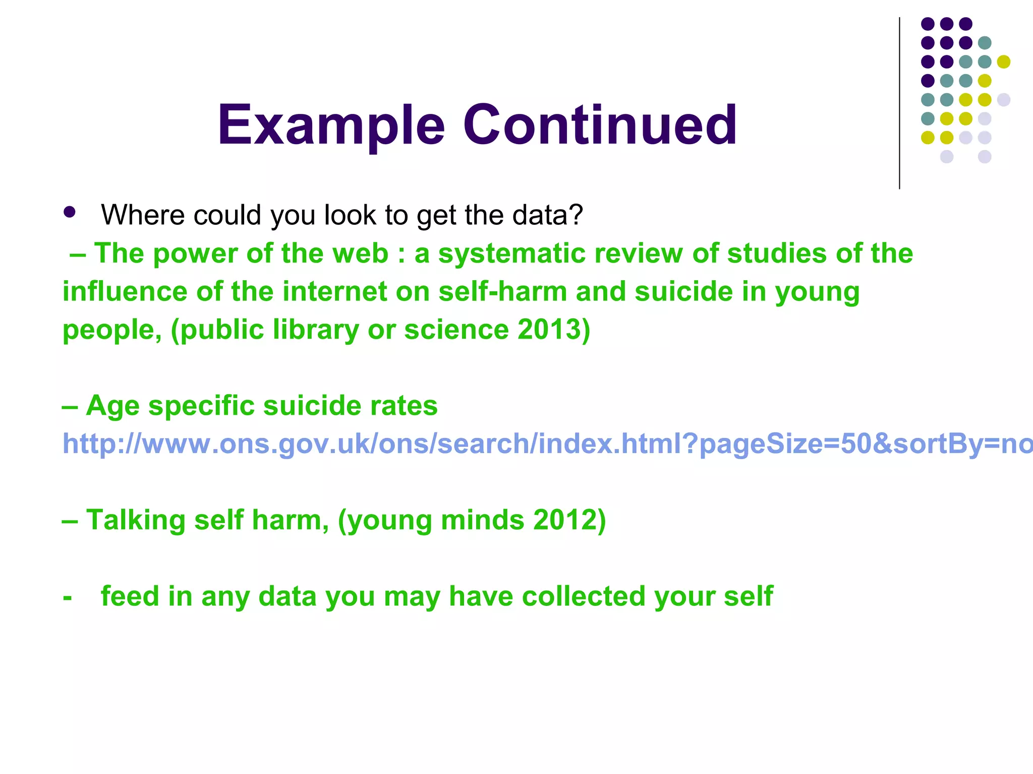
Know your numbers; the 
value of data 
June Gomes 
Providing professional support services to Third Sector 
organisations
What is Data? 
 Sometimes referred to as Big Data 
 Big data – using diverse sources of data sets, some of which 
might be very large and employing mathematical techniques to 
extract new information from them. 
 Open data - Datasets that are made accessible in non 
proprietary formats under licences that permit unrestricted re-use. 
 Open government data involves governments providing many of 
their datasets online in this way
Do we need to crunch 
numbers? 
 “Its is easy to keep on doing things you do because 
that’s what you’ve always done. Data allows you to see if 
its the right thing to do”, (Duncan Ross, Datakind UK) 
 Experience and data: 
 shows what you are doing works 
 Shows you how to do things more effectively 
 Shows you how to do more with the resources you have 
 Private sector been analysing data for years. E.g. Tesco 
Clubcard initiative collects data on its customers 
spending habits and uses it to inform the business
Benefits of using data 
Existing open government data can be used by 
charities/VCS: 
 to add value to their work, 
 to target services better, 
 to improve advocacy and fundraising 
 to support knowledge sharing and 
collaboration between different charities and 
public agencies 
 to demonstrate impact
Types of data out there 
 2001 & 2011 Census 
 Population estimates & future projections 
 Ethnicity, spoken languages 
 Number of households and housing projections 
 Unemployment rates & benefit claimants 
 Educational attainment 
 Deprivation (including Free School Meals) 
 Health, e.g. child obesity, teenage pregnancy, life 
expectancy 
 Waste, energy and climate change 
 Transport
Types of big and open data sets 
 http://data.gov.uk/ - There are over 9,000 datasets available, 
from all central government departments and a number of other 
public sector bodies and local authorities. 
 Councils have been asked to publish info on spending of more 
than £500 in an open format online. 
 The Justice Data Lab has been launched by the Ministry of 
Justice, working with NPC to explore how charities can use data 
on re-offending to assess the outcomes of their programmes. 
http://www.justice.gov.uk/justice-data-lab
Useful places to look for data 
 The Lincolnshire Research Observatory website provides access to 
socio economic data fro and about Lincolnshire. 
http://www.research-lincs.org.uk/Home.aspx 
 Public Health England shares information and expertise with local 
authorities, industry and the NHS, to help them make improvements 
in the public’s health and research, collect and analyse data to 
improve understanding of health. 
https://www.gov.uk/government/organisations/public-health-england 
 Health and Social Care Information Centre provides information about 
hospital and clinic care 
http://www.hscic.gov.uk/searchcatalogue
Useful places to look for data 
 NCVO Almanac a directory of useful sources of data on the 
voluntary sector 
http://data.ncvo.org.uk/category/almanac/ 
 The Global Value Exchange - is an open source data resource that 
relies on contributions from real practitioners. This “bottom up” 
approach allows the real experiences of stakeholders and 
organisations to be heard by others. 
http://www.globalvaluexchange.org/ 
 Data Unity is an open source web tool which lets you explore and 
visualise data then share discoveries with others. The tool promotes 
Open Data, where you can query and publish data from within your 
organisation and outside. http://dataunity.org/
Useful places to look for data 
 NICE Evidence Services are a suite of services that 
provide internet access to high quality authoritative 
evidence and best practice. The services cover 
health, social care and public health evidence. 
https://www.evidence.nhs.uk/ 
 The unit cost database brings together more 
than 600 cost estimates in a single place, most of 
which are national costs derived from 
government reports and academic studies. 
http://data.gov.uk/sib_knowledge_box/toolkit
Case Study: Macmillan Cancer 
Support 
 Macmillan has been able to analyse NHS data 
sets, including cancer registration and mortality 
to create a desktop tool for commissioners to 
plan cancer care in advance in any area of the 
UK. 
 The model developed by the charity predicts 
how many people will be diagnosed with 
cancer, what types they will have, how many 
will die and what their needs will be in 1-3 
years.
Case study: Barnsley Hospice 
Barnsley Hospice provides an example of how data 
can be used to improve fundraising. 
 By linking the postcodes from their donor database 
to local council information on the socio-economic 
profile of neighbourhoods, they are able to tailor 
their fundraising strategy for each area; 
 For example, by marketing small pledges for lower 
income areas and corporate giving where 
businesses are located
Barriers 
 Realistic about the sectors knowledge, skills and 
capacity to work with data 
 Understanding how and where to access big data 
sets. 
 Measuring impact can be hard and a if there is lack of 
human resources and capacity for some VCS 
organisations to do this. 
 Do the benefits outweigh the costs?
Where to get help and support 
 Datakind and the Open Knowledge Foundation offer 
various support to help people gain data skills and 
are helping charities to get to grips with their data. 
 Clinks and NPC's have a guide that introduces you 
to the increasing number of software tools that may 
help you to better collect and analyse data and 
raises some issues to consider. 
http://www.clinks.org/support/evaluation-and-effectiveness
Example 
 Example of an issue you are trying to 
address? 
What data do you need to evidence the need 
for a project/intervention? 
Where could you look to get the data? 
 How do you, could you demonstrate your 
impact?
Example Continued 
 Example of an issue you are trying to address? 
– reducing/minimising self harm and suicide in young people 
 What data do you need to evidence the need for a 
project/intervention? 
– causes self harm and suicide in young people? 
– Number of young people affected each year 
– What types/ages of young people are more susceptible 
 What current provision of support is there? 
-review of current service providers – check with CVS’s for 
voluntary sector providers check with health agencies for 
public/private sector providers. 
-Carry out Google searches.
Example Continued 
 Where could you look to get the data? 
– The power of the web : a systematic review of studies of the 
influence of the internet on self-harm and suicide in young 
people, (public library or science 2013) 
– Age specific suicide rates 
http://www.ons.gov.uk/ons/search/index.html?pageSize=50&sortBy=none&– Talking self harm, (young minds 2012) 
- feed in any data you may have collected your self
Example Continued 
 How do you, could you demonstrate your impact? 
– Cost savings of hospital admissions/camhs 
referrals/GP visits - CG133 Self-harm (longer 
term management): full guideline (NICE 2011) 
– Increased health and emotional wellbeing in to 
adulthood – Increased attendance at school 
/colleges
What are infographics 
 Infographics (a blend of information and 
graphics) are a visually attractive way of 
displaying (often complex) data. 
 An infographic can display a whole variety of 
data, from charts and graphs to timelines and 
flow diagrams.
Examples of Infographics 
 http://www.google.com/think/images/online-consumption- https://www.delineo.com/wp-content/uploads/2013/ http://theceword.files.wordpress.com/2013/08/20130828-
What type of infographic could you use? 
If you want your infographic to be both effective and widely distributed, you need to create the 
right type of infographic for your particular purpose. The major types are: 
 Data visualization is a visual representation of data or the practice of visualizing 
data. Data visualizations enable people to detect trends, patterns, and outliers 
and could include word clouds, maps, and bar graphs. 
 http://cdn2.business2community.com/wp-content/uploads/2013/01/The-Biggest-Shift-infographic- Narrative infographics guide the viewer through a series of information—often 
in a chronological order—that tells a story. Infographics that explore the history of 
a discipline is a common example. 
http://milesbakerclarke.files.wordpress.com/2012/11/media_httpcachegawker_mxaar-scaled1000. 
jpg 
 Information design is a type of infographic that focuses on the display of 
information efficiently and effectively, communicating a message clearly and 
universally. Examples include flowcharts, organizational diagrams, and 
anatomical illustrations. 
http://lish-55.deviantart.com/art/Panda-Infographic-142628025
What are the benefits of creating 
infographics? 
Just like any marketing asset, an infographic has its 
time and place. They work well for the following: 
 Driving traffic 
 Increasing project/campaign/brand awareness 
 Communicating results/impact externally 
 Communicating results/impact internally
What if I Don’t Have Good Design 
Skills? 
No problem! There are plenty of websites requiring little to no technical knowledge 
that can generate infographics out of your data (FREE). 
 Piktochart: Billed as an infographics and presentation tool for non-designers, 
this software gives you access to themes, interactive charts, and customization 
tools. 
 Visual.ly: This service’s free data visualization tools can help you create 
infographics from a handful of themes in a matter of seconds. 
 Infogr.am: With more than 30 chart types, this free tool allows you to edit data, 
customize images, and instantly download and share your infographic. 
 Easle.ly: Still in its public beta, this site boasts thousands of what it calls 
“vhemes” (short for visual themes) that can be used to create your own 
infographic. 
 For interactive timelines, try Timeline JS or Wordle if you’re interested in 
creating ‘word clouds’.
Using PowerPoint to create infographics 
 http://blog.gcflearnfree.org/2012/09/10/creatin 
g-graphics-with-powerpoint/
Example of Infographic created in PowerPoint
Thank you!!

Using data effectively worskhop presentation

  • 1.
    Know your numbers;the value of data June Gomes Providing professional support services to Third Sector organisations
  • 2.
    What is Data?  Sometimes referred to as Big Data  Big data – using diverse sources of data sets, some of which might be very large and employing mathematical techniques to extract new information from them.  Open data - Datasets that are made accessible in non proprietary formats under licences that permit unrestricted re-use.  Open government data involves governments providing many of their datasets online in this way
  • 3.
    Do we needto crunch numbers?  “Its is easy to keep on doing things you do because that’s what you’ve always done. Data allows you to see if its the right thing to do”, (Duncan Ross, Datakind UK)  Experience and data:  shows what you are doing works  Shows you how to do things more effectively  Shows you how to do more with the resources you have  Private sector been analysing data for years. E.g. Tesco Clubcard initiative collects data on its customers spending habits and uses it to inform the business
  • 4.
    Benefits of usingdata Existing open government data can be used by charities/VCS:  to add value to their work,  to target services better,  to improve advocacy and fundraising  to support knowledge sharing and collaboration between different charities and public agencies  to demonstrate impact
  • 5.
    Types of dataout there  2001 & 2011 Census  Population estimates & future projections  Ethnicity, spoken languages  Number of households and housing projections  Unemployment rates & benefit claimants  Educational attainment  Deprivation (including Free School Meals)  Health, e.g. child obesity, teenage pregnancy, life expectancy  Waste, energy and climate change  Transport
  • 6.
    Types of bigand open data sets  http://data.gov.uk/ - There are over 9,000 datasets available, from all central government departments and a number of other public sector bodies and local authorities.  Councils have been asked to publish info on spending of more than £500 in an open format online.  The Justice Data Lab has been launched by the Ministry of Justice, working with NPC to explore how charities can use data on re-offending to assess the outcomes of their programmes. http://www.justice.gov.uk/justice-data-lab
  • 7.
    Useful places tolook for data  The Lincolnshire Research Observatory website provides access to socio economic data fro and about Lincolnshire. http://www.research-lincs.org.uk/Home.aspx  Public Health England shares information and expertise with local authorities, industry and the NHS, to help them make improvements in the public’s health and research, collect and analyse data to improve understanding of health. https://www.gov.uk/government/organisations/public-health-england  Health and Social Care Information Centre provides information about hospital and clinic care http://www.hscic.gov.uk/searchcatalogue
  • 8.
    Useful places tolook for data  NCVO Almanac a directory of useful sources of data on the voluntary sector http://data.ncvo.org.uk/category/almanac/  The Global Value Exchange - is an open source data resource that relies on contributions from real practitioners. This “bottom up” approach allows the real experiences of stakeholders and organisations to be heard by others. http://www.globalvaluexchange.org/  Data Unity is an open source web tool which lets you explore and visualise data then share discoveries with others. The tool promotes Open Data, where you can query and publish data from within your organisation and outside. http://dataunity.org/
  • 9.
    Useful places tolook for data  NICE Evidence Services are a suite of services that provide internet access to high quality authoritative evidence and best practice. The services cover health, social care and public health evidence. https://www.evidence.nhs.uk/  The unit cost database brings together more than 600 cost estimates in a single place, most of which are national costs derived from government reports and academic studies. http://data.gov.uk/sib_knowledge_box/toolkit
  • 10.
    Case Study: MacmillanCancer Support  Macmillan has been able to analyse NHS data sets, including cancer registration and mortality to create a desktop tool for commissioners to plan cancer care in advance in any area of the UK.  The model developed by the charity predicts how many people will be diagnosed with cancer, what types they will have, how many will die and what their needs will be in 1-3 years.
  • 11.
    Case study: BarnsleyHospice Barnsley Hospice provides an example of how data can be used to improve fundraising.  By linking the postcodes from their donor database to local council information on the socio-economic profile of neighbourhoods, they are able to tailor their fundraising strategy for each area;  For example, by marketing small pledges for lower income areas and corporate giving where businesses are located
  • 12.
    Barriers  Realisticabout the sectors knowledge, skills and capacity to work with data  Understanding how and where to access big data sets.  Measuring impact can be hard and a if there is lack of human resources and capacity for some VCS organisations to do this.  Do the benefits outweigh the costs?
  • 13.
    Where to gethelp and support  Datakind and the Open Knowledge Foundation offer various support to help people gain data skills and are helping charities to get to grips with their data.  Clinks and NPC's have a guide that introduces you to the increasing number of software tools that may help you to better collect and analyse data and raises some issues to consider. http://www.clinks.org/support/evaluation-and-effectiveness
  • 14.
    Example  Exampleof an issue you are trying to address? What data do you need to evidence the need for a project/intervention? Where could you look to get the data?  How do you, could you demonstrate your impact?
  • 15.
    Example Continued Example of an issue you are trying to address? – reducing/minimising self harm and suicide in young people  What data do you need to evidence the need for a project/intervention? – causes self harm and suicide in young people? – Number of young people affected each year – What types/ages of young people are more susceptible  What current provision of support is there? -review of current service providers – check with CVS’s for voluntary sector providers check with health agencies for public/private sector providers. -Carry out Google searches.
  • 16.
    Example Continued Where could you look to get the data? – The power of the web : a systematic review of studies of the influence of the internet on self-harm and suicide in young people, (public library or science 2013) – Age specific suicide rates http://www.ons.gov.uk/ons/search/index.html?pageSize=50&sortBy=none&– Talking self harm, (young minds 2012) - feed in any data you may have collected your self
  • 17.
    Example Continued How do you, could you demonstrate your impact? – Cost savings of hospital admissions/camhs referrals/GP visits - CG133 Self-harm (longer term management): full guideline (NICE 2011) – Increased health and emotional wellbeing in to adulthood – Increased attendance at school /colleges
  • 18.
    What are infographics  Infographics (a blend of information and graphics) are a visually attractive way of displaying (often complex) data.  An infographic can display a whole variety of data, from charts and graphs to timelines and flow diagrams.
  • 19.
    Examples of Infographics  http://www.google.com/think/images/online-consumption- https://www.delineo.com/wp-content/uploads/2013/ http://theceword.files.wordpress.com/2013/08/20130828-
  • 20.
    What type ofinfographic could you use? If you want your infographic to be both effective and widely distributed, you need to create the right type of infographic for your particular purpose. The major types are:  Data visualization is a visual representation of data or the practice of visualizing data. Data visualizations enable people to detect trends, patterns, and outliers and could include word clouds, maps, and bar graphs.  http://cdn2.business2community.com/wp-content/uploads/2013/01/The-Biggest-Shift-infographic- Narrative infographics guide the viewer through a series of information—often in a chronological order—that tells a story. Infographics that explore the history of a discipline is a common example. http://milesbakerclarke.files.wordpress.com/2012/11/media_httpcachegawker_mxaar-scaled1000. jpg  Information design is a type of infographic that focuses on the display of information efficiently and effectively, communicating a message clearly and universally. Examples include flowcharts, organizational diagrams, and anatomical illustrations. http://lish-55.deviantart.com/art/Panda-Infographic-142628025
  • 21.
    What are thebenefits of creating infographics? Just like any marketing asset, an infographic has its time and place. They work well for the following:  Driving traffic  Increasing project/campaign/brand awareness  Communicating results/impact externally  Communicating results/impact internally
  • 22.
    What if IDon’t Have Good Design Skills? No problem! There are plenty of websites requiring little to no technical knowledge that can generate infographics out of your data (FREE).  Piktochart: Billed as an infographics and presentation tool for non-designers, this software gives you access to themes, interactive charts, and customization tools.  Visual.ly: This service’s free data visualization tools can help you create infographics from a handful of themes in a matter of seconds.  Infogr.am: With more than 30 chart types, this free tool allows you to edit data, customize images, and instantly download and share your infographic.  Easle.ly: Still in its public beta, this site boasts thousands of what it calls “vhemes” (short for visual themes) that can be used to create your own infographic.  For interactive timelines, try Timeline JS or Wordle if you’re interested in creating ‘word clouds’.
  • 23.
    Using PowerPoint tocreate infographics  http://blog.gcflearnfree.org/2012/09/10/creatin g-graphics-with-powerpoint/
  • 24.
    Example of Infographiccreated in PowerPoint
  • 25.

Editor's Notes

  • #3 IT company IBM estimates 2.5 quintillion bytes of data are created every day
  • #4 Why is open data so important? Data has been referred to as the new raw material of the twenty-first century. And like any other raw material, it needs investment to locate, extract and refine it before it yields value. Used wisely, data creates opportunities for organisations to make more robust decisions, uncover cost savings and get to know their customers better. DataKind™ is a community of pioneering data scientists, visionary changemakers, community builders, and social innovators with the talent, commitment and energy to open the door and show us the way. Headquartered in New York City, we have Chapters in Bangalore, Dublin, San Francisco, Singapore, the UK and Washington DC.
  • #19 In the past few years, infographics have taken off, fuelled by the increasing availability of large datasets and the social web’s hunger for compelling images. It is no wonder more marketers are using this tool in their campaigns, since infographics can concisely convey crucial information in an appealing and shareable form.
  • #22 Driving traffic. Infographics can boost SEO and help drive traffic to your site. Increasing brand awareness. Because of their potential to go viral on social media, infographics can help spread buzz about your brand. When done right, they can help get the attention of potential customers. As they are not primarily sales tools, infographics are better used for campaigns meant to fill the top of the marketing funnel.  Communicating results externally. Infographics can be a great alternative to your typical PowerPoint presentations. Communicating results internally: Internally, infographics can also be used to summarize team achievements after each quarter or after a campaign.