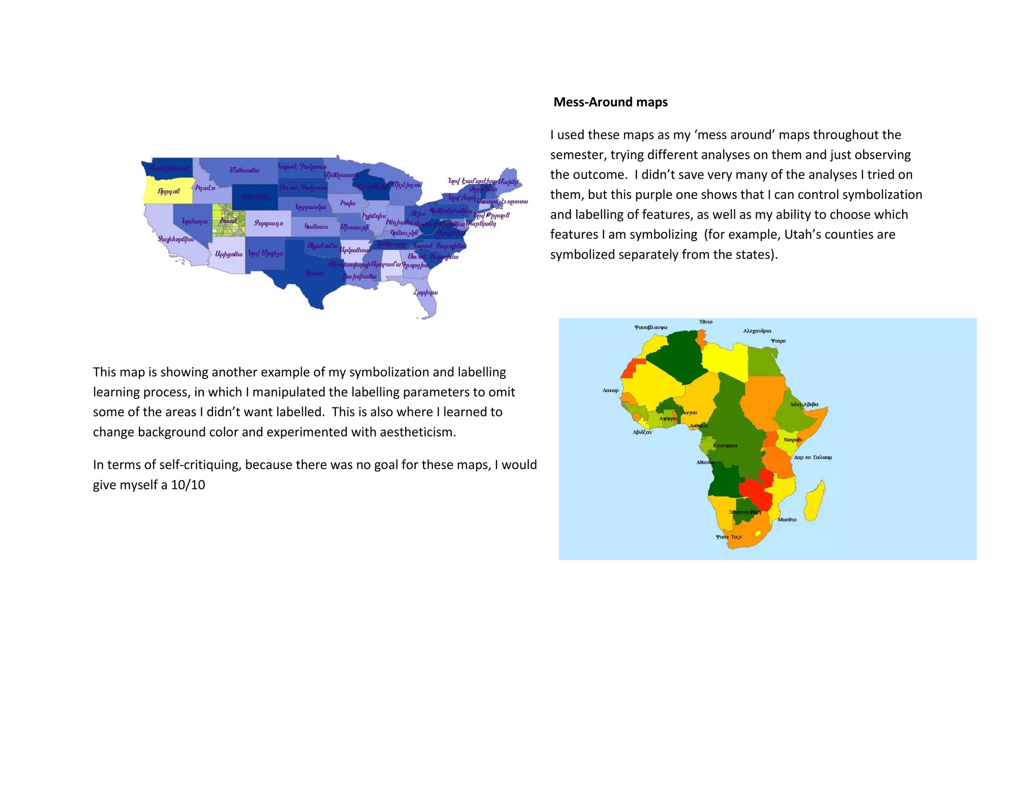
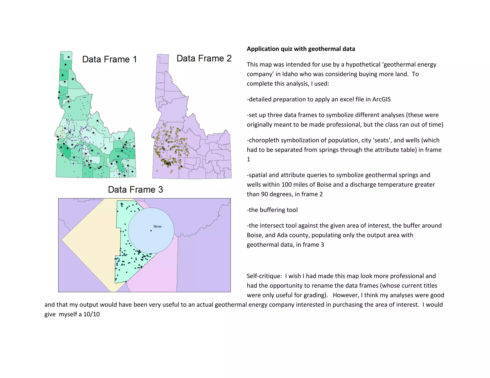
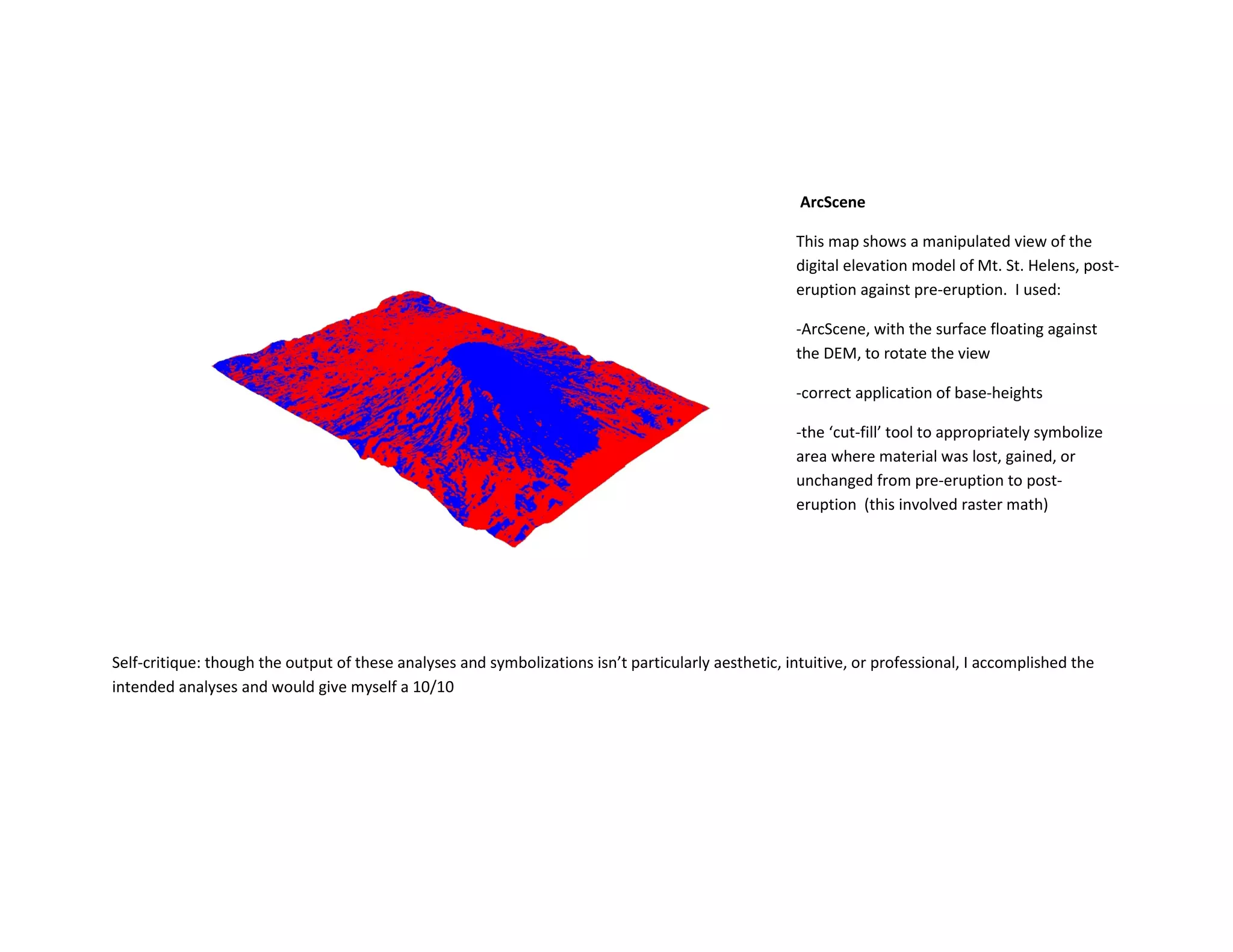
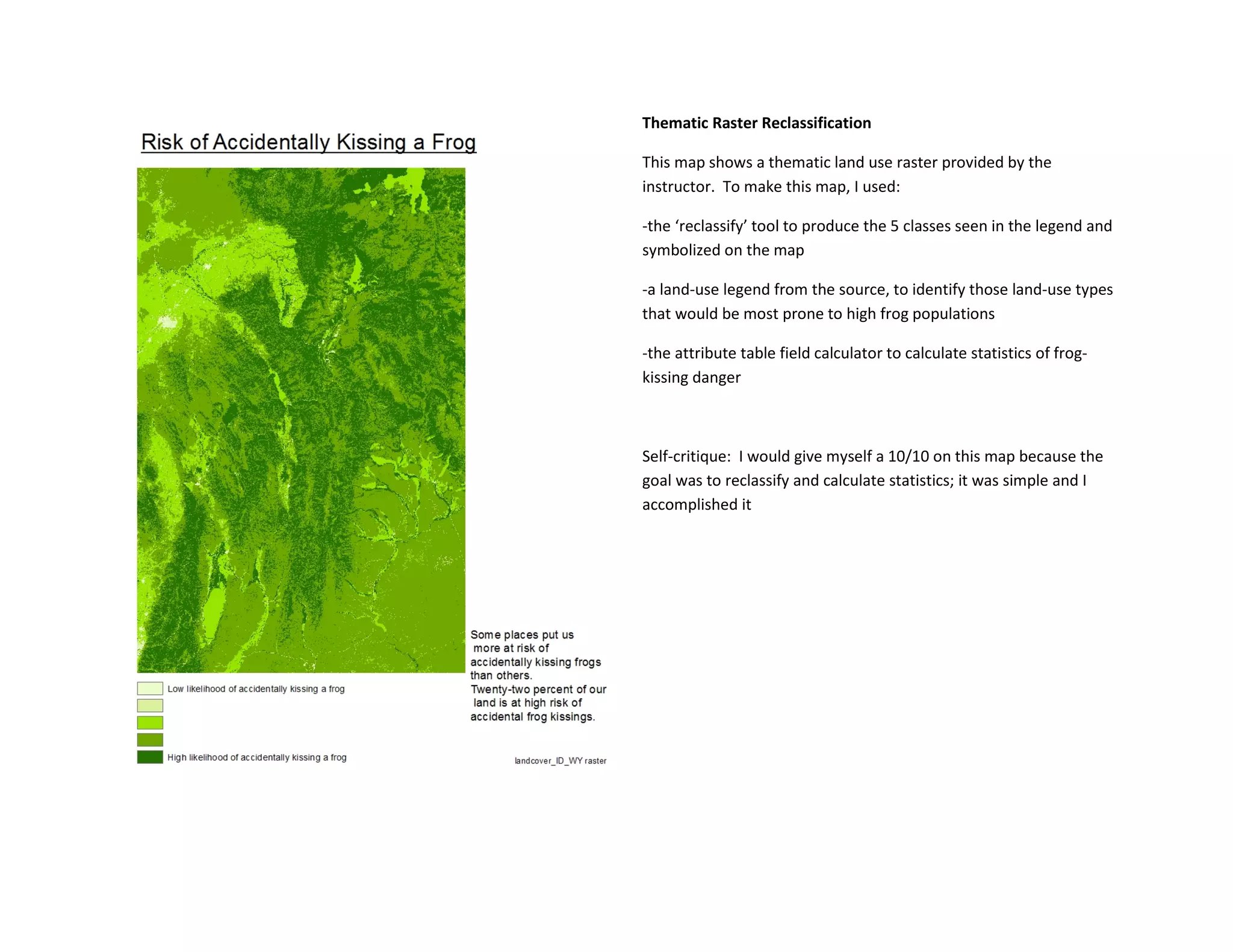
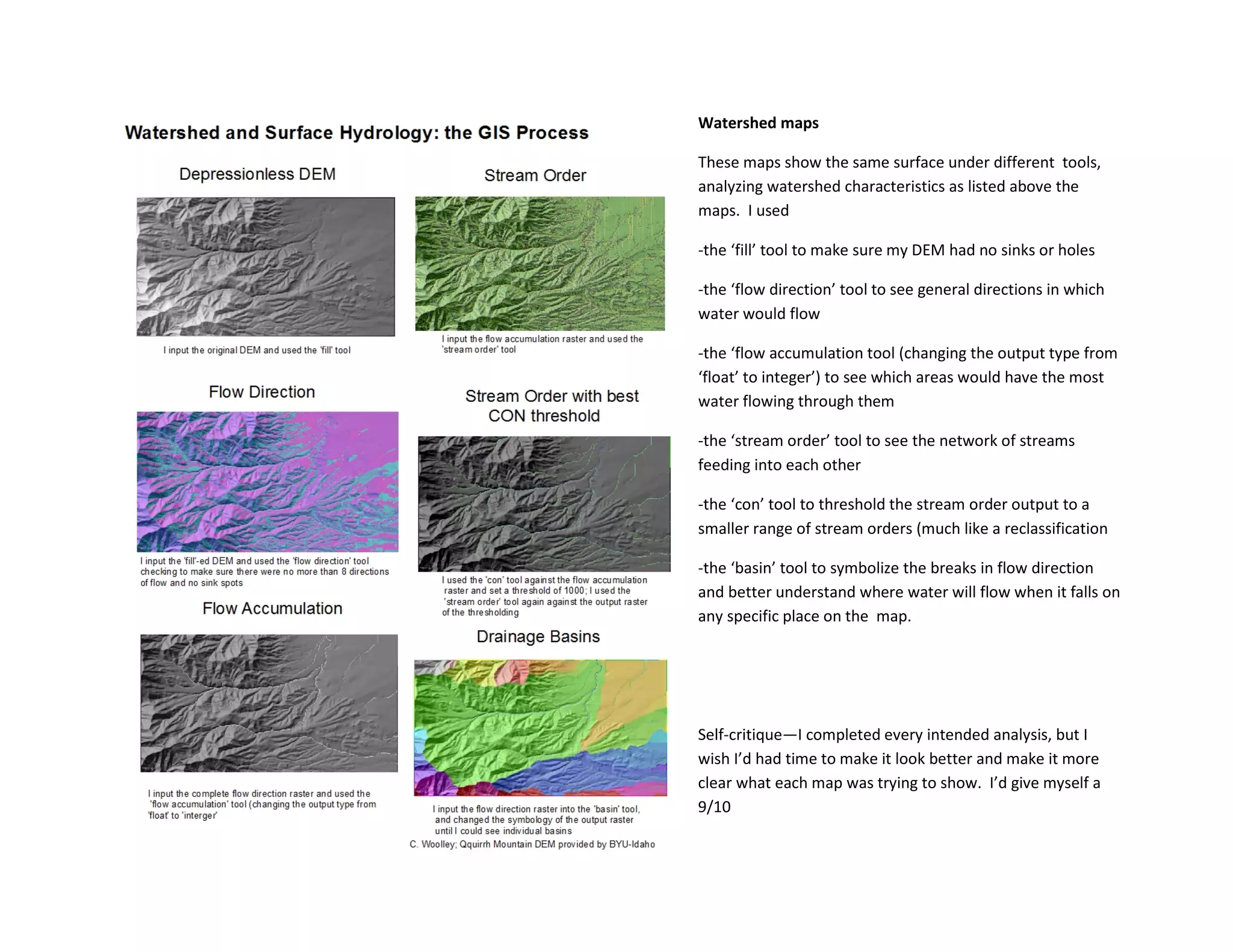
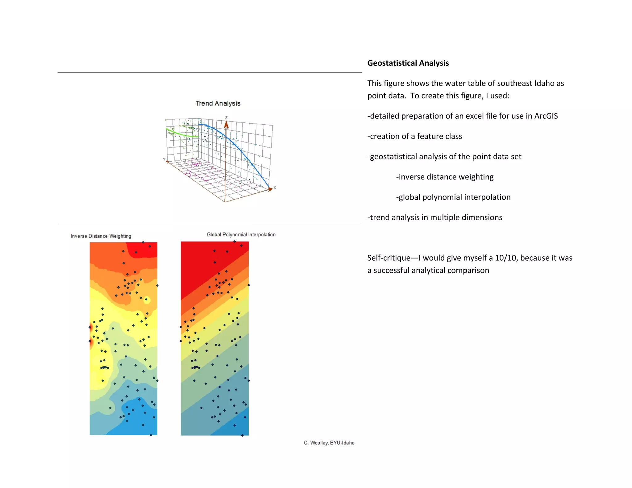
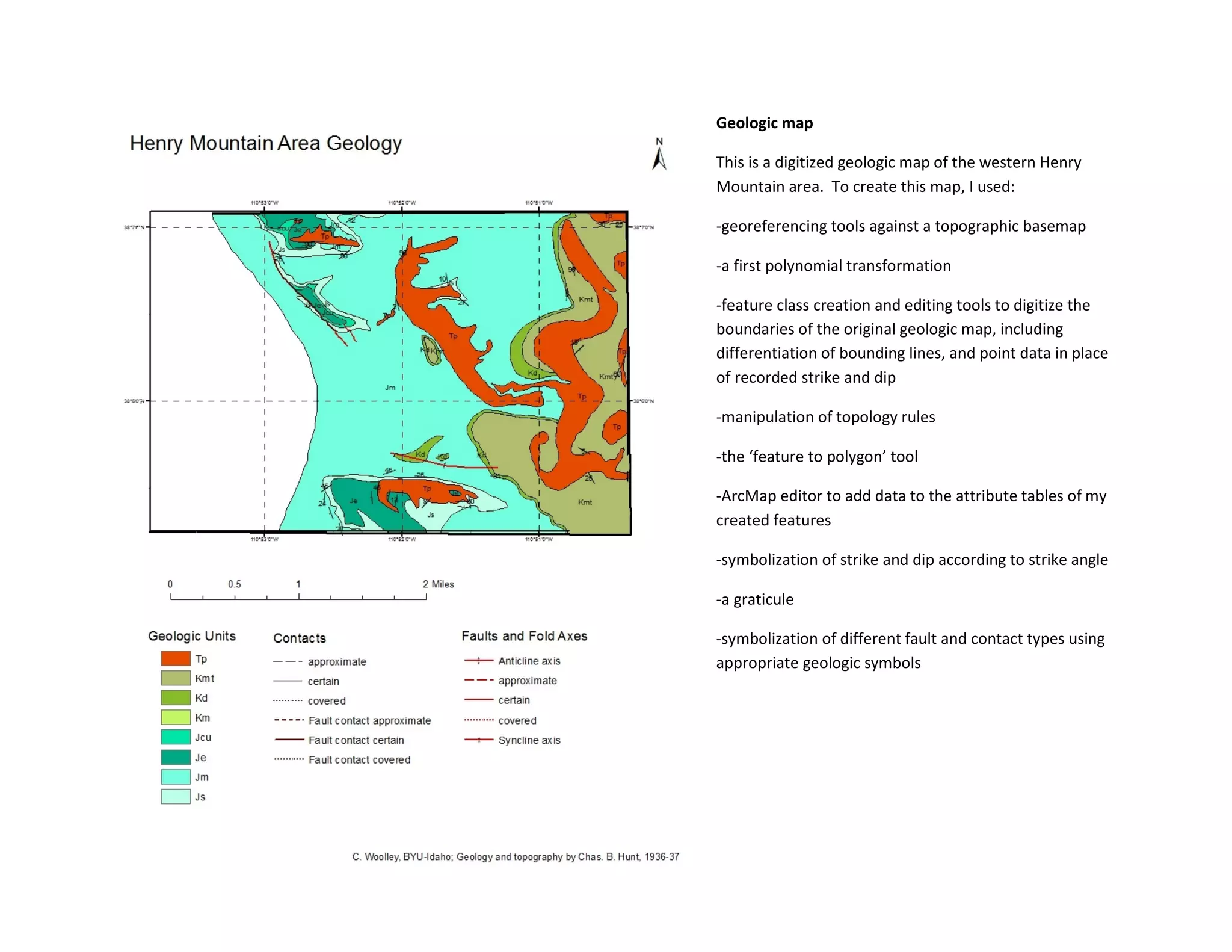
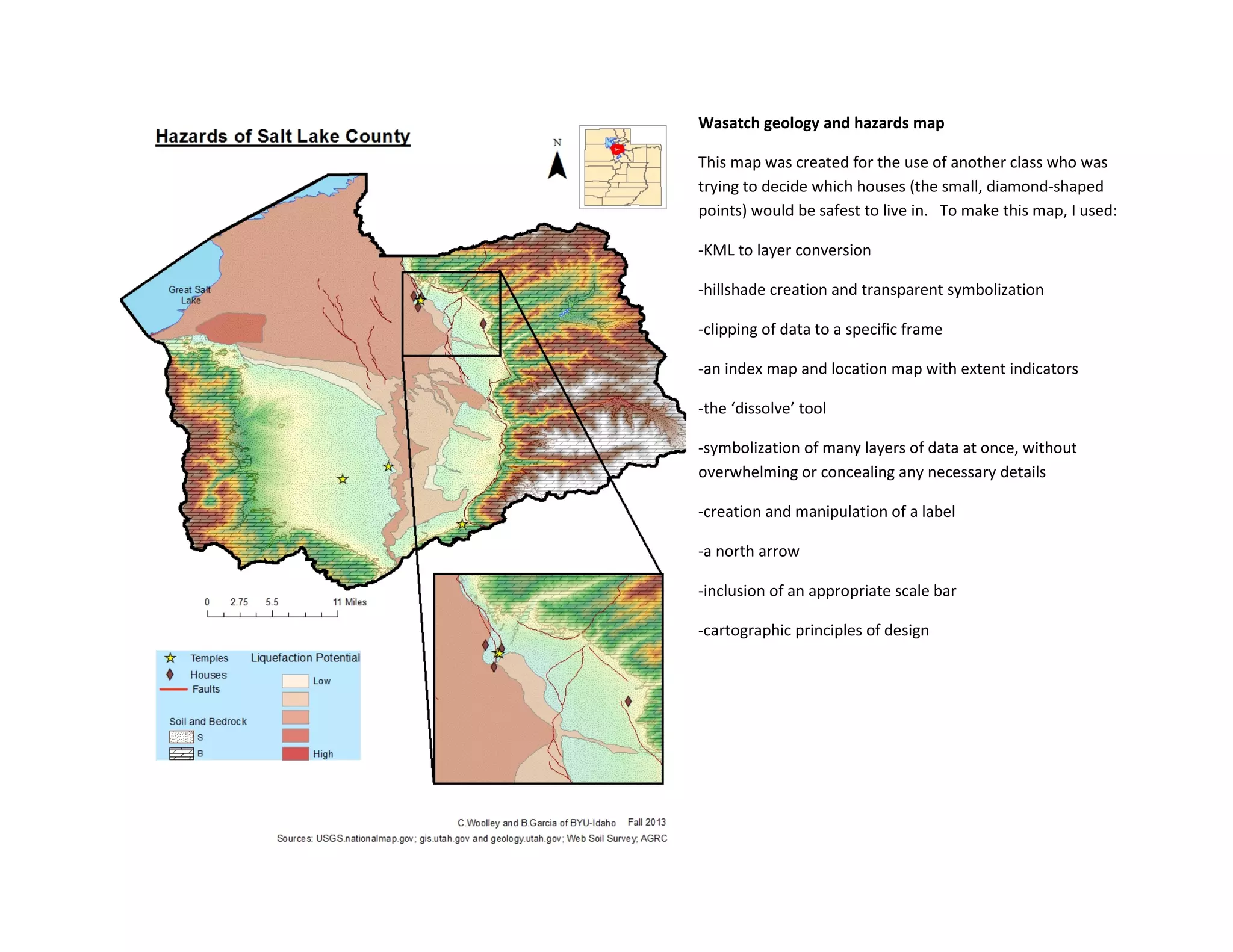
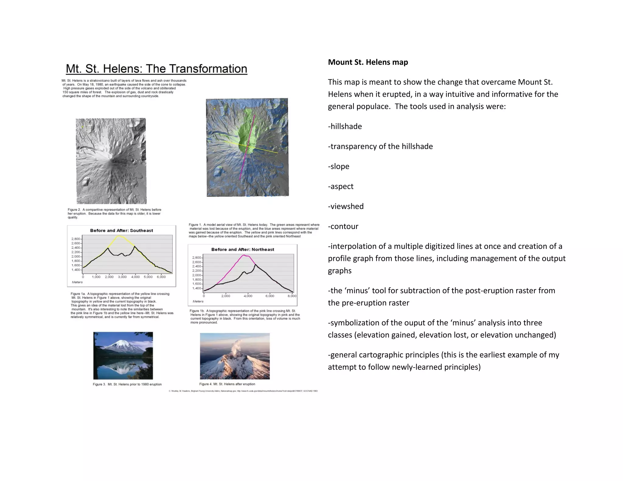
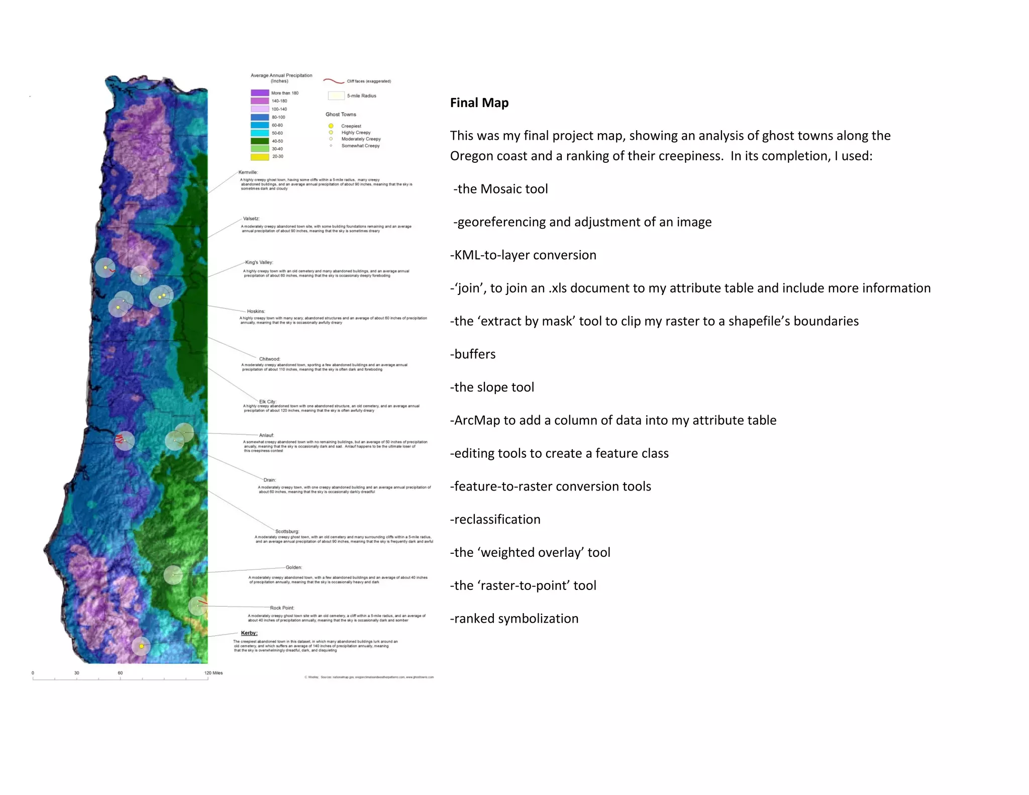
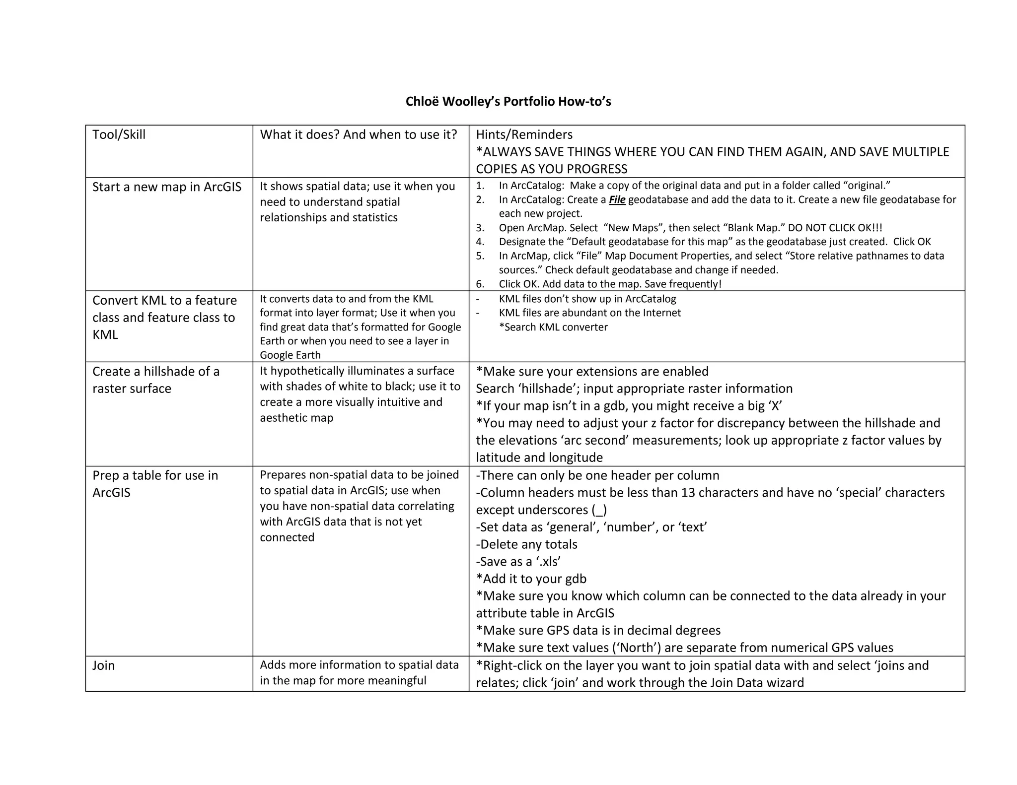
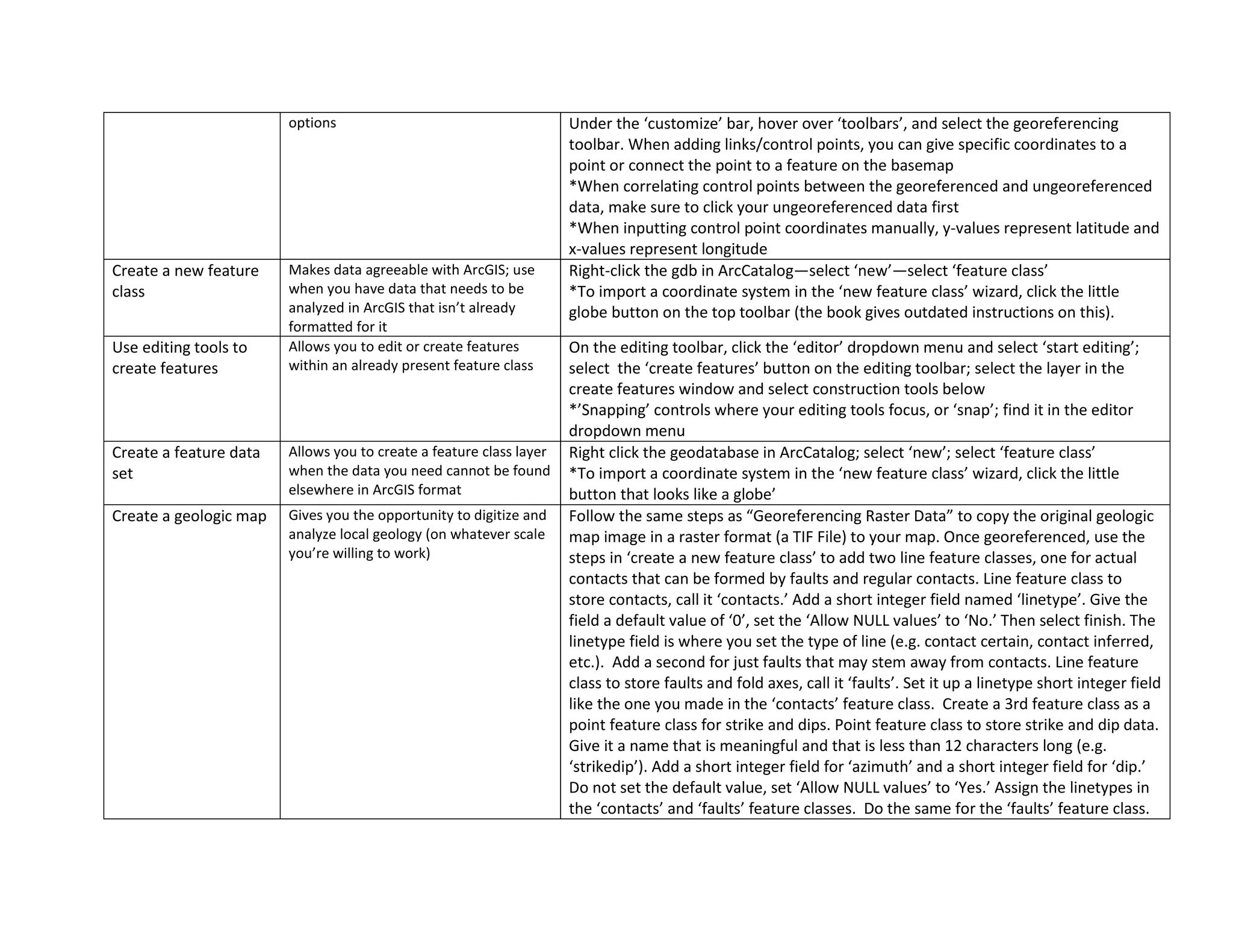
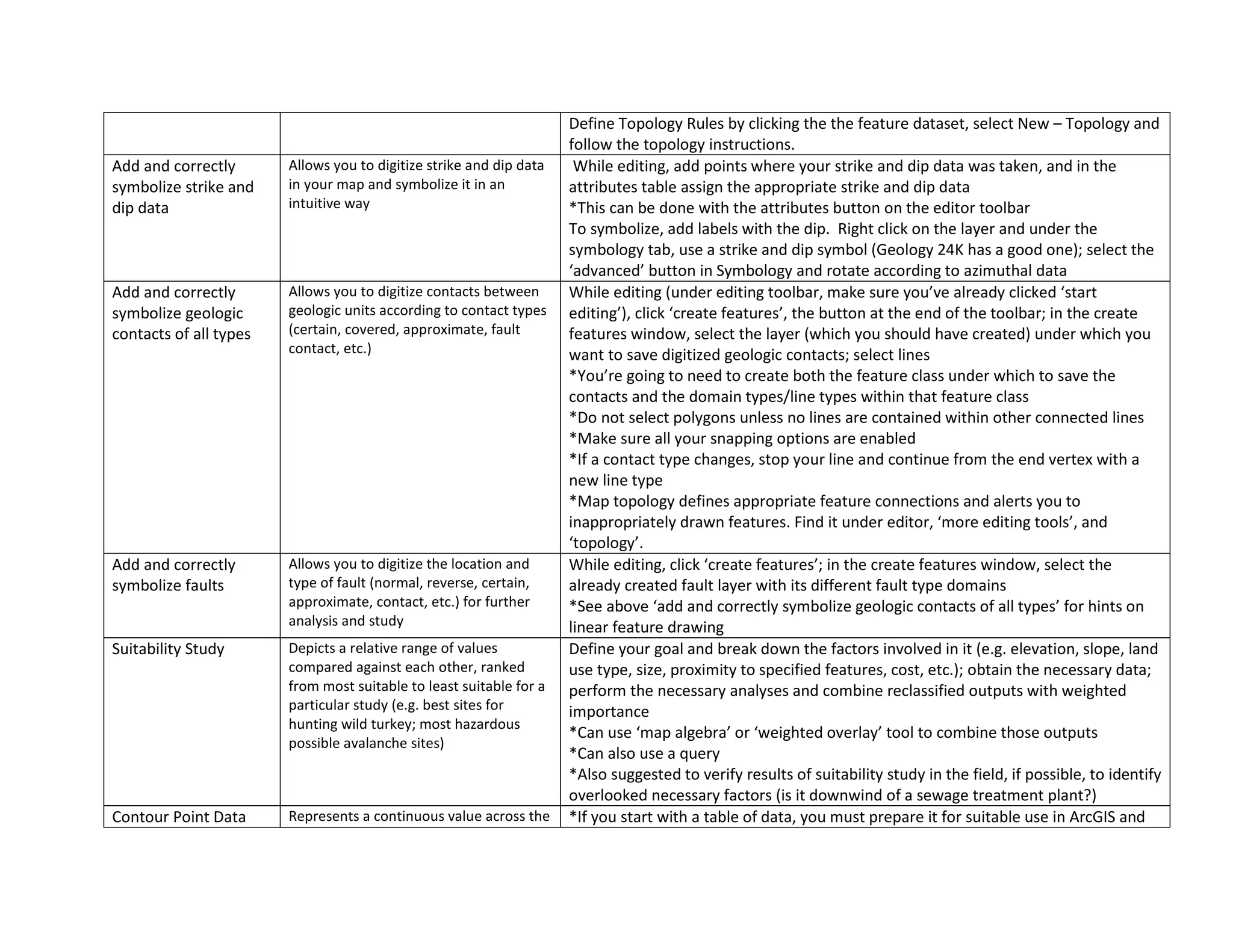
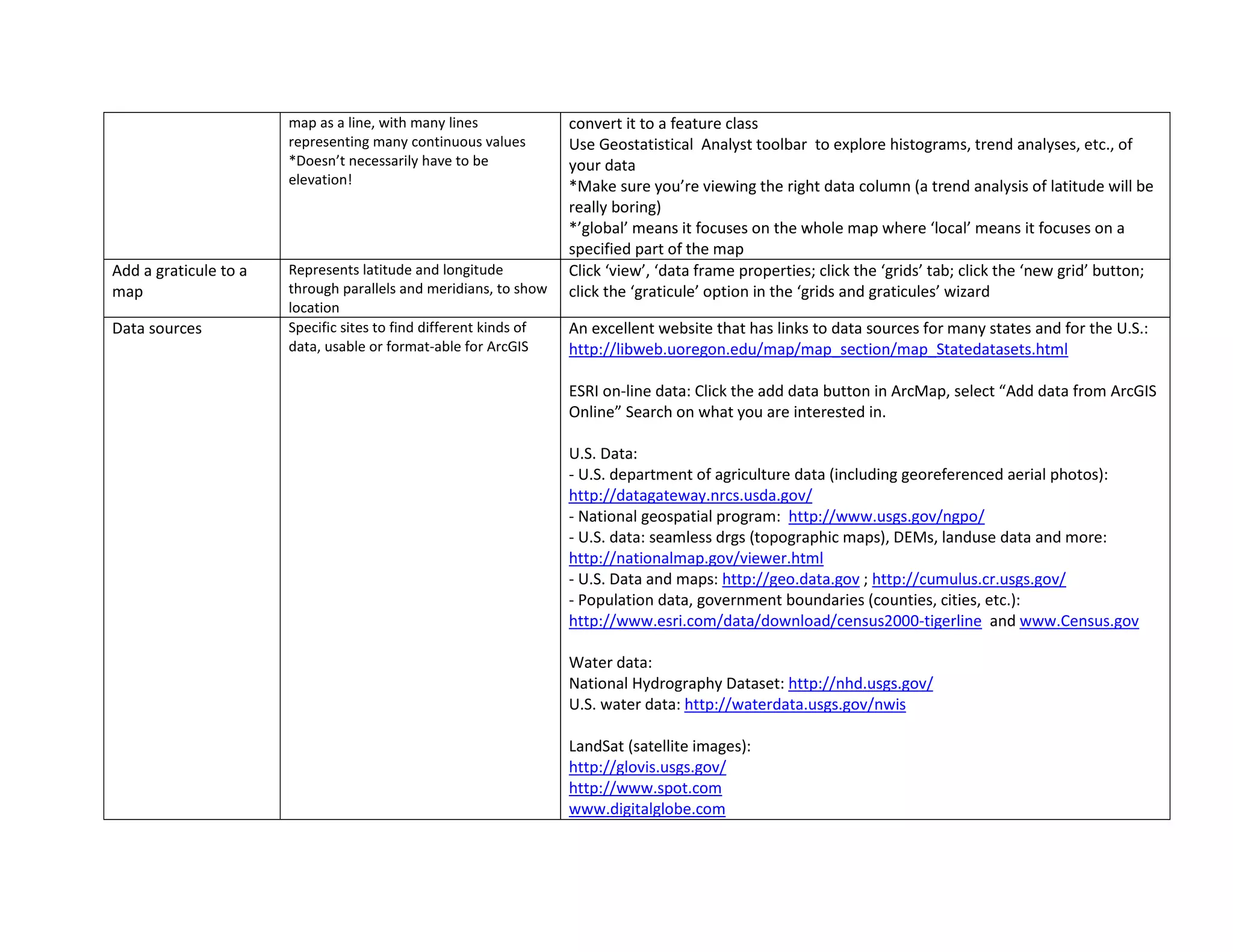
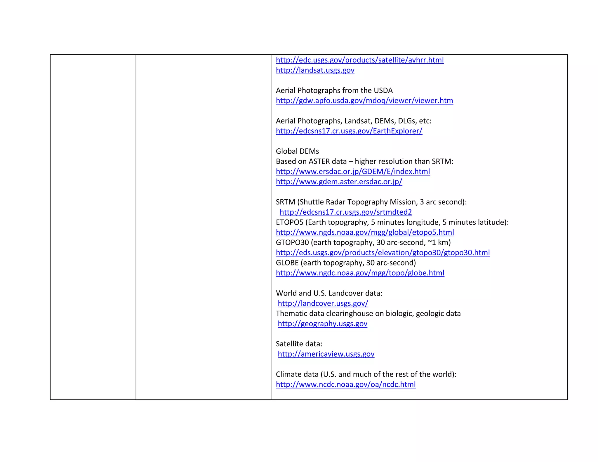
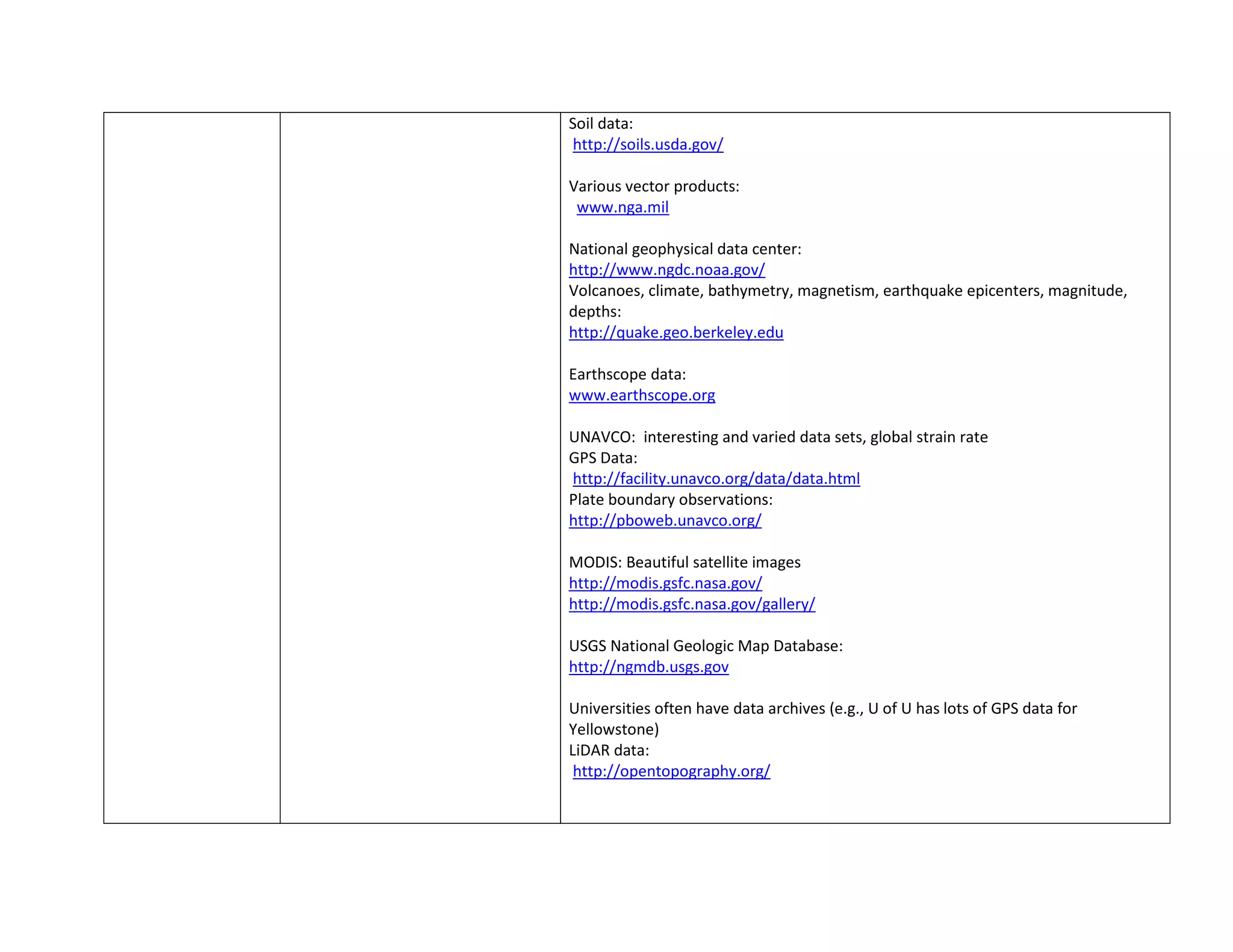
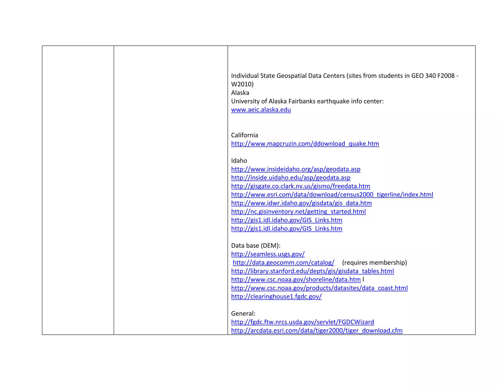
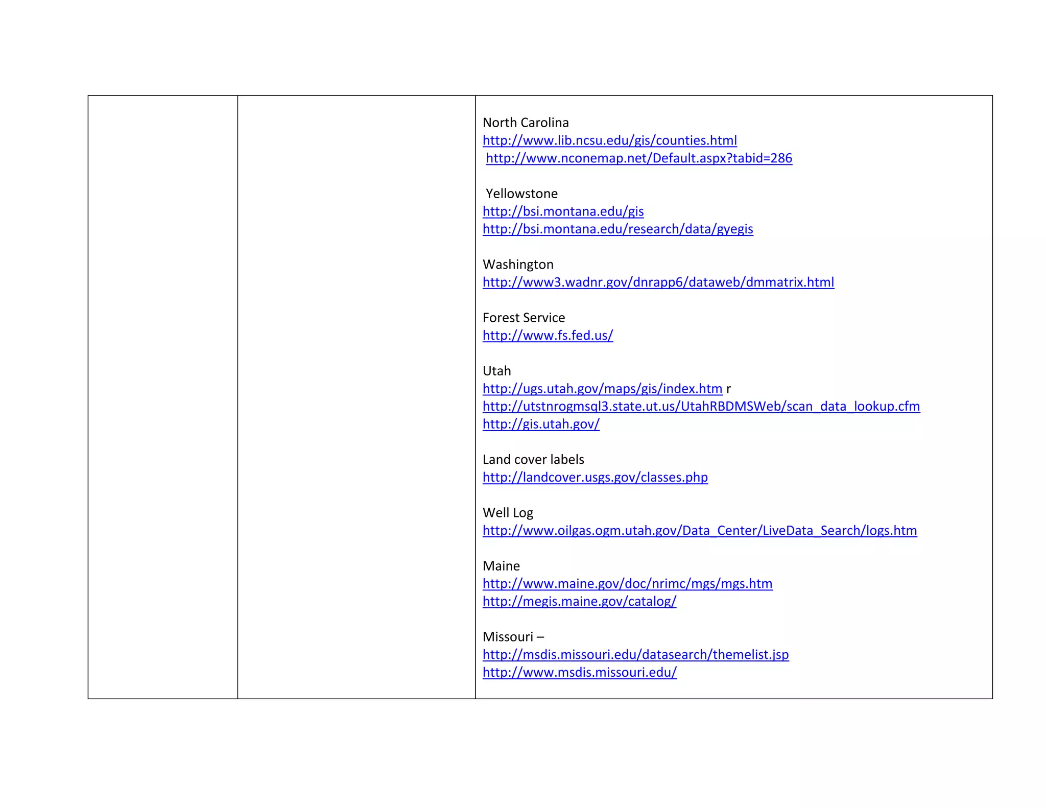
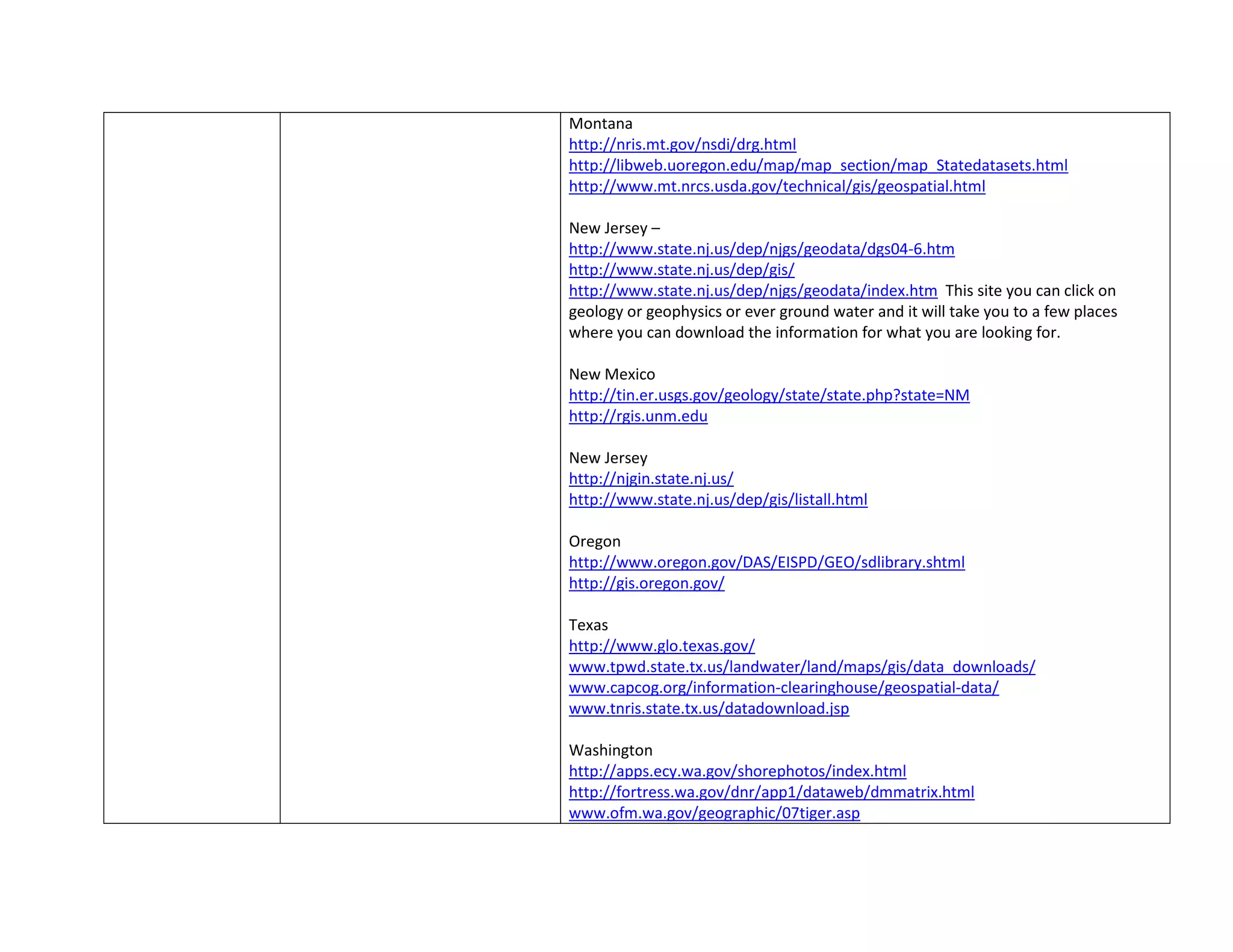
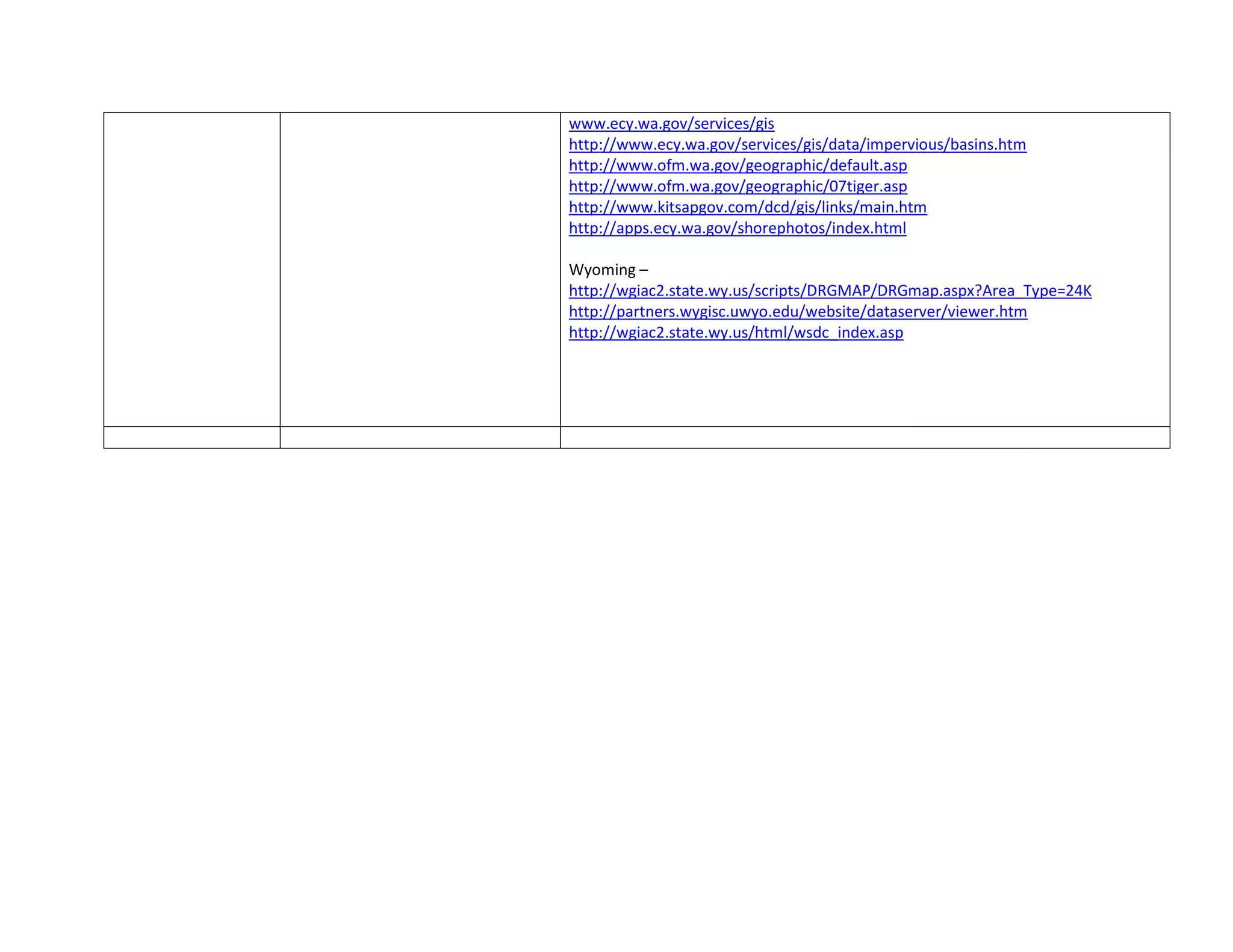
This document contains summaries of various maps and analyses Chloë Woolley created in an ArcGIS class. It describes maps exploring symbolization, geothermal data analysis, DEM manipulation in ArcScene, land use reclassification, watershed analysis, geostatistical interpolation, geologic digitization, geologic hazards, pre- and post-eruption Mount St. Helens, and a final ghost town analysis. For each map, Woolley provides details of the tools and skills used, and self-critiques, generally giving themselves a 10/10 for completing the intended analyses. The document also includes a section with descriptions and tips for various ArcGIS tools and skills.
Using Utah's Linear Referencing GIS Layer: SGID93.Transportation.UDOTRoutes_LRSBert Granberg
Slides from UGIC 2011 conference in Logan (April 2011).
First half of slides (Bert Granberg AGRC) discuss what, why and how of the LRS dataset created by AGRC and UDOT to represent state and federal routes in Utah in a polylineM format.
Second half (Thomas McMurtry, Interplan) shows use cases where tabular data on traffic volume, accidents, projects, etc was linked to the GIS representation of the LRS for map display and query
Introduction to geomorphology in GRASS GIS - by Skyler SorsbySkyler Sorsby
GRASS GIS comprises a powerful geographic tool with which to analyze topography and tectonics. Specifically, GIS aids investigation of elevation data and fluvial hydrology. Here is my personal introduction to the creation and manipulation of the data from DEM's in GRASS GIS.
You can find more gis-based geomorphology workflows at my website: https://sites.google.com/site/sorsbysj/
- Skyler Sorsby
Compelling Cartography with ArcGIS Pro
Tuesday, April 10, 2:40 p.m. – 4:20 p.m.
Venue: AAG Annual COnference 2018
Instructor: Aileen Buckley (Esri)
Room: Nottoway, Sheraton, 4th Floor
This workshop will showcase a range of techniques that take your map-making beyond the defaults. We’ll illustrate how you can use firefly cartogrpahy and smart mapping to drawn the intrcate stories out of yoeur data. We’ll also explore how you can create artistic maps with beautiful terrain representations. And we'll show you how to customize the Esri vectore basemasp to fit your mapping needs. Throughout, we'll show how to take advantage of new and powerful cartographic capabilities in ArcGIS to help you think create beautiful and compelling maps.
Raster data is commonly obtained by scanning maps or collecting aerial photographs and satellite images. Scanned map datasets don't normally contain spatial reference information (either embedded in the file or as a separate file). With aerial photography and satellite imagery, sometimes the location information delivered with them is inadequate, and the data does not align properly with other data one has. Thus, to use some raster datasets in conjunction with other spatial data, we need to align or georeference them to a map coordinate system. A map coordinate system is defined using a map projection (a method by which the curved surface of the earth is portrayed on a flat surface). Georeferencing a raster data defines its location using map coordinates and assigns the coordinate system of the data frame. Georeferencing raster data allows it to be viewed, queried, and analyzed with other geographic data.
Generally, we georeference raster data using existing spatial data (target data)—such as georeferenced rasters or a vector feature class—that resides in the desired map coordinate system. The process involves identifying a series of ground control points—known x,y coordinates—that link locations on the raster dataset with locations in the spatially referenced data (target data). Control points are locations that can be accurately identified on the raster dataset and in real-world coordinates. Many different types of features can be used as identifiable locations, such as road or stream intersections, the mouth of a stream, rock outcrops, the end of a jetty of land, the corner of an established field, street corners, or the intersection of two hedgerows. The control points are used to build a polynomial transformation that will shift the raster dataset from its existing location to the spatially correct location. The connection between one control point on the raster dataset (the from point) and the corresponding control point on the aligned target data (the to point) is a link.
Finally, the georeferenced raster file can be exported for further usage.
THIS PRESENTATION IS TO HELP YOU PERFORM THE TASK STEP BY STEP.
Methods for analyzing and mapping temporal dataAileen Buckley
This presentation focuses on the multiple methods you can use to effectively analyze your temporal data using ArcGIS and how to communicate the temporal nature of your data through maps designed to be shared in print, on-screen, and online. A variety of examples are used to demonstrate how ArcGIS can help you to provide greater understanding of your data through appropriate statistical analyses and share that understanding with aesthetically pleasing and effectively communicative visualizations.
Standard A-A' topographic profiles are widely used in the geosciences to construct cross sections and investigate surficial processes. However, simple line profiles fail to capture the wider topographic regime. Here, I present a workflow to calculate a swath profile in GRASS GIS. The basic premise is, a swath profile "looks off to the side" along each step in a standard profile line, and calculates min/mean/max elevation, hence producing a statistically-relevant 2-d approximation of topography.
You can find more gis-based geomorphology workflows at my website: https://sites.google.com/site/sorsbysj/
- Skyler Sorsby
This session will focus on how to effectively communicate the temporal nature of your data through maps designed to be shared in print, on-screen, and online. The focus is on maps but we also touch on the dynamic display of map surrounds, including graphs and charts, titles, and more. Through a variety of examples, we demonstrate how ArcGIS can help you to provide greater visual clarity of your temporal data and more aesthetically pleasing visualizations.
Categories - Mapping, - Demo Theater Presentations
Hypsometric curves represent a basin-scale topographic metric, comparable to adjacent basins to distinguish relative age and stage of landscape evolution. These curves are easily derivable in GRASS GIS for no cost.
You can find more gis-based geomorphology workflows at my website: https://sites.google.com/site/sorsbysj/
- Skyler Sorsby
Comparison of ESRI's ArcGIS and Bentley's Microstation/GEOPAK terrain data formats. Discussion on the importance of interoperability between the two software packages. Tutorials of how to convert between ArcGIS and Microstation to solve real design issues.
An introduction to GIS Data Types. Strengths and weaknesses of raster and vector data are discussed. Also covered is the importance of topology. Concludes with a discussion of the vector-based format of OpenStreetMap data.
Sinuosity is often approximated at the reach scale, as a back-of-the-envelope calculation to aid in describing morphology of fluvial channels. Here, I present a preliminary workflow for calculating continuous, pixel-by-pixel sinuosity along a rasterized stream channel in GRASS GIS.
You can find more gis-based geomorphology workflows at my website: https://sites.google.com/site/sorsbysj/
- Skyler Sorsby
Charting the Transformation of the Seabed: A Historical Journey along Tunisia...MahdiMadi2
a map showing the evolution of the seabed
along the eastern coast of Tunisia, including the
Kerknah and Djerba islands, between 1886 and 2022
Tools and software used :
• Bathymetric survey maps 1886
• ArcGIS PRO (Data processing software)
• GEBCO (Current Bathymetric data)
• Microsoft Excel
work process :
The first step was to digitize the map. This involves scanning the physical map and converting it into a digital
format that can be viewed and edited on a computer.
• Once the map was digitized, it was imported into the ArcGIS software for further processing.
• ArcGIS is a powerful geographic information system (GIS) software that allows users to analyse, manage, and
display spatial data. It can be used to create maps, perform spatial analysis, and manage geographic data.
• The digitized map was then overlaid with bathymetry data from GEBCO, a web site that provides global
bathymetry data. This allows the examination of changes in the seabed over time and create a map showing
the evolution of the seabed between 1886 and 2022.
• The results were then presented in a Microsoft Excel spreadsheet, allowing for easy visualization and analysis
of the data.
A great experience you've made with my colleague Ashraf, we have taken the design of a map using satellite imagery by Google Earth, the design was by ArcGIS software, in addition to other programs.
Objective To develop maps designed using different programs that allow for the manufacture of a new and modern designs
This project shows methods of mapping surname data from 1940 in Nova Scotia, based on voter lists. The names were mapped in ArcMap to create a hard copy map and ArcGIS Online application, while a CSV database was loaded onto CartoDB to use with a Leaflet template, allowing users to query surnames and see their distribution. The idea was inspired by an interactive map of Irish surname data. The data for this project was transcribed from Ancestry.ca.
2. Mess-Around maps
I used these maps as my ‘mess around’ maps throughout the
semester, trying different analyses on them and just observing
the outcome. I didn’t save very many of the analyses I tried on
them, but this purple one shows that I can control symbolization
and labelling of features, as well as my ability to choose which
features I am symbolizing (for example, Utah’s counties are
symbolized separately from the states).
This map is showing another example of my symbolization and labelling
learning process, in which I manipulated the labelling parameters to omit
some of the areas I didn’t want labelled. This is also where I learned to
change background color and experimented with aestheticism.
In terms of self-critiquing, because there was no goal for these maps, I would
give myself a 10/10
3. Application quiz with geothermal data
This map was intended for use by a hypothetical ‘geothermal energy
company’ in Idaho who was considering buying more land. To
complete this analysis, I used:
-detailed preparation to apply an excel file in ArcGIS
-set up three data frames to symbolize different analyses (these were
originally meant to be made professional, but the class ran out of time)
-choropleth symbolization of population, city ‘seats’, and wells (which
had to be separated from springs through the attribute table) in frame
1
-spatial and attribute queries to symbolize geothermal springs and
wells within 100 miles of Boise and a discharge temperature greater
than 90 degrees, in frame 2
-the buffering tool
-the intersect tool against the given area of interest, the buffer around
Boise, and Ada county, populating only the output area with
geothermal data, in frame 3
Self-critique: I wish I had made this map look more professional and
had the opportunity to rename the data frames (whose current titles
were only useful for grading). However, I think my analyses were good
and that my output would have been very useful to an actual geothermal energy company interested in purchasing the area of interest. I would
give myself a 10/10
4. ArcScene
This map shows a manipulated view of the
digital elevation model of Mt. St. Helens, post-
eruption against pre-eruption. I used:
-ArcScene, with the surface floating against
the DEM, to rotate the view
-correct application of base-heights
-the ‘cut-fill’ tool to appropriately symbolize
area where material was lost, gained, or
unchanged from pre-eruption to post-
eruption (this involved raster math)
Self-critique: though the output of these analyses and symbolizations isn’t particularly aesthetic, intuitive, or professional, I accomplished the
intended analyses and would give myself a 10/10
5. Thematic Raster Reclassification
This map shows a thematic land use raster provided by the
instructor. To make this map, I used:
-the ‘reclassify’ tool to produce the 5 classes seen in the legend and
symbolized on the map
-a land-use legend from the source, to identify those land-use types
that would be most prone to high frog populations
-the attribute table field calculator to calculate statistics of frog-
kissing danger
Self-critique: I would give myself a 10/10 on this map because the
goal was to reclassify and calculate statistics; it was simple and I
accomplished it
6. Watershed maps
These maps show the same surface under different tools,
analyzing watershed characteristics as listed above the
maps. I used
-the ‘fill’ tool to make sure my DEM had no sinks or holes
-the ‘flow direction’ tool to see general directions in which
water would flow
-the ‘flow accumulation tool (changing the output type from
‘float’ to integer’) to see which areas would have the most
water flowing through them
-the ‘stream order’ tool to see the network of streams
feeding into each other
-the ‘con’ tool to threshold the stream order output to a
smaller range of stream orders (much like a reclassification
-the ‘basin’ tool to symbolize the breaks in flow direction
and better understand where water will flow when it falls on
any specific place on the map.
Self-critique—I completed every intended analysis, but I
wish I’d had time to make it look better and make it more
clear what each map was trying to show. I’d give myself a
9/10
7. Geostatistical Analysis
This figure shows the water table of southeast Idaho as
point data. To create this figure, I used:
-detailed preparation of an excel file for use in ArcGIS
-creation of a feature class
-geostatistical analysis of the point data set
-inverse distance weighting
-global polynomial interpolation
-trend analysis in multiple dimensions
Self-critique—I would give myself a 10/10, because it was
a successful analytical comparison
8. Geologic map
This is a digitized geologic map of the western Henry
Mountain area. To create this map, I used:
-georeferencing tools against a topographic basemap
-a first polynomial transformation
-feature class creation and editing tools to digitize the
boundaries of the original geologic map, including
differentiation of bounding lines, and point data in place
of recorded strike and dip
-manipulation of topology rules
-the ‘feature to polygon’ tool
-ArcMap editor to add data to the attribute tables of my
created features
-symbolization of strike and dip according to strike angle
-a graticule
-symbolization of different fault and contact types using
appropriate geologic symbols
9. Wasatch geology and hazards map
This map was created for the use of another class who was
trying to decide which houses (the small, diamond-shaped
points) would be safest to live in. To make this map, I used:
-KML to layer conversion
-hillshade creation and transparent symbolization
-clipping of data to a specific frame
-an index map and location map with extent indicators
-the ‘dissolve’ tool
-symbolization of many layers of data at once, without
overwhelming or concealing any necessary details
-creation and manipulation of a label
-a north arrow
-inclusion of an appropriate scale bar
-cartographic principles of design
10. Mount St. Helens map
This map is meant to show the change that overcame Mount St.
Helens when it erupted, in a way intuitive and informative for the
general populace. The tools used in analysis were:
-hillshade
-transparency of the hillshade
-slope
-aspect
-viewshed
-contour
-interpolation of a multiple digitized lines at once and creation of a
profile graph from those lines, including management of the output
graphs
-the ‘minus’ tool for subtraction of the post-eruption raster from
the pre-eruption raster
-symbolization of the ouput of the ‘minus’ analysis into three
classes (elevation gained, elevation lost, or elevation unchanged)
-general cartographic principles (this is the earliest example of my
attempt to follow newly-learned principles)
11. Final Map
This was my final project map, showing an analysis of ghost towns along the
Oregon coast and a ranking of their creepiness. In its completion, I used:
-the Mosaic tool
-georeferencing and adjustment of an image
-KML-to-layer conversion
-‘join’, to join an .xls document to my attribute table and include more information
-the ‘extract by mask’ tool to clip my raster to a shapefile’s boundaries
-buffers
-the slope tool
-ArcMap to add a column of data into my attribute table
-editing tools to create a feature class
-feature-to-raster conversion tools
-reclassification
-the ‘weighted overlay’ tool
-the ‘raster-to-point’ tool
-ranked symbolization
12. Chloё Woolley’s Portfolio How-to’s
Tool/Skill What it does? And when to use it? Hints/Reminders
*ALWAYS SAVE THINGS WHERE YOU CAN FIND THEM AGAIN, AND SAVE MULTIPLE
COPIES AS YOU PROGRESS
Start a new map in ArcGIS It shows spatial data; use it when you
need to understand spatial
relationships and statistics
1. In ArcCatalog: Make a copy of the original data and put in a folder called “original.”
2. In ArcCatalog: Create a File geodatabase and add the data to it. Create a new file geodatabase for
each new project.
3. Open ArcMap. Select “New Maps”, then select “Blank Map.” DO NOT CLICK OK!!!
4. Designate the “Default geodatabase for this map” as the geodatabase just created. Click OK
5. In ArcMap, click “File” Map Document Properties, and select “Store relative pathnames to data
sources.” Check default geodatabase and change if needed.
6. Click OK. Add data to the map. Save frequently!
Convert KML to a feature
class and feature class to
KML
It converts data to and from the KML
format into layer format; Use it when you
find great data that’s formatted for Google
Earth or when you need to see a layer in
Google Earth
- KML files don’t show up in ArcCatalog
- KML files are abundant on the Internet
*Search KML converter
Create a hillshade of a
raster surface
It hypothetically illuminates a surface
with shades of white to black; use it to
create a more visually intuitive and
aesthetic map
*Make sure your extensions are enabled
Search ‘hillshade’; input appropriate raster information
*If your map isn’t in a gdb, you might receive a big ‘X’
*You may need to adjust your z factor for discrepancy between the hillshade and
the elevations ‘arc second’ measurements; look up appropriate z factor values by
latitude and longitude
Prep a table for use in
ArcGIS
Prepares non-spatial data to be joined
to spatial data in ArcGIS; use when
you have non-spatial data correlating
with ArcGIS data that is not yet
connected
-There can only be one header per column
-Column headers must be less than 13 characters and have no ‘special’ characters
except underscores (_)
-Set data as ‘general’, ‘number’, or ‘text’
-Delete any totals
-Save as a ‘.xls’
*Add it to your gdb
*Make sure you know which column can be connected to the data already in your
attribute table in ArcGIS
*Make sure GPS data is in decimal degrees
*Make sure text values (‘North’) are separate from numerical GPS values
Join Adds more information to spatial data
in the map for more meaningful
*Right-click on the layer you want to join spatial data with and select ‘joins and
relates; click ‘join’ and work through the Join Data wizard
13. symbolizations; use it when you need
more meaningful symbolization and
greater depth of information for your
features
*Make sure the data that you’re joining is prepared for ArcGIS
*You can’t edit the joined columns unless you add the joined tables/layers to
ArcMap; if you edit it in ArcMap, those changes will be reflected in the rest of the
data
Clip feature classes and
rasters
Clip removes input features outside
the parameters of the selected
feature; use it when your features are
of different sizes and shapes to allow
for more concise representation
Search ‘clip’
*’Clip analysis’ is for polygons; ‘clip coverage’ focuses on the features to be
removed instead of the features to be retained; ‘clip data management’ clips
rasters
Dissolve or merge
features
Dissolve aggregates features based on
correlations; Merge combines
multiple features that aren’t yet tied
together but are of the same type
(line, polygon, point); use when
symbolically useful
The ‘Geoprocessing’ button (top toolbar) will give you Dissolve and Merge options.
Add an index map (extent
indicators)
An index map gives a higher level of
spatial reference and context; use
when your audience is unfamiliar with
the area or your main map doesn’t
highlight the details you want to
emphasize
Double-click the data frame; click the ‘extent indicators’ tab; select the data frame
desired for reference
*Click the ‘data frame’ in the data frame properties window; click ‘clip to shape’;
select ‘outline of features’; do the same thing in the other data frame symbolized
Add a legend Explains non-intuitive symbolizations
and what they represent; use it to
explain symbolic representation
*Make sure you’re in ‘layout view’
Click the ‘Insert’ button (top toolbar); select ‘legend’
Use annotation Annotation is text that is not
connected to specific features; it can
be used to label an individual feature
with information that isn’t in its
attribute table or title an individual
map
Click the ‘A’ button
*Because annotation is not inherently linked to features, manipulating the features
will not change your annotations; save annotating until the end so you don’t have
to keep changing your annotation to fit your changing map
Create a feature class
from ‘raw’ point data
Allows point data to be connected to a
map; use to make point data into
visual points
See above: ‘prepare table for use in ArcGIS’ and ‘Join’
14. (GPS) in an excel file
Classify vector and raster
data
Groups data for similar symbolization;
use to increase or decrease the
number of symbols for a dataset or
redefine where those symbol breaks
should lie against their represented
attributes
Double-click the layer to be classified; click the ‘Symbology’ tab; click ‘quantities’ in
the list on the left; indicate desired number of breaks in the dropdown menu; click
‘classify’ to manipulate the position of the breaks
When to use the
geoprocessing tools
(union, intersect, merge,
buffer, dissolve)
Click the ‘Geoprocessing’ button on the top toolbar. Select the desired tool.
Select features using the
selection tool
Selects specific features for further
study; use when only one feature is of
interest for a particular analysis
The ‘selection by features’ button is on the ‘tools’ toolbar; it looks like a white
arrow over a green and white set of polygonal features
*To clear selected features, there’s a button right next to the ‘selection by features’
button
*To select multiple features, click the ‘selection’ button from the top toolbar, follow
the dropdown menu to ‘interactive selection method’, and click ‘add to current
selection’
*To clear specific features without clearing your whole selection, click the
‘selection’ button from the top toolbar, follow the dropdown menu to ‘interactive
selection method’, and click ‘remove from current selection’
Select features in the
attribute table
Selects all features with a specific
attribute through the attribute table;
use to select features with a specific
attribute
Right click the layer in question and select ‘Open Attribute Table’ from the drop-
down menu. When the Attribute table appears, click the ‘select by attributes’
button from the top toolbar (in the attribute table).
*Put spaces between your mathematical parameters and attributes in the selection
window
Select by attribute Allows you to view, change, and
create layers based on, features with
*Turn off selectability for close layers
Click the ‘selection’ button (top toolbar); click ‘select by attributes’
15. specific attributes *Put spaces between the parameters and mathematical symbols
Select by location Allows you to view, change, and
create layers based on, features
within a specific area or distance of a
desired feature
*Turn off selectability for close layers
Click the ‘selection’ button (top toolbar); click ‘select by location’
*Put spaces between the parameters and mathematical symbols
Assign Coordinate system
to data that does not have
a coordinate system
Tells ArcGIS greater spatial reference;
use when trying to spatially connect
data that doesn’t have a GCS to data
that does
In ArcCatalog, search ‘project’.
*Make very sure you’re not changing the coordinate system of any data that
already has its own correct coordinate system
Reproject data from one
coordinate system to
another
Changes the coordinate system of a
dataset from one projection to
another; use when you’re absolutely
sure that a dataset’s stated projection
is incorrect to the data
In ArcCatalog, search ‘project’. Read the descriptions of the tools and select the
appropriate one
Use surface raster tools:
slope, contour, aspect,
viewshed, curvature
Slope symbolizes the angle of the
steepest downhill slope for every cell;
use it to identify the steepest slopes
on your map. Contour lines show
topography linearly; use to simplify
topographic presentation. Aspect
symbolizes downslope direction of the
greatest slope angle; use to identify
flat areas and areas dipping in the
same direction. Viewshed calculates
visible cells from a specific observer
location within a digital elevation
model; use it to identify visible
features from a specific location.
Curvature symbolizes the curvature of
a raster surface; use to symbolize the
curvature of a raster surface
Search for the tool in ArcMap and apply to the desired surface
*Make sure your contour lines are appropriately spaced
Create a topographic
profile
Analyzes a line against the surface and
projects it to represent elevation in
side-view
Select the surface you want to profile; in the 3D Analyst toolbar, click the
‘interpolate line’ button (*looks like an s curve hovering over a surface); make the
line against the surface (*double click to stop; do not click again unless you’re
clicking a new button); click the ‘create profile graph’ button (*it’s in the drop-down
menu under a point graph—it looks like a green topographic profile)
*To change the layout of the graph, right-click the title bar and select ‘properties’
16. *To add the graph to the final presentation, right click the title bar and select ‘Add
to Layout’
Visualizing a surface Adequately represents information
through comparison (subtraction)
between rasters, comparison of
elevation representations, etc.; use to
make a surface more intuitively
symbolic
*When subtracting one dem from another, search ‘minus’; do it in ArcCatalog; put
the dem of larger volume in first; reclassify the symbolization to represent ‘0
change’ with no color; remember that negative numbers represent positive change
in volume and positive numbers represent negative change in volume
*Experiment with transparency of your hillshade, and keep it at the top of your
table of contents
*Try changing the azimuth and sun angle of your hillshade to emphasize different
features
*Try showing a surface in ArcScene, but make sure your custom surface is the dem
Create a customized
toolbar
Allows you to use the tools you
specifically need for a project more
efficiently if they’re not already in their
own toolbar
Click the ‘customize’ button on the top bar, and hover over ‘toolbars’; select
‘customize’ at the bottom of the dropdown menu. An empty toolbar will appear.
Search for the tools you want in the search window; click and drag them to the
empty toolbar
*They will all appear as hammers; if you create the toolbar in ArcCatalog, you can
change the icon by right-clicking on it
Mosaic Raster data Seamlessly stitches raster sets to each
other
*Make a backup copy, especially of the Northernmost or Westernmost raster to be
mosaicked: this raster will be replaced by the full mosaic
Search ‘mosaic’ in ArcCatalog
*The Northernmost or Westernmost of your raster datasets should be the first raster
in the input window, as well as your ‘target raster
Reclassify Raster data A way to assign new values to individual
cells or classes of cells in a raster dataset
Search ‘reclassify’; reclass by the desired field in the reclassify wizard
*Can reclassify by individual values or groups/ranges of values
Use ArcScene (base
height)
Shows a three-dimensional model of
elevation data for more intuitive
representation
*Have your hillshade already created
In ArcScene, open the properties window of your hillshade, and in the ‘base height’
tab, instruct it to ‘float on a custom surface’; set that surface to the DEM (because
that’s where the elevation data is stored’
Georeference raster
data
Aligns uncoordinated data to a map
coordinate system according to a
number of available transformative
*Add a basemap before your un-georeferenced data: Use the drop-down menu of
the ‘add data’ button. Don’t forget to determine the geographic coordinate system
of your basemap.
17. options Under the ‘customize’ bar, hover over ‘toolbars’, and select the georeferencing
toolbar. When adding links/control points, you can give specific coordinates to a
point or connect the point to a feature on the basemap
*When correlating control points between the georeferenced and ungeoreferenced
data, make sure to click your ungeoreferenced data first
*When inputting control point coordinates manually, y-values represent latitude and
x-values represent longitude
Create a new feature
class
Makes data agreeable with ArcGIS; use
when you have data that needs to be
analyzed in ArcGIS that isn’t already
formatted for it
Right-click the gdb in ArcCatalog—select ‘new’—select ‘feature class’
*To import a coordinate system in the ‘new feature class’ wizard, click the little
globe button on the top toolbar (the book gives outdated instructions on this).
Use editing tools to
create features
Allows you to edit or create features
within an already present feature class
On the editing toolbar, click the ‘editor’ dropdown menu and select ‘start editing’;
select the ‘create features’ button on the editing toolbar; select the layer in the
create features window and select construction tools below
*’Snapping’ controls where your editing tools focus, or ‘snap’; find it in the editor
dropdown menu
Create a feature data
set
Allows you to create a feature class layer
when the data you need cannot be found
elsewhere in ArcGIS format
Right click the geodatabase in ArcCatalog; select ‘new’; select ‘feature class’
*To import a coordinate system in the ‘new feature class’ wizard, click the little
button that looks like a globe’
Create a geologic map Gives you the opportunity to digitize and
analyze local geology (on whatever scale
you’re willing to work)
Follow the same steps as “Georeferencing Raster Data” to copy the original geologic
map image in a raster format (a TIF File) to your map. Once georeferenced, use the
steps in ‘create a new feature class’ to add two line feature classes, one for actual
contacts that can be formed by faults and regular contacts. Line feature class to
store contacts, call it ‘contacts.’ Add a short integer field named ‘linetype’. Give the
field a default value of ‘0’, set the ‘Allow NULL values’ to ‘No.’ Then select finish. The
linetype field is where you set the type of line (e.g. contact certain, contact inferred,
etc.). Add a second for just faults that may stem away from contacts. Line feature
class to store faults and fold axes, call it ‘faults’. Set it up a linetype short integer field
like the one you made in the ‘contacts’ feature class. Create a 3rd feature class as a
point feature class for strike and dips. Point feature class to store strike and dip data.
Give it a name that is meaningful and that is less than 12 characters long (e.g.
‘strikedip’). Add a short integer field for ‘azimuth’ and a short integer field for ‘dip.’
Do not set the default value, set ‘Allow NULL values’ to ‘Yes.’ Assign the linetypes in
the ‘contacts’ and ‘faults’ feature classes. Do the same for the ‘faults’ feature class.
18. Define Topology Rules by clicking the the feature dataset, select New – Topology and
follow the topology instructions.
Add and correctly
symbolize strike and
dip data
Allows you to digitize strike and dip data
in your map and symbolize it in an
intuitive way
While editing, add points where your strike and dip data was taken, and in the
attributes table assign the appropriate strike and dip data
*This can be done with the attributes button on the editor toolbar
To symbolize, add labels with the dip. Right click on the layer and under the
symbology tab, use a strike and dip symbol (Geology 24K has a good one); select the
‘advanced’ button in Symbology and rotate according to azimuthal data
Add and correctly
symbolize geologic
contacts of all types
Allows you to digitize contacts between
geologic units according to contact types
(certain, covered, approximate, fault
contact, etc.)
While editing (under editing toolbar, make sure you’ve already clicked ‘start
editing’), click ‘create features’, the button at the end of the toolbar; in the create
features window, select the layer (which you should have created) under which you
want to save digitized geologic contacts; select lines
*You’re going to need to create both the feature class under which to save the
contacts and the domain types/line types within that feature class
*Do not select polygons unless no lines are contained within other connected lines
*Make sure all your snapping options are enabled
*If a contact type changes, stop your line and continue from the end vertex with a
new line type
*Map topology defines appropriate feature connections and alerts you to
inappropriately drawn features. Find it under editor, ‘more editing tools’, and
‘topology’.
Add and correctly
symbolize faults
Allows you to digitize the location and
type of fault (normal, reverse, certain,
approximate, contact, etc.) for further
analysis and study
While editing, click ‘create features’; in the create features window, select the
already created fault layer with its different fault type domains
*See above ‘add and correctly symbolize geologic contacts of all types’ for hints on
linear feature drawing
Suitability Study Depicts a relative range of values
compared against each other, ranked
from most suitable to least suitable for a
particular study (e.g. best sites for
hunting wild turkey; most hazardous
possible avalanche sites)
Define your goal and break down the factors involved in it (e.g. elevation, slope, land
use type, size, proximity to specified features, cost, etc.); obtain the necessary data;
perform the necessary analyses and combine reclassified outputs with weighted
importance
*Can use ‘map algebra’ or ‘weighted overlay’ tool to combine those outputs
*Can also use a query
*Also suggested to verify results of suitability study in the field, if possible, to identify
overlooked necessary factors (is it downwind of a sewage treatment plant?)
Contour Point Data Represents a continuous value across the *If you start with a table of data, you must prepare it for suitable use in ArcGIS and
19. map as a line, with many lines
representing many continuous values
*Doesn’t necessarily have to be
elevation!
convert it to a feature class
Use Geostatistical Analyst toolbar to explore histograms, trend analyses, etc., of
your data
*Make sure you’re viewing the right data column (a trend analysis of latitude will be
really boring)
*’global’ means it focuses on the whole map where ‘local’ means it focuses on a
specified part of the map
Add a graticule to a
map
Represents latitude and longitude
through parallels and meridians, to show
location
Click ‘view’, ‘data frame properties; click the ‘grids’ tab; click the ‘new grid’ button;
click the ‘graticule’ option in the ‘grids and graticules’ wizard
Data sources Specific sites to find different kinds of
data, usable or format-able for ArcGIS
An excellent website that has links to data sources for many states and for the U.S.:
http://libweb.uoregon.edu/map/map_section/map_Statedatasets.html
ESRI on-line data: Click the add data button in ArcMap, select “Add data from ArcGIS
Online” Search on what you are interested in.
U.S. Data:
- U.S. department of agriculture data (including georeferenced aerial photos):
http://datagateway.nrcs.usda.gov/
- National geospatial program: http://www.usgs.gov/ngpo/
- U.S. data: seamless drgs (topographic maps), DEMs, landuse data and more:
http://nationalmap.gov/viewer.html
- U.S. Data and maps: http://geo.data.gov ; http://cumulus.cr.usgs.gov/
- Population data, government boundaries (counties, cities, etc.):
http://www.esri.com/data/download/census2000-tigerline and www.Census.gov
Water data:
National Hydrography Dataset: http://nhd.usgs.gov/
U.S. water data: http://waterdata.usgs.gov/nwis
LandSat (satellite images):
http://glovis.usgs.gov/
http://www.spot.com
www.digitalglobe.com
20. http://edc.usgs.gov/products/satellite/avhrr.html
http://landsat.usgs.gov
Aerial Photographs from the USDA
http://gdw.apfo.usda.gov/mdoq/viewer/viewer.htm
Aerial Photographs, Landsat, DEMs, DLGs, etc:
http://edcsns17.cr.usgs.gov/EarthExplorer/
Global DEMs
Based on ASTER data – higher resolution than SRTM:
http://www.ersdac.or.jp/GDEM/E/index.html
http://www.gdem.aster.ersdac.or.jp/
SRTM (Shuttle Radar Topography Mission, 3 arc second):
http://edcsns17.cr.usgs.gov/srtmdted2
ETOPO5 (Earth topography, 5 minutes longitude, 5 minutes latitude):
http://www.ngds.noaa.gov/mgg/global/etopo5.html
GTOPO30 (earth topography, 30 arc-second, ~1 km)
http://eds.usgs.gov/products/elevation/gtopo30/gtopo30.html
GLOBE (earth topography, 30 arc-second)
http://www.ngdc.noaa.gov/mgg/topo/globe.html
World and U.S. Landcover data:
http://landcover.usgs.gov/
Thematic data clearinghouse on biologic, geologic data
http://geography.usgs.gov
Satellite data:
http://americaview.usgs.gov
Climate data (U.S. and much of the rest of the world):
http://www.ncdc.noaa.gov/oa/ncdc.html
21. Soil data:
http://soils.usda.gov/
Various vector products:
www.nga.mil
National geophysical data center:
http://www.ngdc.noaa.gov/
Volcanoes, climate, bathymetry, magnetism, earthquake epicenters, magnitude,
depths:
http://quake.geo.berkeley.edu
Earthscope data:
www.earthscope.org
UNAVCO: interesting and varied data sets, global strain rate
GPS Data:
http://facility.unavco.org/data/data.html
Plate boundary observations:
http://pboweb.unavco.org/
MODIS: Beautiful satellite images
http://modis.gsfc.nasa.gov/
http://modis.gsfc.nasa.gov/gallery/
USGS National Geologic Map Database:
http://ngmdb.usgs.gov
Universities often have data archives (e.g., U of U has lots of GPS data for
Yellowstone)
LiDAR data:
http://opentopography.org/
22. Individual State Geospatial Data Centers (sites from students in GEO 340 F2008 -
W2010)
Alaska
University of Alaska Fairbanks earthquake info center:
www.aeic.alaska.edu
California
http://www.mapcruzin.com/ddownload_quake.htm
Idaho
http://www.insideidaho.org/asp/geodata.asp
http://inside.uidaho.edu/asp/geodata.asp
http://gisgate.co.clark.nv.us/gismo/freedata.htm
http://www.esri.com/data/download/census2000_tigerline/index.html
http://www.idwr.idaho.gov/gisdata/gis_data.htm
http://nc.gisinventory.net/getting_started.html
http://gis1.idl.idaho.gov/GIS_Links.htm
Data base (DEM):
http://seamless.usgs.gov/
http://data.geocomm.com/catalog/ (requires membership)
http://library.stanford.edu/depts/gis/gisdata_tables.html
http://www.csc.noaa.gov/shoreline/data.htm l
http://www.csc.noaa.gov/products/datasites/data_coast.html
http://clearinghouse1.fgdc.gov/
General:
http://fgdc.ftw.nrcs.usda.gov/servlet/FGDCWizard
http://arcdata.esri.com/data/tiger2000/tiger_download.cfm