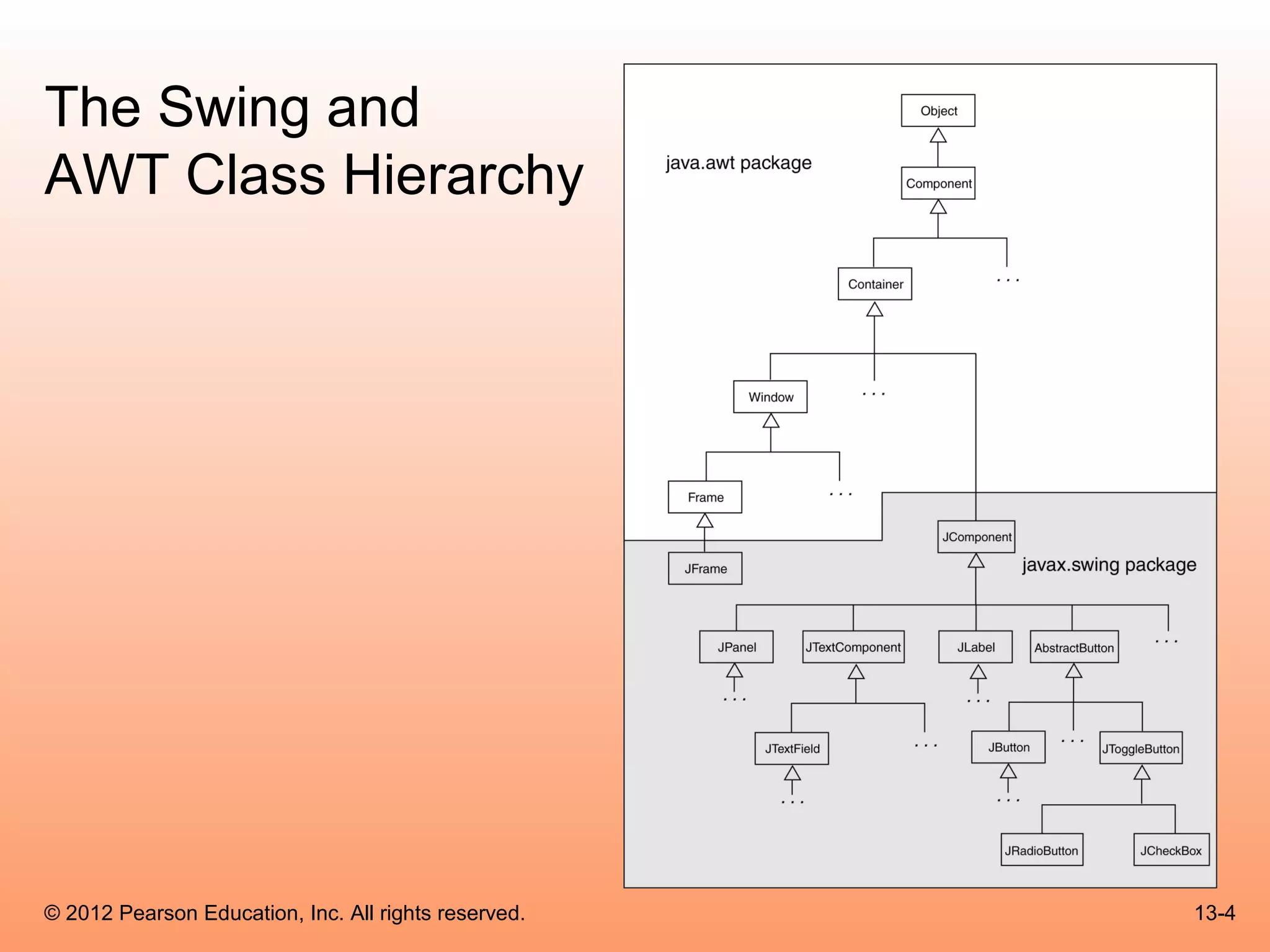
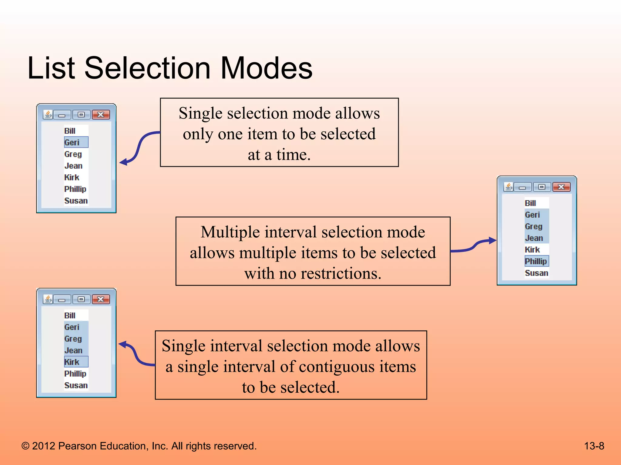
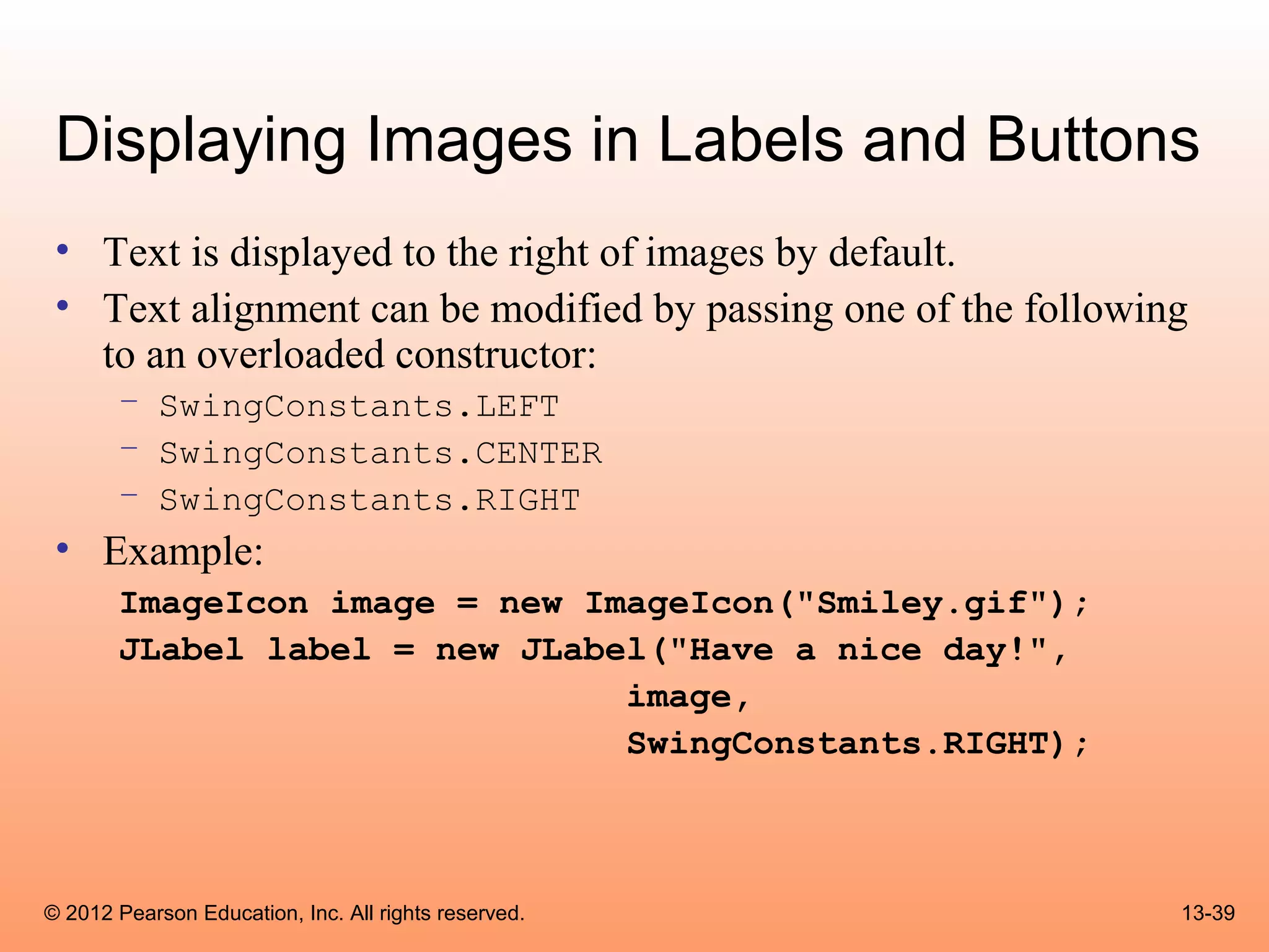
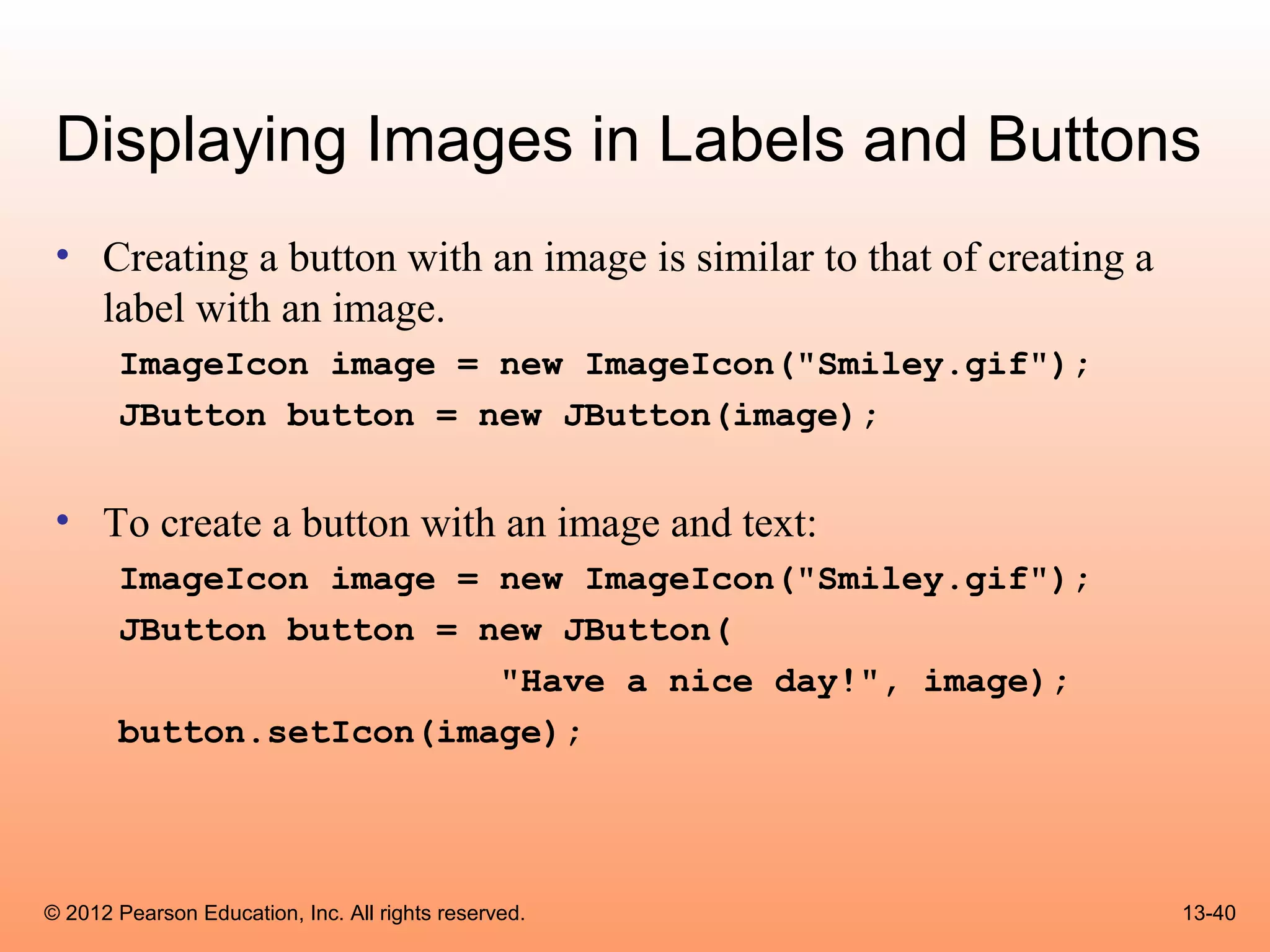
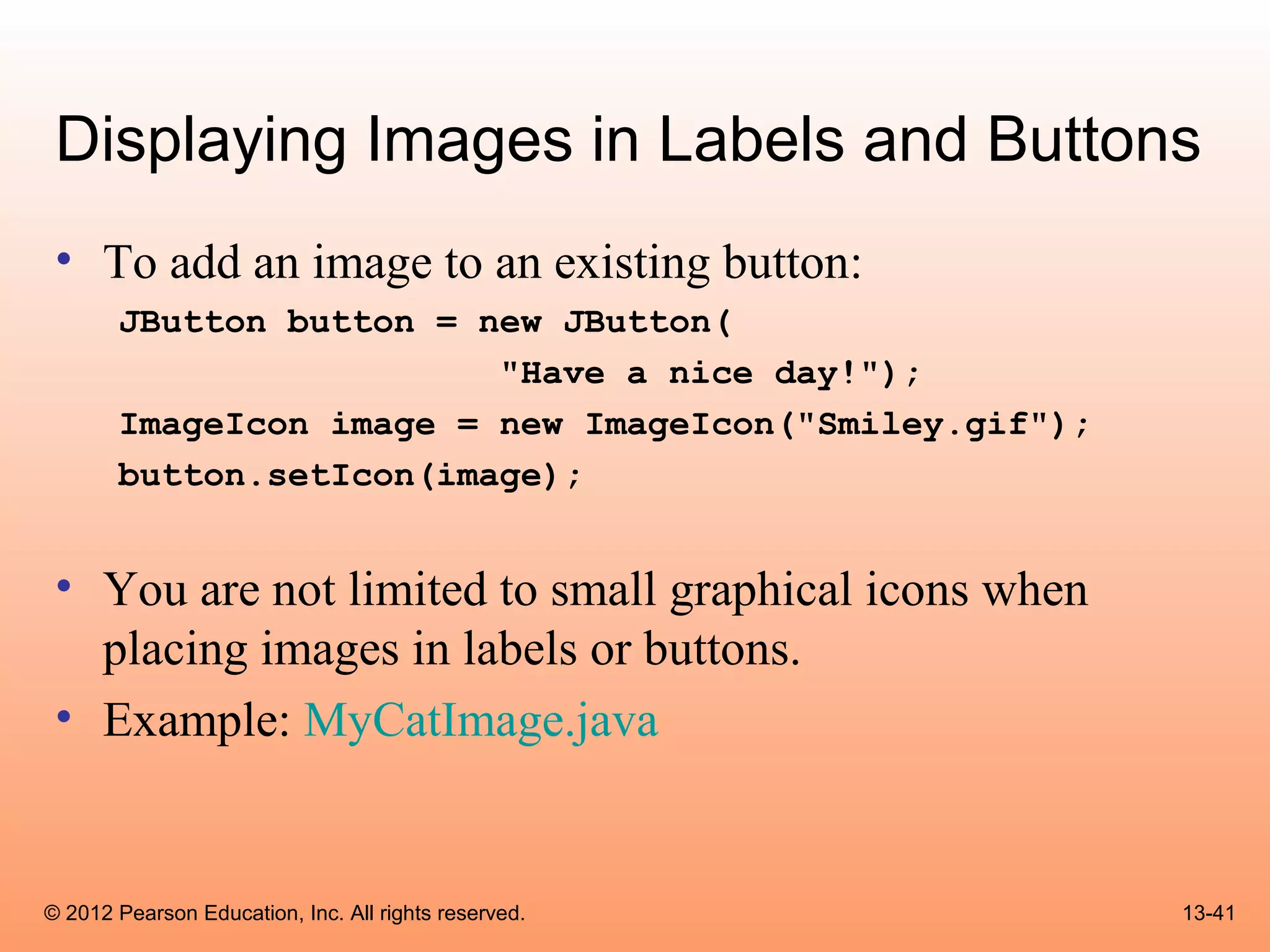
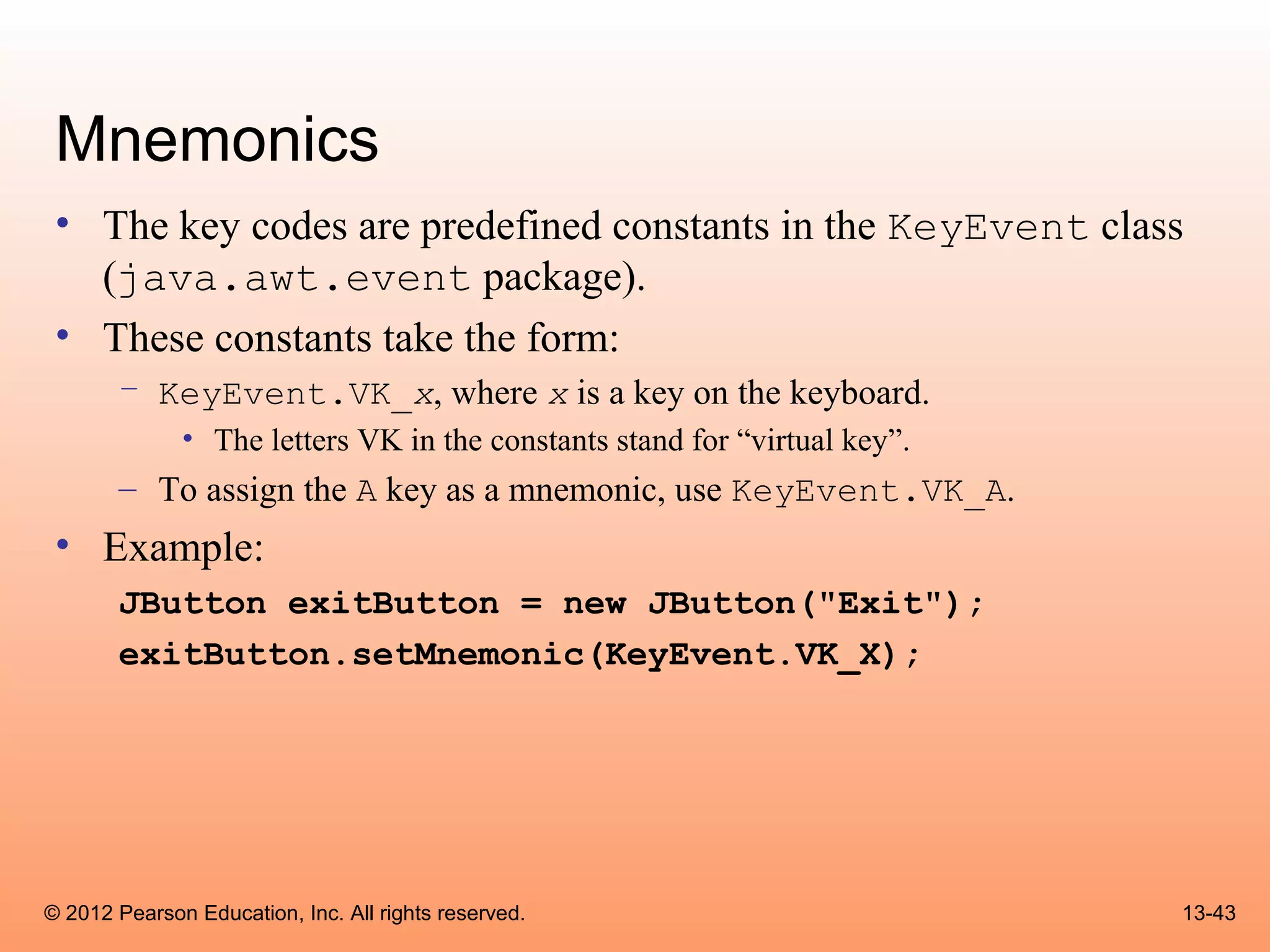
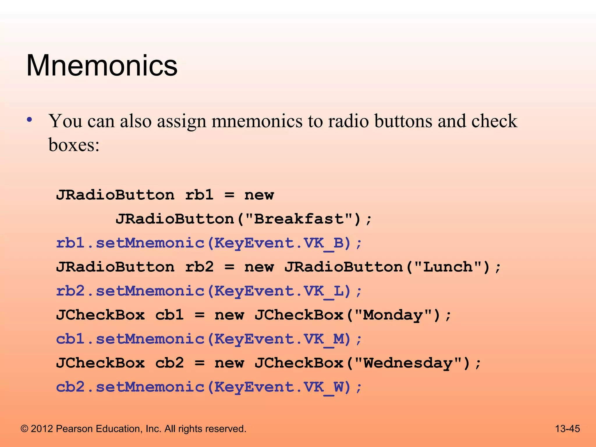
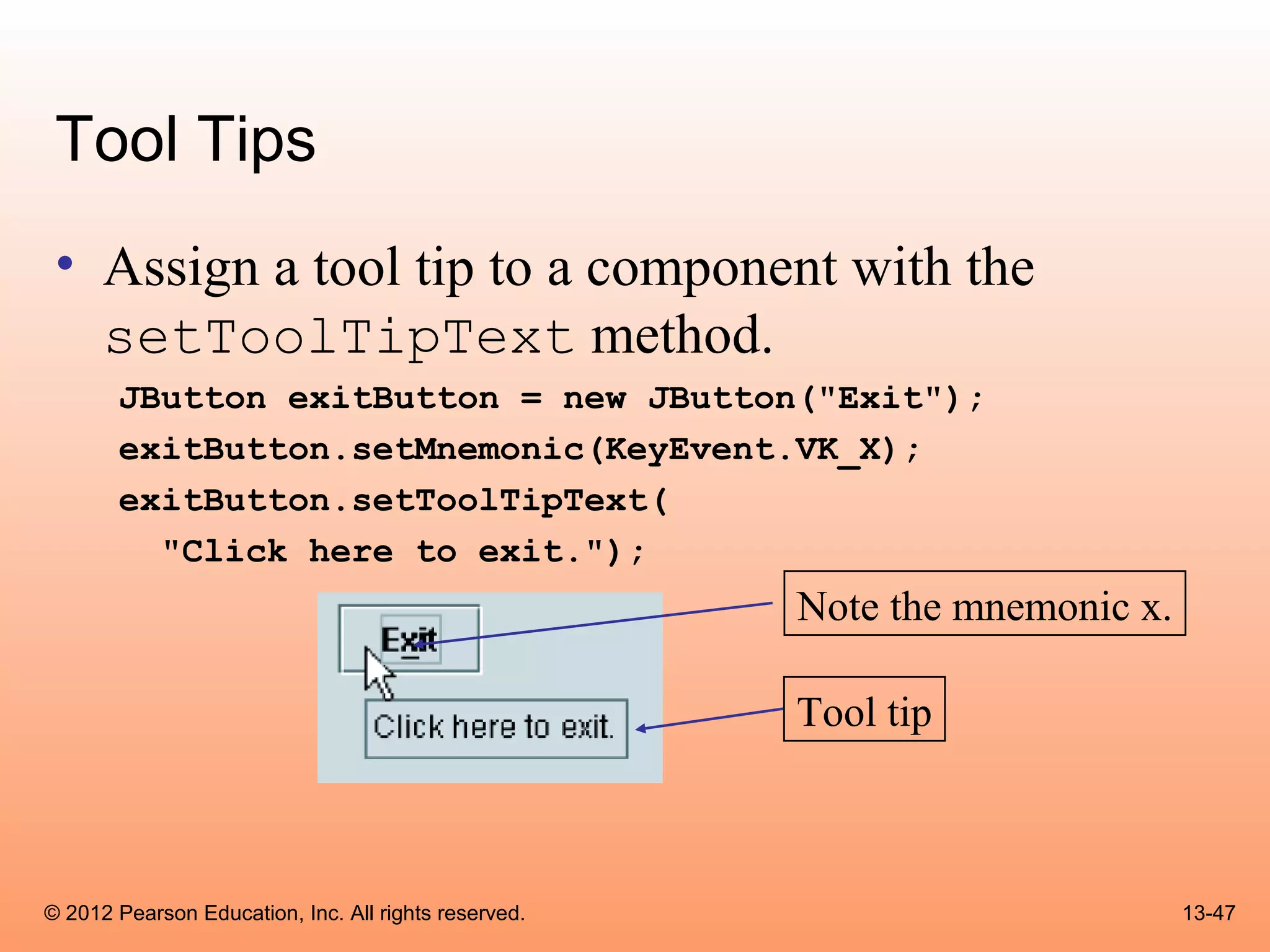
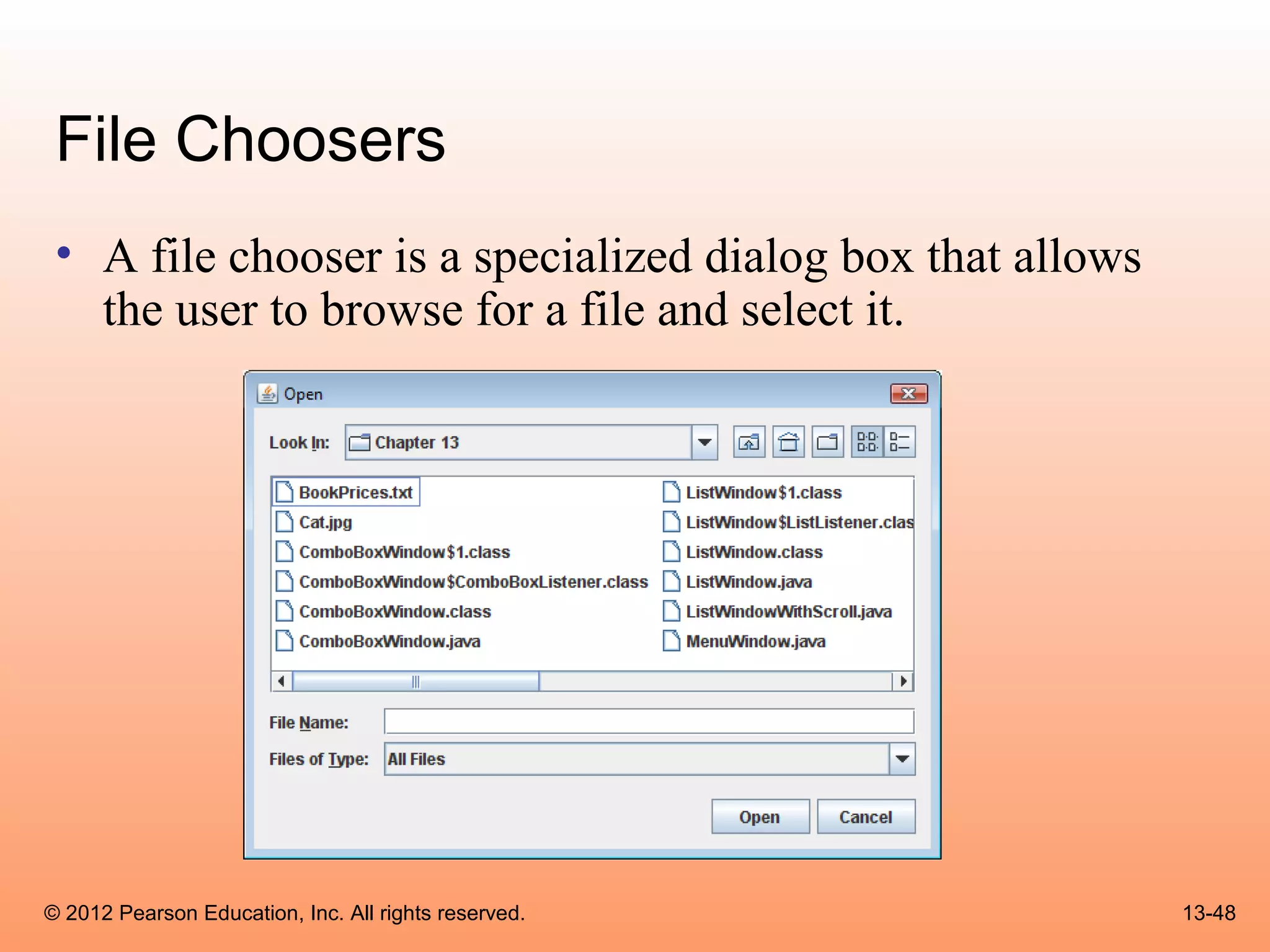
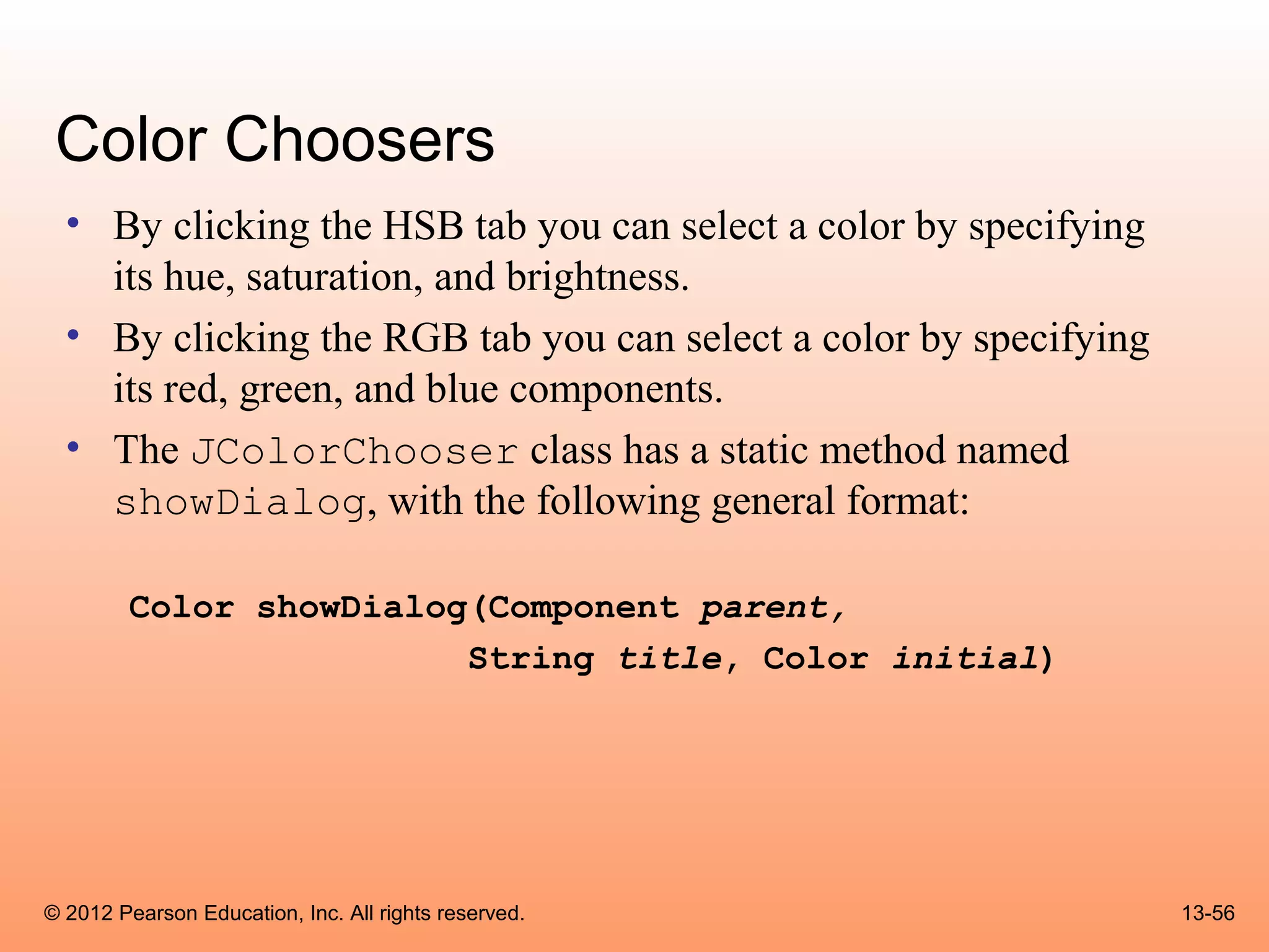
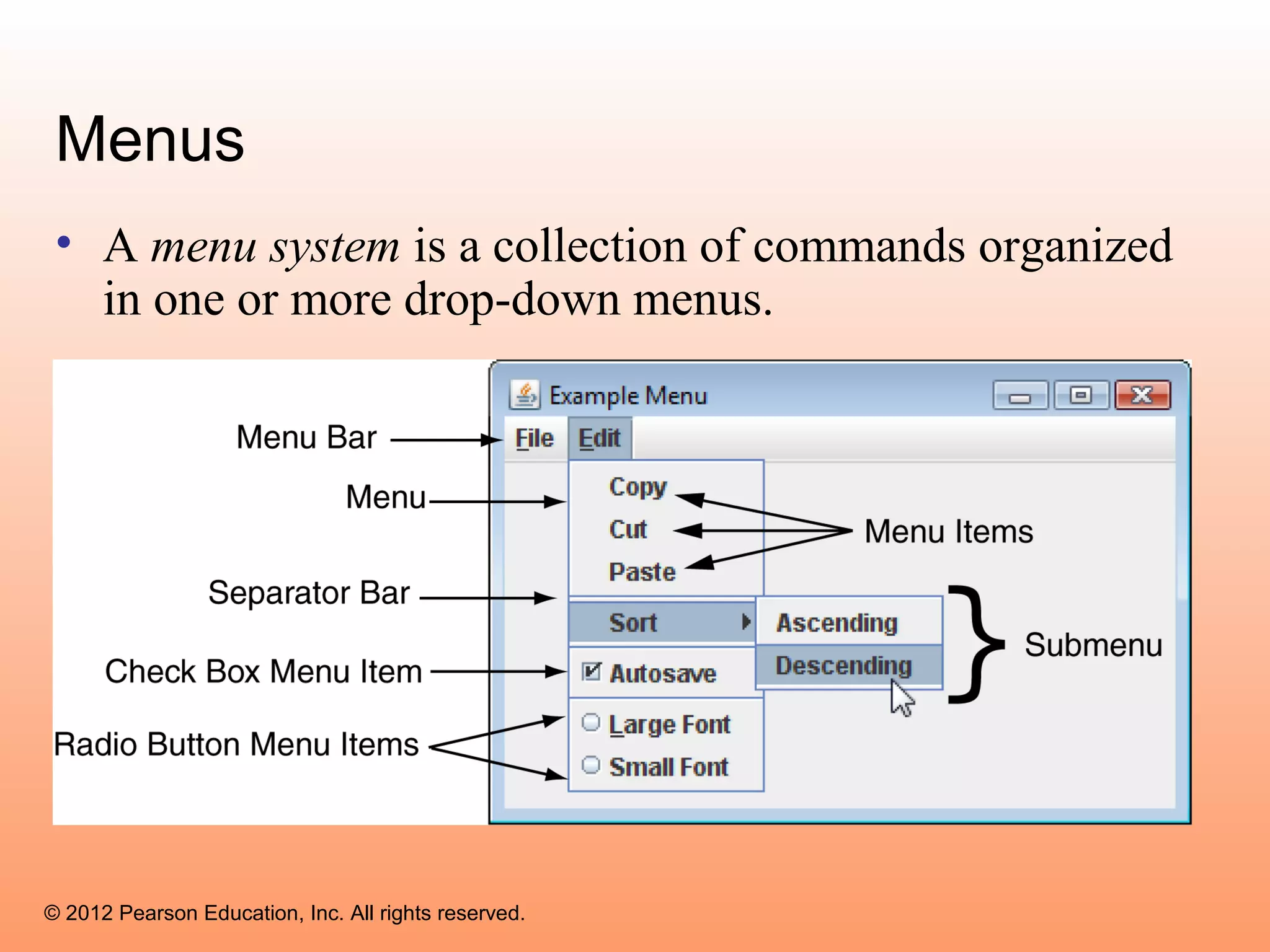
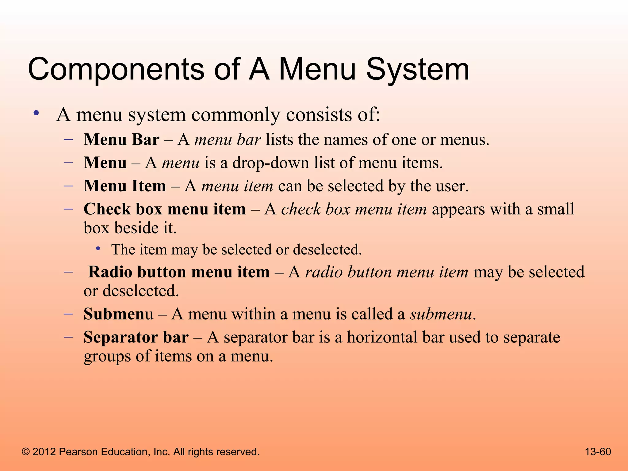
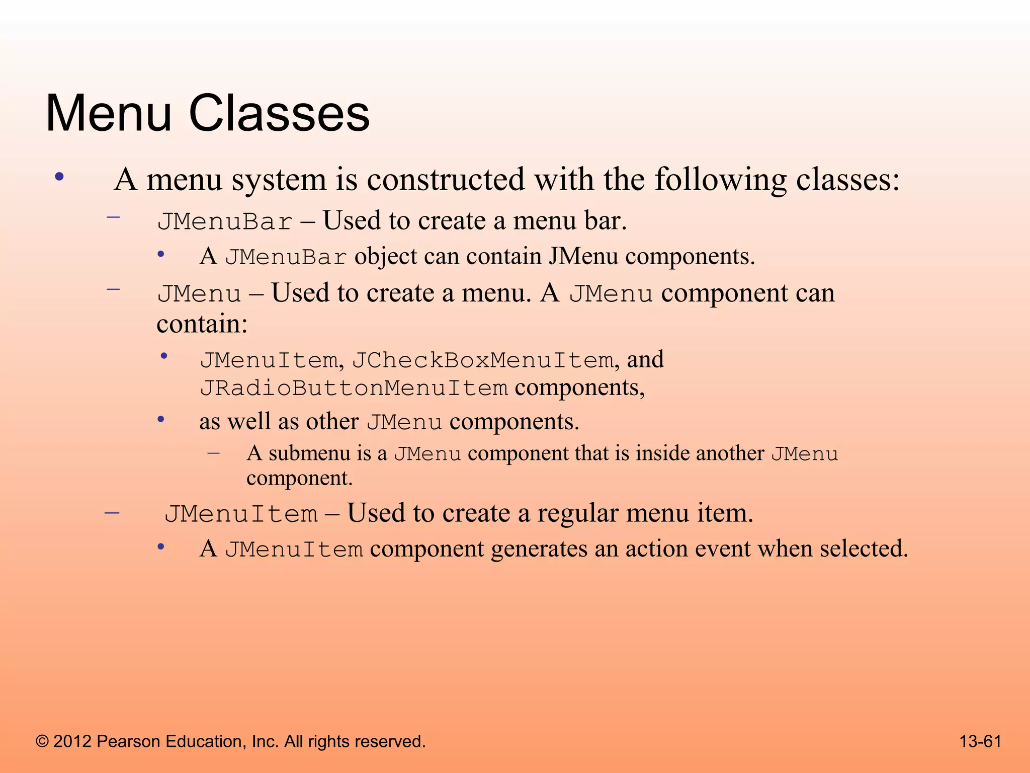
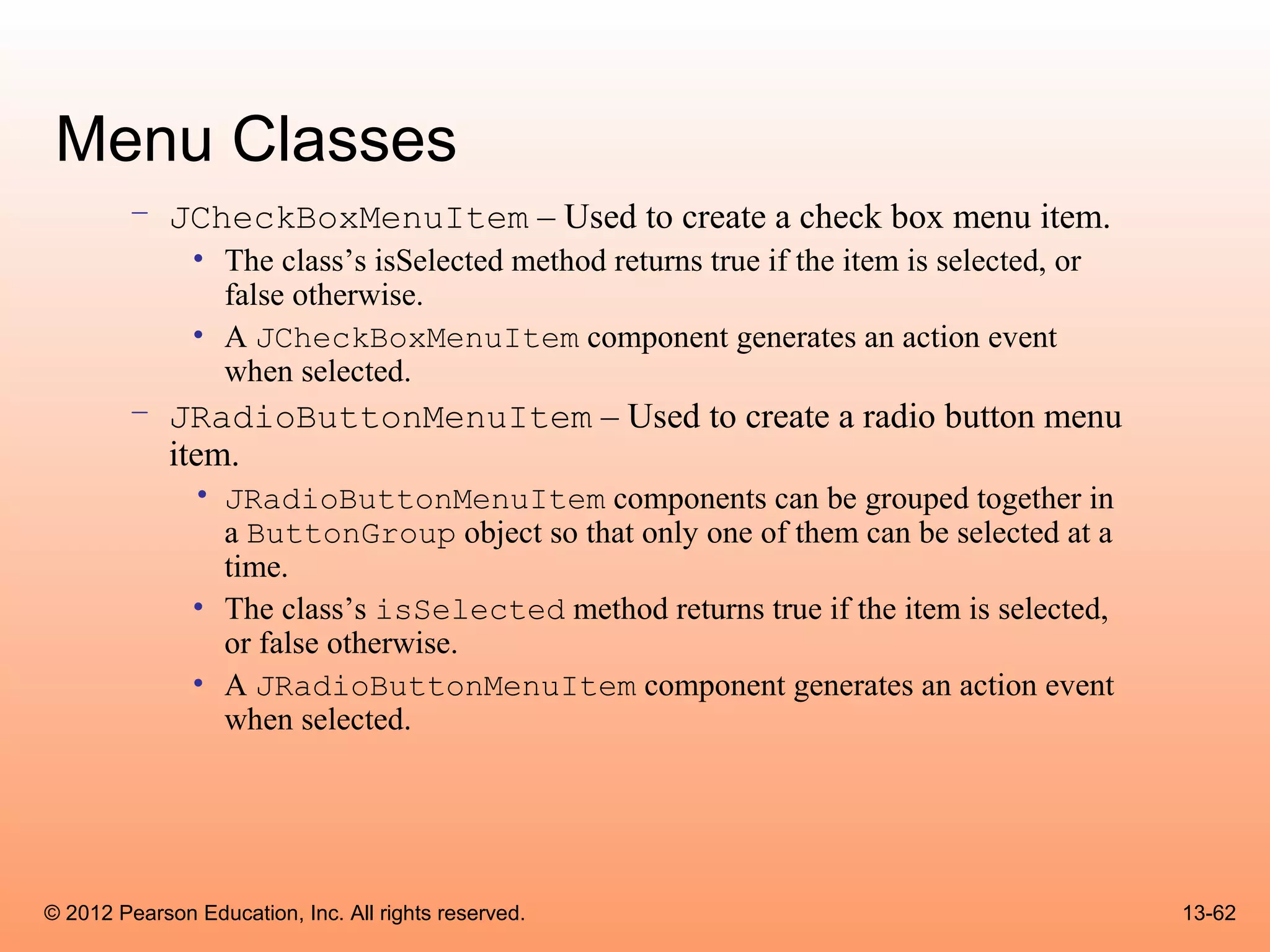
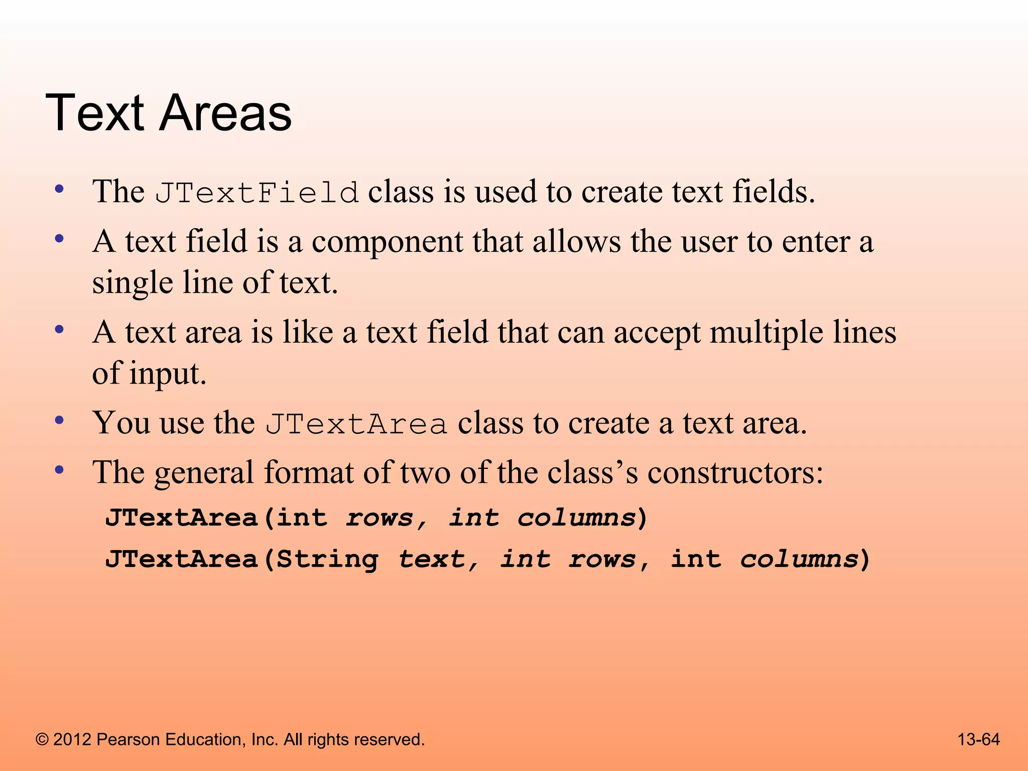
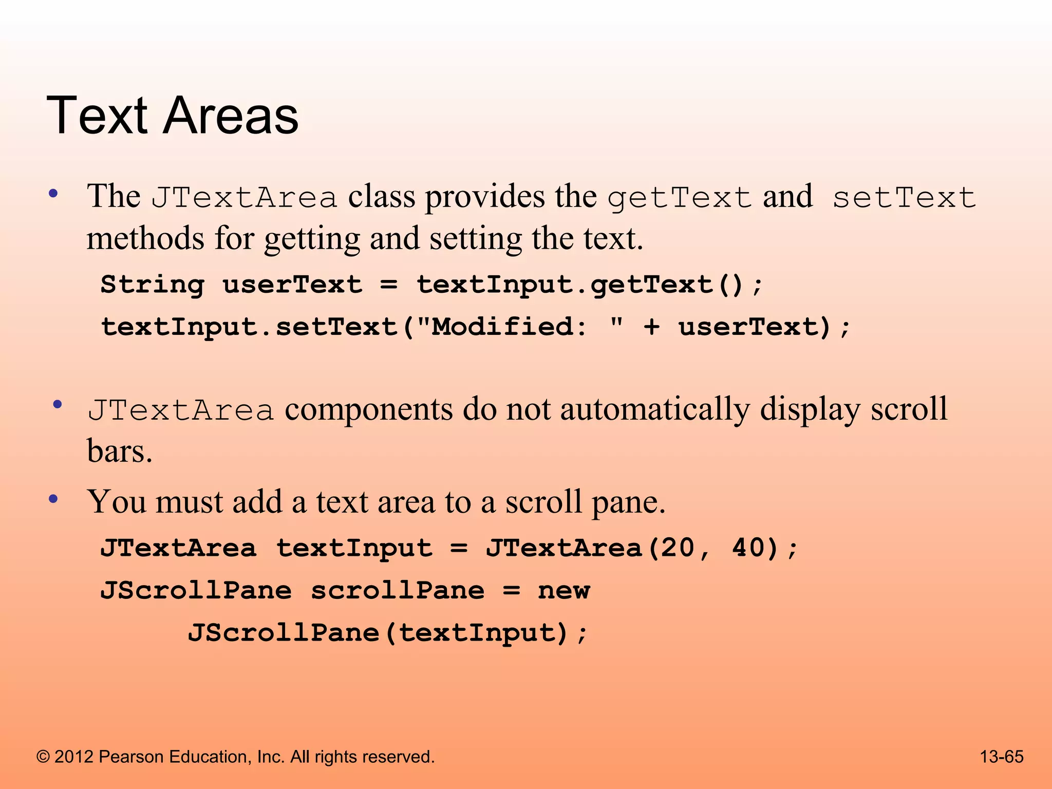
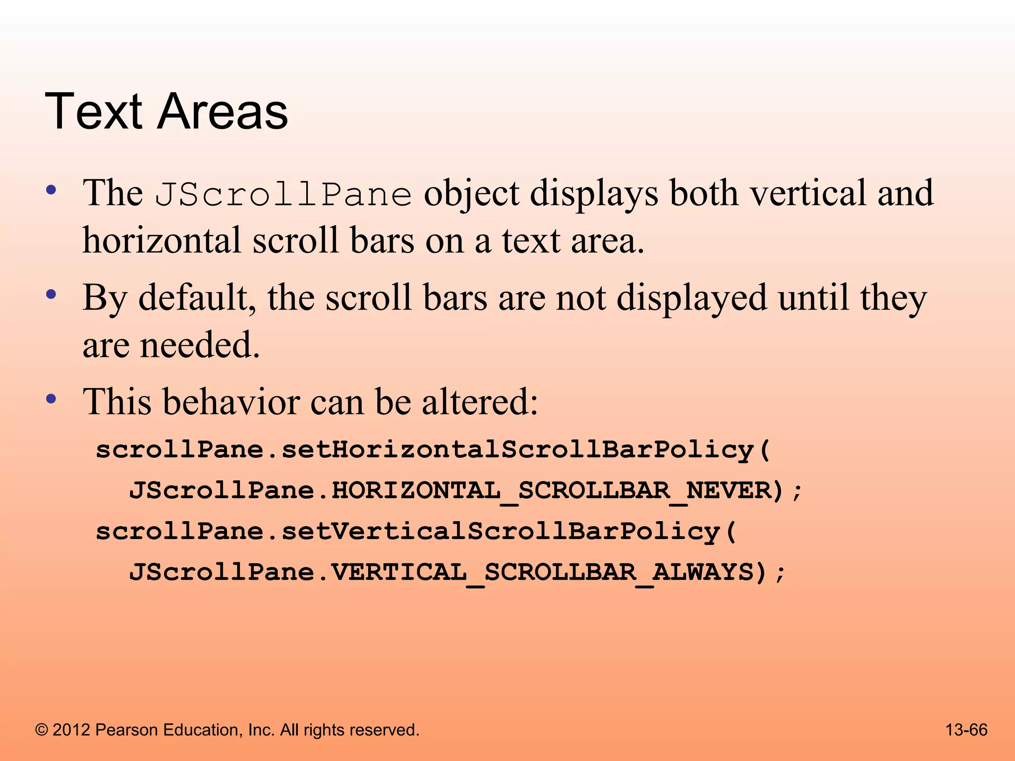
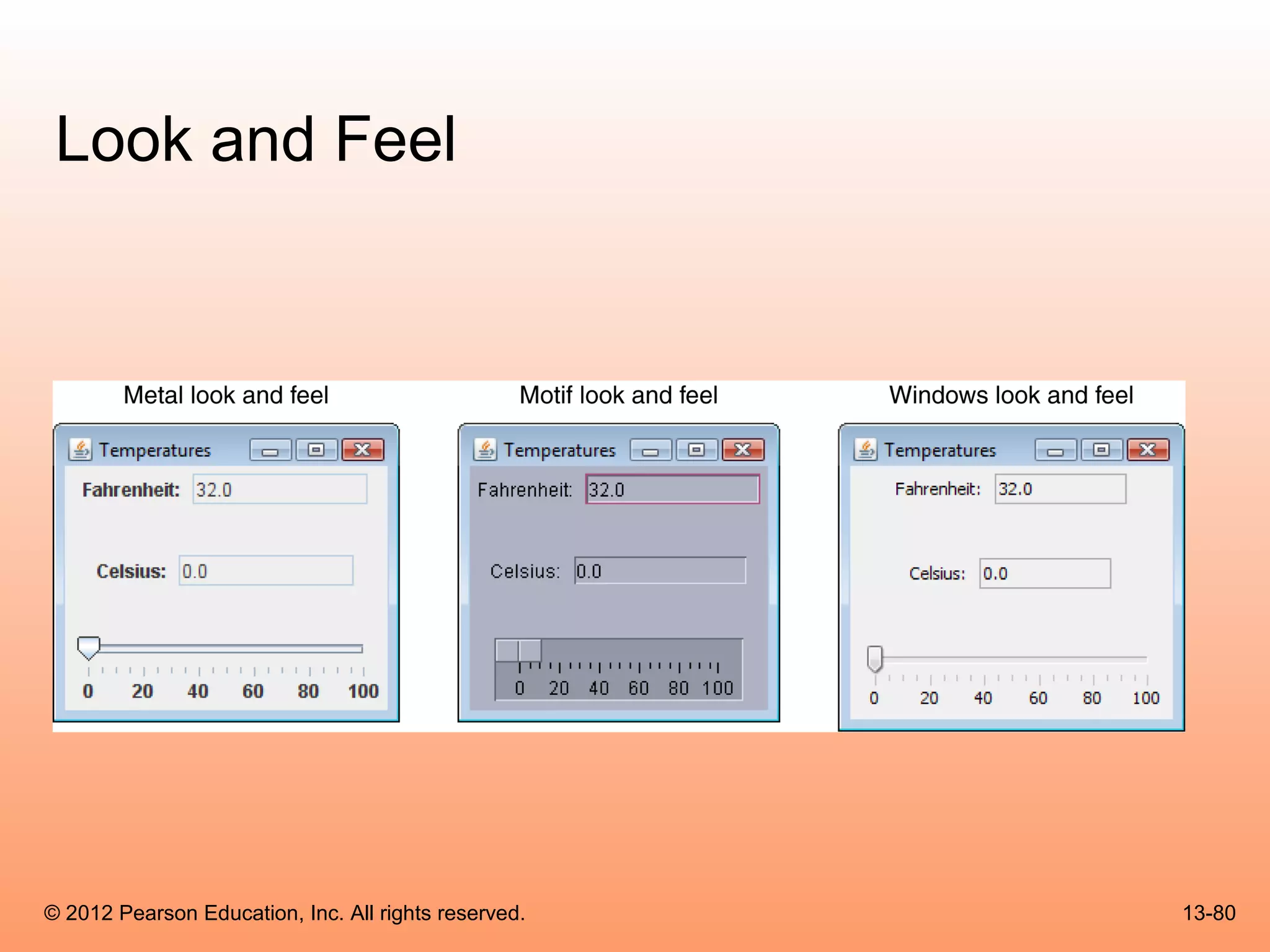
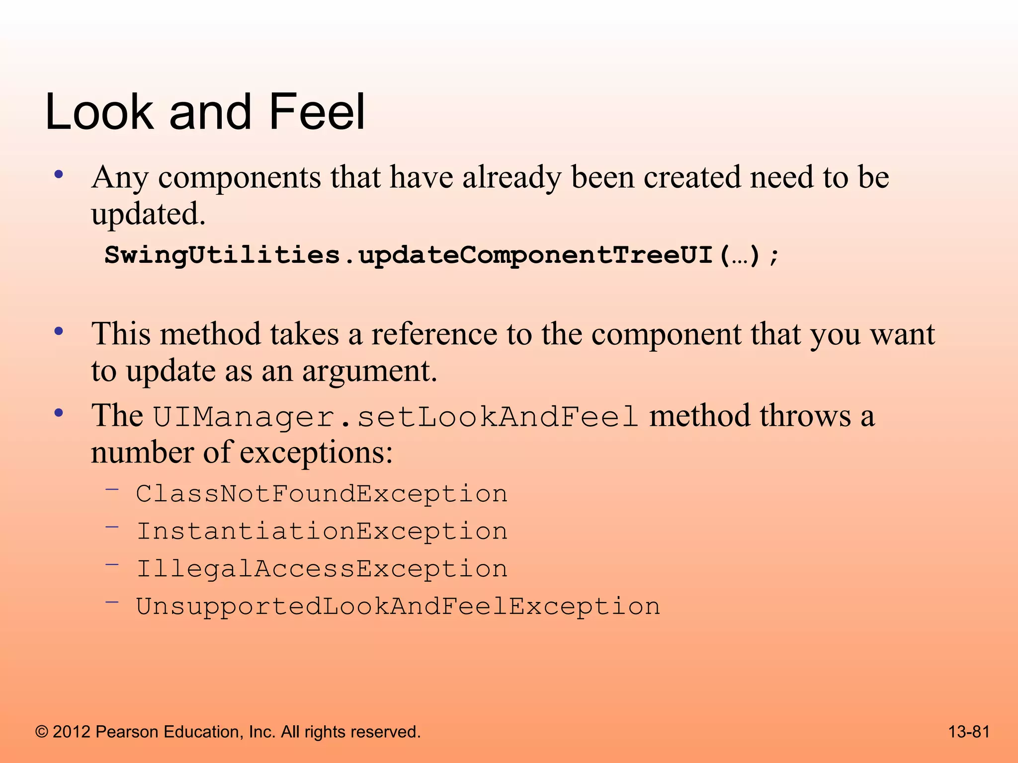
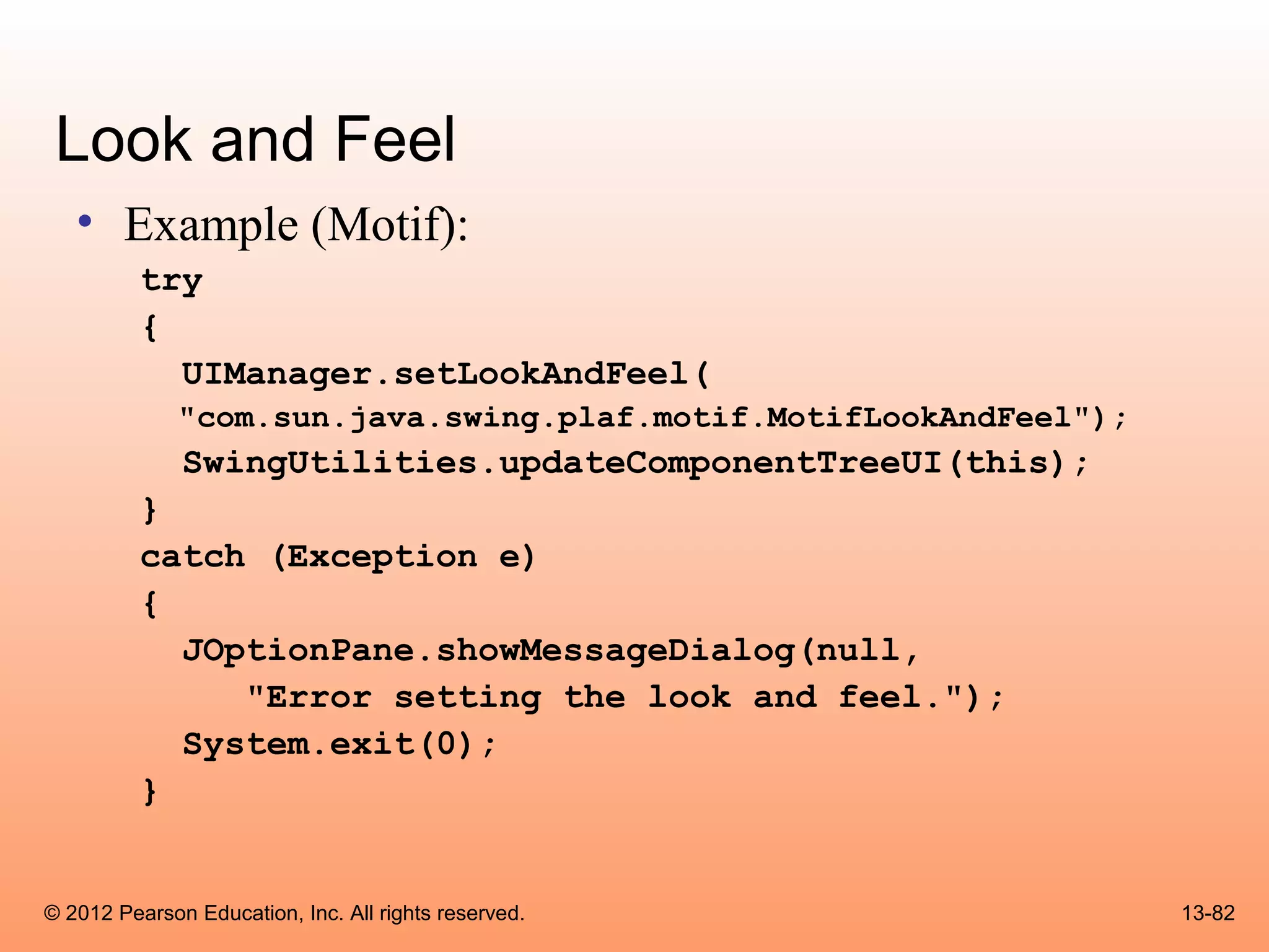
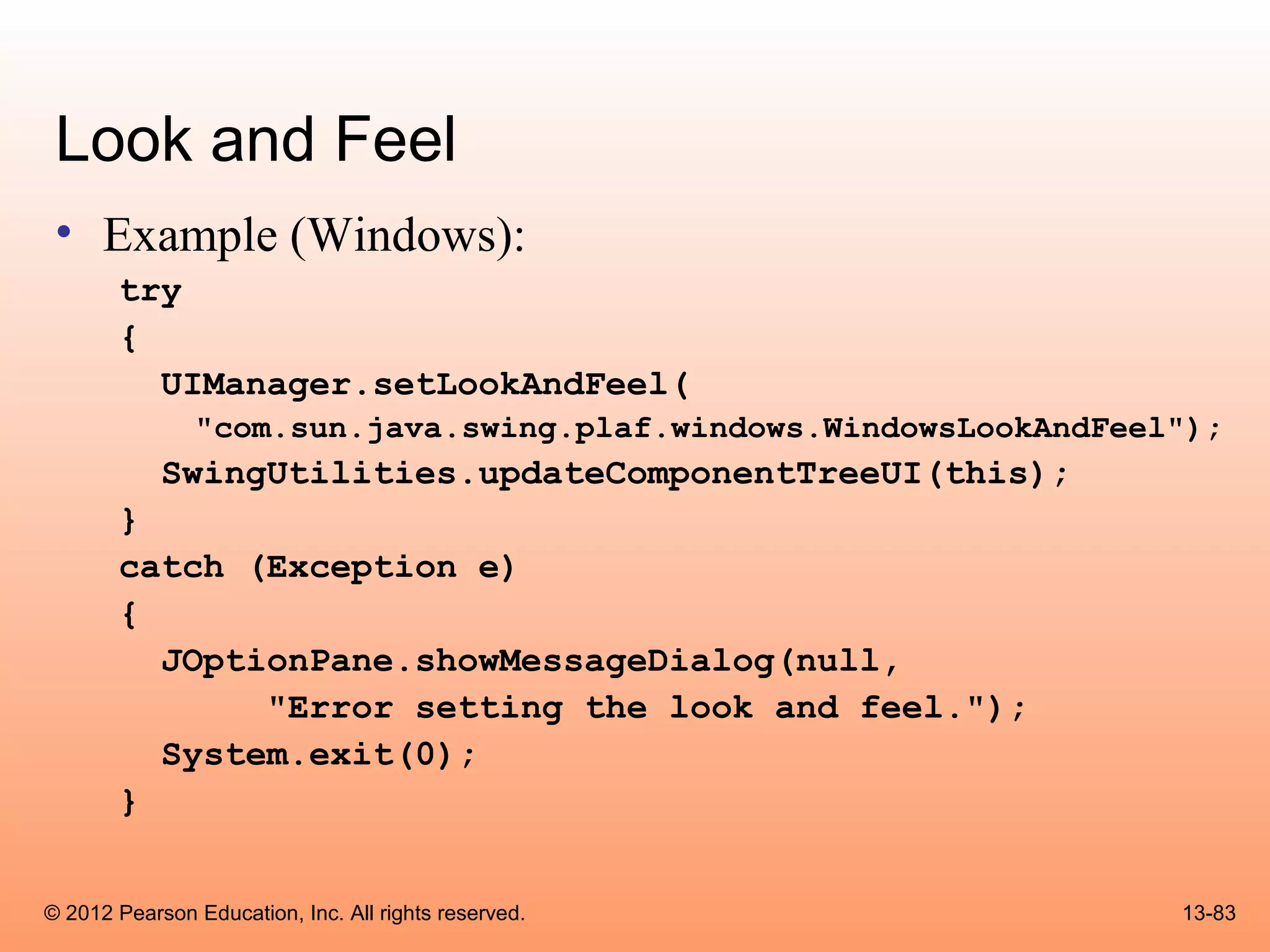
The document summarizes topics from Chapter 13 of a textbook on advanced GUI applications using Java Swing and AWT. It discusses read-only text fields, lists, combo boxes, displaying images, menus, text areas, sliders, and look and feel. Specific topics covered include creating lists from arrays, list selection modes, retrieving selected items, adding scroll bars to lists, combo box events, and displaying images in labels and buttons using the ImageIcon class.

![Lists
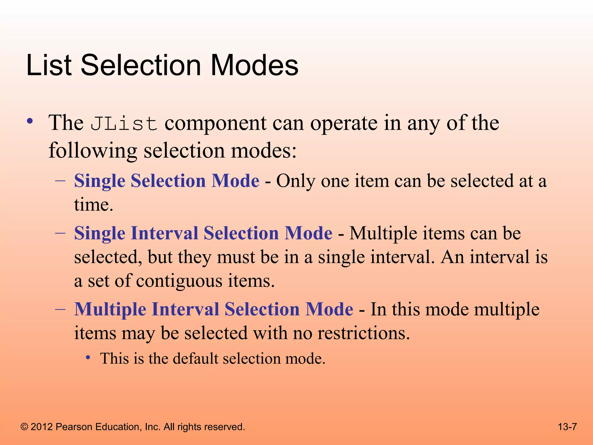
• A list is a component that displays a list of items and
allows the user to select items from the list.
• The JList component is used for creating lists.
• When an instance of the JList class is created, an
array of objects is passed to the constructor.
JList (Object[] array)
• The JList component uses the array to create the list
of items.
String[] names = { "Bill", "Geri", "Greg", "Jean",
"Kirk", "Phillip", "Susan" };
JList nameList = new JList(names);
© 2012 Pearson Education, Inc. All rights reserved. 13-6](https://image.slidesharecdn.com/csogaddisjavachapter13-130411103924-phpapp02/75/Cso-gaddis-java_chapter13-6-2048.jpg)
![Retrieving Selected Items
• The getSelectedIndex method returns the index of the
selected item, or –1 if no item is selected.
• Internally, the items that are stored in a list are numbered
(similar to an array).
• Each item’s number is called its index.
• The first item has the index 0.
• You can use the index of the selected item to retrieve the item
from an array.
String[] names = { "Bill", "Geri", "Greg", "Jean",
"Kirk", "Phillip", "Susan" };
JList nameList = new JList(names);
© 2012 Pearson Education, Inc. All rights reserved. 13-13](https://image.slidesharecdn.com/csogaddisjavachapter13-130411103924-phpapp02/75/Cso-gaddis-java_chapter13-13-2048.jpg)
![Retrieving Selected Items
• This code could be used to determine the
selected item:
int index;
String selectedName;
index = nameList.getSelectedIndex();
if (index != -1)
selectedName = names[index];
• Example: ListWindow.java
© 2012 Pearson Education, Inc. All rights reserved. 13-14](https://image.slidesharecdn.com/csogaddisjavachapter13-130411103924-phpapp02/75/Cso-gaddis-java_chapter13-14-2048.jpg)
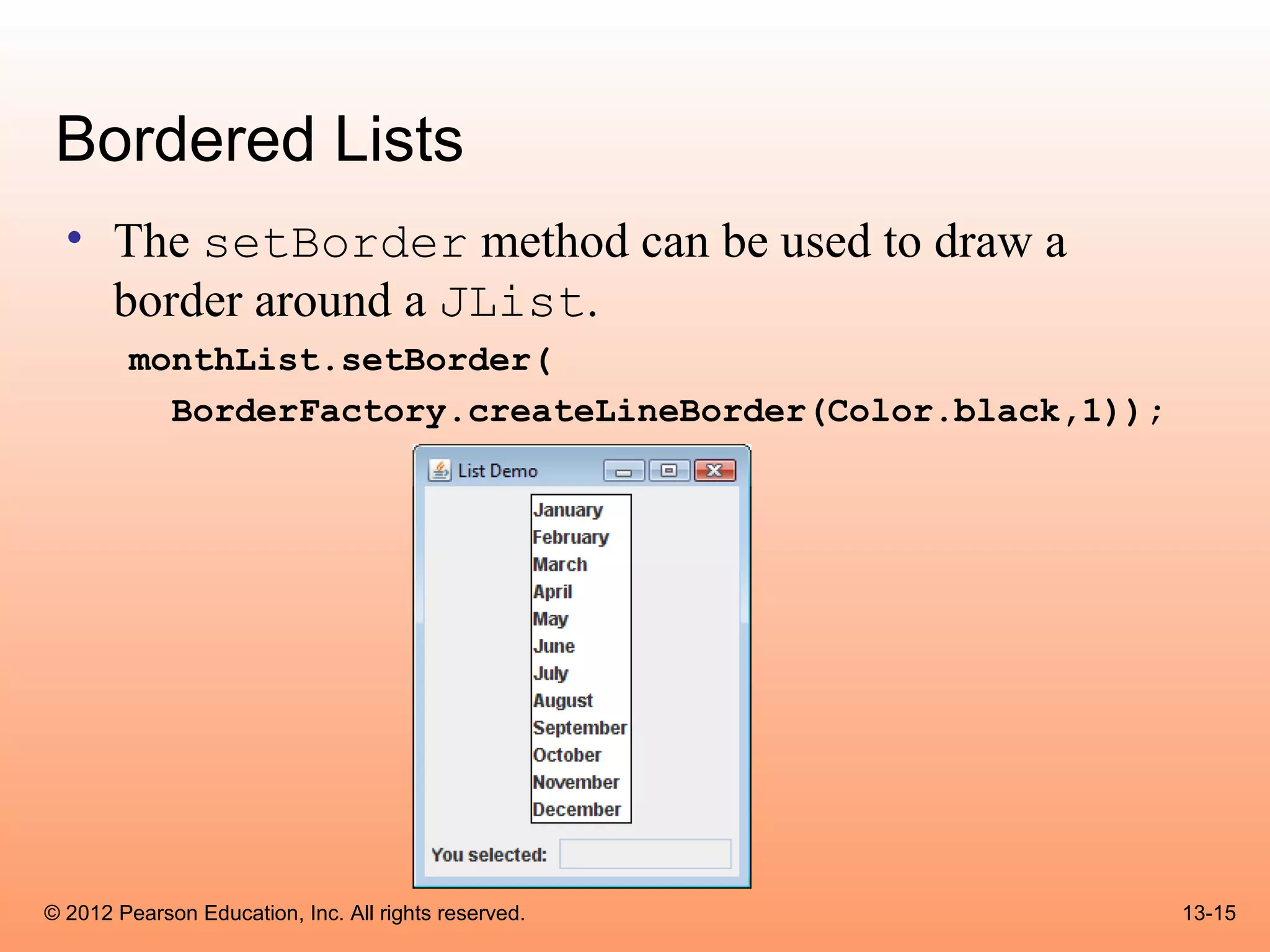
![Adding A Scroll Bar To a List
• To display a scroll bar on a list component, follow
these general steps.
1. Set the number of visible rows for the list component.
2. Create a scroll pane object and add the list component to it.
3. Add the scroll pane object to any other containers, such as
panels.
• For this list:
String[] names = { "Bill", "Geri", "Greg", "Jean",
"Kirk", "Phillip", "Susan" };
JList nameList = new JList(names);
© 2012 Pearson Education, Inc. All rights reserved. 13-17](https://image.slidesharecdn.com/csogaddisjavachapter13-130411103924-phpapp02/75/Cso-gaddis-java_chapter13-17-2048.jpg)
![Adding Items to an Existing List
• The setListData method allows the adding of
items in an existing JList component.
void setListData(Object[] data)
• This replaces any items that are currently displayed in
the component.
• This can be used to add items to an empty list.
© 2012 Pearson Education, Inc. All rights reserved. 13-21](https://image.slidesharecdn.com/csogaddisjavachapter13-130411103924-phpapp02/75/Cso-gaddis-java_chapter13-21-2048.jpg)
![Adding Items to an Existing List
• You can create an empty list by using the JList
component’s no-parameter constructor:
JList nameList = new JList();
• Items can be added to the list:
String[] names = { "Bill", "Geri", "Greg", "Jean",
"Kirk", "Phillip", "Susan" };
nameList.setListData(names);
© 2012 Pearson Education, Inc. All rights reserved. 13-22](https://image.slidesharecdn.com/csogaddisjavachapter13-130411103924-phpapp02/75/Cso-gaddis-java_chapter13-22-2048.jpg)
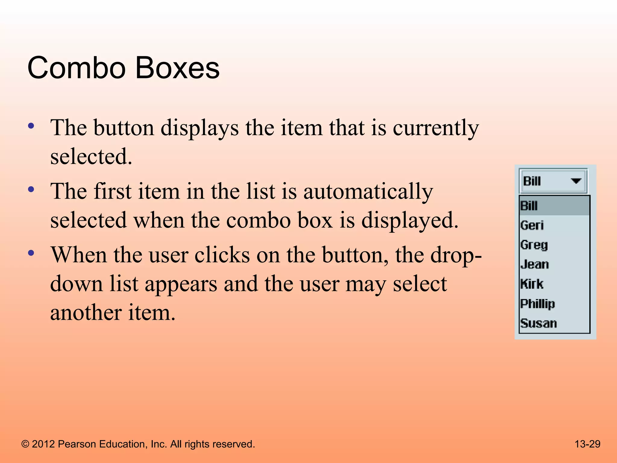
![Combo Boxes
• A combo box presents a drop-down list of items that the user may
select from.
• The JComboBox class is used to create a combo box.
• Pass an array of objects that are to be displayed as the items in the
drop-down list to the constructor.
String[] names = { "Bill", "Geri", "Greg", "Jean",
"Kirk", "Phillip", "Susan" };
JComboBox nameBox = new JComboBox(names);
• When displayed, the combo box created by this code will initially
appear as the button:
© 2012 Pearson Education, Inc. All rights reserved. 13-28](https://image.slidesharecdn.com/csogaddisjavachapter13-130411103924-phpapp02/75/Cso-gaddis-java_chapter13-28-2048.jpg)
![Retrieving Selected Items
• The getSelectedIndex method returns the index
of the selected item.
String[] names = { "Bill", "Geri", "Greg", "Jean",
"Kirk", "Phillip", "Susan" };
JComboBox nameBox = new JComboBox(names);
• Get the selected item from the names array:
int index;
String selectedName;
index = nameBox.getSelectedIndex();
selectedName = names[index];
© 2012 Pearson Education, Inc. All rights reserved. 13-32](https://image.slidesharecdn.com/csogaddisjavachapter13-130411103924-phpapp02/75/Cso-gaddis-java_chapter13-32-2048.jpg)
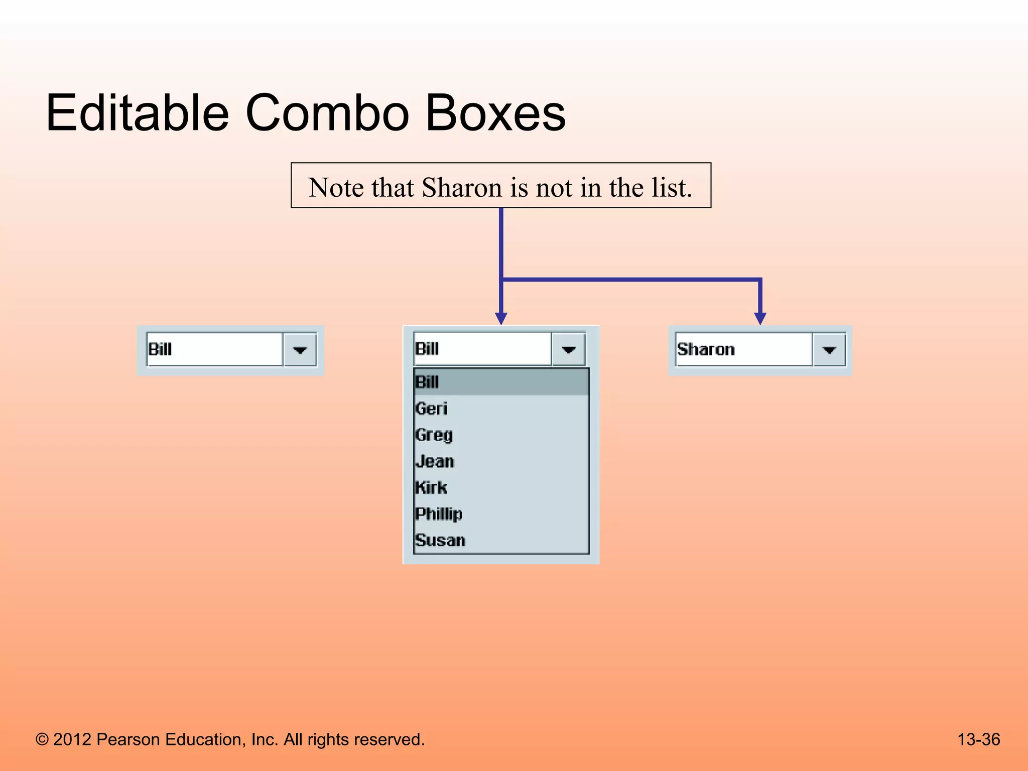
![Editable Combo Boxes
• There are two types of combo boxes:
– uneditable – allows the user to only select items from its list.
– editable – combines a text field and a list.
• It allows the selection of items from the list
• allows the user to type input into the text field
• The setEditable method sets the edit mode for the
component.
String[] names = { "Bill", "Geri", "Greg", "Jean",
"Kirk", "Phillip", "Susan" };
JComboBox nameBox = new JComboBox(names);
nameBox.setEditable(true);
© 2012 Pearson Education, Inc. All rights reserved. 13-34](https://image.slidesharecdn.com/csogaddisjavachapter13-130411103924-phpapp02/75/Cso-gaddis-java_chapter13-34-2048.jpg)


![Coded Agents – with UiPath SDK + LangGraph [Virtual Hands-on Workshop]](https://cdn.slidesharecdn.com/ss_thumbnails/codedagentsdeck-251215155422-5497c599-thumbnail.jpg?width=640&height=640&fit=bounds)


