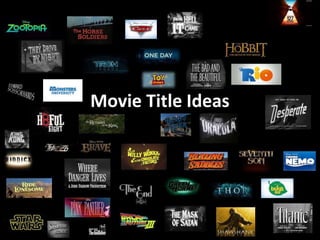
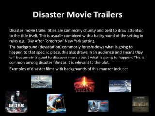
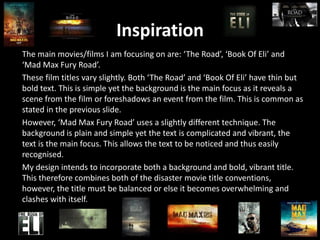
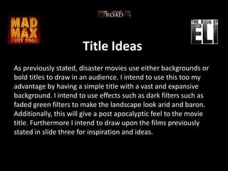
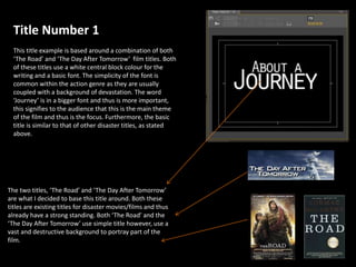
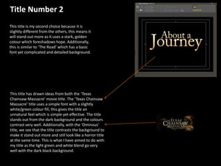
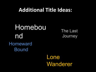
Movie Title Ideas
Disaster Movie Trailers
Disaster movie trailer titles are commonly chunky and bold to draw attention
to the title itself. This is usually combined with a background of the setting in
ruins e.g. ‘Day After Tomorrow’ New York setting.
The background (devastation) commonly foreshadows what is going to
happen to that specific place, this also draws in an audience and means they
will become intrigued to discover more about what is going to happen. This is
common among disaster films as it is relevant to the plot.
Examples of disaster films with backgrounds of this manner include:
Inspiration
The main movies/films I am focusing on are: ‘The Road’, ‘Book Of Eli’ and
‘Mad Max Fury Road’.
These film titles vary slightly. Both ‘The Road’ and ‘Book Of Eli’ have thin but
bold text. This is simple yet the background is the main focus as it reveals a
scene from the film or foreshadows an event from the film. This is common as
stated in the previous slide.
However, ‘Mad Max Fury Road’ uses a slightly different technique. The
background is plain and simple yet the text is complicated and vibrant, the
text is the main focus. This allows the text to be noticed and thus easily
recognised.
My design intends to incorporate both a background and bold, vibrant title.
This therefore combines both of the disaster movie title conventions,
however, the title must be balanced or else it becomes overwhelming and
clashes with itself.
Title Ideas
As previously stated, disaster movies use either backgrounds or
bold titles to draw in an audience. I intend to use this too my
advantage by having a simple title with a vast and expansive
background. I intend to use effects such as dark filters such as
faded green filters to make the landscape look arid and baron.
Additionally, this will give a post apocalyptic feel to the movie
title. Furthermore I intend to draw upon the films previously
stated in slide three for inspiration and ideas.
Title Number 1
This title example is based around a combination of both
‘The Road’ and ‘The Day After Tomorrow’ film titles. Both
of these titles use a white central block colour for the
writing and a basic font. The simplicity of the font is
common within the action genre as they are usually
coupled with a background of devastation. The word
‘Journey’ is in a bigger font and thus is more important,
this signifies to the audience that this is the main theme
of the film and thus is the focus. Furthermore, the basic
title is similar to that of other disaster titles, as stated
above.
The two titles, ‘The Road’ and ‘The Day After Tomorrow’
are what I decided to base this title around. Both these
titles are existing titles for disaster movies/films and thus
already have a strong standing. Both ‘The Road’ and the
‘The Day After Tomorrow’ use simple title however, use a
vast and destructive background to portray part of the
film.
Title Number 2
This title is my second choice because it is
slightly different from the others, this means it
will stand out more as it uses a stark, golden
colour which foreshadows hope. Additionally,
this is similar to ‘The Road’ which has a basic
font yet complicated and detailed background.
This title has drawn ideas from both the ‘Texas
Chainsaw Massacre’ movie title. The ‘Texas Chainsaw
Massacre’ title uses a simple font with a slightly
white/green colour fill, this gives the title an
unnatural feel which is simple yet effective. The title
stands out from the dark background and the colours
contrast very well. Additionally, with the ‘Ominous’
title, we see that the title contrasts the background to
make it stand out more and still look like a horror title
at the same time. This is what I have aimed to do with
my title as the light green and white blend go very
well with the dark black background.
Additional Title Ideas:
Homebou
nd
Lone
Wanderer
The Last
Journey
Homeward
Bound
Final Design
Homeboun
d
This is the final design I have
decided to go with. This design has
a simple bold text that stands out
and is easy for the audience to
read. Furthermore, the use of this
font that has chips and scratches
out of it adds to its impact within
genre. I f we observe similar fonts
such as that of the game ‘The Last
Of Us’ we see that it has the same
effects. Furthermore, the design
title matches the theme of my
narrative with my character trying
to re piece his life and return
home.

Movie title ideas

  • 1.
  • 2.
    Disaster Movie Trailers Disastermovie trailer titles are commonly chunky and bold to draw attention to the title itself. This is usually combined with a background of the setting in ruins e.g. ‘Day After Tomorrow’ New York setting. The background (devastation) commonly foreshadows what is going to happen to that specific place, this also draws in an audience and means they will become intrigued to discover more about what is going to happen. This is common among disaster films as it is relevant to the plot. Examples of disaster films with backgrounds of this manner include:
  • 3.
    Inspiration The main movies/filmsI am focusing on are: ‘The Road’, ‘Book Of Eli’ and ‘Mad Max Fury Road’. These film titles vary slightly. Both ‘The Road’ and ‘Book Of Eli’ have thin but bold text. This is simple yet the background is the main focus as it reveals a scene from the film or foreshadows an event from the film. This is common as stated in the previous slide. However, ‘Mad Max Fury Road’ uses a slightly different technique. The background is plain and simple yet the text is complicated and vibrant, the text is the main focus. This allows the text to be noticed and thus easily recognised. My design intends to incorporate both a background and bold, vibrant title. This therefore combines both of the disaster movie title conventions, however, the title must be balanced or else it becomes overwhelming and clashes with itself.
  • 4.
    Title Ideas As previouslystated, disaster movies use either backgrounds or bold titles to draw in an audience. I intend to use this too my advantage by having a simple title with a vast and expansive background. I intend to use effects such as dark filters such as faded green filters to make the landscape look arid and baron. Additionally, this will give a post apocalyptic feel to the movie title. Furthermore I intend to draw upon the films previously stated in slide three for inspiration and ideas.
  • 5.
    Title Number 1 Thistitle example is based around a combination of both ‘The Road’ and ‘The Day After Tomorrow’ film titles. Both of these titles use a white central block colour for the writing and a basic font. The simplicity of the font is common within the action genre as they are usually coupled with a background of devastation. The word ‘Journey’ is in a bigger font and thus is more important, this signifies to the audience that this is the main theme of the film and thus is the focus. Furthermore, the basic title is similar to that of other disaster titles, as stated above. The two titles, ‘The Road’ and ‘The Day After Tomorrow’ are what I decided to base this title around. Both these titles are existing titles for disaster movies/films and thus already have a strong standing. Both ‘The Road’ and the ‘The Day After Tomorrow’ use simple title however, use a vast and destructive background to portray part of the film.
  • 6.
    Title Number 2 Thistitle is my second choice because it is slightly different from the others, this means it will stand out more as it uses a stark, golden colour which foreshadows hope. Additionally, this is similar to ‘The Road’ which has a basic font yet complicated and detailed background. This title has drawn ideas from both the ‘Texas Chainsaw Massacre’ movie title. The ‘Texas Chainsaw Massacre’ title uses a simple font with a slightly white/green colour fill, this gives the title an unnatural feel which is simple yet effective. The title stands out from the dark background and the colours contrast very well. Additionally, with the ‘Ominous’ title, we see that the title contrasts the background to make it stand out more and still look like a horror title at the same time. This is what I have aimed to do with my title as the light green and white blend go very well with the dark black background.
  • 7.
  • 8.
    Final Design Homeboun d This isthe final design I have decided to go with. This design has a simple bold text that stands out and is easy for the audience to read. Furthermore, the use of this font that has chips and scratches out of it adds to its impact within genre. I f we observe similar fonts such as that of the game ‘The Last Of Us’ we see that it has the same effects. Furthermore, the design title matches the theme of my narrative with my character trying to re piece his life and return home.