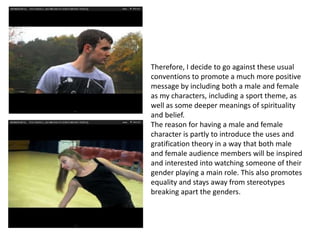
Evaluation
                Q1
   In what way does your media
 product use, develop or challenge
forms and conventions of real media
            products?
USING FORMS AND CONVENTIONS OF
      REAL MEDIA PRODUCTS
To decide on the fashion of my main artist, I had to first look at the typical
conventions of R&B artists that are already around. I decided to look at the work of a
 few different artists, including Conor Maynard, Justin Bieber and Chris Brown – all
young, stylish R&B artists. When analysing these, I found out the typical conventions
         of fashion were the use of hoodies, jeans, polo shirts and trainers.
I then decided that my main artist would conform to these for his individual
 performance scenes, in which I had him wear a hoodie, jeans and trainers. This would
represent him as a young and stylish artist, and because he is shown wearing the typical
 clothing of my target audience, they are more likely to look up for him as inspiration or
                    be more likely to have interest in my music video.
This links to the uses and gratification theory in
which my audience would recognise from my
main artist as they would see he fits into the
conventions of an R&B artist and fits in with
my target audience, so they are more likely to
enjoy listening or watching him.
I also found from my research that R&B music
videos used the main artists for performance
scenes and as well as a character within the
narrative too.
I then decided to use this convention of real music videos
in my own by having a distinct performance setting for my
main artist, but also having him play a part in the main
narrative. This was helpful for my music video because my
main artist is the same age as the target audience, so
watching my main artist within the story would help the
audience recognise that my storyline is normal and are
more likely to be interested in what goes on.
R&B music videos also use specific filming
                                               and editing techniques, such as close-ups
                                               of the main artist, a variety of shots with
                                               interesting transitions and following
                                               Andrew Goodwin’s theory that visuals and
                                               sound works together. I used the
                                               technique of shooting lots of close ups of
                                               my main artist for the purpose of making
                                               him aware to my audience and promoting
                                               him as a music artist too. I chose to use
                                               the variety of shots idea with interesting
                                               transitions from the many music videos I
                                               analysed at the beginning of the course. I
                                               found out that a variety of shots made
                                               sure the music video wasn’t boring and it
Andrew Goodwin’s theory was important in       kept the audience keen to carry on
connecting the audience with my narrative as   watching, and these variety of shots were
it allowed them to understand the tempo of     edited so that there were different
the song and the mood of the narrative.        transitions. The reason for this again to
                                               keep the music video interesting and
                                               appealing for the audience and to
                                               separate certain scenes from each other.
On my Digipak, I used the conventions of using a close-up of the artist on the front
cover to immediately show the audience who the artist is. This still is taken from my
music video too which shows continuity and allows audience to distinguish
between the two. I also included the convention of having an ongoing theme
throughout which I decided to be the convict theme and colours of black, white and
red. This links to the R&B genre I had chosen and it was important I used a colours
and theme so that audiences immediately recognised the genre without reading it.
I have used many conventions from real life
media products for all of my designs for the
purpose of it conforming and fitting in with the
market I am distributing it too. Also, it gives me
confidence that my music video is going to be
successful if I am following conventions of
products and artists that my target audience also
like and are appealed to.
DEVELOPING FORMS AND
CONVENTIONS OF REAL MEDIA
        PRODUCTS
To develop the fashion of I used in my music
video, in the editing process I played around
with colour to make my main artist’s clothing
brighter and bolder to make his fashion stand
out more. I also made the colouring very
different from other scenes so the
performance scenes stood out from others to
show how they are completely different
settings. This aesthetic appeal to the audience
allows them to be more interested in these
scenes, which is clever because the scenes in
which my main artist actually sings them are
the most important lyrics. For example, there
are lots of scenes where he sings the
chorus, which is important to shaping the
narrative and giving understanding for the
story I have chosen, so having these lyrics in a
setting that is bold makes the audience more
likely to pay attention.
I developed the variety of scenes by including different types of
editing, including the main part where I switched the scenes up by adding
black and white editing. The purpose of me doing this is so that the
audience recognise these scenes are from the past, and to give the
impression the characters are moving on. This changes the editing and the
presentation of the scenes and shows I have taken care in effects and
transitions to make them more appealing to the audience.
Also, another way I have done this is by
including the strobe effects on scenes that the
camera tilts upwards from characters
shoes, and also the echoing effect for the main
artist on the lines ‘can’t control’. This specific
scene was influenced from the music video
‘Outta My Mind’ by B.O.B and Nicki Minaj, in
which a blurred effect is used to create the
‘insane’ effect. To develop this to make it my
own, I changed the effect and had lots of
different angles and scenes that I put together
in a fast montage.
For my Digipak, I also developed the
conventions of the inside panel by including a
thank-you speech behind the image of the
artist that made it more personal. Usually, the
inside panel just features an image of the artist
with some promotional information about
their website or label, but I decided I wanted
to make it more personal with the audience
and have a dedicate it to the artists thank-you.
As this is a debut album that I am creating, it
would work well that my main artist would
thank everyone for the production of it and it
makes my Digipak more realistic.
CHALLENGING FORMS AND
CONVENTIONS OF REAL MEDIA
       PRODUCTS
One of the many conventions and theories that I challenged
in my music video was Propp’s character theory. I decided
that I didn’t want to include stereotypical characters that
conformed to the prejudices of society – e.g. women as
weak, men as heroes, different raced people as villains, etc.
The purpose of this is because my original thoughts of my
music video is to be inspiring to 13-20 year olds (my target
audience) and I don’t think the introduction of stereotypes is
a positive nor inspiring theme to include.
Music videos that include conventions of
typical R&B music videos are shown here in
some stills:


                                             sexualised women, gangsters, criminal
                                             ideology, bad messages
Therefore, I decide to go against these usual
conventions to promote a much more positive
message by including both a male and female
as my characters, including a sport theme, as
well as some deeper meanings of spirituality
and belief.
The reason for having a male and female
character is partly to introduce the uses and
gratification theory in a way that both male
and female audience members will be inspired
and interested into watching someone of their
gender playing a main role. This also promotes
equality and stays away from stereotypes
breaking apart the genders.
I also decided at the beginning of my
course to remain away from the
Hypodermic Syringe Model and make sure
that everything I plan isn’t necessarily to
force certain opinions or information onto
the audience, as I wanted their
interpretations to be completely their
own.
An example of how I avoided this was
through the guardian angel theme that
revolves around my main artist. Even
though this was something I had planned
and is a deeper meaning to the
song, some audience members might not
interpret it that way and can believe Ted’s
appearance and narrative to be something
different – e.g. a conscience, a holy figure
or even something completely different. I
didn’t want to force my audience into
thinking that everyone has a guardian
angel or spirit that protects them when
they need help, as this would conform to
the Hypodermic Syringe Model.
For my Digipak, instead of the entire task being urbanised and conforming entirely to
the R&B genre, I decided I would only keep the background and font design with this
meaning. I didn’t want my entire Digipak to have a convict or criminal activity theme
(graffiti font) as this would go against everything I have discussed previously about
promoting positive messages. Therefore, I have merged conventions of a typical R&B
digipak with conventions from other genre’s such as pop. The way I did this was by
keeping the other font very plain and delicate compared to the title font, brightening
colours and having a thank-you speech written on the inside panel – untypical of the
R&B genre. The reason I did this is so audience members aren’t caught up in the bad
messages of graffiti and to show that the R&B genre isn’t really about the stereotypes
that society has labelled it with.
My poster also challenges typical conventions
of an R&B album poster as they normally just
feature an enlarged image of the album cover
itself. It thought that this idea was actually
quite boring for my target audience, and
remembering that some of them are only 13
years of age, I have to make sure the design is
appealing to them. I did this by including a
larger still taken from the music video of my
main artist that doesn’t reveal his face
entirely, yet still fits the conventions of the
R&B clothing I discussed before. I then was
able to add the image of the front cover so the
audience can determine what the album looks
like when purchasing it. I also made sure the
text was suitable to intrigue my target
audience and make sure that when they are
reading it they are persuaded to buy the
album. Similarly, at the bottom I included
images and text of where it is out and able to
be bought from, as well as some information
about the institution that was included on the
CD design too.

Evaluation Q1

  • 1.
    Evaluation Q1 In what way does your media product use, develop or challenge forms and conventions of real media products?
  • 2.
    USING FORMS ANDCONVENTIONS OF REAL MEDIA PRODUCTS
  • 3.
    To decide onthe fashion of my main artist, I had to first look at the typical conventions of R&B artists that are already around. I decided to look at the work of a few different artists, including Conor Maynard, Justin Bieber and Chris Brown – all young, stylish R&B artists. When analysing these, I found out the typical conventions of fashion were the use of hoodies, jeans, polo shirts and trainers.
  • 4.
    I then decidedthat my main artist would conform to these for his individual performance scenes, in which I had him wear a hoodie, jeans and trainers. This would represent him as a young and stylish artist, and because he is shown wearing the typical clothing of my target audience, they are more likely to look up for him as inspiration or be more likely to have interest in my music video.
  • 5.
    This links tothe uses and gratification theory in which my audience would recognise from my main artist as they would see he fits into the conventions of an R&B artist and fits in with my target audience, so they are more likely to enjoy listening or watching him.
  • 6.
    I also foundfrom my research that R&B music videos used the main artists for performance scenes and as well as a character within the narrative too.
  • 7.
    I then decidedto use this convention of real music videos in my own by having a distinct performance setting for my main artist, but also having him play a part in the main narrative. This was helpful for my music video because my main artist is the same age as the target audience, so watching my main artist within the story would help the audience recognise that my storyline is normal and are more likely to be interested in what goes on.
  • 8.
    R&B music videosalso use specific filming and editing techniques, such as close-ups of the main artist, a variety of shots with interesting transitions and following Andrew Goodwin’s theory that visuals and sound works together. I used the technique of shooting lots of close ups of my main artist for the purpose of making him aware to my audience and promoting him as a music artist too. I chose to use the variety of shots idea with interesting transitions from the many music videos I analysed at the beginning of the course. I found out that a variety of shots made sure the music video wasn’t boring and it Andrew Goodwin’s theory was important in kept the audience keen to carry on connecting the audience with my narrative as watching, and these variety of shots were it allowed them to understand the tempo of edited so that there were different the song and the mood of the narrative. transitions. The reason for this again to keep the music video interesting and appealing for the audience and to separate certain scenes from each other.
  • 9.
    On my Digipak,I used the conventions of using a close-up of the artist on the front cover to immediately show the audience who the artist is. This still is taken from my music video too which shows continuity and allows audience to distinguish between the two. I also included the convention of having an ongoing theme throughout which I decided to be the convict theme and colours of black, white and red. This links to the R&B genre I had chosen and it was important I used a colours and theme so that audiences immediately recognised the genre without reading it.
  • 10.
    I have usedmany conventions from real life media products for all of my designs for the purpose of it conforming and fitting in with the market I am distributing it too. Also, it gives me confidence that my music video is going to be successful if I am following conventions of products and artists that my target audience also like and are appealed to.
  • 11.
    DEVELOPING FORMS AND CONVENTIONSOF REAL MEDIA PRODUCTS
  • 12.
    To develop thefashion of I used in my music video, in the editing process I played around with colour to make my main artist’s clothing brighter and bolder to make his fashion stand out more. I also made the colouring very different from other scenes so the performance scenes stood out from others to show how they are completely different settings. This aesthetic appeal to the audience allows them to be more interested in these scenes, which is clever because the scenes in which my main artist actually sings them are the most important lyrics. For example, there are lots of scenes where he sings the chorus, which is important to shaping the narrative and giving understanding for the story I have chosen, so having these lyrics in a setting that is bold makes the audience more likely to pay attention.
  • 13.
    I developed thevariety of scenes by including different types of editing, including the main part where I switched the scenes up by adding black and white editing. The purpose of me doing this is so that the audience recognise these scenes are from the past, and to give the impression the characters are moving on. This changes the editing and the presentation of the scenes and shows I have taken care in effects and transitions to make them more appealing to the audience.
  • 14.
    Also, another wayI have done this is by including the strobe effects on scenes that the camera tilts upwards from characters shoes, and also the echoing effect for the main artist on the lines ‘can’t control’. This specific scene was influenced from the music video ‘Outta My Mind’ by B.O.B and Nicki Minaj, in which a blurred effect is used to create the ‘insane’ effect. To develop this to make it my own, I changed the effect and had lots of different angles and scenes that I put together in a fast montage.
  • 15.
    For my Digipak,I also developed the conventions of the inside panel by including a thank-you speech behind the image of the artist that made it more personal. Usually, the inside panel just features an image of the artist with some promotional information about their website or label, but I decided I wanted to make it more personal with the audience and have a dedicate it to the artists thank-you. As this is a debut album that I am creating, it would work well that my main artist would thank everyone for the production of it and it makes my Digipak more realistic.
  • 16.
    CHALLENGING FORMS AND CONVENTIONSOF REAL MEDIA PRODUCTS
  • 17.
    One of themany conventions and theories that I challenged in my music video was Propp’s character theory. I decided that I didn’t want to include stereotypical characters that conformed to the prejudices of society – e.g. women as weak, men as heroes, different raced people as villains, etc. The purpose of this is because my original thoughts of my music video is to be inspiring to 13-20 year olds (my target audience) and I don’t think the introduction of stereotypes is a positive nor inspiring theme to include.
  • 18.
    Music videos thatinclude conventions of typical R&B music videos are shown here in some stills: sexualised women, gangsters, criminal ideology, bad messages
  • 19.
    Therefore, I decideto go against these usual conventions to promote a much more positive message by including both a male and female as my characters, including a sport theme, as well as some deeper meanings of spirituality and belief. The reason for having a male and female character is partly to introduce the uses and gratification theory in a way that both male and female audience members will be inspired and interested into watching someone of their gender playing a main role. This also promotes equality and stays away from stereotypes breaking apart the genders.
  • 20.
    I also decidedat the beginning of my course to remain away from the Hypodermic Syringe Model and make sure that everything I plan isn’t necessarily to force certain opinions or information onto the audience, as I wanted their interpretations to be completely their own. An example of how I avoided this was through the guardian angel theme that revolves around my main artist. Even though this was something I had planned and is a deeper meaning to the song, some audience members might not interpret it that way and can believe Ted’s appearance and narrative to be something different – e.g. a conscience, a holy figure or even something completely different. I didn’t want to force my audience into thinking that everyone has a guardian angel or spirit that protects them when they need help, as this would conform to the Hypodermic Syringe Model.
  • 21.
    For my Digipak,instead of the entire task being urbanised and conforming entirely to the R&B genre, I decided I would only keep the background and font design with this meaning. I didn’t want my entire Digipak to have a convict or criminal activity theme (graffiti font) as this would go against everything I have discussed previously about promoting positive messages. Therefore, I have merged conventions of a typical R&B digipak with conventions from other genre’s such as pop. The way I did this was by keeping the other font very plain and delicate compared to the title font, brightening colours and having a thank-you speech written on the inside panel – untypical of the R&B genre. The reason I did this is so audience members aren’t caught up in the bad messages of graffiti and to show that the R&B genre isn’t really about the stereotypes that society has labelled it with.
  • 22.
    My poster alsochallenges typical conventions of an R&B album poster as they normally just feature an enlarged image of the album cover itself. It thought that this idea was actually quite boring for my target audience, and remembering that some of them are only 13 years of age, I have to make sure the design is appealing to them. I did this by including a larger still taken from the music video of my main artist that doesn’t reveal his face entirely, yet still fits the conventions of the R&B clothing I discussed before. I then was able to add the image of the front cover so the audience can determine what the album looks like when purchasing it. I also made sure the text was suitable to intrigue my target audience and make sure that when they are reading it they are persuaded to buy the album. Similarly, at the bottom I included images and text of where it is out and able to be bought from, as well as some information about the institution that was included on the CD design too.