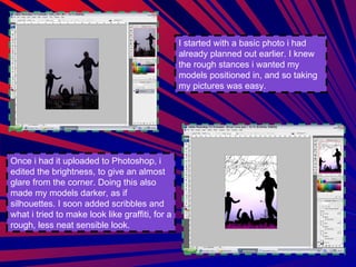
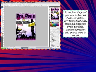
Font Cover Progress Martin Watts
I started with a basic photo i had already planned out earlier. I knew the rough stances i wanted my models positioned in, and so taking my pictures was easy.  Once i had it uploaded to Photoshop, i edited the brightness, to give an almost glare from the corner. Doing this also made my models darker, as if silhouettes. I soon added scribbles and what i tried to make look like graffiti, for a rough, less neat sensible look.
Once I had added the graffiti and scribbles, I wanted to continue this scruffy look with my Mast head. I had decided on the title of my magazine “Pro-Pella” translating as “Good Music”. After using the right font, I gave it an outer glow in keeping with the purple at the bottom of the page. I felt this gives an almost border to the cover. Soon I added some headlines and tittles, drawing more onto the conventional attributes of a magazine. Drawing more attention to the Mast head I felt was very important, and so I decided to use more neutral darker colours for the headlines.
In my final stages of production, I added the lesser details, and things I felt really created a magazine. Price, bar code, article information and skyline were all added.

Font Cover Progress Slide

  • 1.
    Font Cover ProgressMartin Watts
  • 2.
    I started witha basic photo i had already planned out earlier. I knew the rough stances i wanted my models positioned in, and so taking my pictures was easy. Once i had it uploaded to Photoshop, i edited the brightness, to give an almost glare from the corner. Doing this also made my models darker, as if silhouettes. I soon added scribbles and what i tried to make look like graffiti, for a rough, less neat sensible look.
  • 3.
    Once I hadadded the graffiti and scribbles, I wanted to continue this scruffy look with my Mast head. I had decided on the title of my magazine “Pro-Pella” translating as “Good Music”. After using the right font, I gave it an outer glow in keeping with the purple at the bottom of the page. I felt this gives an almost border to the cover. Soon I added some headlines and tittles, drawing more onto the conventional attributes of a magazine. Drawing more attention to the Mast head I felt was very important, and so I decided to use more neutral darker colours for the headlines.
  • 4.
    In my finalstages of production, I added the lesser details, and things I felt really created a magazine. Price, bar code, article information and skyline were all added.