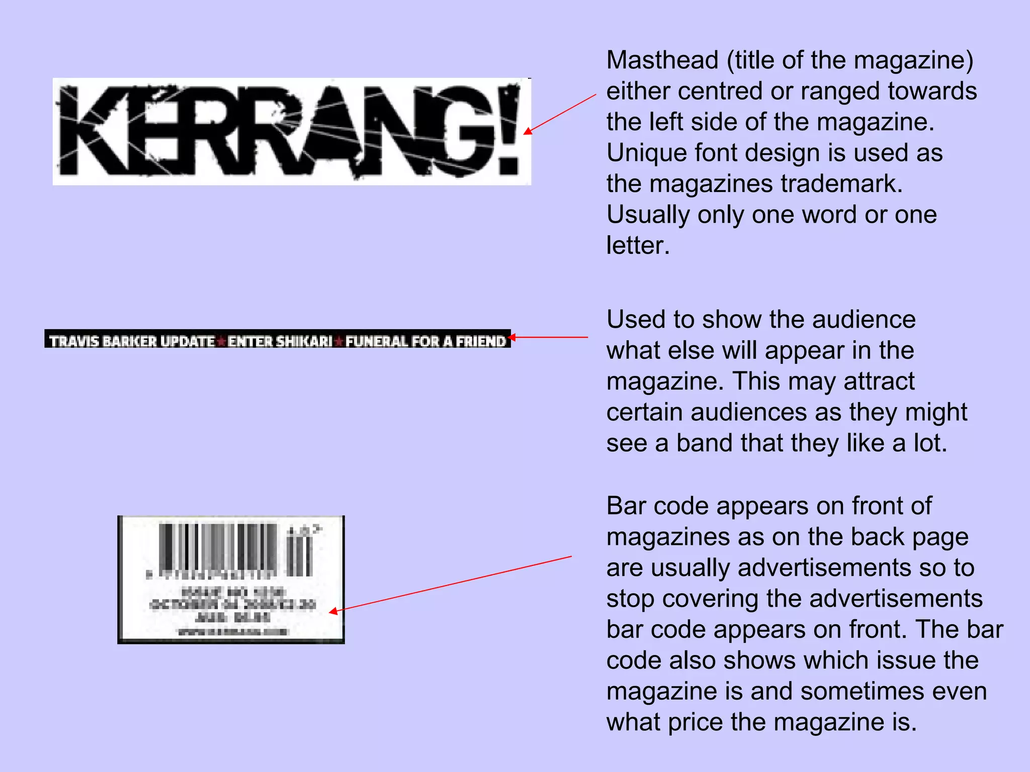
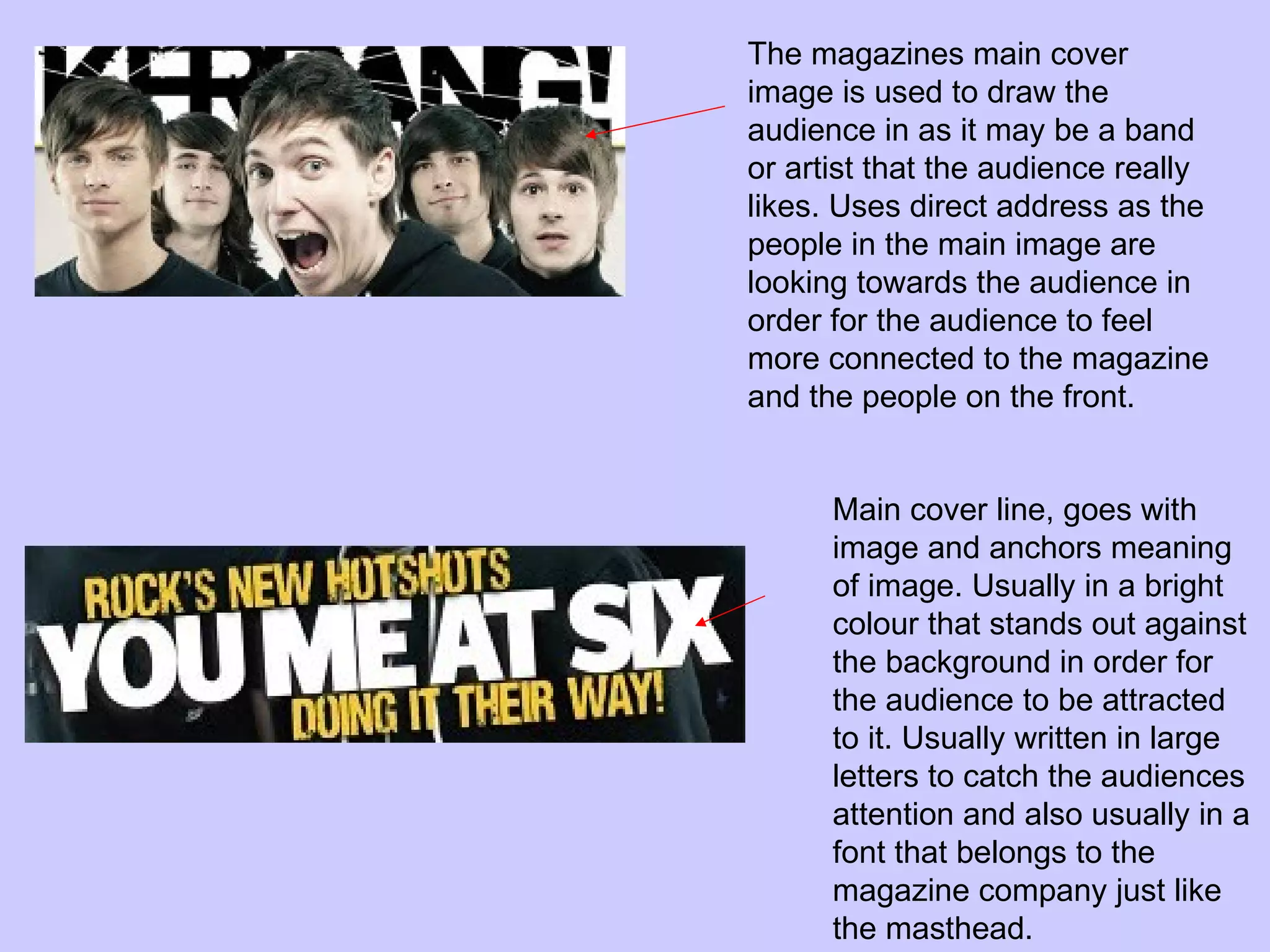
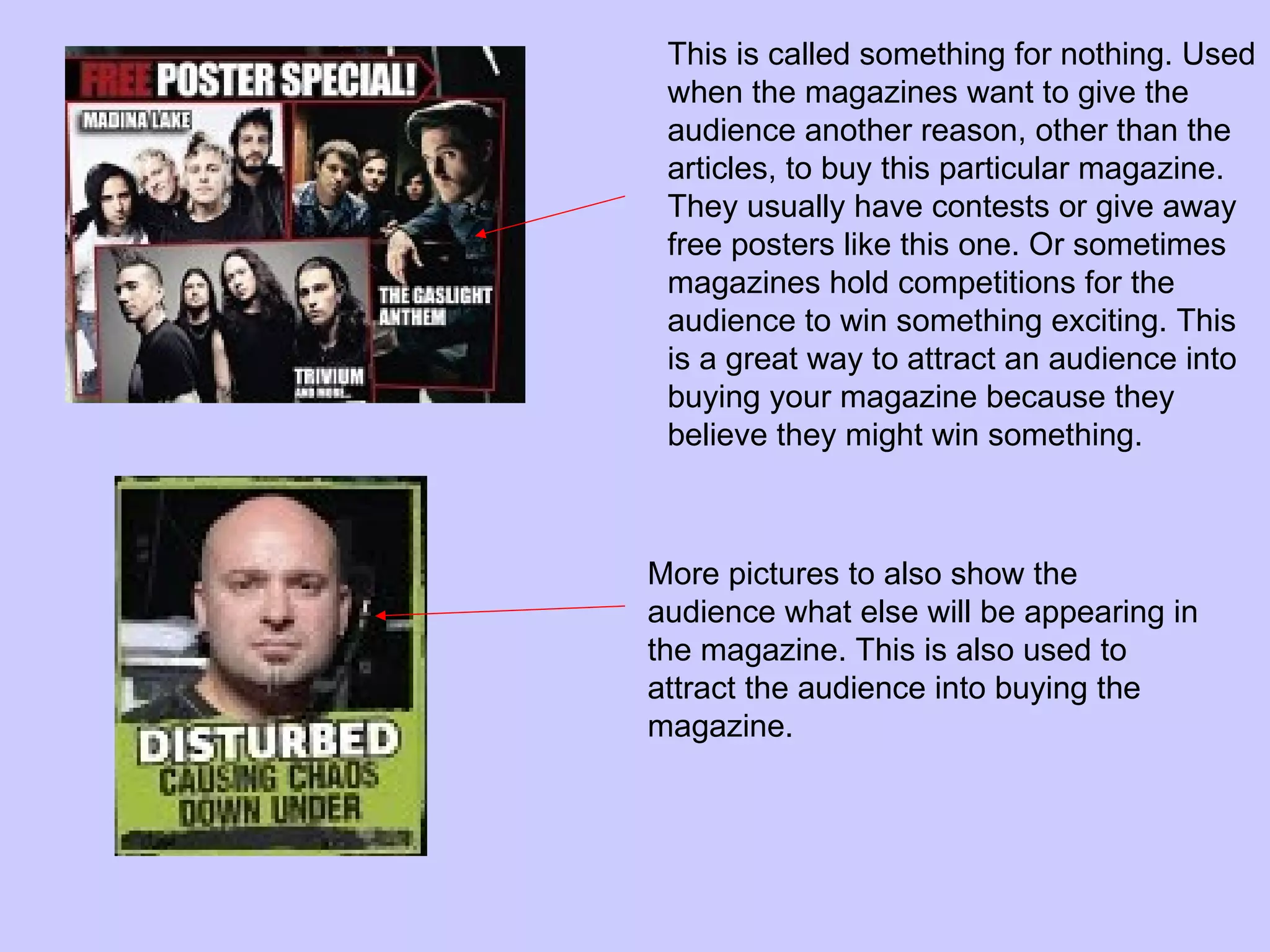
Codes and conventions of a music magazine front cover. By Charlotte Evans
The example.
Masthead (title of the magazine) either centred or ranged towards the left side of the magazine. Unique font design is used as the magazines trademark. Usually only one word or one letter. Used to show the audience what else will appear in the magazine. This may attract certain audiences as they might see a band that they like a lot.  Bar code appears on front of magazines as on the back page are usually advertisements so to stop covering the advertisements bar code appears on front. The bar code also shows which issue the magazine is and sometimes even what price the magazine is.
The magazines main cover image is used to draw the audience in as it may be a band or artist that the audience really likes. Uses direct address as the people in the main image are looking towards the audience in order for the audience to feel more connected to the magazine and the people on the front. Main cover line, goes with image and anchors meaning of image. Usually in a bright colour that stands out against the background in order for the audience to be attracted to it. Usually written in large letters to catch the audiences attention and also usually in a font that belongs to the magazine company just like the masthead.
This is called something for nothing. Used when the magazines want to give the audience another reason, other than the articles, to buy this particular magazine. They usually have contests or give away free posters like this one. Or sometimes magazines hold competitions for the audience to win something exciting. This is a great way to attract an audience into buying your magazine because they believe they might win something.  More pictures to also show the audience what else will be appearing in the magazine. This is also used to attract the audience into buying the magazine.
The end.

Codes and conventions of a music magazine front

  • 1.
    Codes and conventionsof a music magazine front cover. By Charlotte Evans
  • 2.
  • 3.
    Masthead (title ofthe magazine) either centred or ranged towards the left side of the magazine. Unique font design is used as the magazines trademark. Usually only one word or one letter. Used to show the audience what else will appear in the magazine. This may attract certain audiences as they might see a band that they like a lot. Bar code appears on front of magazines as on the back page are usually advertisements so to stop covering the advertisements bar code appears on front. The bar code also shows which issue the magazine is and sometimes even what price the magazine is.
  • 4.
    The magazines maincover image is used to draw the audience in as it may be a band or artist that the audience really likes. Uses direct address as the people in the main image are looking towards the audience in order for the audience to feel more connected to the magazine and the people on the front. Main cover line, goes with image and anchors meaning of image. Usually in a bright colour that stands out against the background in order for the audience to be attracted to it. Usually written in large letters to catch the audiences attention and also usually in a font that belongs to the magazine company just like the masthead.
  • 5.
    This is calledsomething for nothing. Used when the magazines want to give the audience another reason, other than the articles, to buy this particular magazine. They usually have contests or give away free posters like this one. Or sometimes magazines hold competitions for the audience to win something exciting. This is a great way to attract an audience into buying your magazine because they believe they might win something. More pictures to also show the audience what else will be appearing in the magazine. This is also used to attract the audience into buying the magazine.
  • 6.