Science 7 - LAND and SEA BREEZE and its Characteristics
Presentation1
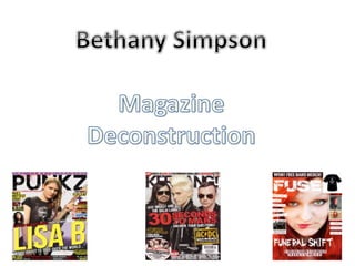
1.
2. Mast head is over the
Image which shows that the
magazine is a lot more
important than the person
in the image. They have
used a cracked type look
which almost looks like
electricity which could
represent a fuse.
They are doing competitions
and posters inside the
magazine which could mean
that the target audience is
more for teenagers and young
adults as many adults don’t
want posters around their
rooms unlike teenagers
The main Image Unlike other
magazines they used the
artists photo as the
background of the magazine
whilst most magazines have
sections which are plain and
only use colours. This is an
interesting way as it shows
that the artist could be the
main story.
Colour Scheme They have
mainly used the colours red,
white and black which is
used by many music
magazines as the white
contrasts to the colours and
shows off the writing better.
It is eye catching to the
audience which is important
as they want the audience
to read their magazine.
3. The main image goes over the
mast head which could mean
that the person in the image is
more important in this
magazine. It also shows a girl
with an electric guitar which
suggests that the music that
will be involved is punk rock
type music.
The mast head spells punkz
rather than punks because it
goes with the generation it is
hoping to attract. In this
magazine it is mostly aiming
for teenagers or young adults
by the way the title is spelt,
the main images clothes and
pose of the artist.
The colour scheme is mixed
colours however at the very
top its purple which is a
feminine type colour . This
shows that this magazine
will be involving females. In
other magazine covers if it
was for females only the
main colours would be
bright and purple like this
however in this magazine its
to show that it will be
showing mostly female
artists not what the target
audience should be.
The coverline is put over the
artist with the words “Lisa B
we’re about to take over the
world…” The fake blood
around the magazine could fit
in with the coverline as it could
give the artist a more ”tough”
look to her image.
4. Main image shows the band
“30 seconds to mars” over
the mast head which shows
the importance of them
compared to the mast head
on this issue. They also have
a rock star type look which
could mean that the
magazine is aimed at young
teenagers and people who
like “rock star” type music.
The colour scheme is
mostly red, white, black
which is quite usual for
this magazine as each
colour contrasts to the
others to make them
separately stand out. The
red also represents
“danger” which gives
this band a “tougher”
look which relates to the
main image.
Competitions and posters is a
way to get the audience to buy
the magazine as they’ll want to
have the chance to meet their
favourite singers/band or have
a poster of them. This also
suggests that the target
audience could possibly be
teenagers or young adults as
not many adults would like
magazines around their house.
However the tickets to meet
the singer/band could urge
adults to buy the magazine too
The cover line says “answer
your questions” which
means the magazine is
aimed to allow its audience
to get involved and show
that what they say matters
to the publishers. This also
urges people to pick up the
magazine to get to know
the artist on the front
cover better. The front over also names other artists that are mentioned in the magazine which is
there so that people reading the article that may not like this particular artist shown on
the front cover that there are other artists in the magazine and allows them to pick up
the magazine and read it.
5. Summary
• I have looked at the different magazines and now know how I plan to set up my front cover
when we construct it.
• For my mast head I plan to have it behind my main image because it gives the image a more
effective look. Also the image is the main part of the magazine that people look at before
they read the mast head so the image needs to stand out quite a lot.
• The image I will be putting on the magazine will represent what my magazine will be about
(e.g if my magazine was about rock music I’d do something including electric guitars, rock star
type clothing)
• I plan to put the main cover line over the image near the bottom so that the image is still
standing out but people know exactly what the magazine will include. It will be the same
sized font as the Kerrang magazine with 30 Seconds to Mars.
• I will include competitions and merchandise on the front cover which will attract younger
audiences to buy my magazine whilst also attracting adults as there is something for them to
win (for example it could be to win backstage passes or something)
• I like the colour scheme the magazines use (black, red and white) as it really makes the text
stand out from the image and background which is a good advantage to have as the subtitles
on the magazine are quite important as the reader needs to know what else is included other
than the cover line and celebrity included.