Download to read offline


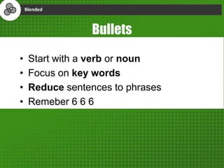
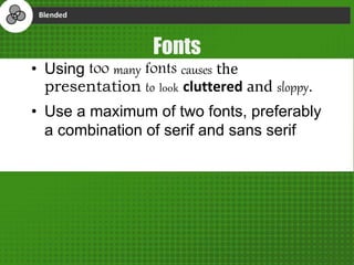
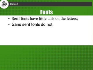
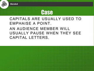
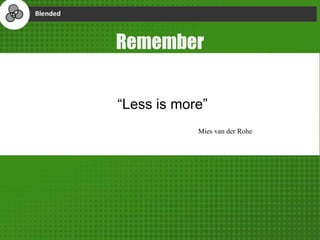
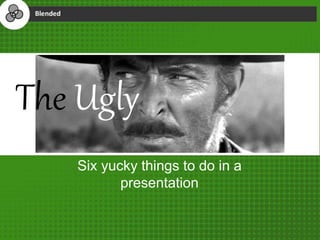
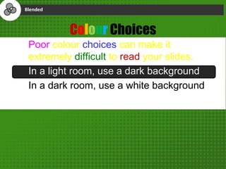
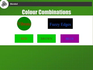


The document outlines best practices for curating educational content, focusing on copyright, file types, and the creation of a style guide. It discusses good, bad, and ugly aspects of design, emphasizing consistency, accessibility, and avoiding clutter in presentations. Key design elements include text alignment, font usage, and color choices to enhance readability and user experience.


