Download to read offline
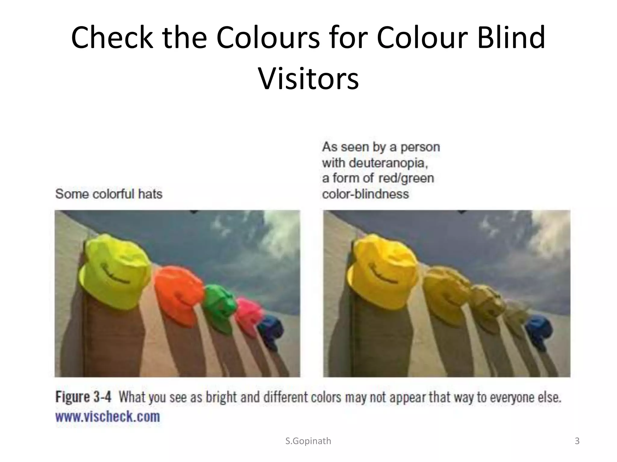
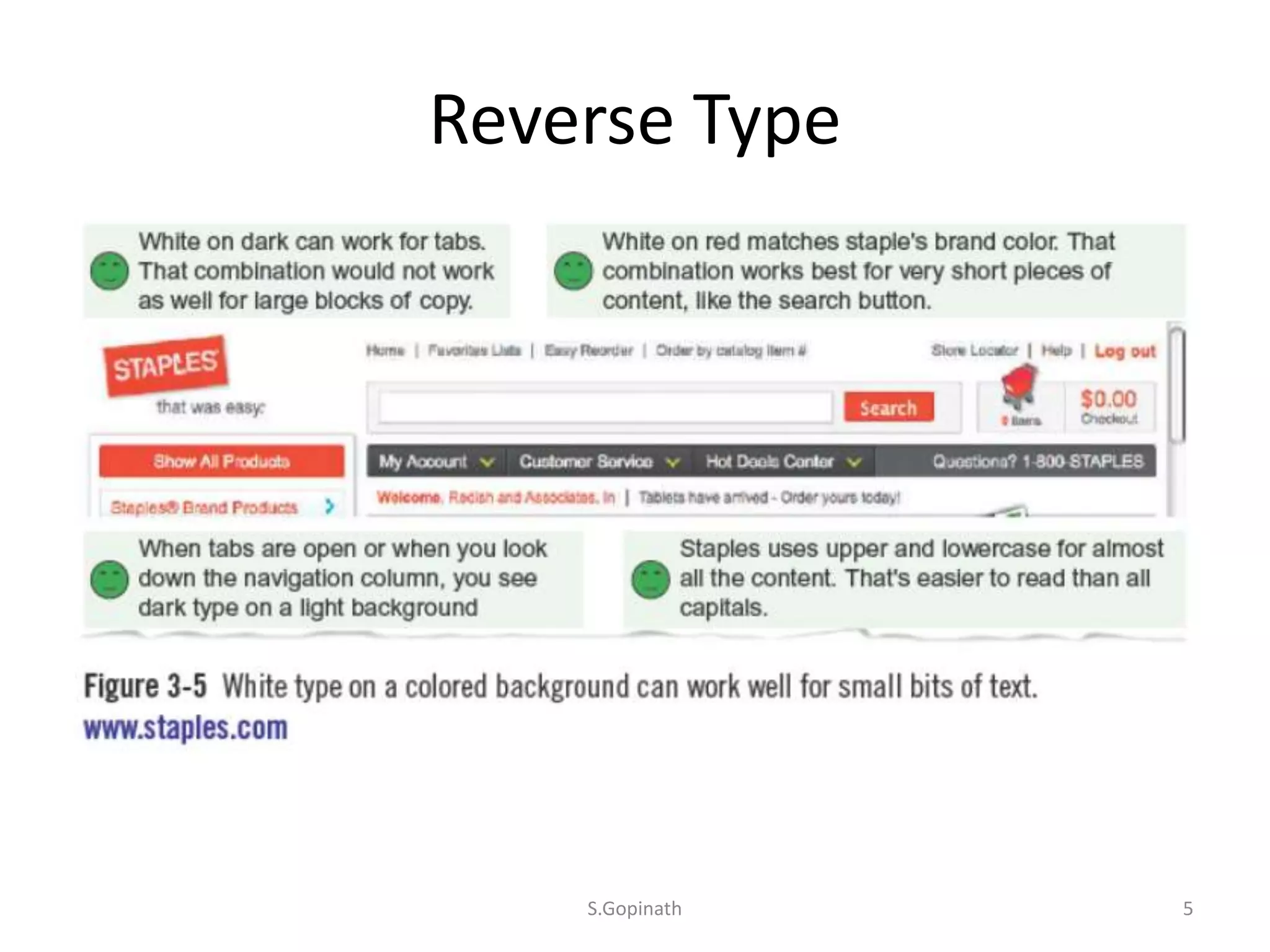
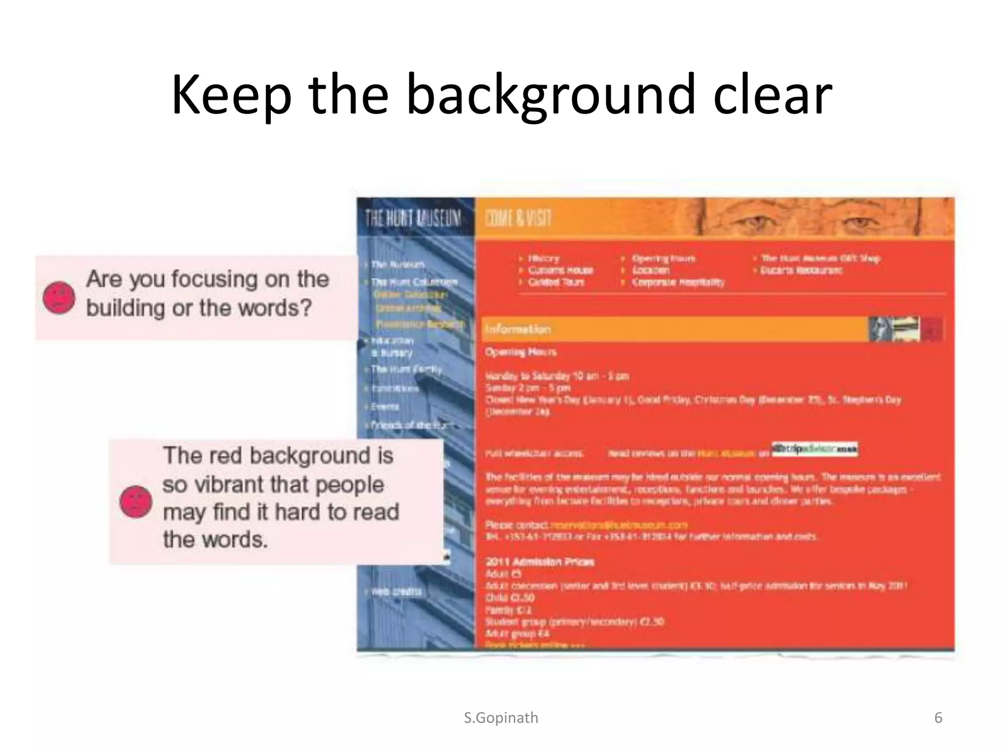
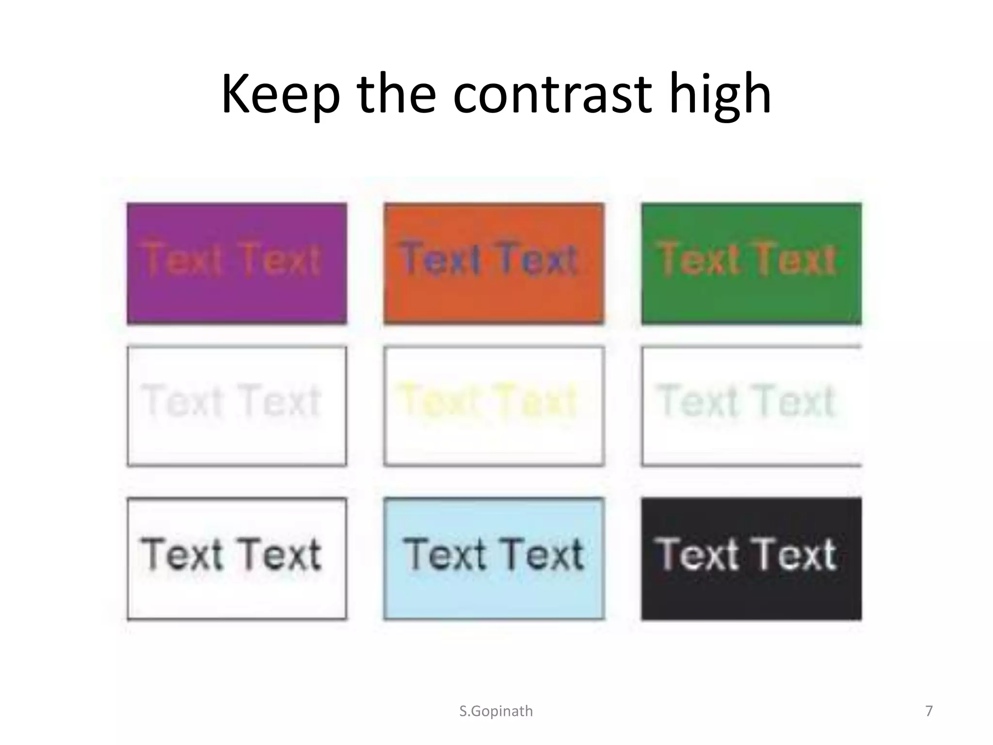
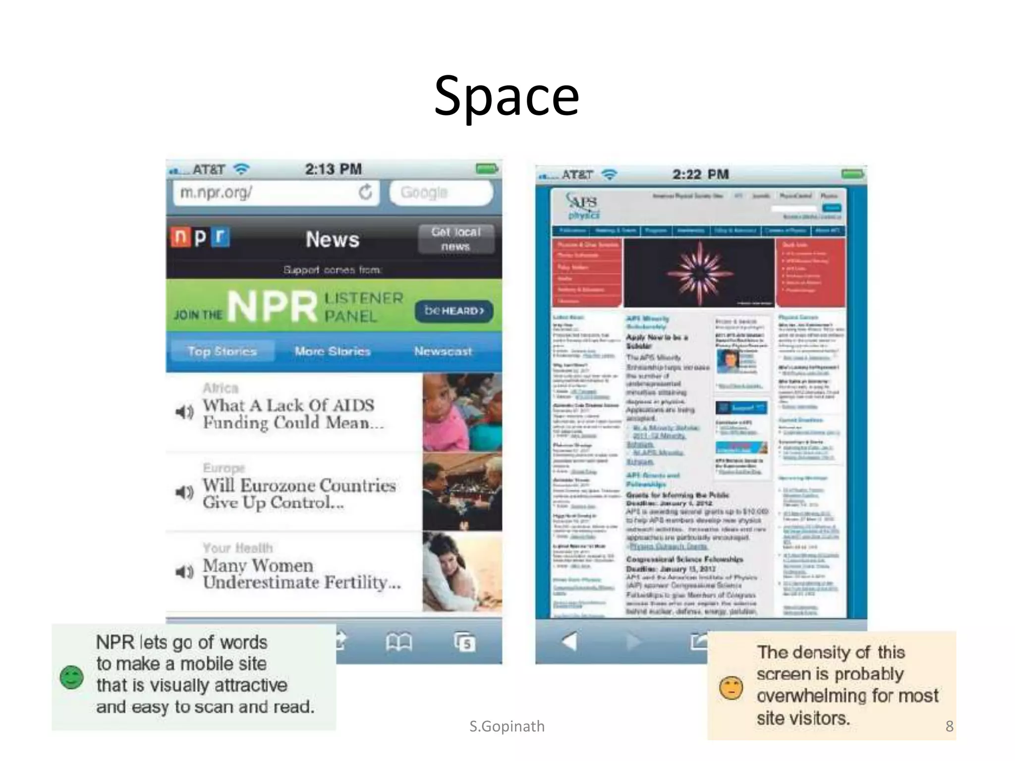
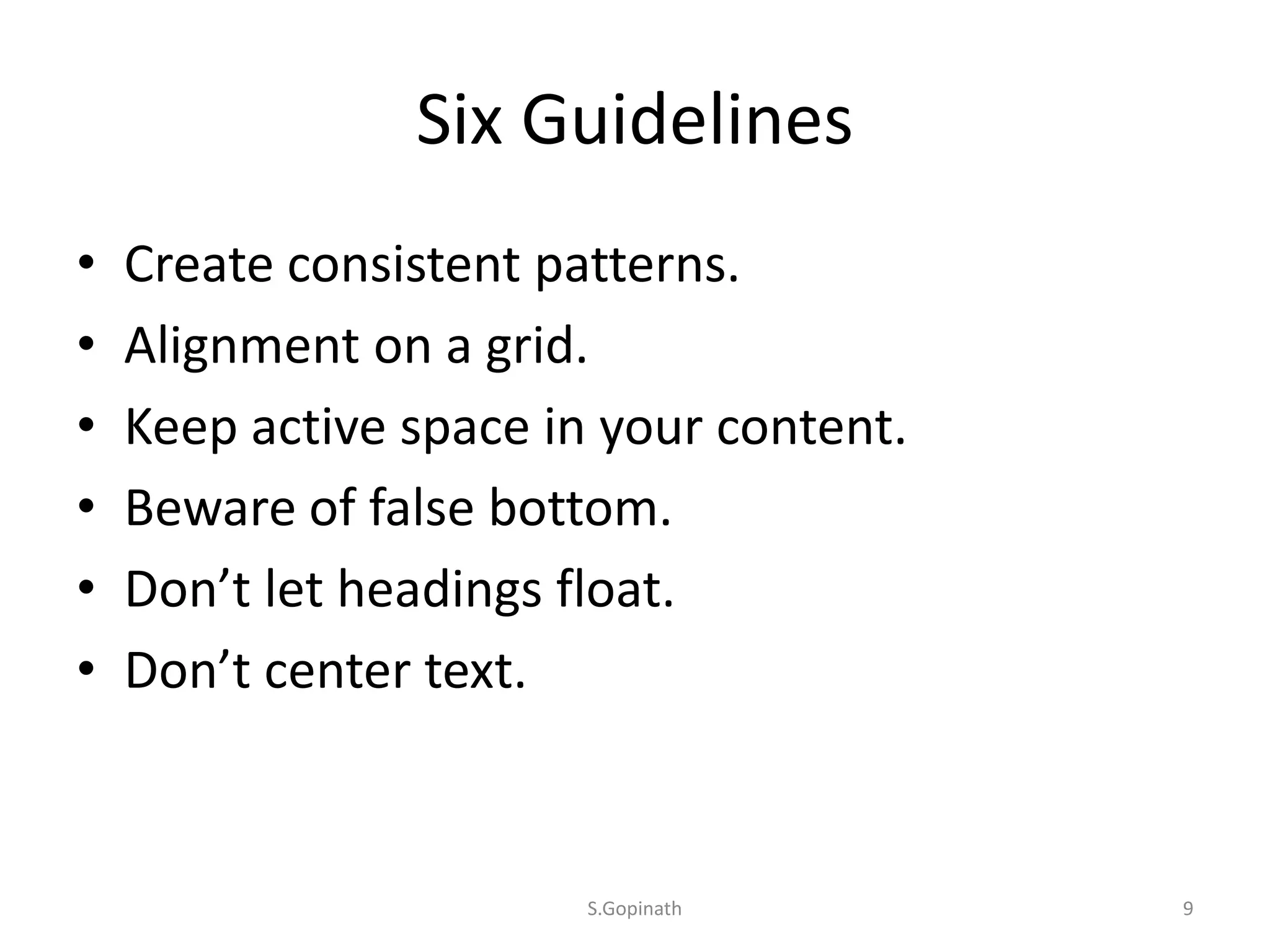
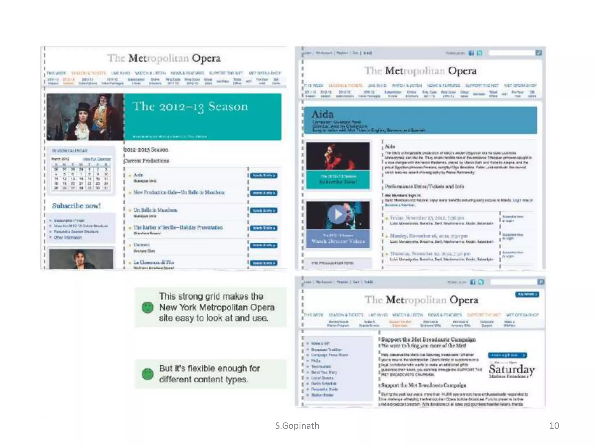
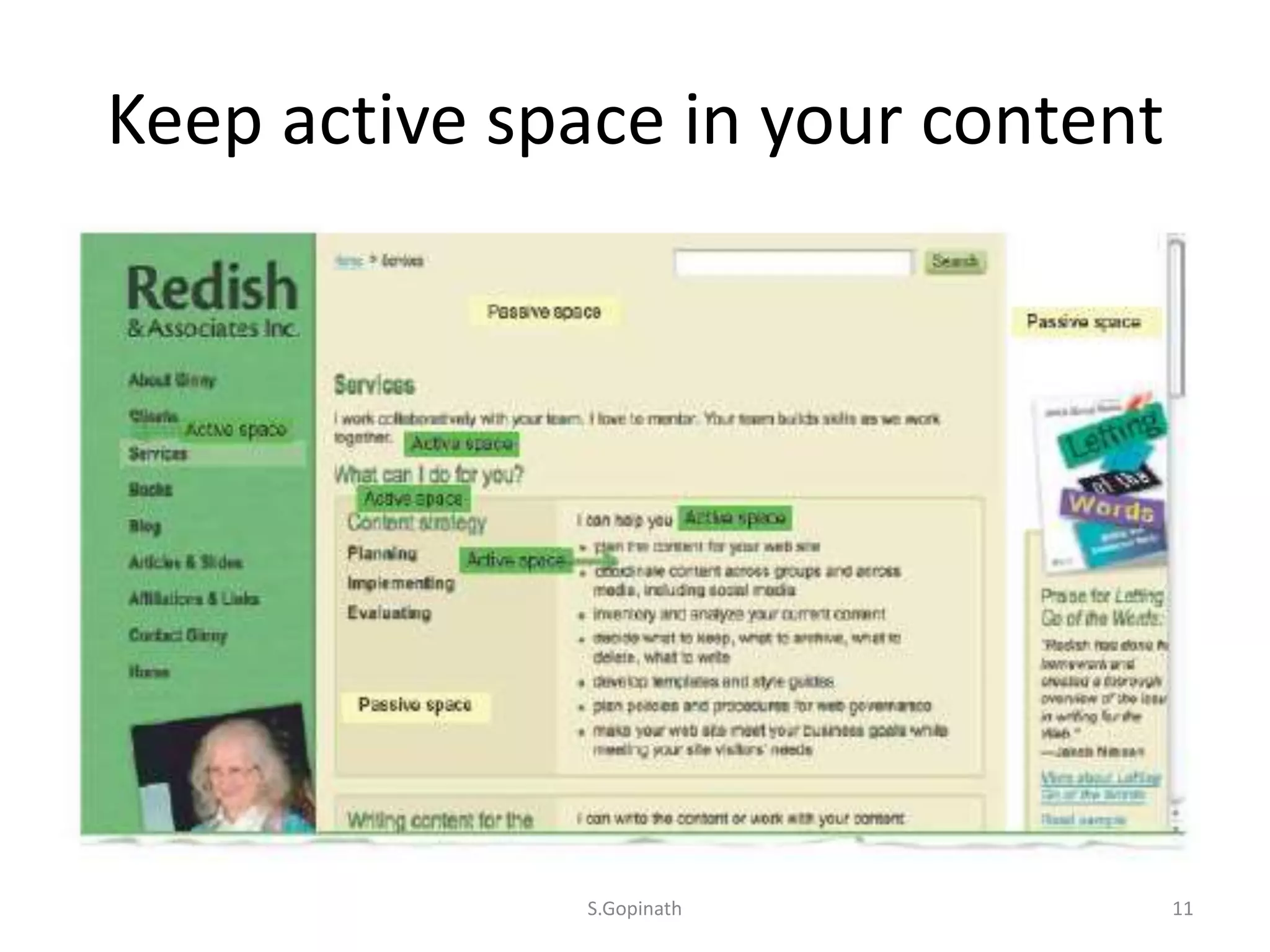
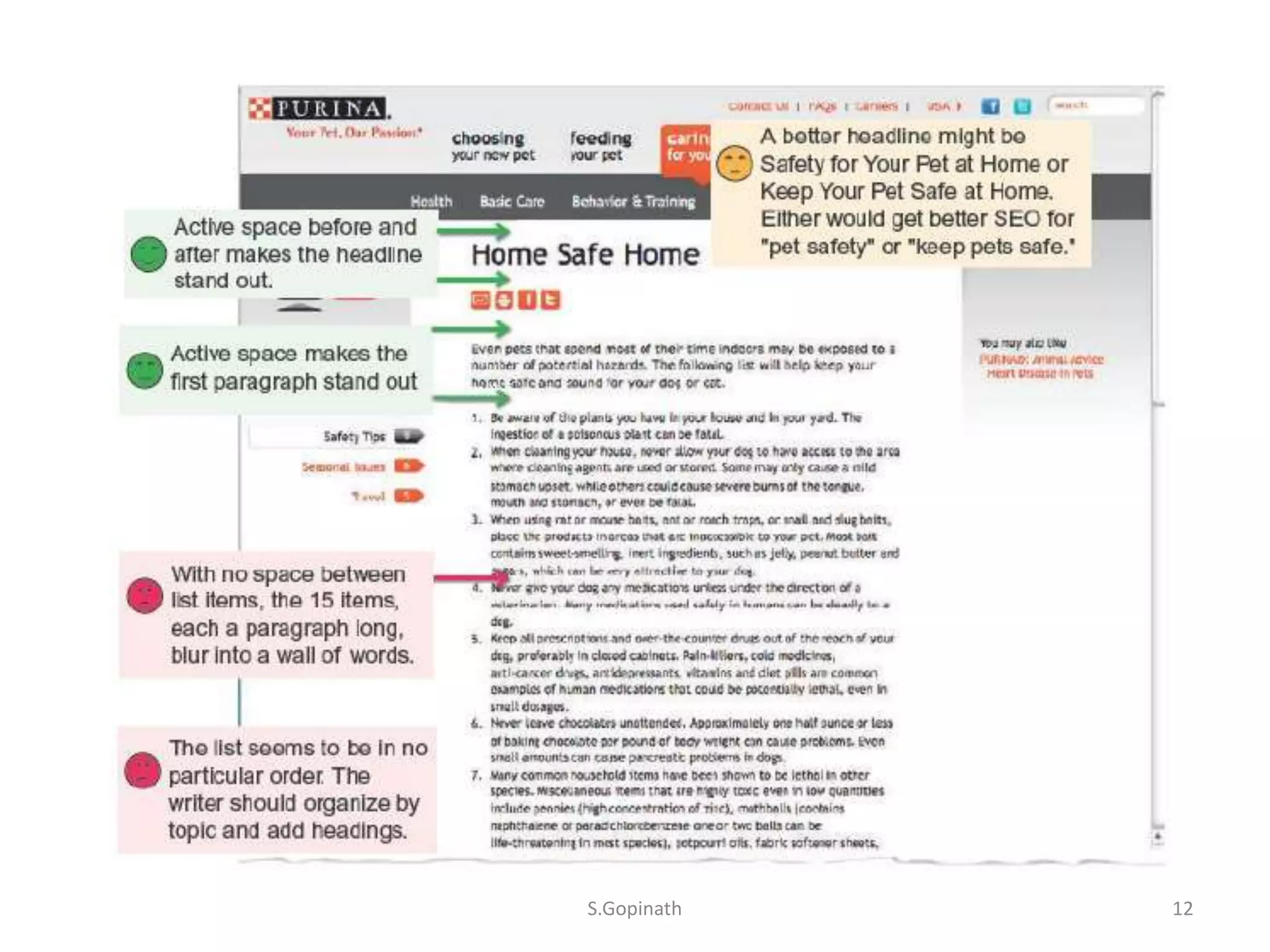
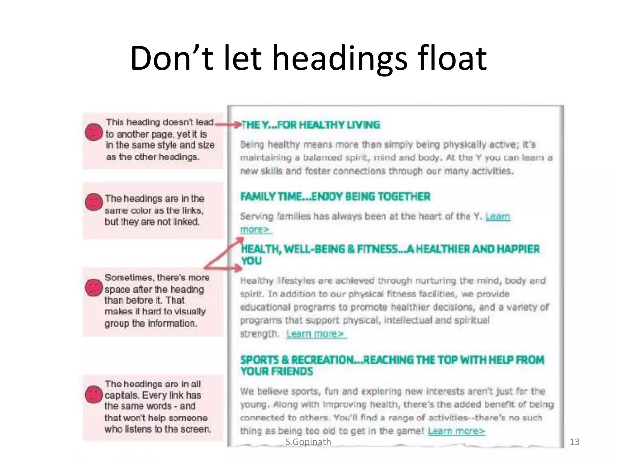
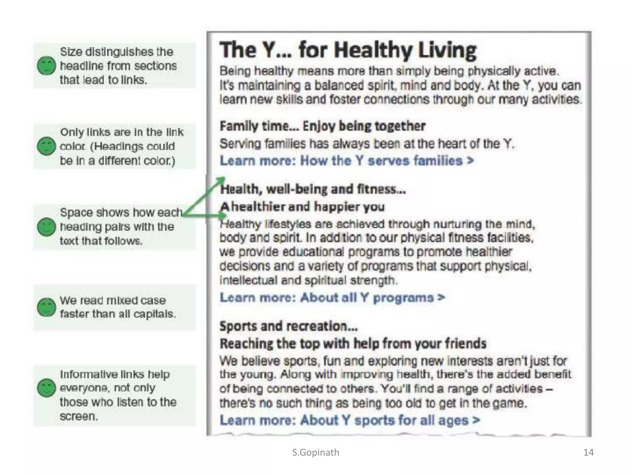
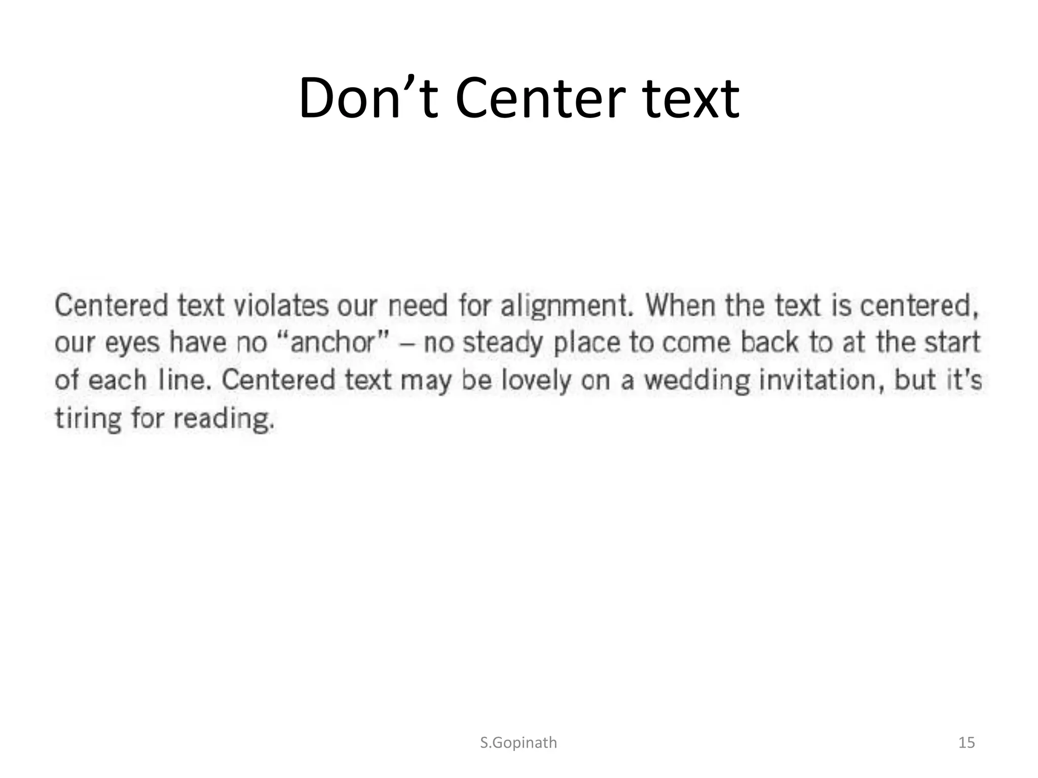
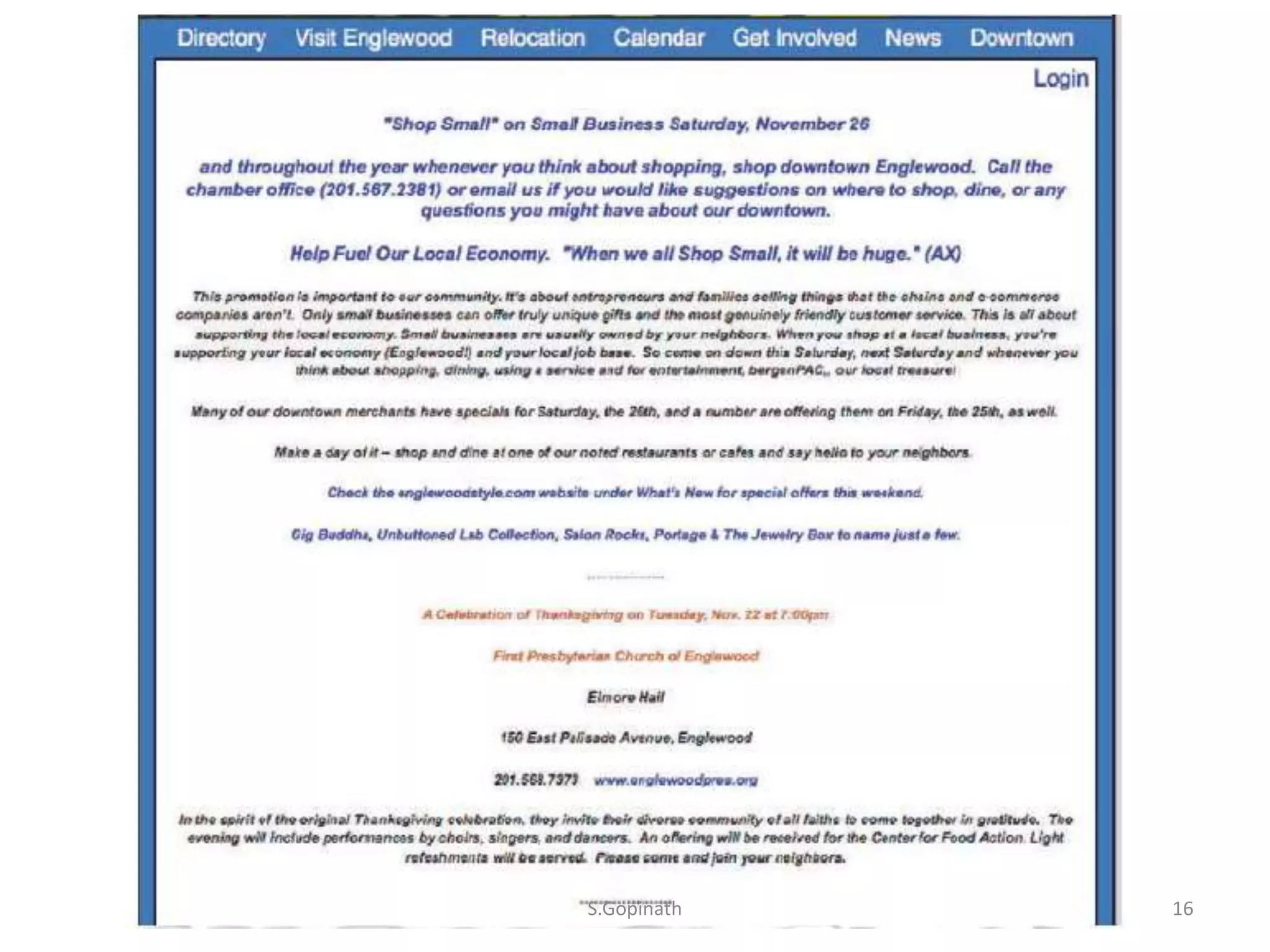
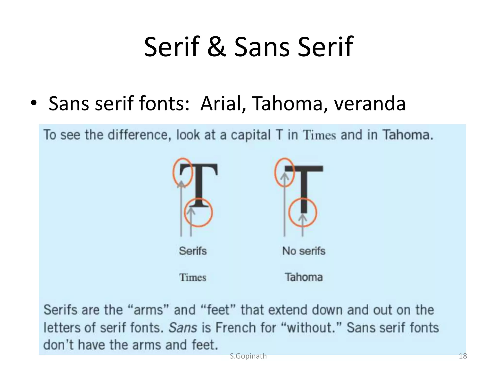
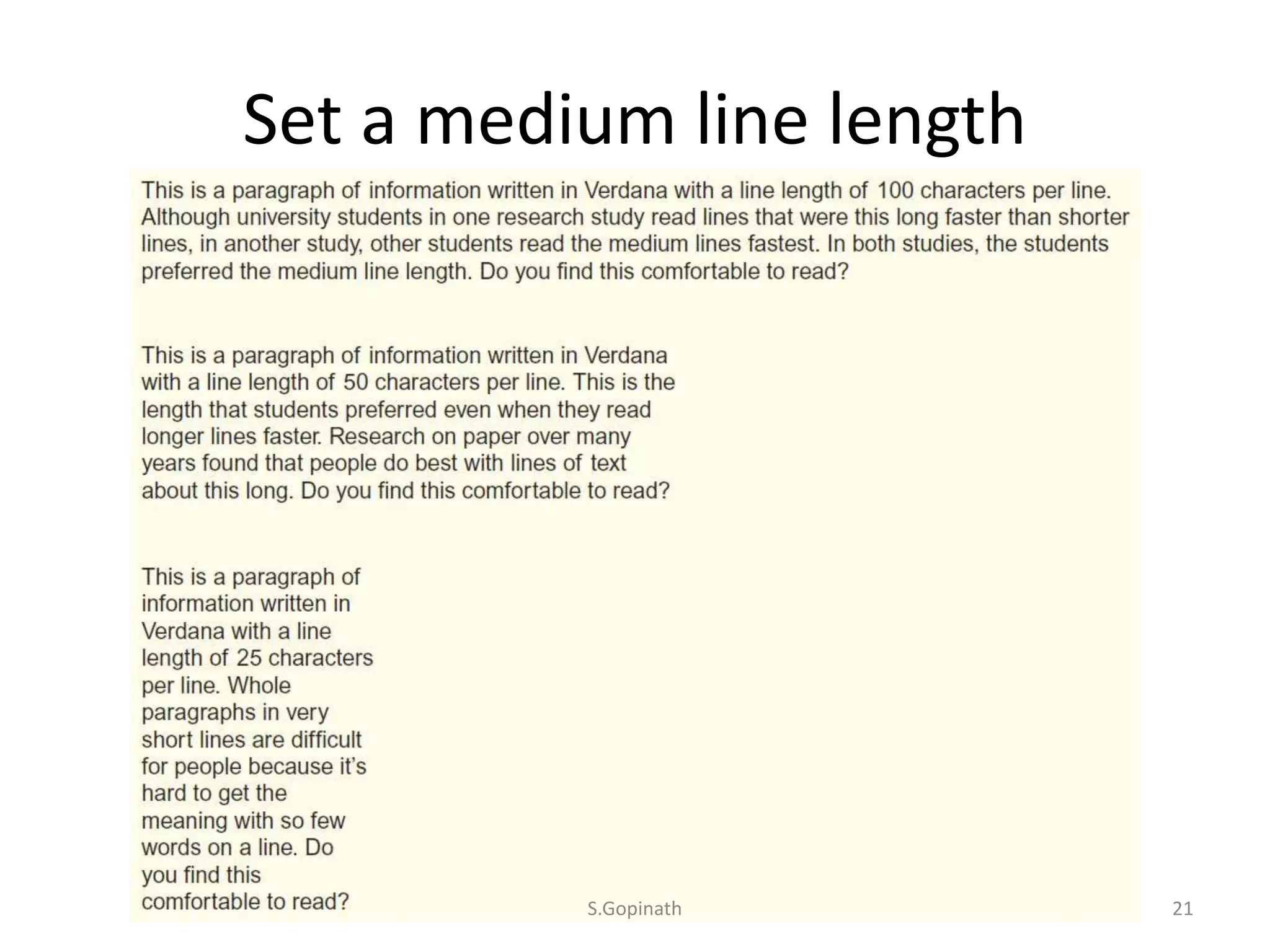
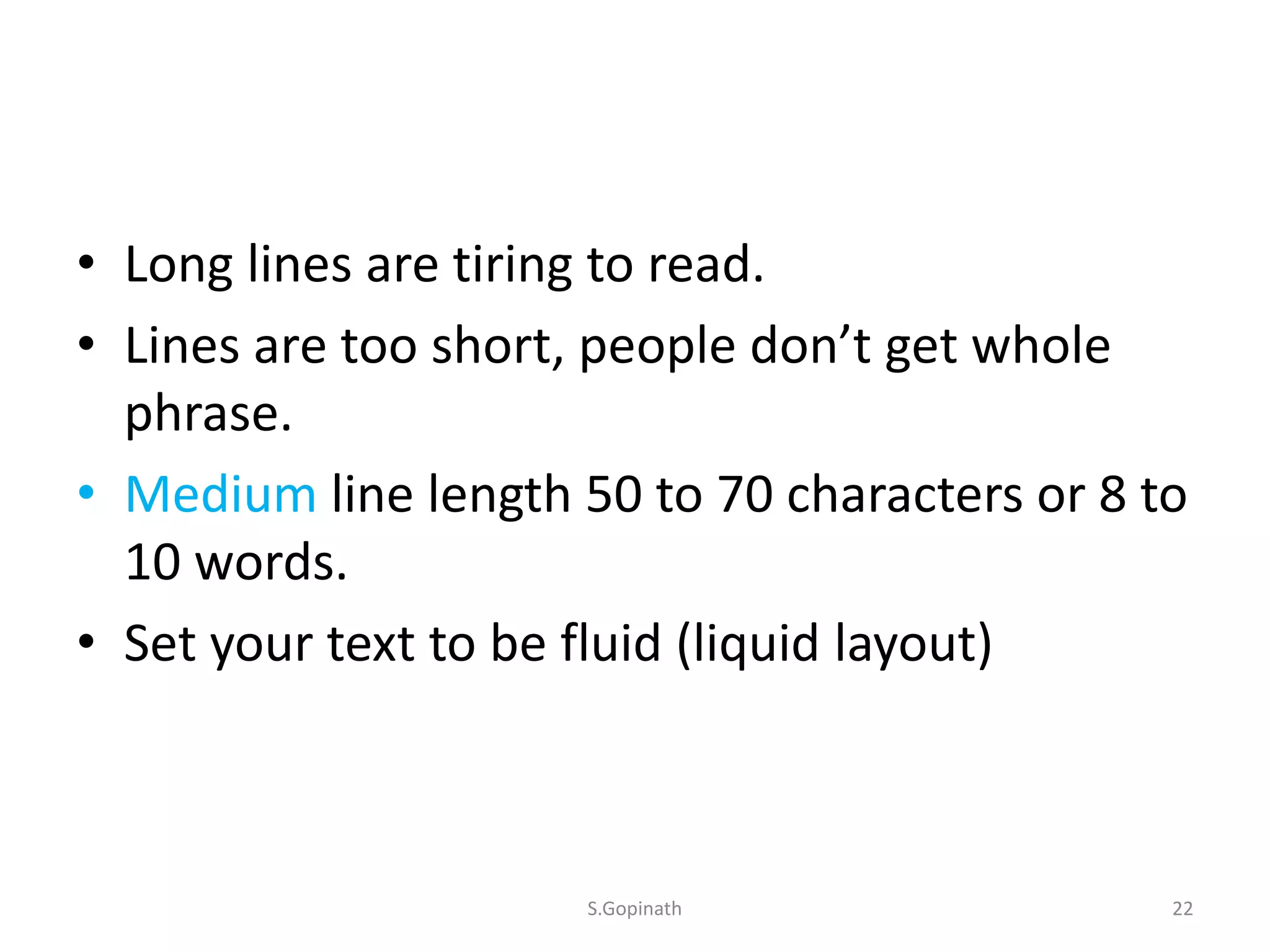
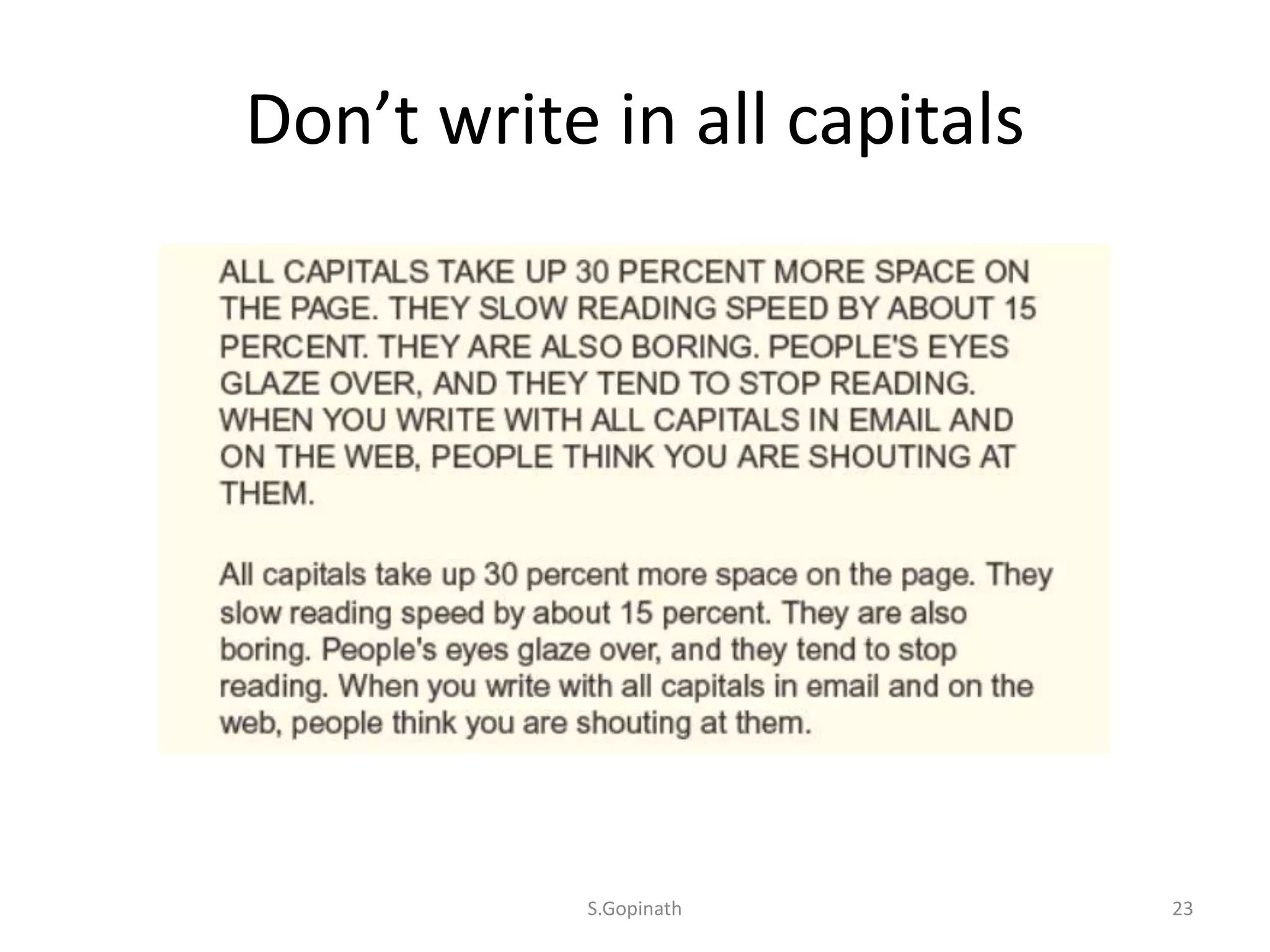
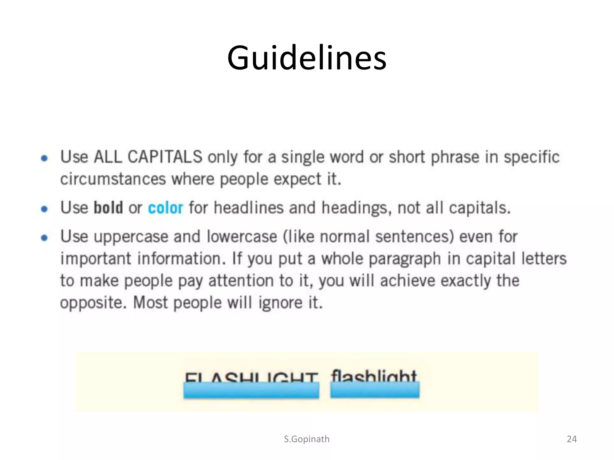
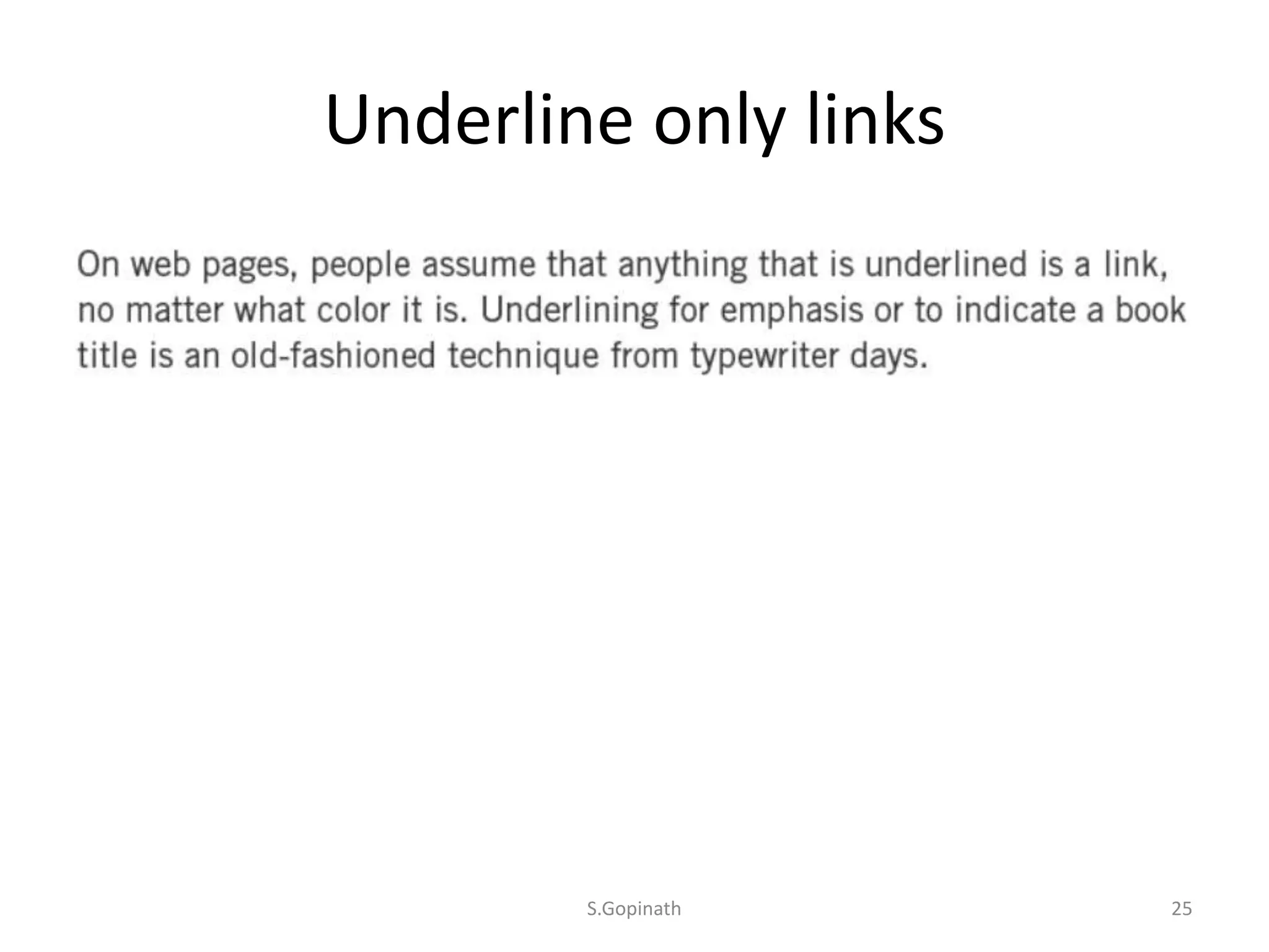
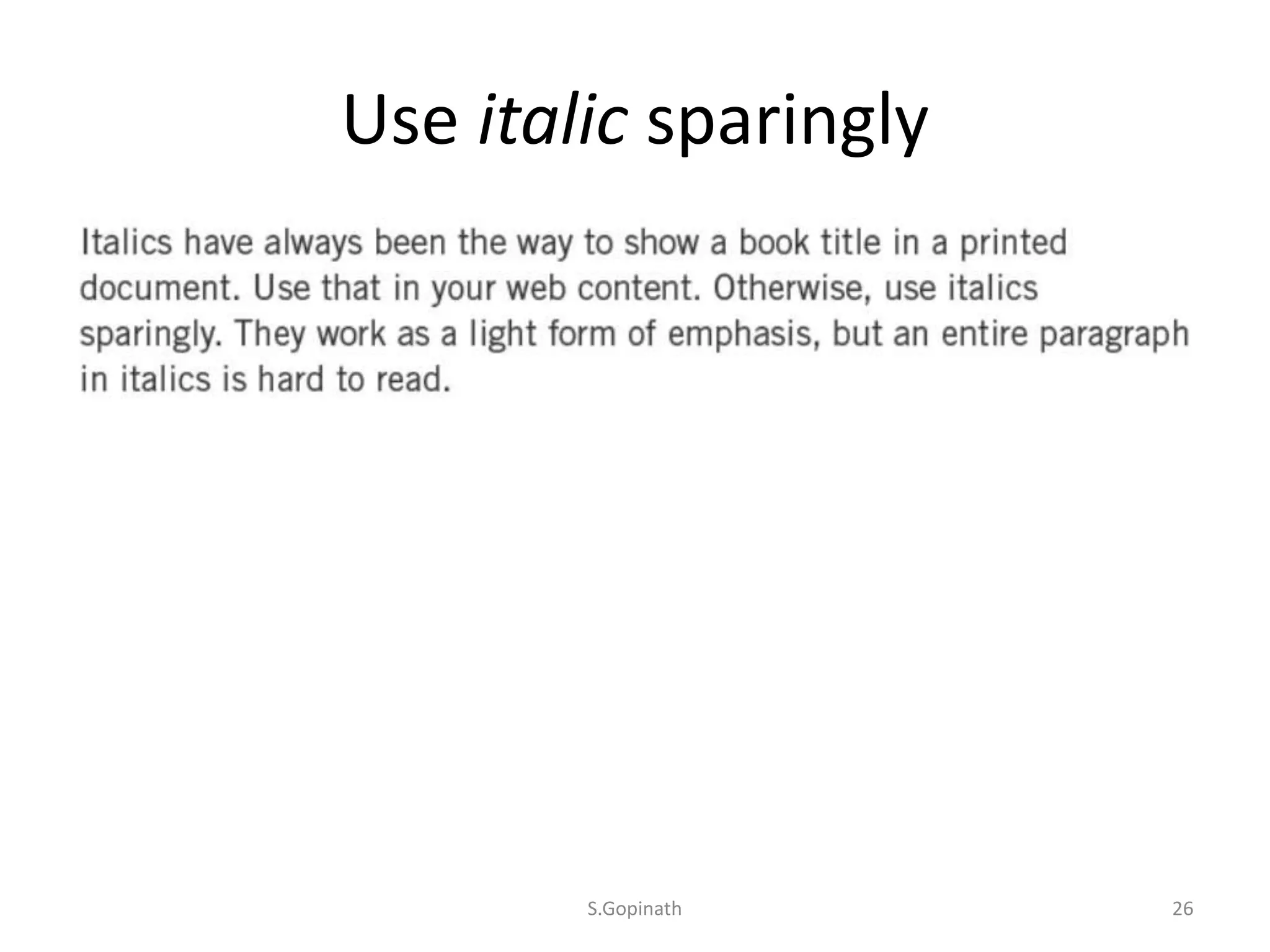

The document provides guidelines for easy-to-use web design. It discusses three categories: color, space, and typography. For color, it recommends using high contrast and avoiding light text on dark backgrounds. For space, it suggests creating a consistent grid, keeping active space in content, and not letting headings float. For typography, it advises using a legible sans serif font, making text sizes readable, setting a medium line length, avoiding all capital letters, underlining only links, and using italics sparingly.


![Chapt_4[1].ppt very interseting and important](https://cdn.slidesharecdn.com/ss_thumbnails/chapt41-251208222956-7cf5e0fa-thumbnail.jpg?width=640&height=640&fit=bounds)

