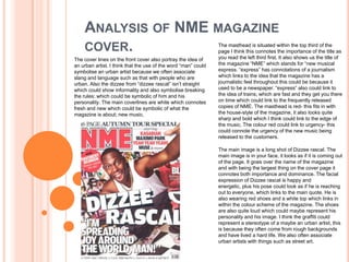
1. ANALYSIS OF NME MAGAZINE
COVER. The masthead is situated within the top third of the
page I think this connotes the importance of the title as
The cover lines on the front cover also portray the idea of you read the left third first. It also shows us the title of
an urban artist. I think that the use of the word “man” could the magazine “NME” which stands for “new musical
symbolise an urban artist because we often associate express. “express” has connotations of a journalism
slang and language such as that with people who are which links to the idea that the magazine has a
urban. Also the dizzee from “dizzee rascal” isn’t straight journalistic feel throughout this could be because it
which could show informality and also symbolise breaking used to be a newspaper. “express” also could link to
the rules; which could be symbolic of him and his the idea of trains; which are fast and they get you there
personality. The main coverlines are white which connotes on time which could link to the frequently released
fresh and new which could be symbolic of what the copies of NME. The masthead is red- this fits in with
magazine is about; new music. the house-style of the magazine, it also looks quite
sharp and bold which I think could link to the edge of
the music. The colour red could link to urgency- this
could connote the urgency of the new music being
released to the customers.
The main image is a long shot of Dizzee rascal. The
main image is in your face, it looks as if it is coming out
of the page. It goes over the name of the magazine
and with being the largest thing on the cover page it
connotes both importance and dominance. The facial
expression of Dizzee rascal is happy and
energetic, plus his pose could look as if he is reaching
out to everyone, which links to the main quote. He is
also wearing red shoes and a white top which links in
within the colour scheme of the magazine. The shoes
are also quite loud which could maybe represent his
personality and his image. I think the graffiti could
represent a stereotype of a maybe an urban artist, this
is because they often come from rough backgrounds
and have lived a hard life. We also often associate
urban artists with things such as street art.
2. ANALYSIS OF CONTENTS PAGE
This is a brief heading and summary of content interesting the reader
and making them want to read also allowing them to navigate
through the magazine.
The NME masthead is the
same, showing consistency and the
housestyle throughout the magazine.
banner date
The main image looks Sub headings blocked out into
as if it were taken at black sub sections. Allowing the
either a gig a concert or white text to be easily viewed. I
during touring. This think the white text could
connotes the idea of live symbolish fresh and new like
music; a happy the music they are promoting.
atmosphere. The image
is also edited to make it This here shows details of future
look like a photograph. or previous NME magazines
This is appropriate combined with contact details
because: it gives it a enabling the reader to subscribe
more personal touch it or get in touch with the magazine.
also makes it look This is an editors
memorable giving us a introduction to the contents
feel of the experience of the magazine. It gives the
and making the reader magazine a more personal
feel included. touch as the readers are
being directly addressed
and spoken to. The
language in this is quite
chatty giving the magazine
an informal tone. We feel
as though we are being
directly talked to by the
The bands are listed in red with the page number in black, this is editor with rhetorical
following the housestyle of the magazine. Red also connotes urgency so questions being used such
people will be likely to look at the bands, which show the wide variation as “thank god the sun has
of music the magazine focuses upon. Telling us they focus mainly on disappeared eh?”
indie/rock but also other genres such as urban.
3. ANALYSIS OF DOUBLE PAGE SPREAD. PAGE 1
The mise en scene, background
of the image shows graffiti. It
could be a stereotype of urban
music that they are often
associated with street and
graffiti. It could also represent
the stereotype that some urban
acts often come from a tough
background.
This is the main image. It presents us
to the main featured artist within the
issue of the magazine. We see the
clothes Dizzee is wearing are quite
loud which could be reprehensive of
his personality and music.
Page number
NME title and
date.
4. ANALYSIS OF DOUBLE PAGE SPREAD. PAGE 2
Layout wise the text is presented in 4 columns
allowing the ease of reading for the reader.
Also there are text wraps around the image of
the radio allowing the reader to focus upon it
which I think could represent how the music Caption saying
has turned his life round and with it being dizzee, presenting him
quite large the scale of the impact. This is the main heading/headline.
to the audience. This isn’t all straight and ranges
from using capital letters to
lowercase. I think that this could
represent the idea that dizzee isn't
straight-forward and is in fact quite
quirky. It uses a clever ploy on
This is the byline which words, telling the reader we are
gives credit to both the going to learn about dizzee’s
author and photographer. background.
This is part of the
housestyle which allows
the readers to recognise
NME. It is present within
every issue in the same
style.
The subheading gives the reader an idea of
what the text is going to be about it interests
them further from the heading and
specifically tells them what the article will be
about.
Two second images are used here.
Beers of bottle and a stereo. I think
that these could be representative of
dizzee’s life and add a more
personal touch allow the reader to
see more into his life. I think it shows
quite the influence music has had on
his life.
5. BACKGROUND OF NME.
The editor on NME is Mike Williams.
Nme is a music magazine which is released weekly.
The total circulation of sales from july to december 2001 is 23, 924.
The sales has dramatically reduced I think this is because previously the magazine
was a newspaper also people don’t buy magazines and newspapers as much as
they used to.
The first issue was released on the 7th of march 1952.
It started as a music newspaper, and gradually moved toward a magazine format
during the 1980s, changing from newsprint in 1998. It was the first British paper to
include a singles chart, in the 14 November 1952 edition. In the 1970s it became
the best-selling British music newspaper. During the period 1972 to 1976 it was
particularly associated with Gonzo journalism, then became closely associated
with punk rock through the writing of Tony Parsons and Julie Burchall.
Lastly the core target audience of NME is 16- 24 year olds. However I think though
that although this is the main target older people do read it and have an interest in
it.
6. HOUSE STYLE
The masthead of NME is always displayed in large uppercase red lettering
throughout the magazine and on every issue. This has made it stand out
more and it now worldly recognised.
Throughout a colour scheme is used: black red and white. This is always
present it is used for page numbers, headings ext it portrays the main colours
of the magazine frequently to the audience.
The language used is always the same it portrays a chatty and friendly tone
inviting the audience every time.
It is used on every page, the colour scheme is portrayed on the title page
through the heading, the clothes dizzee is wearing and the coverlines.
On the contents page it is again evident in the masthead. Also the bands
listed and the page numbers follow the red and black colour scheme.
Lastly on the double page spread; dizzee is wearing a red jacket which could
portray the colour scheme and the title is also again black showing the
scheme throughout.