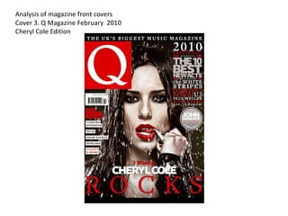
1. Analysis of magazine front covers
Cover 3. Q Magazine February 2010
Cheryl Cole Edition
2. BANNER
The banner at the top of
THE MASTHEAD
Front cover analysis the page is a plain black
strip with bold italics writing
saying “ THE UKLS
The Q is taking up around a BIGGEST MUSIC
quarter of the cover page, it’s a MAGAZINE” this creates
large capital “Q” on a red block the magazine to feel more
square making it stand out and special and limited, it also
drawing the attention to the focal gives the reader the feel of
point of the Q. trust, they can trust the
magazine for everything it
THE SELL LINES/COVER LINES says.
THE MAIN COVER LINE
The sell lines used here are simple and
snappy of bands the magazine The main cover line is “ROCKS” By
has, these are “ Snow Patrol”, “Muse” saying she “rocks” this shows a rock
and “50 Cent”. The bands are and roll/ heavy metal edge to the
advertised so the reader knows what magazine. The colour used are red
other type of artists they can find in the showing a feminine elegant colour
magazine. which also can be used for a sexy
Barcode-date/issue/price feel as well.
THE HEADER…
The barcode makes the magazine
sellable it is the way to audience The header used here is the best new
know how much the magazine costs acts of 2010, these are “The White
and the date it was issued, this lets Stripes” and “Biffy Clyro” and others.
the customer know if they may have This advertises other articles in the
already brought this magazine or if magazine about what's new and up
there is a new one due out so they coming in the music industry.
are always on track with the THE MAIN IMAGE
magazine.
The main image used is of the artist
USE OF A SUB- HEADING Cheryl Cole, she is positioned to look
as if she is standing in the rain and
The sub-heading says “3 words
isn't afraid. Her red lips look seductive
Cheryl Cole ” this create
and sexy but also look sophisticated
excitement and as if breathless
and elegant making her look classy.
because they make the reader
think how amazing she is if not With her tongue licking the edge of a
many words need to describe her. spike it shows her power and how
strong she us.
BACKGROUND USE OF A FLASH
The background colour is a dark There is a flash telling the
black/ grey which feels dark and reader of “John Lennon's lost
mysterious to the reader, it also weekend” , it also states there
make Cheryl Cole stand out of the are never seen before pictures
page being the main focal point making it more special and
because she is the most important. interesting for the reader to buy
the magazine and get a glimpse
of those pics!
3. History
Q is a popular magazine published monthly in
the United Kingdom. The magazine was
originally named “CUE” but because it was
often misread as the cue in snooker and for a
snooker magazine it was changed to a single Q.
The founders of Q magazine were Mark
Ellen and David Hepworth, they both
felt that the older generation were
being ignored so the magazine is
created for an audience above the age
of 25 and ranges for both male and
female. The magazine Q's current editor
is Andrew Harrison. The magazine also
have there own radio and album series.
4. Target Audience
The founders of Q magazine were Mark
Ellen and David Hepworth, they both felt
that the older generation were being
ignored so the magazine is created for an
audience above the age of 25 and ranges for
both male and female. The magazine is
around £3.80 but because it is aimed at over
25’s they are more likely able to afford the
magazine.
Because of this the magazine includes older
music so it targets that of the older
generation, however young adults are
interested in this as well.
The audience ranges from different ages
and different genres weather it being rock
like the stone roses or Oasis, Cheryl Cole
and Alicia Keys.