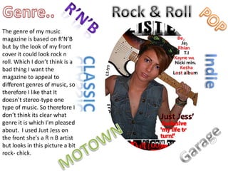
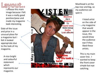
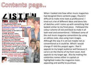
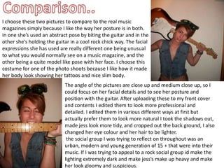
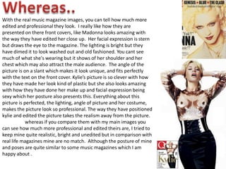
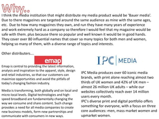
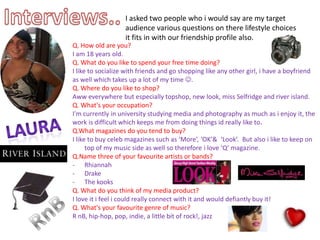
SlideShare a Scribd company logo
1 of 32
EVALUATION By Ellie Thacker
1.What ways does your media product  use, develop or challenge forms  and conventions of a real media products?
Masthead.. Whilst deciding my title name I was torn between ‘Gig’ and ‘listen’ which were my finial two names I decided to go with ‘Listen’ because I felt it had more meaning and a musical theme to it. When I started to develop the name and make it into a eye catching masthead I went through a lot of different fonts to get to my finial one. I tried to follow the conventions of a real music magazine but I felt that it was difficult to get it to look as professional as they had made  there's look, although I didn’t let that stop me and carried on till I found the perfect one for my magazine. It may not look as professional but  i felt it went with the whole look of my magazine which I was going for.   Which was quite ‘Rock & Roll’ and I felt the font I used which I got  off of www.dafont.com really looked the part when I put it on the front  and pieced the magazine together.  It looks like a vintage style stencil  which would be used at a gig for instance in the back.  I kept the title black although it may not stand out as much as say Q magazine with the bright red         I felt it fitted in with my colour scheme; black, red and white. The font used throughout was Modern No.20 and Arial, I felt that they looked nice and neat and looked good with my pictures and other text, I also feel it appealed to my target audience.
Mise en scene.. When I started to think about what I wanted my main images to be, I immediately thought about using a musical instrument and luckily my dad has a collection of guitars but I liked the thought of a electric looking one.  I asked my sister to model for me because I felt she had quite a unique look about her so I began to take various photographs with her modelling with a guitar in different lighting; bright, dark, dim, daylight etc. I also took some of her in night clubs to get that urban vibe and background look. I tried a collection of costumes on her for my front cover and decided with a jean waste coat with nothing underneath so you could see her tattoos and put a hair accessory in her hair, with green sculls on I done all this to make a rock chick look.  Jessica positioned and posed a variety of ways, to have a different selection of photographs. Her make up was different in each selection of photographs but I kept it quite natural in each.
Writtencontent.. Before I started to write my interview of the new solo artist Just Jess, I looked through real music & celeb magazines to get an idea of how I would like to structure mine. After reading through I found that there was two types of interviews a very well structured one where there was a question and a sold answer, and then found that there was a more laid back type where it was a interview but a discussion as well. I tried out both and found it extremely difficult to get my interview to flow when it was well structured, so therefore I used the relaxed technique which made it very enjoyable to do when interviewing Just Jess in this way I felt I could get her to express her self more and feel more relaxed when asking her questions.  When I got stuck or felt I couldn’t ask any more questions I would look at magazines such as ‘More’ and look at there interviews for inspiration.  I feel when I read back over my interview I could have made it a little more formal and structured but I am happy with the overall outcome. The language used wasn’t to formal or informal which I felt appealed to my target audience well.
Genre.. Rock & Roll R’n’b POP The genre of my music magazine is based on R’N’B but by the look of my front cover it could look rock n roll. Which I don’t think is a bad thing I want the magazine to appeal to different genres of music, so therefore I like that It doesn’t stereo-type one type of music. So therefore I don’t think its clear what genre it is which I'm pleased about.  I used Just Jess on the front she's a R n B artist but looks in this picture a bit rock- chick.  Indie classic Garage MOTOWN
Layout.. Masthead is at the top nice and big, so my audience can spot it.  I choose this main image because I felt it was a really good position/pose and made my magazine look interesting.  I listed artist on the side of my magazine that would appear in the issue, this would draw the audience eye if they liked these artists. Date of the issue and price in a unusual place for a magazine but I felt it looked appropriate due to the look of my magazine. This is my main cover line.  I wanted to keep the front cover simple but eye catching.  A nice bright and colourful statement which represents our magazine.
Contents page.. When I looked into how other music magazines had designed there contents page, I found it difficult to make mine look as professional. I tried out a lot of different ideas and done lots of sketches until I come up with something that looked similar to my finial piece.  I followed the colour scheme of red and black to make it all look neat and conventional. I followed some of the real music magazine conventions by using an editors note, also using main images. Although the way it is set out maybe not as conventional as it could be. Which I would change if I did this project again. I feel it appeals to my target audience well because it carry's on the theme of my front cover. And appeals to my target age.  Also by making the celebrities names either in capitals or highlighted makes the magazine more appealing and worthy to purchase.
2.How does your media product  Represent Particular social groups?
Comparison.. I choose these two pictures to compare to the real music magazines simply because I like the way her posture is in both. in one she’s used an abstract pose by biting the guitar and in the other she's holding the guitar in a cool rock chick way. The facial expressions she has used are really different one being unusual to what you would normally see on a music magazine, and the other being a quite model like pose with her face. I choose this costume for one of the photo shoots because I like how it made her body look showing her tattoos and nice slim body.  The angle of the pictures are close up and medium close up, so I could focus on her facial details and to see her posture and position with the guitar. After uploading these to my front cover and contents I edited them to look more professional and detailed. I edited them in various different ways at first but actually prefer them to look more natural I took the shadows out, made jess look more tidy, and cropped out the back ground, I also changed her eye colour and her hair to be lighter.   the social group I was trying to reflect on throughout was an urban, modern and young generation of 15 + that were into their music. If I was trying to appeal to a rock social group id make the lighting extremely dark and make jess’s make up heavy and make her look gloomy and suspicious.
Whereas.. With the real music magazine images, you can tell how much more edited and professional they look.  I really like how they are presented on there front covers, like Madonna looks amazing with the way they have edited her close up.  Her facial expression is stern but draws the eye to the magazine. The lighting is bright but they have dimed it to look washed out and old fashioned. You cant see much of what she's wearing but it shows of her shoulder and her chest which may also attract the male audience.  The angle of the picture is on a slant which makes it look unique, and fits perfectly with the text on the front cover. Kylie’s picture is so clever with how they have made her look kind of plastic but she also looks amazing with how they have done her make up and facial expression being sexy which her posture also presents this. Everything about this picture is perfected, the lighting, angle of picture and her costume, makes the picture look so professional. The way they have positioned kylie and edited the picture takes the realism away from the picture.  	whereas if you compare them with my main images you can see how much more professional and edited theirs are, I tried to keep mine quite realistic, bright and unedited but in comparison with real life magazines mine are no match.  Although the posture of mine and poses are quite similar to some music magazines which I am happy about .
3.What kind of media institution Might distribute your media  product And why?
Media institution..  A little bit of history! . Bauer is the largest privately owned publisher in Europe, publishing in Germany, France, Spain, Portugal and the United Kingdom. Additionally, Bauer publishes in the United States and Mexico. - The Bauer Publishing Group was founded in Hamburg in 1875 by Johann Bauer. Under the management of four generations of the Bauer family, The Bauer Publishing Group has grown from its humble beginnings as a printing house into a worldwide publishing empire comprising 282 magazines in 15 countries with 6,600 employees worldwide and an annual turnover of 1.79 billion Euro. -Bauer entered the UK scene with Bella magazine in 1987. Introducing a new format that mixes previously unseen real life editorial and exciting service features, Bella made a significant impact on the women's market. The company gained attention again in 1990 with the launch of Take a Break magazine. Touching the lives of millions of women with its unique blend of upfront real life and competitions, the title quickly became market leader. Despite strong competition, Take a Break has maintained its No.1 status, currently selling over 1 million copies a week.
Why.. I think the media institution that might distribute my media product would be ‘Bauer media’.  Due to there magazines are targeted around the same audience as mine with the same ages, etc.  Due to how many magazines they own, and run they have many years of experience and work extremely hard as a company so therefore I would feel that my magazine would be safe with them. plus because there so popular and well known it would be in good hands.  They cover over 80 influential names that cover so many topics for both men and women, helping so many of them, with a diverse range of topics and interests.  Other distributers…. Emap is central to providing the latest information, analysis and inspiration to the apparel, style, design and retail industries, so that our customers can maximize opportunities and avoid the pitfalls of today’s changing fashion industry.  IPC Media produces over 60 iconic media brands, with print alone reaching almost two thirds of UK women and 42% of UK men – almost 26 million UK adults – while our websites collectively reach over 14 million users every month. IPC's diverse print and digital portfolio offers something for everyone, with a focus on three core audiences: men, mass market women and upmarket women. Media is transforming, both globally and on local and micro-local levels. Digital technologies and high-speed broadband are fundamentally changing the way we consume and share content. Such change provokes a need for all media companies to create new business models, form new partnerships and communicate with consumers in new ways.
4. Who would be the audience For your media product?
Interviews.. I asked two people who i would say are my target audience various questions on there lifestyle choices it fits in with our friendship profile also. Q. How old are you?  I am 18 years old. Q. What do you like to spend your free time doing? I like to socialize with friends and go shopping like any other girl, i have a boyfriend as well which takes up a lot of my time .  Q. Where do you like to shop? Aww everywhere but especially topshop, new look, miss Selfridge and river island. Q. What's your occupation? I'm currently in university studying media and photography as much as i enjoy it, the work is difficult which keeps me from doing things id really like to. Q.What magazines do you tend to buy? I like to buy celeb magazines such as ‘More’, ‘OK’&  ‘Look’.  But also i like to keep on top of my music side as well so therefore i love ‘Q’ magazine. Q.Name three of your favourite artists or bands? ,[object Object]
Drake
The kooks Q. What do you think of my media product? I love it i feel i could really connect with it and would defiantly buy it! Q. What's your favourite genre of music? R nB, hip-hop, pop, indie, a little bit of rock!, jazz Laura RnB
Q. How old are you?  I am 19 years old. Q. What do you like to spend your free time doing? To be honest i like to spend time with my mates, getting drunk and watching the football.  Q. Where do you like to shop? I'm not a grate lover of shopping so i normally do it over the internet & buy from choice, topman, zacks etc.  Q. What's your occupation? I'm a student at London university  Q. What magazines do you tend to buy? I like ‘Kerang!’  Q. Name three of your favourite artists or bands? ,[object Object]
Eminem
Jay-zQ. What do you think of my media product? I personally wouldn't buy it but id defiantly give it a look.  Seems really good. Q. What's your favourite genre of music? Garage, indie, RnB, hip-hop Q. Do you like to go to parties or festivals? I like the expericance of festivals but prefer parties. Q. Do you still live at home? Er yeah  sean These two people Sean and Laura are my typical readers for my magazine they like the genre of music my magazine is based on, and like the look of my media product. My magazine may not appeal to everyone but id like to think that it would appeal to fashion and music lovers, I would try and put a large variety of music genres in there. But I do want to keep it quite urban and up beat. 15 +.
5. How did you attract/address  your audience?
Annotations..  I tried to make my masthead look really interesting and stand out i realise that the colour isn't the best choice compared with a brighter colour such as red, but i feel it still eye catching enough. And fits in with my colour scheme.  My main image is the main thing to attract an audience  to my magazine. I tried to make it look as professional as i could, and tweaked it to make it look bright and appealing , i feel it grabs my target audience with the ways she's dressed and how she's holding the guitar.   I listed artists that would be involved in my magazine and listed them in red and black which also is another eye catching element.  For two reasons the first because if my target audience like any of the listed they will be more entitled to buy the magazine, due to who is being wrote about also because of the colours i used of red and black being extremely bright.  I put my price and date in unusual places to make the magazine look a little unique. I went and looked at some of the real music magazine prices and thought some was to dear and would put people off of buying them so i tried to do mine at a reasonable price, i also made the date quite big to show my audience the issue of this months magazine.  I made my main story line bold and vibrant to appeal to the audience and bring them in to read what its about, itook a quote from the interview so that the readers will want to see what its about and read the article.   This is one of my favourite parts of the magazine i used dafont to make a statement ‘the new outlook on music’ and loved  how it come out i put a red slanted back ground on it to make it extremely eye catching to the audience which i feel it does, due to my eyes are drawn to it straight away. I feel it gives it a nice modern touch.
I put the masthead on the inside very big, to make a bold statement that this is ‘Listen’ and that you should read on. I also put ‘this month 01/10’ to remind readers of what the month is of this issue and followed the colour scheme of red & black. I faded the images on the left hand side, to let the audience take in the content of what is going to be inside, instead of just on the images, i used just jess who my main article was based on as my main images due to it being an important article within my media product so therefore based this issue on her.  I put three different pictures in to interest the audience into reading about her.  I listed the contents page number and listed articles etc in red and black to carry on the theme, and also to attract the audience to read what will be inside, i done some pages in capitals to catch the audiences eye, and also did celebrities names in capital to address and enlighten the audience of the main celebs inside. If i done this task again i would of added more pages.  I put an editors note at the bottom because i don't feel its the most important think so that's why i put it there, i didn't make it stand out as maybe as much as i should but i feel its eye catching enough to take a look at.
I tried to make the opening masthead appealing to my audience so therefore I went on to dafont and spent ages trying to find a good font to suit my double page spread I then saw this one and loved it.  I choose, to use colours purple and black because I feel that they looked nice together.  And made the purple look bright in contrast with the black. I also tried to make it look girly due to the interview being based on a female.  I choose to dot the pictures around the double page spread because I felt it would make the article look more interesting and appealing.   I choose four different photos of jess, two of her looking done up and ready to go out and two of her naturally. The reasons for this is because I wanted the audience to be able to look at her real life and celebrity life style.
Grace  I feel that Ellie’s magazine looks very professional. I like how all the images are positioned and that it very clear and easy to read.  I feel that the front cover draws in the audience as the title is very bold and appropriate to the theme of ‘music’.  The image of he front is very striking.  I like how the colours go together which is pleasing on the eye.
Teresa ,[object Object]
& how she has arranged her pictures she has made it look very professional
I like her mast head and how she has used dafont
She could of made her pictures a little bigger but that’s my only criticism.
I like how busy it looks and the use of purple my favourite colour ,[object Object]
I like the font she used for the title

More Related Content

What's hot

Media presentation of representations
Media presentation of representationsMedia presentation of representations
Media presentation of representationskateparkinson
 
Evaluation presentation
Evaluation presentationEvaluation presentation
Evaluation presentationgracieglancy
 
Media presentation of representations
Media presentation of representationsMedia presentation of representations
Media presentation of representationskateparkinson
 
Media evalueation
Media evalueationMedia evalueation
Media evalueationa10939
 
Shannons Evaluation
Shannons EvaluationShannons Evaluation
Shannons Evaluationgranshan06
 
Music Magazine (Soundcheck) Evaluation
Music Magazine (Soundcheck) EvaluationMusic Magazine (Soundcheck) Evaluation
Music Magazine (Soundcheck) Evaluationkerryanne1995
 
Hatties evaluation
Hatties evaluationHatties evaluation
Hatties evaluationhattie_clyde
 
Evaluation of magazine
Evaluation of magazineEvaluation of magazine
Evaluation of magazinemediaanie
 

What's hot (15)

Evaluation
EvaluationEvaluation
Evaluation
 
Evaluation
EvaluationEvaluation
Evaluation
 
Media presentation of representations
Media presentation of representationsMedia presentation of representations
Media presentation of representations
 
Evaluation presentation
Evaluation presentationEvaluation presentation
Evaluation presentation
 
Media presentation of representations
Media presentation of representationsMedia presentation of representations
Media presentation of representations
 
5
55
5
 
Evaluation media
Evaluation mediaEvaluation media
Evaluation media
 
Media evalueation
Media evalueationMedia evalueation
Media evalueation
 
Evaluation 1
Evaluation 1Evaluation 1
Evaluation 1
 
Shannons Evaluation
Shannons EvaluationShannons Evaluation
Shannons Evaluation
 
Music Magazine (Soundcheck) Evaluation
Music Magazine (Soundcheck) EvaluationMusic Magazine (Soundcheck) Evaluation
Music Magazine (Soundcheck) Evaluation
 
Evaluation
EvaluationEvaluation
Evaluation
 
Hatties evaluation
Hatties evaluationHatties evaluation
Hatties evaluation
 
Media evaluation
Media evaluationMedia evaluation
Media evaluation
 
Evaluation of magazine
Evaluation of magazineEvaluation of magazine
Evaluation of magazine
 

Viewers also liked

Evaluation
EvaluationEvaluation
Evaluationellfred
 
Evaluation
EvaluationEvaluation
Evaluationellfred
 
Planning of contents page
Planning of contents pagePlanning of contents page
Planning of contents pageellfred
 
Lefferts Historic House Interactive Kitchen
Lefferts Historic House Interactive KitchenLefferts Historic House Interactive Kitchen
Lefferts Historic House Interactive KitchenObinna Izeogu
 
Presentation on graphs
Presentation on graphsPresentation on graphs
Presentation on graphstruptipatel123
 
Planning of front cover
Planning of front coverPlanning of front cover
Planning of front coverellfred
 
Planning of front cover
Planning of front coverPlanning of front cover
Planning of front coverellfred
 
Double page spread
Double page spreadDouble page spread
Double page spreadellfred
 
Planning of contents page
Planning of contents pagePlanning of contents page
Planning of contents pageellfred
 
Music magazine pictures
Music magazine picturesMusic magazine pictures
Music magazine picturesellfred
 
Consumer buying behaviour
Consumer buying behaviourConsumer buying behaviour
Consumer buying behaviourPradeep Chauhan
 
Hw299 01-unit 4 project
Hw299 01-unit 4 projectHw299 01-unit 4 project
Hw299 01-unit 4 projectsouldrifter
 
Heuristic Evaluation of newschool.edu
Heuristic Evaluation of newschool.eduHeuristic Evaluation of newschool.edu
Heuristic Evaluation of newschool.eduObinna Izeogu
 

Viewers also liked (15)

Presentation props
Presentation propsPresentation props
Presentation props
 
Evaluation
EvaluationEvaluation
Evaluation
 
Evaluation
EvaluationEvaluation
Evaluation
 
Petter og Pia blir venner
Petter og Pia blir vennerPetter og Pia blir venner
Petter og Pia blir venner
 
Planning of contents page
Planning of contents pagePlanning of contents page
Planning of contents page
 
Lefferts Historic House Interactive Kitchen
Lefferts Historic House Interactive KitchenLefferts Historic House Interactive Kitchen
Lefferts Historic House Interactive Kitchen
 
Presentation on graphs
Presentation on graphsPresentation on graphs
Presentation on graphs
 
Planning of front cover
Planning of front coverPlanning of front cover
Planning of front cover
 
Planning of front cover
Planning of front coverPlanning of front cover
Planning of front cover
 
Double page spread
Double page spreadDouble page spread
Double page spread
 
Planning of contents page
Planning of contents pagePlanning of contents page
Planning of contents page
 
Music magazine pictures
Music magazine picturesMusic magazine pictures
Music magazine pictures
 
Consumer buying behaviour
Consumer buying behaviourConsumer buying behaviour
Consumer buying behaviour
 
Hw299 01-unit 4 project
Hw299 01-unit 4 projectHw299 01-unit 4 project
Hw299 01-unit 4 project
 
Heuristic Evaluation of newschool.edu
Heuristic Evaluation of newschool.eduHeuristic Evaluation of newschool.edu
Heuristic Evaluation of newschool.edu
 

Similar to Evaluation

Question 1 - media evaluation
Question 1 -  media evaluationQuestion 1 -  media evaluation
Question 1 - media evaluationClaraRodrigues96
 
Media Presentation
Media PresentationMedia Presentation
Media PresentationJessica
 
Media presentation
Media presentationMedia presentation
Media presentationJessica
 
Media presentation
Media presentationMedia presentation
Media presentationa10939
 
Media presentation
Media presentationMedia presentation
Media presentationJessica
 
Shannons Evaluation
Shannons EvaluationShannons Evaluation
Shannons Evaluationgranshan06
 
Evaluation of magazine
Evaluation of magazineEvaluation of magazine
Evaluation of magazinemediaanie
 
Evaluation of magazine
Evaluation of magazineEvaluation of magazine
Evaluation of magazinemediaanie
 
Planning
PlanningPlanning
Planningmiahyde
 
In what ways does your media product use
In what ways does your media product useIn what ways does your media product use
In what ways does your media product usefrazer burbery
 
Media evaluationnnn
Media evaluationnnnMedia evaluationnnn
Media evaluationnnnParishti1993
 
Media evaluation
Media evaluationMedia evaluation
Media evaluationmegan
 
Media as coursework – music magazine evaluation
Media as coursework – music magazine evaluationMedia as coursework – music magazine evaluation
Media as coursework – music magazine evaluationHannahLuise
 
Front cover production
Front cover productionFront cover production
Front cover productionlucyeldridge
 

Similar to Evaluation (20)

Question 1 - media evaluation
Question 1 -  media evaluationQuestion 1 -  media evaluation
Question 1 - media evaluation
 
Media Presentation
Media PresentationMedia Presentation
Media Presentation
 
Media presentation
Media presentationMedia presentation
Media presentation
 
Media presentation
Media presentationMedia presentation
Media presentation
 
Media presentation
Media presentationMedia presentation
Media presentation
 
Shannons Evaluation
Shannons EvaluationShannons Evaluation
Shannons Evaluation
 
Evaluation of magazine
Evaluation of magazineEvaluation of magazine
Evaluation of magazine
 
Evaluation of magazine
Evaluation of magazineEvaluation of magazine
Evaluation of magazine
 
Planning
PlanningPlanning
Planning
 
Question 1
Question 1Question 1
Question 1
 
Question 5
Question 5Question 5
Question 5
 
In what ways does your media product use
In what ways does your media product useIn what ways does your media product use
In what ways does your media product use
 
Magazine evaluation
Magazine evaluationMagazine evaluation
Magazine evaluation
 
Media evaluationnnn
Media evaluationnnnMedia evaluationnnn
Media evaluationnnn
 
Media evaluation
Media evaluationMedia evaluation
Media evaluation
 
Media evaluation
Media evaluationMedia evaluation
Media evaluation
 
Evaluation 1
Evaluation 1Evaluation 1
Evaluation 1
 
Media as coursework – music magazine evaluation
Media as coursework – music magazine evaluationMedia as coursework – music magazine evaluation
Media as coursework – music magazine evaluation
 
Front cover production
Front cover productionFront cover production
Front cover production
 
Numer1 presentation
Numer1 presentationNumer1 presentation
Numer1 presentation
 

Recently uploaded

Organic Name Reactions for the students and aspirants of Chemistry12th.pptx
Organic Name Reactions  for the students and aspirants of Chemistry12th.pptxOrganic Name Reactions  for the students and aspirants of Chemistry12th.pptx
Organic Name Reactions for the students and aspirants of Chemistry12th.pptxVS Mahajan Coaching Centre
 
Science 7 - LAND and SEA BREEZE and its Characteristics
Science 7 - LAND and SEA BREEZE and its CharacteristicsScience 7 - LAND and SEA BREEZE and its Characteristics
Science 7 - LAND and SEA BREEZE and its CharacteristicsKarinaGenton
 
Solving Puzzles Benefits Everyone (English).pptx
Solving Puzzles Benefits Everyone (English).pptxSolving Puzzles Benefits Everyone (English).pptx
Solving Puzzles Benefits Everyone (English).pptxOH TEIK BIN
 
Presiding Officer Training module 2024 lok sabha elections
Presiding Officer Training module 2024 lok sabha electionsPresiding Officer Training module 2024 lok sabha elections
Presiding Officer Training module 2024 lok sabha electionsanshu789521
 
Employee wellbeing at the workplace.pptx
Employee wellbeing at the workplace.pptxEmployee wellbeing at the workplace.pptx
Employee wellbeing at the workplace.pptxNirmalaLoungPoorunde1
 
POINT- BIOCHEMISTRY SEM 2 ENZYMES UNIT 5.pptx
POINT- BIOCHEMISTRY SEM 2 ENZYMES UNIT 5.pptxPOINT- BIOCHEMISTRY SEM 2 ENZYMES UNIT 5.pptx
POINT- BIOCHEMISTRY SEM 2 ENZYMES UNIT 5.pptxSayali Powar
 
Call Girls in Dwarka Mor Delhi Contact Us 9654467111
Call Girls in Dwarka Mor Delhi Contact Us 9654467111Call Girls in Dwarka Mor Delhi Contact Us 9654467111
Call Girls in Dwarka Mor Delhi Contact Us 9654467111Sapana Sha
 
mini mental status format.docx
mini    mental       status     format.docxmini    mental       status     format.docx
mini mental status format.docxPoojaSen20
 
Presentation by Andreas Schleicher Tackling the School Absenteeism Crisis 30 ...
Presentation by Andreas Schleicher Tackling the School Absenteeism Crisis 30 ...Presentation by Andreas Schleicher Tackling the School Absenteeism Crisis 30 ...
Presentation by Andreas Schleicher Tackling the School Absenteeism Crisis 30 ...EduSkills OECD
 
Class 11 Legal Studies Ch-1 Concept of State .pdf
Class 11 Legal Studies Ch-1 Concept of State .pdfClass 11 Legal Studies Ch-1 Concept of State .pdf
Class 11 Legal Studies Ch-1 Concept of State .pdfakmcokerachita
 
SOCIAL AND HISTORICAL CONTEXT - LFTVD.pptx
SOCIAL AND HISTORICAL CONTEXT - LFTVD.pptxSOCIAL AND HISTORICAL CONTEXT - LFTVD.pptx
SOCIAL AND HISTORICAL CONTEXT - LFTVD.pptxiammrhaywood
 
_Math 4-Q4 Week 5.pptx Steps in Collecting Data
_Math 4-Q4 Week 5.pptx Steps in Collecting Data_Math 4-Q4 Week 5.pptx Steps in Collecting Data
_Math 4-Q4 Week 5.pptx Steps in Collecting DataJhengPantaleon
 
How to Make a Pirate ship Primary Education.pptx
How to Make a Pirate ship Primary Education.pptxHow to Make a Pirate ship Primary Education.pptx
How to Make a Pirate ship Primary Education.pptxmanuelaromero2013
 
ECONOMIC CONTEXT - LONG FORM TV DRAMA - PPT
ECONOMIC CONTEXT - LONG FORM TV DRAMA - PPTECONOMIC CONTEXT - LONG FORM TV DRAMA - PPT
ECONOMIC CONTEXT - LONG FORM TV DRAMA - PPTiammrhaywood
 
Software Engineering Methodologies (overview)
Software Engineering Methodologies (overview)Software Engineering Methodologies (overview)
Software Engineering Methodologies (overview)eniolaolutunde
 

Recently uploaded (20)

Organic Name Reactions for the students and aspirants of Chemistry12th.pptx
Organic Name Reactions  for the students and aspirants of Chemistry12th.pptxOrganic Name Reactions  for the students and aspirants of Chemistry12th.pptx
Organic Name Reactions for the students and aspirants of Chemistry12th.pptx
 
Science 7 - LAND and SEA BREEZE and its Characteristics
Science 7 - LAND and SEA BREEZE and its CharacteristicsScience 7 - LAND and SEA BREEZE and its Characteristics
Science 7 - LAND and SEA BREEZE and its Characteristics
 
Solving Puzzles Benefits Everyone (English).pptx
Solving Puzzles Benefits Everyone (English).pptxSolving Puzzles Benefits Everyone (English).pptx
Solving Puzzles Benefits Everyone (English).pptx
 
Presiding Officer Training module 2024 lok sabha elections
Presiding Officer Training module 2024 lok sabha electionsPresiding Officer Training module 2024 lok sabha elections
Presiding Officer Training module 2024 lok sabha elections
 
Model Call Girl in Tilak Nagar Delhi reach out to us at 🔝9953056974🔝
Model Call Girl in Tilak Nagar Delhi reach out to us at 🔝9953056974🔝Model Call Girl in Tilak Nagar Delhi reach out to us at 🔝9953056974🔝
Model Call Girl in Tilak Nagar Delhi reach out to us at 🔝9953056974🔝
 
Employee wellbeing at the workplace.pptx
Employee wellbeing at the workplace.pptxEmployee wellbeing at the workplace.pptx
Employee wellbeing at the workplace.pptx
 
POINT- BIOCHEMISTRY SEM 2 ENZYMES UNIT 5.pptx
POINT- BIOCHEMISTRY SEM 2 ENZYMES UNIT 5.pptxPOINT- BIOCHEMISTRY SEM 2 ENZYMES UNIT 5.pptx
POINT- BIOCHEMISTRY SEM 2 ENZYMES UNIT 5.pptx
 
Call Girls in Dwarka Mor Delhi Contact Us 9654467111
Call Girls in Dwarka Mor Delhi Contact Us 9654467111Call Girls in Dwarka Mor Delhi Contact Us 9654467111
Call Girls in Dwarka Mor Delhi Contact Us 9654467111
 
Model Call Girl in Bikash Puri Delhi reach out to us at 🔝9953056974🔝
Model Call Girl in Bikash Puri  Delhi reach out to us at 🔝9953056974🔝Model Call Girl in Bikash Puri  Delhi reach out to us at 🔝9953056974🔝
Model Call Girl in Bikash Puri Delhi reach out to us at 🔝9953056974🔝
 
mini mental status format.docx
mini    mental       status     format.docxmini    mental       status     format.docx
mini mental status format.docx
 
TataKelola dan KamSiber Kecerdasan Buatan v022.pdf
TataKelola dan KamSiber Kecerdasan Buatan v022.pdfTataKelola dan KamSiber Kecerdasan Buatan v022.pdf
TataKelola dan KamSiber Kecerdasan Buatan v022.pdf
 
9953330565 Low Rate Call Girls In Rohini Delhi NCR
9953330565 Low Rate Call Girls In Rohini  Delhi NCR9953330565 Low Rate Call Girls In Rohini  Delhi NCR
9953330565 Low Rate Call Girls In Rohini Delhi NCR
 
Presentation by Andreas Schleicher Tackling the School Absenteeism Crisis 30 ...
Presentation by Andreas Schleicher Tackling the School Absenteeism Crisis 30 ...Presentation by Andreas Schleicher Tackling the School Absenteeism Crisis 30 ...
Presentation by Andreas Schleicher Tackling the School Absenteeism Crisis 30 ...
 
Class 11 Legal Studies Ch-1 Concept of State .pdf
Class 11 Legal Studies Ch-1 Concept of State .pdfClass 11 Legal Studies Ch-1 Concept of State .pdf
Class 11 Legal Studies Ch-1 Concept of State .pdf
 
Código Creativo y Arte de Software | Unidad 1
Código Creativo y Arte de Software | Unidad 1Código Creativo y Arte de Software | Unidad 1
Código Creativo y Arte de Software | Unidad 1
 
SOCIAL AND HISTORICAL CONTEXT - LFTVD.pptx
SOCIAL AND HISTORICAL CONTEXT - LFTVD.pptxSOCIAL AND HISTORICAL CONTEXT - LFTVD.pptx
SOCIAL AND HISTORICAL CONTEXT - LFTVD.pptx
 
_Math 4-Q4 Week 5.pptx Steps in Collecting Data
_Math 4-Q4 Week 5.pptx Steps in Collecting Data_Math 4-Q4 Week 5.pptx Steps in Collecting Data
_Math 4-Q4 Week 5.pptx Steps in Collecting Data
 
How to Make a Pirate ship Primary Education.pptx
How to Make a Pirate ship Primary Education.pptxHow to Make a Pirate ship Primary Education.pptx
How to Make a Pirate ship Primary Education.pptx
 
ECONOMIC CONTEXT - LONG FORM TV DRAMA - PPT
ECONOMIC CONTEXT - LONG FORM TV DRAMA - PPTECONOMIC CONTEXT - LONG FORM TV DRAMA - PPT
ECONOMIC CONTEXT - LONG FORM TV DRAMA - PPT
 
Software Engineering Methodologies (overview)
Software Engineering Methodologies (overview)Software Engineering Methodologies (overview)
Software Engineering Methodologies (overview)
 

Evaluation

  • 2. 1.What ways does your media product use, develop or challenge forms and conventions of a real media products?
  • 3. Masthead.. Whilst deciding my title name I was torn between ‘Gig’ and ‘listen’ which were my finial two names I decided to go with ‘Listen’ because I felt it had more meaning and a musical theme to it. When I started to develop the name and make it into a eye catching masthead I went through a lot of different fonts to get to my finial one. I tried to follow the conventions of a real music magazine but I felt that it was difficult to get it to look as professional as they had made there's look, although I didn’t let that stop me and carried on till I found the perfect one for my magazine. It may not look as professional but i felt it went with the whole look of my magazine which I was going for. Which was quite ‘Rock & Roll’ and I felt the font I used which I got off of www.dafont.com really looked the part when I put it on the front and pieced the magazine together. It looks like a vintage style stencil which would be used at a gig for instance in the back. I kept the title black although it may not stand out as much as say Q magazine with the bright red I felt it fitted in with my colour scheme; black, red and white. The font used throughout was Modern No.20 and Arial, I felt that they looked nice and neat and looked good with my pictures and other text, I also feel it appealed to my target audience.
  • 4. Mise en scene.. When I started to think about what I wanted my main images to be, I immediately thought about using a musical instrument and luckily my dad has a collection of guitars but I liked the thought of a electric looking one. I asked my sister to model for me because I felt she had quite a unique look about her so I began to take various photographs with her modelling with a guitar in different lighting; bright, dark, dim, daylight etc. I also took some of her in night clubs to get that urban vibe and background look. I tried a collection of costumes on her for my front cover and decided with a jean waste coat with nothing underneath so you could see her tattoos and put a hair accessory in her hair, with green sculls on I done all this to make a rock chick look. Jessica positioned and posed a variety of ways, to have a different selection of photographs. Her make up was different in each selection of photographs but I kept it quite natural in each.
  • 5. Writtencontent.. Before I started to write my interview of the new solo artist Just Jess, I looked through real music & celeb magazines to get an idea of how I would like to structure mine. After reading through I found that there was two types of interviews a very well structured one where there was a question and a sold answer, and then found that there was a more laid back type where it was a interview but a discussion as well. I tried out both and found it extremely difficult to get my interview to flow when it was well structured, so therefore I used the relaxed technique which made it very enjoyable to do when interviewing Just Jess in this way I felt I could get her to express her self more and feel more relaxed when asking her questions. When I got stuck or felt I couldn’t ask any more questions I would look at magazines such as ‘More’ and look at there interviews for inspiration. I feel when I read back over my interview I could have made it a little more formal and structured but I am happy with the overall outcome. The language used wasn’t to formal or informal which I felt appealed to my target audience well.
  • 6. Genre.. Rock & Roll R’n’b POP The genre of my music magazine is based on R’N’B but by the look of my front cover it could look rock n roll. Which I don’t think is a bad thing I want the magazine to appeal to different genres of music, so therefore I like that It doesn’t stereo-type one type of music. So therefore I don’t think its clear what genre it is which I'm pleased about. I used Just Jess on the front she's a R n B artist but looks in this picture a bit rock- chick. Indie classic Garage MOTOWN
  • 7. Layout.. Masthead is at the top nice and big, so my audience can spot it. I choose this main image because I felt it was a really good position/pose and made my magazine look interesting. I listed artist on the side of my magazine that would appear in the issue, this would draw the audience eye if they liked these artists. Date of the issue and price in a unusual place for a magazine but I felt it looked appropriate due to the look of my magazine. This is my main cover line. I wanted to keep the front cover simple but eye catching. A nice bright and colourful statement which represents our magazine.
  • 8. Contents page.. When I looked into how other music magazines had designed there contents page, I found it difficult to make mine look as professional. I tried out a lot of different ideas and done lots of sketches until I come up with something that looked similar to my finial piece. I followed the colour scheme of red and black to make it all look neat and conventional. I followed some of the real music magazine conventions by using an editors note, also using main images. Although the way it is set out maybe not as conventional as it could be. Which I would change if I did this project again. I feel it appeals to my target audience well because it carry's on the theme of my front cover. And appeals to my target age. Also by making the celebrities names either in capitals or highlighted makes the magazine more appealing and worthy to purchase.
  • 9. 2.How does your media product Represent Particular social groups?
  • 10. Comparison.. I choose these two pictures to compare to the real music magazines simply because I like the way her posture is in both. in one she’s used an abstract pose by biting the guitar and in the other she's holding the guitar in a cool rock chick way. The facial expressions she has used are really different one being unusual to what you would normally see on a music magazine, and the other being a quite model like pose with her face. I choose this costume for one of the photo shoots because I like how it made her body look showing her tattoos and nice slim body. The angle of the pictures are close up and medium close up, so I could focus on her facial details and to see her posture and position with the guitar. After uploading these to my front cover and contents I edited them to look more professional and detailed. I edited them in various different ways at first but actually prefer them to look more natural I took the shadows out, made jess look more tidy, and cropped out the back ground, I also changed her eye colour and her hair to be lighter. the social group I was trying to reflect on throughout was an urban, modern and young generation of 15 + that were into their music. If I was trying to appeal to a rock social group id make the lighting extremely dark and make jess’s make up heavy and make her look gloomy and suspicious.
  • 11. Whereas.. With the real music magazine images, you can tell how much more edited and professional they look. I really like how they are presented on there front covers, like Madonna looks amazing with the way they have edited her close up. Her facial expression is stern but draws the eye to the magazine. The lighting is bright but they have dimed it to look washed out and old fashioned. You cant see much of what she's wearing but it shows of her shoulder and her chest which may also attract the male audience. The angle of the picture is on a slant which makes it look unique, and fits perfectly with the text on the front cover. Kylie’s picture is so clever with how they have made her look kind of plastic but she also looks amazing with how they have done her make up and facial expression being sexy which her posture also presents this. Everything about this picture is perfected, the lighting, angle of picture and her costume, makes the picture look so professional. The way they have positioned kylie and edited the picture takes the realism away from the picture. whereas if you compare them with my main images you can see how much more professional and edited theirs are, I tried to keep mine quite realistic, bright and unedited but in comparison with real life magazines mine are no match. Although the posture of mine and poses are quite similar to some music magazines which I am happy about .
  • 12. 3.What kind of media institution Might distribute your media product And why?
  • 13. Media institution.. A little bit of history! . Bauer is the largest privately owned publisher in Europe, publishing in Germany, France, Spain, Portugal and the United Kingdom. Additionally, Bauer publishes in the United States and Mexico. - The Bauer Publishing Group was founded in Hamburg in 1875 by Johann Bauer. Under the management of four generations of the Bauer family, The Bauer Publishing Group has grown from its humble beginnings as a printing house into a worldwide publishing empire comprising 282 magazines in 15 countries with 6,600 employees worldwide and an annual turnover of 1.79 billion Euro. -Bauer entered the UK scene with Bella magazine in 1987. Introducing a new format that mixes previously unseen real life editorial and exciting service features, Bella made a significant impact on the women's market. The company gained attention again in 1990 with the launch of Take a Break magazine. Touching the lives of millions of women with its unique blend of upfront real life and competitions, the title quickly became market leader. Despite strong competition, Take a Break has maintained its No.1 status, currently selling over 1 million copies a week.
  • 14. Why.. I think the media institution that might distribute my media product would be ‘Bauer media’. Due to there magazines are targeted around the same audience as mine with the same ages, etc. Due to how many magazines they own, and run they have many years of experience and work extremely hard as a company so therefore I would feel that my magazine would be safe with them. plus because there so popular and well known it would be in good hands. They cover over 80 influential names that cover so many topics for both men and women, helping so many of them, with a diverse range of topics and interests. Other distributers…. Emap is central to providing the latest information, analysis and inspiration to the apparel, style, design and retail industries, so that our customers can maximize opportunities and avoid the pitfalls of today’s changing fashion industry. IPC Media produces over 60 iconic media brands, with print alone reaching almost two thirds of UK women and 42% of UK men – almost 26 million UK adults – while our websites collectively reach over 14 million users every month. IPC's diverse print and digital portfolio offers something for everyone, with a focus on three core audiences: men, mass market women and upmarket women. Media is transforming, both globally and on local and micro-local levels. Digital technologies and high-speed broadband are fundamentally changing the way we consume and share content. Such change provokes a need for all media companies to create new business models, form new partnerships and communicate with consumers in new ways.
  • 15. 4. Who would be the audience For your media product?
  • 16.
  • 17. Drake
  • 18. The kooks Q. What do you think of my media product? I love it i feel i could really connect with it and would defiantly buy it! Q. What's your favourite genre of music? R nB, hip-hop, pop, indie, a little bit of rock!, jazz Laura RnB
  • 19.
  • 21. Jay-zQ. What do you think of my media product? I personally wouldn't buy it but id defiantly give it a look. Seems really good. Q. What's your favourite genre of music? Garage, indie, RnB, hip-hop Q. Do you like to go to parties or festivals? I like the expericance of festivals but prefer parties. Q. Do you still live at home? Er yeah sean These two people Sean and Laura are my typical readers for my magazine they like the genre of music my magazine is based on, and like the look of my media product. My magazine may not appeal to everyone but id like to think that it would appeal to fashion and music lovers, I would try and put a large variety of music genres in there. But I do want to keep it quite urban and up beat. 15 +.
  • 22. 5. How did you attract/address your audience?
  • 23. Annotations.. I tried to make my masthead look really interesting and stand out i realise that the colour isn't the best choice compared with a brighter colour such as red, but i feel it still eye catching enough. And fits in with my colour scheme. My main image is the main thing to attract an audience to my magazine. I tried to make it look as professional as i could, and tweaked it to make it look bright and appealing , i feel it grabs my target audience with the ways she's dressed and how she's holding the guitar. I listed artists that would be involved in my magazine and listed them in red and black which also is another eye catching element. For two reasons the first because if my target audience like any of the listed they will be more entitled to buy the magazine, due to who is being wrote about also because of the colours i used of red and black being extremely bright. I put my price and date in unusual places to make the magazine look a little unique. I went and looked at some of the real music magazine prices and thought some was to dear and would put people off of buying them so i tried to do mine at a reasonable price, i also made the date quite big to show my audience the issue of this months magazine. I made my main story line bold and vibrant to appeal to the audience and bring them in to read what its about, itook a quote from the interview so that the readers will want to see what its about and read the article. This is one of my favourite parts of the magazine i used dafont to make a statement ‘the new outlook on music’ and loved how it come out i put a red slanted back ground on it to make it extremely eye catching to the audience which i feel it does, due to my eyes are drawn to it straight away. I feel it gives it a nice modern touch.
  • 24. I put the masthead on the inside very big, to make a bold statement that this is ‘Listen’ and that you should read on. I also put ‘this month 01/10’ to remind readers of what the month is of this issue and followed the colour scheme of red & black. I faded the images on the left hand side, to let the audience take in the content of what is going to be inside, instead of just on the images, i used just jess who my main article was based on as my main images due to it being an important article within my media product so therefore based this issue on her. I put three different pictures in to interest the audience into reading about her. I listed the contents page number and listed articles etc in red and black to carry on the theme, and also to attract the audience to read what will be inside, i done some pages in capitals to catch the audiences eye, and also did celebrities names in capital to address and enlighten the audience of the main celebs inside. If i done this task again i would of added more pages. I put an editors note at the bottom because i don't feel its the most important think so that's why i put it there, i didn't make it stand out as maybe as much as i should but i feel its eye catching enough to take a look at.
  • 25. I tried to make the opening masthead appealing to my audience so therefore I went on to dafont and spent ages trying to find a good font to suit my double page spread I then saw this one and loved it. I choose, to use colours purple and black because I feel that they looked nice together. And made the purple look bright in contrast with the black. I also tried to make it look girly due to the interview being based on a female. I choose to dot the pictures around the double page spread because I felt it would make the article look more interesting and appealing. I choose four different photos of jess, two of her looking done up and ready to go out and two of her naturally. The reasons for this is because I wanted the audience to be able to look at her real life and celebrity life style.
  • 26. Grace I feel that Ellie’s magazine looks very professional. I like how all the images are positioned and that it very clear and easy to read. I feel that the front cover draws in the audience as the title is very bold and appropriate to the theme of ‘music’. The image of he front is very striking. I like how the colours go together which is pleasing on the eye.
  • 27.
  • 28. & how she has arranged her pictures she has made it look very professional
  • 29. I like her mast head and how she has used dafont
  • 30. She could of made her pictures a little bigger but that’s my only criticism.
  • 31.
  • 32. I like the font she used for the title
  • 33. She gave it a barcode to make it look more professional & also gave it a date and price
  • 34.
  • 35. I like how the images are all based to the left
  • 36. I also like how the house style is consistent from front cover to contents
  • 37. I like how the pictures are situated and how they are edited.
  • 38.
  • 39. I like how they are positioned around the page it makes it look more interesting and professional
  • 40. I like the ‘Just Jess’ font and how the interview is structured
  • 41. I like how the images brake up the large amount of text
  • 42.
  • 43. To produce my media product I had to use various types of technologies to make it happen. I have taken a picture of my 6 main things. Fireworks I feel that is was the main one because It designed and tweaked everything and without fireworks I wouldn’t been able to design my front cover, contents or double page spread at first I found it difficult to use but after that I felt that I could work with it properly. the computer was another main help due to without this I couldn’t of done anything. And this product would not have been done. Blogger because I had to upload all my bits of coursework on there so therefore I could get a mark. It’s a good way to keep your coursework safe.
  • 44. 4. Dafont was a huge help because it made my magazine look so much more professional with the font, I used this website a lot due to it being so good with some many choices. I would recommend this website to anyone. 5. Slide share was amazing due to making a PowerPoint look so much neater and presentable I am going to use it all the time now, It really helped me with this project. 6. The use of a camera within making my magazine helped me so much from taking pictures for my front cover, contents and also double page spread. It also helped with the little bits as well like taking pictures of my sketches etc. From using these technology's it has taught me so much I am so much more confidant on a computer now and will carry on using them for a long time and hopefully in more detail.
  • 45. 7.Looking back at your Preliminary task what do you feel you have Learnt in the progression from it to the Full product?
  • 46. Front cover comparison.. In comparison from my school magazine to my music magazine I can see how much more confidant I was using the different tools and technologies. Even the use with the font is completely different although I'm glad I had to do my school magazine first because if I didn’t I wouldn't have had so much confidence with the music magazine also wouldn’t of progressed as much as a media student. If you compare the picture quality its so different and you can see how much I have edited and put so much more effort into the music magazine compared with the school magazine. I'm extremely pleased with how my music magazine has came out but I'm very happy that I had to do the school one to give me this confidence for the music one.
  • 47. Contents comparison.. These two comparisons are not as opposite as the front covers, I have kept the pictures on the left hand side still, and used two colours in listing the page names. Although when it comes to what looks more professional its defiantly the music contents page, its so much more busier and lively compared to the school magazine. Also the text is more creative on the music magazine where as its quite boring and spaced out on the school magazine, the images may still be on the same side but the way they have been edited are completely unalike you can see how much time I would of spent on the music magazine contents compared to the school simply through the images. Also by putting in the editors note it just makes the whole page look more similar to a professional magazine. But as I said with the front cover, by creating the school magazine taught me a lot for the music magazine and made me a lot more confidant.