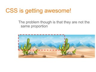
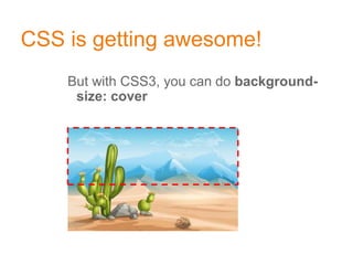
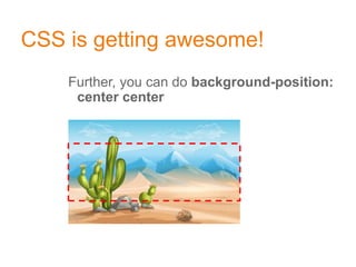
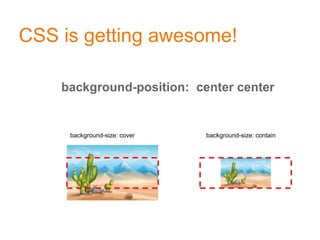
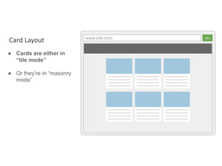
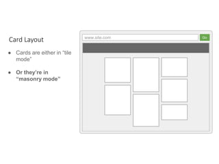
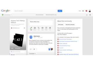
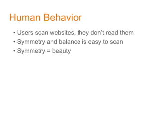
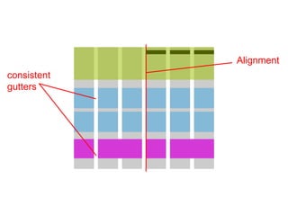
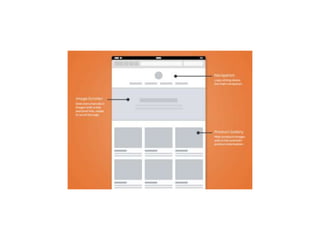
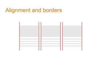
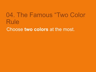
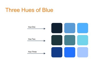
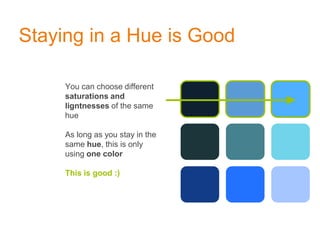
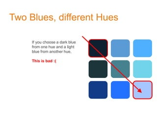
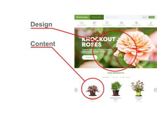
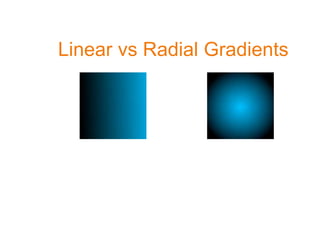
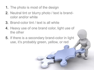
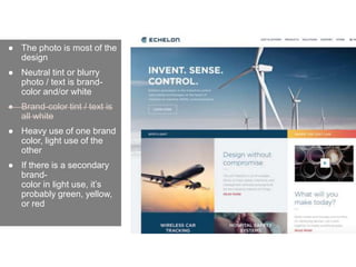
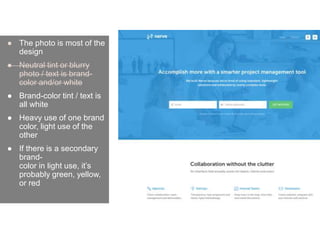
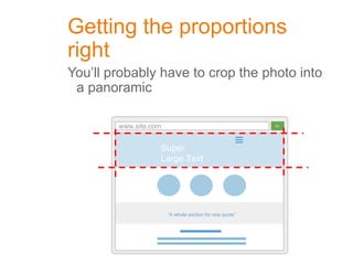
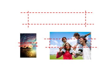
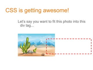
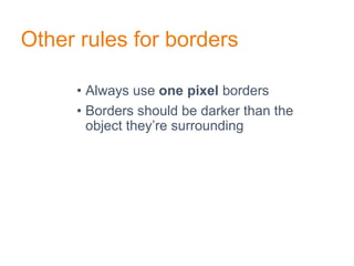
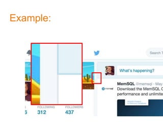
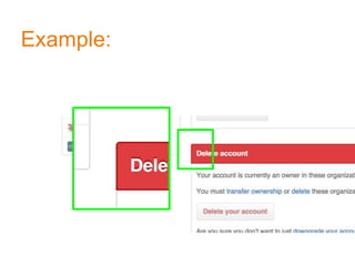
Principles behind Design
Thinking
By Abhiman Ranaweera
Roadmap
• Design patterns
• Alignment, Gutters and Vertical rhythm
• Color rules
• Font Rules
• Photography and Graphics
• Light borders and edges
• Flat Design
01. Design Patterns
A design pattern is a general reusable
solution to a commonly occurring
problem
Design patterns are “safe zones”
• “thinking outside the box” is not as cool in design
• Don’t do anything too crazy or unusual
Oh, and most importantly...
If you were designing shirts...
This is not in the safe zone
Not safe! Not safe!
02. Major Layout Patterns
Modular design “is in” because it helps
responsive design
www.site.com Go
● All content and
graphics are centered
● Always a left menu,
maybe a right menu
● Optimal for 1024
resolution
● A billion articles on
“how to do multi-
column layout in
CSS?”
Layouts of the past,
before 2008
www.site.com Go
“A whole section for one quote”
Super
Large Text
● Panels extend to edges
of screen
● Content however still
has fixed width in the
center
● The first panel is
usually large, graphical
and is known as the
hero
● Panels alternate in
color
● For some reason
there’s always circles
Panel layouts, for
content sites
A totally legitimate graph
2008 ishMulti-column Design
CSS3 Responsive Design
somenumbers
www.site.com Go
● Always a lightgray or
gray-ish background
● Cards are always white
● Works well with social
media sites
● Works well with
dashboards if you add
a sidebar
Card Layout
www.site.com Go
● Always a lightgray or
gray-ish background
● Cards are always white
● Works well with social
media sites
● Works well with
dashboards if you
add a sidebar
Card Layout
www.site.com Go
● Cards are either in
“tile mode”
● Or they’re in “masonry
mode”
Card Layout
www.site.com Go
● Cards are either in “tile
mode”
● Or they’re in
“masonry mode”
Card Layout
03. Alignment , Consistent
Gutters, And Vertical Rhythm
Human Behavior
• Users scan websites, they don’t read them
• Symmetry and balance is easy to scan
• Symmetry = beautyds
Beauty is a
science.
Symmetry and
average features
are easily
spotted
Alignment
consistent
gutters
Alignment and borders
with cards...
04. The Famous “Two Color
Rule
Choose two colors at the most.
Two colors explained...
Let the logo’s color determine the one or two colors for
your design.
* Shades of gray (including black and white) are considered
neutral colors and don’t count towards overall number of
colors
Company Name
Company Name
Three Hues of Blue
Hue One
Hue Two
Hue Three
Staying in a Hue is Good
You can choose different
saturations and
ligntnesses of the same
hue
As long as you stay in the
same hue, this is only
using one color
This is good :)
Two Blues, different Hues
If you choose a dark blue
from one hue and a light
blue from another hue,
This is bad :(
Choose within the same Hue
05. Font Rules
Never user more than two fonts
Legible Font
Start by choosing your legible font, which is the
font used for the larger bodies of text.
It can be Serif or Sans-Serif, but Sans-Serif is more popular. You can’t go
wrong with one of these:
Open Sans, Lato, or Roboto
A ASerif Sans-Serif
(without)
Title Font
(your “stand-out” font)
After choosing the legible font, choose a title
font which complements the attitude your
brand has.
Title One
The quick brown fox jumps over the…
Title Two
The quick brown fox jumps over the…
Title Three
The quick brown fox jumps over the...
If the background is white or
off-white...
...then the legible text is almost always a
neutral color (probably gray or black)
If the background is the brand-
color...
… then it’s safe for the title and legible text to
be white
Or, with the brand-color
background...
The title can be a darker shade of the same color
with the legible text being white
However, with a white
background...
...it is not okay to have the title be a neutral
color like gray while the legible text is the
brand color, especially a bright one like this
green
And under no circumstances...
...can the title and the legible text be the brand-
color at the same time in the same area
The same is true of pure white text on a
pure black background
Avoid pure black text on pure white
backgrounds - it’s harsh on the
eyes.
The same is true of pure white
text on a pure black background
05. Photography & Graphics
Unless you’re making a dashboard,
photos are critical to good design
Good Sources
Get your photos from:
1.Buy from the Internet (iStock Photos, Flicker…)
2.A professional photographer
Photography & Graphics
At all costs, avoid doing your own photos from
your phone.
Photography & Graphics
If you must take your own photos, take them when
the Sun is low on the horizon. This is when the light
is the best.
Photography & Graphics
Graphics fall into one of two categories:
1. Content
2. Design
Content Graphics
There are very little rules to content based
graphics, other than they need to complement the
content they belong to.
Design Graphics
Design graphics are fixtures to your design. They
are not tied to a particular piece of content. Design
Graphics complement your design or brand
Design
Content
Text on photos is tricky
Some White Text
Text on photos is tricky
Some White Text
Text on photos is tricky
Some White Text
Text on photos is tricky
Some White Text
Linear vs Radial Gradients
Text on photos is tricky
Some White Text
Text on photos is tricky
Some White Text
Text on photos is tricky
Some White Text
The Hero Section
Probably the single most popular feature of
websites today
www.site.com Go
“A whole section for one quote”
Super
Large Text
1. The photo is most of the design
2. Neutral tint or blurry photo / text is brand-
color and/or white
3. Brand-color tint / text is all white
4. Heavy use of one brand color, light use of
the other
5. If there is a secondary brand-color in light
use, it’s probably green, yellow, or red
● The photo is most of the
design
● Neutral tint or blurry
photo / text is brand-
color and/or white
● Brand-color tint / text is
all white
● Heavy use of one brand
color, light use of the
other
● If there is a secondary
brand-
color in light use, it’s
probably green, yellow,
or red
● The photo is most of the
design
● Neutral tint or blurry
photo / text is brand-
color and/or white
● Brand-color tint / text is
all white
● Heavy use of one brand
color, light use of the
other
● If there is a secondary
brand-
color in light use, it’s
probably green, yellow,
or red
● The photo is most of the
design
● Neutral tint or blurry
photo / text is brand-
color and/or white
● Brand-color tint / text is
all white
● Heavy use of one brand
color, light use of the
other
● If there is a secondary
brand-
color in light use, it’s
probably green, yellow,
or red
● The photo is most of the
design
● Neutral tint or blurry
photo / text is brand-
color and/or white
● Brand-color tint / text is
all white
● Heavy use of one brand
color, light use of the
other
● If there is a secondary
brand-
color in light use, it’s
probably green, yellow,
or red
● The photo is most of the
design
● Neutral tint or blurry
photo / text is brand-
color and/or white
● Brand-color tint / text is
all white
● Heavy use of one brand
color, light use of the
other
● If there is a secondary
brand-
color in light use, it’s
probably green, yellow,
or red
● The photo is most of the
design
● Neutral tint or blurry
photo / text is brand-
color and/or white
● Brand-color tint / text is
all white
● Heavy use of one brand
color, light use of the
other
● If there is a secondary
brand-
color in light use, it’s
probably green, yellow,
or red
● The photo is most of the
design
● Neutral tint or blurry
photo / text is brand-
color and/or white
● Brand-color tint / text is
all white
● Heavy use of one brand
color, light use of the
other
● If there is a secondary
brand-
color in light use, it’s
probably green, yellow,
or red
Getting the proportions
right
You’ll probably have to crop the photo into
a panoramic
www.site.com Go
“A whole section for one quote”
Super
Large Text
CSS is getting awesome!
Let’s say you want to fit this photo into this
div tag...
CSS is getting awesome!
The problem though is that they are not the
same proportion
CSS is getting awesome!
But with CSS3, you can do background-
size: cover
CSS is getting awesome!
Further, you can do background-position:
center center
CSS is getting awesome!
background-position: center center
background-size: cover background-size: contain
The best photos
have the main object off
to the side with blur off to
the other side, perfect for
text
The best photos
have the main object off
to the side with blur off to
the other side, perfect for
text
Choose Photography First
Let photography influence your overall design,
not the other way around
05. Light Borders &
Edges
Light from above
The “gel” phase
The “post gel” phase
Use Borders Lightly
Not all background transitions need a border
between them, but if you use one, the border
must be a darker hue of which ever
background is the darkest
Correct Incorrect
Use Borders Lightly
If one of the two colors is an actual color while the
other is a shade, the line should the the darker
version of the color
Correct Incorrect
Other rules for borders
• Always use one pixel borders
• Borders should be darker than the
object they’re surrounding
Example:
Example:
05. Flat Design Flat Icons
Flat Design
• Solid colors or gradients
• No drop shadows
• No 3D tricks with borders
• No gel nonsense
• Just solid colors
Still a thing?
• Flat Design Still?
• Flat Icons are in for sure!
• Font Icons
• SVG Icons
• HTTP (Web) Performance
Image Sprite
UI Principles Behind Design Thinking

UI Principles Behind Design Thinking

  • 1.
  • 2.
    Roadmap • Design patterns •Alignment, Gutters and Vertical rhythm • Color rules • Font Rules • Photography and Graphics • Light borders and edges • Flat Design
  • 3.
    01. Design Patterns Adesign pattern is a general reusable solution to a commonly occurring problem
  • 4.
    Design patterns are“safe zones” • “thinking outside the box” is not as cool in design • Don’t do anything too crazy or unusual Oh, and most importantly...
  • 5.
    If you weredesigning shirts...
  • 6.
    This is notin the safe zone
  • 7.
  • 8.
    02. Major LayoutPatterns Modular design “is in” because it helps responsive design
  • 9.
    www.site.com Go ● Allcontent and graphics are centered ● Always a left menu, maybe a right menu ● Optimal for 1024 resolution ● A billion articles on “how to do multi- column layout in CSS?” Layouts of the past, before 2008
  • 10.
    www.site.com Go “A wholesection for one quote” Super Large Text ● Panels extend to edges of screen ● Content however still has fixed width in the center ● The first panel is usually large, graphical and is known as the hero ● Panels alternate in color ● For some reason there’s always circles Panel layouts, for content sites
  • 11.
    A totally legitimategraph 2008 ishMulti-column Design CSS3 Responsive Design somenumbers
  • 12.
    www.site.com Go ● Alwaysa lightgray or gray-ish background ● Cards are always white ● Works well with social media sites ● Works well with dashboards if you add a sidebar Card Layout
  • 13.
    www.site.com Go ● Alwaysa lightgray or gray-ish background ● Cards are always white ● Works well with social media sites ● Works well with dashboards if you add a sidebar Card Layout
  • 14.
    www.site.com Go ● Cardsare either in “tile mode” ● Or they’re in “masonry mode” Card Layout
  • 15.
    www.site.com Go ● Cardsare either in “tile mode” ● Or they’re in “masonry mode” Card Layout
  • 20.
    03. Alignment ,Consistent Gutters, And Vertical Rhythm
  • 21.
    Human Behavior • Usersscan websites, they don’t read them • Symmetry and balance is easy to scan • Symmetry = beautyds
  • 22.
    Beauty is a science. Symmetryand average features are easily spotted
  • 23.
  • 25.
  • 27.
  • 29.
    04. The Famous“Two Color Rule Choose two colors at the most.
  • 30.
    Two colors explained... Letthe logo’s color determine the one or two colors for your design. * Shades of gray (including black and white) are considered neutral colors and don’t count towards overall number of colors
  • 31.
  • 35.
    Three Hues ofBlue Hue One Hue Two Hue Three
  • 36.
    Staying in aHue is Good You can choose different saturations and ligntnesses of the same hue As long as you stay in the same hue, this is only using one color This is good :)
  • 37.
    Two Blues, differentHues If you choose a dark blue from one hue and a light blue from another hue, This is bad :(
  • 38.
  • 40.
    05. Font Rules Neveruser more than two fonts
  • 41.
    Legible Font Start bychoosing your legible font, which is the font used for the larger bodies of text. It can be Serif or Sans-Serif, but Sans-Serif is more popular. You can’t go wrong with one of these: Open Sans, Lato, or Roboto
  • 42.
  • 43.
    Title Font (your “stand-out”font) After choosing the legible font, choose a title font which complements the attitude your brand has.
  • 44.
    Title One The quickbrown fox jumps over the… Title Two The quick brown fox jumps over the… Title Three The quick brown fox jumps over the...
  • 45.
    If the backgroundis white or off-white... ...then the legible text is almost always a neutral color (probably gray or black)
  • 46.
    If the backgroundis the brand- color... … then it’s safe for the title and legible text to be white
  • 47.
    Or, with thebrand-color background... The title can be a darker shade of the same color with the legible text being white
  • 48.
    However, with awhite background... ...it is not okay to have the title be a neutral color like gray while the legible text is the brand color, especially a bright one like this green
  • 49.
    And under nocircumstances... ...can the title and the legible text be the brand- color at the same time in the same area
  • 50.
    The same istrue of pure white text on a pure black background Avoid pure black text on pure white backgrounds - it’s harsh on the eyes. The same is true of pure white text on a pure black background
  • 54.
    05. Photography &Graphics Unless you’re making a dashboard, photos are critical to good design
  • 55.
    Good Sources Get yourphotos from: 1.Buy from the Internet (iStock Photos, Flicker…) 2.A professional photographer
  • 56.
    Photography & Graphics Atall costs, avoid doing your own photos from your phone.
  • 57.
    Photography & Graphics Ifyou must take your own photos, take them when the Sun is low on the horizon. This is when the light is the best.
  • 58.
    Photography & Graphics Graphicsfall into one of two categories: 1. Content 2. Design
  • 59.
    Content Graphics There arevery little rules to content based graphics, other than they need to complement the content they belong to.
  • 60.
    Design Graphics Design graphicsare fixtures to your design. They are not tied to a particular piece of content. Design Graphics complement your design or brand
  • 61.
  • 62.
    Text on photosis tricky Some White Text
  • 63.
    Text on photosis tricky Some White Text
  • 64.
    Text on photosis tricky Some White Text
  • 65.
    Text on photosis tricky Some White Text
  • 66.
  • 67.
    Text on photosis tricky Some White Text
  • 68.
    Text on photosis tricky Some White Text
  • 69.
    Text on photosis tricky Some White Text
  • 70.
    The Hero Section Probablythe single most popular feature of websites today www.site.com Go “A whole section for one quote” Super Large Text
  • 71.
    1. The photois most of the design 2. Neutral tint or blurry photo / text is brand- color and/or white 3. Brand-color tint / text is all white 4. Heavy use of one brand color, light use of the other 5. If there is a secondary brand-color in light use, it’s probably green, yellow, or red
  • 72.
    ● The photois most of the design ● Neutral tint or blurry photo / text is brand- color and/or white ● Brand-color tint / text is all white ● Heavy use of one brand color, light use of the other ● If there is a secondary brand- color in light use, it’s probably green, yellow, or red
  • 73.
    ● The photois most of the design ● Neutral tint or blurry photo / text is brand- color and/or white ● Brand-color tint / text is all white ● Heavy use of one brand color, light use of the other ● If there is a secondary brand- color in light use, it’s probably green, yellow, or red
  • 74.
    ● The photois most of the design ● Neutral tint or blurry photo / text is brand- color and/or white ● Brand-color tint / text is all white ● Heavy use of one brand color, light use of the other ● If there is a secondary brand- color in light use, it’s probably green, yellow, or red
  • 75.
    ● The photois most of the design ● Neutral tint or blurry photo / text is brand- color and/or white ● Brand-color tint / text is all white ● Heavy use of one brand color, light use of the other ● If there is a secondary brand- color in light use, it’s probably green, yellow, or red
  • 76.
    ● The photois most of the design ● Neutral tint or blurry photo / text is brand- color and/or white ● Brand-color tint / text is all white ● Heavy use of one brand color, light use of the other ● If there is a secondary brand- color in light use, it’s probably green, yellow, or red
  • 77.
    ● The photois most of the design ● Neutral tint or blurry photo / text is brand- color and/or white ● Brand-color tint / text is all white ● Heavy use of one brand color, light use of the other ● If there is a secondary brand- color in light use, it’s probably green, yellow, or red
  • 78.
    ● The photois most of the design ● Neutral tint or blurry photo / text is brand- color and/or white ● Brand-color tint / text is all white ● Heavy use of one brand color, light use of the other ● If there is a secondary brand- color in light use, it’s probably green, yellow, or red
  • 79.
    Getting the proportions right You’llprobably have to crop the photo into a panoramic www.site.com Go “A whole section for one quote” Super Large Text
  • 82.
    CSS is gettingawesome! Let’s say you want to fit this photo into this div tag...
  • 83.
    CSS is gettingawesome! The problem though is that they are not the same proportion
  • 84.
    CSS is gettingawesome! But with CSS3, you can do background- size: cover
  • 85.
    CSS is gettingawesome! Further, you can do background-position: center center
  • 86.
    CSS is gettingawesome! background-position: center center background-size: cover background-size: contain
  • 87.
    The best photos havethe main object off to the side with blur off to the other side, perfect for text
  • 88.
    The best photos havethe main object off to the side with blur off to the other side, perfect for text
  • 89.
    Choose Photography First Letphotography influence your overall design, not the other way around
  • 90.
  • 91.
  • 92.
  • 93.
  • 95.
    Use Borders Lightly Notall background transitions need a border between them, but if you use one, the border must be a darker hue of which ever background is the darkest Correct Incorrect
  • 96.
    Use Borders Lightly Ifone of the two colors is an actual color while the other is a shade, the line should the the darker version of the color Correct Incorrect
  • 97.
    Other rules forborders • Always use one pixel borders • Borders should be darker than the object they’re surrounding
  • 98.
  • 99.
  • 101.
    05. Flat DesignFlat Icons
  • 102.
    Flat Design • Solidcolors or gradients • No drop shadows • No 3D tricks with borders • No gel nonsense • Just solid colors
  • 103.
    Still a thing? •Flat Design Still? • Flat Icons are in for sure! • Font Icons • SVG Icons • HTTP (Web) Performance
  • 106.