Contents page annotation
•Download as DOCX, PDF•
1 like•672 views
The document provides an analysis of the layout, design and visual elements of various magazine covers and contents pages. It examines the use of colour schemes, images, fonts, headings and other stylistic choices to convey the intended audience and topics of different magazines. Red and black are used on one magazine to seem sophisticated for teenage or middle-aged women. Other magazines employ green for a healthy image, yellow and white to stand out, and orange and black titles to draw attention. Images, fonts, and page organization are tailored for topics like fashion, interior design, food, and pets.
Report
Share
Report
Share

Recommended
Q Cover Page Analysis
The document summarizes the key elements that are typically found on the cover of a magazine, including the masthead, cover line, features, cover image, layout, puff, barcode, and dateline. Specifically, it provides details on the masthead location and colors, cover line text promoting the main Florence Welsh article, listed features, full-body cover image of Florence, conventional layout, single promotional puff, barcode placement, and date placement above the price.
Brand Identity
The document analyzes the branding, design, and messaging techniques used in a Billboard magazine cover featuring Rihanna. It discusses how the serious portrait of Rihanna, her red hair and outfit, and mysterious pull quote establish a sophisticated yet engaging tone. The sans-serif typography, masthead, and use of colors create a modern aesthetic that appeals to Billboard's target demographic of teenagers and young adults across multiple music genres.
Vibe magazine analysis presentation
Presentation of VIBE music magazine. Includes analysis of a front cover, a contents page and a double page spread.
Close analysis (2)
1) The magazine content pages analyzed use visual cues like fonts, sizing, coloring and positioning of text/images to draw reader attention to key information and sections. Important topics are made to stand out with techniques like using red text, larger text, unique shapes and centering.
2) Photographs of celebrities/games are prominently displayed to allow readers to quickly identify if their interests will be covered.
3) Section headings and descriptions are organized clearly on the left side of pages to provide readers an overview of what each article will discuss.
Ramsha z z (2)
1) The document describes three magazine covers. The first magazine cover features an overweight man and details about the title, main image, article line, cover line, and contact information.
2) The second magazine cover features actress Sarah Jessica Parker and details about the title hiding the 'A' in BAZAAR, the main image of Parker, cover lines introducing her role in Arabian design, and date and contact information.
3) The third magazine cover features two swans and details about the simple nature-focused title, main image of wildlife, date, price, and additional information about the volume number.
Magazine analysis final
The magazine Kerrang targets 13-24 year olds interested in heavy metal and indie rock music. This is evident from the dark coloring and comic book style of the cover that appeals stereotypically to males in this age group. The low price of £1.89 also indicates the target market cannot afford much, placing them in social groups C1-E. The magazine layout follows the Guttenberg design theory with important elements like the masthead and band photos placed in the primary optical area to attract readers' eyes. Kerrang's masthead uses an onomatopoeic name and cracked font to represent the loud, grungy rock music genre.
How my magazine appeals to the target audience
The document discusses how the magazine's design appeals to its target rock music audience. Key design elements discussed include using aggressive colors like red, black and grey on the cover and throughout for their rock connotations. Fonts and images are also chosen to be bold and eye-catching as is typical for rock magazines. The content focuses on rock news, bands and articles written in an informal tone to appeal to younger readers. Overall, the document emphasizes using conventional rock magazine design tropes to attract the target audience.
Gospel magazine research
The masthead 'Gospel Today' uses a large white 'G' on a dark brown background to clearly indicate to readers that the magazine focuses on the genre of gospel. The simple color scheme of three shades of brown and white aims to give the magazine a sophisticated, professional look. The main image features two famous gospel artists, MaryMary, to intrigue readers and create a sense of intimacy. Key details such as cover lines in different colors and sizes and the price are prominently displayed to attract and inform readers.
Gospel magazine research
The masthead 'Gospel Today' uses a large white 'G' on a dark brown background to clearly indicate to readers that the magazine focuses on the gospel genre. The simple color scheme of three shades of brown and white aims to give the magazine a sophisticated, professional look. The main image features two famous gospel artists, MaryMary, to attract readers and convey a sense of intimacy. Key details like cover lines and article topics are drawn out in different colors and sizes to emphasize importance and ensure the layout does not feel crowded.
Close analysis
The document analyzes content pages from 4 magazines. Key points:
1) Magazine content pages use visual cues like fonts, sizing, positioning and colors to draw attention to important sections and categories. Photos are included to highlight featured celebrities and topics.
2) Descriptions, previews and teasers are used to entice readers to specific articles. Informal language and humor is also used in some magazines.
3) Color contrasts, sizing, shaping and positioning of text boxes and images guide readers to prioritized content and advertisements. Red is a frequent color used to demand attention.
Contents Page Analysis
This document provides a detailed analysis of the contents page of "We Love Pop" magazine. It summarizes that the page follows conventions of contents pages with a 50/50 split of images and text. The layout, colors, fonts and images are designed to appeal to the target audience of teenage girls. Key features included are a letter from the editor, photos and descriptions of featured articles, and small images advertising additional content. The consistent style across issues maintains the magazine's brand identity and allows readers to easily navigate the page.
Question 2 new
The document provides an analysis of the design elements and conventions used in the front cover of a tabloid television magazine. It discusses various visual techniques employed such as the large bold masthead to establish the brand, the use of bright clashing colors to make elements like the price tag stand out, tabs listing the days of the week to help readers find content quickly, and only featuring one main celebrity image to draw attention. The analysis also notes conventions like centering the anchor text rather than placing it on the left to make the content seem unusual. Overall, the document examines how the cover utilizes design techniques and some non-traditional layout choices to attract readers' attention and market the magazine's content.
Cover page analysis(muskaan n aveed)
The document analyzes the cover designs of three magazines - Vogue, Bon Appetit, and Filmfare.
For Vogue, the orange masthead stands out against dull backgrounds. The main selling point is singer Adele, whose name is prominently displayed.
Bon Appetit focuses on food, shown by the full-page photo of pasta. Colors like red and black make the food pop. Recipes from Italy, Spain and France are highlighted.
Filmfare covers Bollywood films. The masthead identifies the magazine despite being partially covered. Actor Hrithik Roshan anchors the cover, attracting readers with his exclusive interview inside. Buzzwords and prominent cover lines entice
Double page spread
The document describes a double-page magazine spread focused on the artist Lady Gaga. The left page features a large greyscale image of Lady Gaga taking up the entire page. Her name is displayed prominently in differing fonts across both pages. The spread uses a limited color palette of black, white, grey and red to give it a classy, vintage appearance.
Magazine Analysis
The editor uses a large central image of rap artist Lil Wayne to dominate the cover of Rolling Stone magazine. The main story is about Lil Wayne changing his music style, as indicated by the headline "Lil Wayne Goes Rock" below his image. Additional stories are listed down the left side in bold white text against a white background. Overall the design draws attention to the central figure of Lil Wayne and the key article about his changing musical direction.
Analysing music magazines edit
The document analyzes several music magazine covers and contents pages. Some key points:
- Color schemes, font styles, and image placement are used consistently across covers and interior pages to maintain a coherent style.
- Main artists/features are highlighted through larger images and fonts to draw reader attention.
- Contents pages list key articles and use formatting like bolding to make sections stand out.
- Double page spreads maximize the main image size and use columns, fonts, and colors to lay out text in a clear, visually appealing manner. Quotes and headers entice readers into articles.
Assignment 9
This document analyzes the cover designs of several magazines, including Empire, Bazar, Vibe, Dance Magazine, and Art. Key elements discussed include placement of the masthead, use of fonts, color palettes, images of models/art, and inclusion of website URLs or barcodes. Overall trends are identified, such as most magazines using direct eye contact from models to engage readers, consistent fonts for neatness, and discreet placement of non-essential elements like barcodes. Individual magazines also incorporate distinctive design choices related to their topics, such as Dance Magazine including open space and atypical masthead formatting.
Media studies
Elle Magazine is a monthly publication aimed at young women aged 16-30 who are interested in fashion and beauty trends. It is published in the UK by Hachette Filipacchi Media, a large magazine publisher. Each issue of Elle UK costs £3.80 and there are 12 issues published per year. The magazine also has a website.
Magazine cover analysis
This Q magazine cover targets adults aged 20-30 years old. The layout is mature and features various artists that would appeal more to adults. The dark color scheme and intriguing sell lines and images suggest the stories and content inside are meant for a more mature audience. The main image of Ed Sheeran implies he has a significant feature in this awards special edition focused on recognizing top performers.
F. Evaluation: addressing my audience
1) The document discusses the design choices for the front cover, contents page, and double page spread of a magazine aimed at teenage girls.
2) For the front cover, bright colors and an image of the smiling model were used to intrigue readers.
3) The contents page uses similar design elements and numbers to clearly guide readers to stories.
4) The double page spread features the main cover story with a sidebar and images to continue engaging readers.
Evaluation question 1 magazine
The document discusses the conventions and codes used in magazine front covers. It provides examples of how the student's magazine cover both follows and varies from typical conventions. Elements like central images with direct eye contact, limited colors, and tag words are discussed as conventions that the student's cover follows. Variations from conventions include using multiple topics of interest rather than a single focus, and having all text the same size rather than varying sizes. The codes and conventions discussed aim to engage audiences and follow realistic styles of existing magazines.
Question 2 media
The document discusses the effectiveness of cross-promotion between a film trailer, magazine, and poster. It finds some successful elements of synergy including using the same tagline, characters, and color scheme. However, it also notes some limitations, such as the tagline not being as clear in the magazine and trailer. Overall, the link between the three media is deemed somewhat effective, but improvements could be made to better connect the elements, like standardizing the visual presentation of the tagline.
Kerrang Contents Page
The contents page of a rock music magazine uses a cluttered and bold layout to attract their target audience. Large bold fonts are used for section headings to emphasize the magazine's angsty style. Images of rockers in rebellious poses provide a taste of the magazine's content without revealing too much. A short note from the informal editor builds rapport with readers by relating to the target market.
Magazine Analyses
This magazine document analyzes and summarizes the key details and design elements of two music magazines - NME Magazine and Mixmag Magazine. For NME, it notes that the magazine has a white background with Taylor Swift on the cover targeting younger audiences. It also analyzes design elements like colors, images, poses and coverlines. For Mixmag, it summarizes that the magazine focuses on dance and club music with Loco Dice on the cover in a unique pose. Key colors, images and fonts are also described that appeal to younger readers interested in music genres like dance.
Question 2 media evaluation
The document discusses the effectiveness of linking a film trailer, magazine cover, and poster through shared elements. It finds the linking elements of character, color scheme, and language are somewhat effective at connecting the materials. Specifically, the killer character appearing in all materials with blood creates an effective link. However, the tagline is not as clear in the magazine and trailer as it is in the poster, weakening the connection between the materials. Improving tagline presentation could strengthen the cross-promotion between the trailer, magazine, and poster. In general, character is most successfully leveraged to link the different media while language elements could be enhanced.
New Evaluation[1]
- The front cover of the magazine features two celebrities that are not part of the same group but relate to the title of the featured article, with one celebrity identifiable as the subject of the "puff piece" through proxemics.
- The title "Fruity" suggests juicy gossip that will be revealed, as indicated by the line "the unknown is revealed" and the celebrities' expressions of secrecy and smiling.
- The magazine aims to challenge conventions by presenting celebrities in a positive light and representing them as happy, laid back individuals unlike stereotypical portrayals.
New Evaluation[1] Rochelle
- The front cover of the magazine features two celebrities that are not part of the same group but relate to the title of the featured article, with one celebrity identifiable as the subject of the "puff piece" through proxemics.
- The title "Fruity" suggests juicy gossip that will be revealed, as indicated by the tagline "the unknown is revealed". The celebrities' expressions convey secrecy and revelation.
- The magazine aims to challenge conventions by presenting celebrities in a positive light and revealing insights into their lives, unlike stereotypical portrayals.
Magazine deconstruction
Here is two magazine deconstructions on different music magazines explaining the codes and conventions as well as what the magazine is trying to tell and show us as the audience so we by their magazine.
Four double page music spreads
Here i have analysed four music double page spreads. i have talked about the effect on the audience and an overall analysis of the magazine itself.
Double page spread design
The document discusses three different layout designs for a double page spread (DPS). The first uses a large central image to draw readers' attention, allowing more information to be included. The second features a bold image and subheading to tell readers what the text is about while keeping the amount of text low. The third uses direct address through an image that seems to pull readers in, along with highlighted text to easily convey important information without reading everything.
More Related Content
What's hot
Gospel magazine research
The masthead 'Gospel Today' uses a large white 'G' on a dark brown background to clearly indicate to readers that the magazine focuses on the gospel genre. The simple color scheme of three shades of brown and white aims to give the magazine a sophisticated, professional look. The main image features two famous gospel artists, MaryMary, to attract readers and convey a sense of intimacy. Key details like cover lines and article topics are drawn out in different colors and sizes to emphasize importance and ensure the layout does not feel crowded.
Close analysis
The document analyzes content pages from 4 magazines. Key points:
1) Magazine content pages use visual cues like fonts, sizing, positioning and colors to draw attention to important sections and categories. Photos are included to highlight featured celebrities and topics.
2) Descriptions, previews and teasers are used to entice readers to specific articles. Informal language and humor is also used in some magazines.
3) Color contrasts, sizing, shaping and positioning of text boxes and images guide readers to prioritized content and advertisements. Red is a frequent color used to demand attention.
Contents Page Analysis
This document provides a detailed analysis of the contents page of "We Love Pop" magazine. It summarizes that the page follows conventions of contents pages with a 50/50 split of images and text. The layout, colors, fonts and images are designed to appeal to the target audience of teenage girls. Key features included are a letter from the editor, photos and descriptions of featured articles, and small images advertising additional content. The consistent style across issues maintains the magazine's brand identity and allows readers to easily navigate the page.
Question 2 new
The document provides an analysis of the design elements and conventions used in the front cover of a tabloid television magazine. It discusses various visual techniques employed such as the large bold masthead to establish the brand, the use of bright clashing colors to make elements like the price tag stand out, tabs listing the days of the week to help readers find content quickly, and only featuring one main celebrity image to draw attention. The analysis also notes conventions like centering the anchor text rather than placing it on the left to make the content seem unusual. Overall, the document examines how the cover utilizes design techniques and some non-traditional layout choices to attract readers' attention and market the magazine's content.
Cover page analysis(muskaan n aveed)
The document analyzes the cover designs of three magazines - Vogue, Bon Appetit, and Filmfare.
For Vogue, the orange masthead stands out against dull backgrounds. The main selling point is singer Adele, whose name is prominently displayed.
Bon Appetit focuses on food, shown by the full-page photo of pasta. Colors like red and black make the food pop. Recipes from Italy, Spain and France are highlighted.
Filmfare covers Bollywood films. The masthead identifies the magazine despite being partially covered. Actor Hrithik Roshan anchors the cover, attracting readers with his exclusive interview inside. Buzzwords and prominent cover lines entice
Double page spread
The document describes a double-page magazine spread focused on the artist Lady Gaga. The left page features a large greyscale image of Lady Gaga taking up the entire page. Her name is displayed prominently in differing fonts across both pages. The spread uses a limited color palette of black, white, grey and red to give it a classy, vintage appearance.
Magazine Analysis
The editor uses a large central image of rap artist Lil Wayne to dominate the cover of Rolling Stone magazine. The main story is about Lil Wayne changing his music style, as indicated by the headline "Lil Wayne Goes Rock" below his image. Additional stories are listed down the left side in bold white text against a white background. Overall the design draws attention to the central figure of Lil Wayne and the key article about his changing musical direction.
Analysing music magazines edit
The document analyzes several music magazine covers and contents pages. Some key points:
- Color schemes, font styles, and image placement are used consistently across covers and interior pages to maintain a coherent style.
- Main artists/features are highlighted through larger images and fonts to draw reader attention.
- Contents pages list key articles and use formatting like bolding to make sections stand out.
- Double page spreads maximize the main image size and use columns, fonts, and colors to lay out text in a clear, visually appealing manner. Quotes and headers entice readers into articles.
Assignment 9
This document analyzes the cover designs of several magazines, including Empire, Bazar, Vibe, Dance Magazine, and Art. Key elements discussed include placement of the masthead, use of fonts, color palettes, images of models/art, and inclusion of website URLs or barcodes. Overall trends are identified, such as most magazines using direct eye contact from models to engage readers, consistent fonts for neatness, and discreet placement of non-essential elements like barcodes. Individual magazines also incorporate distinctive design choices related to their topics, such as Dance Magazine including open space and atypical masthead formatting.
Media studies
Elle Magazine is a monthly publication aimed at young women aged 16-30 who are interested in fashion and beauty trends. It is published in the UK by Hachette Filipacchi Media, a large magazine publisher. Each issue of Elle UK costs £3.80 and there are 12 issues published per year. The magazine also has a website.
Magazine cover analysis
This Q magazine cover targets adults aged 20-30 years old. The layout is mature and features various artists that would appeal more to adults. The dark color scheme and intriguing sell lines and images suggest the stories and content inside are meant for a more mature audience. The main image of Ed Sheeran implies he has a significant feature in this awards special edition focused on recognizing top performers.
F. Evaluation: addressing my audience
1) The document discusses the design choices for the front cover, contents page, and double page spread of a magazine aimed at teenage girls.
2) For the front cover, bright colors and an image of the smiling model were used to intrigue readers.
3) The contents page uses similar design elements and numbers to clearly guide readers to stories.
4) The double page spread features the main cover story with a sidebar and images to continue engaging readers.
Evaluation question 1 magazine
The document discusses the conventions and codes used in magazine front covers. It provides examples of how the student's magazine cover both follows and varies from typical conventions. Elements like central images with direct eye contact, limited colors, and tag words are discussed as conventions that the student's cover follows. Variations from conventions include using multiple topics of interest rather than a single focus, and having all text the same size rather than varying sizes. The codes and conventions discussed aim to engage audiences and follow realistic styles of existing magazines.
Question 2 media
The document discusses the effectiveness of cross-promotion between a film trailer, magazine, and poster. It finds some successful elements of synergy including using the same tagline, characters, and color scheme. However, it also notes some limitations, such as the tagline not being as clear in the magazine and trailer. Overall, the link between the three media is deemed somewhat effective, but improvements could be made to better connect the elements, like standardizing the visual presentation of the tagline.
Kerrang Contents Page
The contents page of a rock music magazine uses a cluttered and bold layout to attract their target audience. Large bold fonts are used for section headings to emphasize the magazine's angsty style. Images of rockers in rebellious poses provide a taste of the magazine's content without revealing too much. A short note from the informal editor builds rapport with readers by relating to the target market.
Magazine Analyses
This magazine document analyzes and summarizes the key details and design elements of two music magazines - NME Magazine and Mixmag Magazine. For NME, it notes that the magazine has a white background with Taylor Swift on the cover targeting younger audiences. It also analyzes design elements like colors, images, poses and coverlines. For Mixmag, it summarizes that the magazine focuses on dance and club music with Loco Dice on the cover in a unique pose. Key colors, images and fonts are also described that appeal to younger readers interested in music genres like dance.
Question 2 media evaluation
The document discusses the effectiveness of linking a film trailer, magazine cover, and poster through shared elements. It finds the linking elements of character, color scheme, and language are somewhat effective at connecting the materials. Specifically, the killer character appearing in all materials with blood creates an effective link. However, the tagline is not as clear in the magazine and trailer as it is in the poster, weakening the connection between the materials. Improving tagline presentation could strengthen the cross-promotion between the trailer, magazine, and poster. In general, character is most successfully leveraged to link the different media while language elements could be enhanced.
New Evaluation[1]
- The front cover of the magazine features two celebrities that are not part of the same group but relate to the title of the featured article, with one celebrity identifiable as the subject of the "puff piece" through proxemics.
- The title "Fruity" suggests juicy gossip that will be revealed, as indicated by the line "the unknown is revealed" and the celebrities' expressions of secrecy and smiling.
- The magazine aims to challenge conventions by presenting celebrities in a positive light and representing them as happy, laid back individuals unlike stereotypical portrayals.
New Evaluation[1] Rochelle
- The front cover of the magazine features two celebrities that are not part of the same group but relate to the title of the featured article, with one celebrity identifiable as the subject of the "puff piece" through proxemics.
- The title "Fruity" suggests juicy gossip that will be revealed, as indicated by the tagline "the unknown is revealed". The celebrities' expressions convey secrecy and revelation.
- The magazine aims to challenge conventions by presenting celebrities in a positive light and revealing insights into their lives, unlike stereotypical portrayals.
Magazine deconstruction
Here is two magazine deconstructions on different music magazines explaining the codes and conventions as well as what the magazine is trying to tell and show us as the audience so we by their magazine.
What's hot (20)
Viewers also liked
Four double page music spreads
Here i have analysed four music double page spreads. i have talked about the effect on the audience and an overall analysis of the magazine itself.
Double page spread design
The document discusses three different layout designs for a double page spread (DPS). The first uses a large central image to draw readers' attention, allowing more information to be included. The second features a bold image and subheading to tell readers what the text is about while keeping the amount of text low. The third uses direct address through an image that seems to pull readers in, along with highlighted text to easily convey important information without reading everything.
Music front cover mrs robbins
This magazine cover uses graphology with the main image in the center and related text around it. The typography varies in size to draw attention, with large bold text for the title. The color palette of yellow, white, and black aims this magazine at females. The mode of address is direct as the main image appears to look at the viewer.
Magazine name analysis
The magazine is called FLUX, chosen because it has four letters like the magazine being copied. FLUX relates to the R&B theme and sounds sophisticated to attract the 18-30 year old target audience. The red block letters on a black background and how smoothly the name flows out make FLUX pleasant to say and catch readers' eyes.
Magazine evaluation
This magazine cover uses a consistent color theme to make information stand out. The magazine name and key details are in white among other colors. Small snippets of text in orange highlight the magazine's interior contents to pique potential buyers' interest. The font placement around an image of Kim Kardashian indicates the magazine's focus on her. Both her name and the headline are in larger text to clearly identify the magazine's subject and title.
Music contents pages media mrs robbins
The document describes the design elements of a contents page, including:
- Graphology uses a large central image on the page with text on one side.
- Typography varies font sizes based on importance of text.
- Color palette includes black, grey, and red, suggesting the article may be about love or feelings.
- Mode of address is direct as the central image looks at the audience.
Step by step dps (2)
The document describes the process of creating a double page magazine spread. It discusses adding a large center image, headline in two colors, drop capital, article summary, questions in purple and answers in black, an interview, bold purple quote, and the band's website. Further edits included a pull quote on the image, single color headline, removing text boxes, and moving text with a black dotted border.
Music double page spreads
The double page spread features an article about singer Nicki Minaj. The color scheme is pink and black, which are stereotypically associated with Nicki Minaj, making the page more feminine. Nicki Minaj's name appears in large, bold, capitalized text at the top, explicitly indicating the subject of the article. The article is divided into clearly labeled sections to aid the reader. Photographs of Nicki Minaj in outfits reflecting her bold personality accompany and complement the text.
Music contents pages media mrs robbins
The document describes the design elements of a contents page, including:
- Graphology uses a large central image on the page with text on one side.
- Typography varies font sizes based on importance of text.
- Color palette includes black, grey, and red, suggesting the article may be about love or feelings.
- Mode of address is direct as the central image looks at the audience.
Masthead and analysis
The document discusses different font and design options for a magazine masthead for an R&B themed publication. It analyzes why an initial scary-looking design was rejected for not standing out enough, and considers other fonts that were not bold enough or used italics. The final design chosen has bold letters that stand out and fits the R&B genre.
Music double page spreads mrs robbins
The document discusses the design, typography, color palette, and mode of address used in several digital press summaries (DPS). It analyzes the graphology, or layout structure, typography, or font usage, and color palettes in the DPS. The mode of address, or how directly the DPS engages the reader, is also considered. Key aspects like certain words in different colors are used to highlight important points and guide the reader.
Costume and prop research and consideration
The document discusses costume and prop research for a magazine photoshoot, noting that a formal hat, glasses, and formal wear were used for the front cover to match the magazine being copied. It also describes wanting close-up and zoomed-out images of the model's face for the contents page displayed one above the other, and planning to feature an image on one side of the double-page spread with related text on the other side. A chain prop could not be found to match the magazine being copied.
School news paper contents page
This document contains information across various topics related to education, including stationary competition details on page 2, A level subject choices on page 3, a new cantine menu on page 4, advice for dealing with GCSE exams on page 5, information for students going to university next year on page 6, and A level and GCSE exam results on page 7, as well as apprenticeship information on page 8 and homework help and a school prayer on the final two pages.
Mixed genre contents mrs robbins media
The document discusses various design elements used in magazines, including layout, typography, images, color palette, and address style. It analyzes the positioning of images, use of different font sizes, inclusion of side-on photos, limited color schemes, and direct versus indirect addresses to readers. The layout structures text and pictures together and anchors captions to images to clearly connect the information. Font sizes vary based on importance within the standardized typeface.
Music double page spreads mrs robbins
The document discusses the design, typography, color palette, and mode of address used in several digital press summaries (DPS). It analyzes the graphology, or layout structure, typography, or font usage, and color palettes in the DPS. The mode of address, or how directly the DPS engages the reader, is also considered. Key aspects like certain words in different colors are used to highlight important points related to the article.
Mixed genre contents mrs robbins media
The document discusses various design elements used in magazines, including layout, typography, images, color palette, and address style. It analyzes the positioning of images, use of different font sizes, inclusion of side-on photos, limited color schemes, and direct versus indirect addresses to readers. The layout structures text and pictures together and anchors captions to images to clearly connect the information. Font sizes vary based on importance within the standardized typeface.
Front cover designs of magazines
This document contains analyses of different magazine cover layouts. For the first layout, the writer likes that it is familiar and contains a lot of information without being cluttered. They also appreciate the use of color. For the second layout, the writer likes that it looks very formal and structured with consistent typography and color theme. For the third layout, the writer thinks it is good because it contains a lot of key information on the front to draw in readers, and the information relates to the magazine's theme.
Viewers also liked (20)
Similar to Contents page annotation
media studies Magazine cover analysis
Media studies as level magazine task - Magazine cover analysis
Travel magazine, food magazine, fashion magazine
Task 3
The document provides an analysis of the design elements used across multiple pages (cover, contents, double page spread) of a magazine. It discusses the use of images, layout, color, font, and other graphical elements to attract the target audience of 15-34 year olds and fit within the conventions of the genre. Key design choices analyzed include using bright colors, mid-shot images of smiling artists, an organized layout following the root of the eye and noughts and crosses principles, and both friendly and slightly aggressive wording. The overall aim of the design is summarized as attracting readers within the target demographic while staying true to the house style of the publication.
Evaluation Question 5
The document discusses the design elements of a magazine cover and contents page to attract the target audience. On the cover, the large bold masthead and cover lines featuring popular music festivals and artists are intended to catch readers' attention. The model features the same style as the target audience. The tagline and price are prominently displayed. On the contents page, the masthead, featured artists, and images relating to articles provide insights to entice readers. The double page spread uses a large central image and pull quote to draw readers in, with the headline spanning both pages. An red, white, and dark grey color scheme is used throughout to make key elements stand out against the clean white background.
Codes and conventions of digital images
The document provides information on the codes and conventions used in digital and print magazines. For digital magazines, it discusses elements like the masthead, tagline, date, cover lines, and anchor text. Pros of digital magazines include lower costs, ability to add videos, and easier sharing. Cons are reliance on technology and inability to read copies offline. For print magazines, it analyzes elements such as barcodes, fonts, images, and skylines. Pros are reliability, ability to take copies anywhere, and supporting more jobs. Cons include higher costs and slower results from print advertising. It also summarizes a double-page spread from a print magazine, noting techniques like subheadings describing days, contact information, and images showing activities.
Media magazine cover
The magazine cover is for Beano, a long-running British children's comic magazine known for characters like Dennis the Menace. The target audience is boys ages 4-7, though it also appeals to older collectors. The cover uses bright colors and recognizable characters like Dennis to attract children visually. It promotes a free iPad mini to incentivize purchases. The masthead title matches the color scheme and dominates the cover to clearly identify the magazine.
As Media Evaluation 1.25
The document discusses conventions and forms used in real music magazines that the author's media product draws from, develops, or challenges. Specifically, it discusses conventions around cover images, mastheads, headlines, secondary stories, exclusives, freebies, features, publication details, cover lines, barcodes, websites, house styles, quotes, images, modeling details, fashion, captions, and menus. The author aimed to apply these conventions appropriately while also developing some to suit their vision and genre of grime/hip hop magazines.
Evaulation For Coursework
This document discusses how the author's music magazine uses conventions of real magazines to appeal to its target audience of teenagers and young adults. Some conventions it uses include large central images, catchy headlines and taglines, freebies and competitions to attract readers. The magazine also employs a consistent color scheme and fonts throughout to establish its house style and make it feel more professional. Images of young, relatable bands are featured to represent and engage the target social group.
Evaulation To My Coursework
This document discusses how the author's music magazine uses conventions of real magazines to appeal to its target audience of teenagers and young adults. Some conventions it uses include large central images, catchy headlines and taglines, freebies and competitions to attract readers. The magazine also employs a consistent color scheme and fonts throughout to establish its house style and make it feel more professional. Images of young, relatable bands are featured to represent and engage the target social group.
four mixed genre magazine front covers
Here i have edited four different magazine covers. one being in interview, the next a food magazine, a home and furniture magazine and finally a fashion/interview based magazine.
Music Magazine Analysis
This document analyzes the cover of a music magazine. The masthead uses a bright sans-serif font to appeal to teens and young adults. The main cover image is of singer Lana Del Rey looking directly at the camera. Cover lines along the side advertise additional content inside the magazine using diagonal text for a unique layout. The contents page lists articles in a newspaper-like format to attract a mature audience while still relating to younger readers.
Media evaluation
The document provides information on the typical conventions and elements found on magazine covers and inside pages such as mastheads, barcodes, images, headlines, and columns of text. It also shows examples of a preliminary magazine cover and contents page created by the author and discusses what they learned about improving their magazine through the process of research and development.
Evaluation 1.2
The document discusses conventions used in music magazines and how the creator applied and developed these conventions in their own magazine. Key conventions included using prominent images and quotes on the cover to attract readers, as well as features, exclusives, and a freebie giveaway. The creator aimed to represent the grime/hip-hop genre through stylistic choices like poses, backgrounds, and fashion while making the magazine feel polished and on-trend. Overall, the creator worked to authentically apply genre-specific conventions while putting their own spin on conventions like placement of elements and use of captions.
Music Magazine Analysis
This document analyzes the cover of a music magazine. The main cover features singer Lana Del Rey with blood on her head and the headline "So what's so bloody good?". Additional elements on the cover include cover lines, a subscription offer, and "free" posters advertised. The contents page has a diverse layout with images, quotes, and articles about various artists described in a casual tone to appeal to younger readers.
Music Magazine Analysis
This document analyzes the cover of a music magazine. The main cover features singer Lana Del Rey with blood on her head and the headline "So what's so bloody good?". Additional elements on the cover include cover lines, a barcode, subscription information, and ads for free posters. The layout and design aim to attract the target audience of young adults interested in rock music through an unconventional style and provocative imagery.
In what ways does your media product use, develop and challenge forms and con...
The document discusses how the media product follows conventions of real magazines. It describes using consistent colors, fonts, and branding throughout the magazine to show continuity. Key elements like the masthead, skyline, headlines, and main image are placed in conventional locations on the front cover to attract readers. Interior pages also feature consistent branding and design elements as well as conventional article formats like columns, questions and answers, and drop caps. The document analyzes how these formal elements make the media product look professional and realistic like actual magazines.
Development
The document describes the stages of developing the cover design for a music magazine called "Front Cover". Over 7 stages, various design elements are added, such as the cover star image, magazine title, background colors and textures, article previews, and pricing information. The goal is to create an eye-catching design that draws attention to the cover star and articles, follows magazine design conventions, and will appeal to the target audience to increase profits. Color, fonts, images, and layout are carefully crafted at each stage to achieve these objectives.
Evaluation
The document describes the key conventions and design elements used in a mock music magazine created by the author to emulate real music magazines. These include a bold gold masthead, a central image of a hip hop model, cover lines to entice readers, a barcode and price for authenticity, competitions and prizes to attract readers, and a contents page laying out the magazine's features. The author has aimed to develop forms and conventions of real magazines while portraying the hip hop genre.
Market research
This document provides a summary of key elements found in various music magazines' media packs and covers. It describes common design features across magazines like Rock Sound, Billboard, Q Magazine, including prominent artist images, plugs and puffs to attract readers, and consistent branding elements. Information on the target audiences and what readers can access in each magazine is also summarized. The document analyzes specific techniques used across magazine covers and spreads to engage and inform readers.
1. Research
The document summarizes research done on existing food and lifestyle magazine products. It describes features common across the magazines' front covers and double page spreads, such as the masthead placement and use of images and text. The target audiences are generally identified as adult females aged 18-49. Aspects the author intends to incorporate in their own work include a prominent central food image on the cover and arranging text around images in double page spreads.
Contents evaluation
The document discusses the design choices made for the contents page of a magazine on Bhangra music. Key points include:
1) Conventions from other magazines were followed such as placing the contents title, issue date, and masthead in consistent locations with the same fonts and colors.
2) The cover story was emphasized through a larger image, different formatting, and overlaying text.
3) A subscription and social media links were included per industry standards.
4) Images varied in type and subject matter to showcase the cultural aspects of Bhangra music.
Similar to Contents page annotation (20)
In what ways does your media product use, develop and challenge forms and con...
In what ways does your media product use, develop and challenge forms and con...
More from carlaharrisss
Evaltion 6
The student learned how to use Adobe Photoshop and InDesign software to create their media product. They used Photoshop to design pages and edit images, and learned InDesign allows for easier double page spreads. Through tutorials, speaking to other students and teachers, and internet research, the student improved their skills in both programs. They also used presentation software like Prezi and found it a fun and easy way to create professional, navigable presentations.
Step by step front page.png (2)
The document describes the process of designing the front cover of a magazine. It discusses choosing colors and images that will catch readers' attention, such as a darker purple masthead and a photo of a smiling band. Plugs and headlines are added around the cover to draw readers in with questions and highlights of exclusive content. The layout is refined over multiple iterations, adjusting sizes, colors and positioning of elements to ultimately mirror the style of an inspiration magazine cover.
Step by step front page.png (1)
The document describes the process of designing the front cover of a magazine. Key details include:
- Choosing a darker purple for the masthead to catch readers' eyes more than a lighter color.
- Adding a photo of a band to portray a lighthearted feel and using scarves to show their personalities.
- Adding plugs about exclusive music, festivals, artists, and interviews in colors and styles that match the magazine and stand out.
- Changing the cover image to one model wearing headphones to indicate the music genre and making the image larger.
Step by step front page.png
The document describes the process of designing the front cover of a magazine. Key details include:
- Choosing a darker purple for the masthead to catch readers' eyes more than a lighter color.
- Adding a photo of a band to portray a lighthearted feel and using scarves to show their personalities.
- Adding plugs about exclusive music, festivals, artists, and interviews in colors and styles that match the magazine design.
- Changing the cover image to one model wearing headphones to represent the music genre and making the design resemble the inspiration magazine more closely.
Step by step dps (1)
The document describes the process of creating a double page magazine spread. It discusses choosing a large black and white image, adding a two-colored headline, including a drop capital to emphasize the article, writing questions and answers in different colors, adding a bold quote, and editing the page by removing text boxes and adding a pull quote and the magazine website.
Step by step dps
The document summarizes the steps taken to create a double page spread for a magazine interview. It describes adding a large black and white image on the left page, adding a headline in two colors in a fun font, including a drop capital in purple to emphasize the start of the article, and adding the full text of the interview questions and answers along with a bold purple quote to summarize the interview.
Step by step front page.png
The document describes the process of designing the front cover of a magazine. Key details include choosing a darker purple for the masthead to stand out against the off-white background, adding a photo of a band to portray a lighthearted feel, and including promotional text and headlines in different colors and styles to draw attention and curiosity from potential readers. The goal is to craft an eye-catching cover that will entice people to buy the magazine from the store shelf.
Music magazine contents page analysis
The content page uses a color scheme of grey, black, and white with accents of blue to create a calm, sophisticated tone. The main image in the center shows a smiling model kneeling down to convey a joyful mood. Three additional images at the top show different models in suits or blazers to demonstrate the magazine's variety of exciting articles. Key information such as the magazine title, section headings, and page numbers match the stylistic elements of the masthead for a cohesive design.
Magazine name planning and analysis
here i have analysed existent music magazine names and mastheads and also made a brainstorm of magazine names for my own music magazine.
Plans of magazine covers
Here I have used different magazine covers for inspiration for my own magazine cover.
Magazine covers
This magazine cover features a photo of model Cara Delevingne. The main colors used are brown, white, black, and red. Subtitles promote stories about fashion to encourage readers to buy the issue. The cover aims to attract fans of both Cara and the famous Vogue magazine brand.
Mixed Magazine cover analysis
This magazine cover features a photo of model Cara Delevingne. The main colors used are brown, white, red, and black. Subtitles promote stories about fashion to encourage readers to buy the issue. The cover aims to attract fans of both Cara and the famous Vogue magazine brand.
More from carlaharrisss (12)
Recently uploaded
LAND USE LAND COVER AND NDVI OF MIRZAPUR DISTRICT, UP
This Dissertation explores the particular circumstances of Mirzapur, a region located in the
core of India. Mirzapur, with its varied terrains and abundant biodiversity, offers an optimal
environment for investigating the changes in vegetation cover dynamics. Our study utilizes
advanced technologies such as GIS (Geographic Information Systems) and Remote sensing to
analyze the transformations that have taken place over the course of a decade.
The complex relationship between human activities and the environment has been the focus
of extensive research and worry. As the global community grapples with swift urbanization,
population expansion, and economic progress, the effects on natural ecosystems are becoming
more evident. A crucial element of this impact is the alteration of vegetation cover, which plays a
significant role in maintaining the ecological equilibrium of our planet.Land serves as the foundation for all human activities and provides the necessary materials for
these activities. As the most crucial natural resource, its utilization by humans results in different
'Land uses,' which are determined by both human activities and the physical characteristics of the
land.
The utilization of land is impacted by human needs and environmental factors. In countries
like India, rapid population growth and the emphasis on extensive resource exploitation can lead
to significant land degradation, adversely affecting the region's land cover.
Therefore, human intervention has significantly influenced land use patterns over many
centuries, evolving its structure over time and space. In the present era, these changes have
accelerated due to factors such as agriculture and urbanization. Information regarding land use and
cover is essential for various planning and management tasks related to the Earth's surface,
providing crucial environmental data for scientific, resource management, policy purposes, and
diverse human activities.
Accurate understanding of land use and cover is imperative for the development planning
of any area. Consequently, a wide range of professionals, including earth system scientists, land
and water managers, and urban planners, are interested in obtaining data on land use and cover
changes, conversion trends, and other related patterns. The spatial dimensions of land use and
cover support policymakers and scientists in making well-informed decisions, as alterations in
these patterns indicate shifts in economic and social conditions. Monitoring such changes with the
help of Advanced technologies like Remote Sensing and Geographic Information Systems is
crucial for coordinated efforts across different administrative levels. Advanced technologies like
Remote Sensing and Geographic Information Systems
9
Changes in vegetation cover refer to variations in the distribution, composition, and overall
structure of plant communities across different temporal and spatial scales. These changes can
occur natural.
Community pharmacy- Social and preventive pharmacy UNIT 5
Covered community pharmacy topic of the subject Social and preventive pharmacy for Diploma and Bachelor of pharmacy
BÀI TẬP BỔ TRỢ TIẾNG ANH 8 CẢ NĂM - GLOBAL SUCCESS - NĂM HỌC 2023-2024 (CÓ FI...
BÀI TẬP BỔ TRỢ TIẾNG ANH 8 CẢ NĂM - GLOBAL SUCCESS - NĂM HỌC 2023-2024 (CÓ FI...Nguyen Thanh Tu Collection
https://app.box.com/s/y977uz6bpd3af4qsebv7r9b7s21935vdHow to Make a Field Mandatory in Odoo 17
In Odoo, making a field required can be done through both Python code and XML views. When you set the required attribute to True in Python code, it makes the field required across all views where it's used. Conversely, when you set the required attribute in XML views, it makes the field required only in the context of that particular view.
Executive Directors Chat Leveraging AI for Diversity, Equity, and Inclusion
Let’s explore the intersection of technology and equity in the final session of our DEI series. Discover how AI tools, like ChatGPT, can be used to support and enhance your nonprofit's DEI initiatives. Participants will gain insights into practical AI applications and get tips for leveraging technology to advance their DEI goals.
How to Build a Module in Odoo 17 Using the Scaffold Method
Odoo provides an option for creating a module by using a single line command. By using this command the user can make a whole structure of a module. It is very easy for a beginner to make a module. There is no need to make each file manually. This slide will show how to create a module using the scaffold method.
Walmart Business+ and Spark Good for Nonprofits.pdf
"Learn about all the ways Walmart supports nonprofit organizations.
You will hear from Liz Willett, the Head of Nonprofits, and hear about what Walmart is doing to help nonprofits, including Walmart Business and Spark Good. Walmart Business+ is a new offer for nonprofits that offers discounts and also streamlines nonprofits order and expense tracking, saving time and money.
The webinar may also give some examples on how nonprofits can best leverage Walmart Business+.
The event will cover the following::
Walmart Business + (https://business.walmart.com/plus) is a new shopping experience for nonprofits, schools, and local business customers that connects an exclusive online shopping experience to stores. Benefits include free delivery and shipping, a 'Spend Analytics” feature, special discounts, deals and tax-exempt shopping.
Special TechSoup offer for a free 180 days membership, and up to $150 in discounts on eligible orders.
Spark Good (walmart.com/sparkgood) is a charitable platform that enables nonprofits to receive donations directly from customers and associates.
Answers about how you can do more with Walmart!"
Exploiting Artificial Intelligence for Empowering Researchers and Faculty, In...
Exploiting Artificial Intelligence for Empowering Researchers and Faculty, In...Dr. Vinod Kumar Kanvaria
Exploiting Artificial Intelligence for Empowering Researchers and Faculty,
International FDP on Fundamentals of Research in Social Sciences
at Integral University, Lucknow, 06.06.2024
By Dr. Vinod Kumar KanvariaBBR 2024 Summer Sessions Interview Training
Qualitative research interview training by Professor Katrina Pritchard and Dr Helen Williams
South African Journal of Science: Writing with integrity workshop (2024)
South African Journal of Science: Writing with integrity workshop (2024)Academy of Science of South Africa
A workshop hosted by the South African Journal of Science aimed at postgraduate students and early career researchers with little or no experience in writing and publishing journal articles.PCOS corelations and management through Ayurveda.
This presentation includes basic of PCOS their pathology and treatment and also Ayurveda correlation of PCOS and Ayurvedic line of treatment mentioned in classics.
Hindi varnamala | hindi alphabet PPT.pdf
हिंदी वर्णमाला पीपीटी, hindi alphabet PPT presentation, hindi varnamala PPT, Hindi Varnamala pdf, हिंदी स्वर, हिंदी व्यंजन, sikhiye hindi varnmala, dr. mulla adam ali, hindi language and literature, hindi alphabet with drawing, hindi alphabet pdf, hindi varnamala for childrens, hindi language, hindi varnamala practice for kids, https://www.drmullaadamali.com
What is Digital Literacy? A guest blog from Andy McLaughlin, University of Ab...
What is Digital Literacy? A guest blog from Andy McLaughlin, University of Aberdeen
বাংলাদেশ অর্থনৈতিক সমীক্ষা (Economic Review) ২০২৪ UJS App.pdf
বাংলাদেশের অর্থনৈতিক সমীক্ষা ২০২৪ [Bangladesh Economic Review 2024 Bangla.pdf] কম্পিউটার , ট্যাব ও স্মার্ট ফোন ভার্সন সহ সম্পূর্ণ বাংলা ই-বুক বা pdf বই " সুচিপত্র ...বুকমার্ক মেনু 🔖 ও হাইপার লিংক মেনু 📝👆 যুক্ত ..
আমাদের সবার জন্য খুব খুব গুরুত্বপূর্ণ একটি বই ..বিসিএস, ব্যাংক, ইউনিভার্সিটি ভর্তি ও যে কোন প্রতিযোগিতা মূলক পরীক্ষার জন্য এর খুব ইম্পরট্যান্ট একটি বিষয় ...তাছাড়া বাংলাদেশের সাম্প্রতিক যে কোন ডাটা বা তথ্য এই বইতে পাবেন ...
তাই একজন নাগরিক হিসাবে এই তথ্য গুলো আপনার জানা প্রয়োজন ...।
বিসিএস ও ব্যাংক এর লিখিত পরীক্ষা ...+এছাড়া মাধ্যমিক ও উচ্চমাধ্যমিকের স্টুডেন্টদের জন্য অনেক কাজে আসবে ...
Recently uploaded (20)
LAND USE LAND COVER AND NDVI OF MIRZAPUR DISTRICT, UP
LAND USE LAND COVER AND NDVI OF MIRZAPUR DISTRICT, UP
Community pharmacy- Social and preventive pharmacy UNIT 5
Community pharmacy- Social and preventive pharmacy UNIT 5
BÀI TẬP BỔ TRỢ TIẾNG ANH 8 CẢ NĂM - GLOBAL SUCCESS - NĂM HỌC 2023-2024 (CÓ FI...
BÀI TẬP BỔ TRỢ TIẾNG ANH 8 CẢ NĂM - GLOBAL SUCCESS - NĂM HỌC 2023-2024 (CÓ FI...
Executive Directors Chat Leveraging AI for Diversity, Equity, and Inclusion
Executive Directors Chat Leveraging AI for Diversity, Equity, and Inclusion
How to Build a Module in Odoo 17 Using the Scaffold Method
How to Build a Module in Odoo 17 Using the Scaffold Method
Walmart Business+ and Spark Good for Nonprofits.pdf
Walmart Business+ and Spark Good for Nonprofits.pdf
Exploiting Artificial Intelligence for Empowering Researchers and Faculty, In...
Exploiting Artificial Intelligence for Empowering Researchers and Faculty, In...
South African Journal of Science: Writing with integrity workshop (2024)
South African Journal of Science: Writing with integrity workshop (2024)
What is Digital Literacy? A guest blog from Andy McLaughlin, University of Ab...
What is Digital Literacy? A guest blog from Andy McLaughlin, University of Ab...
Digital Artefact 1 - Tiny Home Environmental Design
Digital Artefact 1 - Tiny Home Environmental Design
বাংলাদেশ অর্থনৈতিক সমীক্ষা (Economic Review) ২০২৪ UJS App.pdf
বাংলাদেশ অর্থনৈতিক সমীক্ষা (Economic Review) ২০২৪ UJS App.pdf
Contents page annotation
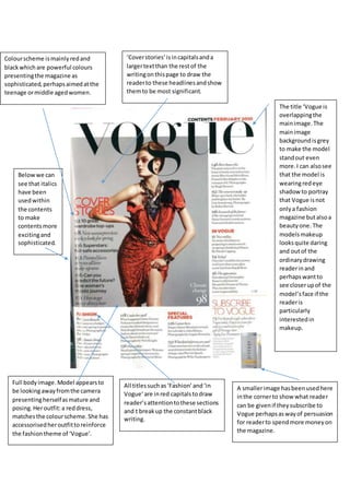
- 1. Colourscheme ismainlyredand blackwhichare powerful colours presentingthe magazine as sophisticated,perhapsaimedatthe teenage ormiddle agedwomen. Full bodyimage.Model appearsto be lookingawayfromthe camera presentingherselfasmature and posing.Heroutfit:a reddress, matchesthe colourscheme.She has accessorisedheroutfittoreinforce the fashiontheme of ‘Vogue’. ‘Coverstories’isincapitalsanda largertextthan the restof the writingonthispage to draw the readerto these headlinesandshow themto be most significant. All titlessuch as‘Fashion’and‘in Vogue’are inred capitalstodraw reader’sattentiontothese sections and t breakup the constantblack writing. Belowwe can see that italics have been usedwithin the contents to make contentsmore excitingand sophisticated. A smallerimage hasbeenusedhere inthe cornerto show what reader can be givenif theysubscribe to Vogue perhapsaswayof persuasion for readerto spendmore moneyon the magazine. The title ‘Vogue is overlappingthe mainimage.The mainimage backgroundisgrey to make the model standout even more.I can alsosee that the model is wearingredeye shadow to portray that Vogue isnot onlya fashion magazine butalsoa beautyone. The modelsmakeup looksquite daring and outof the ordinarydrawing readerinand perhapswantto see closerupof the model’sface if the readeris particularly interestedin makeup.
- 2. Main coloursusedare orange and black.The titlesappearto be orange and ina largertextthanthe smaller titlestodraw attentiontothemand to summarise the titleswhichare goingto be underneath.If the readerhas the magazine tofocuson home designsthentheywillbe able to findthese pageseasilybyusing the contents Three imagesina row have been used.Each image isdifferent showingdifferentviewsof ahome. Each picture looksappetisingand usesinterestingcolourstobrighten the contentsup andappeal to the reader. The picturesused showhouseswhich lookwealthyand quite poshperhaps showingthatthis readerisaimedmore at the wealthier home ownerswho enjoyinteriordesign. At the bottomI can see a website is on the page showingthatif the readerwantsto findoutmore the readerhas online resourcesthatare alsoavailable. Brightblue andgreen has beenusedinthis image makingthe contentscolourful.If a dark greysky had beenusedthenit would’ve made the house lookless appealing. Contentshasbeenclearlylaidout withnumbersatthe side,titlesin capitalsandextrainformation underneathmakingthe contents easyto use and clear.
- 3. Here I can see that actual food products:pepperandtomatohas beenusedasthe main title reinforcingthe ideathatthisisa foodmagazine andmakingthe contentsmore intriguing,funfor the readerinsteadof havingjusta normal fontfor the title.Thisis more artisticand creative. The main coloursusedare green and black.Greenisa typical colourrelated to vegetablesperhapspresentingthe magazine asquite a healthymagazine. Greenwe can see isusedregularlyin the picturesdownthe side andalsoas a border-likeimage atthe bottom. The titlesonthiscontentspage are in Italics.Italicstendtobe usedon the namesof dishesinposh,expensive restaurantsperhapsshowingthe recipes usedinthe magazine use expensive ingredients,fancyfood.The contents has overall been laidoutlikeamenu linkingtothe foodtheme. The fourth image showndown the right handside of the contentsisof cupcakesthatlook like theyhave beendecoratedto looklike witcheshatsperhaps portrayingthatthis magazine was issuedaroundHalloween. Thiswouldalsoexplainthe constantuse of the colourgreen. The contentsisa double page which because of my researchI foundquite unusual asthe contentsisnormallya single page.However the double page I believemakesitlook more spreadout and clear.
- 4. The main colourscheme usedis yellowandwhite.Thesecolours massivelystandoutfromthe dull greybackgroundmakingthe contentseasyto readand clear. The main image isof a cat lookingaway fromthe camera.We can see mostof the cat’s body.The cat lookswell fed and lookedaftershowingthatthis magazine isperhapsaimedatpeople whohave petcats or are lookingtobuy a cat. Againthe contents has beenclearlylaid out withnumbers downthe side to showthe page numbersanda title in capital,large letters witha summary/small insightunderneath. The cat shownisa tabby cat whichis a popularcat normallykeptasa pet by familiesshowingthatthis magazine isperhaps aimedat familieslooking for a petcat? The cat is lookingawaymakingthe picture indirect. The cat’s eyesare yellowish matchingthe colourscheme.The cat’s furis mostlya greyishcolour againmatchingthe colour scheme whilststandingoutfromthe background. The magazine appearsto be called Cat Fancy as thisisin capital letters and alsomatchesthe colour scheme. The word‘Fancy’shows that thisisa magazine perhaps aimedat more poshgenerations.