
Recommended
More Related Content
What's hot
What's hot (20)
Viewers also liked
Similar to Media magazine cover
Similar to Media magazine cover (20)
More from rebeccaosborne1
More from rebeccaosborne1 (20)
Recently uploaded
Recently uploaded (20)
Media magazine cover
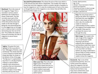
- 1. Gender: Mainly women. Age: 16-34 Lifestyle: Those interested in fashion, beauty and celebrities. They work and have an above average income. Normally business owners, managers, specialists etc. Masthead: This is the name of the magazine ‘Vogue’ this is normally in various colours befitting to the model that is shown underneath. The title normally covers part of the image showing the dominance of the title and this draws the reader to the title through it being the most dominating text. It is the biggest text on the page and is in bold so that it is further dominating over the rest of the text. This enables the reader to know and remember the title of magazine to secure future purchases. Tagline: This gives the main highlight of the issue which is here ‘460 pages of fashion, style and beauty’ This shows that this is issue is based on mostly these things described. As shown at the bottom of the of the page, ‘The Big Issue’ In capital letters says that it is a all about fashion making it a special edition making it more attractive to customers that are interested in fashion and beauty and therefore makes it more likely that they will buy this issue. Strip: The strip shows what is going to be within the magazine and states the main highlights which is also shown on the other side, this enables the reader to receive an understanding of what is within the magazine and enables them to decide if they want to purchase the issue or not through this strip. Main cover line: This is the next biggest piece of text after the title and this shows that this is a special edition based on fashion which enables to persuade readers who are interested within fashion. Main Image: The model is the main image of this magazine, she is a well known model meaning it will attract audiences that recognise her and therefore make them more willing to buy the issue. As this is an issue that is all about fashion, by using a model that is famous helps to further endorse this issue and persuades readers to buy the magazine. Buzzwords: ‘Big’ is one of the buzzwords found here, this is to further excite the audience about the magazine, the fact that this issue is an exclusive on fashion the fact that is may have more content than usual will further interest readers. Barcode/Price/Information: This shows the price of the issue which is £3.99 and also the date which is September. This enables the reader to know how much the magazine is which is another decider of weather to buy the magazine or not. It is also the smallest piece of text on the cover, as though the price of the magazine is not a factor that will effect the decision of the reader or not.
- 2. The institution responsible for this magazine is Vogue they are a worldwide magazine company that is nationally recognised around the world as a high class women's fashion and lifestyle magazine. There is a lot of media around those which are on the cover of Vogue have ‘made it’ and it is recognised as the aim of some celebrities to be featured on the cover especially of the American edition. This magazine first of all sells because of the institution which creates it, the name Vogue is well recognised and therefore readers buy the magazine just because it is Vogue. The main image is the only image on the page and is the famous model, this means that readers will purchase the magazine as they will recognise the model and therefore be attracted to the content which will involve her within the magazine. The colour scheme seems to be red and black which can suggest a high class feeling of sophistication as the text is in clear font and the main focus is to the model rather than the text. The main cover line which reads ‘The Big Fashion Issue’ which is written in red and is the biggest title on the page is another persuasive to get readers to purchase the magazine as the issues focuses of fashion and this will appeal to a lot of the readers. There is no props being used within this magazine cover, only the model is seen and this is again to focus on the model. This camera shot if a mid shot of the model so that we can see her face, so inclusion of details such as makeup can be seen which relates to the magazines content and also it allows us to see the jacket which she is wearing which relates to the fashion side. The sort of shot allows the magazine to advertise clothing and makeup on the model and acts as a way to show outfits on the model. The facial expression is that of a pose and of a ‘model face’ she has no expression and this again takes the focus away from the face and rather to the clothes she is wearing. I do like this cover in some ways as it is rather simplistic and enables the magazine to get the audience to focus on the model and who can be recognised by many readers. The text is simplistic but the font size and the colour red enables the audience to focus on certain subheadings when needed, and this is done in a simplistic and appealing way. I do feel that it does lack colour or some sort of focus on the text which colour be helped with various colours or a background colour. I think it does attract the target audience well which covers a range of ages going up to around 34, I feel the cover is sophisticated yet playful so that it can attract this age range of women. Overall this research into this particular magazine cover has been helpful as it shows the way in which techniques can be helpful when trying to focus on various aspects of the cover, for example the simplistic font of the text allows the image to the main focus and this is possibly something I may want to corporate into my own.
- 3. Masthead: This is the title of the magazine, is matches the rest of the cover as concerning colours. It is bold and in large red letter that dominate the magazine cover. It attracts the audience to the magazine and makes it be recognisable to the audiences the bright colours make it attractive to the audience of children. Puff and Pug: Here the magazine is giving away a free iPad mini and this attracts an audience to buy the issue so that they have a chance to win something. This creates even more of an incentive as to why the magazine should be purchased and the magazine might just be purchased for the factor of a freebie which is an attraction to children. Main cover line: This is ‘Beano Style’ this states what the magazine contains and shows that the style of magazine is. It enables the reader to decide further if they want to buy this magazine and for children they may want this style of magazine. Main Image: The main image of this magazine cover is the two character Dennis and Gnasher who are the main characters of the Beano magazines. This makes it easy for children to recognise and this enables children to choose the magazine through images and not through the title which accommodates more to the audiences age. Thumbnail Images: There are various thumbnail images of other characters on the cover of the magazine. This builds a recognisable story based cover that children are able to relate to and can feel as though they are part of the story as they can recognise all the characters shown. Tagline: The tagline for this magazine is directly under the Masthead, this shows that the magazine stars the main character Dennis and Gnasher. This again create an exclusive feel around the magazine and draws in the children who are fans of the two characters. Barcode/Price/ Information: This is to make the magazine purchasable and is the smallest of the things on the magazine as it is not appealing and money is not a concern to a child. Genre: Children's magazine. Gender: Boys Age: 4-7 Lifestyle: Working- class to middle class children, interested in cartoons and have previously watched the TV show, could also be seen as a collectable to older generations.
- 4. Beano is well recognised children's British magazine which has been running for many years and is known of worldwide. It has gained the number 1 spot on the bestselling magazines within the UK for many years and the magazine is based around Dennis the Menace and his friends. The profile of the readership is made for 11 year old boys, the website dos mention it is for girls as well but mostly boys. The audience can also be those of collectors as the magazine has been running since 1938, this means that many children are now much older and therefore can but the magazine as a memorable item or collectable. The magazine first of all sells through it’s recognisable institution, which may influence parents which grew up with the magazine to buy it for their children. The characters which are advertised on the front are also recognisable as a TV show has been made about them and many more media has circulated meaning the children will recognise the characters. The inclusion of some text such as ‘Free’ is used a lot as a form of persuasion in mostly children magazines as a free toy or something for free is used to persuade the reader they are getting something extra. This also persuaded the parent which will be buying it will be getting their money’s worth with the freebies. The style of the magazine uses a lot of bright colours which are over exposed so that they are attractive tot he audience such as the bright blue sky, the reds, orange and yellow all colours that will attract a Childs attention. As this is a comic the characters are all computer generated or drawn onto a computer so this mans a more unrealistic image can be created rather than a real life one. The main character Dennis which can be recognised by the audience and he is running away from something a long a street and this shows part of the story that they are up to mischief, the low camera angle shows them as the main characters of the page and makes them look bigger. Other characters are seen within the background and are a lot smaller but still included such as the police officers which certifies that the characters have been up to no good. Overall I think this cover is very creative and appeals o the audience very well, I like the use of colours as they are very bright and have been chosen appropriately for the target audience. I like the camera angle used to represent the creates and the use of Buzz words such as free create a further persuasive technique. I feel like the magazine does lack other content and lack of subheadings on the front but I can see which is this done as it’s targeted at children and they won’t be interested in text. This research into this magazine cover has been helpful as it has allowed me to see how Buzz words such as free can be used as a further persuasive technique and how the colours can be attention drawing and be used in a creative way. This makes me consider how I can use colours within my magazine to my advantage and how I can manipulate them to achieve the look I want for my cover.
- 5. Masthead: This is the title of the magazine ‘Mens Health’ this is in bold red writing that dominates the cover. It’s simplistic and red normally evokes danger which is attractive to males. This title is memorable and is easily spotted by the audience. Header Bar: This is above the title to possibly to highlight it as an important factor than the title itself. It’s in black writing in bold and capitals to further highlight it’s importance. For men who are looking to burn fat and loose weight or just maintain a good shape will buy this magazine naturally and therefore by seeing a header bar that directly aims at what they want to do will persuade them to pick up the magazine. Footer Bar: The footer of the magazine is based at the bottom which is in black bold capitals and is highlighted in yellow as to draw the readers attention to this being one of the main details about the magazine. This enables the reader to quickly decide if they want to purchase the magazine or not. Tagline & Main cover line: ‘Get back in shape!’ is the tagline underneath the masthead it’s in bold black capital letters and goes with the theme of the magazine which seems to be very black white and red. This relates to the header and masthead and it’s all based on health and getting into shape and the header tells how to do this, this enables the reader to feel confident that they can rely on this magazine to help them het into good shape. This could also be seen as the main cover line as it is the next biggest piece of text after the title, it does support the image seen of celebrity David Beckham and anchors the meaning of the image that this magazine can help readers to look like him. Strip & Cover Line: The strip is seen on both sides surrounding the main image, they are all in similar colours of red, black and grey and this enables the reader to know they are interrelated and are all ways to help the reader get into shape. All of them have number in such as 27, 30 and 5 all stating figures that the reader can aim for, which is appropriate for the audience of males as they prefer quick times and facts that they can rely on. These are also cover lines, as most of it is in bold all of it seems to be the main information that is found within the magazine, this further persuades the reader as they are able to see the main features of the magazine before buying it. Main Image: The main image is of the celebrity sportsman David Beckham. He is used to model for the magazine and it seen as someone that readers can aspire to and want to be like, this makes readers who are fans of him as more willing to pick up the magazine and read it. It also is covering part of the masthead making it the most dominate image on the page that stands out above everything else as an incentive to buy it. Puff and Pug: Here is an offer of a free workout poster, this further persuades the reader to buy the magazine as there is something free relating to getting back into shape inside the magazine. Buzzwords: ‘Cool new’ ‘Red-Hot’ are all examples of the type of buzzwords seen on the cover. These get the reader excited for the content of the magazine and makes them feel pumped as a workout magazine should make them. Genre: Male Fitness magazine Gender: Male Age: 16- 40 Lifestyle: Those who are unhealthy and are inspiring to get healthy or those who are already within good shape and want to maintain it. They will most probably be Middle class people who have full time jobs.
- 6. The institution is a well known UK and US magazine that is created for men’s lifestyle and health. The readers are mainly men as it is based completely on male life and fitness. The magazine normally features a well know celebrity that has a good sense of fitness and well being. As seen in my example David Beckham who is a famous footballer is featured on the cover and takes up the majority of the page. He is recognised for a sport and therefore will be fit and this an appropriate figure to feature on the front of the magazine and readers will chose to buy the magazine for the celebrity. The language used on the front cover are a lot of Buzz words such as ‘Cool’ and ‘New’ and this gets the readers excited to read more and acts as trigger words to create curiosity. The inclusion of a free workout poster is also highlighted on the front of page and this shows how freebies can work to attract all types of readers as they feel they are getting their moneys worth. The colours of this magazine are mainly white, black and red and this shows the manly side of the magazine and there isn’t a lot of colours going on but it also focuses on the main image which is a the celebrity. The shot of the celebrity is a mid shot which allows the readers to see his arms and full body which shows that he is ‘muscley’ and therefore this is appropriate for the magazine. He is very posed and has a slight smile and this arms are folded possibly to accentuates his arms and there size further and there is also a focus on his tattoos which stand out even more against his white top and the white background. The tattoos are something that are recognisable to him as a person and readers may be interested within his tattoos. Overall I do like the minimalistic approach this cover has taken by making the main image the eye catching subjects and the titles with the colours have been used appropriately to attract the audience to the right things they want to see. The techniques I have learnt from this is that the minimalistic approach can just be effective as a having a lot gong on within the cover and may be something I will want to consider when making my own magazine cover.