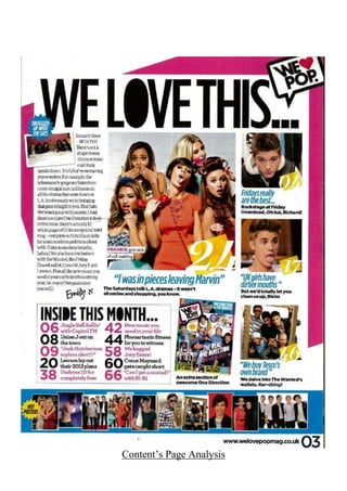
This document provides a detailed analysis of the contents page of "We Love Pop" magazine. It summarizes that the page follows conventions of contents pages with a 50/50 split of images and text. The layout, colors, fonts and images are designed to appeal to the target audience of teenage girls. Key features included are a letter from the editor, photos and descriptions of featured articles, and small images advertising additional content. The consistent style across issues maintains the magazine's brand identity and allows readers to easily navigate the page.


