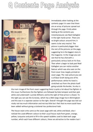
1. Immediately when looking at the
contents page it is seen that there
are an array of pictures spread out
through the page. Firstly when
looking at the contents you
instantaneously see Noel Gallagher
in the right hand corner. There are
no bright colours around him; it
seems to be very neutral. The
picture is particularly bigger than
the rest of the pictures on the page,
suggesting he is the biggest story in
the magazine. In the image you can
see that he has shot with a
particularly serious look on his face.
Then when u begin to look past Noel
Gallagher you can notice another
feature which was also seen on the
front cover lines largely printed on
cover page. The next picture you see
is of Dave Grohl doing one of his
performances whilst his hand is
stretched out from the photo itself
going outside the border, he also is
the main image of the front cover suggesting there is quite a lot about Foo fighters in
this issue. Furthermore the foo fighters are followed by Kate tempest and then jack
white and underneath Lucinda Williams and to the right of that prince is shown. To
the right you can see the Q review, which has a DKA twigs image live in Birmingham
and this was in a separate section to the right. Overall I thought the page was laid out
nicely not too much information and not too little but i feel that no more could have
been added without giving a cluttered less professional look.
The house style is the same as the cover page with red, white and black; also I
noticed the used different colours to their usual house style from green, orange,
yellow, turquoise and pink to fill in the speech bubbles used to label each page
number, which each have different colours, these are attractive to the readers but I
2. cant help feel the readers are drawn in more by its normal house style colours.
Everything is extremely accessible in the magazine everything is laid out accordingly
and numbers with its page each are in their own box with their own page number
making everything a easily accessible as possible. The q review seems quite
prominent in the page with its thick black border and this suggests it’s a very formal
magazine.
There isn’t any promotional offers/features on the contents page but there is stuff
advertised in the pages before the contents page firstly there is a double page ad of
“Bleu de Chanel” which is of course men’s aftershave then the next page is also a
double page ad which is “Hugo boss” and this suggest that this is a magazine mostly
for men. On the third page it is some information about the free enticement that was
mounted onto the front cover, then it goes onto advertise a new 2015 film release
called “black sea”. The magazine logo is at the top Q is placed in the top with the
skyline next to contents and also it included the issue date on the skyline. Q doesn’t
seem to advertise anything on its contents page but give information on
artists/music, which as a music magazine it’s, what its readers would prefer instead
of sacrificing information and space for ads.