SlideShare a Scribd company logo
1 of 7
The close up image takes up the large space because he is obviously going to be one of the main features of this issue. The title ‘DAVE GROHL’ is in white on a black background so it stands out from the page. The pictures at the bottom also might make consumers intrigued about what is inside this issue and also implies the magazine is aimed at a male audience as it says “Nice guys finish first!.” The image of Dave Grohl with his unshaven beard and rude hand gesture suggests he is carefree and doesn’t care what people think of him or what he looks like. He also looks like nothing phases him and to be strong is the only option. People may look up to him and aspire to have his care free attitude. The front cover is simple and not too detailed so all the information is easy to read and accessible. Only three colours are used; red, black and white. Red implies fearlessness and madness which is a key feature NME likes to portray as it is an escape from reality. The fact NME is only in a tiny font suggests it has a certain way of presenting the front cover so people know exactly what it is as soon as they see it, this shows NME are confident there magazine is successful. Words such as “rare” and “classic features” suggests NME has exclusive content that no other magazine can offer. This word choice reassures the reader NME is the best music magazine to read. The magazine cover includes the usual content we expect to see such as a barcode in the corner and title at the top. The fact it looks “normal” may also reassure the consumer the source is reliable. The logo “new album” shows NME is up to date with what’s going on in the industry and the fact it has an “exclusive interview” with the band gives the magazine credit. There are two referrals to amounts on the cover such as “50 things..” and “100 pages of..” which shows they are never unable to fill the pages with interesting and new things.
The white background represents something fresh and new which is what R n B is. It also suggests it is popular and a key genre in the music industry. The photo of Lil Wayne is a medium long shot which takes up half of the front cover, even some of the title is covered up suggesting he is the main focus for this particular issue. His posture suggests he is confident and his hard face suggests he is trying to portray a certain negative image of himself. The word “exclusive” will help sell the magazine as it is something to persuade the consumer to buy because it suggests no one else has the content they do. The front cover is really simple suggesting everything is organised and easy to understand inside. The only colours used are; Red, Black and white. The main content like “Lil Wayne” and “Jimmy Carter” are in red to show they are the big news. Lil Wayne’s tattoos and dreadlocks represent him as a strong independent man and his white pants above his jeans may attract a female audience. It also says “Lil Wayne out of jail and on the loose” which could be why he looks so hard faced and aggressive towards to camera. The shadow behind Lil Wayne makes him stand out from the background even more as he is the centre piece. Key lighting has been used to create a harsh contrast. The phrase “I dropped my nuts and took it” suggests this magazine is aimed at a predominantly male audience.
The black background contrasts nicely with the big image of the boys singing with the blue filler light. The title “the next best thing” suggests they are getting popular and are growing in the industry. The quote “it wasn’t easy” suggests they may have been through a rough time but aren’t giving up which may inspire others to work hard and keep at it even if it seems impossible. The images of the boys messing about and not posing properly suggests they are young and want to have fun! The boys clothes are casual and informal suggesting they have freedom and are confident in themselves. Only dark colours are used suggesting the genre is rock as blue, black and white are the only three colours used throughout the spread. The white writing stands out on the black background to emphasis what is wrote. The spread sheet suggests the target audience is young males between 15-30 as they are quite fashionable but rough round the edges at the same time. One of the photos suggests the boys are playing in front of an audience at a gig which could imply they are new and growing.
This double page spread has a large image on the left hand side which is the main focus. There are also a number of smaller images as well as a substantial amount of writing which suggests this particular magazine has a happy medium of both. The continuous use of the same colours blue and black keeps the spread looking tidy and colour co-ordinated. Too much colour can be over whelming and look unprofessional. They have kept the captions the same with the black writing and blue background as well to keep a theme going so it looks smart and presentable. The shape around “NME loves” adds character and creativeness to the article. The mise en scene shows the image to be a typical teenagers bedroom as they are all lounging on a bed and have photos and articles on the wall behind them from nights out and other times. The box on the right has a systematic format which says “everyone's talking about” this entices the consumer to read on. The photos on the wall in the large image shows images of girls and people messing around which indicates youthfulness, immaturity and fun which could suggest this is what the magazine gives. The number of text boxes used creates a tidy formal mise en scene. This spreadsheet has all the connotations of a respectable magazine, including the page number and repetition of the magazine name, “nme.” The red box at the bottom right suggests it is urgent to read because it stands out from the rest of the colours as red is only used once. The enlarged quote entices the reader to look deeper into the column rather then just flicking through because it has interesting important things contained.
The title “ How perfect is Pixie?” implies that she is flawless and amazing. The fact it is asked in a question format could mean the producer wants the consumer to think about the question. The big images of Pixie posing suggest she is a sex icon and a person people should inspire to look like. She doesn’t look so innocent in the smaller images suggesting she maybe puts on a front. The spread is set out in a question and answer format which allows the consumer to find out things about Pixie they may not necessarily know, enticing them to read on. The light blue and white colours suggest peace and freshness implying she is a calm and gentle person. In the title a number of different fonts have been used, “Pixie” has been put into italics and on a slant suggesting femininity and innocence which the image backs up as she is smiling looking away from the camera. The high verdict 21/25 suggests he is popular and highly thought of in the media. The use of circular shapes suggests lightness and the sense of nothing too heavy just fun. The use of shapes makes it look different and unusual because they want the page to stand out. The blue question and white answer shows clearly and easily what is what so the consumer doesn’t get confused.  The caption underneath Pixie gives more information to the reader suggesting they are concerned with customer satisfaction and their opinions.
This contents page is very simple which makes it not too over whelming and confusing. The simplicity of it shows clearly what to expect inside in a neat format. There are only three colours used which are; red, white and black which have a mixture of connotations. For example red and black could be seen as fear and bravery which could mean the music they focus on is quite heavy going but the white also suggests purity and peace implying calmness. I think they have done this so the consumer wants to find out more as nothing is given away.  The usual things we expect to find on the contents page are present for example; the key features, date, title and reviews. These all reassure the consumer Q is a highly respectable magazine. The big image of the four males shows them to be “rocky” as they are all wearing black jeans and have messy longish hair. The layout of the contents is also very systematic as the features are all neatly listed along the side and the image is large which takes up the majority of the page which implies they are the main focus of this issue.  The logo Q has been put in twice on this page as if to remind the consumer what they are reading. It also could suggest clarification and recognition so everyone knows what it is. The page numbers a present in red so they stand out to the consumer. The main focus of the page is in capital letters and bold also to draw attention to it. A summary underneath is in lower case which suggests it is not essential to read but is available is anyone wants to find out that little bit more. The black background and white writing is also replicated to keep it looking smart and tidy, otherwise it would look messy and untidy is they were all different fonts, sizes and colours.
This contents is very colourful and unorganised suggesting the magazine is full of fun and interesting. The producers are clearly trying to create a fun vibrant look so the consumer wants to know more. This magazine is also more image orientated compared to others like Q as they are the main focus. There are a variety of colours used including black, yellow, red and white. These colours all work well together and make an eye catching page. Black and yellow seem to be the key colours as I have noticed that all magazine pick a few key colours and fonts to keep it looking fresh otherwise it would look messy and untidy. There are a number of fonts and sizes used in the writing to create a sense of variety and individuality. This could inspire and reassure the consumer to stand out and be different is a good thing.  There are also a number of different images on this page suggesting the magazine is packed full of interesting different stories and people. The different sizes of images also gives variation and style. However, even though the page looks quite manic there is a list of exactly what to expect this week to give the consumer some clarity as what to expect. This is similar to Q but not as much information is given as to what it is about, it is almost suggesting to delve in and have a look yourself! In the top left hand corner the editor has wrote a paragraph and her picture and signature are present. This shows she must be proud and happy to work for this particular magazine otherwise she wouldn’t want to be identified!

More Related Content

What's hot

Presentation1.pptx signs and signifiers
Presentation1.pptx signs and signifiersPresentation1.pptx signs and signifiers
Presentation1.pptx signs and signifiersanniemyatt
 
Task 3 - VIBE Analysis
Task 3 - VIBE AnalysisTask 3 - VIBE Analysis
Task 3 - VIBE Analysisgeorgiamarie
 
Double page spread research
Double page spread researchDouble page spread research
Double page spread researchchloehiorns1
 
Front Covers
Front CoversFront Covers
Front Covers10lysharp
 
Signs and Signifiers
Signs and SignifiersSigns and Signifiers
Signs and Signifiersanniemyatt
 
Presentation1
Presentation1Presentation1
Presentation1Amy Moss
 
Magazine analysis
Magazine analysisMagazine analysis
Magazine analysispangk1
 
AS media studies magazine research and planning
AS media studies magazine research and planning AS media studies magazine research and planning
AS media studies magazine research and planning Caitlin Meredith
 
Analysis of magazine covers
Analysis of magazine coversAnalysis of magazine covers
Analysis of magazine coversAmy Lea
 
Kerrang Contents Page
Kerrang Contents PageKerrang Contents Page
Kerrang Contents Pagereyganrudgley
 
Powerpoint on deconstructions
Powerpoint on deconstructionsPowerpoint on deconstructions
Powerpoint on deconstructionsellie_kershaw
 
Research into roducts
Research into roducts Research into roducts
Research into roducts paris12346
 
Homework double page spread 2
Homework double page spread 2Homework double page spread 2
Homework double page spread 2JadeOckerby
 
GCSE Magazine Research and Planning
GCSE Magazine Research and PlanningGCSE Magazine Research and Planning
GCSE Magazine Research and PlanningNeill Ford
 
Analysis of three double page spreads from music magazines
Analysis of three double page spreads from music magazinesAnalysis of three double page spreads from music magazines
Analysis of three double page spreads from music magazineszoewarwood
 

What's hot (18)

Presentation1.pptx signs and signifiers
Presentation1.pptx signs and signifiersPresentation1.pptx signs and signifiers
Presentation1.pptx signs and signifiers
 
Task 3 - VIBE Analysis
Task 3 - VIBE AnalysisTask 3 - VIBE Analysis
Task 3 - VIBE Analysis
 
Double page spread research
Double page spread researchDouble page spread research
Double page spread research
 
Front Covers
Front CoversFront Covers
Front Covers
 
Signs and Signifiers
Signs and SignifiersSigns and Signifiers
Signs and Signifiers
 
Presentation1
Presentation1Presentation1
Presentation1
 
Magazine analysis
Magazine analysisMagazine analysis
Magazine analysis
 
AS media studies magazine research and planning
AS media studies magazine research and planning AS media studies magazine research and planning
AS media studies magazine research and planning
 
Magazine Analysis
Magazine AnalysisMagazine Analysis
Magazine Analysis
 
Analysis of magazine covers
Analysis of magazine coversAnalysis of magazine covers
Analysis of magazine covers
 
Magazine Analysis
Magazine AnalysisMagazine Analysis
Magazine Analysis
 
Kerrang Contents Page
Kerrang Contents PageKerrang Contents Page
Kerrang Contents Page
 
Powerpoint on deconstructions
Powerpoint on deconstructionsPowerpoint on deconstructions
Powerpoint on deconstructions
 
Research into roducts
Research into roducts Research into roducts
Research into roducts
 
Homework double page spread 2
Homework double page spread 2Homework double page spread 2
Homework double page spread 2
 
Research
ResearchResearch
Research
 
GCSE Magazine Research and Planning
GCSE Magazine Research and PlanningGCSE Magazine Research and Planning
GCSE Magazine Research and Planning
 
Analysis of three double page spreads from music magazines
Analysis of three double page spreads from music magazinesAnalysis of three double page spreads from music magazines
Analysis of three double page spreads from music magazines
 

Viewers also liked

Viewers also liked (16)

Emilia wrosz prezentacja
Emilia wrosz prezentacjaEmilia wrosz prezentacja
Emilia wrosz prezentacja
 
Patria Mirabal
Patria MirabalPatria Mirabal
Patria Mirabal
 
Smb purl presentaion
Smb purl presentaionSmb purl presentaion
Smb purl presentaion
 
Improving Customer Experience (CX) Through Traceability
Improving Customer Experience (CX) Through TraceabilityImproving Customer Experience (CX) Through Traceability
Improving Customer Experience (CX) Through Traceability
 
Curso de inglés i (a)
Curso de inglés i (a)Curso de inglés i (a)
Curso de inglés i (a)
 
Higher Education System in Srilanka ¥2
Higher Education System in Srilanka ¥2Higher Education System in Srilanka ¥2
Higher Education System in Srilanka ¥2
 
Dr. Heide LaForge Presents: Snooze Fest
Dr. Heide LaForge Presents: Snooze FestDr. Heide LaForge Presents: Snooze Fest
Dr. Heide LaForge Presents: Snooze Fest
 
Mini case study
Mini case studyMini case study
Mini case study
 
Estructura estrategia online hotel 2012 lolo_rey
Estructura estrategia online hotel 2012 lolo_reyEstructura estrategia online hotel 2012 lolo_rey
Estructura estrategia online hotel 2012 lolo_rey
 
Clase de Redes sociales hoteles 2012 Lolo Rey
Clase de Redes sociales hoteles 2012 Lolo ReyClase de Redes sociales hoteles 2012 Lolo Rey
Clase de Redes sociales hoteles 2012 Lolo Rey
 
Marketing myopia ¥2
Marketing myopia ¥2Marketing myopia ¥2
Marketing myopia ¥2
 
Los mejores
Los mejoresLos mejores
Los mejores
 
Pa 906.transportation problem and algorithms final
Pa 906.transportation problem and algorithms finalPa 906.transportation problem and algorithms final
Pa 906.transportation problem and algorithms final
 
Game theory and its applications
Game theory and its applicationsGame theory and its applications
Game theory and its applications
 
Webtest
WebtestWebtest
Webtest
 
Webtest2
Webtest2Webtest2
Webtest2
 

Similar to Dave Grohl and Lil Wayne front covers analyzed

Magazine analysis
Magazine analysisMagazine analysis
Magazine analysisJake Kemp
 
Contents pages
Contents pagesContents pages
Contents pages10lysharp
 
Magazine research really official [recovered]
Magazine research really official [recovered]Magazine research really official [recovered]
Magazine research really official [recovered]Karis Hays
 
Magazine research really official [recovered]
Magazine research really official [recovered]Magazine research really official [recovered]
Magazine research really official [recovered]eleanorwaring1
 
Magazine analaysis
Magazine analaysisMagazine analaysis
Magazine analaysisjeny_green
 
AS Level Music Magazine Analysis
 AS Level Music Magazine Analysis  AS Level Music Magazine Analysis
AS Level Music Magazine Analysis shanndx
 
Magazine Analysis
Magazine AnalysisMagazine Analysis
Magazine Analysisitsdoublem
 
Analysing 3 magazine covers
Analysing 3 magazine coversAnalysing 3 magazine covers
Analysing 3 magazine coversblack-bird
 
3 Magazine front cover analysing
3 Magazine front cover analysing3 Magazine front cover analysing
3 Magazine front cover analysinglaylakeegan
 
Analysis of Music Magazines
Analysis of Music MagazinesAnalysis of Music Magazines
Analysis of Music MagazinesBeniboy39
 
Contents pages
Contents pagesContents pages
Contents pagesJak Butler
 
Analysis of magazines
Analysis of magazinesAnalysis of magazines
Analysis of magazinesasmediag13
 

Similar to Dave Grohl and Lil Wayne front covers analyzed (20)

Music mag analysed
Music mag analysedMusic mag analysed
Music mag analysed
 
Music mag analysed
Music mag analysedMusic mag analysed
Music mag analysed
 
Magazine analysis
Magazine analysisMagazine analysis
Magazine analysis
 
Contents pages
Contents pagesContents pages
Contents pages
 
Magazine research really official [recovered]
Magazine research really official [recovered]Magazine research really official [recovered]
Magazine research really official [recovered]
 
Magazine research really official [recovered]
Magazine research really official [recovered]Magazine research really official [recovered]
Magazine research really official [recovered]
 
Textual Analysis
Textual AnalysisTextual Analysis
Textual Analysis
 
Magazine analaysis
Magazine analaysisMagazine analaysis
Magazine analaysis
 
AS Level Music Magazine Analysis
 AS Level Music Magazine Analysis  AS Level Music Magazine Analysis
AS Level Music Magazine Analysis
 
Magazine Analysis
Magazine AnalysisMagazine Analysis
Magazine Analysis
 
Analysing 3 magazine covers
Analysing 3 magazine coversAnalysing 3 magazine covers
Analysing 3 magazine covers
 
Sight & sound
Sight & soundSight & sound
Sight & sound
 
Work mag.
Work mag.Work mag.
Work mag.
 
3 Magazine front cover analysing
3 Magazine front cover analysing3 Magazine front cover analysing
3 Magazine front cover analysing
 
Analysis of Music Magazines
Analysis of Music MagazinesAnalysis of Music Magazines
Analysis of Music Magazines
 
Contents pages
Contents pagesContents pages
Contents pages
 
Media research 2nd
Media research 2ndMedia research 2nd
Media research 2nd
 
All 3 deconstructions
All 3 deconstructionsAll 3 deconstructions
All 3 deconstructions
 
Mt t1-a
Mt t1-aMt t1-a
Mt t1-a
 
Analysis of magazines
Analysis of magazinesAnalysis of magazines
Analysis of magazines
 

Recently uploaded

Industrial Policy - 1948, 1956, 1973, 1977, 1980, 1991
Industrial Policy - 1948, 1956, 1973, 1977, 1980, 1991Industrial Policy - 1948, 1956, 1973, 1977, 1980, 1991
Industrial Policy - 1948, 1956, 1973, 1977, 1980, 1991RKavithamani
 
Organic Name Reactions for the students and aspirants of Chemistry12th.pptx
Organic Name Reactions  for the students and aspirants of Chemistry12th.pptxOrganic Name Reactions  for the students and aspirants of Chemistry12th.pptx
Organic Name Reactions for the students and aspirants of Chemistry12th.pptxVS Mahajan Coaching Centre
 
The Most Excellent Way | 1 Corinthians 13
The Most Excellent Way | 1 Corinthians 13The Most Excellent Way | 1 Corinthians 13
The Most Excellent Way | 1 Corinthians 13Steve Thomason
 
microwave assisted reaction. General introduction
microwave assisted reaction. General introductionmicrowave assisted reaction. General introduction
microwave assisted reaction. General introductionMaksud Ahmed
 
URLs and Routing in the Odoo 17 Website App
URLs and Routing in the Odoo 17 Website AppURLs and Routing in the Odoo 17 Website App
URLs and Routing in the Odoo 17 Website AppCeline George
 
The basics of sentences session 2pptx copy.pptx
The basics of sentences session 2pptx copy.pptxThe basics of sentences session 2pptx copy.pptx
The basics of sentences session 2pptx copy.pptxheathfieldcps1
 
Contemporary philippine arts from the regions_PPT_Module_12 [Autosaved] (1).pptx
Contemporary philippine arts from the regions_PPT_Module_12 [Autosaved] (1).pptxContemporary philippine arts from the regions_PPT_Module_12 [Autosaved] (1).pptx
Contemporary philippine arts from the regions_PPT_Module_12 [Autosaved] (1).pptxRoyAbrique
 
Presiding Officer Training module 2024 lok sabha elections
Presiding Officer Training module 2024 lok sabha electionsPresiding Officer Training module 2024 lok sabha elections
Presiding Officer Training module 2024 lok sabha electionsanshu789521
 
Call Girls in Dwarka Mor Delhi Contact Us 9654467111
Call Girls in Dwarka Mor Delhi Contact Us 9654467111Call Girls in Dwarka Mor Delhi Contact Us 9654467111
Call Girls in Dwarka Mor Delhi Contact Us 9654467111Sapana Sha
 
18-04-UA_REPORT_MEDIALITERAСY_INDEX-DM_23-1-final-eng.pdf
18-04-UA_REPORT_MEDIALITERAСY_INDEX-DM_23-1-final-eng.pdf18-04-UA_REPORT_MEDIALITERAСY_INDEX-DM_23-1-final-eng.pdf
18-04-UA_REPORT_MEDIALITERAСY_INDEX-DM_23-1-final-eng.pdfssuser54595a
 
Arihant handbook biology for class 11 .pdf
Arihant handbook biology for class 11 .pdfArihant handbook biology for class 11 .pdf
Arihant handbook biology for class 11 .pdfchloefrazer622
 
Alper Gobel In Media Res Media Component
Alper Gobel In Media Res Media ComponentAlper Gobel In Media Res Media Component
Alper Gobel In Media Res Media ComponentInMediaRes1
 
Software Engineering Methodologies (overview)
Software Engineering Methodologies (overview)Software Engineering Methodologies (overview)
Software Engineering Methodologies (overview)eniolaolutunde
 
CARE OF CHILD IN INCUBATOR..........pptx
CARE OF CHILD IN INCUBATOR..........pptxCARE OF CHILD IN INCUBATOR..........pptx
CARE OF CHILD IN INCUBATOR..........pptxGaneshChakor2
 
Mastering the Unannounced Regulatory Inspection
Mastering the Unannounced Regulatory InspectionMastering the Unannounced Regulatory Inspection
Mastering the Unannounced Regulatory InspectionSafetyChain Software
 
POINT- BIOCHEMISTRY SEM 2 ENZYMES UNIT 5.pptx
POINT- BIOCHEMISTRY SEM 2 ENZYMES UNIT 5.pptxPOINT- BIOCHEMISTRY SEM 2 ENZYMES UNIT 5.pptx
POINT- BIOCHEMISTRY SEM 2 ENZYMES UNIT 5.pptxSayali Powar
 
Accessible design: Minimum effort, maximum impact
Accessible design: Minimum effort, maximum impactAccessible design: Minimum effort, maximum impact
Accessible design: Minimum effort, maximum impactdawncurless
 

Recently uploaded (20)

Industrial Policy - 1948, 1956, 1973, 1977, 1980, 1991
Industrial Policy - 1948, 1956, 1973, 1977, 1980, 1991Industrial Policy - 1948, 1956, 1973, 1977, 1980, 1991
Industrial Policy - 1948, 1956, 1973, 1977, 1980, 1991
 
Organic Name Reactions for the students and aspirants of Chemistry12th.pptx
Organic Name Reactions  for the students and aspirants of Chemistry12th.pptxOrganic Name Reactions  for the students and aspirants of Chemistry12th.pptx
Organic Name Reactions for the students and aspirants of Chemistry12th.pptx
 
Model Call Girl in Tilak Nagar Delhi reach out to us at 🔝9953056974🔝
Model Call Girl in Tilak Nagar Delhi reach out to us at 🔝9953056974🔝Model Call Girl in Tilak Nagar Delhi reach out to us at 🔝9953056974🔝
Model Call Girl in Tilak Nagar Delhi reach out to us at 🔝9953056974🔝
 
The Most Excellent Way | 1 Corinthians 13
The Most Excellent Way | 1 Corinthians 13The Most Excellent Way | 1 Corinthians 13
The Most Excellent Way | 1 Corinthians 13
 
microwave assisted reaction. General introduction
microwave assisted reaction. General introductionmicrowave assisted reaction. General introduction
microwave assisted reaction. General introduction
 
URLs and Routing in the Odoo 17 Website App
URLs and Routing in the Odoo 17 Website AppURLs and Routing in the Odoo 17 Website App
URLs and Routing in the Odoo 17 Website App
 
The basics of sentences session 2pptx copy.pptx
The basics of sentences session 2pptx copy.pptxThe basics of sentences session 2pptx copy.pptx
The basics of sentences session 2pptx copy.pptx
 
Contemporary philippine arts from the regions_PPT_Module_12 [Autosaved] (1).pptx
Contemporary philippine arts from the regions_PPT_Module_12 [Autosaved] (1).pptxContemporary philippine arts from the regions_PPT_Module_12 [Autosaved] (1).pptx
Contemporary philippine arts from the regions_PPT_Module_12 [Autosaved] (1).pptx
 
Presiding Officer Training module 2024 lok sabha elections
Presiding Officer Training module 2024 lok sabha electionsPresiding Officer Training module 2024 lok sabha elections
Presiding Officer Training module 2024 lok sabha elections
 
Call Girls in Dwarka Mor Delhi Contact Us 9654467111
Call Girls in Dwarka Mor Delhi Contact Us 9654467111Call Girls in Dwarka Mor Delhi Contact Us 9654467111
Call Girls in Dwarka Mor Delhi Contact Us 9654467111
 
Código Creativo y Arte de Software | Unidad 1
Código Creativo y Arte de Software | Unidad 1Código Creativo y Arte de Software | Unidad 1
Código Creativo y Arte de Software | Unidad 1
 
18-04-UA_REPORT_MEDIALITERAСY_INDEX-DM_23-1-final-eng.pdf
18-04-UA_REPORT_MEDIALITERAСY_INDEX-DM_23-1-final-eng.pdf18-04-UA_REPORT_MEDIALITERAСY_INDEX-DM_23-1-final-eng.pdf
18-04-UA_REPORT_MEDIALITERAСY_INDEX-DM_23-1-final-eng.pdf
 
Arihant handbook biology for class 11 .pdf
Arihant handbook biology for class 11 .pdfArihant handbook biology for class 11 .pdf
Arihant handbook biology for class 11 .pdf
 
Alper Gobel In Media Res Media Component
Alper Gobel In Media Res Media ComponentAlper Gobel In Media Res Media Component
Alper Gobel In Media Res Media Component
 
Software Engineering Methodologies (overview)
Software Engineering Methodologies (overview)Software Engineering Methodologies (overview)
Software Engineering Methodologies (overview)
 
CARE OF CHILD IN INCUBATOR..........pptx
CARE OF CHILD IN INCUBATOR..........pptxCARE OF CHILD IN INCUBATOR..........pptx
CARE OF CHILD IN INCUBATOR..........pptx
 
Mastering the Unannounced Regulatory Inspection
Mastering the Unannounced Regulatory InspectionMastering the Unannounced Regulatory Inspection
Mastering the Unannounced Regulatory Inspection
 
Staff of Color (SOC) Retention Efforts DDSD
Staff of Color (SOC) Retention Efforts DDSDStaff of Color (SOC) Retention Efforts DDSD
Staff of Color (SOC) Retention Efforts DDSD
 
POINT- BIOCHEMISTRY SEM 2 ENZYMES UNIT 5.pptx
POINT- BIOCHEMISTRY SEM 2 ENZYMES UNIT 5.pptxPOINT- BIOCHEMISTRY SEM 2 ENZYMES UNIT 5.pptx
POINT- BIOCHEMISTRY SEM 2 ENZYMES UNIT 5.pptx
 
Accessible design: Minimum effort, maximum impact
Accessible design: Minimum effort, maximum impactAccessible design: Minimum effort, maximum impact
Accessible design: Minimum effort, maximum impact
 

Dave Grohl and Lil Wayne front covers analyzed

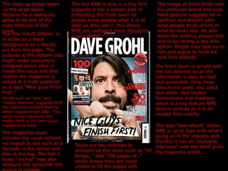
  • 1. The close up image takes up the large space because he is obviously going to be one of the main features of this issue. The title ‘DAVE GROHL’ is in white on a black background so it stands out from the page. The pictures at the bottom also might make consumers intrigued about what is inside this issue and also implies the magazine is aimed at a male audience as it says “Nice guys finish first!.” The image of Dave Grohl with his unshaven beard and rude hand gesture suggests he is carefree and doesn’t care what people think of him or what he looks like. He also looks like nothing phases him and to be strong is the only option. People may look up to him and aspire to have his care free attitude. The front cover is simple and not too detailed so all the information is easy to read and accessible. Only three colours are used; red, black and white. Red implies fearlessness and madness which is a key feature NME likes to portray as it is an escape from reality. The fact NME is only in a tiny font suggests it has a certain way of presenting the front cover so people know exactly what it is as soon as they see it, this shows NME are confident there magazine is successful. Words such as “rare” and “classic features” suggests NME has exclusive content that no other magazine can offer. This word choice reassures the reader NME is the best music magazine to read. The magazine cover includes the usual content we expect to see such as a barcode in the corner and title at the top. The fact it looks “normal” may also reassure the consumer the source is reliable. The logo “new album” shows NME is up to date with what’s going on in the industry and the fact it has an “exclusive interview” with the band gives the magazine credit. There are two referrals to amounts on the cover such as “50 things..” and “100 pages of..” which shows they are never unable to fill the pages with interesting and new things.
  • 2. The white background represents something fresh and new which is what R n B is. It also suggests it is popular and a key genre in the music industry. The photo of Lil Wayne is a medium long shot which takes up half of the front cover, even some of the title is covered up suggesting he is the main focus for this particular issue. His posture suggests he is confident and his hard face suggests he is trying to portray a certain negative image of himself. The word “exclusive” will help sell the magazine as it is something to persuade the consumer to buy because it suggests no one else has the content they do. The front cover is really simple suggesting everything is organised and easy to understand inside. The only colours used are; Red, Black and white. The main content like “Lil Wayne” and “Jimmy Carter” are in red to show they are the big news. Lil Wayne’s tattoos and dreadlocks represent him as a strong independent man and his white pants above his jeans may attract a female audience. It also says “Lil Wayne out of jail and on the loose” which could be why he looks so hard faced and aggressive towards to camera. The shadow behind Lil Wayne makes him stand out from the background even more as he is the centre piece. Key lighting has been used to create a harsh contrast. The phrase “I dropped my nuts and took it” suggests this magazine is aimed at a predominantly male audience.
  • 3. The black background contrasts nicely with the big image of the boys singing with the blue filler light. The title “the next best thing” suggests they are getting popular and are growing in the industry. The quote “it wasn’t easy” suggests they may have been through a rough time but aren’t giving up which may inspire others to work hard and keep at it even if it seems impossible. The images of the boys messing about and not posing properly suggests they are young and want to have fun! The boys clothes are casual and informal suggesting they have freedom and are confident in themselves. Only dark colours are used suggesting the genre is rock as blue, black and white are the only three colours used throughout the spread. The white writing stands out on the black background to emphasis what is wrote. The spread sheet suggests the target audience is young males between 15-30 as they are quite fashionable but rough round the edges at the same time. One of the photos suggests the boys are playing in front of an audience at a gig which could imply they are new and growing.
  • 4. This double page spread has a large image on the left hand side which is the main focus. There are also a number of smaller images as well as a substantial amount of writing which suggests this particular magazine has a happy medium of both. The continuous use of the same colours blue and black keeps the spread looking tidy and colour co-ordinated. Too much colour can be over whelming and look unprofessional. They have kept the captions the same with the black writing and blue background as well to keep a theme going so it looks smart and presentable. The shape around “NME loves” adds character and creativeness to the article. The mise en scene shows the image to be a typical teenagers bedroom as they are all lounging on a bed and have photos and articles on the wall behind them from nights out and other times. The box on the right has a systematic format which says “everyone's talking about” this entices the consumer to read on. The photos on the wall in the large image shows images of girls and people messing around which indicates youthfulness, immaturity and fun which could suggest this is what the magazine gives. The number of text boxes used creates a tidy formal mise en scene. This spreadsheet has all the connotations of a respectable magazine, including the page number and repetition of the magazine name, “nme.” The red box at the bottom right suggests it is urgent to read because it stands out from the rest of the colours as red is only used once. The enlarged quote entices the reader to look deeper into the column rather then just flicking through because it has interesting important things contained.
  • 5. The title “ How perfect is Pixie?” implies that she is flawless and amazing. The fact it is asked in a question format could mean the producer wants the consumer to think about the question. The big images of Pixie posing suggest she is a sex icon and a person people should inspire to look like. She doesn’t look so innocent in the smaller images suggesting she maybe puts on a front. The spread is set out in a question and answer format which allows the consumer to find out things about Pixie they may not necessarily know, enticing them to read on. The light blue and white colours suggest peace and freshness implying she is a calm and gentle person. In the title a number of different fonts have been used, “Pixie” has been put into italics and on a slant suggesting femininity and innocence which the image backs up as she is smiling looking away from the camera. The high verdict 21/25 suggests he is popular and highly thought of in the media. The use of circular shapes suggests lightness and the sense of nothing too heavy just fun. The use of shapes makes it look different and unusual because they want the page to stand out. The blue question and white answer shows clearly and easily what is what so the consumer doesn’t get confused. The caption underneath Pixie gives more information to the reader suggesting they are concerned with customer satisfaction and their opinions.
  • 6. This contents page is very simple which makes it not too over whelming and confusing. The simplicity of it shows clearly what to expect inside in a neat format. There are only three colours used which are; red, white and black which have a mixture of connotations. For example red and black could be seen as fear and bravery which could mean the music they focus on is quite heavy going but the white also suggests purity and peace implying calmness. I think they have done this so the consumer wants to find out more as nothing is given away. The usual things we expect to find on the contents page are present for example; the key features, date, title and reviews. These all reassure the consumer Q is a highly respectable magazine. The big image of the four males shows them to be “rocky” as they are all wearing black jeans and have messy longish hair. The layout of the contents is also very systematic as the features are all neatly listed along the side and the image is large which takes up the majority of the page which implies they are the main focus of this issue. The logo Q has been put in twice on this page as if to remind the consumer what they are reading. It also could suggest clarification and recognition so everyone knows what it is. The page numbers a present in red so they stand out to the consumer. The main focus of the page is in capital letters and bold also to draw attention to it. A summary underneath is in lower case which suggests it is not essential to read but is available is anyone wants to find out that little bit more. The black background and white writing is also replicated to keep it looking smart and tidy, otherwise it would look messy and untidy is they were all different fonts, sizes and colours.
  • 7. This contents is very colourful and unorganised suggesting the magazine is full of fun and interesting. The producers are clearly trying to create a fun vibrant look so the consumer wants to know more. This magazine is also more image orientated compared to others like Q as they are the main focus. There are a variety of colours used including black, yellow, red and white. These colours all work well together and make an eye catching page. Black and yellow seem to be the key colours as I have noticed that all magazine pick a few key colours and fonts to keep it looking fresh otherwise it would look messy and untidy. There are a number of fonts and sizes used in the writing to create a sense of variety and individuality. This could inspire and reassure the consumer to stand out and be different is a good thing. There are also a number of different images on this page suggesting the magazine is packed full of interesting different stories and people. The different sizes of images also gives variation and style. However, even though the page looks quite manic there is a list of exactly what to expect this week to give the consumer some clarity as what to expect. This is similar to Q but not as much information is given as to what it is about, it is almost suggesting to delve in and have a look yourself! In the top left hand corner the editor has wrote a paragraph and her picture and signature are present. This shows she must be proud and happy to work for this particular magazine otherwise she wouldn’t want to be identified!