1. Photoshoot Plan DPS
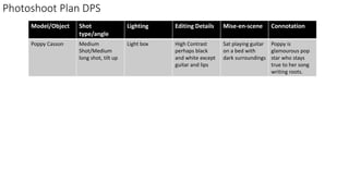
Model/Object Shot
type/angle
Lighting Editing Details Mise-en-scene Connotation
Poppy Casson Medium
Shot/Medium
long shot, tilt up
Light box High Contrast
perhaps black
and white except
guitar and lips
Sat playing guitar
on a bed with
dark surroundings
Poppy is
glamourous pop
star who stays
true to her song
writing roots.
2. Photo Selection DPS
I discarded this photo because I don’t like how it cuts
off the top of my model’s head and I don’t like the tilt
down angle
I chose this photo because it has the perfect
amount of space for me to put my article and I
love how bright the model’s face looks
Although I love this photograph, I didn’t use it
because it doesn’t have enough space for me to
work with to put my article.
I don’t feel like my model is the focus of this
photo and that the green wall distracts from her
so I don’t want to use it.
I really like this photo however for my DPS, there
isn’t enough space to put my article over her.
I didn’t want to use this photo because the
lighting makes my model’s eyeliner look a bit
weird.
3. Drop cap to draw attention to
my article
Small version of
masthead to brand
the page.
Slug to categorise my page and
make it easy to find when a
reader is looking through the
pages
I have chosen to use AR Bonnie
for my masthead because it
matches my masthead and
therefore will be the most stand
out piece of text on the page. I
have used Calibri for my main
body of text as it is easy to read
and I used it for my subheading
because its bold and modern
looking. I chose to use freestyle
script which is a script font as it
looks like handwriting which will
make it more obvious that its the
artist’s own words. I want to use
red for my headline to reflect the
colour of my model’s lips and
guitar strap however this may be
too dark.
4. Having
duplicated my
layer, I used the
convert to
black and white
tool and
changed the
contrast until I
was happy with
the
photograph.
I then used
the eraser
tool to pick
out her lips,
eyes and
guitar as they
are the most
important
features of
the
photograph.
I used the quick
selection tool to
select the guitar
strap and used
the bucket tool
to make it more
vibrant.
7. Having been given my feedback, I have changed my colour scheme. I chose to use a bright blue and pink as they are both bright
and contrast each other and this is a technique often employed by Pop magazines such as ‘Top of the Pops’ to catch the eye of
readers and those colours work well next to my photos which are mostly purple toned.
I then went about looking for a new font to replace AR Bonnie and Orator Std. I looked through all of the fonts already on my
school and home computers but decided I’d be better off finding a new one online. I went onto Dafont.com and looked through
all of the possible fonts I could use before settling on GoBold. I downloaded and installed it to my home computer and used
Gobold itallic as well on my contents page to create some variation.
Font and Colour Scheme Changes
8. I used the scribble tool in Publisher to
make my article go around my
model’s shoulder and guitar to make
it look more professional. I also
realigned my text using the ruler to
ensure that when its printed, it falls to
the right of my page. I created my
page numbers using the circle tool to
make them easy to see.
Having changed my
colour scheme, I
changed my model’s lip
colour and also her
guitar strap to be purple
using the brush tool
seen on the left hand
slide.
9. I inserted a drop cap in order to draw attention to
my article. I chose to use pink here to keep a
constant theme with my page and the rest of my
magazine. I picked up and dropped my pull quotes
into text boxes in the centre of my text. This made
the text wrap around my pull quotes as it usually
does in magazines.
11. Here, I rotated my photo
credit and put it on the
right of the page to make
it less distracting to the
reader
I made my page
numbers smaller and
got rid of its pink
outline again this is to
make it less distracting.
I moved my
masthead to
the left of my
page number.
This made it
less invasive
while also
keeping that
branding.
I added a slug to my DPS so that my page would be easy to find for a reader and to
show that this is a feature article. I did this by creating a box with the shape tool and
writing in it