The document summarizes and critiques the content pages of three magazines:
- Woofah's content page has a dark, bold style to emphasize importance and catch readers' attention with different titles and logos.
- RWD's content page effectively fills space with good quality images but crowds the writing too much.
- Vibe's content page tries to attract different audiences with popular clothes, sports, and politics, using a simple background and bold subtitles alongside an image of a well-known person to draw readers in.
UNIVERSAL HUMAN VALUES - INTRODUCTION TO VALUE EDUCATION
Contents
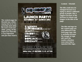
1. Content – Woofah
The title could also be
changed because it is
trying to attract a different
group of people, this is
suggest because of the
increase in colours and
images in the title of the
The content page for
page.
Woofah has a thick
musky feel to it, it is
generally dark while The title and logo for
the text is bold and the content page are
white, giving off the very different to the
impression that this front page logo, this
is very important is probably because
and you must read it. the change of style
will catch the
readers attention
even more than a
repeated title/logo.
2. Content – RWD
This contents page is
packed tightly with page
information at the
bottom of the whole
page as at the top it is
full of good quality
images.
The images make this
magazine feel more
like a fashion
magazine than a
music magazine.
There really is enough
hint about what they
are on about with no
description of the
images
The use of filling up
a lot of space with
images I effective
but I just don’t really
think it works well
with the gigantic,
squished amount of
writing .
3. Content – VIBE
Vibe’s content page tries to attract
audiences from different views, such
as people who are trying to look for
cloths that are popular and that
everyone is wearing, or the latest
sport or politics which everyone
needs to know about.
This contents page has a very
simple background but backs itself
up with a image of a well know
person along with very bold
subtitles that catch the persons eye
so they can be lured into the thick
content, this page set up. however
this page looks advertised for a
much older audience and doesn’t
have that youth bounce to me.