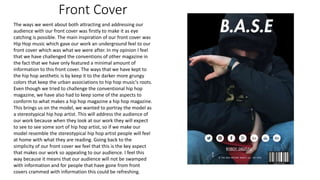
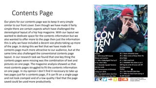
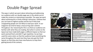
The document discusses how the magazine attracted and addressed its hip hop audience through its front cover, contents page, and double page spread. For the front cover, it used eye-catching dark colors and featured a stereotypical hip hop artist to appeal to readers. The contents page combined text and a large photo to make it more visually interesting while still fitting on one page. The double page spread maintained a consistent color scheme for familiarity but varied the layouts to keep content from feeling repetitive.


![Preliminary task, school magazine compared to music[1]](https://cdn.slidesharecdn.com/ss_thumbnails/preliminarytaskschoolmagazinecomparedtomusic1-130201041120-phpapp02-thumbnail.jpg?width=640&height=640&fit=bounds)


![Final%20 magazine%20–%20double%20page%20spread[2]](https://cdn.slidesharecdn.com/ss_thumbnails/final20magazine2020double20page20spread2-120511045804-phpapp02-thumbnail.jpg?width=640&height=640&fit=bounds)


