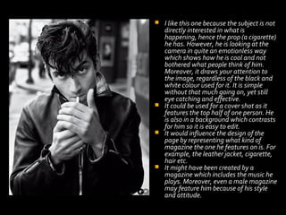
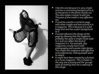
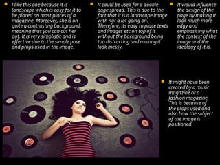
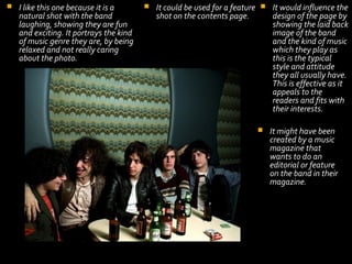
Selecting and Constructing photography for the music magazine


I looked at a series of websites to find appropriate professional photography
that I could use in my magazine. This is because:
 I need to have lots of options for what to use in the magazine.
 I need to have plenty of variety that helps to represent my music scene
accurately.
I like this one because the subject is not
directly interested in what is
happening, hence the prop (a cigarette)
he has. However, he is looking at the
camera in quite an emotionless way
which shows how he is cool and not
bothered what people think of him.
Moreover, it draws your attention to
the image, regardless of the black and
white colour used for it. It is simple
without that much going on, yet still
eye catching and effective.
 It could be used for a cover shot as it
features the top half of one person. He
is also in a background which contrasts
for him so it is easy to edit.
 It would influence the design of the
page by representing what kind of
magazine the one he features on is. For
example, the leather jacket, cigarette,
hair etc.
 It might have been created by a
magazine which includes the music he
plays. Moreover, even a male magazine
may feature him because of his style
and attitude.

I like this one because it is very simple
and has a contrasting background to it,
so the person in the photo stands out.
This also makes it easier to edit too.
The pose of the model is very effective
too.
 It could be used for a contents page
with other images and text around it in
a magazine. This is because it is a full
body shot and has a plain background
to it.
 It would influence the design of the
page by showing that the magazine
probably has quite a simple house style
to it and can reflect the kind of
magazine it is. For example, pop
magazines usually have more
photography and a poster style design.
This makes the magazine look effective
and professional, making people want
to read it.
 It might have been created by a fashion
or a music magazine. This is shown in
the way she is posing and the ‘grunge’
style of clothing that she is wearing in
this image.



I like this one because it is
landscape which is easy for it to
be placed on most places of a
magazine. Moreover, she is on
quite a contrasting background,
meaning that you can cut her
out. It is very simplistic and is
effective due to the simple pose
and props used in the image.




It could be used for a double
page spread. This is due to the
fact that it is a landscape image
with not a lot going on.
Therefore, its easy to place texts
and images etc on top of it
without the background being
too distracting and making it
look messy.



It would influence
the design of the
page by making it
look much more
edgy and
emphasising what
the context of the
image and the
ideology of it is.

It might have been
created by a music
magazine or a
fashion magazine.
This is because of
the props used and
also how the subject
of the image is
positioned.


I like this one because it is a
natural shot with the band
laughing, showing they are fun
and exciting. It portrays the kind
of music genre they are, by being
relaxed and not really caring
about the photo.



It could be used for a feature  It would influence the
shot on the contents page.
design of the page by
showing the laid back
image of the band
and the kind of music
which they play as
this is the typical
style and attitude
they all usually have.
This is effective as it
appeals to the
readers and fits with
their interests.


It might have been
created by a music
magazine that
wants to do an
editorial or feature
on the band in their
magazine.


Some of the common techniques that appear to be used in photography for this
genre include medium close ups. This just shows usually the shoulders and head of
the person on the image. Moreover, a common technique for bands is placing the
band members ahead of each other depending on their importance and impact on
the band. For example, they often place the lead singer of the band ahead of all of
the other members to show their role. Not only this, they often make them have
props on the shoot such as instruments and microphones. This emphasises what
the photo is for and that they are actually musicians. Not only this, but they often
do framed shots. This means that the people in the image often stand out and
contrast from everything else. Furthermore, they also use fun or story-relevant
inset shots of the artists. This makes the photography and artists look much more
enthusiastic and emphasises the image completely. A similar technique to this is
when photographers take photos of people doing dramatic poses and expressions
that focus on their kind of character and personality. This is effective for the
readers as it shows us what they are really about and can also portray magazine
styles too.

Photography Research

  • 1.
    Selecting and Constructingphotography for the music magazine
  • 2.
     I looked ata series of websites to find appropriate professional photography that I could use in my magazine. This is because:  I need to have lots of options for what to use in the magazine.  I need to have plenty of variety that helps to represent my music scene accurately.
  • 3.
    I like thisone because the subject is not directly interested in what is happening, hence the prop (a cigarette) he has. However, he is looking at the camera in quite an emotionless way which shows how he is cool and not bothered what people think of him. Moreover, it draws your attention to the image, regardless of the black and white colour used for it. It is simple without that much going on, yet still eye catching and effective.  It could be used for a cover shot as it features the top half of one person. He is also in a background which contrasts for him so it is easy to edit.  It would influence the design of the page by representing what kind of magazine the one he features on is. For example, the leather jacket, cigarette, hair etc.  It might have been created by a magazine which includes the music he plays. Moreover, even a male magazine may feature him because of his style and attitude. 
  • 4.
    I like thisone because it is very simple and has a contrasting background to it, so the person in the photo stands out. This also makes it easier to edit too. The pose of the model is very effective too.  It could be used for a contents page with other images and text around it in a magazine. This is because it is a full body shot and has a plain background to it.  It would influence the design of the page by showing that the magazine probably has quite a simple house style to it and can reflect the kind of magazine it is. For example, pop magazines usually have more photography and a poster style design. This makes the magazine look effective and professional, making people want to read it.  It might have been created by a fashion or a music magazine. This is shown in the way she is posing and the ‘grunge’ style of clothing that she is wearing in this image. 
  • 5.
     I like thisone because it is landscape which is easy for it to be placed on most places of a magazine. Moreover, she is on quite a contrasting background, meaning that you can cut her out. It is very simplistic and is effective due to the simple pose and props used in the image.   It could be used for a double page spread. This is due to the fact that it is a landscape image with not a lot going on. Therefore, its easy to place texts and images etc on top of it without the background being too distracting and making it look messy.  It would influence the design of the page by making it look much more edgy and emphasising what the context of the image and the ideology of it is. It might have been created by a music magazine or a fashion magazine. This is because of the props used and also how the subject of the image is positioned.
  • 6.
     I like thisone because it is a natural shot with the band laughing, showing they are fun and exciting. It portrays the kind of music genre they are, by being relaxed and not really caring about the photo.  It could be used for a feature  It would influence the shot on the contents page. design of the page by showing the laid back image of the band and the kind of music which they play as this is the typical style and attitude they all usually have. This is effective as it appeals to the readers and fits with their interests.  It might have been created by a music magazine that wants to do an editorial or feature on the band in their magazine.
  • 8.
     Some of thecommon techniques that appear to be used in photography for this genre include medium close ups. This just shows usually the shoulders and head of the person on the image. Moreover, a common technique for bands is placing the band members ahead of each other depending on their importance and impact on the band. For example, they often place the lead singer of the band ahead of all of the other members to show their role. Not only this, they often make them have props on the shoot such as instruments and microphones. This emphasises what the photo is for and that they are actually musicians. Not only this, but they often do framed shots. This means that the people in the image often stand out and contrast from everything else. Furthermore, they also use fun or story-relevant inset shots of the artists. This makes the photography and artists look much more enthusiastic and emphasises the image completely. A similar technique to this is when photographers take photos of people doing dramatic poses and expressions that focus on their kind of character and personality. This is effective for the readers as it shows us what they are really about and can also portray magazine styles too.