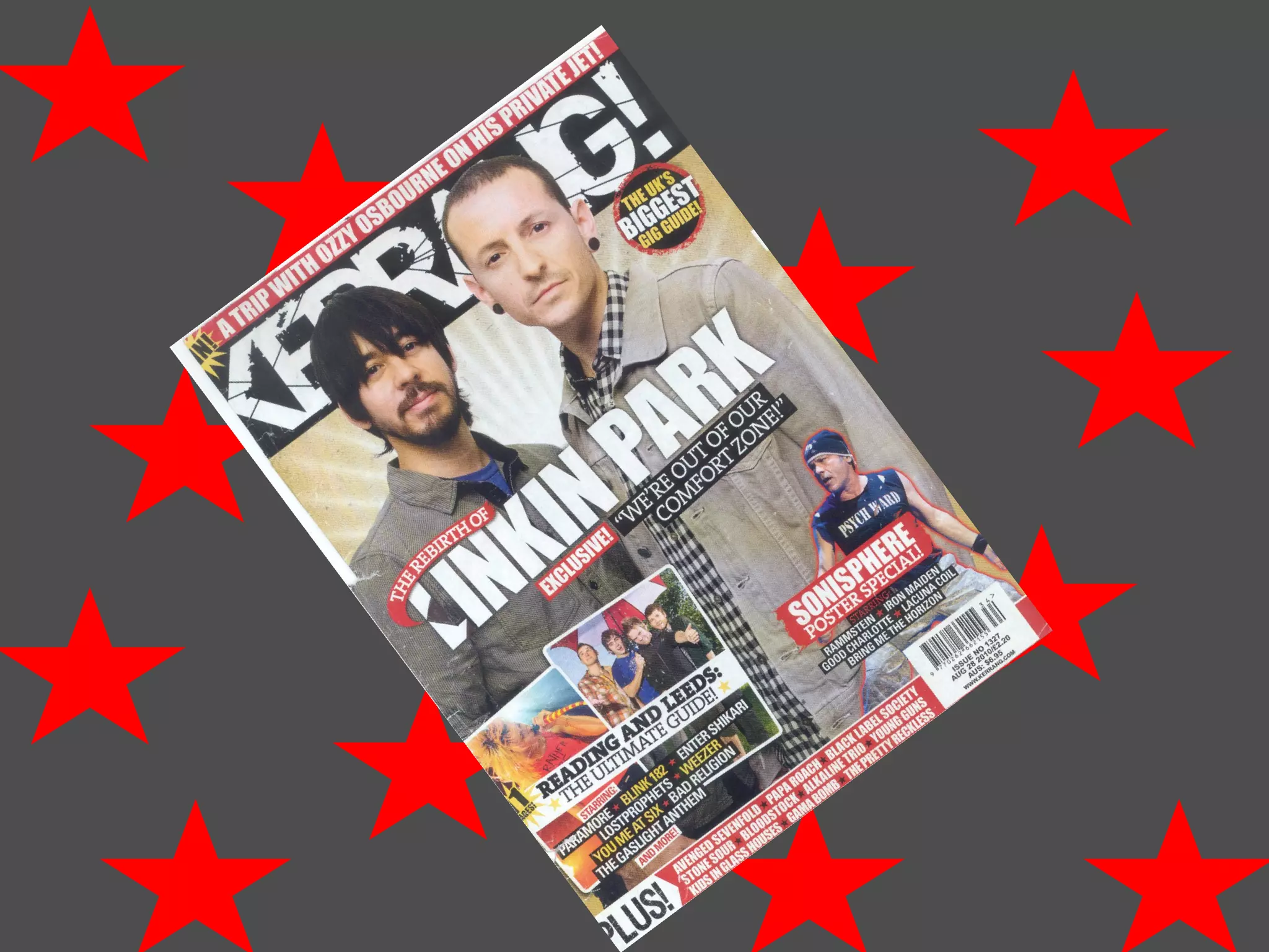
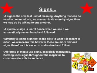
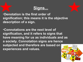
25. Layout... The layout is often similar for each issue and often contains the same types of features. we think it is like that because it is easily recognisable to the reader and the bold masthead and cover images attract your eyes to the magazine.
29. Contents page… A contents page is really important in a magazine , this is due to the fact that the contents page is one of the first things a reader looks at, hence the first part of the magazine that will catch the readers eye and make them want to read on. The contents page shows an outline of what the magazine consist of.
30. Contents page… The layout and design of the contents page are fairly conventional due to the fact that the content is laid out in sections, such as feedback, news, live reviews, features, albums and gig guide. The contents page is divided in to two of which the top half is mostly taken up by a musician form Blink 182, the page number has a white background in contrast with the black background of the big image, this makes the page number and the Blink 182 stand out therefore easier for the reader to find the page.
31. Contents page… The top half of the contents page also consist of two double spread pages, showing what to look out for in the magazine. The page uses a gutter that separates both sections of the page. The bottom half of the page is more cramped together, but still very attractive and readable, due to the colour scheme used. The bottom right hand corner has a little advertisement showing where and how to get the magazine.
32. Double Page Spread... There is a large image place in the middle of the double page spread, which again states that the reader likes to read from images rather then text. The image is an editorial image that represents the Rock ‘n’ Roll life style . The double page spread also consist of brief background and achievements related to the image, this is then followed by an interview. The language used in these pages are followed in the previous pages, it is not formal however it is not so slang and therefore readable by audiences that do not use slang. The colour scheme used is very bright and vibrant, this makes the page very attractive to view. The page also follows the same colour scheme used throughout the magazine this is again bright and vibrant colours.