
Recommended
More Related Content
What's hot
What's hot (17)
Viewers also liked
Similar to Construction of my contents
Similar to Construction of my contents (20)
More from mark shaw
Recently uploaded
Recently uploaded (20)
Construction of my contents
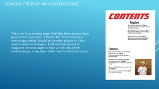
- 1. CONSTRUCTION OF MY CONTENTS PAGE This is my first contents page. I feel that there are too many gaps on the page itself, in the top left corner there is a massive gap which I should put another picture in. I also need to work on my layout, I will continue to look at magazine contents pages to keep a fresh idea of the contents pages in my head. I also need to add more colour.
- 2. I have now added more colour, I added a red border around main core, the red colour also suits the colour scheme. The contents page sticks to my colour scheme – red, white and black. I also changed the colour of the page number & information under the headline, this was to draw more attention to it and it also adds vibe and character to the page.
- 3. I asked for feedback from my classmates for my contents, a key area was that there was too much space on the page and a good way to overcome this was to add another sub heading, this will increase interest to my magazine as there will be more to read about, plus I added a competition which will interest more people.
- 4. After looking at more contents pages, I have changed the layout, I moved the regulars section to the left hand side of the page just above the features section, I did this as I feel it fits better, also lots of magazines lay their contents like this. I will now focus on the pictures.
- 5. I have added another image, this time of Beats headphones, I did this as I am doing a review of the headphones in my magazine, the image will interest owners/potential owners into buying the magazine to see what they’re like. Inbetween the gap I will most likely add an editors note or more information about the magazine.
- 6. I decided to add an editors notice. Most magazines that use this pride themselves on repeat purchase, it adds a key, yet personal element to the magazine which I like. I also added a signature to make it even more personal to the readers. This is my finished contents page.