SlideShare a Scribd company logo
1 of 2
The mast Heads Differ in terms of care and suitability my preliminary magazine to the left has the magazines title recklessly placed across the top with really un professional writing not following the media magazine industry conventions. The masthead on my final piece however has been carefully crafted to fit the media magazine industries conventions with the magazine title coming in from the left.   The Predominant front page photo on my final magazine is big and overcrowding the masthead like Conventional magazines do. Were as my preliminary photo is just placed in the bottom right corner edited badly with parts of background still in the photo it doesn't follow the typical magazine conventions.  The story is written on the front page of my preliminary magazine which it shouldn’t be, as this takes up unnecessary  space and is not conventional. My Final piece how ever just has the typical features and exclusives as to what and who features within the magazine issue along with the sub-headings. The preliminary task magazines’ writing is not aligned making it look odd and unprofessional. Not following any media conventions for that matter. My final piece how ever is all aligned looking professional and of good quality. The preliminary task was created on ‘Word’ My Final Piece was created on the programme ‘Macromedia Fireworks’
My preliminary content page I didn’t really put any effort in to with the layout design. The masthead and writing is rather rubbish and dull, selected of off the programme ‘Word’ on which it was created on. The placing of the writing isn’t very conventional as it’s just placed at the top with no form of arrangement what so ever. Were as my Final finished piece the masthead font jumps out at you and is more pleasant to look at unlike my preliminary. The pictures add more reality and sophistication to the magazine and content page on my Final Piece. As you can see a content page without pictures on my preliminary task looks grey and dull and doesn't help the magazine at all.  The Content and page references are written rather boringly on my preliminary magazine, almost looking like a shopping or Argos magazine, Plus there isn’t enough content going for it. How ever over on my Final Piece the page Numbers are written in bold as they are of importance, along with the content on that page written beside it. The Content on my preliminary is sectioned of in to the sections ‘Regulars’, meaning what is usually in the magazine and the section ‘Features’ These are the new juicy content found in the issue. This is very conventional and is what helps sell magazines. Were as my preliminary content isn’t sectioned of and is just placed as a list, which is rather boring and unpleasant to look at. The font colour for the content page on my preliminary I didn’t think about but now looking back I realised that people could easily get confused as it’s the same colour as the title masthead. The Colour of the font I chose very carefully as I didn’t want it to be to bright and confusing. So I had to make sure it was different to all the other colours used

More Related Content

What's hot (20)

Comparison between preliminary task and final product
Comparison between preliminary task and final productComparison between preliminary task and final product
Comparison between preliminary task and final product
 
College magazine evalution
College magazine evalutionCollege magazine evalution
College magazine evalution
 
Magazine drafts.
Magazine drafts.Magazine drafts.
Magazine drafts.
 
7. evaluation(1) (1)
7. evaluation(1) (1)7. evaluation(1) (1)
7. evaluation(1) (1)
 
Creating my contents page
Creating my contents pageCreating my contents page
Creating my contents page
 
Magazine evaluation
Magazine evaluationMagazine evaluation
Magazine evaluation
 
Screen shots for contents
Screen shots for contentsScreen shots for contents
Screen shots for contents
 
Question 1
Question 1Question 1
Question 1
 
Evaluation
EvaluationEvaluation
Evaluation
 
Front cover AS Draft 1
Front cover AS Draft 1Front cover AS Draft 1
Front cover AS Draft 1
 
Evaluation contents page
Evaluation contents pageEvaluation contents page
Evaluation contents page
 
Evaluation front cover
Evaluation front coverEvaluation front cover
Evaluation front cover
 
Media power point
Media power pointMedia power point
Media power point
 
Analysing Student Magazine
Analysing Student MagazineAnalysing Student Magazine
Analysing Student Magazine
 
Contents construction
Contents constructionContents construction
Contents construction
 
Evaluation
EvaluationEvaluation
Evaluation
 
Cover construction
Cover constructionCover construction
Cover construction
 
Front cover step by step
Front cover step by stepFront cover step by step
Front cover step by step
 
Contents page plans
Contents page plansContents page plans
Contents page plans
 
Step by step contents
Step by step contentsStep by step contents
Step by step contents
 

Similar to Q7 presentation

Student Textual Analysis
Student Textual AnalysisStudent Textual Analysis
Student Textual Analysis
elliemaddison2
 
Pr11 Production Commentary
Pr11 Production CommentaryPr11 Production Commentary
Pr11 Production Commentary
ryansharman
 
My music based magazine evaluation
My music based magazine evaluationMy music based magazine evaluation
My music based magazine evaluation
kamar95
 
Research and planning new as 28 march 2013
Research and planning new as   28 march 2013Research and planning new as   28 march 2013
Research and planning new as 28 march 2013
juhelmiah
 
Looking back at
Looking back atLooking back at
Looking back at
Kalise
 
Contents construction
Contents constructionContents construction
Contents construction
TaylerRebecca
 
School Magazine Progress
School Magazine ProgressSchool Magazine Progress
School Magazine Progress
Rosie
 

Similar to Q7 presentation (20)

Student Textual Analysis
Student Textual AnalysisStudent Textual Analysis
Student Textual Analysis
 
Pr11 Production Commentary
Pr11 Production CommentaryPr11 Production Commentary
Pr11 Production Commentary
 
My music based magazine evaluation
My music based magazine evaluationMy music based magazine evaluation
My music based magazine evaluation
 
Contents page evaluation
Contents page evaluationContents page evaluation
Contents page evaluation
 
Magazine analysis
Magazine analysisMagazine analysis
Magazine analysis
 
rough cut comparison
rough cut comparison rough cut comparison
rough cut comparison
 
Research and planning new as 28 march 2013
Research and planning new as   28 march 2013Research and planning new as   28 march 2013
Research and planning new as 28 march 2013
 
Evaluation question 7
Evaluation question 7Evaluation question 7
Evaluation question 7
 
Q1
Q1Q1
Q1
 
Evaluation question 7
Evaluation question 7Evaluation question 7
Evaluation question 7
 
Textual analysis of student work
Textual analysis of student workTextual analysis of student work
Textual analysis of student work
 
Student maga
Student magaStudent maga
Student maga
 
Looking back at
Looking back atLooking back at
Looking back at
 
Contents construction
Contents constructionContents construction
Contents construction
 
School Magazine Progress
School Magazine ProgressSchool Magazine Progress
School Magazine Progress
 
Final content page and double spread article designs
Final content page and double spread article designsFinal content page and double spread article designs
Final content page and double spread article designs
 
Evaluation question 7
Evaluation question 7Evaluation question 7
Evaluation question 7
 
Magazine Cover Analysis
Magazine Cover AnalysisMagazine Cover Analysis
Magazine Cover Analysis
 
Magazine cover analysis
Magazine cover analysisMagazine cover analysis
Magazine cover analysis
 
Magazine cover process
Magazine cover processMagazine cover process
Magazine cover process
 

More from EugeneBongo (20)

Presentation of photoshoot
Presentation of photoshootPresentation of photoshoot
Presentation of photoshoot
 
Music presentation
Music presentationMusic presentation
Music presentation
 
Music presentation
Music presentationMusic presentation
Music presentation
 
Malice Review (Editing)
Malice Review (Editing)Malice Review (Editing)
Malice Review (Editing)
 
Schoool location
Schoool locationSchoool location
Schoool location
 
Media A2
Media A2Media A2
Media A2
 
Results bar charts
Results bar chartsResults bar charts
Results bar charts
 
Questionnaire
QuestionnaireQuestionnaire
Questionnaire
 
Q6 presentation
Q6 presentationQ6 presentation
Q6 presentation
 
Q5 presentation
Q5 presentationQ5 presentation
Q5 presentation
 
First question presentation
First question presentationFirst question presentation
First question presentation
 
Content page
Content pageContent page
Content page
 
Content page creation
Content page creationContent page creation
Content page creation
 
Double page spread
Double page spreadDouble page spread
Double page spread
 
Creation of double page spread
Creation of double page spreadCreation of double page spread
Creation of double page spread
 
Front page
Front pageFront page
Front page
 
Creation of front page
Creation of front pageCreation of front page
Creation of front page
 
Contents pages
Contents pagesContents pages
Contents pages
 
Sketches
SketchesSketches
Sketches
 
Questionaire
QuestionaireQuestionaire
Questionaire
 

Recently uploaded

Spellings Wk 4 and Wk 5 for Grade 4 at CAPS
Spellings Wk 4 and Wk 5 for Grade 4 at CAPSSpellings Wk 4 and Wk 5 for Grade 4 at CAPS
Spellings Wk 4 and Wk 5 for Grade 4 at CAPS
AnaAcapella
 
Transparency, Recognition and the role of eSealing - Ildiko Mazar and Koen No...
Transparency, Recognition and the role of eSealing - Ildiko Mazar and Koen No...Transparency, Recognition and the role of eSealing - Ildiko Mazar and Koen No...
Transparency, Recognition and the role of eSealing - Ildiko Mazar and Koen No...
EADTU
 

Recently uploaded (20)

FSB Advising Checklist - Orientation 2024
FSB Advising Checklist - Orientation 2024FSB Advising Checklist - Orientation 2024
FSB Advising Checklist - Orientation 2024
 
OSCM Unit 2_Operations Processes & Systems
OSCM Unit 2_Operations Processes & SystemsOSCM Unit 2_Operations Processes & Systems
OSCM Unit 2_Operations Processes & Systems
 
VAMOS CUIDAR DO NOSSO PLANETA! .
VAMOS CUIDAR DO NOSSO PLANETA!                    .VAMOS CUIDAR DO NOSSO PLANETA!                    .
VAMOS CUIDAR DO NOSSO PLANETA! .
 
On_Translating_a_Tamil_Poem_by_A_K_Ramanujan.pptx
On_Translating_a_Tamil_Poem_by_A_K_Ramanujan.pptxOn_Translating_a_Tamil_Poem_by_A_K_Ramanujan.pptx
On_Translating_a_Tamil_Poem_by_A_K_Ramanujan.pptx
 
How to Create and Manage Wizard in Odoo 17
How to Create and Manage Wizard in Odoo 17How to Create and Manage Wizard in Odoo 17
How to Create and Manage Wizard in Odoo 17
 
Exploring_the_Narrative_Style_of_Amitav_Ghoshs_Gun_Island.pptx
Exploring_the_Narrative_Style_of_Amitav_Ghoshs_Gun_Island.pptxExploring_the_Narrative_Style_of_Amitav_Ghoshs_Gun_Island.pptx
Exploring_the_Narrative_Style_of_Amitav_Ghoshs_Gun_Island.pptx
 
How to Add a Tool Tip to a Field in Odoo 17
How to Add a Tool Tip to a Field in Odoo 17How to Add a Tool Tip to a Field in Odoo 17
How to Add a Tool Tip to a Field in Odoo 17
 
COMMUNICATING NEGATIVE NEWS - APPROACHES .pptx
COMMUNICATING NEGATIVE NEWS - APPROACHES .pptxCOMMUNICATING NEGATIVE NEWS - APPROACHES .pptx
COMMUNICATING NEGATIVE NEWS - APPROACHES .pptx
 
dusjagr & nano talk on open tools for agriculture research and learning
dusjagr & nano talk on open tools for agriculture research and learningdusjagr & nano talk on open tools for agriculture research and learning
dusjagr & nano talk on open tools for agriculture research and learning
 
Wellbeing inclusion and digital dystopias.pptx
Wellbeing inclusion and digital dystopias.pptxWellbeing inclusion and digital dystopias.pptx
Wellbeing inclusion and digital dystopias.pptx
 
80 ĐỀ THI THỬ TUYỂN SINH TIẾNG ANH VÀO 10 SỞ GD – ĐT THÀNH PHỐ HỒ CHÍ MINH NĂ...
80 ĐỀ THI THỬ TUYỂN SINH TIẾNG ANH VÀO 10 SỞ GD – ĐT THÀNH PHỐ HỒ CHÍ MINH NĂ...80 ĐỀ THI THỬ TUYỂN SINH TIẾNG ANH VÀO 10 SỞ GD – ĐT THÀNH PHỐ HỒ CHÍ MINH NĂ...
80 ĐỀ THI THỬ TUYỂN SINH TIẾNG ANH VÀO 10 SỞ GD – ĐT THÀNH PHỐ HỒ CHÍ MINH NĂ...
 
Play hard learn harder: The Serious Business of Play
Play hard learn harder:  The Serious Business of PlayPlay hard learn harder:  The Serious Business of Play
Play hard learn harder: The Serious Business of Play
 
Spellings Wk 4 and Wk 5 for Grade 4 at CAPS
Spellings Wk 4 and Wk 5 for Grade 4 at CAPSSpellings Wk 4 and Wk 5 for Grade 4 at CAPS
Spellings Wk 4 and Wk 5 for Grade 4 at CAPS
 
HMCS Max Bernays Pre-Deployment Brief (May 2024).pptx
HMCS Max Bernays Pre-Deployment Brief (May 2024).pptxHMCS Max Bernays Pre-Deployment Brief (May 2024).pptx
HMCS Max Bernays Pre-Deployment Brief (May 2024).pptx
 
How to Add New Custom Addons Path in Odoo 17
How to Add New Custom Addons Path in Odoo 17How to Add New Custom Addons Path in Odoo 17
How to Add New Custom Addons Path in Odoo 17
 
Accessible Digital Futures project (20/03/2024)
Accessible Digital Futures project (20/03/2024)Accessible Digital Futures project (20/03/2024)
Accessible Digital Futures project (20/03/2024)
 
Transparency, Recognition and the role of eSealing - Ildiko Mazar and Koen No...
Transparency, Recognition and the role of eSealing - Ildiko Mazar and Koen No...Transparency, Recognition and the role of eSealing - Ildiko Mazar and Koen No...
Transparency, Recognition and the role of eSealing - Ildiko Mazar and Koen No...
 
How to setup Pycharm environment for Odoo 17.pptx
How to setup Pycharm environment for Odoo 17.pptxHow to setup Pycharm environment for Odoo 17.pptx
How to setup Pycharm environment for Odoo 17.pptx
 
TỔNG ÔN TẬP THI VÀO LỚP 10 MÔN TIẾNG ANH NĂM HỌC 2023 - 2024 CÓ ĐÁP ÁN (NGỮ Â...
TỔNG ÔN TẬP THI VÀO LỚP 10 MÔN TIẾNG ANH NĂM HỌC 2023 - 2024 CÓ ĐÁP ÁN (NGỮ Â...TỔNG ÔN TẬP THI VÀO LỚP 10 MÔN TIẾNG ANH NĂM HỌC 2023 - 2024 CÓ ĐÁP ÁN (NGỮ Â...
TỔNG ÔN TẬP THI VÀO LỚP 10 MÔN TIẾNG ANH NĂM HỌC 2023 - 2024 CÓ ĐÁP ÁN (NGỮ Â...
 
AIM of Education-Teachers Training-2024.ppt
AIM of Education-Teachers Training-2024.pptAIM of Education-Teachers Training-2024.ppt
AIM of Education-Teachers Training-2024.ppt
 

Q7 presentation

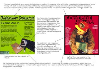
  • 1. The mast Heads Differ in terms of care and suitability my preliminary magazine to the left has the magazines title recklessly placed across the top with really un professional writing not following the media magazine industry conventions. The masthead on my final piece however has been carefully crafted to fit the media magazine industries conventions with the magazine title coming in from the left. The Predominant front page photo on my final magazine is big and overcrowding the masthead like Conventional magazines do. Were as my preliminary photo is just placed in the bottom right corner edited badly with parts of background still in the photo it doesn't follow the typical magazine conventions. The story is written on the front page of my preliminary magazine which it shouldn’t be, as this takes up unnecessary space and is not conventional. My Final piece how ever just has the typical features and exclusives as to what and who features within the magazine issue along with the sub-headings. The preliminary task magazines’ writing is not aligned making it look odd and unprofessional. Not following any media conventions for that matter. My final piece how ever is all aligned looking professional and of good quality. The preliminary task was created on ‘Word’ My Final Piece was created on the programme ‘Macromedia Fireworks’
  • 2. My preliminary content page I didn’t really put any effort in to with the layout design. The masthead and writing is rather rubbish and dull, selected of off the programme ‘Word’ on which it was created on. The placing of the writing isn’t very conventional as it’s just placed at the top with no form of arrangement what so ever. Were as my Final finished piece the masthead font jumps out at you and is more pleasant to look at unlike my preliminary. The pictures add more reality and sophistication to the magazine and content page on my Final Piece. As you can see a content page without pictures on my preliminary task looks grey and dull and doesn't help the magazine at all. The Content and page references are written rather boringly on my preliminary magazine, almost looking like a shopping or Argos magazine, Plus there isn’t enough content going for it. How ever over on my Final Piece the page Numbers are written in bold as they are of importance, along with the content on that page written beside it. The Content on my preliminary is sectioned of in to the sections ‘Regulars’, meaning what is usually in the magazine and the section ‘Features’ These are the new juicy content found in the issue. This is very conventional and is what helps sell magazines. Were as my preliminary content isn’t sectioned of and is just placed as a list, which is rather boring and unpleasant to look at. The font colour for the content page on my preliminary I didn’t think about but now looking back I realised that people could easily get confused as it’s the same colour as the title masthead. The Colour of the font I chose very carefully as I didn’t want it to be to bright and confusing. So I had to make sure it was different to all the other colours used