Company name and logo 
By Crystal Bukenya
CB Productions 
From my company name brainstorm, I have chosen to use the name CB 
Productions, as it reflects my name initials in a simplistic and company 
based way. I think this is appropriate as I am the only member to consider 
in my individual work. The initials are also fitted well together, and so it 
will not look odd when forming it together on photo shop. I am pleased 
with the outcome of my logo as I have chosen colours that match my – 
navy blue theme, fitted to the codes and convention of a drama thriller. I 
believe this fits well into my blog and improves the appearance of the 
layout.
The process of making my logo… 
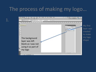
1. 
My first 
layer was 
created 
to make 
my logo 
shape 
The background 
layer was left 
blank as I was not 
using it as part of 
my logo
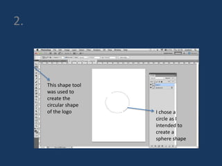
2. 
This shape tool 
was used to 
create the 
circular shape 
of the logo I chose a 
circle as I 
intended to 
create a 
sphere shape
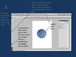
3. 
This paint 
bucket tool 
is how I 
filled in the 
area of the 
circle 
I selected the 
blue colour 
theme with 
this tool, which 
was a main 
factor in 
establishing 
my blogger 
theme colour 
With the same tool, I was 
able to select a shade 
effect which created the 
sphere appearance of my 
logo 
Lighter 
blue 
area
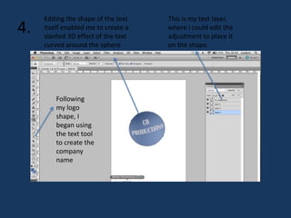
4. 
Following 
my logo 
shape, I 
began using 
the text tool 
to create the 
company 
name 
This is my text layer, 
where I could edit the 
adjustment to place it 
on the shape. 
Editing the shape of the text 
itself enabled me to create a 
slanted 3D effect of the text 
curved around the sphere
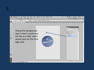
5. 
Hiding the background 
layer meant I could save 
the file as a PNG, which 
would save me the final 
logo only.
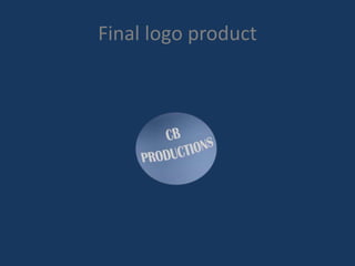
Final logo product

Company name and logo fin

  • 1.
    Company name andlogo By Crystal Bukenya
  • 2.
    CB Productions Frommy company name brainstorm, I have chosen to use the name CB Productions, as it reflects my name initials in a simplistic and company based way. I think this is appropriate as I am the only member to consider in my individual work. The initials are also fitted well together, and so it will not look odd when forming it together on photo shop. I am pleased with the outcome of my logo as I have chosen colours that match my – navy blue theme, fitted to the codes and convention of a drama thriller. I believe this fits well into my blog and improves the appearance of the layout.
  • 3.
    The process ofmaking my logo… 1. My first layer was created to make my logo shape The background layer was left blank as I was not using it as part of my logo
  • 4.
    2. This shapetool was used to create the circular shape of the logo I chose a circle as I intended to create a sphere shape
  • 5.
    3. This paint bucket tool is how I filled in the area of the circle I selected the blue colour theme with this tool, which was a main factor in establishing my blogger theme colour With the same tool, I was able to select a shade effect which created the sphere appearance of my logo Lighter blue area
  • 6.
    4. Following mylogo shape, I began using the text tool to create the company name This is my text layer, where I could edit the adjustment to place it on the shape. Editing the shape of the text itself enabled me to create a slanted 3D effect of the text curved around the sphere
  • 7.
    5. Hiding thebackground layer meant I could save the file as a PNG, which would save me the final logo only.
  • 8.