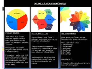
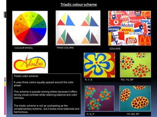
PRIMARY COLORS
Red, Yellow, Blue. These 3
colors are the base colors for
every other color on the color
wheel. This is why they are called
“ Primary”.
Primary colors are used for
designs or art that needs to have
a sense of urgency.
Primary colors are the most vivid
colors when placed next to each
other, which is why you will notice
that most fast food joints use
primary colors in their logos, as it
evokes speed.
SECONDARY COLORS
Orange, Green, Purple. These 3
colors are what you get when you mix
the primary colors together.
They are located in between the
primary colors to indicate what colors
they are made from. Notice how
green is between yellow and blue.
Secondary colors are usually more
interesting than primary colors, but
they do not evoke speed and
urgency.
YELLOW
BLUE RED
COLOR – An Element Of Design
YELLOW
RED
BLUEORANGE
GREEN
PURPLE
Y
YG
G
BG
YOO
RO
B
P
BP
RP
R
TERTIARY COLORS
When we mix one Primary and one
Secondary color we get a tertiary color.
There are 6 tertiary colors-
1.Yellow-Orange
2.Yellow-Green
3.Blue-Green
4.Blue-Purple
5.Red-Purple
6.Red-Orange
COLOR WHEEL
It shows the relationship between primary,
secondary, tertiary colors.
Chroma achromatic colour scheme
ACHROMATIC COLORS
Achromatic colors posses no
hue.
Neutral colors like white, grey,
brown and black are
achromatic.
These neutral colors are far
from being negative because
they affect the appearance of
other hues.
Neutral colors are useful in
modifying the values and
intensities of all hues.
COLLAGE
Chroma achromatic color
scheme:
In this color scheme a chroma
color is used with an achromatic
color.
RED & WHITE YELLOW & BLACK RED- PURPLE & WHITE
BLUE & WHITE YELLOW-ORANGE & BLACK BLUE-PURPLE & WHITE
Monochromatic colour scheme
Monochromatic colors are all
the colors (tinges, tints, tones
and shades) of a single hue.
Monochromatic color schemes
are derieved from a single
base hue, and extended using
its shades, tones ,tints and
tinges. (that is, a hue modified
by the addition of black, gray
and white). As a result, the
energy is more subtle and
peaceful due to the lack of
contrast of hue.
Monochromatic color schemes
may be considered boring
unless there is diversity in
design
COLLAGE
MONOCHROMATIC COLORS
RED-PURPLE YELLOW- ORANGE RED
BLUE BLUE-GREEN BLUE-PURPLE
Analogous colour scheme
Analogous colors:
Red and orange, blue and
green, etc. These are colors
right next to each other on the
color wheel.
They usually match extremely
well, but they also create
almost no contrast.
They are good for very serene-
feeling designs and artwork
where you want viewers to feel
comfortable.
COLLAGEANALOGOUS COLORS
RED & RED-PURPLE ORANGE & YELLOW-ORANGE YELLOW & YELLOW-ORANGE
BLUE & BLUE-PURPLE GREEN & YELLOW-GREEN BLUE & BLUE-GREEN
COLOUR WHEEL
Complementary colour scheme
Complementary colors:
Red and green, blue and
orange, purple and yellow.
These are colors directly across
from each other on the color
wheel.
They are called complementary
because, when used together,
they become extremely vibrant
and have heavy contrast.
They are useful when you want
to make something stand out.
For example, if you use a green
background and have a red
circle on it, the red will jump off
the page and be almost
blinding.
COLLAGE
COMPLEMENTARY COLORS
YELLOW & PURPLE YELLOW-GREEN & RED-PURPLE RED & GREEN
RED-ORANGE & GREEN-BLUE ORANGE & BLUE YELLOW-ORANGE & BLUE-PURPLE
COLOUR WHEEL
DOUBLE COMPLEMENTARY COLORS
Double Complementary colour scheme
Double complementary scheme:
It is the richest of all the schemes
because it uses four colors
arranged into two complementary
color pairs.
This scheme is hard to
harmonize, if all four colors are
used in equal amounts, the
scheme may look unbalanced, so
you should choose a color to be
dominant or subdue the colors.
COLLAGE
Y/P & YO/BP B/O & BG/RO R/G & RP/YG
Y/P & YG/RP R/G & RO/BG B/O & BP/YO
12 SPLIT COMPLEMENTARY SETS
Split Complementary colour scheme
Split complementary scheme:
These are formed from finding
complements – like yellow and
purple – then choosing the colors
on either side of one the
complement – like bluish purple
and reddish purple.
COLLAGE
Y, RP, BP BG, O, R R, YG, BG
O, BG, BP B, YO, RO YO, B, P
COLOURWHEEL
TRIAD COLORS
Triadic colour scheme
Triadic color scheme:
It uses three colors equally spaced around the color
wheel.
This scheme is popular among artists because it offers
strong visual contrast while retaining balance and color
richness.
The triadic scheme is not as contrasting as the
complementary scheme , but it looks more balanced and
harmonious.
COLLAGE
R, Y, B RO, YG, BP
O, G, P YO, BG, RP
COLOURWHEEL
TETRAD-SQUARE COLOR COMBINATIONS
Tetrad –Square colour scheme
Tetrad - Square color scheme:
This scheme is a combination of four colors at equal distance in the color
wheel.
It can be created by drawing a square to link up the colors.
COLLAGE
Y/P & RO/BG R/G, B/O YG/RP & YO/BP
COLOURWHEEL
Visilibility Sheets

Colour-Schemes by Adeeba Afreen

  • 1.
    PRIMARY COLORS Red, Yellow,Blue. These 3 colors are the base colors for every other color on the color wheel. This is why they are called “ Primary”. Primary colors are used for designs or art that needs to have a sense of urgency. Primary colors are the most vivid colors when placed next to each other, which is why you will notice that most fast food joints use primary colors in their logos, as it evokes speed. SECONDARY COLORS Orange, Green, Purple. These 3 colors are what you get when you mix the primary colors together. They are located in between the primary colors to indicate what colors they are made from. Notice how green is between yellow and blue. Secondary colors are usually more interesting than primary colors, but they do not evoke speed and urgency. YELLOW BLUE RED COLOR – An Element Of Design YELLOW RED BLUEORANGE GREEN PURPLE Y YG G BG YOO RO B P BP RP R TERTIARY COLORS When we mix one Primary and one Secondary color we get a tertiary color. There are 6 tertiary colors- 1.Yellow-Orange 2.Yellow-Green 3.Blue-Green 4.Blue-Purple 5.Red-Purple 6.Red-Orange COLOR WHEEL It shows the relationship between primary, secondary, tertiary colors.
  • 2.
    Chroma achromatic colourscheme ACHROMATIC COLORS Achromatic colors posses no hue. Neutral colors like white, grey, brown and black are achromatic. These neutral colors are far from being negative because they affect the appearance of other hues. Neutral colors are useful in modifying the values and intensities of all hues. COLLAGE Chroma achromatic color scheme: In this color scheme a chroma color is used with an achromatic color. RED & WHITE YELLOW & BLACK RED- PURPLE & WHITE BLUE & WHITE YELLOW-ORANGE & BLACK BLUE-PURPLE & WHITE
  • 3.
    Monochromatic colour scheme Monochromaticcolors are all the colors (tinges, tints, tones and shades) of a single hue. Monochromatic color schemes are derieved from a single base hue, and extended using its shades, tones ,tints and tinges. (that is, a hue modified by the addition of black, gray and white). As a result, the energy is more subtle and peaceful due to the lack of contrast of hue. Monochromatic color schemes may be considered boring unless there is diversity in design COLLAGE MONOCHROMATIC COLORS RED-PURPLE YELLOW- ORANGE RED BLUE BLUE-GREEN BLUE-PURPLE
  • 4.
    Analogous colour scheme Analogouscolors: Red and orange, blue and green, etc. These are colors right next to each other on the color wheel. They usually match extremely well, but they also create almost no contrast. They are good for very serene- feeling designs and artwork where you want viewers to feel comfortable. COLLAGEANALOGOUS COLORS RED & RED-PURPLE ORANGE & YELLOW-ORANGE YELLOW & YELLOW-ORANGE BLUE & BLUE-PURPLE GREEN & YELLOW-GREEN BLUE & BLUE-GREEN COLOUR WHEEL
  • 5.
    Complementary colour scheme Complementarycolors: Red and green, blue and orange, purple and yellow. These are colors directly across from each other on the color wheel. They are called complementary because, when used together, they become extremely vibrant and have heavy contrast. They are useful when you want to make something stand out. For example, if you use a green background and have a red circle on it, the red will jump off the page and be almost blinding. COLLAGE COMPLEMENTARY COLORS YELLOW & PURPLE YELLOW-GREEN & RED-PURPLE RED & GREEN RED-ORANGE & GREEN-BLUE ORANGE & BLUE YELLOW-ORANGE & BLUE-PURPLE COLOUR WHEEL
  • 6.
    DOUBLE COMPLEMENTARY COLORS DoubleComplementary colour scheme Double complementary scheme: It is the richest of all the schemes because it uses four colors arranged into two complementary color pairs. This scheme is hard to harmonize, if all four colors are used in equal amounts, the scheme may look unbalanced, so you should choose a color to be dominant or subdue the colors. COLLAGE Y/P & YO/BP B/O & BG/RO R/G & RP/YG Y/P & YG/RP R/G & RO/BG B/O & BP/YO
  • 7.
    12 SPLIT COMPLEMENTARYSETS Split Complementary colour scheme Split complementary scheme: These are formed from finding complements – like yellow and purple – then choosing the colors on either side of one the complement – like bluish purple and reddish purple. COLLAGE Y, RP, BP BG, O, R R, YG, BG O, BG, BP B, YO, RO YO, B, P COLOURWHEEL
  • 8.
    TRIAD COLORS Triadic colourscheme Triadic color scheme: It uses three colors equally spaced around the color wheel. This scheme is popular among artists because it offers strong visual contrast while retaining balance and color richness. The triadic scheme is not as contrasting as the complementary scheme , but it looks more balanced and harmonious. COLLAGE R, Y, B RO, YG, BP O, G, P YO, BG, RP COLOURWHEEL
  • 9.
    TETRAD-SQUARE COLOR COMBINATIONS Tetrad–Square colour scheme Tetrad - Square color scheme: This scheme is a combination of four colors at equal distance in the color wheel. It can be created by drawing a square to link up the colors. COLLAGE Y/P & RO/BG R/G, B/O YG/RP & YO/BP COLOURWHEEL
  • 10.