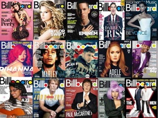
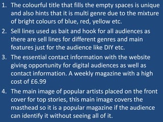
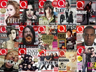
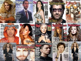
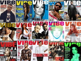
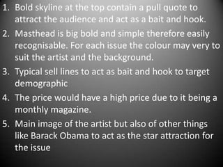
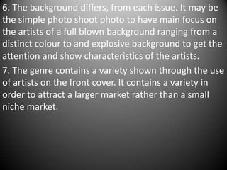
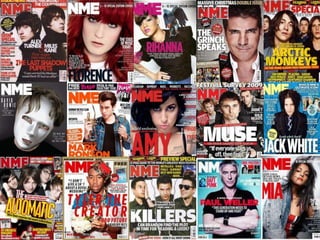
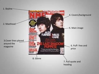
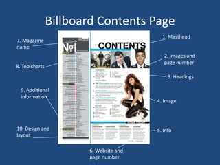
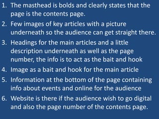
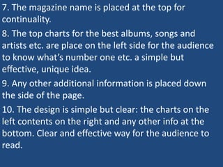
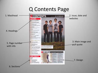
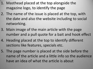
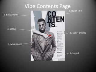
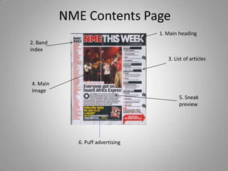
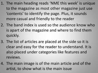
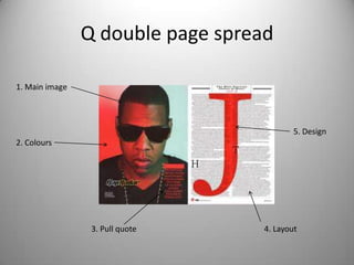
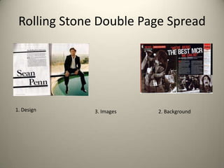
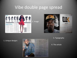
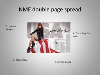
1. The document analyzes the front covers and contents pages of several music magazines including Billboard, Q, Rolling Stone, and Vibe.
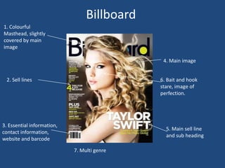
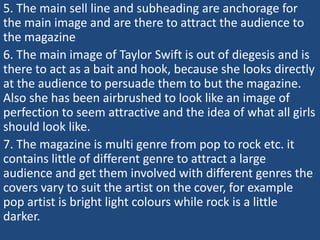
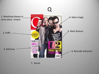
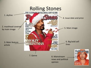
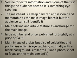
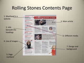
2. It identifies common design elements like mastheads, images of popular artists, headlines, and pricing information that are used across magazines to attract audiences.
3. Key purposes of the design elements identified include acting as anchors for the cover image, bait to entice readers, and hooks to draw in target demographics. Consistent branding and layouts also aid reader recognition of each magazine.
The document discusses the front cover design of three different music magazines: Kerrang, Kerrang, and Billboard. It analyzes the key design elements of each cover, including the masthead, main image, pull quotes, fonts, and target audience. Some of the magazines challenge conventions by omitting certain elements or placing them in unusual locations. Overall, the document examines how the magazine covers appeal to their target rock/music audiences and conform to typical magazine design standards.
The document provides details on the design elements of magazine covers and contents pages. It analyzes elements like the masthead, headlines, images, layout, and other visual components. According to the document, these elements are intentionally designed to attract readers' attention and encourage them to purchase the magazine. For example, prominent images of famous artists are used to draw interest, while plugs and free gifts provide an incentive. Additionally, the document notes that simplicity in design helps avoid overwhelming readers. Overall, the document examines how magazine covers and contents pages use visual rhetoric to market the publication to potential audiences.
The document analyzes features of music magazine covers and contents pages. It discusses conventions such as mastheads, dates, images, headlines and puffs on covers. It examines layouts of contents pages, including logos, titles, indexes, images and sub-headings. Key conventions highlighted include prominent placement of mastheads, stars on covers, charts and categories to organize content. Color schemes, fonts, images and headlines are designed to attract readers and promote the magazine's content and brand.
The student created a music magazine as their media product. They researched conventions of real music magazines and applied many of these to their own magazine to make it look professional and realistic, while also developing some conventions. The student evaluated how they attracted and addressed their target audience of 16-23 year olds interested in music through elements like eye-catching designs, relevant content, and representative imagery. Through this process, the student learned important skills in using technologies like Photoshop, blogging, and photography equipment to construct a high-quality media product.
The document analyzes and compares three music magazine covers: Vibe, Billboard, and Rolling Stone. For Vibe, the analysis notes the masthead, cover lines providing content information, use of red, white and black colors, a puff about Eminem, and a large central photo of Kesha making eye contact. For Billboard, the masthead is in colors matching Katy Perry's dress photo on the cover, with a puff, cover lines, and Katy Perry as the large central photo. For Rolling Stone, elements noted include the masthead, price and date, main cover line, additional cover lines, and a barcode.
Kerrang! is a UK-based magazine devoted to rock music. It was initially focused on heavy metal genres but expanded its coverage in the 2000s. While sales declined after the nu-metal trend ended, adopting emo and metalcore helped boost readership. Kerrang! primarily targets 16-24 year old males and appeals to them through imagery of iconic male bands. It maintains a devoted audience through diverse online content that keeps readers engaged between issues.
The document describes the design elements of two magazine covers - NME magazine and Top of the Pops magazine. For NME, it discusses the color palette of red, white and black which appeals to its rock music audience. The large masthead in white stands out against the red background. The main image takes up the whole cover with a close-up shot of Florence. For Top of the Pops, the target audience is young girls aged 8-13. It uses a girly color palette of pink, white and purple. The cover features a mid-shot of Cheryl Cole and text that tells readers "you can be Cheryl." Both magazines employ consistent color palettes, prominent cover lines and images, and mast
1. The document discusses the design elements of magazine covers, including mastheads, images, color schemes, and layouts.
2. It compares the document author's own magazine cover design to covers of real magazines like Vibe and NME.
3. The author explains how they used and experimented with different design elements and technologies to create a unique and appealing cover for their intended audience of teenagers interested in hip hop music.
The document analyzes the front cover of Kerrang magazine to understand its target audience. Kerrang targets predominantly male rock fans aged 17-24. The front cover uses conventions like a dominant image of a rock artist and headlines in line with the magazine's house style to attract this audience. The codes and conventions employed on the cover aim to appeal to the attitudes and lifestyle of the target readership.
This document provides an evaluation of a music magazine created by Kiranjit Jandu. The summary discusses several key elements of the magazine's design and how it represents certain conventions or challenges them:
- The bold masthead on the front cover challenges conventions by its placement and bold style. It is influenced by Vibe magazine.
- The main image of singer Bella challenges conventions by using a female figure rather than typical male figures.
- Other elements like the barcode placement, spread title, and single cover image challenge conventions while keeping the overall style cohesive.
- The magazine represents younger generations interested in R&B music and portrays the group OVOXO as strong and rebellious
Q1. In what ways does your media product use, develop or challenge forms and ...ciaraoakes
The document summarizes the development of forms and conventions used in the media product of an indie rock magazine from its initial concepts to the final version.
The key developments included changing the magazine's theme from a Brit pop focus to solely featuring indie rock music. This led to changes in the magazine title from "Vertigo" to "Indigo" and the color scheme from red/white/black to blue/white/black. Images throughout were also updated to better represent the genres featured. Additional changes refined the layout and design elements to improve clarity and aesthetics. The final versions of the cover, contents page, and feature article demonstrate how conventions of real magazines were both followed and challenged during the creative process.
The document describes the layout and design elements of magazine covers and interior pages. It analyzes the use of color schemes, typography, images, and other graphical elements across different magazine examples. Consistent design features include placing the magazine title, barcodes, and issue numbers in standardized locations. Cover images and stories are usually related to promote interest. Interior pages like contents lists use indexing and previews to help readers navigate articles of interest. Double page spreads employ large centered images and titles to showcase featured stories.
NME is a weekly British music magazine that was first published in 1952. It began as a music newspaper and transitioned to a magazine format in the 1980s. The target audience is males aged 17-25. Elements that link the different pages together include consistent use of font, colors like red and black, and an informal tone throughout the text.
The Q magazine cover uses a dominant image of Ed Sheeran to intrigue viewers. He is casually dressed with an acoustic guitar, suggesting a laid-back musician. The lighting suggests he has overcome a dark past. The masthead is in bold red behind Sheeran, showing he is most important. The coverlines advertise other articles in bold font. The plug stands out in red to attract attention. The target audience is ages 16-24 based on the organized layout and color scheme.
The document provides an analysis of the layout, design elements, and techniques used across several music magazine covers to attract audiences. Key elements discussed include the use of bright colors and large fonts to make text and mastheads stand out, center images of artists to represent the main stories, and teaser text and questions to engage readers. Multiple magazines employ layered and overlapping design elements to give the impression of being packed with content. Overall the document examines how magazines utilize visual cues and advertising approaches to draw in their target demographics.
This magazine cover uses several visual techniques to attract and inform readers. The masthead stands out against the dark background in bright white text. The central image of a guitarist overlaps the masthead and cover lines to create a 3D effect. Additional images and cover lines around the page provide multiple snippets of content and stories within the magazine to draw in a variety of readers.
The document analyzes the design elements used on the covers and contents pages of Kerrang and Q magazine. It discusses how these elements appeal to the target audience of rock music fans and follow magazine design conventions. Key design features analyzed include the masthead, images of recognizable rock stars, cover lines in contrasting colors, and secondary images to entice readers to specific articles inside. The purpose is to attract readers who enjoy rock music and get them to purchase the magazine by including bands, artists and topics they will want to learn more about.
The generic conventions of magazines coverJenny McNulty
The front covers of magazines aim to attract buyers through eye-catching design elements. They establish a consistent house style through fonts, layout, color, and logos to build brand recognition and loyalty. Covers typically feature a central high-resolution celebrity image looking directly at viewers to create engagement. Additional cover lines advertise internal articles to entice purchases. Dates, prices, and web addresses round out the nonverbal communication on magazine fronts.
The document provides information about music magazines, including:
- The first music magazine was founded in 1894 called Billboard. Music magazines grew popular in the 1950s-1960s with magazines like NME and Rolling Stone.
- The biggest music magazine publishers currently are Rolling Stone, NME, Smash Hits, Kerrang!, and Billboard.
- The document then analyzes sample pages from magazines like NME and Smash Hits, examining things like layout, colors, target audiences, and conventions used across issues.
Thomas McEnaney submitted a portfolio for the Level 3 Cambridge Introductory Diploma in Media unit on UK Media Publishing. The portfolio included mood boards, mind maps, draft interviews, masthead designs, and graphic layouts for the magazine's front cover, double page spread, and "Off the Radar" section. Analysis explained the design choices like using the house style colors and layouts inspired by established magazines. A magazine flat plan outlined the planned content sections.
This document analyzes the cover of Kerrang! magazine issue 1296. The cover targets a niche audience interested in rock and metal music, as shown by the aggressive images and fonts used. The masthead is in a cracked font linking to the idea of the onomatopoeic sound of "kerrang." The main image spreads across the cover to promote the featured article inside. Cover lines use techniques like banners, pull quotes, and fonts on colored backgrounds to draw readers in and create anticipation. Smaller images on the lower half of the cover promote inside content without distracting from the main image.
This document contains details from a student about planning and pitching a print-based music magazine as part of their coursework. It includes sections on genre selection, masthead design ideas, magazine format concepts, target audience analysis considering age, gender and socioeconomic factors, product research on similar magazines, draft front covers, and conclusions. The student conducted research on magazine styles and target audiences to develop concepts for a hip hop and rap focused magazine aimed at teenagers and young adults between 15-30 years old.
The document summarizes a student's evaluation of their music magazine project. The student discusses how they developed conventions of real music magazines in their design of a front cover, contents page, and double-page article spread. Key points included using consistent color schemes, fonts, large images, and layout elements like dates and prices found on real magazines. The student felt their final project better represented conventions compared to their preliminary task due to gaining more experience with design software and analyzing other magazines.
This document discusses wedding options at the Tahoe Biltmore in Lake Tahoe. The Tahoe Biltmore offers several spaces for ceremonies and receptions accommodating 10 to 300 guests, including a 6,435 square foot grand ballroom and outdoor balcony. They can help plan an affordable, personalized Lake Tahoe wedding with on-site accommodations, spaces for ceremonies and meetings, and views of Lake Tahoe.
Las Loberas del Ferrol son un área rocosa semicircular que alberga numerosos lobos marinos de la especie Otaria o "Lobo Chusco". Los turistas pueden observar a cientos de lobos marinos de diferentes tamaños descansando en los peñascos, que rugen fuertemente cuando detectan presencia humana. Estos lobos marinos pueden medir más de 2 metros y pesar más de 300 kilos, y viven en grupos de más de 400 individuos con jerarquías definidas. Sin embargo, su hábitat está amenazado
Este documento habla sobre la ergonomía en el uso de computadores. Explica que la ergonomía estudia la adaptación entre el hombre y la máquina. Luego detalla recomendaciones ergonómicas para el monitor, teclado, mobiliario y postura correcta, como mantener el monitor a una distancia y ángulo adecuados, elevar el teclado, usar una silla ajustable y mantener una postura alineada frente al monitor.
Elder Dallin Harris Oaks is an apostle of The Church of Jesus Christ of Latter-day Saints. He was born in 1932 in Provo, Utah and raised by his mother after his father died of tuberculosis when he was 7 years old. He earned degrees from BYU and the University of Chicago and had a successful career as a lawyer, judge, and professor before being called as an apostle in 1984 at age 51. He has provided inspired counsel through challenging personal experiences like the death of his first wife from cancer.
El documento trata sobre diferentes temas relacionados con la filosofía y la educación. En primer lugar, define la filosofía como el amor a la sabiduría y las ciencias de las primeras causas. Luego, señala que la filosofía de la educación es un saber crítico de las condiciones de posibilidad de la realidad educativa. Por último, explica que educar es despertar personas orientándolas y guiándolas desde dentro hacia fuera.
• “Detecting radio-astronomical "Fast Radio Transient Events" via an OODT-based metadata processing pipeline”, Chris Mattmann, Andrew Hart , Luca Cinquini, David Thompson, Kiri Wagstaff, Shakeh Khudikyan. ApacheCon NA 2013, Februrary 2013
Este documento discute as universidades medievais e como elas surgiram a partir do século XII como uma inovação que permitiu o acesso ao conhecimento fora dos mosteiros. As primeiras universidades eram corporações de professores e alunos sem estruturas físicas definidas, e surgiram em cidades como Oxford, Paris e Bolonha.
This document provides an overview of precorrection as a low-intensity strategy within a three-tiered prevention framework. It discusses precorrection as an antecedent strategy that identifies contexts where problem behaviors typically occur and provides supports to encourage appropriate behavior. The summary is:
Precorrection is presented as a proactive, low-intensity strategy that can be used at the primary, secondary, or tertiary prevention tiers. It involves identifying contexts where problem behaviors typically occur and providing prompts and reinforcement for the desired alternative behaviors before issues arise. Research supports precorrection's effectiveness in decreasing problem behaviors in various settings like classrooms and playgrounds. Implementing with treatment integrity and obtaining social validity are emphasized for monitoring precorrection's impact
The document analyzes the contents pages of several music magazines, including Billboard, Q, Rolling Stone, Vibe, and NME. Some key points made:
1. Contents pages use images, headings, and brief descriptions to entice readers to specific articles.
2. Layouts are clear with sections, page numbers, and lists of articles for easy navigation.
3. Designs mirror the magazines' brands with consistent colors, logos, and styles to feel recognizable to readers.
4. Images are prominently featured to draw readers in using popular artists or celebrities from featured stories.
1. The document provides an analysis of the cover of a magazine.
2. Key details analyzed include the masthead design, imagery used, color schemes, cover lines and plugs, price and publication details.
3. The analysis suggests the magazine is targeting college students based on the cover lines, imagery of young people, and use of informal language.
The masthead is recognizable even though partially covered by the main image. The main image is of the featured artist/band. Additional details or quotes from the artist/band are included to entice readers. Other artists mentioned in the magazine are also displayed to attract fans of those artists to purchase the issue.
The document defines common elements of magazine design such as the masthead, headline, main image, barcode, and splash page. It also examines conventions regarding the publisher's background, the magazine's ideology in appealing to its target audience, and how the main cover story is visually represented.
The document analyzes the codes and conventions of magazine covers and content pages. It discusses the media language elements like mastheads, headlines, images, barcodes, and page references. It also examines the institutions that publish the magazines, their intended ideologies and target audiences. Finally, it analyzes how magazine covers represent and portray the key people featured through image placement and design.
The magazine uses simple design elements like bold colors, large images and informal text to appeal to its target audience of college students. Notable design choices include an eye-catching red masthead, a comical main image of books representing student work, and punny article titles and quotes to grab attention. The overall presentation aims to seem familiar and relatable to readers through a casual, easy to navigate style.
This document provides guidance on designing the cover and interior pages of a music magazine. It recommends that the masthead be prominently displayed at the top of the cover to identify the publication and genre. The cover should feature 5 cover lines highlighting artists and buzzwords to attract readers. Background and subsidiary images should showcase relevant artists. Interior pages should include a celebrity double-page spread, prominent titles and pull quotes, and colloquial language to engage the target youth audience. Consistency in house style, logo, and page design helps readers navigate easily.
This document analyzes and summarizes the layout and design elements of the front cover and first few pages of a rock music magazine. It finds that the layout uses conventional design techniques for the genre, such as a prominent cover image and headline about the main feature article, pull quotes, page numbers, and band name and image given the most space. Color scheme and fonts are also described as typical and helping draw attention to important elements like the contents listing. In summary, the document evaluates the magazine pages and determines that the layout and design choices effectively showcase content in a conventional style for the genre.
This document analyzes the codes and conventions, institution, ideology, audience, and representation of three music magazine covers:
1) Billboard magazine with Drake on the cover is analyzed for its masthead, headline, main image, barcode, and splash codes. Its publisher is Prometheus Global Media and it aims to bring together people interested in music across genres.
2) Q Magazine with Adele on the cover is examined for its masthead, headline, main image, sub-story, and barcode elements. Its publisher is Bauer Media Group and it aims for higher production quality than other music magazines.
3) NME magazine featuring Rihanna uses codes like masthead, headline, splash, main image,
The document provides an analysis of the cover designs of three different music magazines: Rolling Stone, Billboard, and NME. It examines the key elements of each cover including the masthead, main image, coverlines, and essential information. Specific design techniques are highlighted like the use of bold colors and fonts to draw attention, inclusion of the featured artist's name, and quotes to intrigue readers. Overall the summary analyzes how each magazine uses visual elements in distinct ways to target their intended audience and promote the issue's content.
This document discusses genres of music and magazines. It focuses on the pop genre and similarities found across pop music magazine covers, contents pages, and double page spreads. Key similarities highlighted include the use of bright colors, bold text, themes, packed but organized layouts, and visual elements like photos that provide context and identify articles and celebrities. The document analyzes design and formatting elements that make pop music magazines visually appealing and easy to navigate.
The document analyzes the front covers of three magazines - Billboard, Q Magazine, and NME. It examines the codes and conventions used on magazine covers such as the masthead, headline, main image, barcode, and splash. It then summarizes key details about the publisher/company behind each magazine, their overall message or ideology, their target audience, and how the main story is represented visually on the front cover through images and layout.
The document provides an analysis of different elements of the NME magazine, including the front cover, contents page, and a double page spread. It discusses design elements like the masthead, images, headings, and drop caps that are used consistently across pages. The target audience is identified as 15-25 year olds, with the magazine priced affordably. Key connections between sections are the consistent font style, attractive artist images, and inclusion of interesting facts about popular musicians.
The document analyzes the design elements of a magazine cover, explaining how each element follows conventions to attract readers. The masthead uses bold text and colors to identify the magazine brand. Sell lines highlight celebrity interviews that will interest fans. The skyline uses bold text on a white background to advertise a "special" exclusive story. Together these visual elements signal the music genre and aim to generate excitement about articles inside to drive sales.
The document analyzes the design elements of a magazine cover, explaining how each element follows conventions to attract readers. The masthead uses bold text and colors to identify the magazine brand. Sell lines highlight celebrity interviews that will interest fans. The skyline uses bold text on a white background to advertise a special feature. Together the visual elements are designed to excite the target audience and motivate them to purchase the magazine.
This document summarizes the key elements of magazine front covers including:
1) The main image which dominates the page and is positioned in front of the masthead to draw attention.
2) Cover lines and tag lines which list articles and the magazine's selling point to target different audiences.
3) The masthead which is typically positioned at the top third of the page in a large, attention-grabbing font.
4) Date, price and barcode which provide basic identifying information in a subtle manner.
The document describes the key elements of magazine front covers including the masthead, main image, tag line, cover lines, date line, publisher information, and more. It analyzes how different magazines use elements like colors, fonts, images and text to target audiences and promote their content in distinct styles aligned with their brand and topic. Elements are typically positioned conventionally but magazines may take risks with placement to stand out or draw more attention to priority content.
The document outlines several key conventions for magazine covers and content pages including:
1) The masthead is prominently featured on the cover to identify the magazine but should not overwhelm the main image/story. Date lines and barcodes provide issue information and assist with purchasing.
2) Cover lines in colorful fonts preview stories inside to attract readers. The main cover story and large, eye-catching image relate to the issue's central topic.
3) Additional elements like straplines, backgrounds, fonts, titles and images are designed to stand out, appeal to audiences, and entice readers to learn more inside.
The document discusses research conducted for a music magazine project. It covers researching existing magazines' conventions, target demographics, and audiences' wants. Questionnaires found the types of music and content the target audience wanted. Past successful student projects showed effective elements. In-depth analysis of magazines identified all needed components and reasons for their success. Mood boards combined research insights and audience wants into a magazine concept. The research emphasized pleasing the audience with a unique idea using proven conventions.
This document lists prop ideas for a photo shoot of an artist that help identify them and convey their personality and style. It suggests including a pack of cards to reference a signature accessory, musical instruments to identify what they play, CDs and posters and food to show aspects of their personality, a coat or jacket for them to wear that suits their style, and a camera and bags that could be incorporated into images to acknowledge it is from a photo shoot.
This document provides information about audience demographics and psychographic profiling for market research. It segments the population into categories such as mainstreamers, succeeders, and aspirers based on attitudes, personality traits, values, and interests. Examples of psychographic segments include trendies, egoists, puritans, innovators, rebels, and more. The document also discusses fans producing their own magazines, called fanzines, to provide unbiased information. It introduces Uses and Gratifications Theory, which focuses on what audiences do with media rather than what media does to people, such as watching X Factor for entertainment.
The document summarizes audience research and demographics for media segmentation. It breaks audiences into socioeconomic classes from high-ranking professionals to unemployed individuals. It also describes psychographic profiling based on personality, lifestyle, values, and interests. The document then outlines several audience segments including mainstreamers, succeeders, and aspirers. It provides examples of fanzines as anti-establishment magazines created using affordable software. Finally, it discusses uses and gratifications theory, focusing on why audiences engage with media to satisfy psychological needs like entertainment, education, social interaction, and escape.
Daniel created a horror film trailer and supporting marketing materials that used conventions from real horror media but also challenged conventions and included unique elements:
1) The trailer used point-of-view shots, night filming, and ominous shots inspired by films like Halloween, but did not include graphic violence or nudity.
2) Scenes implied danger through atmosphere rather than showing it, such as a victim found dressed in the bath.
3) The final scene built suspense through stalking imagery rather than blood or gore as seen in other trailers.
4) Supporting materials like magazine covers and posters featured sinister images that identified the genre while leaving aspects open to interpretation. Overall, Daniel both drew from
The document outlines the typical layout and elements of a magazine cover, including the masthead, slogan, issue date, price, cover lines and pull quotes from articles to entice readers, a main background image to persuade audiences, and additional images and links to social media pages to make the cover more appealing.
The document analyzes and summarizes several movie posters:
- The Dark Knight poster emphasizes key information like the title, cast, and release date to stand out against the dark background. Warner Bros. had the rights to make DC comics films.
- The Texas Chainsaw Massacre poster aims to look old/tattered to seem real. It features the villain without revealing his identity to build intrigue.
- A Nightmare on Elm Street remakes use familiar iconography to appeal to original fans. The poster focuses on the villain but lacks context unlike the original poster.
- Grave Encounters posters use reviews/views to convince audiences after positive reception. It mimics the found footage
Wes Craven's A Nightmare on Elm Street was a success due to its creative dream-based murders and frightening villain Freddy Krueger. The reboot updated the franchise while keeping elements that made it scary. Friday the 13th benefited from cashing in on Halloween's success, introducing iconic killer Jason Voorhees. Halloween was terrifying because the murders could happen anywhere, and Michael Myers' masked face was unknown evil. Psycho's shocking twist ending set the standard, while Texas Chainsaw Massacre used its "based on true events" premise to attract audiences.
The document outlines the steps taken during a location recce for a film production. It involves examining the location to determine suitability, identifying any health and safety issues, checking lighting and sound conditions, arranging logistics like parking and confirming details with cast and crew. Permission is obtained and necessary precautions are taken into account to ensure the location filming can be done safely and effectively.
The call sheet outlines a film shoot taking place at Lucy's house from 6-9pm. It will involve filming scenes in various indoor and outdoor locations using a video camera, with Allison, Eleanor, James and Lucy acting and Lucy's kitchen knife and a tomato being used as props. Costumes will include Halloween costumes and a "Stalker Hoodie." Minimal transportation will be used to save on fuel. Scenes will be filmed non-chronologically to make efficient use of time at each location.
The document summarizes a horror film involving attacks in the woods and city. A group of students goes to film in the woods and mysteriously dies from brutal wounds. Police investigate and cannot determine if it was an animal or murder. Later, people start going missing at a party and are attacked across the city by a hooded figure with blood dripping from its mouth. Rapid shots show people running and being surprised and attacked as the vampire seems to enjoy killing and drinking blood.
Anna begins receiving threatening messages and feels she is being stalked. During a night out with friends, she feels someone touch her hair but sees no one when she turns around. Later at home, she finds a disturbing message written on her bathroom mirror and grows increasingly paranoid that someone is following her. In the climactic scene, Anna thinks she sees a figure outside her kitchen window at night, but when she turns away it is revealed the stalker has pressed his hand against the glass, breathing heavily while watching her inside the house.
Devlin Fay, nicknamed the "Purple Man", is an inmate deemed insane who convinced his classmates to brutally end their own lives. People refuse to go near him due to his alleged ability to get inside people's heads. A female psychologist named Rosaline is assigned to oversee his therapy. During their session, Devlin smiles and says he is ready to begin. The prisoner later escapes and is seen in a rapid montage as past victims scream and kill themselves. He claims he doesn't kill anyone, but talks to them until they kill themselves. In the final scenes, Devlin says an asylum is like home for an insane patient. He then greets a girl named Emma with a sinister smile.
A group of friends explore an abandoned asylum known as Purgatory Asylum. They sneak in through a hole in the fence to explore and take pictures. However, once inside they hear gunshots and alarms. Voices announce that a prisoner is escaping. The friends realize the asylum is not actually empty as others had claimed. They encounter a man wearing a gas mask and the inmates seem to have been released, attacking the group.
The poster summarizes the key elements of the Dark Knight poster:
- The title "The Dark Knight" stands out in white against a dark background, emphasizing Batman as either a beacon of hope or the dark knight.
- The burning bat symbol in the background reinforces the conflict between Batman and the Joker.
- The dark, smoky background suggests the dark atmosphere and action/thriller elements of the film.
- The cast and credits are included to attract fans and imply it is a big blockbuster film.
- The release date is prominently displayed at the bottom as key information for audiences.
- Batman stands alone in the foreground, facing away from an explosion, implying
1. The document discusses the marketing strategy for the horror film The Blair Witch Project.
2. It aimed to target horror fans by creating an elaborate fictional story around the film and marketing it as real found footage to generate intrigue and mystery.
3. The campaign involved creating a realistic website with background information, well-placed cryptic trailers, film festival buzz, and relying on word-of-mouth - which proved to be the most effective strategy before the rise of social media.
Bauer Media Group is a multinational media company founded in 1875 that publishes 282 magazine titles across 15 countries reaching 38 million readers weekly. They publish magazines spanning various interests from fashion to cooking. Similarly, Future PLC is an international media group founded in 1985 that publishes over 150 magazines and creates over 200 digital products monthly reaching over 45 million online visitors. Future PLC focuses on niche topics across technology, entertainment, sports and more. Both companies own many magazine brands and have successful international operations, however Future PLC may be a better fit as its brands reflect genres similar to a potential new music and culture magazine.
The theory proposes that audiences play an active role in choosing and using media to fulfill certain needs. It divides audience motivations into four categories: diversion or relaxation; forming personal relationships; exploring personal identity; and gaining information through surveillance of current events. The theory links these categories to Maslow's hierarchy of needs and suggests readers may pick up a magazine for diversion, companionship, or to learn about their surroundings.
3. Billboard
1. Colourful
Masthead, slightly
covered by main
image
4. Main image
2. Sell lines 6. Bait and hook
stare, image of
perfection.
3. Essential information,
5. Main sell line
contact information,
and sub heading
website and barcode
7. Multi genre
4. 1. The colourful title that fills the empty spaces is unique
and also hints that it is multi genre due to the mixture
of bright colours of blue, red, yellow etc.
2. Sell lines used as bait and hook for all audiences as
there are sell lines for different genres and main
features just for the audience like DIY etc.
3. The essential contact information with the website
giving opportunity for digital audiences as well as
contact information. A weekly magazine with a high
cost of £6.99
4. The main image of popular artists placed on the front
cover for top stories, this main image covers the
masthead so it is a popular magazine if the audience
can identify it without seeing all of it.
5. 5. The main sell line and subheading are anchorage for
the main image and are there to attract the audience to
the magazine
6. The main image of Taylor Swift is out of diegesis and is
there to act as a bait and hook, because she looks directly
at the audience to persuade them to but the magazine.
Also she has been airbrushed to look like an image of
perfection to seem attractive and the idea of what all girls
should look like.
7. The magazine is multi genre from pop to rock etc. it
contains little of different genre to attract a large
audience and get them involved with different genres the
covers vary to suit the artist on the cover, for example
pop artist is bright light colours while rock is a little
darker.
6.
7. Q
1. Masthead always in 4. Main image
same place. unique
5. Main feature
2. Puffs
3. Sell lines
6. Barcode and price
7. Genre
8. 1. The Masthead is iconic, unique and well
recognised. With a simple but effective design.
2. Little puffs with extra sell lines alerting to audience
to something big
3. Sell lines used as bait and hook mostly kept
together but using different colours.
4. The main image is always an artist or band in a
blank background so they can strike a pose like a
photo shot, normally the magazine uses artists
from the past
5. Main feature is highlighted to attract the target
demographic to the magazine
9. 6. Barcode, website address and the price which is an
incredibly cheap £3.50-90 for a monthly issue, which
assures consumer loyalty.
7. The magazine genre is pop/rock which include well
known and popular artists but mostly from the past as
they are major news with the interviews. Plus the
magazine also includes reviews and other platforms
including film.
10.
11. Rolling Stones
1. skyline
4. Issue date and price
2. masthead covered
5. Main image
by main image
3. Main feature 6. Big bold sell
article lines
7. Genre 8. Mainstream
news and political
opinion
12. 1. Skyline for extra information and is one of the first
things the audience sees so it is something eye
catching
2. The masthead is a deep dark red and is iconic and
memorable as the main image hides it but the
audience can still identify it
3. Main sell line and article feature as anchorage for
the main image.
4. Issue number and price, published fortnightly at a
price of $4.50
5. Main image of artists but also of celebrities and
politicians which is eye catching, normally with a
blank background, similar to Q, like a photo shoot
to focus on the main person(‘s)
13. 6. The sell lines are big bold and some in a different
colour so they are eye catching and draw the
audience in.
7. The genre varies like the other magazines such as Q
and Billboard.
8. The magazine doesn't just focus on the music if also
focuses on mainstream, public issues which is shown
through the use of celebrities and politicians on the
front cover. This may hint that the magazine publishes
all the info for the demographic or that they also give
and opinion as well.
14.
15. Vibe
5. Main image
1. Skyline
2. Big bold masthead
6. Background
3. Sell lines
7. Genre
4. Barcode and price
16. 1. Bold skyline at the top contain a pull quote to
attract the audience and act as a bait and hook.
2. Masthead is big bold and simple therefore easily
recognisable. For each issue the colour may very to
suit the artist and the background.
3. Typical sell lines to act as bait and hook to target
demographic
4. The price would have a high price due to it being a
monthly magazine.
5. Main image of the artist but also of other things
like Barack Obama to act as the star attraction for
the issue
17. 6. The background differs, from each issue. It may be
the simple photo shoot photo to have main focus on
the artists of a full blown background ranging from a
distinct colour to and explosive background to get the
attention and show characteristics of the artists.
7. The genre contains a variety shown through the use
of artists on the front cover. It contains a variety in
order to attract a larger market rather than a small
niche market.
18.
19. 1. Skyline
4. Covers/background
2. Masthead
5. Main image
3.Cover lines placed
around the
magazine 6. Puff- free and
price
8. Genre
7. Pull quote and
heading
20. 1. Skyline detailing what the magazine contains,
giving the audience full knowledge before hand.
Maybe something massive placed at the top so the
audience read it first
2. Masthead is big, bold and is the same iconic image
in deep red and white outline
3. The cover lines are placed around the magazine
sometimes in an organised manner or no
particular order, depends on the cover. Each have
its own information to appeal to all readers
4. The covers and background change to suit the
artist. Some have a background or just one shade
of colour and some change to suit the Christmas
theme
21. 5. The main images are popular artist and normally
stare directly at the reader in order to persuade them
to buy it, the artists sell the magazine
6. The price is £2.20, average price for the weekly
magazine. However the magazine does advertise free
offers for the reader in hope of gaining consumer
loyalty
7. The cover has a main heading underneath as
anchorage for the main image. There are also a buzz
quote to act as a bait and hook
8. The genre had differed over the years from punk
rock to indie music (independent music) and currently
uses a few from each genre to appeal to all readers
22. Billboard Contents Page
1. Masthead
7. Magazine
name
2. Images and
page number
8. Top charts
3. Headings
9. Additional
information
4. Image
10. Design and 5. Info
layout
6. Website and
page number
23. 1. The masthead is bolds and clearly states that the
page is the contents page.
2. Few images of key articles with a picture
underneath so the audience can get straight there.
3. Headings for the main articles and a little
description underneath as well as the page
number, the info is to act as the bait and hook
4. Image as a bait and hook for the main article
5. Information at the bottom of the page containing
info about events and online for the audience
6. Website is there if the audience wish to go digital
and also the page number of the contents page.
24. 7. The magazine name is placed at the top for
continuality.
8. The top charts for the best albums, songs and
artists etc. are place on the left side for the audience
to know what’s number one etc. a simple but
effective, unique idea.
9. Any other additional information is placed down
the side of the page.
10. The design is simple but clear: the charts on the
left contents on the right and any other info at the
bottom. Clear and effective way for the audience to
read.
25. Q Contents Page
1. Masthead 2. issue, date and
websites
4. Headings
3. Main image and
5. Page number
pull quote
with info
7. Design
6. Sections
26. 1. Masthead placed at the top alongside the
magazine logo, to identify the page
2. The name of the issue is placed at the top, with
the date and also the website including to social
networking.
3. Main image of the main article with the page
number and a pull quote for a bait and hook effect
4. Heading placed at the top to identify different
sections like features, specials etc.
5. The page number is placed at the side before the
name of the article and a little info so the audience
have an idea of what the article is about
27. 6. The contents are separated into different sections
for the audience to get to a certain place, also the
different sections allow the magazine to group the
articles together, for example the features first and
later on the reviews and normal things like
crosswords.
7. The design resembles the same as the magazine
front cover and keep a continuous design as well as a
similar colour. A simple design to have the page
number next to the article, in columns, so the
audience can read it easily and have a main image
take up some space
28. Rolling Stones Contents Page
1. Masthead is a
website
3. Main article
2. Info
beneath the
headings
6. Different media
4. Use of images
7. Design and
background
5. Page
numbers
29. 1. The masthead does not say if it is the contents page
because it believes that the audience can identify it by
themselves, instead I states the name of it’s website to
persuade the reader to go online.
2. Information beneath each article to give description to
persuade the audience to read it.
3. Main articles are on the right and in separate boxes to
highlight them
4. It uses many images to illustrate the articles, many of
them are of celebrities from the stories, used as a bait
and hook
5. Page numbers are shown on the left but not the right
so the audience need to read through to find it, a
technique that leaves the audience wanting more.
30. 6. The magazine also uses different media and
separates the articles under the different headings, so
the audience get the most information from the
magazine.
7. The design is organised and simplistic, a little busy
for the audience but is effective. The is little colour
and apart from the magazines colour scheme of red.
Plus the use of little colour places more focus on the
main articles.
31. Vibe Contents Page
1. Stylish title
2. Background
3. Colour
5. List of articles
4. Main image
6. Layout
32. 1. The main heading the identifies the page is big
bold and done in an abstract way, where it
continues on the next line. It is done like this so
the reader can identify this unique heading to the
magazine.
2. The background is plain with a grey colour palate.
This places focus on the foreground, on the image
and writing
3. The grey colour palate places focus on the
foreground but also on the heart as it is the only
object with colour. It is red and placed there by an
unknown feminine hand, the connotation of this
would imply love or lust.
33. 4. The main image is of popular artist, Kanye West. His
image dominates the screen and stares directly at the
audience to draw them in. fans of the artist will be excited
and read on to see if there's and article on him. His image
is selling the magazine and the clothes his wearing, as
they are fashionable and persuades the reader to get
them.
5. The list of articles are placed neatly at the side for the
audience to read, it also contains subjects like features
and fashion. Gives information of what appears in the
magazine
6. The layout is simplistic: the bold heading, main image
dominating the page and neatly placed list of articles. All
done so it is clear, concise and easy for the reader to
understand, nothing extra is added to confuse them.
34. 1. Main heading
2. Band
index
3. List of articles
4. Main
image
5. Sneak
preview
6. Puff advertising
35. 1. The main heading reads ‘NME this week’ is unique
to the magazine as most other magazine just use
‘contents’ to identify the page. Plus, it sounds
more casual and friendly to the reader
2. The band index is used so the audience know who
is apart of the magazine and where to find them
quickly.
3. The list of articles are placed at the side so it is
clear and easy for the reader to understand. It is
also placed under categories like features and
reviews.
4. The main image is of the main article and of the
artist, to show what is the main issue
36. 5. There is a sneak preview from the main article to
act as a bait and hook to whether the audience want
to read on.
6. There is a quick advertisement at the bottom to
persuade the reader to subscribe to the magazine and
also gain consumer loyalty from them as well.
37. Billboard double page spread
5.Background
1. interviews
2. Main image
4. Heading 3. Article
38. 1. The articles may consist of one or more artists
giving a review or and interview
2. The main image dominates the double page
spread to promote the artist(s) and the image is
more effective as the reader prefers to look at the
image rather than read the words
3. The main article will be about the artist to
promote them it may consist an interview, new
artist or just a review of them.
4. The heading will be bold and a pull quote to
describe the artist
5. The background will reflect the artist whether it is
one colour or an actual setting
40. 1. Main image on the left is a profile picture to
promote the image.
2. The colours suit the artist, for example the red side
resembles either love or danger.
3. There is a pull quote in a different colour to draw
attention to it and is a quote from the artist
themselves which will act as a bait and hook for the
reader.
4. The layout is simple and concise for the reader to
understand: image on the left, words on the write
giving the article.
5. Unique and smart idea from the magazine, use as
bold letter of the artist’s name in a different colour to
identify them and show off the iconic design.
42. 1. The design changes for each artist, from
professional and calm, to stylish and graphic, to
dark atmosphere etc.
2. The background also changes to suit the artist,
whether it’s pure white or neutral or dark
background to resemble the artist and also the
music genre
3. There is either one main image which is placed on
one page or a number of images mixed with the
wording.
44. 1. The designs are unique to the magazine in order to
make itself recognizable to the audience
2. The images are always of the artists and mostly are
on one page, but there are times when there is use
of more than one to get different views of the
artist
3. The typography of the heading is bold and
colourful and also unique to the magazine but also
resembles the artist. Plus the actual writing must
identify the magazine.
4. The actual article would be a review of the artist or
an exclusive interview.
45. NME double page spread
1. Unique
design
4. Promoting the
artist
2. Main image
3. Stylish layout
46. 1. The design is unique to the magazine so the
audience can identify it.
2. The main image is used as the background for both
pages rather than the conventional use of just one
page, this makes it unique to the magazine.
3. The stylish layout is used to show the artist and
also make it unique to the design.
4. Every article especially a two page spread is used
to promote the artist and the magazine itself as
the audience want to hear about these artist and
seems very successful to use popular artitsts.