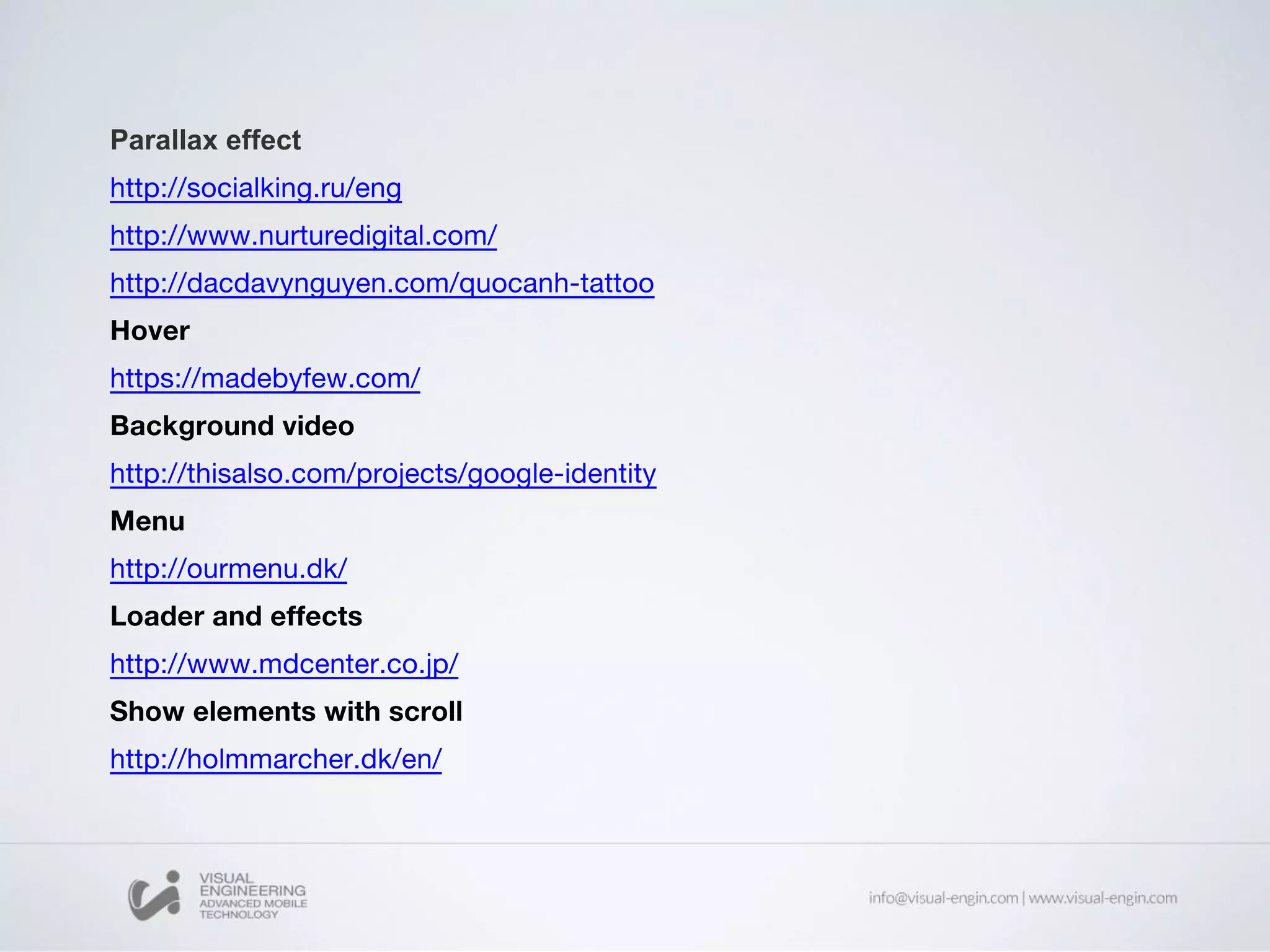
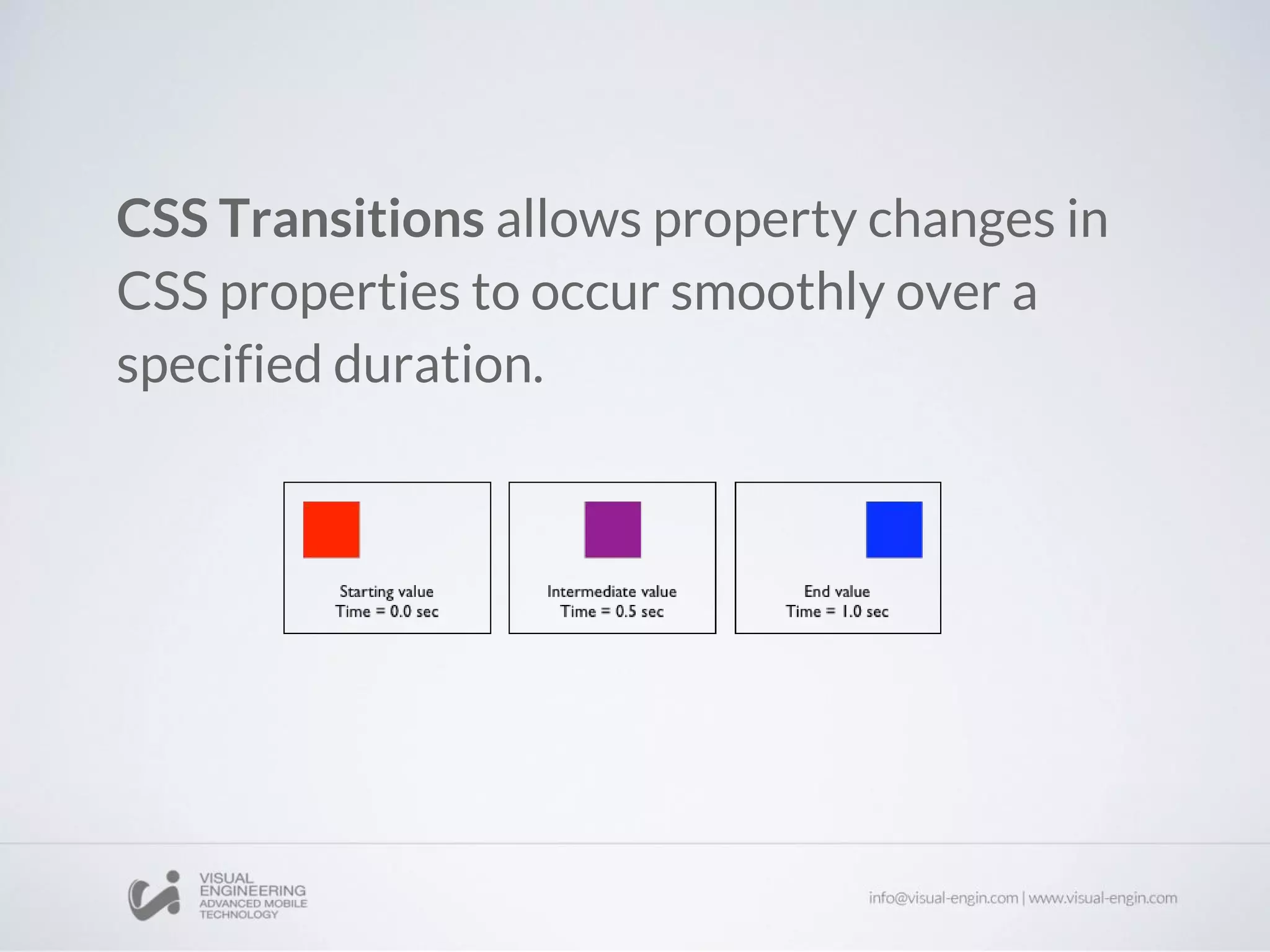
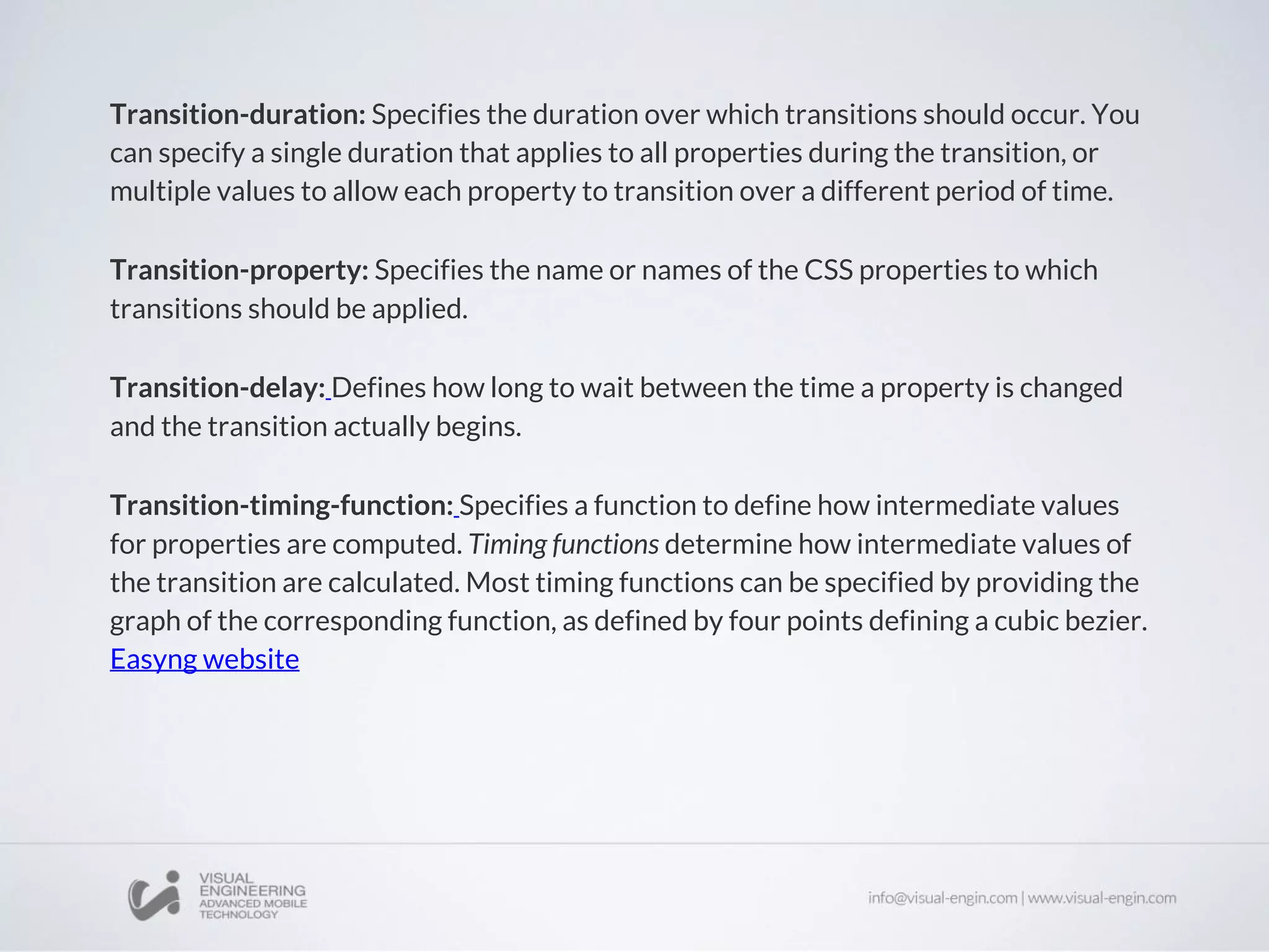
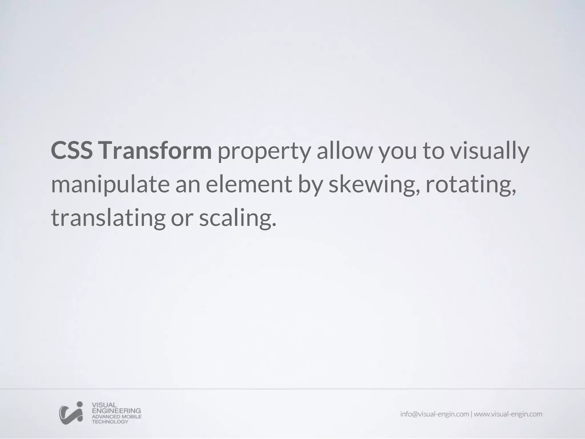
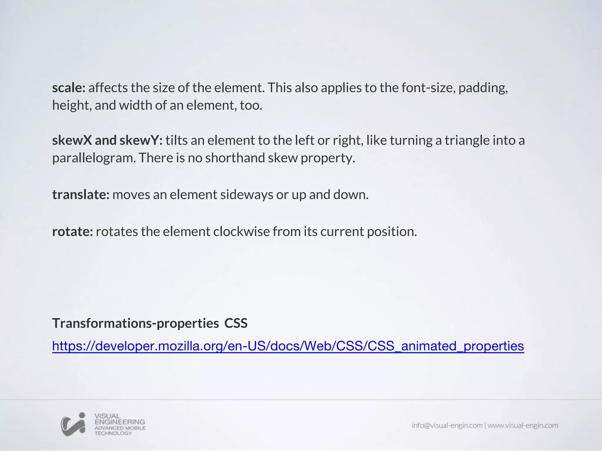
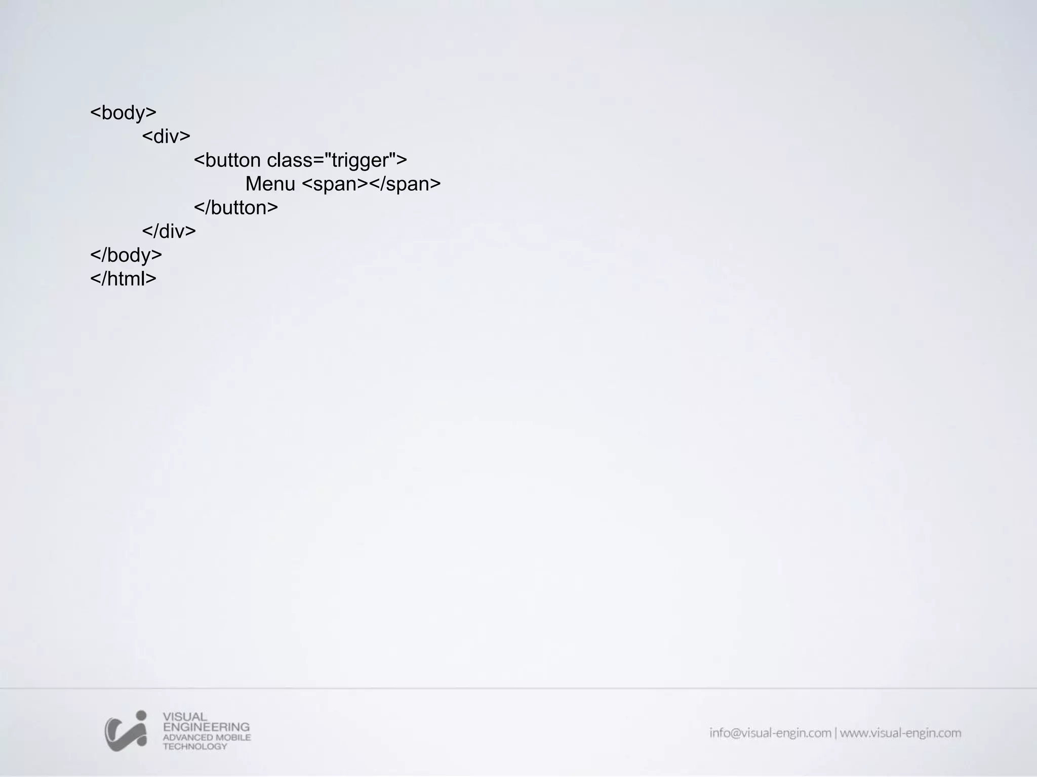
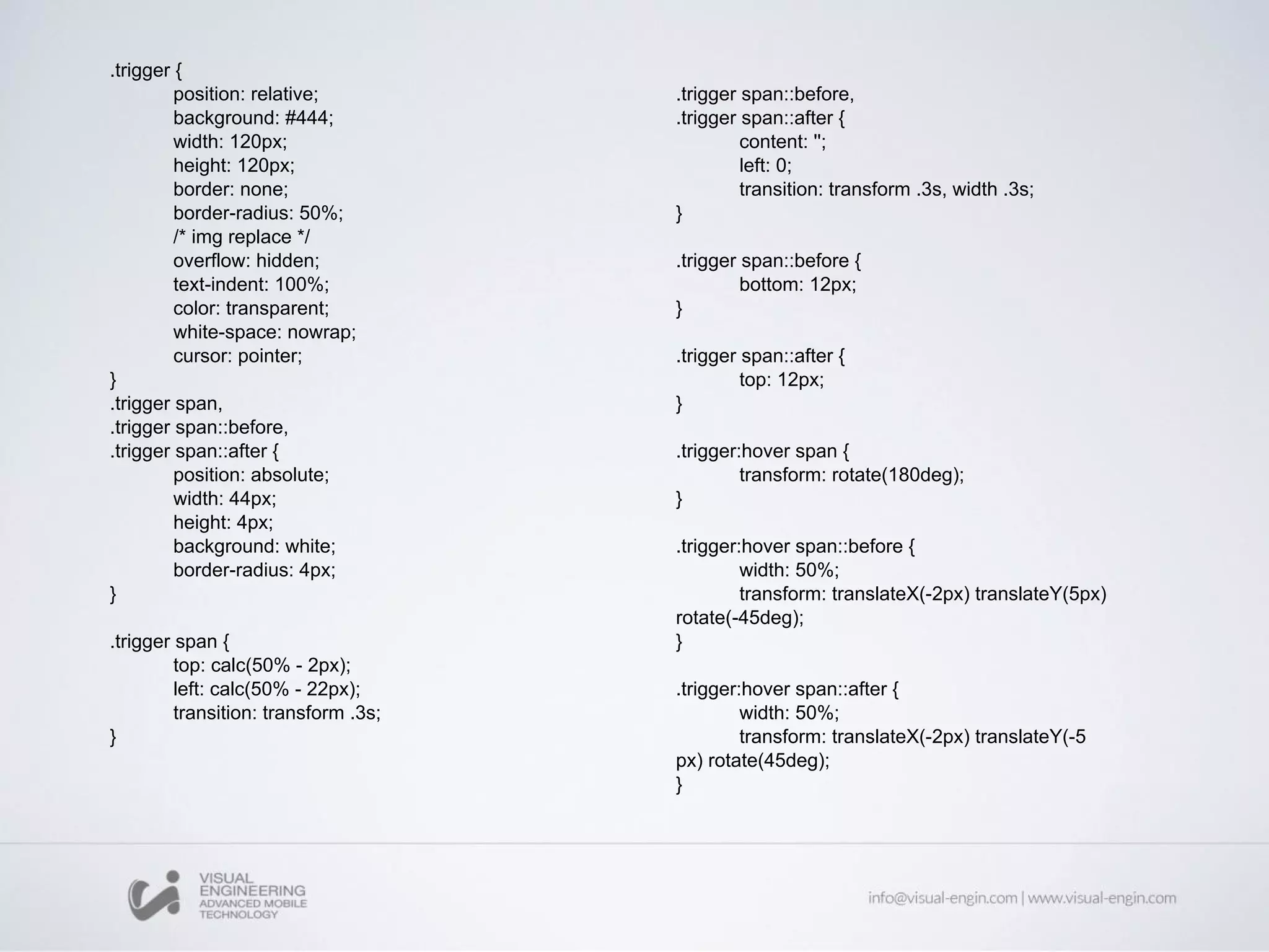
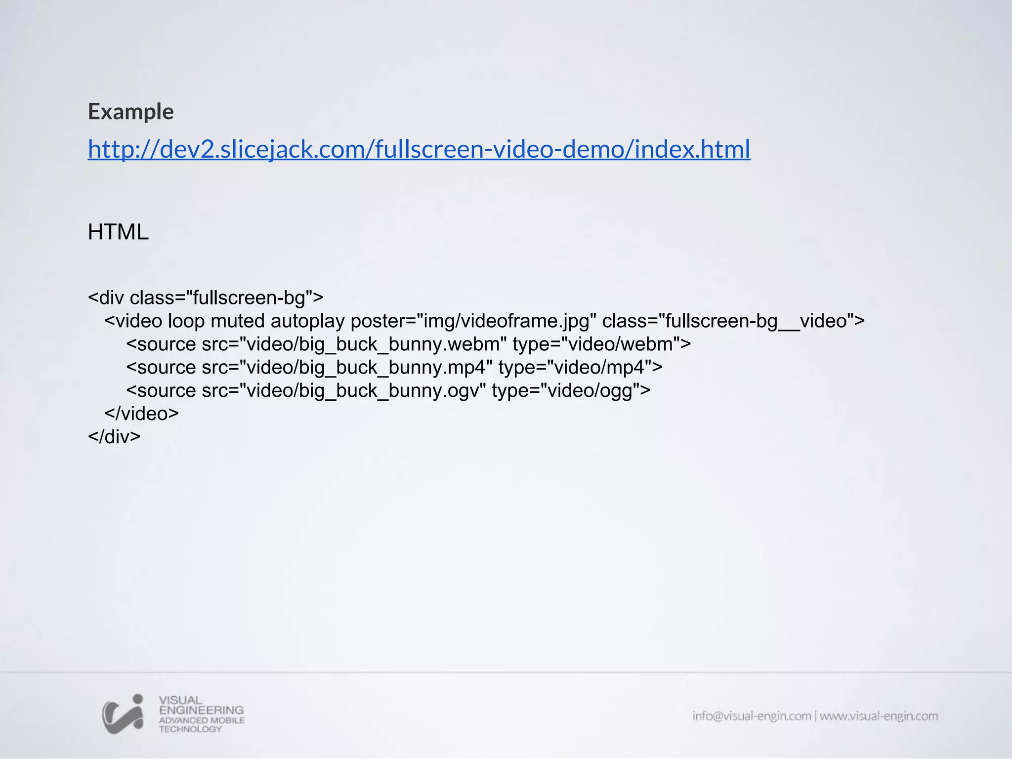
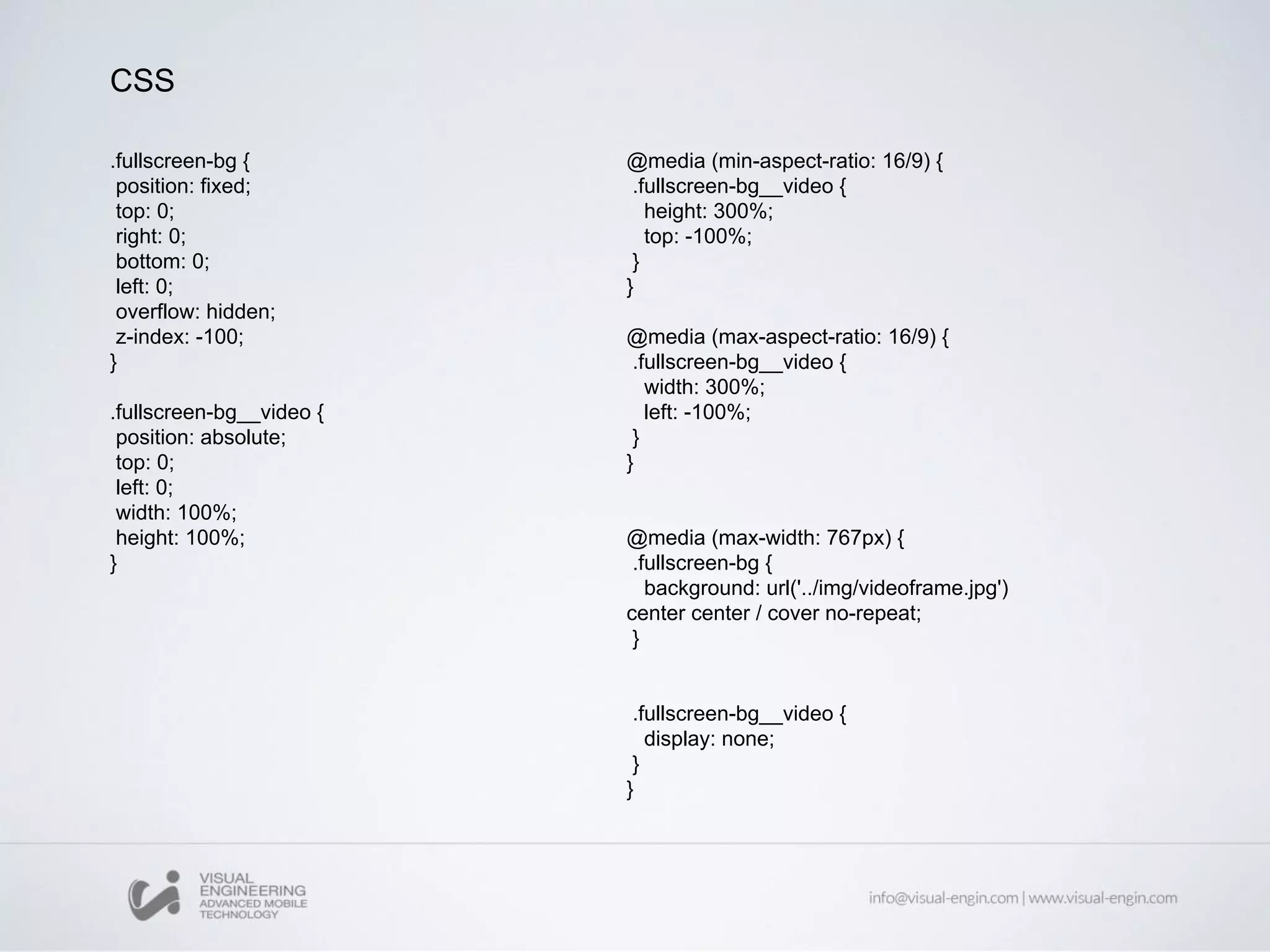
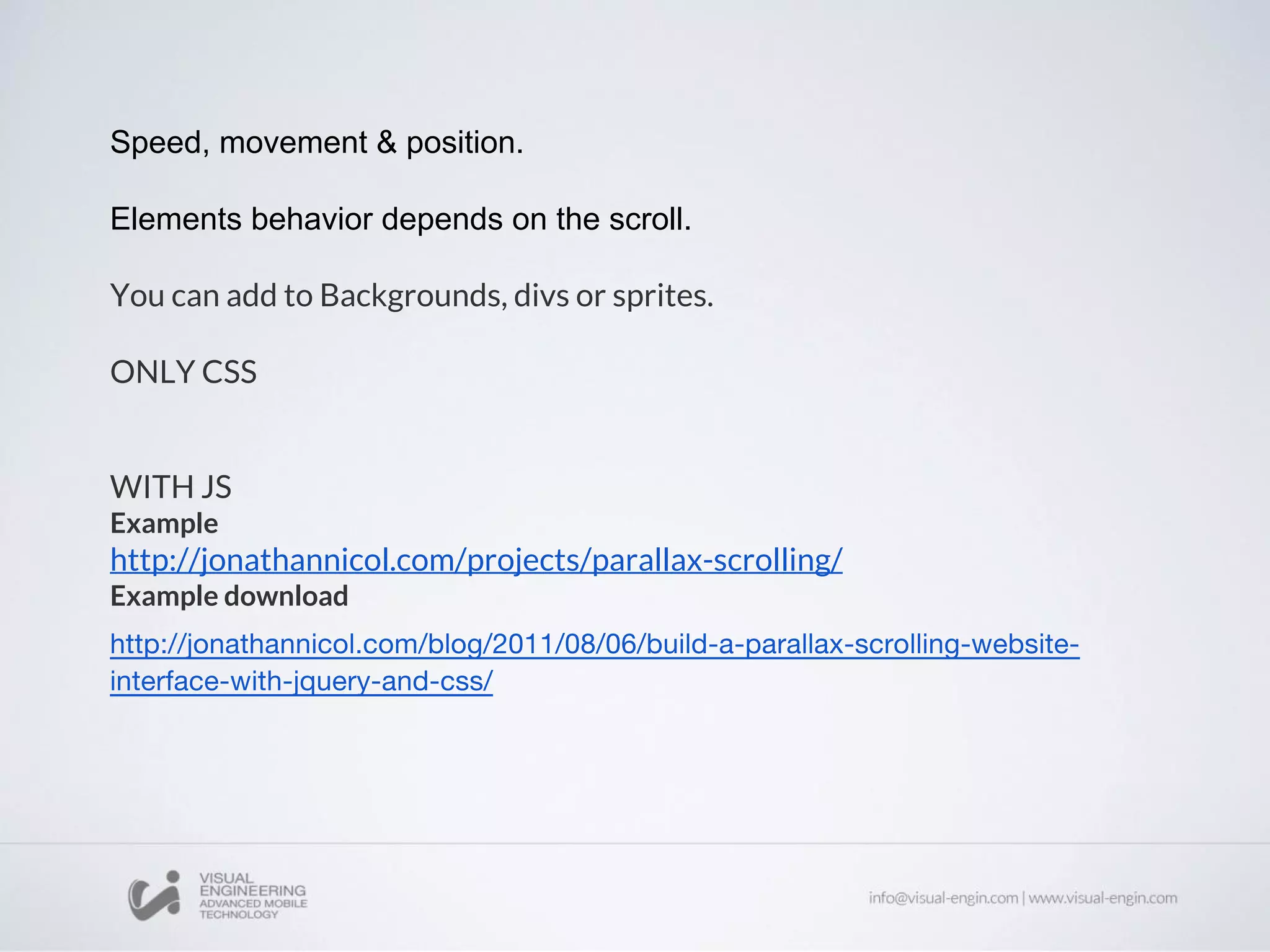
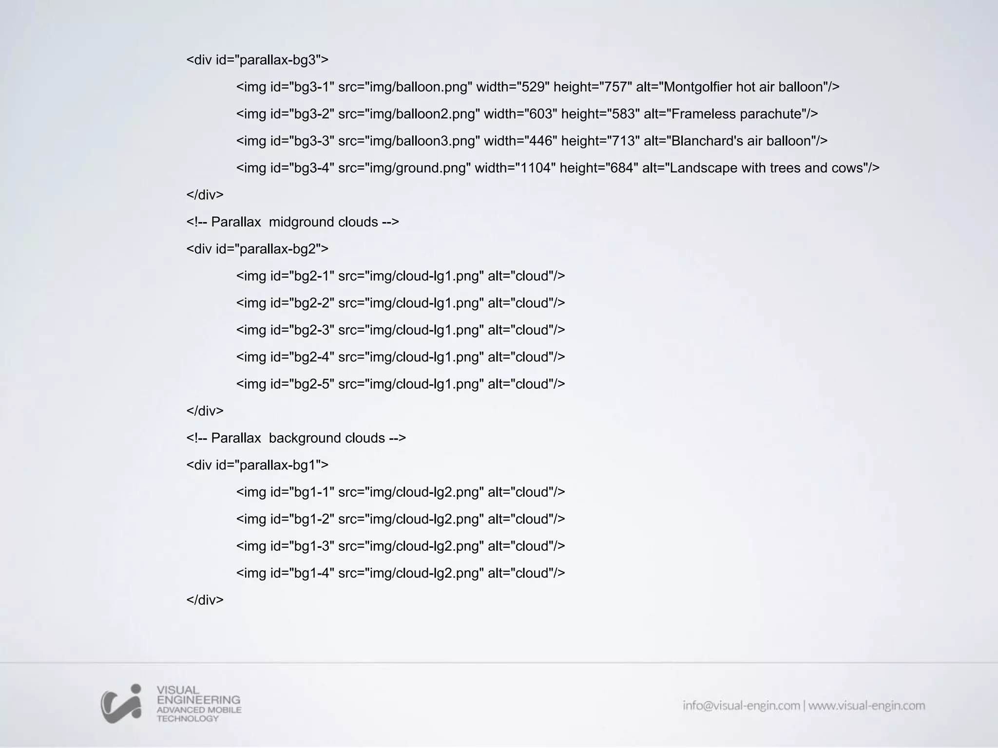
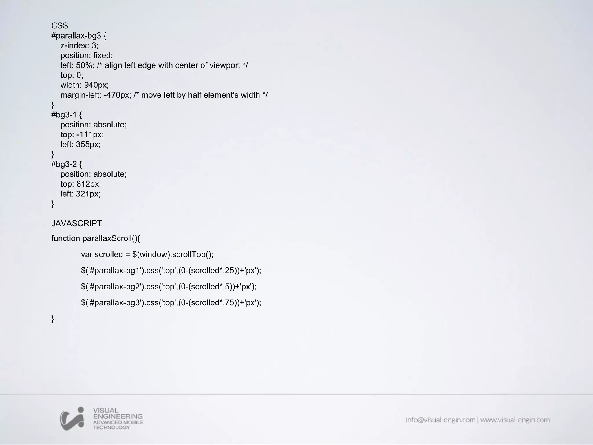
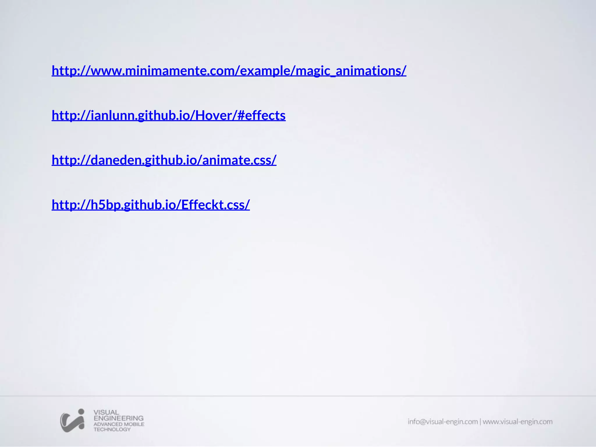
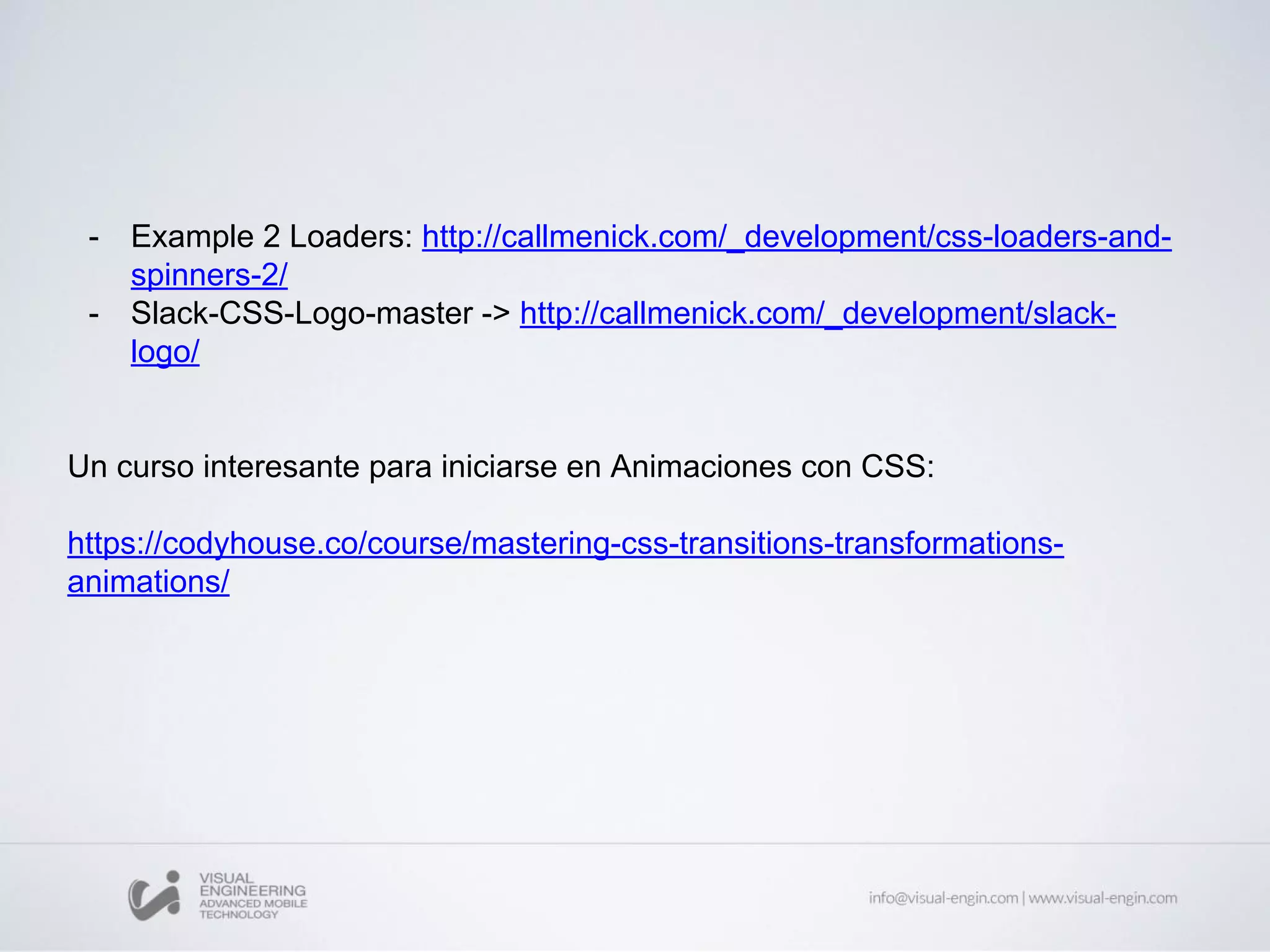
SlideShare a Scribd company logo
Front End Workshops
CSS Animations & cool effects
Toni Camí & Jorge López
jlopez@visual-engin.com
tcami@visual-engin.com
Cool Effects
Examples
Parallax effect
CSS Transitions
CSS Transitions allows property changes in
CSS properties to occur smoothly over a
specified duration.
Transition-duration: Specifies the duration over which transitions should occur. You
can specify a single duration that applies to all properties during the transition, or
multiple values to allow each property to transition over a different period of time.
Transition-property: Specifies the name or names of the CSS properties to which
transitions should be applied.
Transition-delay: Defines how long to wait between the time a property is changed
and the transition actually begins.
Transition-timing-function: Specifies a function to define how intermediate values
for properties are computed. Timing functions determine how intermediate values of
the transition are calculated. Most timing functions can be specified by providing the
graph of the corresponding function, as defined by four points defining a cubic bezier.
Easyng website
Transition-property CSS
Transformations
CSS Transform property allow you to visually
manipulate an element by skewing, rotating,
translating or scaling.
scale: affects the size of the element. This also applies to the font-size, padding,
height, and width of an element, too.
skewX and skewY: tilts an element to the left or right, like turning a triangle into a
parallelogram. There is no shorthand skew property.
translate: moves an element sideways or up and down.
rotate: rotates the element clockwise from its current position.
Transformations-properties CSS
CSS Animations
CSS animations make it possible to animate
transitions from one CSS style configuration to
another.
Animations consist of two components, a style describing the CSS animation and a set
of keyframes that indicate the start and end states of the animation's style, as well as
possible intermediate waypoints.
Advantages:
1. No JS is required.
2. Animations run well, rendering…
3. The browser optimize performance and efficiency. For example, reducing
the update frequency of animations running in tabs that aren't currently visible.
animation-delay
Configures the delay between the time the element is loaded and the beginning of the
animation sequence.
animation-direction
Configures whether or not the animation should alternate direction on each run
through the sequence or reset to the start point and repeat itself.
animation-duration
Configures the length of time that an animation should take to complete one cycle.
animation-iteration-count
Configures the number of times the animation should repeat; you can specify infinite
to repeat the animation indefinitely.
animation-name
Specifies the name of the @keyframes at-rule describing the animation's keyframes.
animation-play-state
Lets you pause and resume the animation sequence.
animation-timing-function
Configures the timing of the animation; that is, how the animation transitions through
keyframes, by establishing acceleration curves.
animation-fill-mode
Configures what values are applied by the animation before and after it is executing.
Animation-properties CSS
Keyframes
Keyframes are used to specify the values for
the animating properties at various points
during the animation.
@keyframes identifier (which will be referenced using animation-name:
identifier) {
CSS style rules
}
● Keyframes use a <percentage> to indicate the time during the animation sequence
at which they take place.
● 0% Start / 100% End.
● These two times are so important, they have special aliases: from and to.
● No negative
● No higher than 100%;
● You can optionally include additional keyframes that describe intermediate steps
between the start and end of the animation.
Hover
<body>
<div>
<button class="trigger">
Menu <span></span>
</button>
</div>
</body>
</html>
.trigger {
position: relative;
background: #444;
width: 120px;
height: 120px;
border: none;
border-radius: 50%;
/* img replace */
overflow: hidden;
text-indent: 100%;
color: transparent;
white-space: nowrap;
cursor: pointer;
}
.trigger span,
.trigger span::before,
.trigger span::after {
position: absolute;
width: 44px;
height: 4px;
background: white;
border-radius: 4px;
}
.trigger span {
top: calc(50% - 2px);
left: calc(50% - 22px);
transition: transform .3s;
}
.trigger span::before,
.trigger span::after {
content: '';
left: 0;
transition: transform .3s, width .3s;
}
.trigger span::before {
bottom: 12px;
}
.trigger span::after {
top: 12px;
}
.trigger:hover span {
transform: rotate(180deg);
}
.trigger:hover span::before {
width: 50%;
transform: translateX(-2px) translateY(5px)
rotate(-45deg);
}
.trigger:hover span::after {
width: 50%;
transform: translateX(-2px) translateY(-5
px) rotate(45deg);
}
Background video
Example
http://dev2.slicejack.com/fullscreen-video-demo/index.html
<div class="fullscreen-bg">
<video loop muted autoplay poster="img/videoframe.jpg" class="fullscreen-bg__video">
<source src="video/big_buck_bunny.webm" type="video/webm">
<source src="video/big_buck_bunny.mp4" type="video/mp4">
<source src="video/big_buck_bunny.ogv" type="video/ogg">
</video>
</div>
.fullscreen-bg {
position: fixed;
top: 0;
right: 0;
bottom: 0;
left: 0;
overflow: hidden;
z-index: -100;
}
.fullscreen-bg__video {
position: absolute;
top: 0;
left: 0;
width: 100%;
height: 100%;
}
@media (min-aspect-ratio: 16/9) {
.fullscreen-bg__video {
height: 300%;
top: -100%;
}
}
@media (max-aspect-ratio: 16/9) {
.fullscreen-bg__video {
width: 300%;
left: -100%;
}
}
@media (max-width: 767px) {
.fullscreen-bg {
background: url('../img/videoframe.jpg')
center center / cover no-repeat;
}
.fullscreen-bg__video {
display: none;
}
}
CSS
Parallax effect
Speed, movement & position.
Elements behavior depends on the scroll.
You can add to Backgrounds, divs or sprites.
ONLY CSS
WITH JS
Example
http://jonathannicol.com/projects/parallax-scrolling/
Example download
<section id="home" data-type="background" data-speed="10" class="pages">
<article>I am absolute positioned</article>
</section>
<section id="about" data-type="background" data-speed="10" class="pages">
<article>Simple Parallax Scroll</article>
</section>
#about {
background: url(about-bg.jpg) 50% 0 repeat fixed; min-height:
1000px;
height: 1000px;
margin: 0 auto;
width: 100%;
max-width: 1920px;
position: relative;
-webkit-box-shadow: 0 0 50px rgba(0,0,0,0.8);
box-shadow: 0 0 50px rgba(0,0,0,0.8);
}
#about article {
height: 458px;
position: absolute;
text-align: center;
top: 150px;
width: 100%;
}
#home {
background: url(home-bg.jpg) 50% 0 repeat fixed; min-height:
1000px;
height: 1000px;
margin: 0 auto;
width: 100%;
max-width: 1920px;
position: relative;
}
#home article {
height: 458px;
position: absolute;
text-align: center;
top: 150px;
width: 100%;
}
<div id="parallax-bg3">
<img id="bg3-1" src="img/balloon.png" width="529" height="757" alt="Montgolfier hot air balloon"/>
<img id="bg3-2" src="img/balloon2.png" width="603" height="583" alt="Frameless parachute"/>
<img id="bg3-3" src="img/balloon3.png" width="446" height="713" alt="Blanchard's air balloon"/>
<img id="bg3-4" src="img/ground.png" width="1104" height="684" alt="Landscape with trees and cows"/>
</div>
<!-- Parallax midground clouds -->
<div id="parallax-bg2">
<img id="bg2-1" src="img/cloud-lg1.png" alt="cloud"/>
<img id="bg2-2" src="img/cloud-lg1.png" alt="cloud"/>
<img id="bg2-3" src="img/cloud-lg1.png" alt="cloud"/>
<img id="bg2-4" src="img/cloud-lg1.png" alt="cloud"/>
<img id="bg2-5" src="img/cloud-lg1.png" alt="cloud"/>
</div>
<!-- Parallax background clouds -->
<div id="parallax-bg1">
<img id="bg1-1" src="img/cloud-lg2.png" alt="cloud"/>
<img id="bg1-2" src="img/cloud-lg2.png" alt="cloud"/>
<img id="bg1-3" src="img/cloud-lg2.png" alt="cloud"/>
<img id="bg1-4" src="img/cloud-lg2.png" alt="cloud"/>
</div>
CSS
#parallax-bg3 {
z-index: 3;
position: fixed;
left: 50%; /* align left edge with center of viewport */
top: 0;
width: 940px;
margin-left: -470px; /* move left by half element's width */
}
#bg3-1 {
position: absolute;
top: -111px;
left: 355px;
}
#bg3-2 {
position: absolute;
top: 812px;
left: 321px;
}
JAVASCRIPT
function parallaxScroll(){
var scrolled = $(window).scrollTop();
$('#parallax-bg1').css('top',(0-(scrolled*.25))+'px');
$('#parallax-bg2').css('top',(0-(scrolled*.5))+'px');
$('#parallax-bg3').css('top',(0-(scrolled*.75))+'px');
}
Librerías CSS animation
http://www.minimamente.com/example/magic_animations/
http://ianlunn.github.io/Hover/#effects
http://daneden.github.io/animate.css/
http://h5bp.github.io/Effeckt.css/
Examples
- Example 2 Loaders: http://callmenick.com/_development/css-loaders-and-
spinners-2/
- Slack-CSS-Logo-master -> http://callmenick.com/_development/slack-
logo/
Un curso interesante para iniciarse en Animaciones con CSS:
https://codyhouse.co/course/mastering-css-transitions-transformations-
animations/
Thanks for your time!
:)
Workshop 18: CSS Animations & cool effects

More Related Content

What's hot

Angular를 활용한 웹 프론트단 개발과 2.0에서 달라진점
Angular를 활용한 웹 프론트단 개발과 2.0에서 달라진점Angular를 활용한 웹 프론트단 개발과 2.0에서 달라진점
Angular를 활용한 웹 프론트단 개발과 2.0에서 달라진점
Jeado Ko
 

What's hot (19)

Image Manipulation in WordPress 3.5 - WordCamp Phoenix 2013
Image Manipulation in WordPress 3.5 - WordCamp Phoenix 2013Image Manipulation in WordPress 3.5 - WordCamp Phoenix 2013
Image Manipulation in WordPress 3.5 - WordCamp Phoenix 2013
 
SproutCore and the Future of Web Apps
SproutCore and the Future of Web AppsSproutCore and the Future of Web Apps
SproutCore and the Future of Web Apps
 
HTML5: friend or foe (to Flash)?
HTML5: friend or foe (to Flash)?HTML5: friend or foe (to Flash)?
HTML5: friend or foe (to Flash)?
 
Quick ref capybara
Quick ref capybaraQuick ref capybara
Quick ref capybara
 
Ext JS Architecture Best Practices - Mitchell Simeons
Ext JS Architecture Best Practices - Mitchell SimeonsExt JS Architecture Best Practices - Mitchell Simeons
Ext JS Architecture Best Practices - Mitchell Simeons
 
Custom post-framworks
Custom post-framworksCustom post-framworks
Custom post-framworks
 
Randomising css animations
Randomising css animationsRandomising css animations
Randomising css animations
 
CSS Grid Layout
CSS Grid LayoutCSS Grid Layout
CSS Grid Layout
 
Bootstrap과 UI-Bootstrap
Bootstrap과 UI-BootstrapBootstrap과 UI-Bootstrap
Bootstrap과 UI-Bootstrap
 
Dynamic CSS: Transforms, Transitions, and Animation Basics
Dynamic CSS: Transforms, Transitions, and Animation BasicsDynamic CSS: Transforms, Transitions, and Animation Basics
Dynamic CSS: Transforms, Transitions, and Animation Basics
 
Difference between java script and jquery
Difference between java script and jqueryDifference between java script and jquery
Difference between java script and jquery
 
Your JavaScript Library
Your JavaScript LibraryYour JavaScript Library
Your JavaScript Library
 
Animating an svg icon
Animating an svg iconAnimating an svg icon
Animating an svg icon
 
Angular를 활용한 웹 프론트단 개발과 2.0에서 달라진점
Angular를 활용한 웹 프론트단 개발과 2.0에서 달라진점Angular를 활용한 웹 프론트단 개발과 2.0에서 달라진점
Angular를 활용한 웹 프론트단 개발과 2.0에서 달라진점
 
Intro to Ember.JS 2016
Intro to Ember.JS 2016Intro to Ember.JS 2016
Intro to Ember.JS 2016
 
Web Frontend development: tools and good practices to (re)organize the chaos
Web Frontend development: tools and good practices to (re)organize the chaosWeb Frontend development: tools and good practices to (re)organize the chaos
Web Frontend development: tools and good practices to (re)organize the chaos
 
Modular and Event-Driven JavaScript
Modular and Event-Driven JavaScriptModular and Event-Driven JavaScript
Modular and Event-Driven JavaScript
 
Polymer 1.0
Polymer 1.0Polymer 1.0
Polymer 1.0
 
Landing Pages 101
Landing Pages 101Landing Pages 101
Landing Pages 101
 

Similar to Workshop 18: CSS Animations & cool effects

CSS3 TTA (Transform Transition Animation)
CSS3 TTA (Transform Transition Animation)CSS3 TTA (Transform Transition Animation)
CSS3 TTA (Transform Transition Animation)
창석 한
 
HTML5 and CSS3 – exploring mobile possibilities - Frontend Conference Zürich
HTML5 and CSS3 – exploring mobile possibilities - Frontend Conference ZürichHTML5 and CSS3 – exploring mobile possibilities - Frontend Conference Zürich
HTML5 and CSS3 – exploring mobile possibilities - Frontend Conference Zürich
Robert Nyman
 
Girl Develop It Cincinnati: Intro to HTML/CSS Class 4
Girl Develop It Cincinnati: Intro to HTML/CSS Class 4Girl Develop It Cincinnati: Intro to HTML/CSS Class 4
Girl Develop It Cincinnati: Intro to HTML/CSS Class 4
Erin M. Kidwell
 
Css3 transitions and animations + graceful degradation with jQuery
Css3 transitions and animations + graceful degradation with jQueryCss3 transitions and animations + graceful degradation with jQuery
Css3 transitions and animations + graceful degradation with jQuery
Andrea Verlicchi
 
Blog skins396734
Blog skins396734Blog skins396734
Blog skins396734
pantangmrny
 
CSS3 Transitions
CSS3 TransitionsCSS3 Transitions
CSS3 Transitions
hstryk
 

Similar to Workshop 18: CSS Animations & cool effects (20)

Css3
Css3Css3
Css3
 
Tailwind Animation: How to Make Eye-Catching Websites
Tailwind Animation: How to Make Eye-Catching WebsitesTailwind Animation: How to Make Eye-Catching Websites
Tailwind Animation: How to Make Eye-Catching Websites
 
Css3
Css3Css3
Css3
 
GOTO Berlin - You can use CSS for that
GOTO Berlin - You can use CSS for thatGOTO Berlin - You can use CSS for that
GOTO Berlin - You can use CSS for that
 
CSS3 TTA (Transform Transition Animation)
CSS3 TTA (Transform Transition Animation)CSS3 TTA (Transform Transition Animation)
CSS3 TTA (Transform Transition Animation)
 
Css3
Css3Css3
Css3
 
The Creative New World of CSS
The Creative New World of CSSThe Creative New World of CSS
The Creative New World of CSS
 
Angular js animate shashikant bhongale -20-7-16
Angular js animate shashikant bhongale -20-7-16Angular js animate shashikant bhongale -20-7-16
Angular js animate shashikant bhongale -20-7-16
 
HTML5 and CSS3 Shizzle
HTML5 and CSS3 ShizzleHTML5 and CSS3 Shizzle
HTML5 and CSS3 Shizzle
 
html5_css3
html5_css3html5_css3
html5_css3
 
CSS and CSS3
CSS and CSS3CSS and CSS3
CSS and CSS3
 
HTML5 and CSS3 – exploring mobile possibilities - Frontend Conference Zürich
HTML5 and CSS3 – exploring mobile possibilities - Frontend Conference ZürichHTML5 and CSS3 – exploring mobile possibilities - Frontend Conference Zürich
HTML5 and CSS3 – exploring mobile possibilities - Frontend Conference Zürich
 
I Can't Believe It's Not Flash
I Can't Believe It's Not FlashI Can't Believe It's Not Flash
I Can't Believe It's Not Flash
 
CSS Walktrough Internship Course
CSS Walktrough Internship CourseCSS Walktrough Internship Course
CSS Walktrough Internship Course
 
Angular animate
Angular animateAngular animate
Angular animate
 
Girl Develop It Cincinnati: Intro to HTML/CSS Class 4
Girl Develop It Cincinnati: Intro to HTML/CSS Class 4Girl Develop It Cincinnati: Intro to HTML/CSS Class 4
Girl Develop It Cincinnati: Intro to HTML/CSS Class 4
 
Css3 transitions and animations + graceful degradation with jQuery
Css3 transitions and animations + graceful degradation with jQueryCss3 transitions and animations + graceful degradation with jQuery
Css3 transitions and animations + graceful degradation with jQuery
 
Blog skins396734
Blog skins396734Blog skins396734
Blog skins396734
 
Html5
Html5Html5
Html5
 
CSS3 Transitions
CSS3 TransitionsCSS3 Transitions
CSS3 Transitions
 

More from Visual Engineering

More from Visual Engineering (20)

Workshop 27: Isomorphic web apps with ReactJS
Workshop 27: Isomorphic web apps with ReactJSWorkshop 27: Isomorphic web apps with ReactJS
Workshop 27: Isomorphic web apps with ReactJS
 
Workshop iOS 4: Closures, generics & operators
Workshop iOS 4: Closures, generics & operatorsWorkshop iOS 4: Closures, generics & operators
Workshop iOS 4: Closures, generics & operators
 
Workshop iOS 3: Testing, protocolos y extensiones
Workshop iOS 3: Testing, protocolos y extensionesWorkshop iOS 3: Testing, protocolos y extensiones
Workshop iOS 3: Testing, protocolos y extensiones
 
Workshop iOS 2: Swift - Structures
Workshop iOS 2: Swift - StructuresWorkshop iOS 2: Swift - Structures
Workshop iOS 2: Swift - Structures
 
Workhop iOS 1: Fundamentos de Swift
Workhop iOS 1: Fundamentos de SwiftWorkhop iOS 1: Fundamentos de Swift
Workhop iOS 1: Fundamentos de Swift
 
Workshop 26: React Native - The Native Side
Workshop 26: React Native - The Native SideWorkshop 26: React Native - The Native Side
Workshop 26: React Native - The Native Side
 
Workshop 25: React Native - Components
Workshop 25: React Native - ComponentsWorkshop 25: React Native - Components
Workshop 25: React Native - Components
 
Workshop 24: React Native Introduction
Workshop 24: React Native IntroductionWorkshop 24: React Native Introduction
Workshop 24: React Native Introduction
 
Workshop 23: ReactJS, React & Redux testing
Workshop 23: ReactJS, React & Redux testingWorkshop 23: ReactJS, React & Redux testing
Workshop 23: ReactJS, React & Redux testing
 
Workshop 22: ReactJS Redux Advanced
Workshop 22: ReactJS Redux AdvancedWorkshop 22: ReactJS Redux Advanced
Workshop 22: ReactJS Redux Advanced
 
Workshop 22: React-Redux Middleware
Workshop 22: React-Redux MiddlewareWorkshop 22: React-Redux Middleware
Workshop 22: React-Redux Middleware
 
Workshop 21: React Router
Workshop 21: React RouterWorkshop 21: React Router
Workshop 21: React Router
 
Workshop 20: ReactJS Part II Flux Pattern & Redux
Workshop 20: ReactJS Part II Flux Pattern & ReduxWorkshop 20: ReactJS Part II Flux Pattern & Redux
Workshop 20: ReactJS Part II Flux Pattern & Redux
 
Workshop 19: ReactJS Introduction
Workshop 19: ReactJS IntroductionWorkshop 19: ReactJS Introduction
Workshop 19: ReactJS Introduction
 
Workshop 17: EmberJS parte II
Workshop 17: EmberJS parte IIWorkshop 17: EmberJS parte II
Workshop 17: EmberJS parte II
 
Workshop 16: EmberJS Parte I
Workshop 16: EmberJS Parte IWorkshop 16: EmberJS Parte I
Workshop 16: EmberJS Parte I
 
Workshop 15: Ionic framework
Workshop 15: Ionic frameworkWorkshop 15: Ionic framework
Workshop 15: Ionic framework
 
Workshop 14: AngularJS Parte III
Workshop 14: AngularJS Parte IIIWorkshop 14: AngularJS Parte III
Workshop 14: AngularJS Parte III
 
Workshop 13: AngularJS Parte II
Workshop 13: AngularJS Parte IIWorkshop 13: AngularJS Parte II
Workshop 13: AngularJS Parte II
 
Workshop 8: Templating: Handlebars, DustJS
Workshop 8: Templating: Handlebars, DustJSWorkshop 8: Templating: Handlebars, DustJS
Workshop 8: Templating: Handlebars, DustJS
 

Recently uploaded

National-Learning-Camp 2024 deped....pptx
National-Learning-Camp 2024 deped....pptxNational-Learning-Camp 2024 deped....pptx
National-Learning-Camp 2024 deped....pptx
AlecAnidul
 
Transforming Brand Perception and Boosting Profitability
Transforming Brand Perception and Boosting ProfitabilityTransforming Brand Perception and Boosting Profitability
Transforming Brand Perception and Boosting Profitability
aaryangarg12
 

Recently uploaded (11)

Book Formatting: Quality Control Checks for Designers
Book Formatting: Quality Control Checks for DesignersBook Formatting: Quality Control Checks for Designers
Book Formatting: Quality Control Checks for Designers
 
National-Learning-Camp 2024 deped....pptx
National-Learning-Camp 2024 deped....pptxNational-Learning-Camp 2024 deped....pptx
National-Learning-Camp 2024 deped....pptx
 
Top 5 Indian Style Modular Kitchen Designs
Top 5 Indian Style Modular Kitchen DesignsTop 5 Indian Style Modular Kitchen Designs
Top 5 Indian Style Modular Kitchen Designs
 
Art Nouveau Movement Presentation for Art History.
Art Nouveau Movement Presentation for Art History.Art Nouveau Movement Presentation for Art History.
Art Nouveau Movement Presentation for Art History.
 
The Design Code Google Developer Student Club.pptx
The Design Code Google Developer Student Club.pptxThe Design Code Google Developer Student Club.pptx
The Design Code Google Developer Student Club.pptx
 
CA OFFICE office office office _VIEWS.pdf
CA OFFICE office office office _VIEWS.pdfCA OFFICE office office office _VIEWS.pdf
CA OFFICE office office office _VIEWS.pdf
 
Transforming Brand Perception and Boosting Profitability
Transforming Brand Perception and Boosting ProfitabilityTransforming Brand Perception and Boosting Profitability
Transforming Brand Perception and Boosting Profitability
 
The Evolution of Fashion Trends: History to Fashion
The Evolution of Fashion Trends: History to FashionThe Evolution of Fashion Trends: History to Fashion
The Evolution of Fashion Trends: History to Fashion
 
Expert Accessory Dwelling Unit (ADU) Drafting Services
Expert Accessory Dwelling Unit (ADU) Drafting ServicesExpert Accessory Dwelling Unit (ADU) Drafting Services
Expert Accessory Dwelling Unit (ADU) Drafting Services
 
Common Designing Mistakes and How to avoid them
Common Designing Mistakes and How to avoid themCommon Designing Mistakes and How to avoid them
Common Designing Mistakes and How to avoid them
 
PORTFOLIO FABIANA VILLANI ARCHITECTURE.pdf
PORTFOLIO FABIANA VILLANI ARCHITECTURE.pdfPORTFOLIO FABIANA VILLANI ARCHITECTURE.pdf
PORTFOLIO FABIANA VILLANI ARCHITECTURE.pdf
 

Workshop 18: CSS Animations & cool effects

  • 1. Front End Workshops CSS Animations & cool effects Toni Camí & Jorge López jlopez@visual-engin.com tcami@visual-engin.com
  • 5. CSS Transitions allows property changes in CSS properties to occur smoothly over a specified duration.
  • 6. Transition-duration: Specifies the duration over which transitions should occur. You can specify a single duration that applies to all properties during the transition, or multiple values to allow each property to transition over a different period of time. Transition-property: Specifies the name or names of the CSS properties to which transitions should be applied. Transition-delay: Defines how long to wait between the time a property is changed and the transition actually begins. Transition-timing-function: Specifies a function to define how intermediate values for properties are computed. Timing functions determine how intermediate values of the transition are calculated. Most timing functions can be specified by providing the graph of the corresponding function, as defined by four points defining a cubic bezier. Easyng website
  • 8.
  • 10. CSS Transform property allow you to visually manipulate an element by skewing, rotating, translating or scaling.
  • 11. scale: affects the size of the element. This also applies to the font-size, padding, height, and width of an element, too. skewX and skewY: tilts an element to the left or right, like turning a triangle into a parallelogram. There is no shorthand skew property. translate: moves an element sideways or up and down. rotate: rotates the element clockwise from its current position. Transformations-properties CSS
  • 13. CSS animations make it possible to animate transitions from one CSS style configuration to another. Animations consist of two components, a style describing the CSS animation and a set of keyframes that indicate the start and end states of the animation's style, as well as possible intermediate waypoints. Advantages: 1. No JS is required. 2. Animations run well, rendering… 3. The browser optimize performance and efficiency. For example, reducing the update frequency of animations running in tabs that aren't currently visible.
  • 14. animation-delay Configures the delay between the time the element is loaded and the beginning of the animation sequence. animation-direction Configures whether or not the animation should alternate direction on each run through the sequence or reset to the start point and repeat itself. animation-duration Configures the length of time that an animation should take to complete one cycle. animation-iteration-count Configures the number of times the animation should repeat; you can specify infinite to repeat the animation indefinitely. animation-name Specifies the name of the @keyframes at-rule describing the animation's keyframes.
  • 15. animation-play-state Lets you pause and resume the animation sequence. animation-timing-function Configures the timing of the animation; that is, how the animation transitions through keyframes, by establishing acceleration curves. animation-fill-mode Configures what values are applied by the animation before and after it is executing. Animation-properties CSS
  • 17. Keyframes are used to specify the values for the animating properties at various points during the animation. @keyframes identifier (which will be referenced using animation-name: identifier) { CSS style rules }
  • 18. ● Keyframes use a <percentage> to indicate the time during the animation sequence at which they take place. ● 0% Start / 100% End. ● These two times are so important, they have special aliases: from and to. ● No negative ● No higher than 100%; ● You can optionally include additional keyframes that describe intermediate steps between the start and end of the animation.
  • 19. Hover
  • 21. .trigger { position: relative; background: #444; width: 120px; height: 120px; border: none; border-radius: 50%; /* img replace */ overflow: hidden; text-indent: 100%; color: transparent; white-space: nowrap; cursor: pointer; } .trigger span, .trigger span::before, .trigger span::after { position: absolute; width: 44px; height: 4px; background: white; border-radius: 4px; } .trigger span { top: calc(50% - 2px); left: calc(50% - 22px); transition: transform .3s; } .trigger span::before, .trigger span::after { content: ''; left: 0; transition: transform .3s, width .3s; } .trigger span::before { bottom: 12px; } .trigger span::after { top: 12px; } .trigger:hover span { transform: rotate(180deg); } .trigger:hover span::before { width: 50%; transform: translateX(-2px) translateY(5px) rotate(-45deg); } .trigger:hover span::after { width: 50%; transform: translateX(-2px) translateY(-5 px) rotate(45deg); }
  • 23. Example http://dev2.slicejack.com/fullscreen-video-demo/index.html <div class="fullscreen-bg"> <video loop muted autoplay poster="img/videoframe.jpg" class="fullscreen-bg__video"> <source src="video/big_buck_bunny.webm" type="video/webm"> <source src="video/big_buck_bunny.mp4" type="video/mp4"> <source src="video/big_buck_bunny.ogv" type="video/ogg"> </video> </div>
  • 24. .fullscreen-bg { position: fixed; top: 0; right: 0; bottom: 0; left: 0; overflow: hidden; z-index: -100; } .fullscreen-bg__video { position: absolute; top: 0; left: 0; width: 100%; height: 100%; } @media (min-aspect-ratio: 16/9) { .fullscreen-bg__video { height: 300%; top: -100%; } } @media (max-aspect-ratio: 16/9) { .fullscreen-bg__video { width: 300%; left: -100%; } } @media (max-width: 767px) { .fullscreen-bg { background: url('../img/videoframe.jpg') center center / cover no-repeat; } .fullscreen-bg__video { display: none; } } CSS
  • 26. Speed, movement & position. Elements behavior depends on the scroll. You can add to Backgrounds, divs or sprites. ONLY CSS WITH JS Example http://jonathannicol.com/projects/parallax-scrolling/ Example download
  • 27. <section id="home" data-type="background" data-speed="10" class="pages"> <article>I am absolute positioned</article> </section> <section id="about" data-type="background" data-speed="10" class="pages"> <article>Simple Parallax Scroll</article> </section> #about { background: url(about-bg.jpg) 50% 0 repeat fixed; min-height: 1000px; height: 1000px; margin: 0 auto; width: 100%; max-width: 1920px; position: relative; -webkit-box-shadow: 0 0 50px rgba(0,0,0,0.8); box-shadow: 0 0 50px rgba(0,0,0,0.8); } #about article { height: 458px; position: absolute; text-align: center; top: 150px; width: 100%; } #home { background: url(home-bg.jpg) 50% 0 repeat fixed; min-height: 1000px; height: 1000px; margin: 0 auto; width: 100%; max-width: 1920px; position: relative; } #home article { height: 458px; position: absolute; text-align: center; top: 150px; width: 100%; }
  • 28. <div id="parallax-bg3"> <img id="bg3-1" src="img/balloon.png" width="529" height="757" alt="Montgolfier hot air balloon"/> <img id="bg3-2" src="img/balloon2.png" width="603" height="583" alt="Frameless parachute"/> <img id="bg3-3" src="img/balloon3.png" width="446" height="713" alt="Blanchard's air balloon"/> <img id="bg3-4" src="img/ground.png" width="1104" height="684" alt="Landscape with trees and cows"/> </div> <!-- Parallax midground clouds --> <div id="parallax-bg2"> <img id="bg2-1" src="img/cloud-lg1.png" alt="cloud"/> <img id="bg2-2" src="img/cloud-lg1.png" alt="cloud"/> <img id="bg2-3" src="img/cloud-lg1.png" alt="cloud"/> <img id="bg2-4" src="img/cloud-lg1.png" alt="cloud"/> <img id="bg2-5" src="img/cloud-lg1.png" alt="cloud"/> </div> <!-- Parallax background clouds --> <div id="parallax-bg1"> <img id="bg1-1" src="img/cloud-lg2.png" alt="cloud"/> <img id="bg1-2" src="img/cloud-lg2.png" alt="cloud"/> <img id="bg1-3" src="img/cloud-lg2.png" alt="cloud"/> <img id="bg1-4" src="img/cloud-lg2.png" alt="cloud"/> </div>
  • 29. CSS #parallax-bg3 { z-index: 3; position: fixed; left: 50%; /* align left edge with center of viewport */ top: 0; width: 940px; margin-left: -470px; /* move left by half element's width */ } #bg3-1 { position: absolute; top: -111px; left: 355px; } #bg3-2 { position: absolute; top: 812px; left: 321px; } JAVASCRIPT function parallaxScroll(){ var scrolled = $(window).scrollTop(); $('#parallax-bg1').css('top',(0-(scrolled*.25))+'px'); $('#parallax-bg2').css('top',(0-(scrolled*.5))+'px'); $('#parallax-bg3').css('top',(0-(scrolled*.75))+'px'); }
  • 33. - Example 2 Loaders: http://callmenick.com/_development/css-loaders-and- spinners-2/ - Slack-CSS-Logo-master -> http://callmenick.com/_development/slack- logo/ Un curso interesante para iniciarse en Animaciones con CSS: https://codyhouse.co/course/mastering-css-transitions-transformations- animations/
  • 34. Thanks for your time! :)